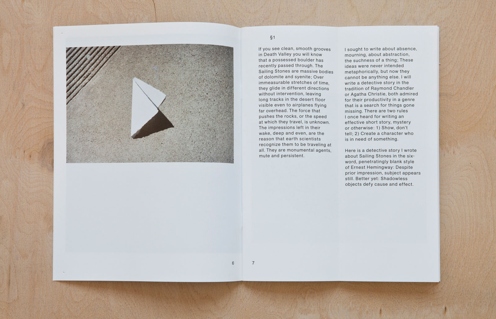
ISSUES IN PRESERVATION POLICY for COLUMBIA BOOKS ON ARCHITECTURE & THE CITY — Increasingly, the field of preservation is being challenged to consider questions of social inclusion, of how multiple publics are or are not represented in heritage decision making, geographies and governance structures. Community engagement is being integrated into project-based preservation practice, but the policy toolbox has been slower to evolve. Recognizing how preservation can both empower and marginalize compels greater reflection on its past and future and collective action beyond the project level. In the first of this three-volume series, a broad range of academics, historians and practitioners are brought together to document progress and evaluate steps to be taken.

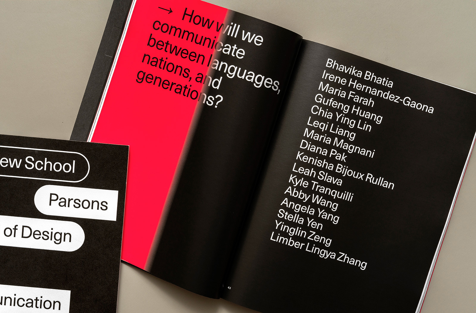
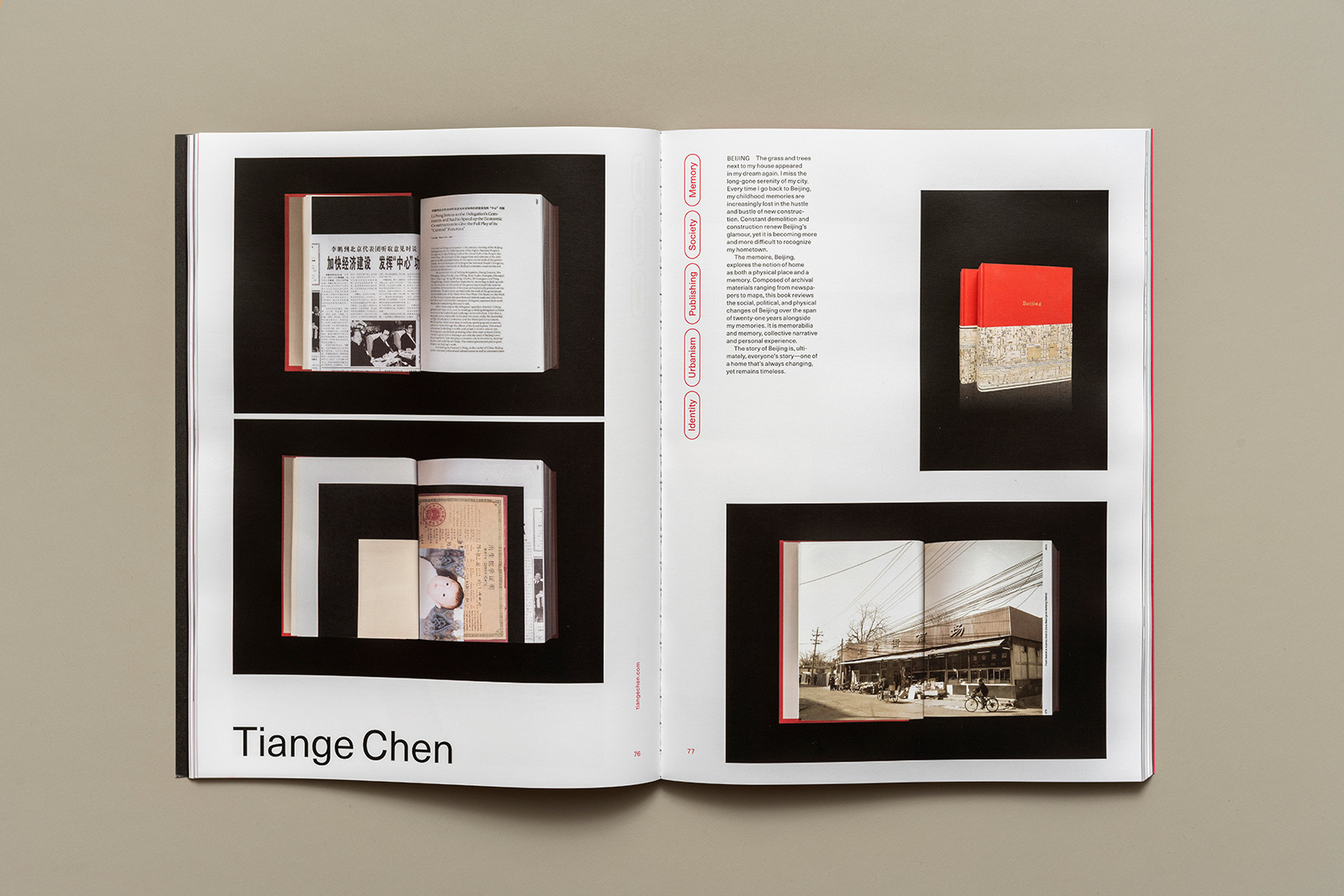
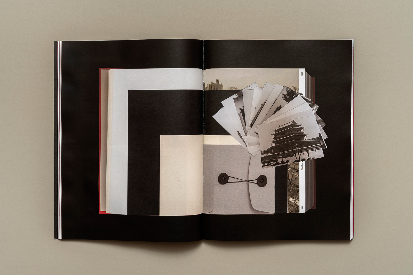
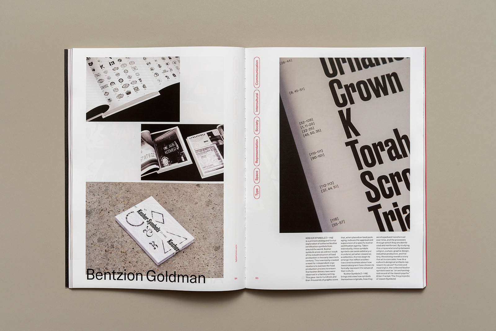
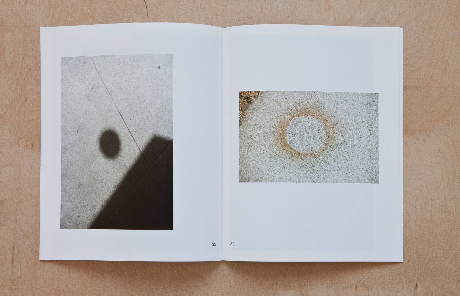
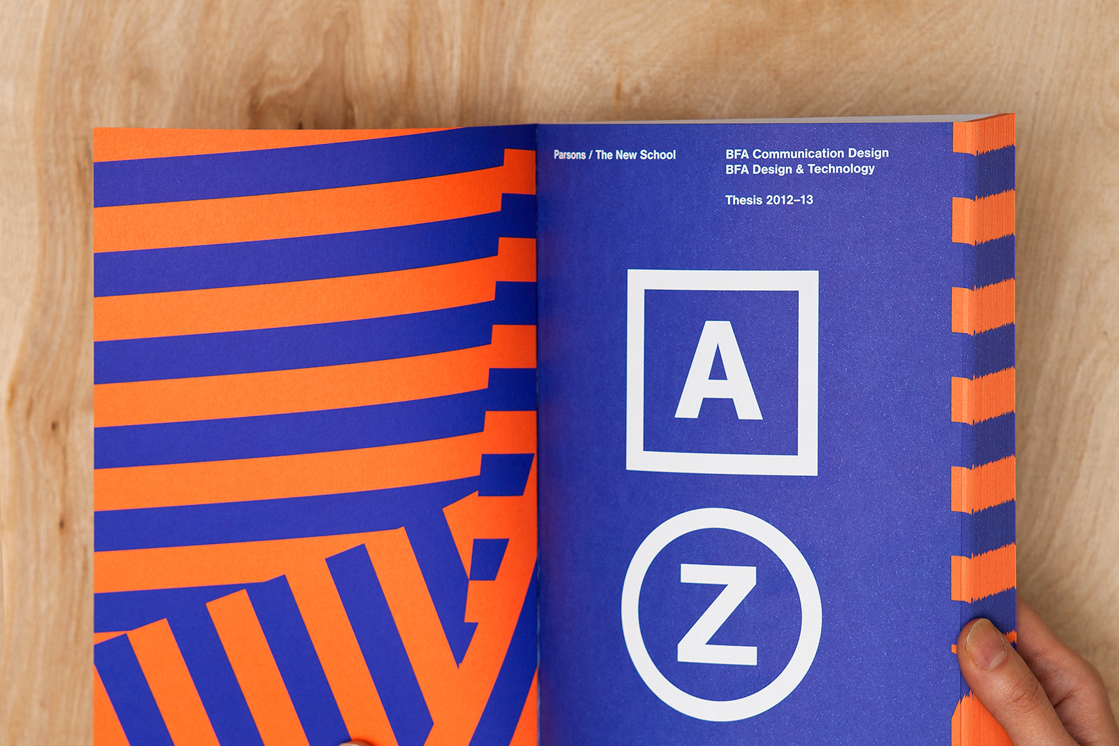
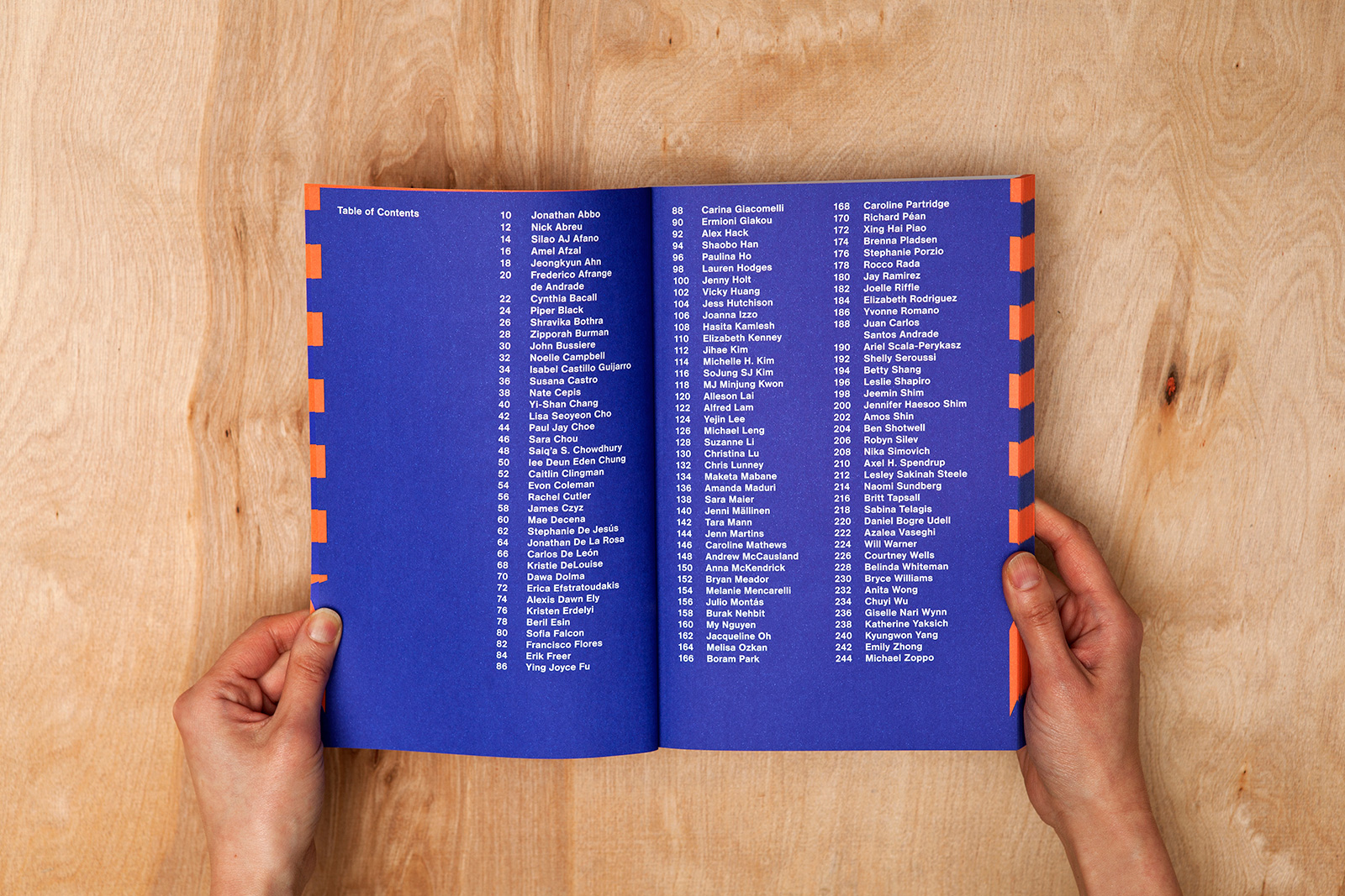
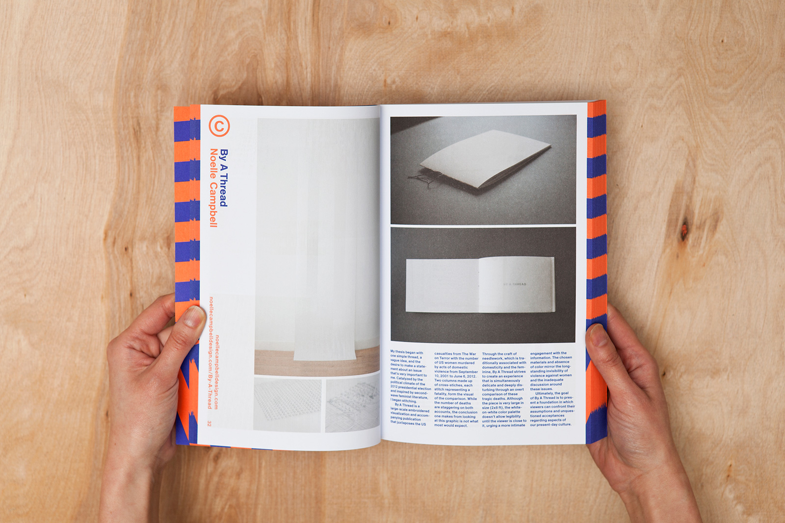
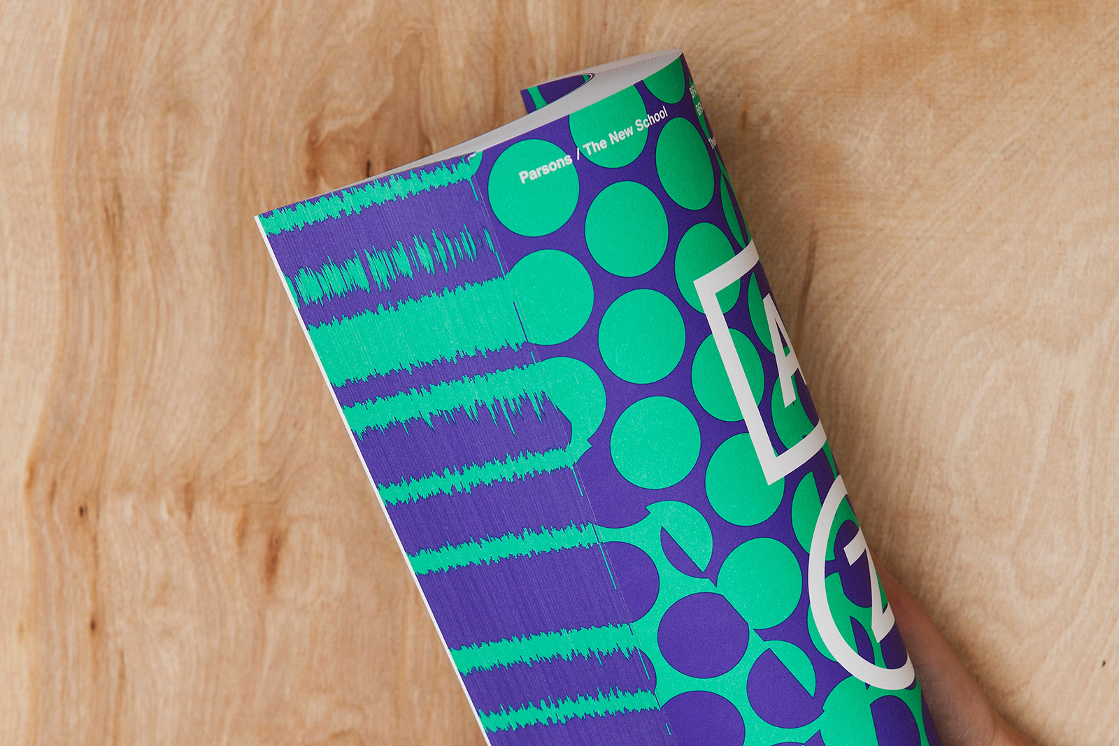
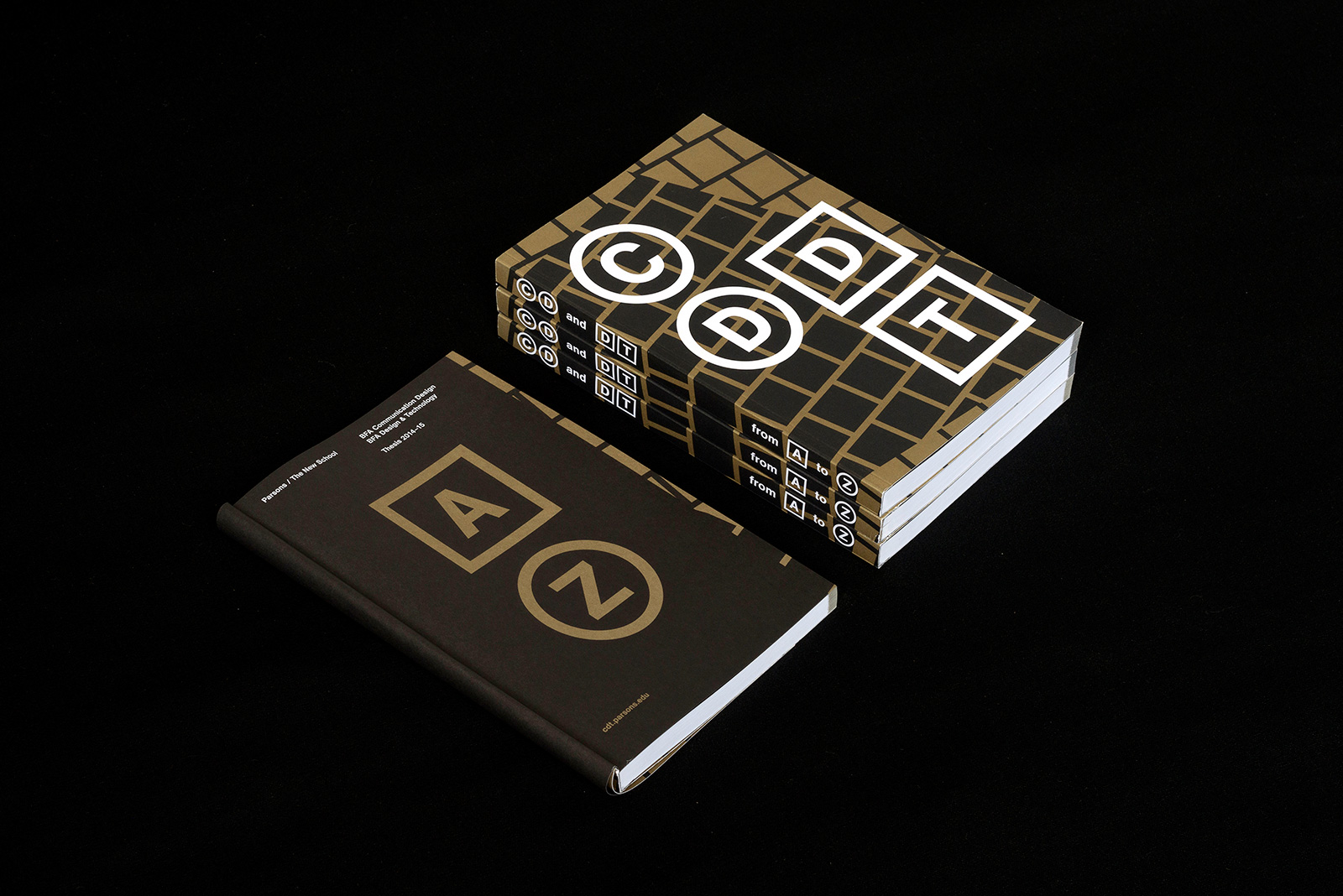
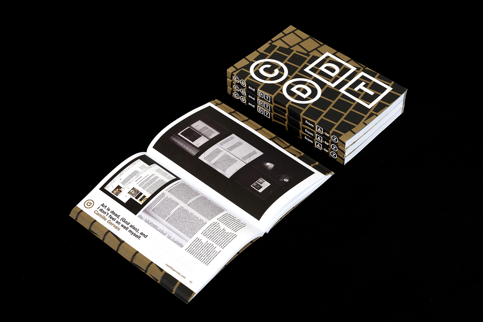
COMMUNICATION DESIGN CATALOG for PARSONS SCHOOL OF DESIGN — Parsons’ Communication Design program is one of the most internationally diverse, technologically inclined and socially minded university departments of its kind. These students are not just designers: many are also photographers, artists, illustrators, programmers, social scientists and writers, and their engagement outside of their chosen field is encouraged and visible in the work. The thesis, one year of which is compiled in this volume, begins with a question, problem or dilemma, and responds with design. Over the course of a year, students practice research, ideation, prototyping, iteration and presentation in the service of something that matters to them. A successful project does not only show a capable designer but also someone who has the curiosity to learn independently about a subject outside of design.

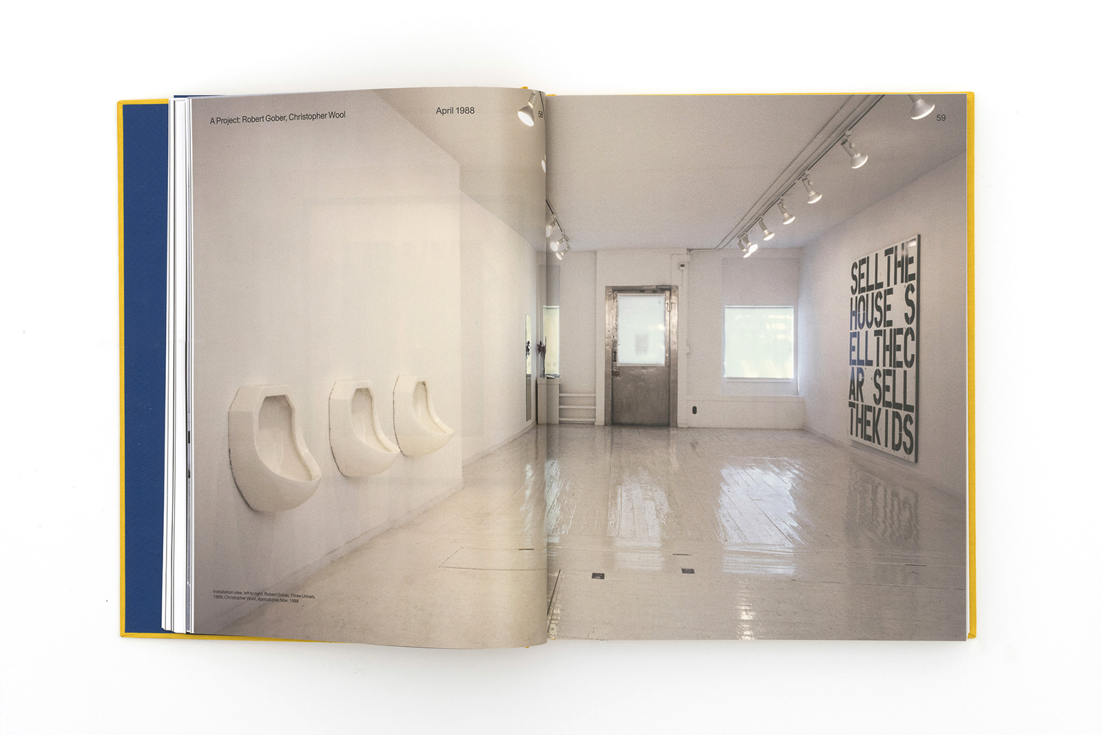
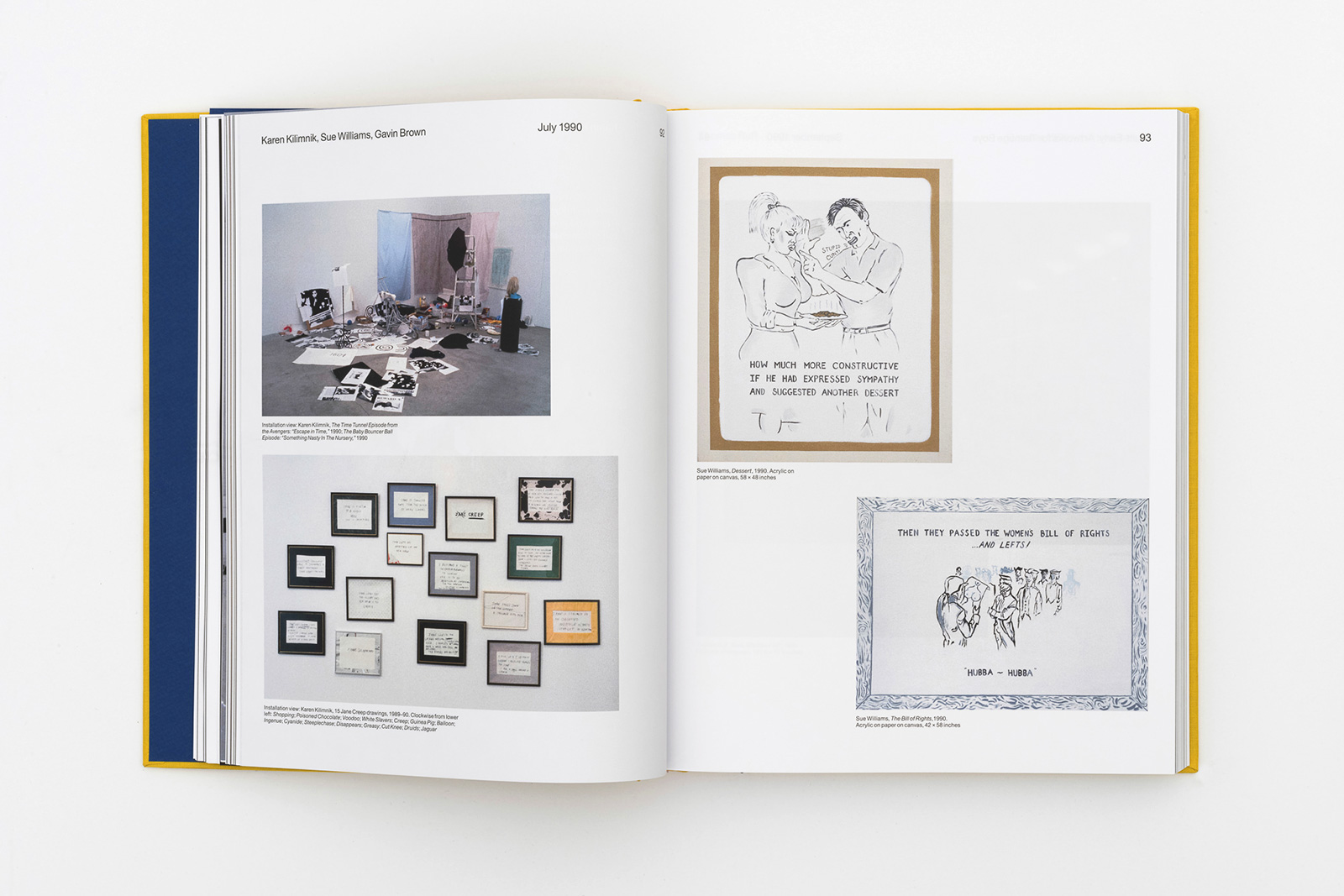
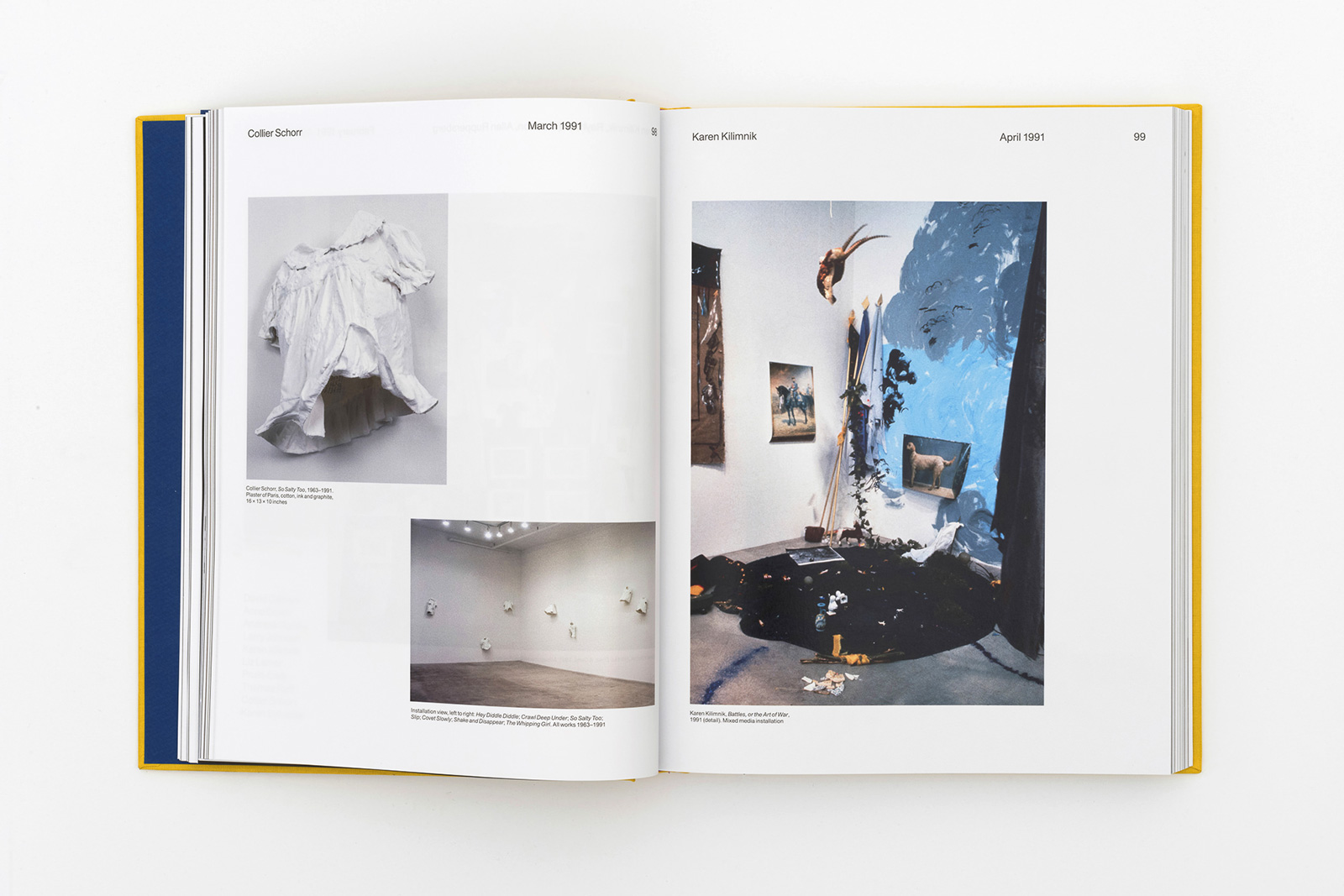
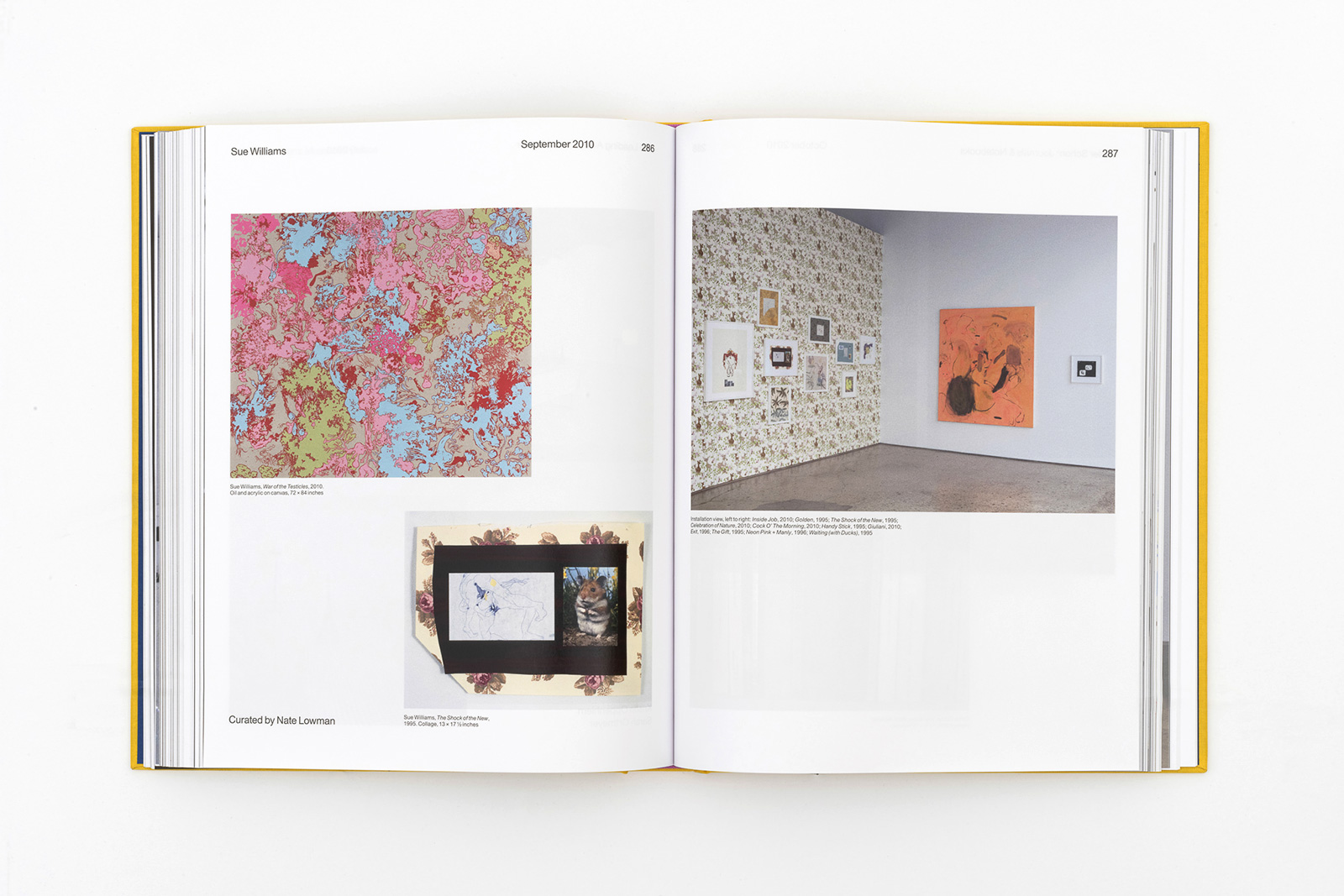
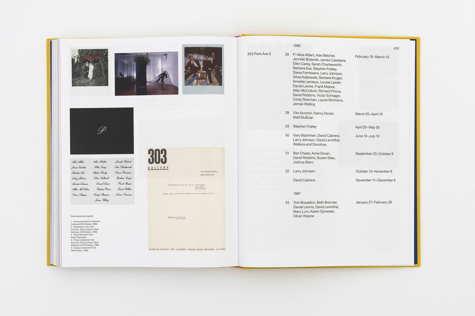
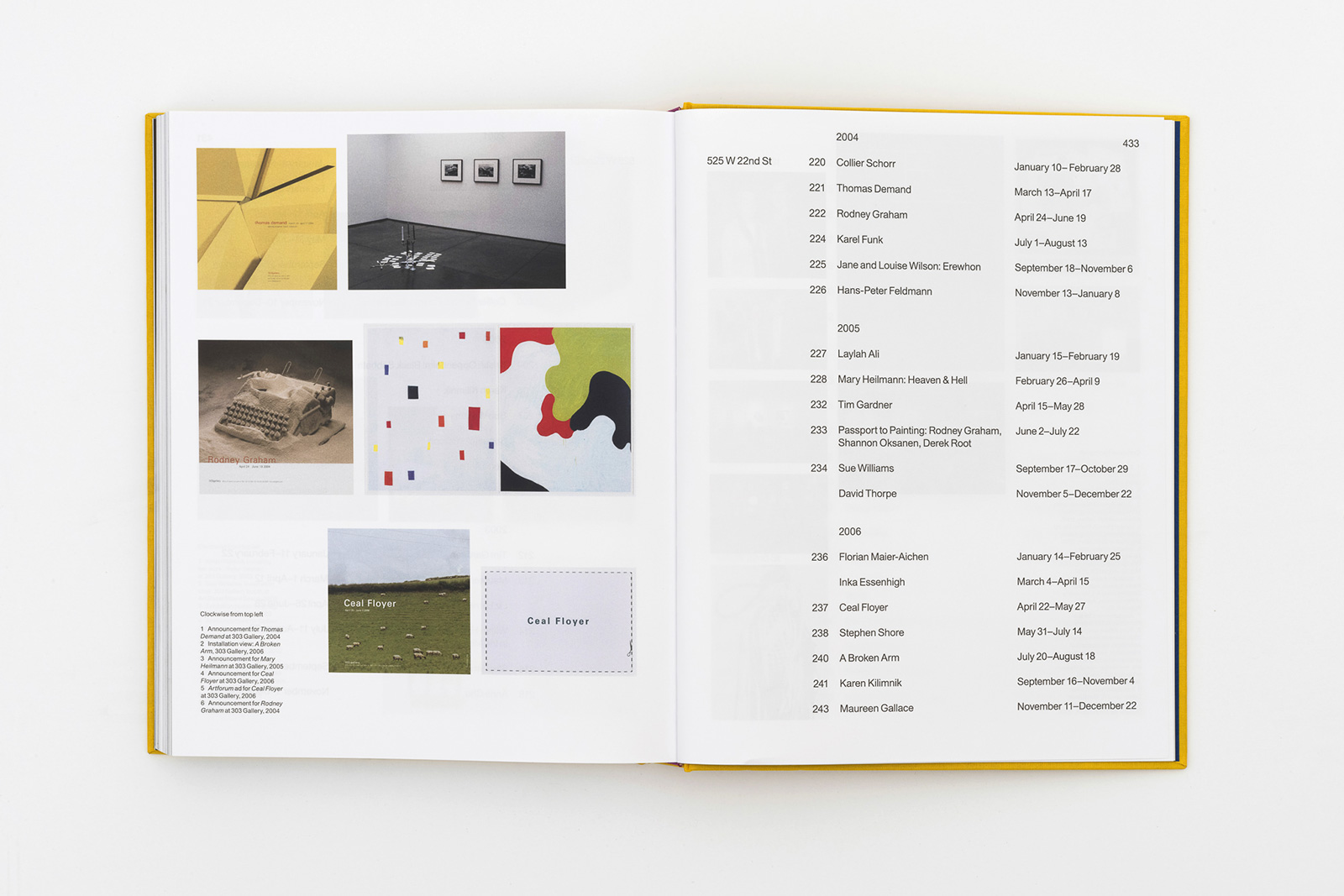
35 YEARS: 1984-2019 for 303 GALLERY — This publication chronicles the story of 303 Gallery from its founding in 1984, creating and mirroring developments in the New York and international art worlds. The culmination of years of research, collation and expansion of the gallery’s archives in an attempt to construct a complete history. Documentation of early group shows, guest curatorial projects and provocations illustrate the collaborative nature of the program, where now-seminal artists, curators, gallerists and writers exchanged ideas and roles in New York City’s fertile 1980s heyday.

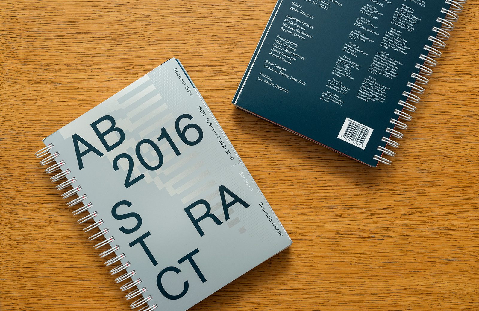
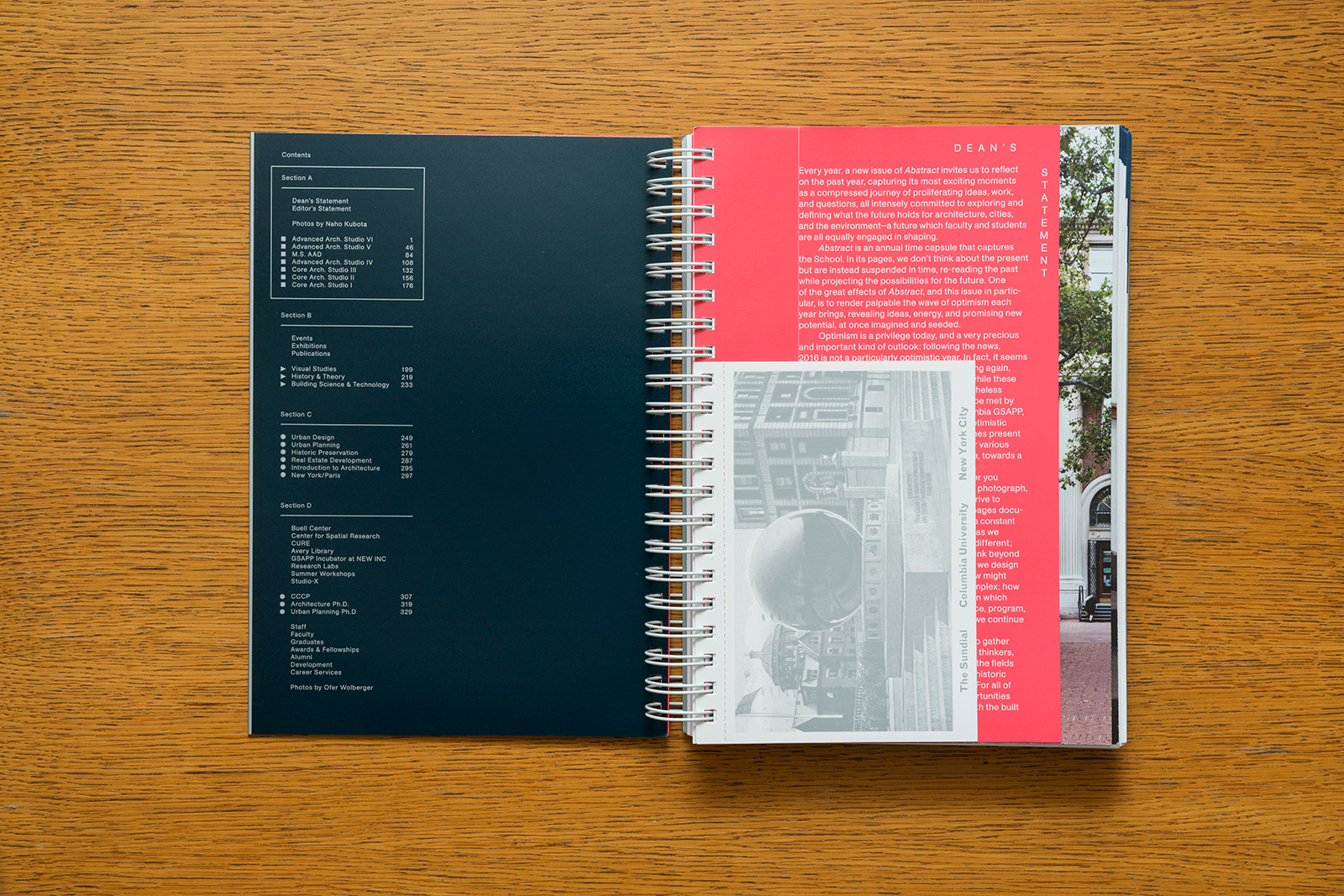
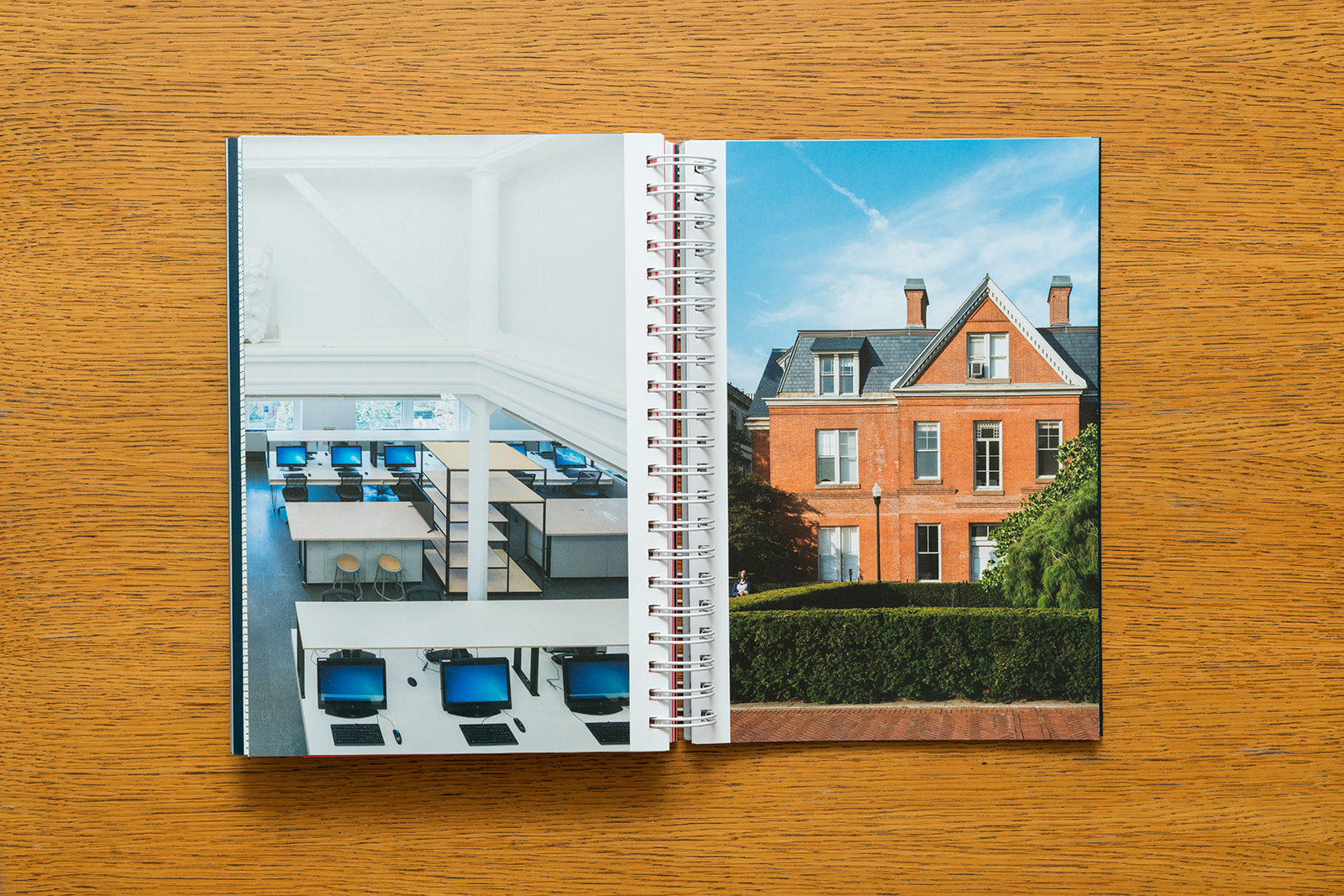
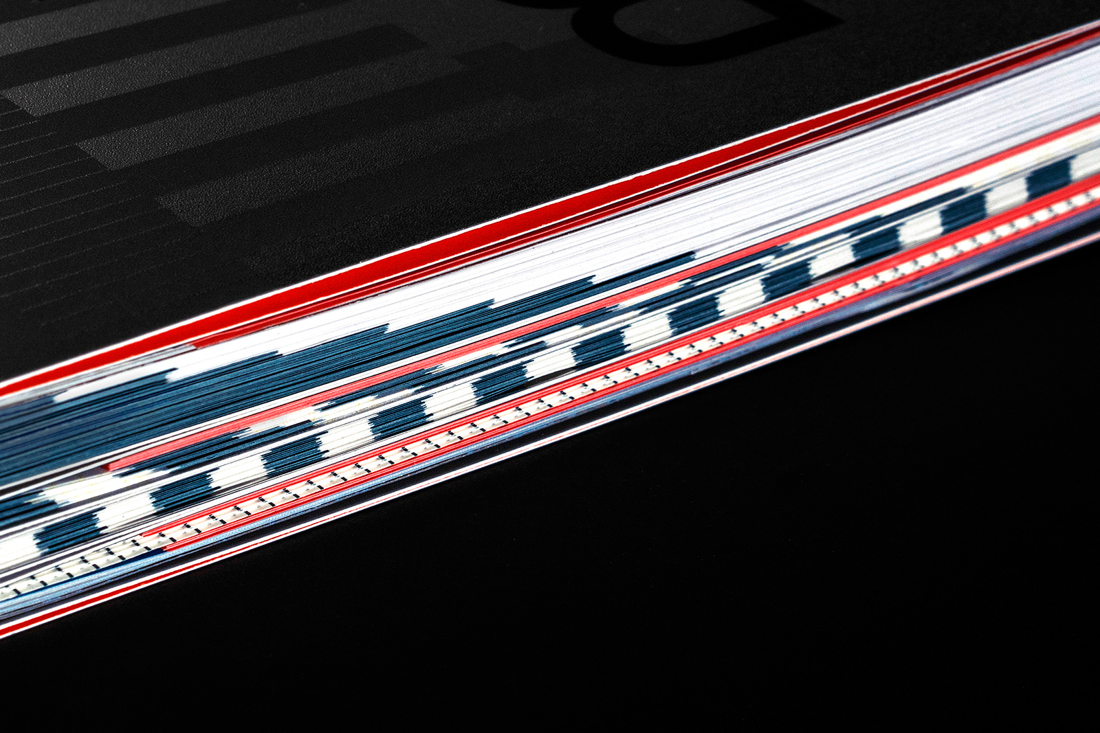
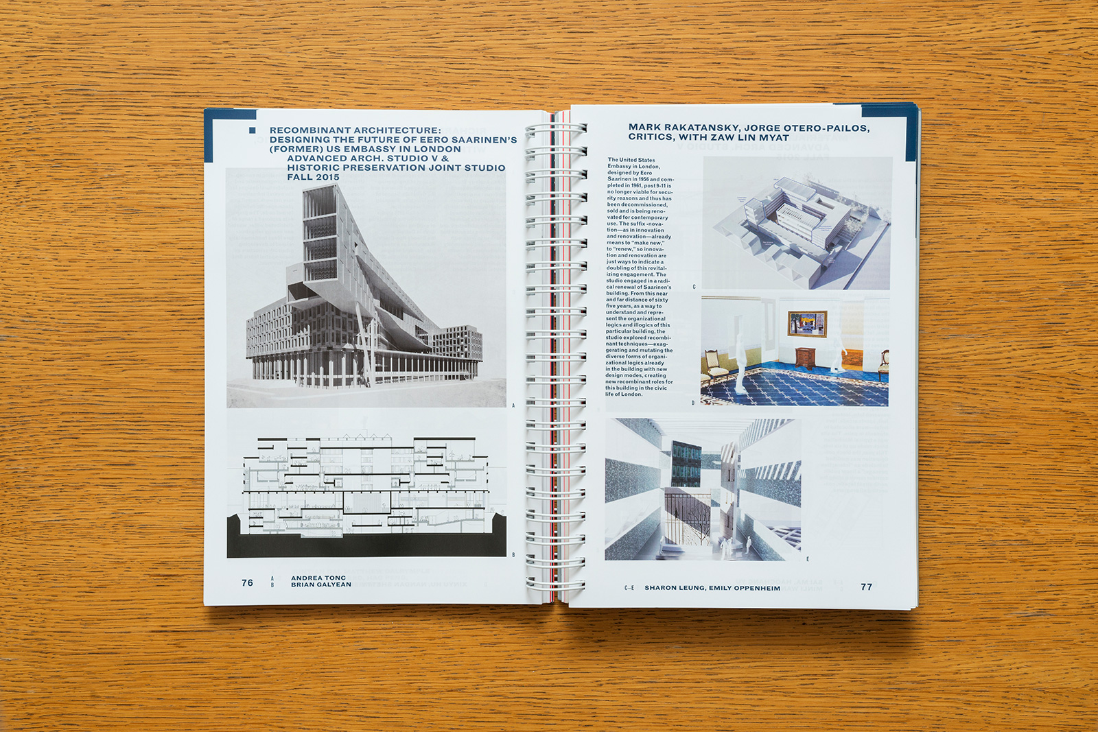
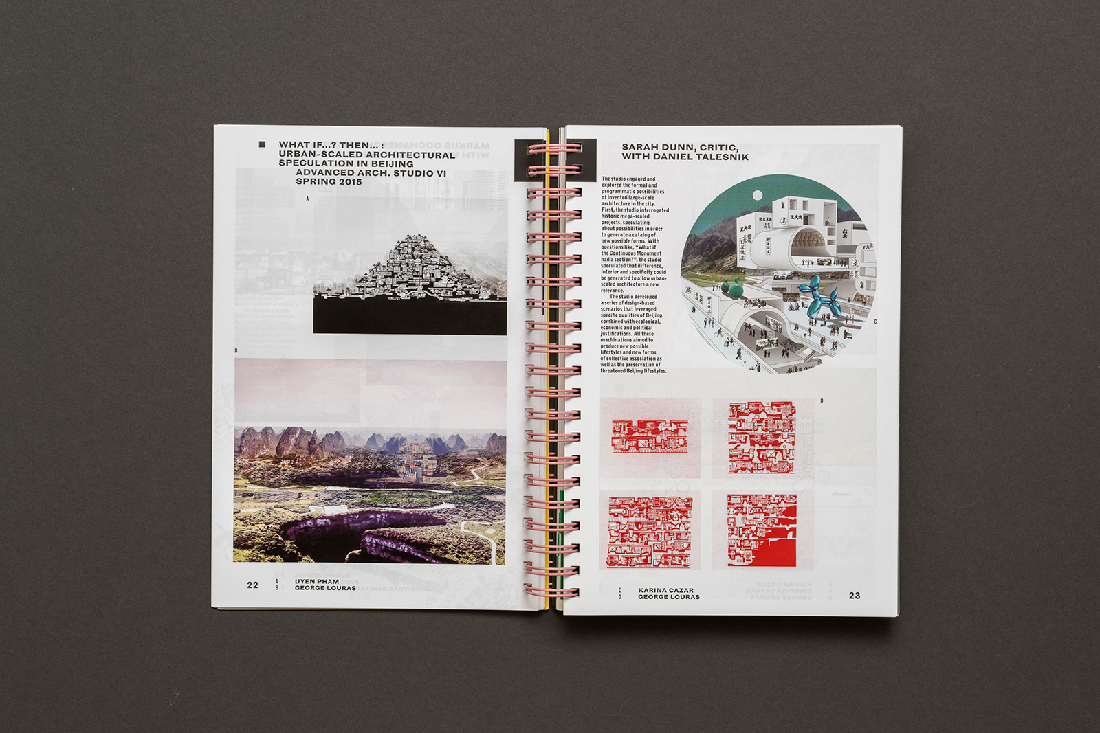
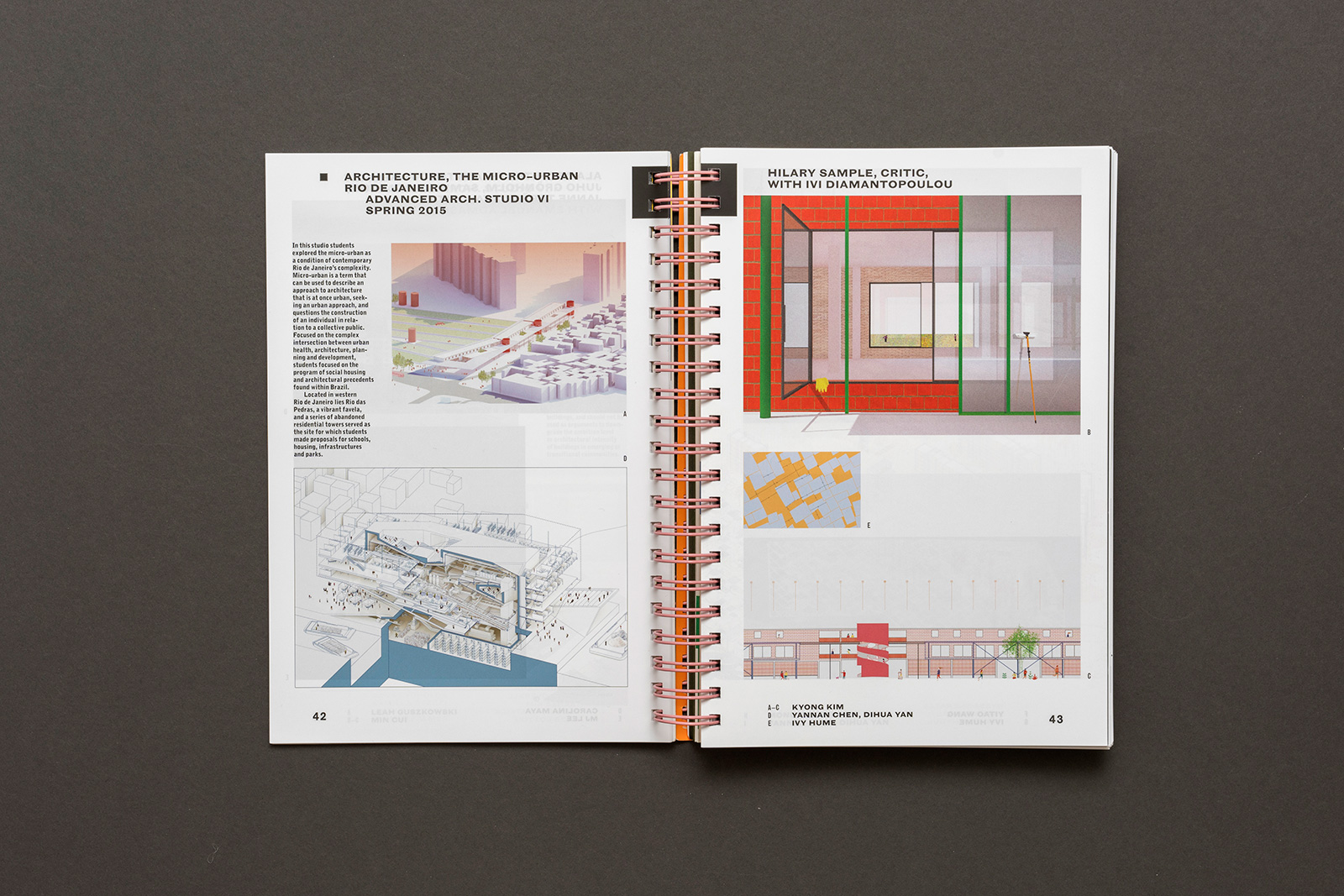
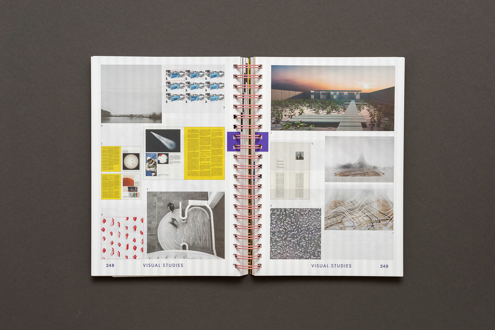
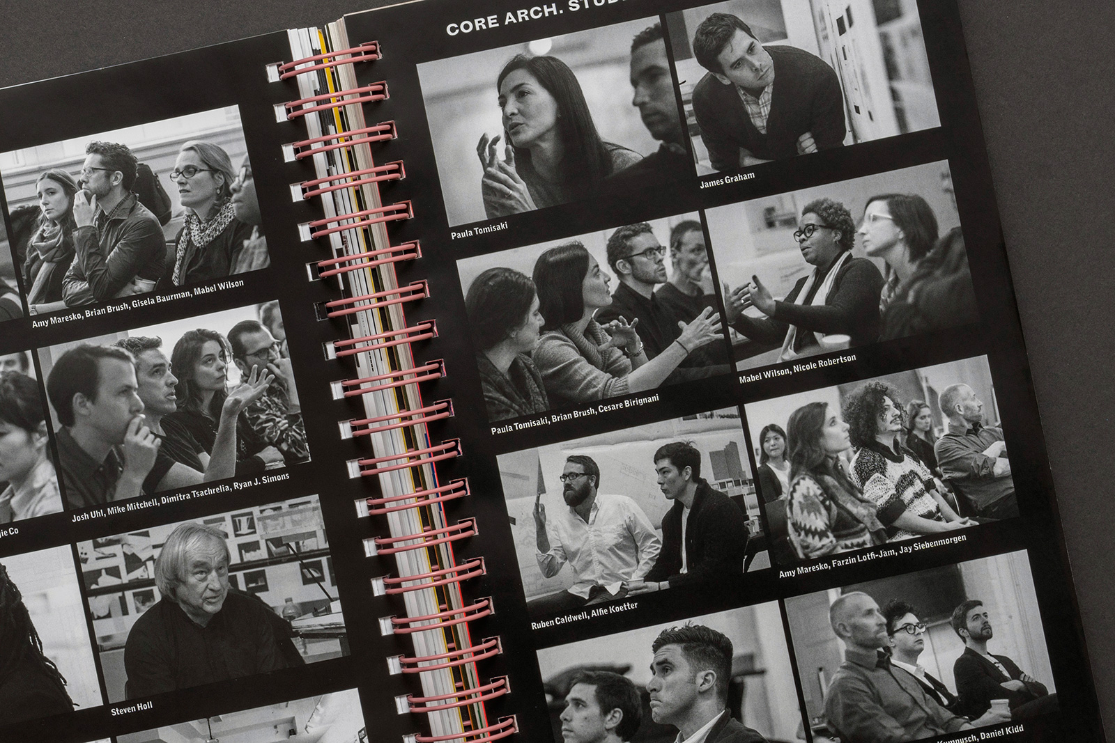
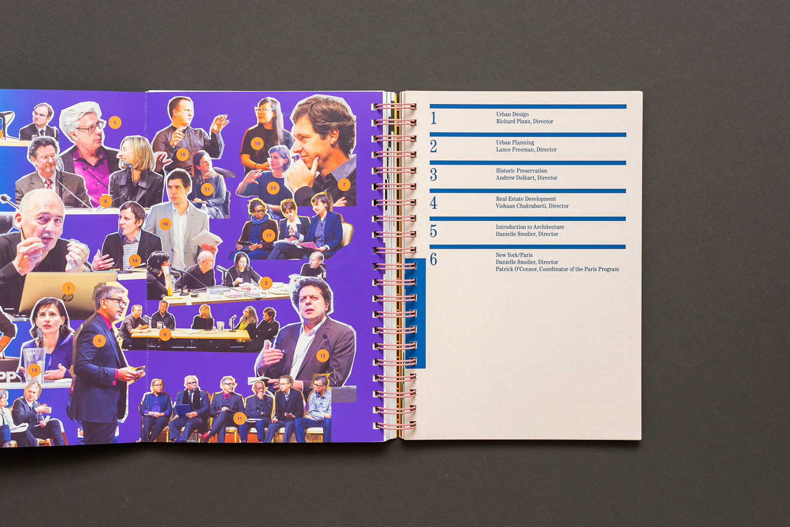
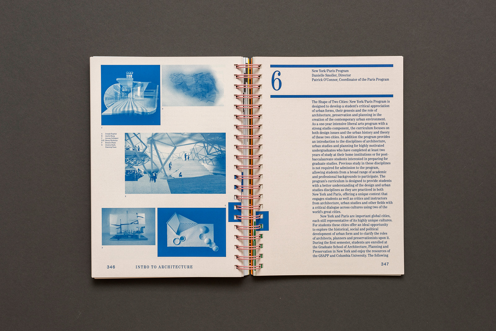
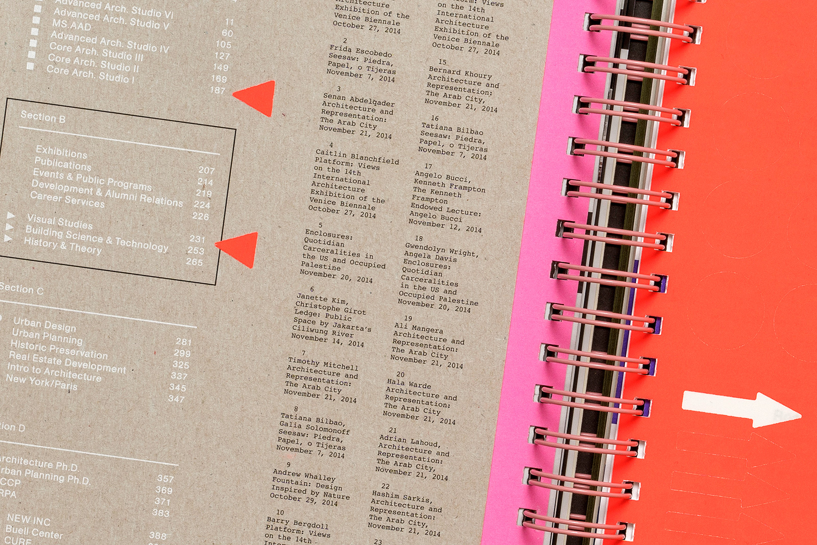
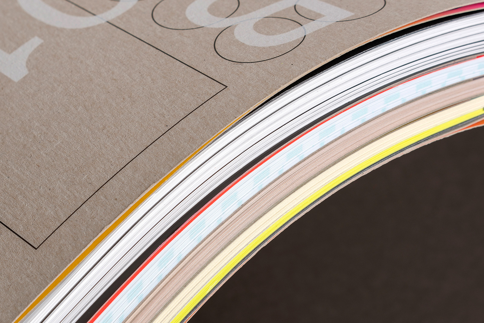
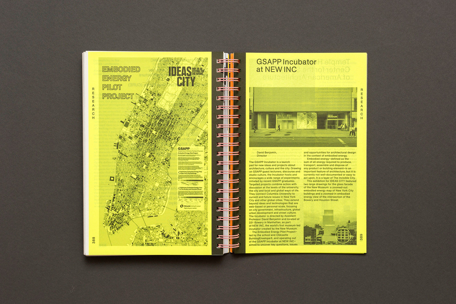
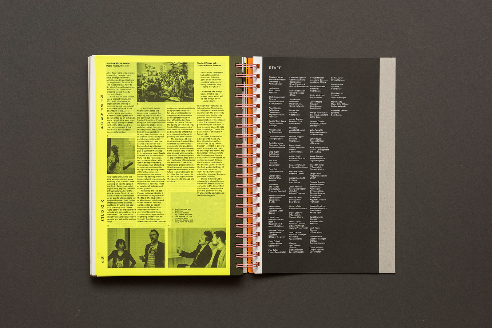
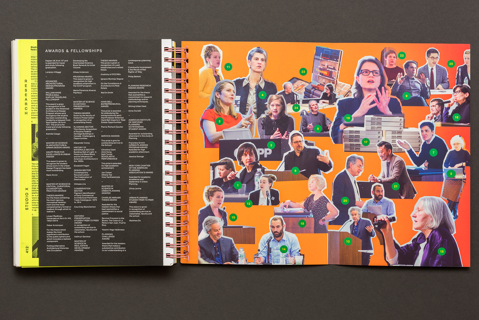
ABSTRACT 2016 for COLUMBIA GSAPP — Abstract is the long-running, annual compendium of student projects, applied research, events, and exhibitions from Columbia University’s Graduate School of Architecture, Planning, and Preservation (GSAPP). Overseen by the Office of the Dean, and edited in part by a growing list of notable faculty, Abstract showcases studios, electives, and departments from all across the school. Conceived of as a reflection of GSAPP’s unique organizational model, the book’s binding allows for multiple covers, multiple materials (and interruptions), and multiple points of entry.

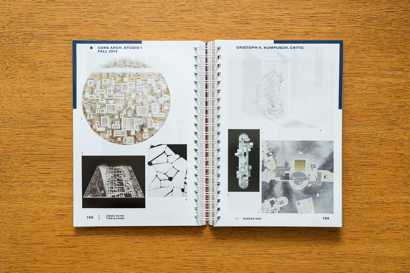
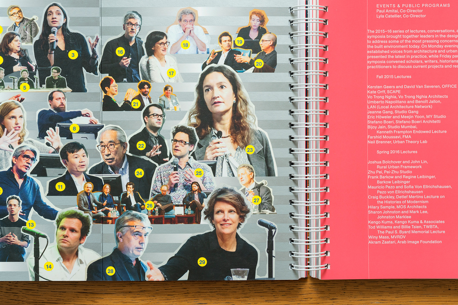
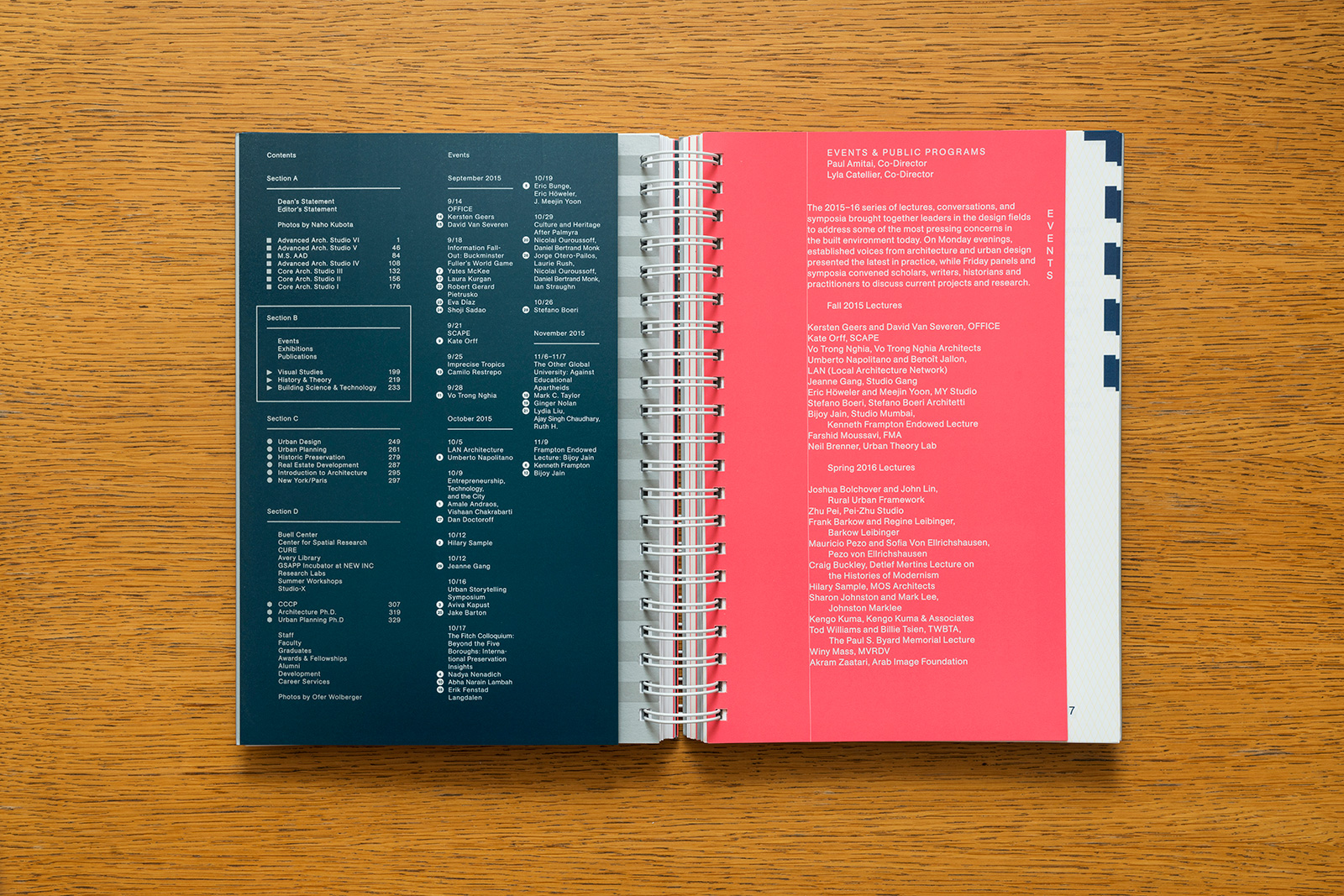
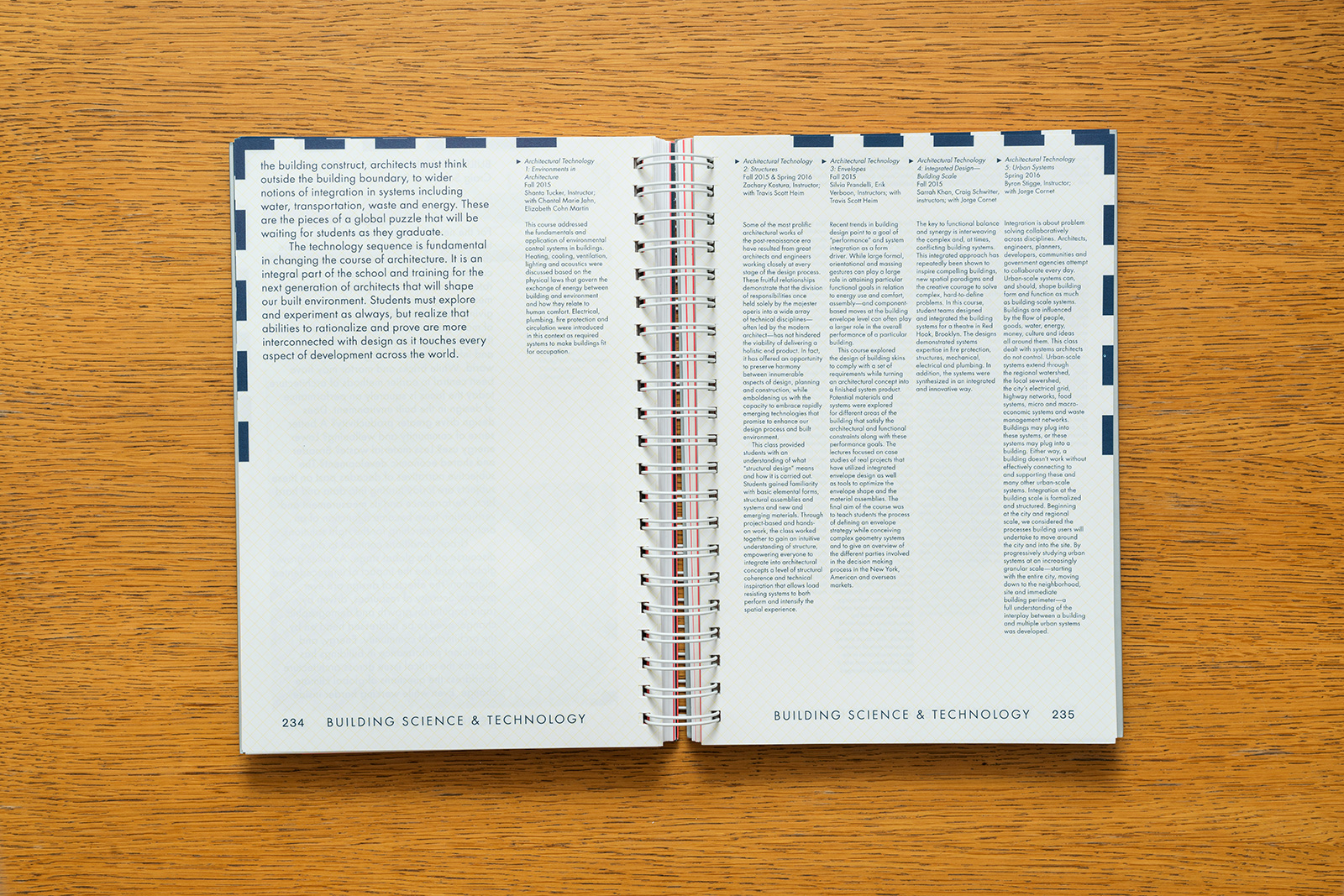
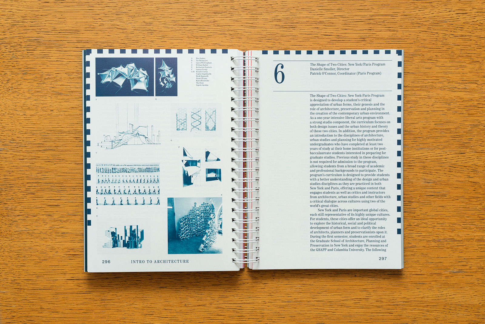
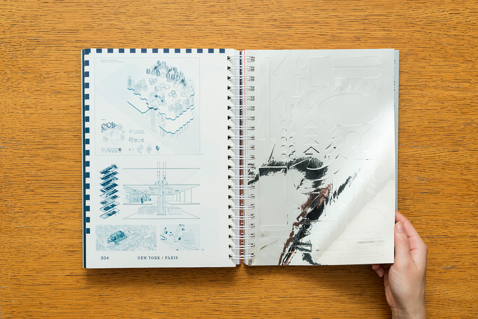
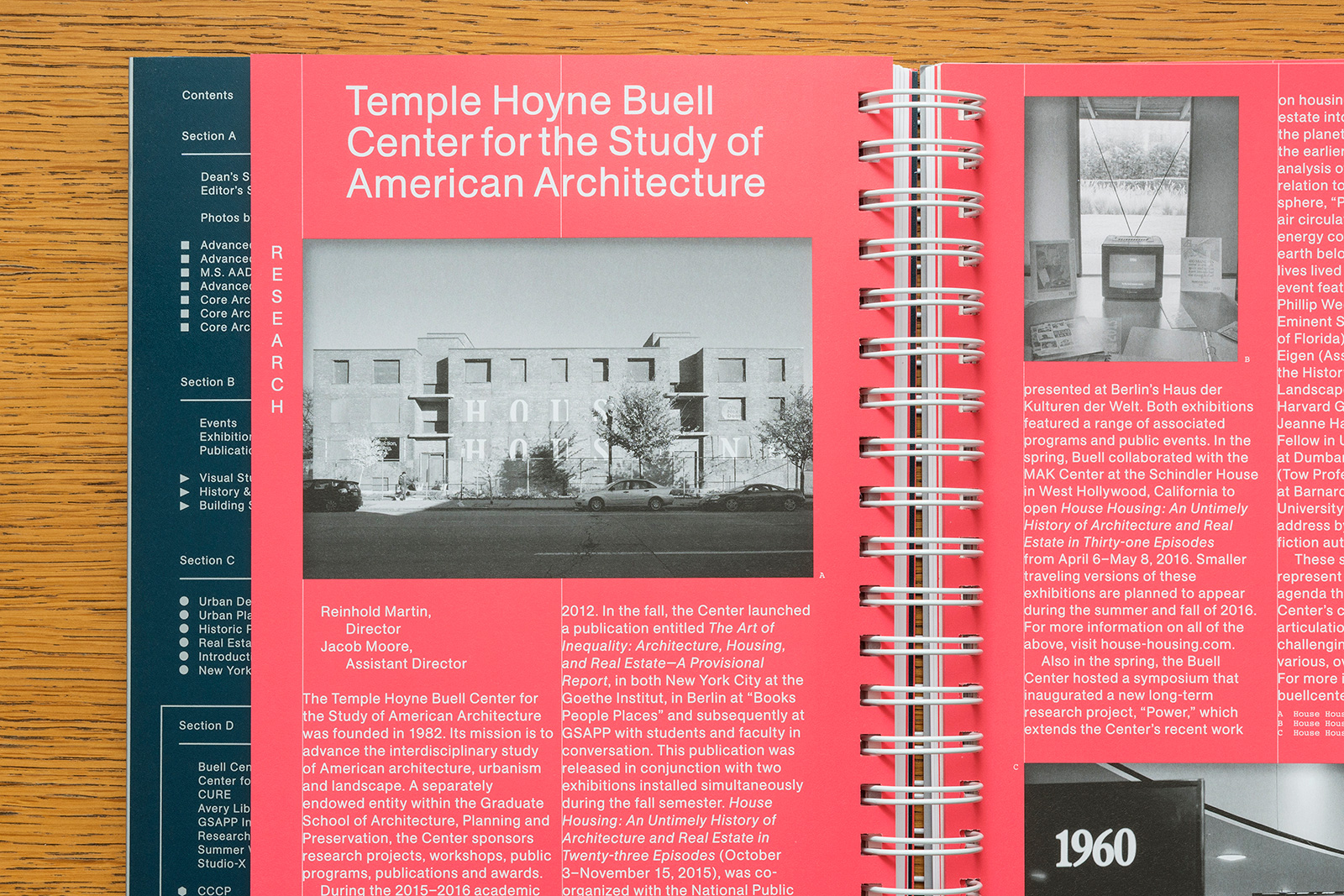
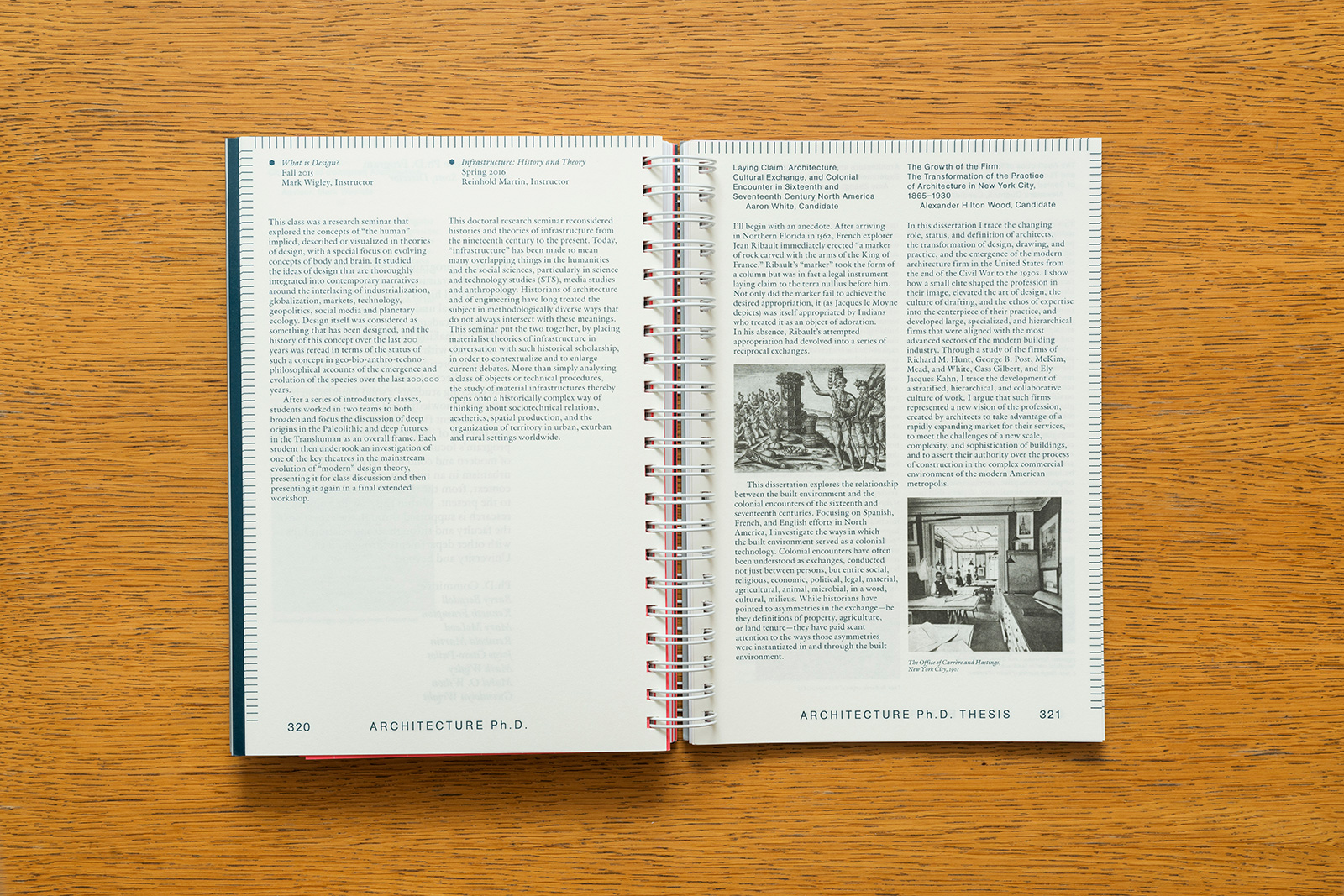
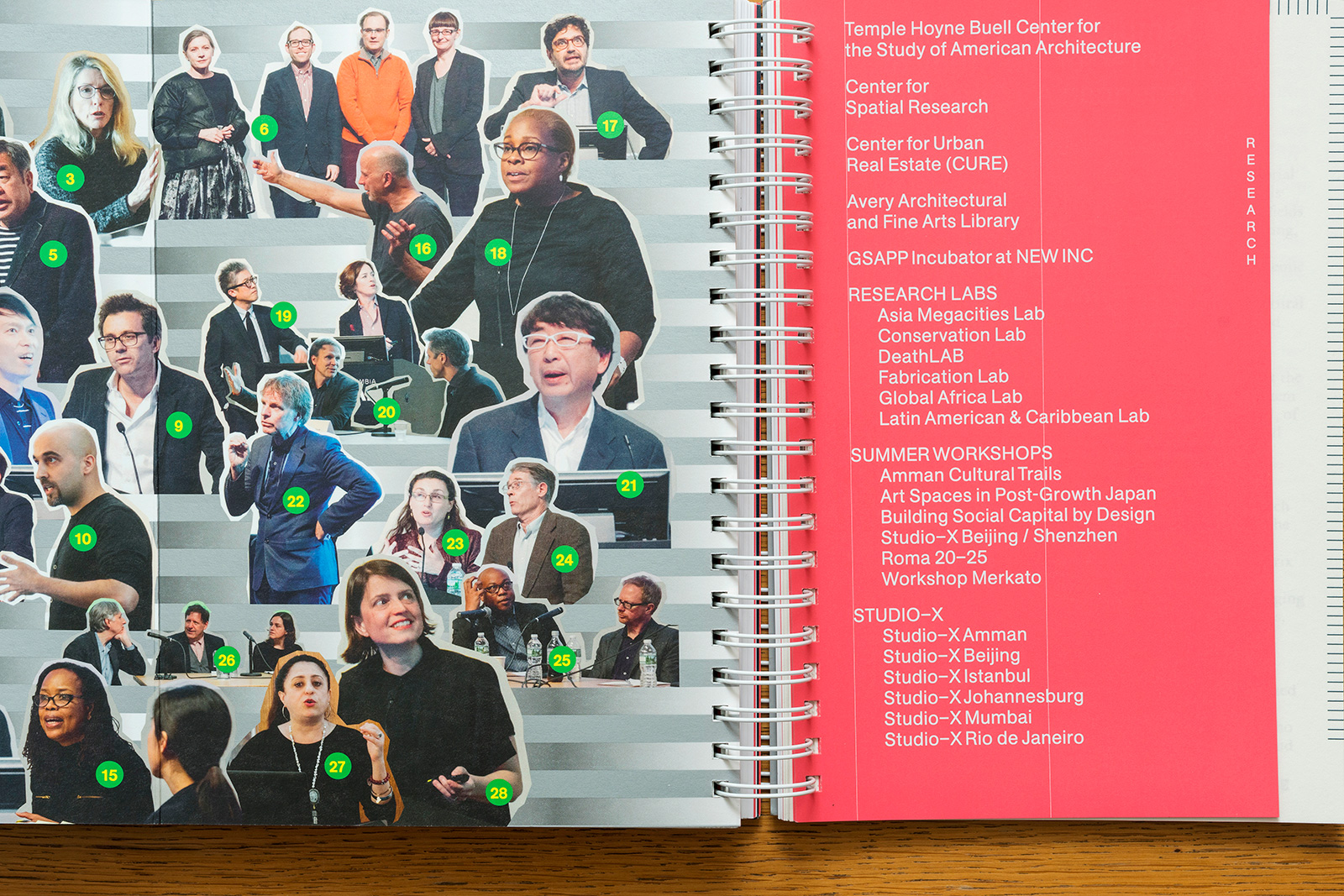
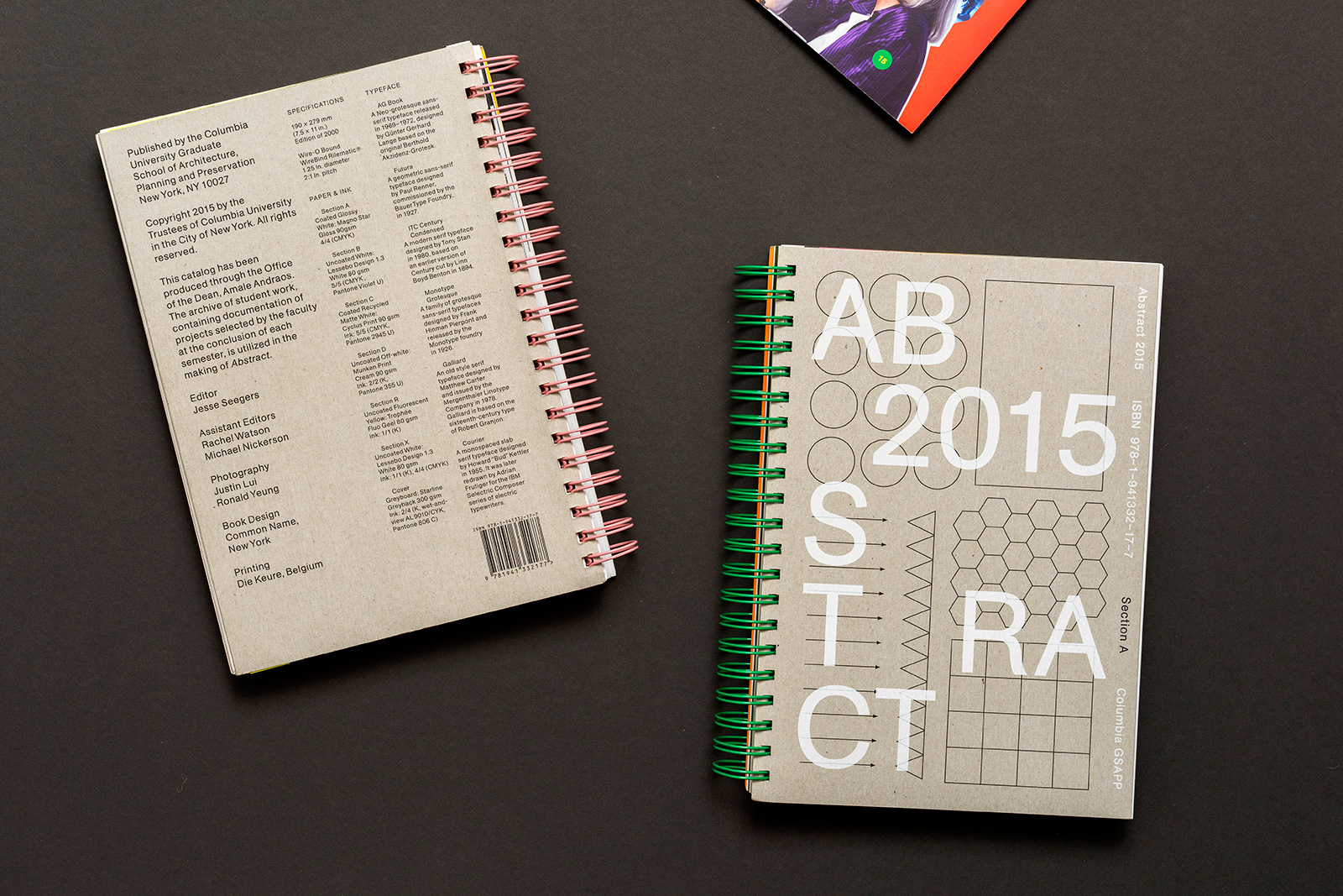
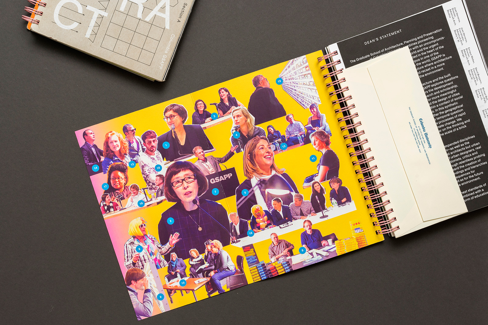
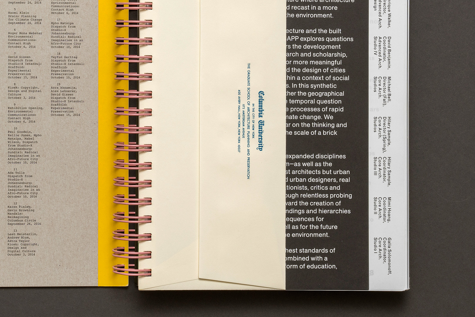
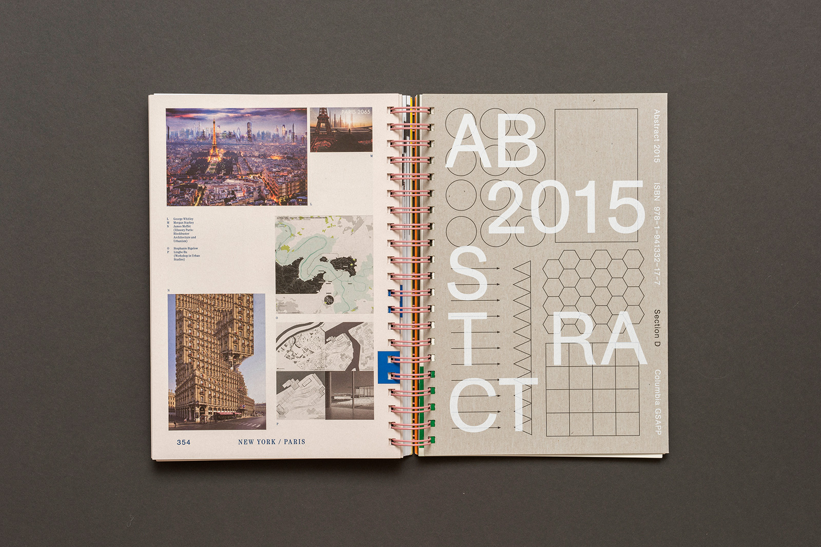
ABSTRACT 2015 for COLUMBIA GSAPP — Abstract is the long-running, annual compendium of student projects, applied research, events, and exhibitions from Columbia University’s Graduate School of Architecture, Planning, and Preservation (GSAPP). Overseen by the Office of the Dean, and edited in part by a growing list of notable faculty, Abstract showcases studios, electives, and departments from all across the school. Conceived of as a reflection of GSAPP’s unique organizational model, the book’s binding allows for multiple covers, multiple materials (and interruptions), and multiple points of entry.
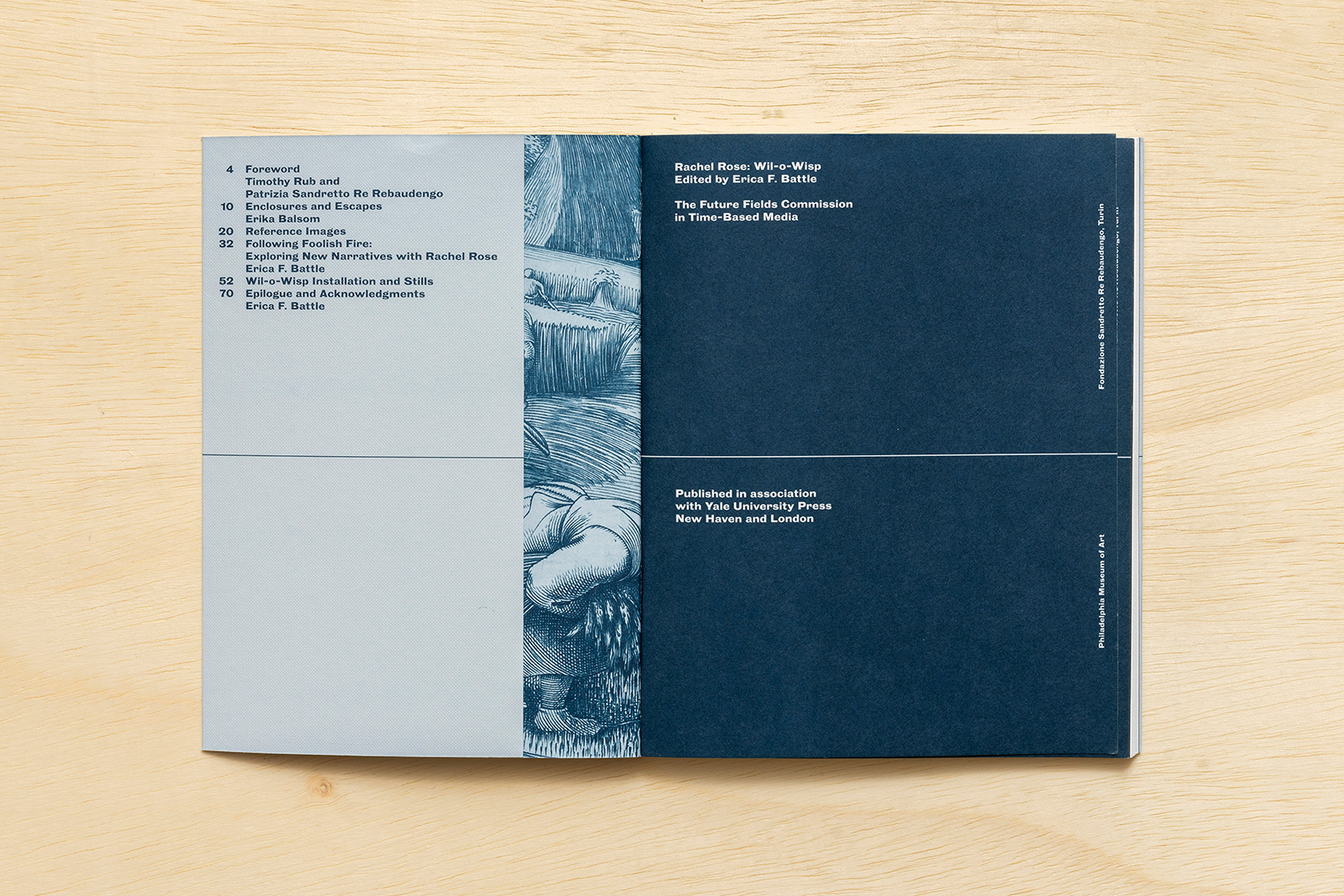
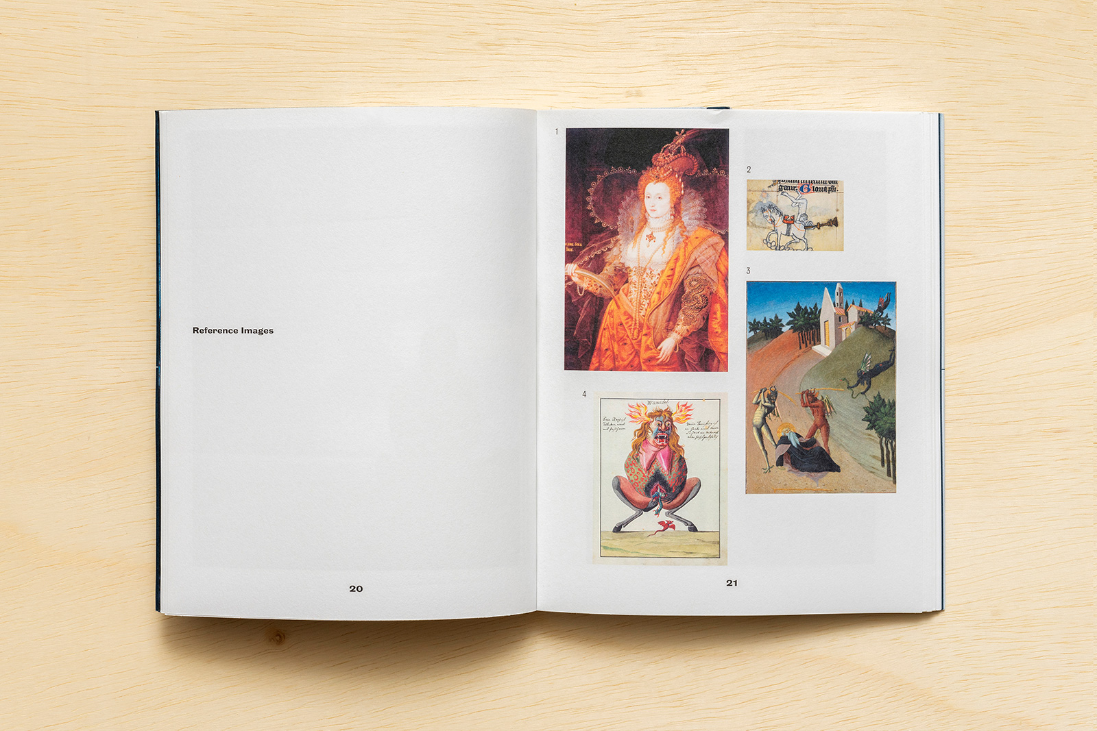
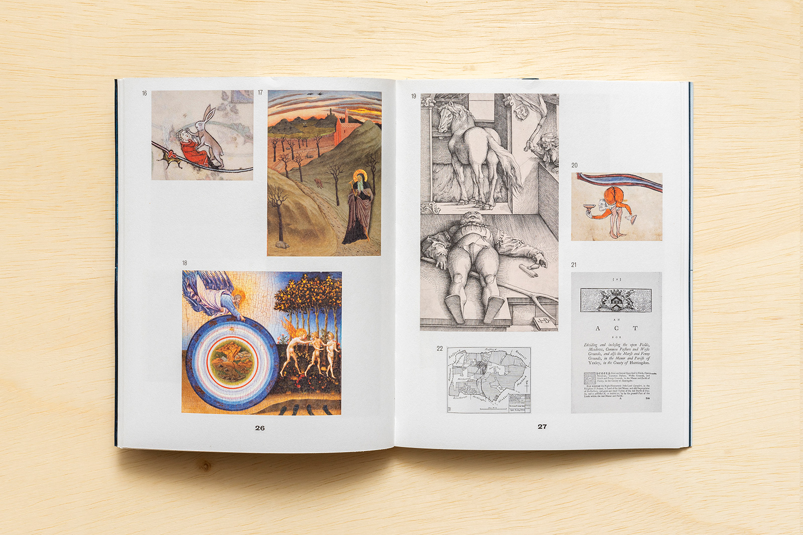
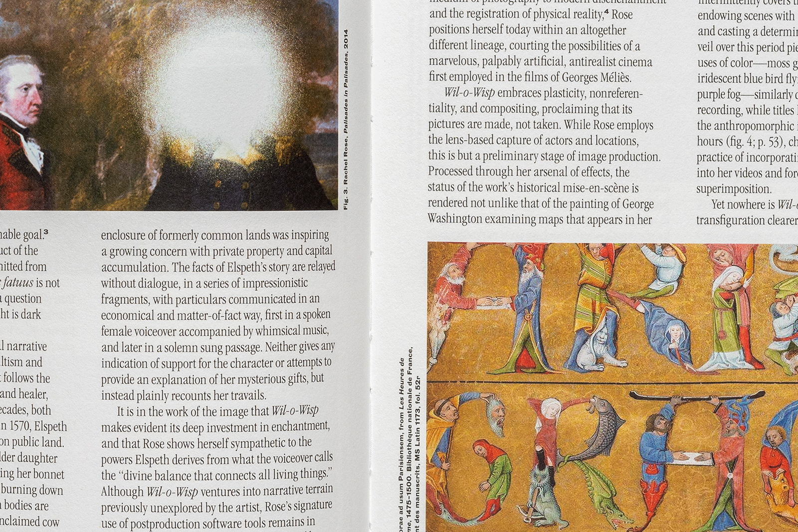
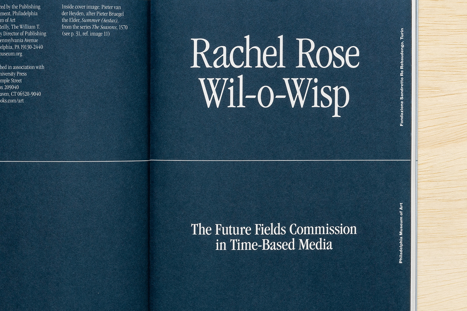
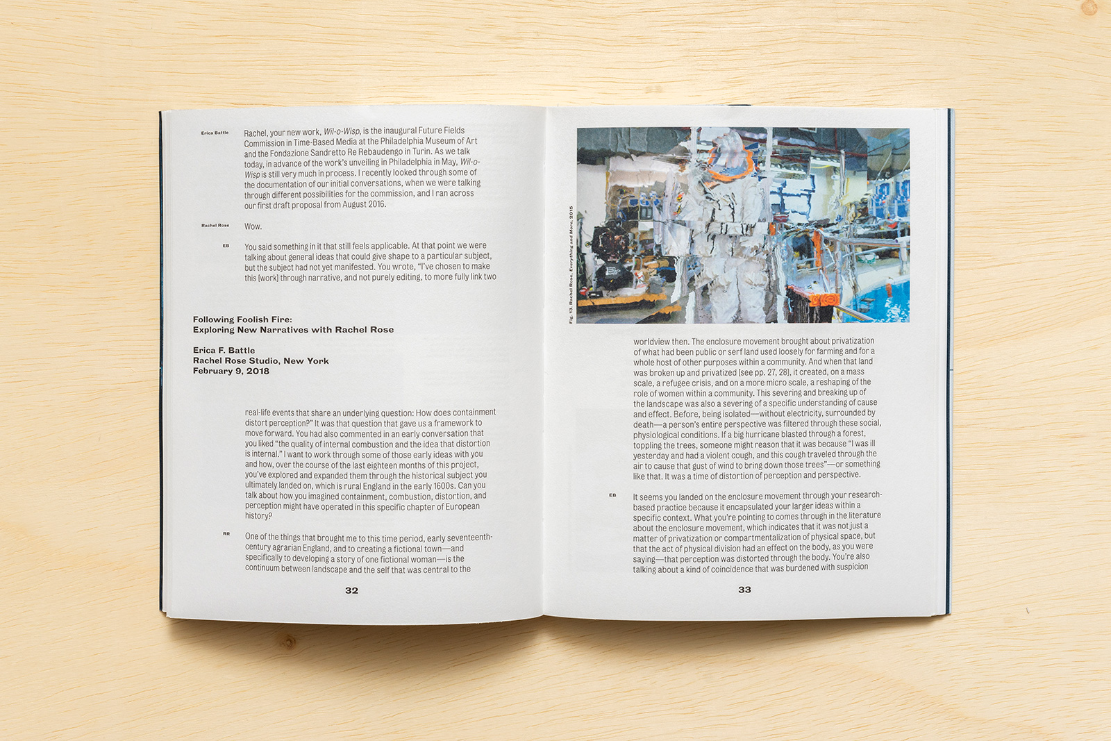
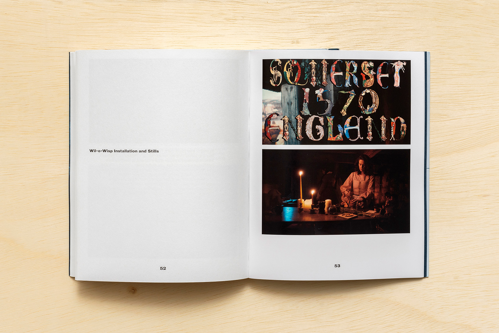
RACHEL ROSE: WIL-O-WISP for PHILADELPHIA MUSEUM OF ART — Rachel Rose creates video installations that explore our image-saturated culture and histories of the past. In the commissioned video and accompanying book, the first Future Fields commission at the Philadelphia Museum of Art, Rose trains her lens on a tumultuous moment in history: England in the late 1500s. Wil-o-Wisp explores how the practice of magic and coincidence influence the fate of a woman named Elspeth Blake. Rose frames her story against the backdrop of England’s Enclosure Movement, which privatized communal land and spurred violent upheavals in agrarian life. Rose models the chapters of Elspeth’s life after accounts of healers persecuted for their practices, which were considered deviant and threatening within increasingly regulated society. The work questions how our perceptions of the world, and of others, can so radically change within the fluctuating norms of society and the seismic shifts of history.

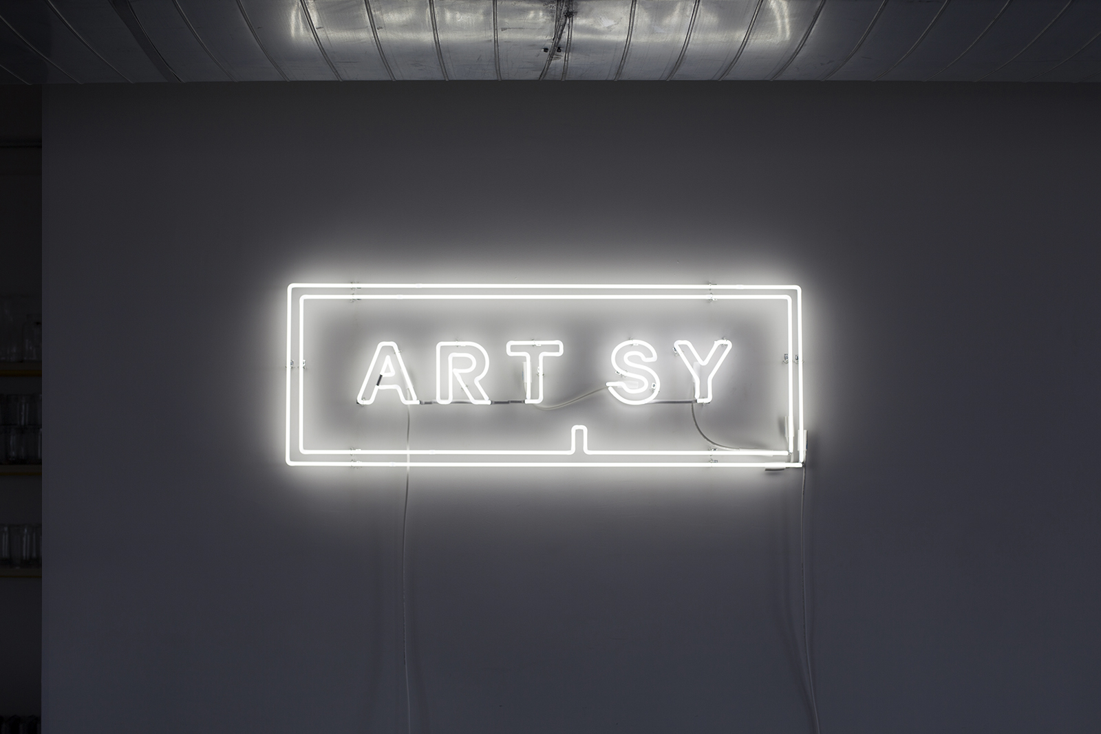
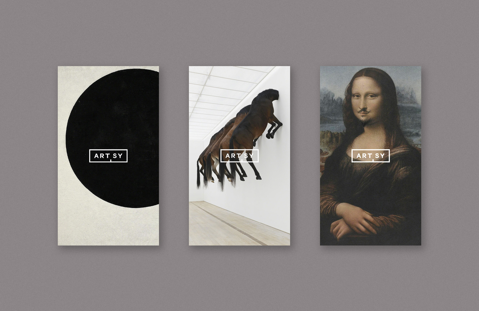
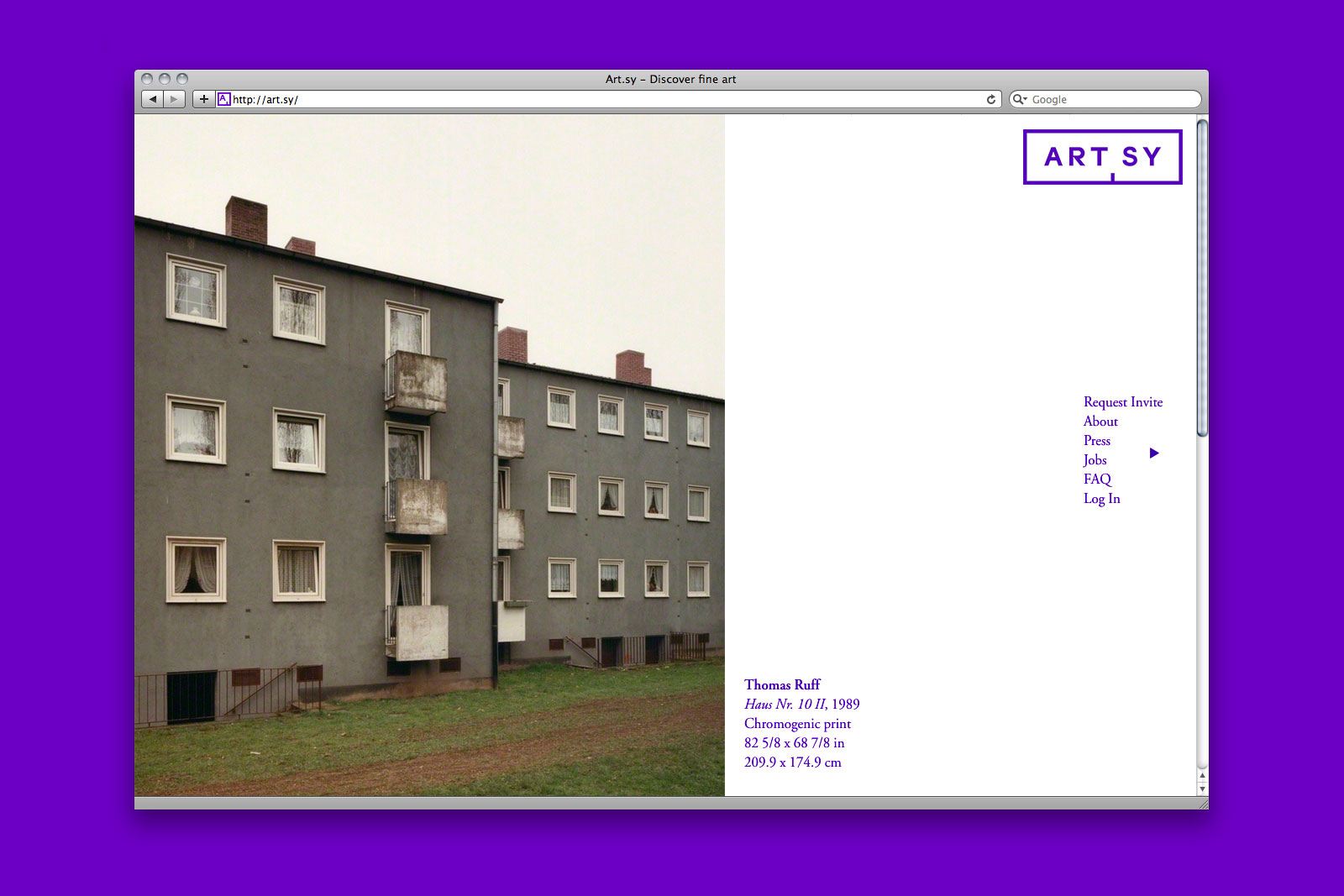
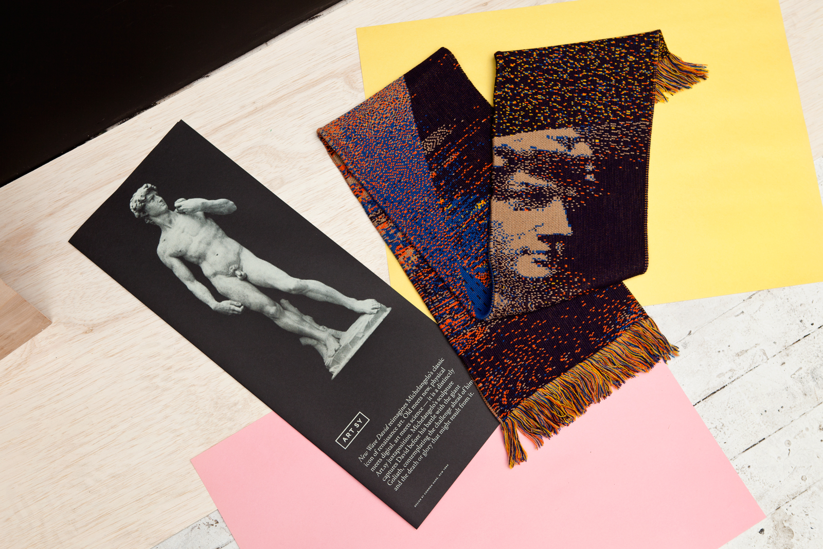
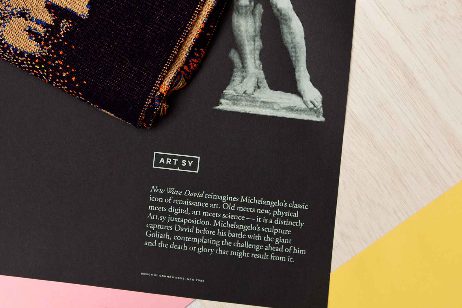
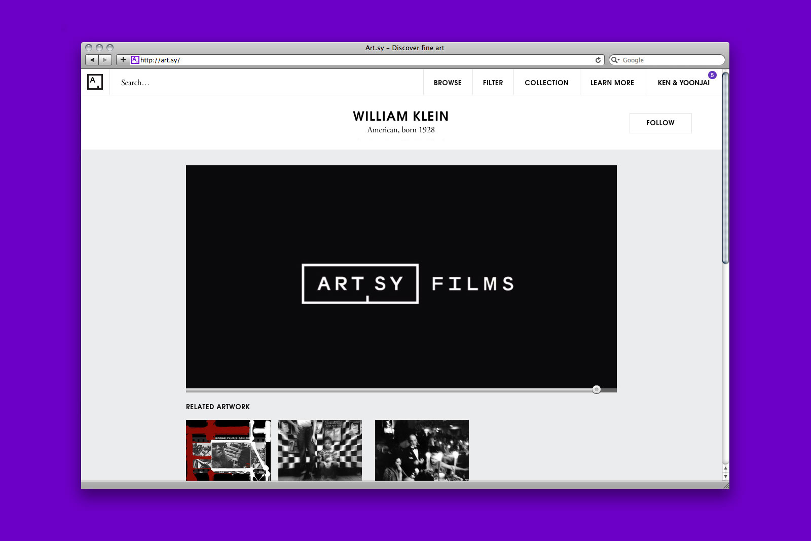
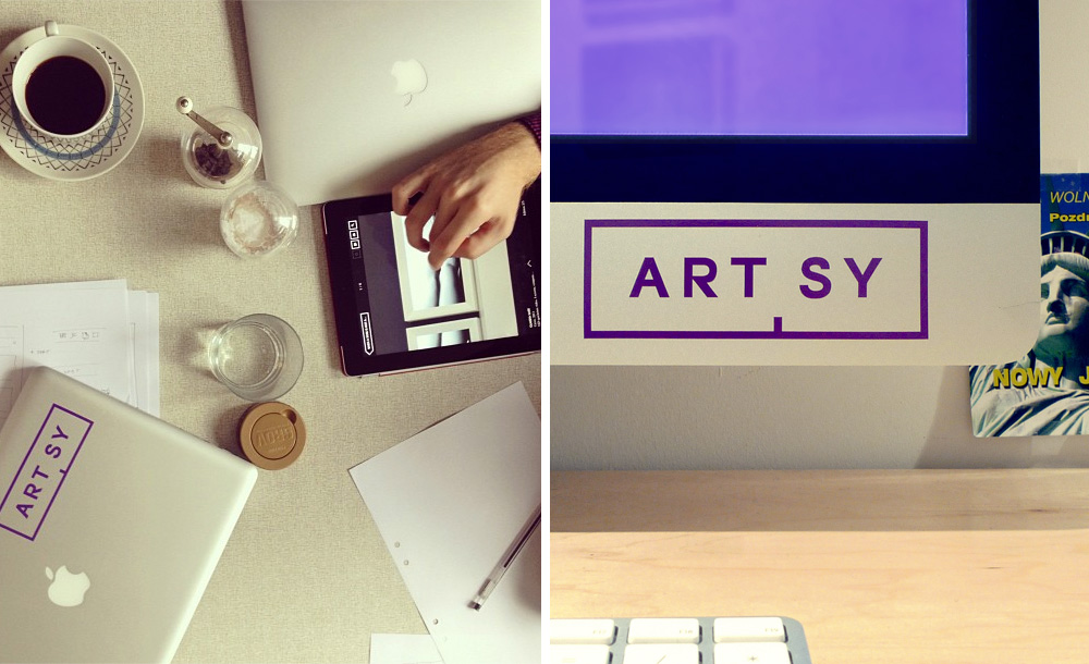
IDENTITY SYSTEM and APPLICATIONS for ARTSY —— Artsy is an ambitious new art discovery tool, connecting users with an expansive database of works, spanning movements, styles, and time periods. Through partnerships with galleries and museums around the world, Artsy collects and organizes art using its proprietary Art Genome, a broad, ever-growing semantic database. Interested parties can also choose to buy work directly through the site. We were asked to help develop the brand identity and related applications in collaboration with Artsy’s in-house design team. The resulting system has been implemented across print, digital, and environmental media.
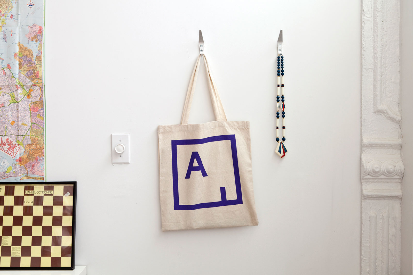
Tote bag
Holding page featuring full logo
Designed by Artsy
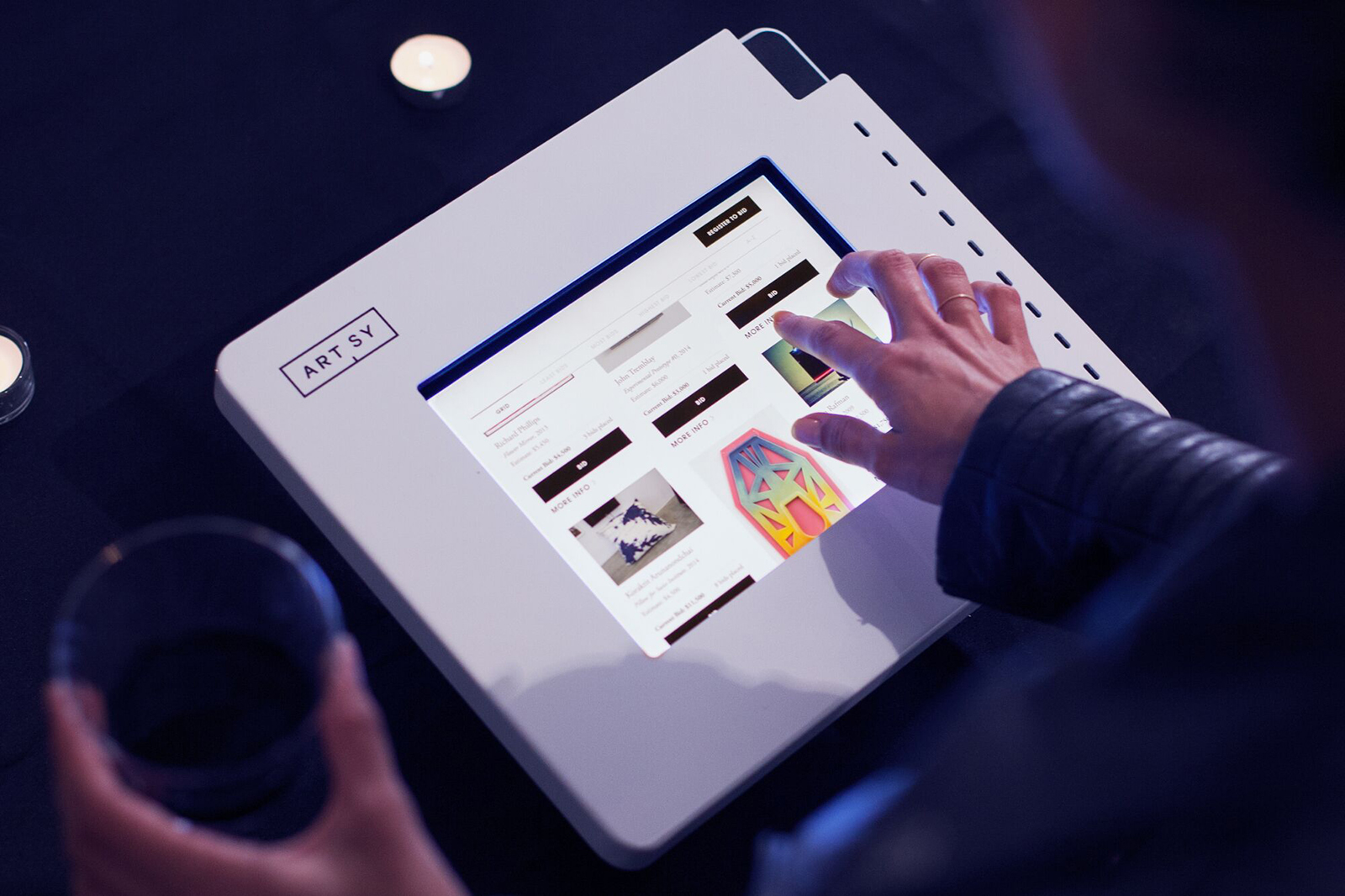
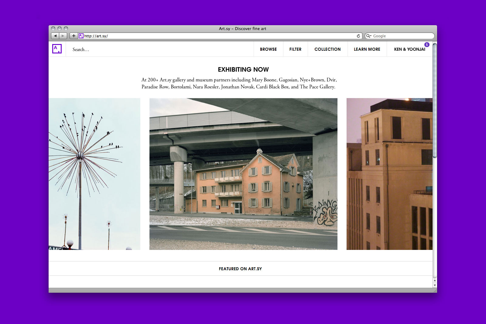
Website featuring abbreviated logo
Designed by Artsy
Video bumper

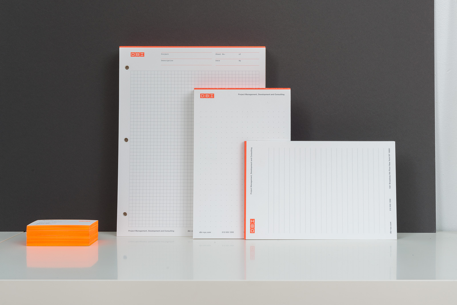
Print stationery
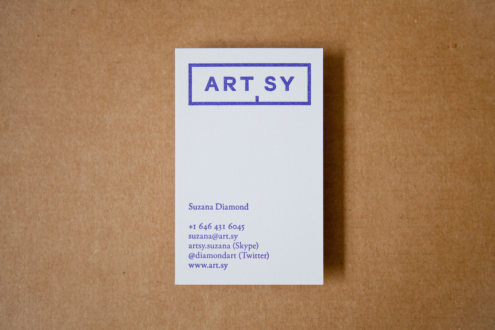
Business card
Die-cut stickers
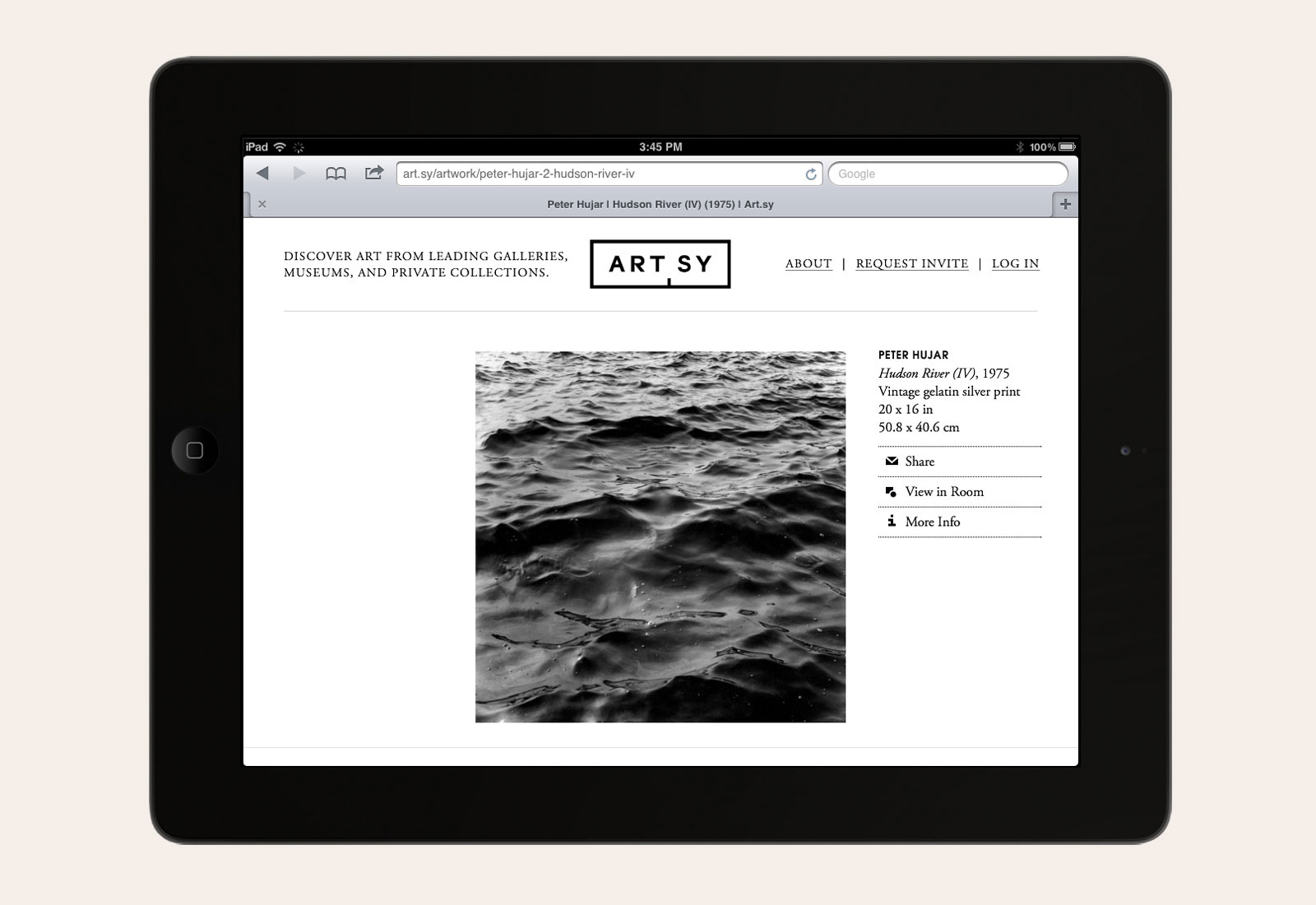
Mobile website featuring full logo
Designed by Artsy
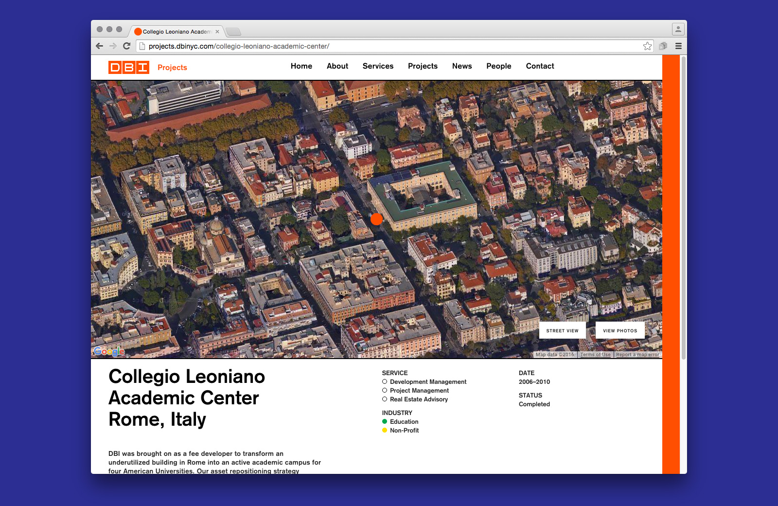
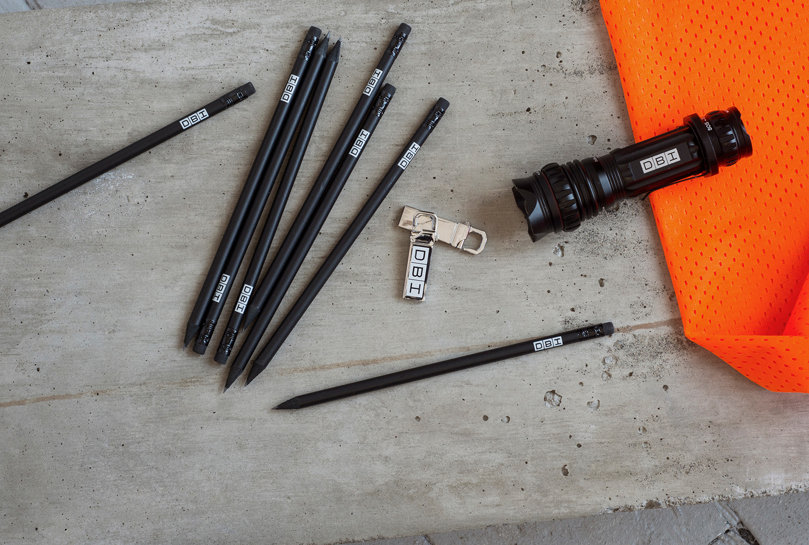
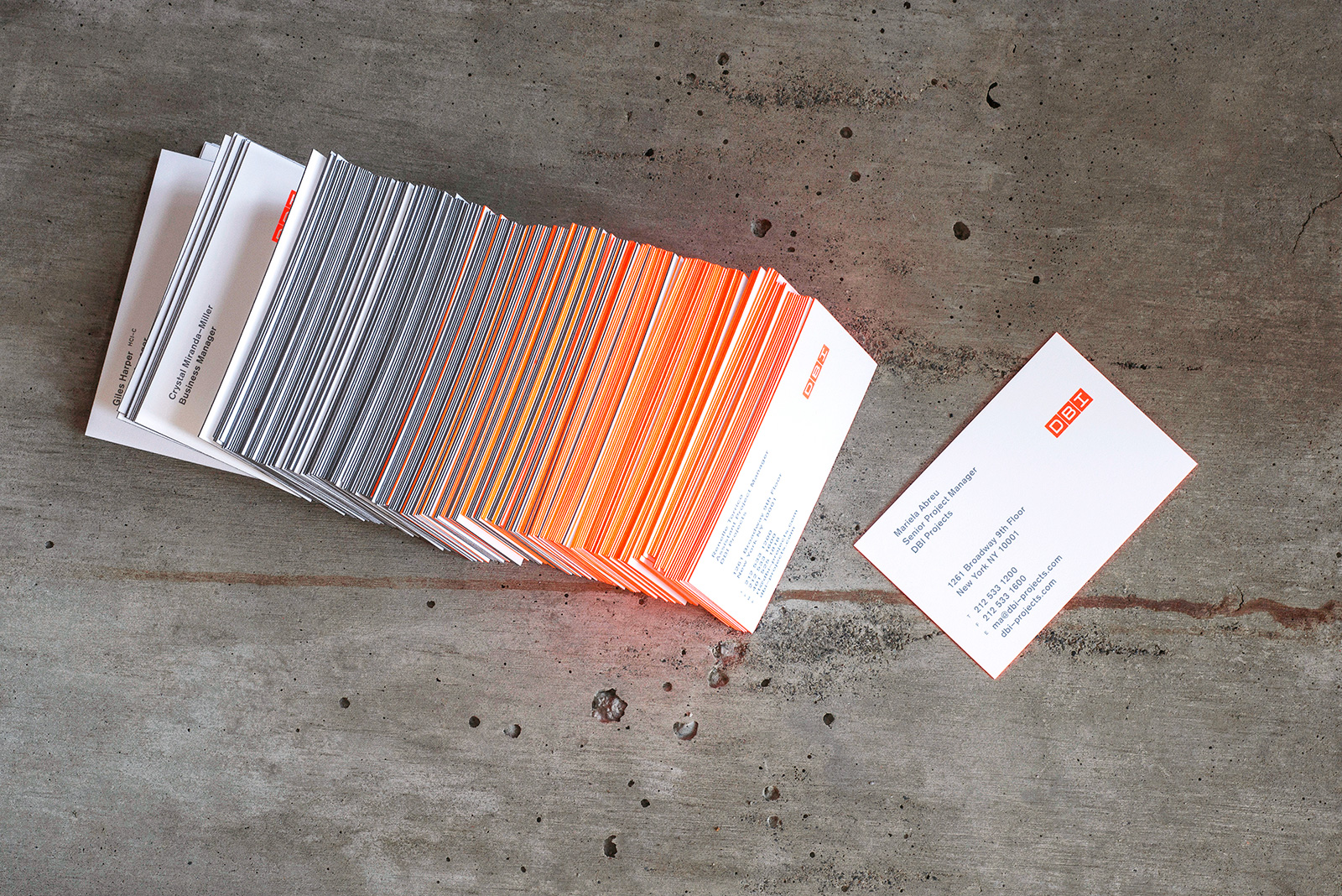
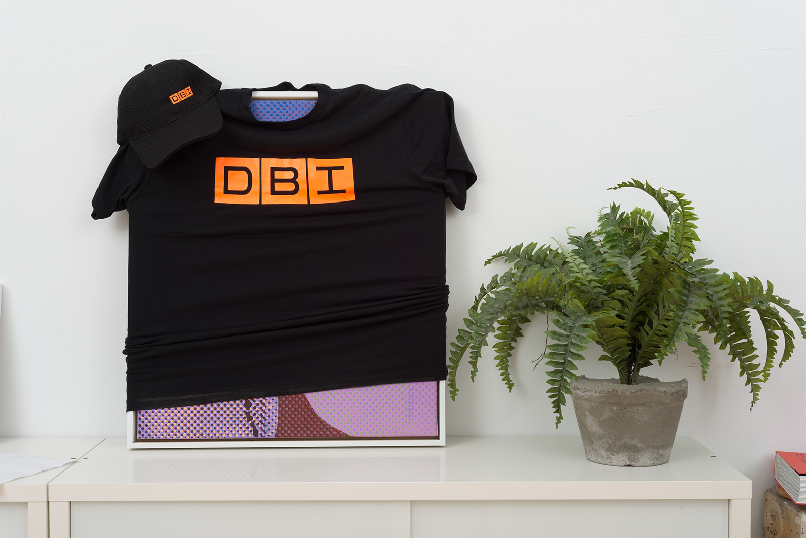
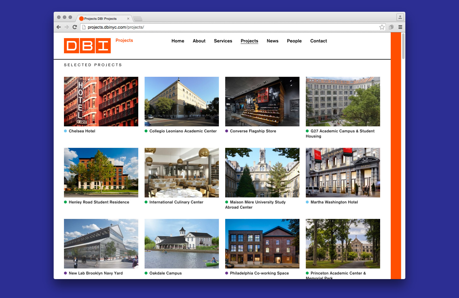
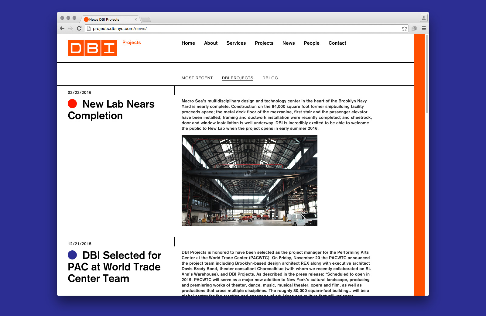
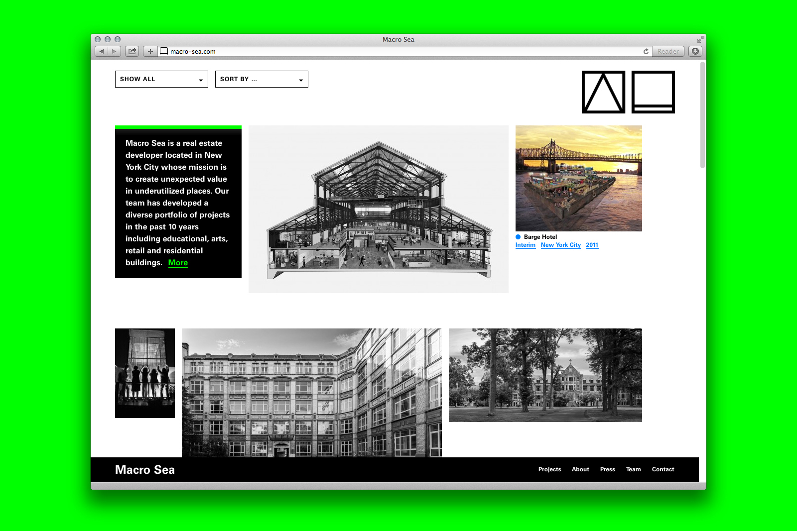
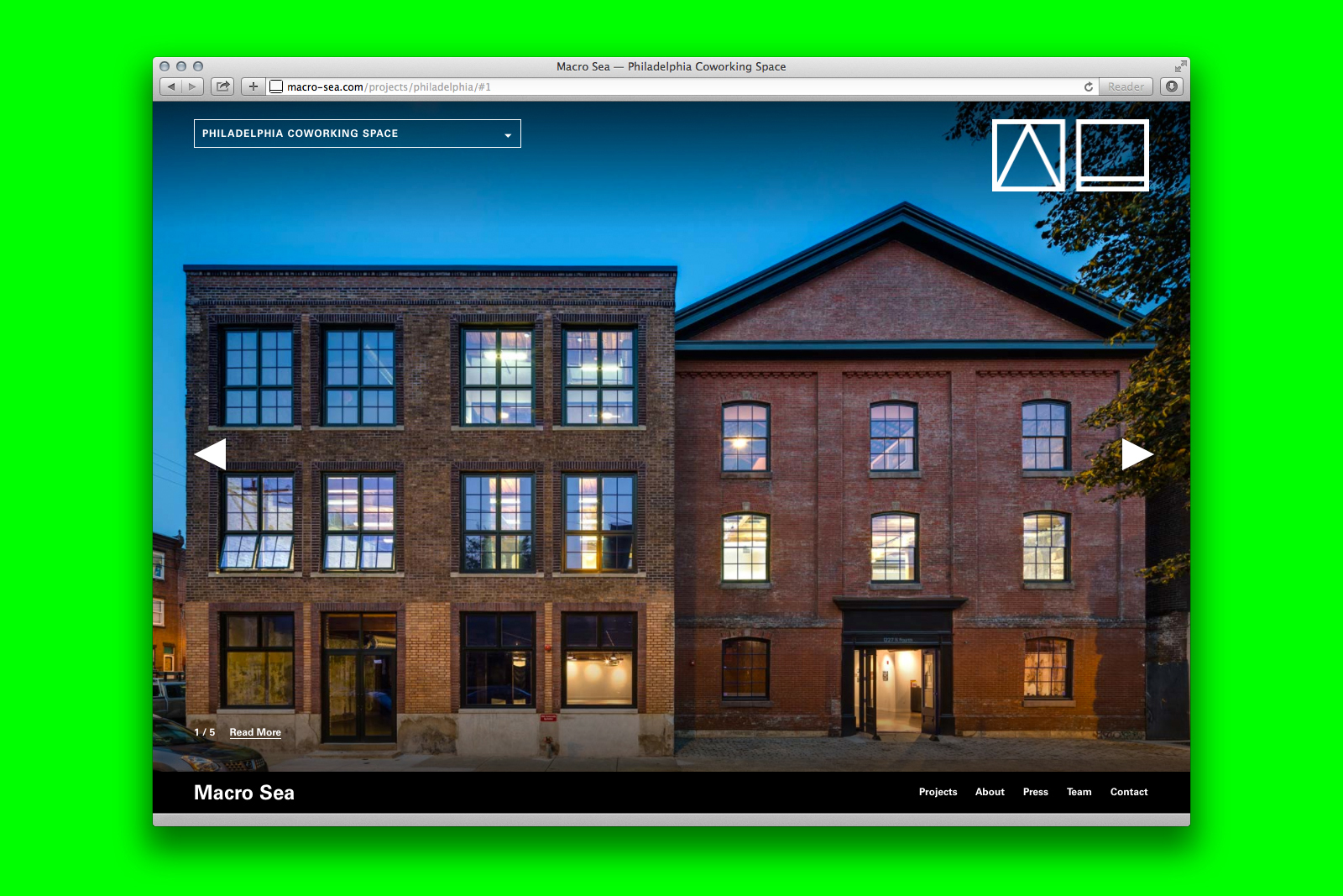
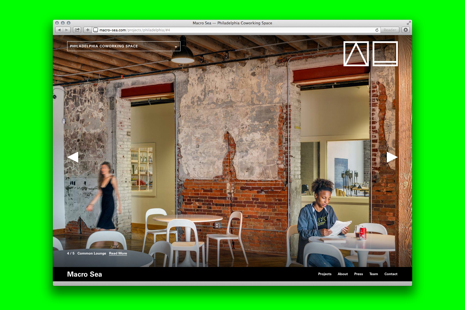
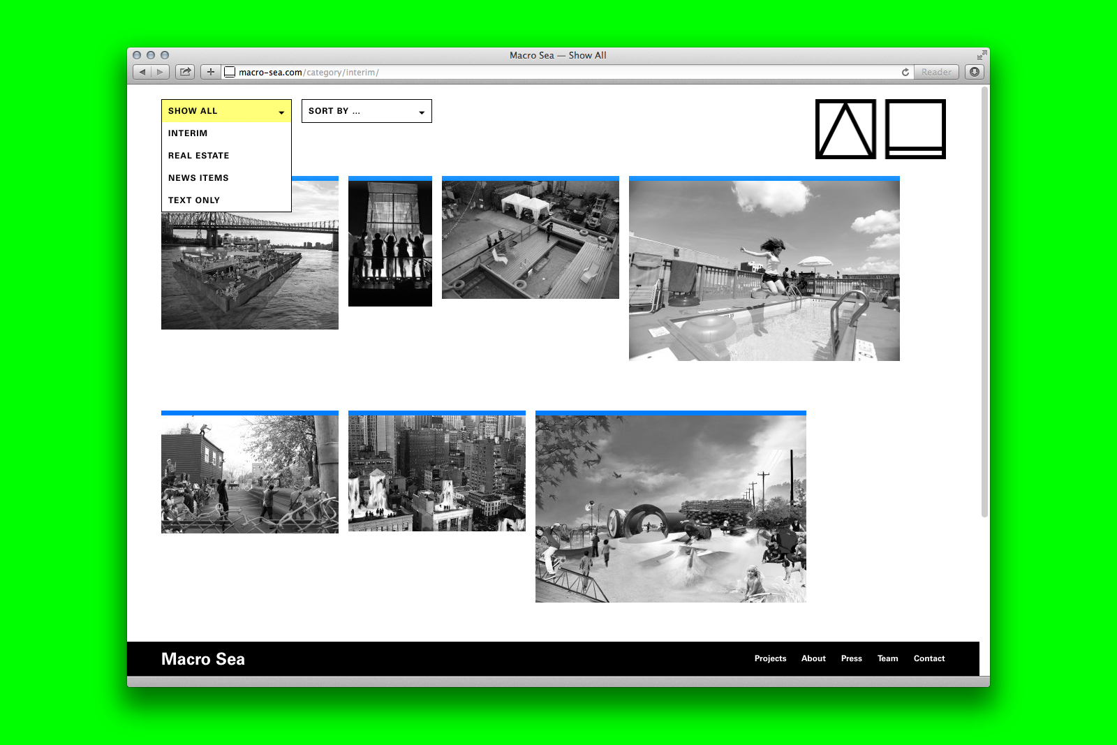
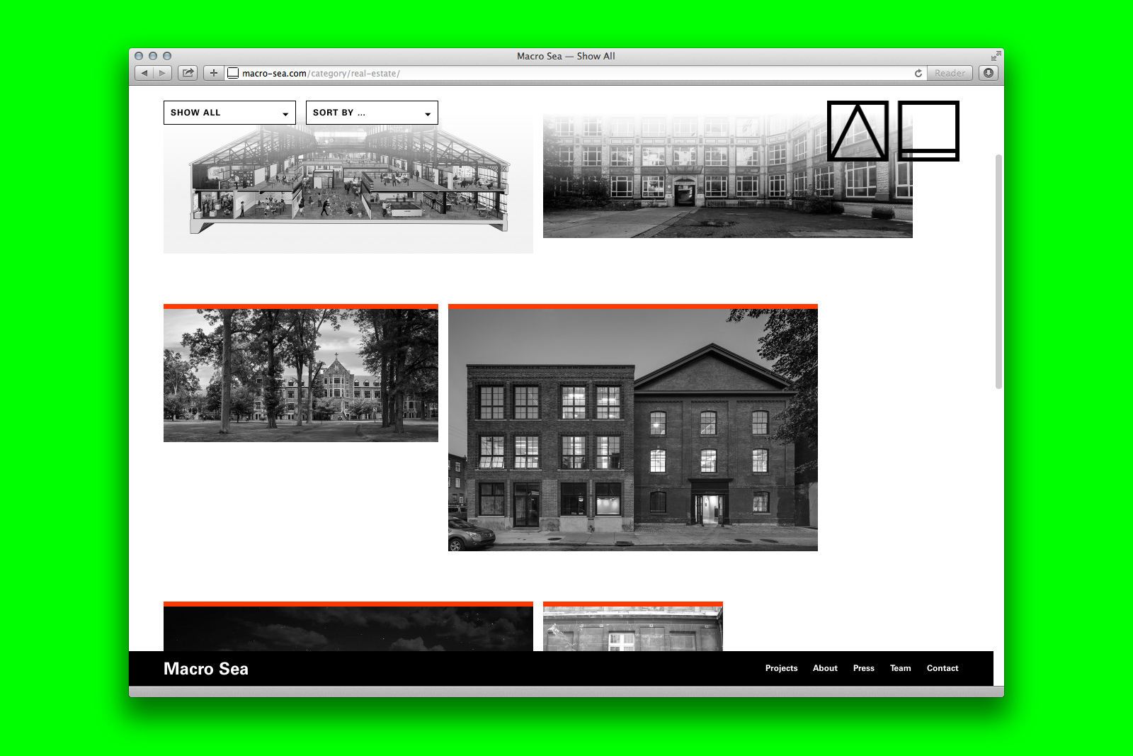
IDENTITY SYSTEM, WEBSITE, and APPLICATIONS for DBI and MACRO SEA — DBI Projects and its sister company Macro Sea approach development with the mindset of architects, maintaining an internal design staff who help to guide the work. Many of their initiatives have a conceptual or experimental edge, and occasionally operate as interim projects, popping up between buidlings or activating previously unused spaces. Their work exists in cities across the globe, engaging with local creative and educational communities. They also manage a number of these projects themselves, including their most recent success story: New Lab in the Brooklyn Navy Yard.

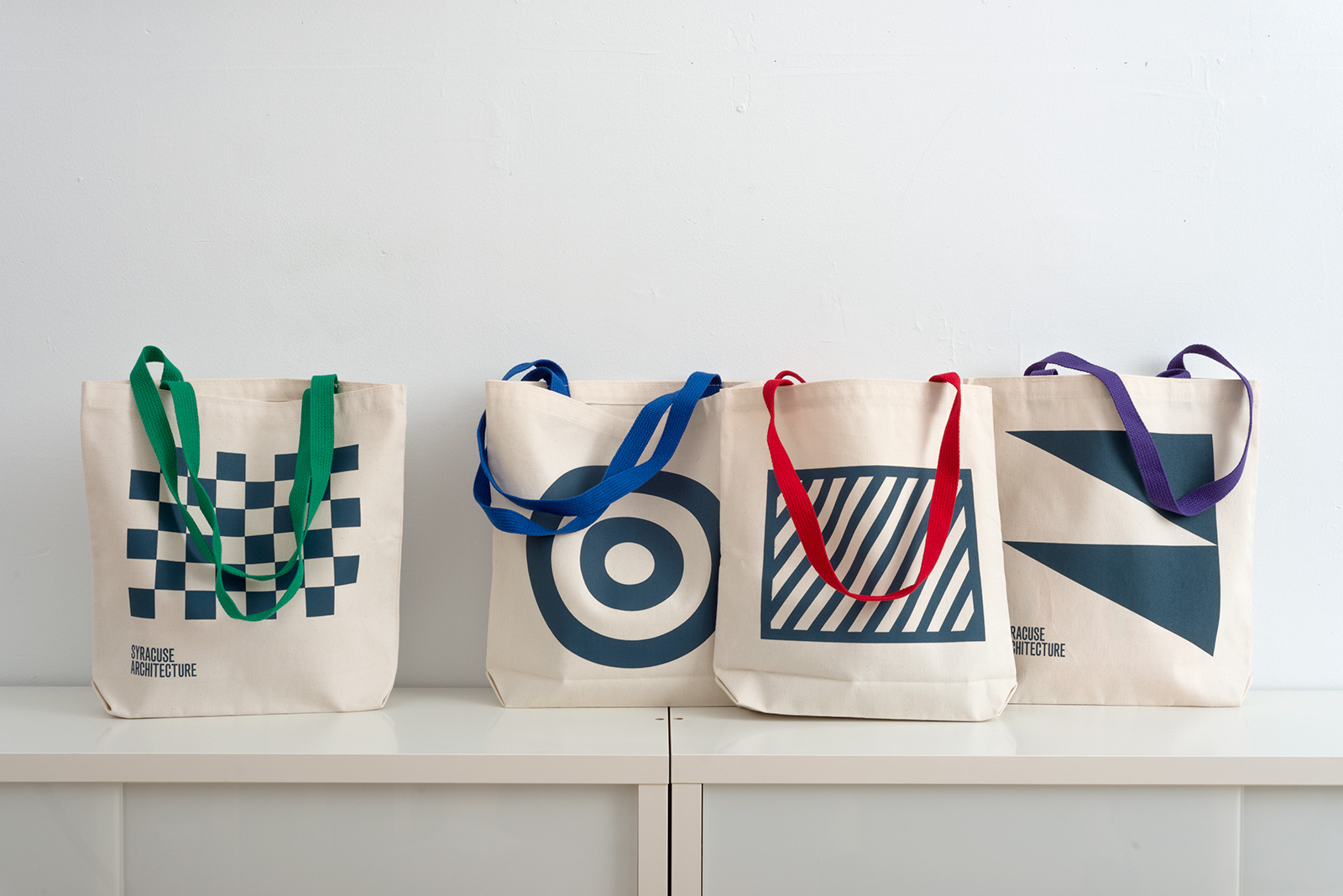
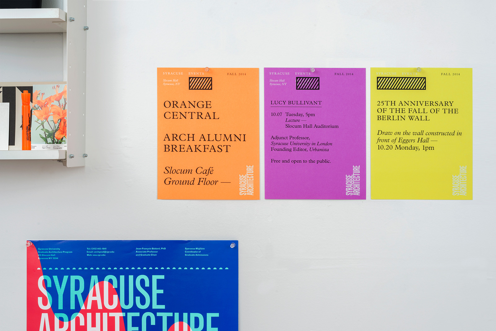
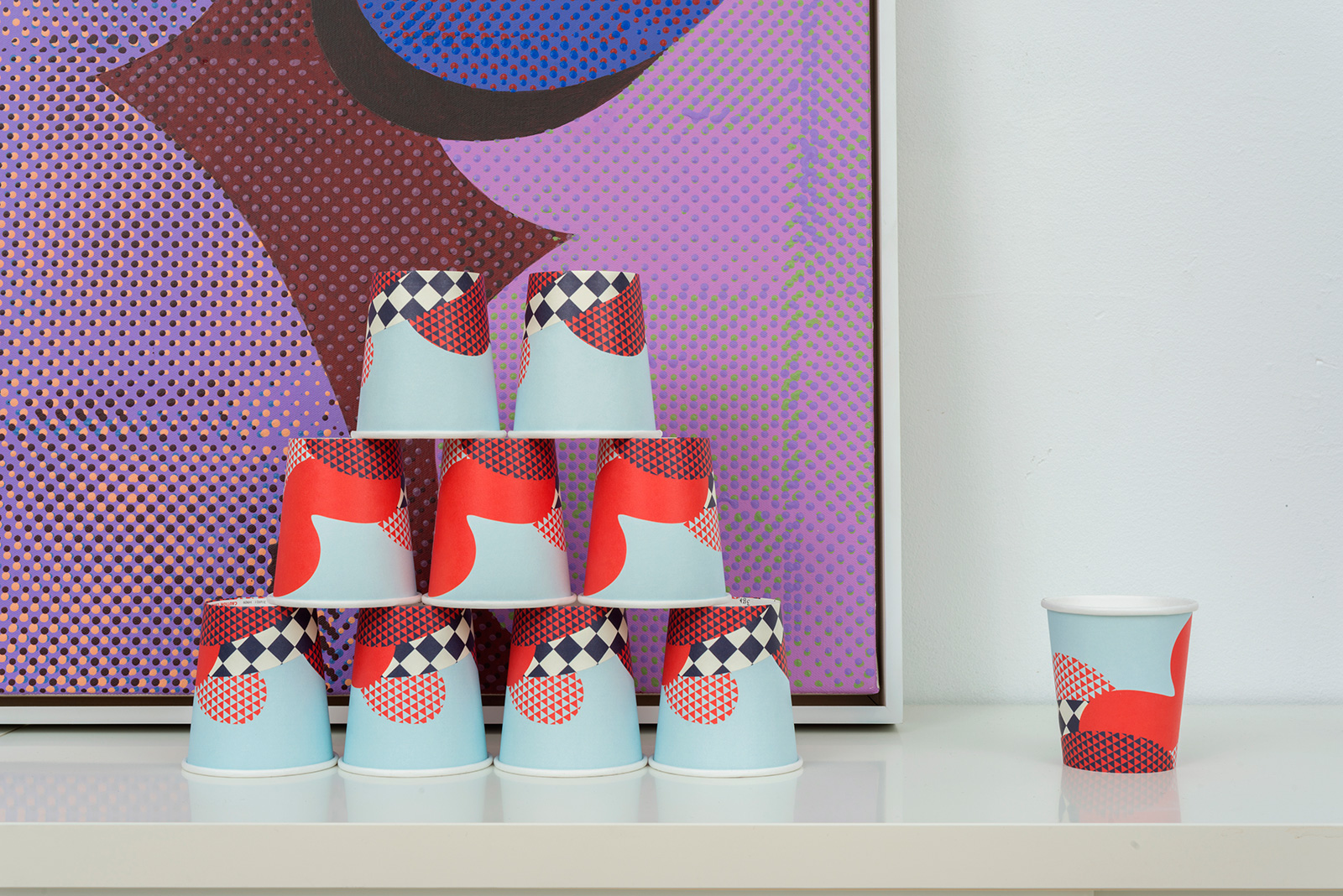
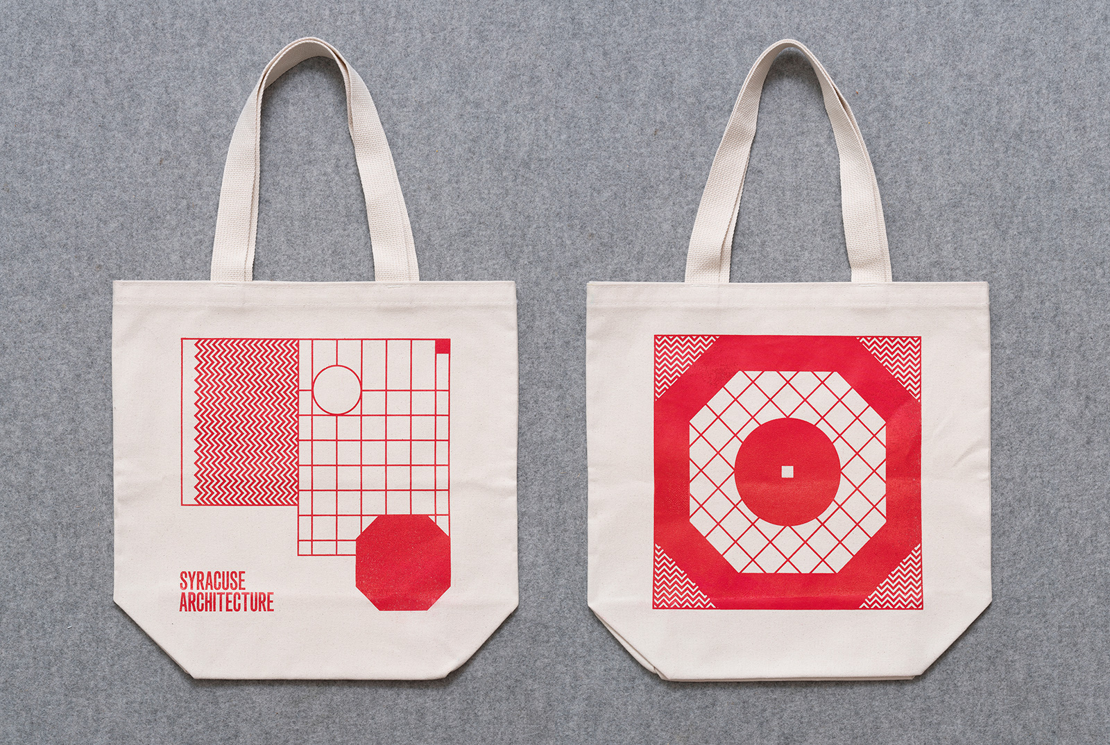
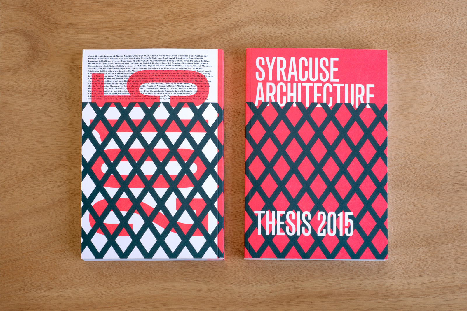
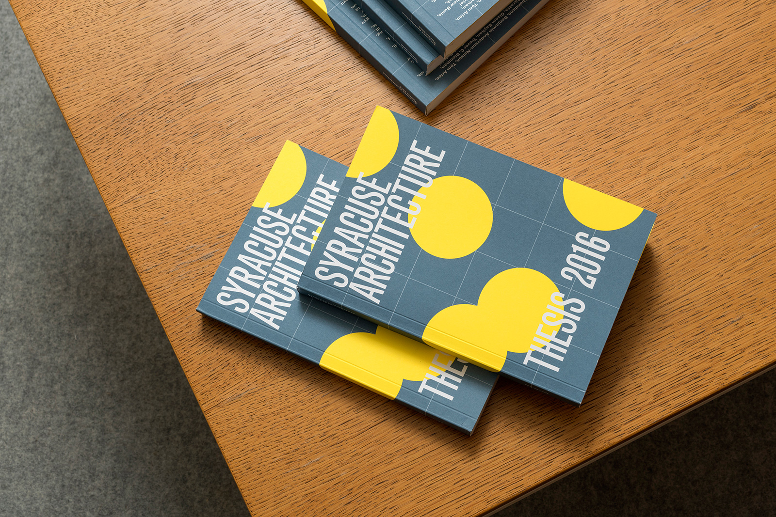
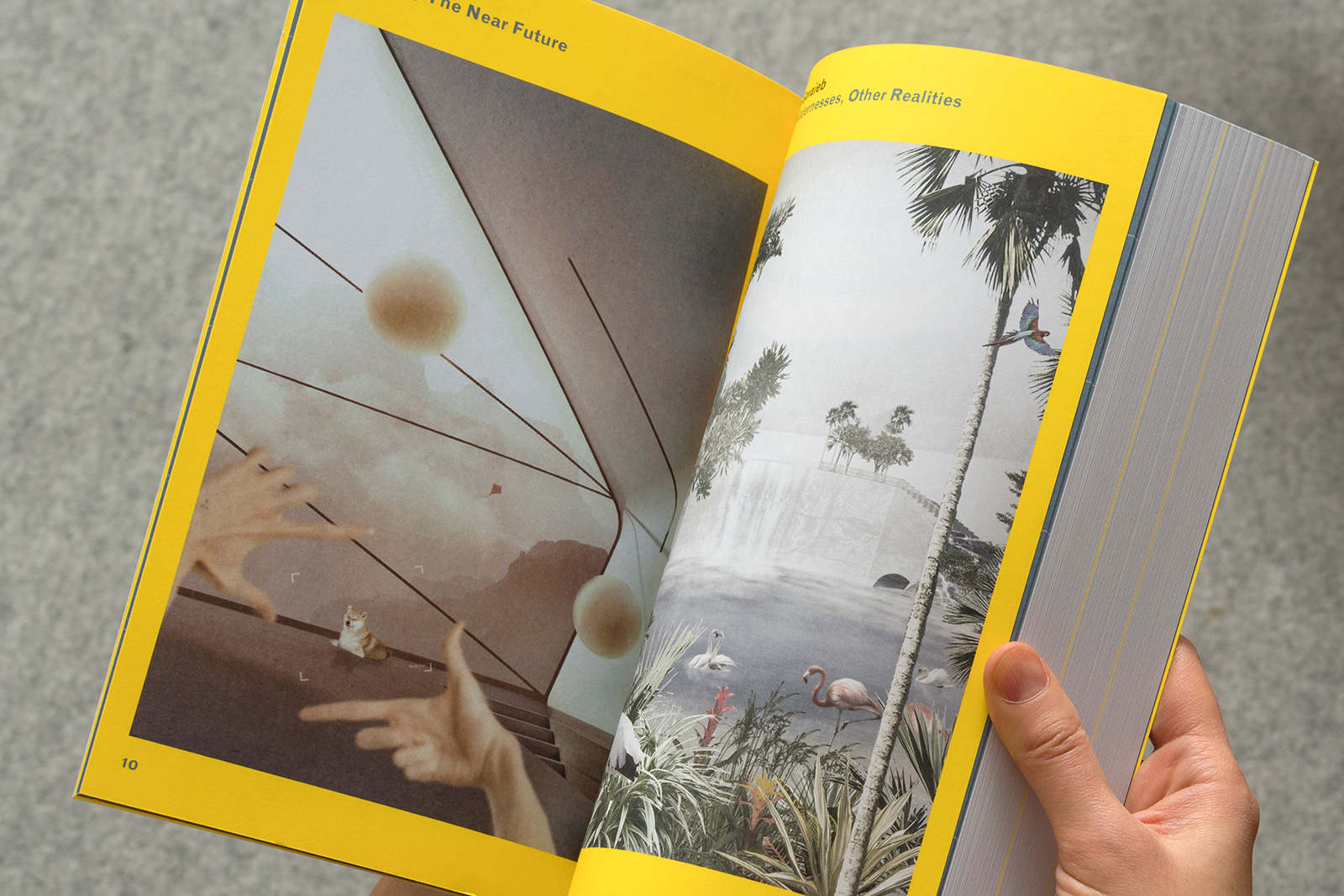
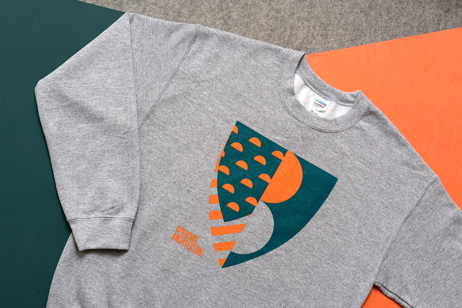
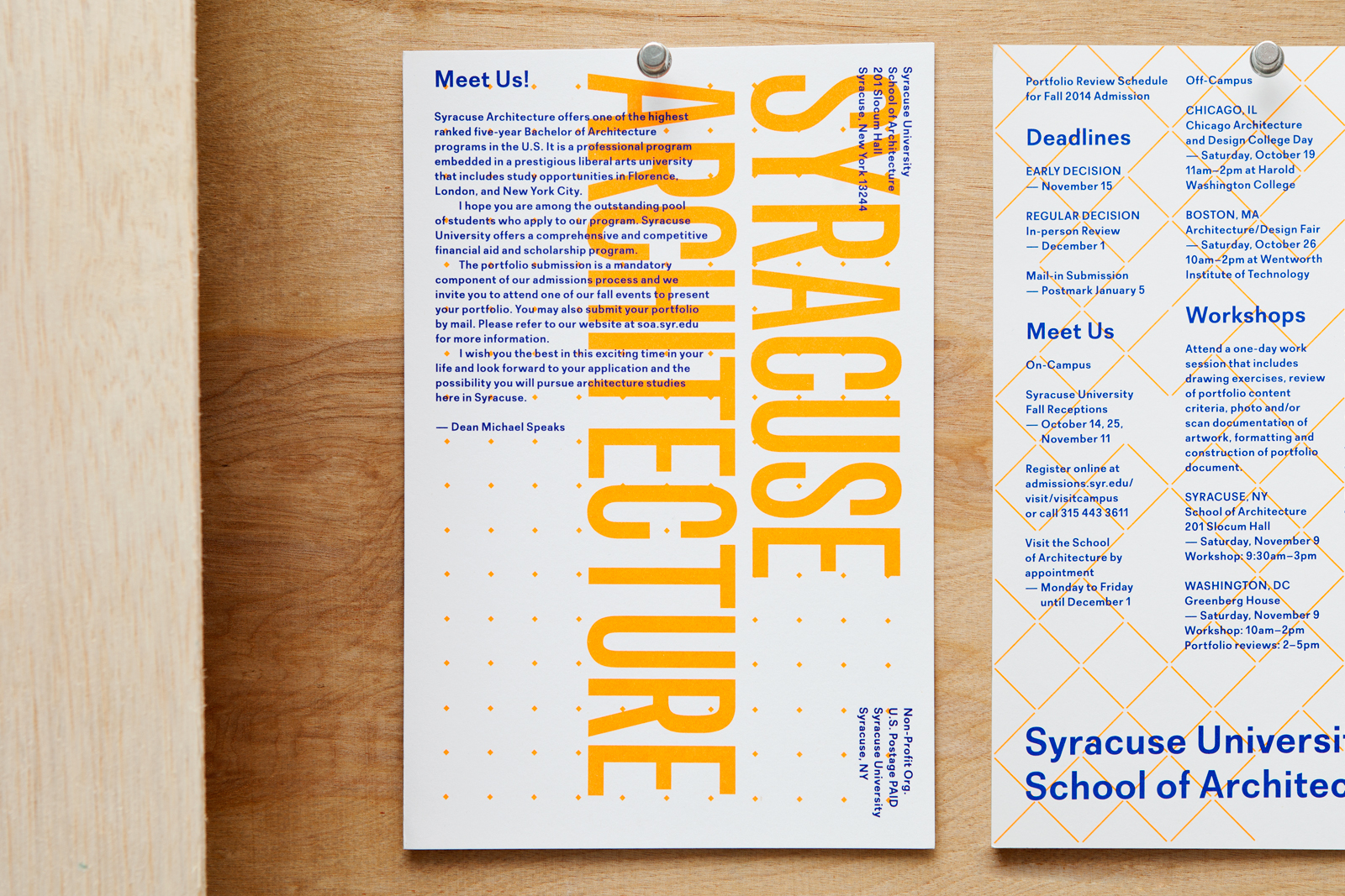
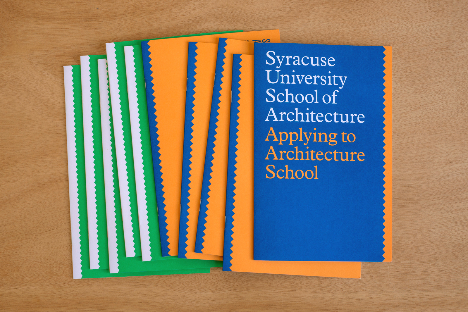
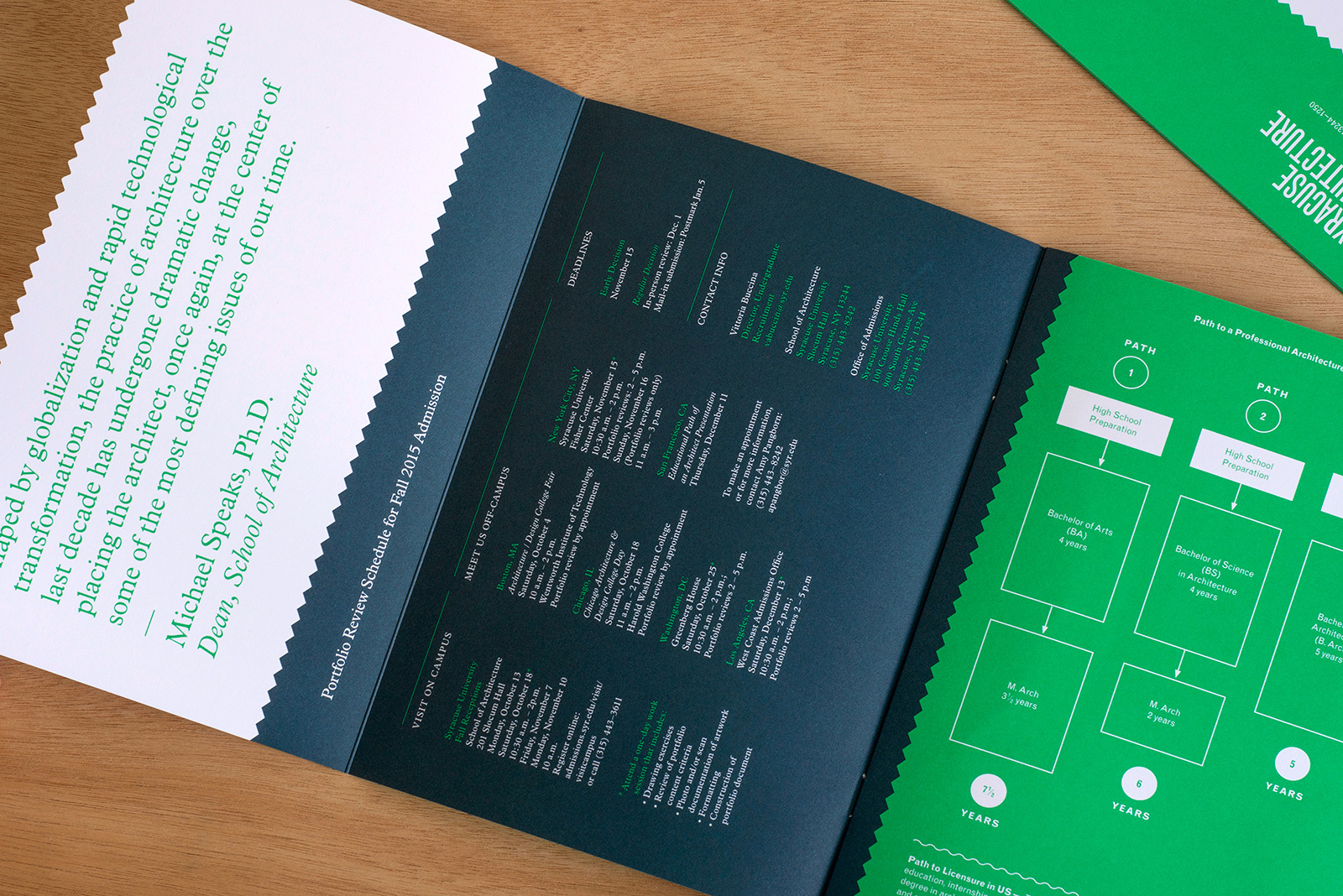
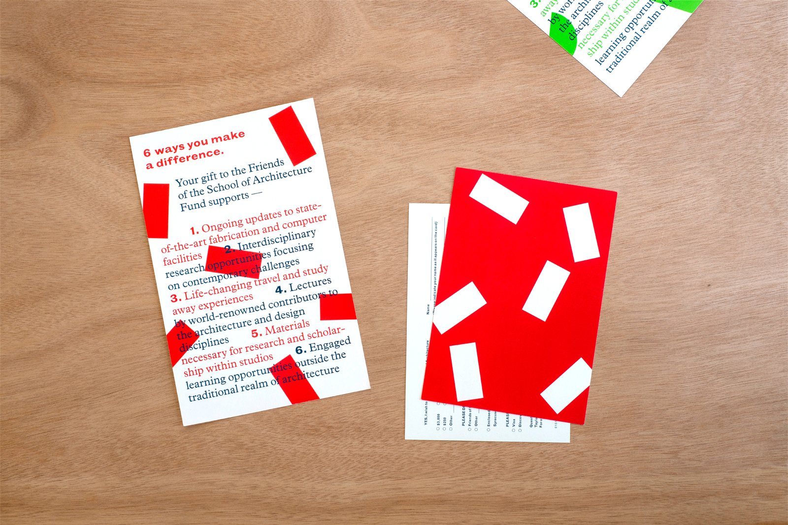
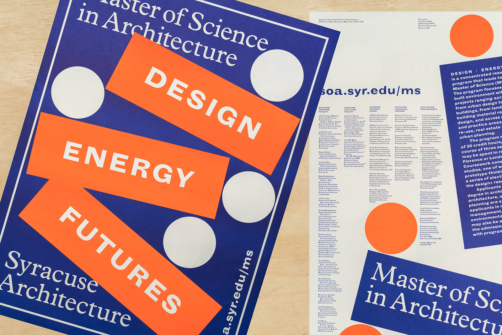
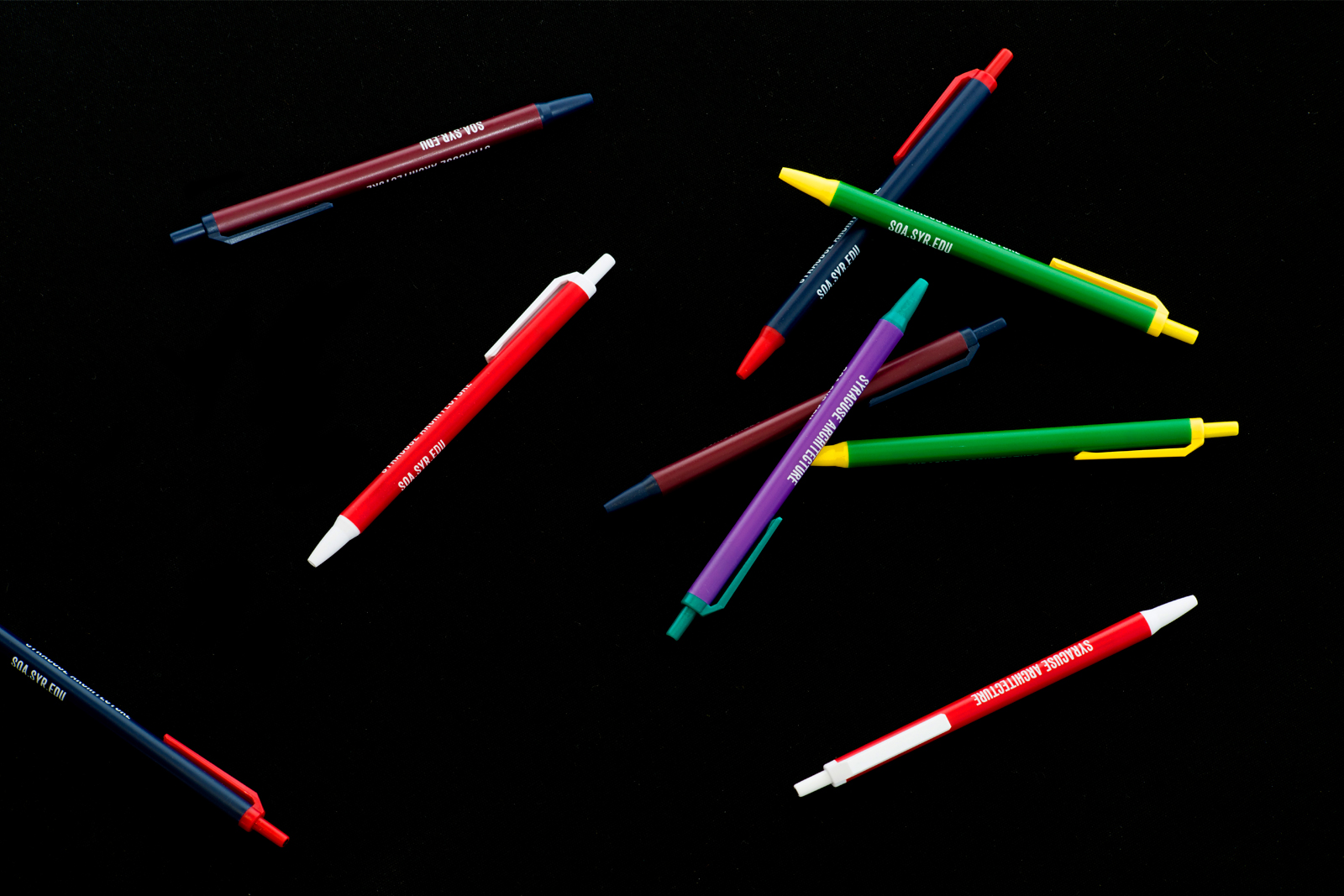
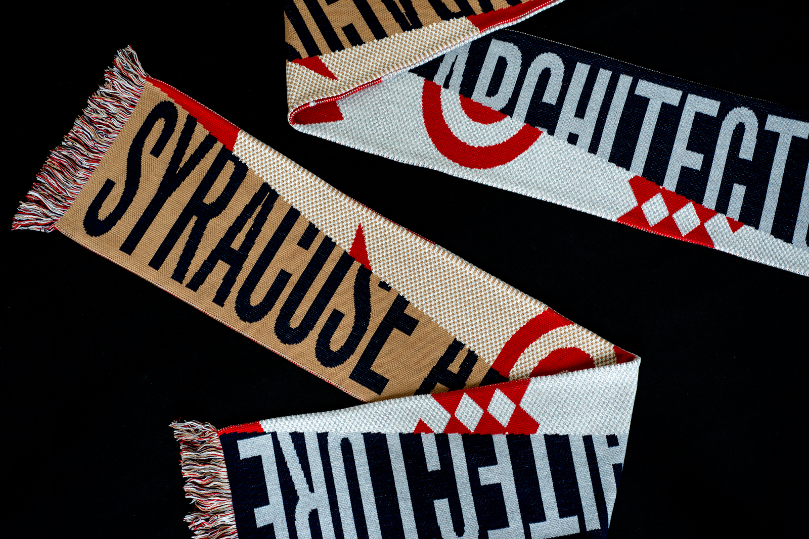
IDENTITY SYSTEM, WEBSITE, and APPLICATIONS for SYRACUSE ARCHITECTURE — Syracuse Architecture is an amalgamation of many perspectives; diverse and dynamic in nature, connected to the past but forward-looking; critical, curious, and intentionally curated. The school’s visual identity expresses these traits through a varied group of formal devices, including the layering, masking, and revealing of content by an ever-expanding vocabulary of graphic forms. Extending across print, digital, and environmental applications, the system is reworked incrementally and expanded upon each academic year.

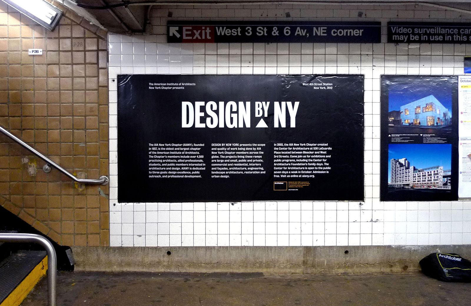
DESIGN BY NEW YORK for AMERICAN INSTITUTE OF ARCHITECTS —— This unique exhibition presents a variety of architectural works by AIA NY members not within a gallery space, but within the highly-visible confines of the New York subway system. In addition to commissioned projects, this year’s call includes unbuilt competition entries, theoretical proposals, and design research. Large keywords punctuate the long tunnels of the West 4th Street station, highlighting different themes and playing with notions of construction process and architectural scale.
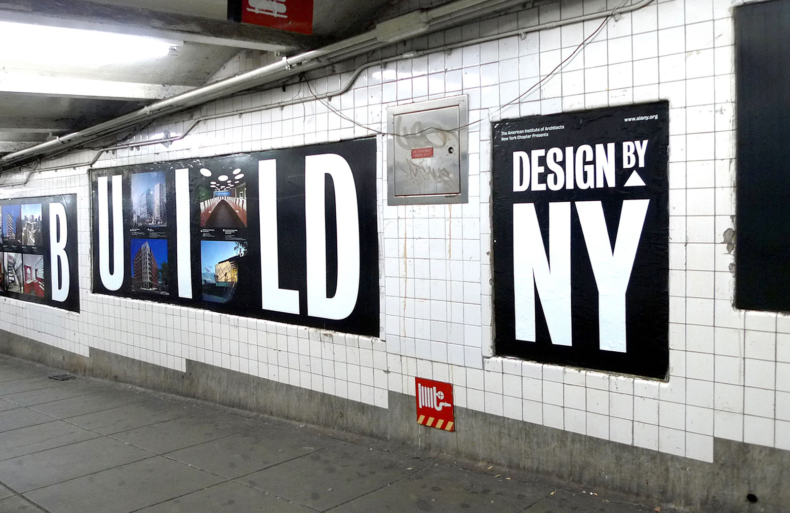
Installation view, W 4th St subway station
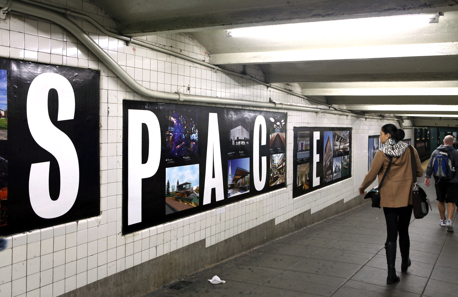
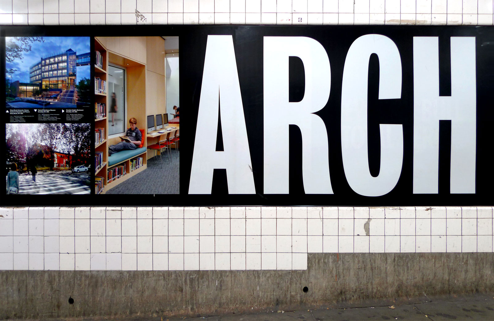
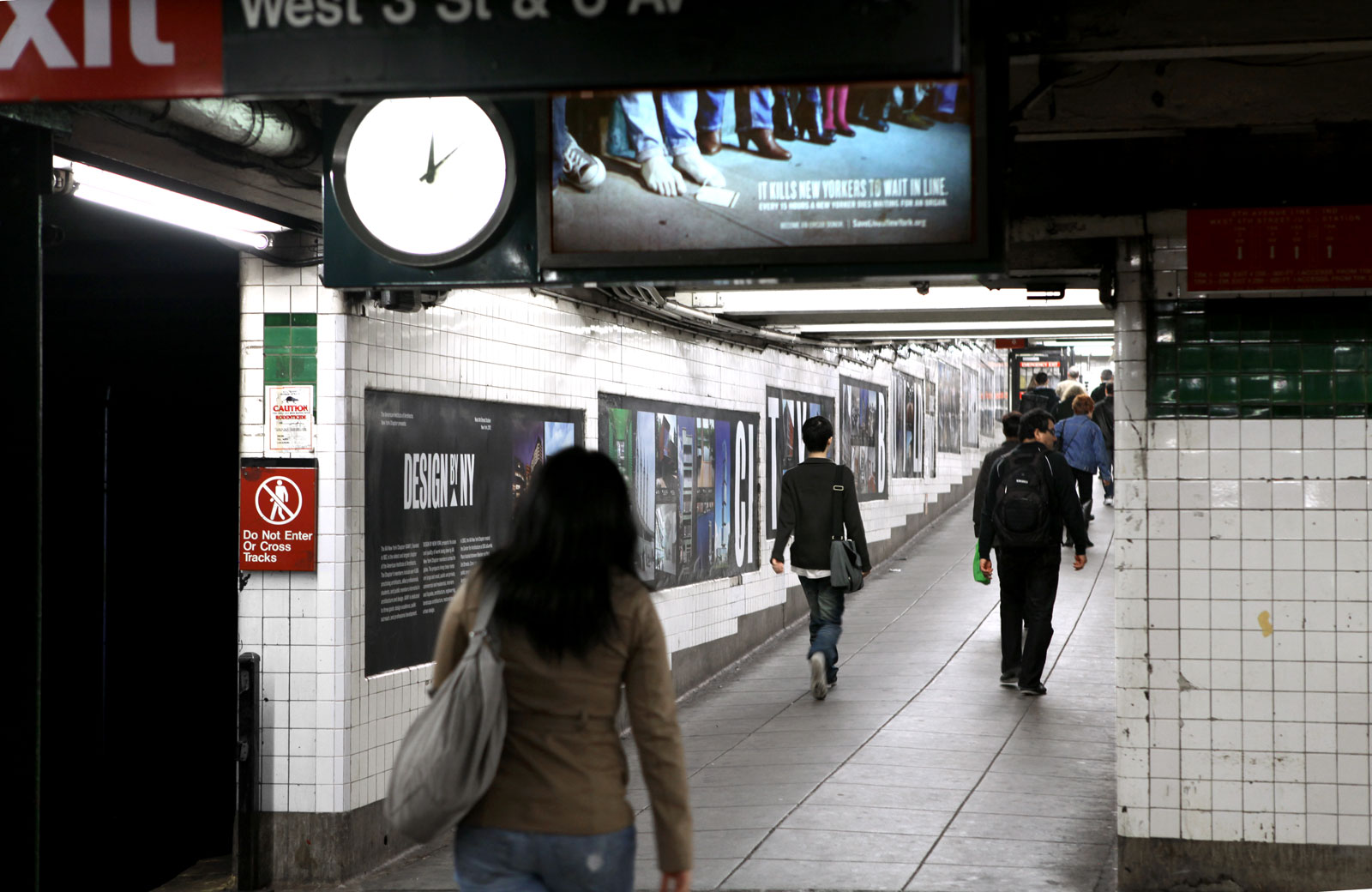
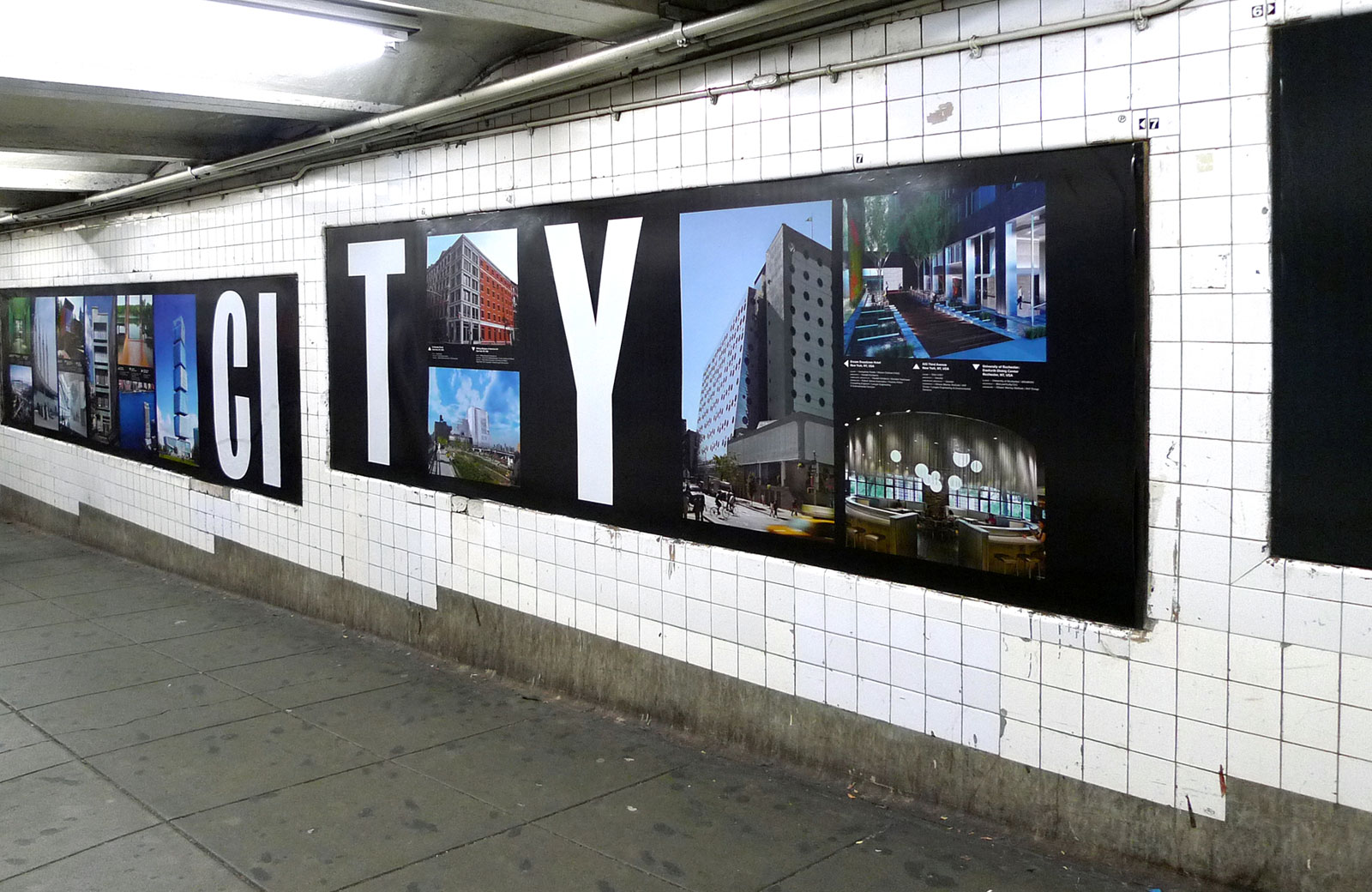
Panel detail
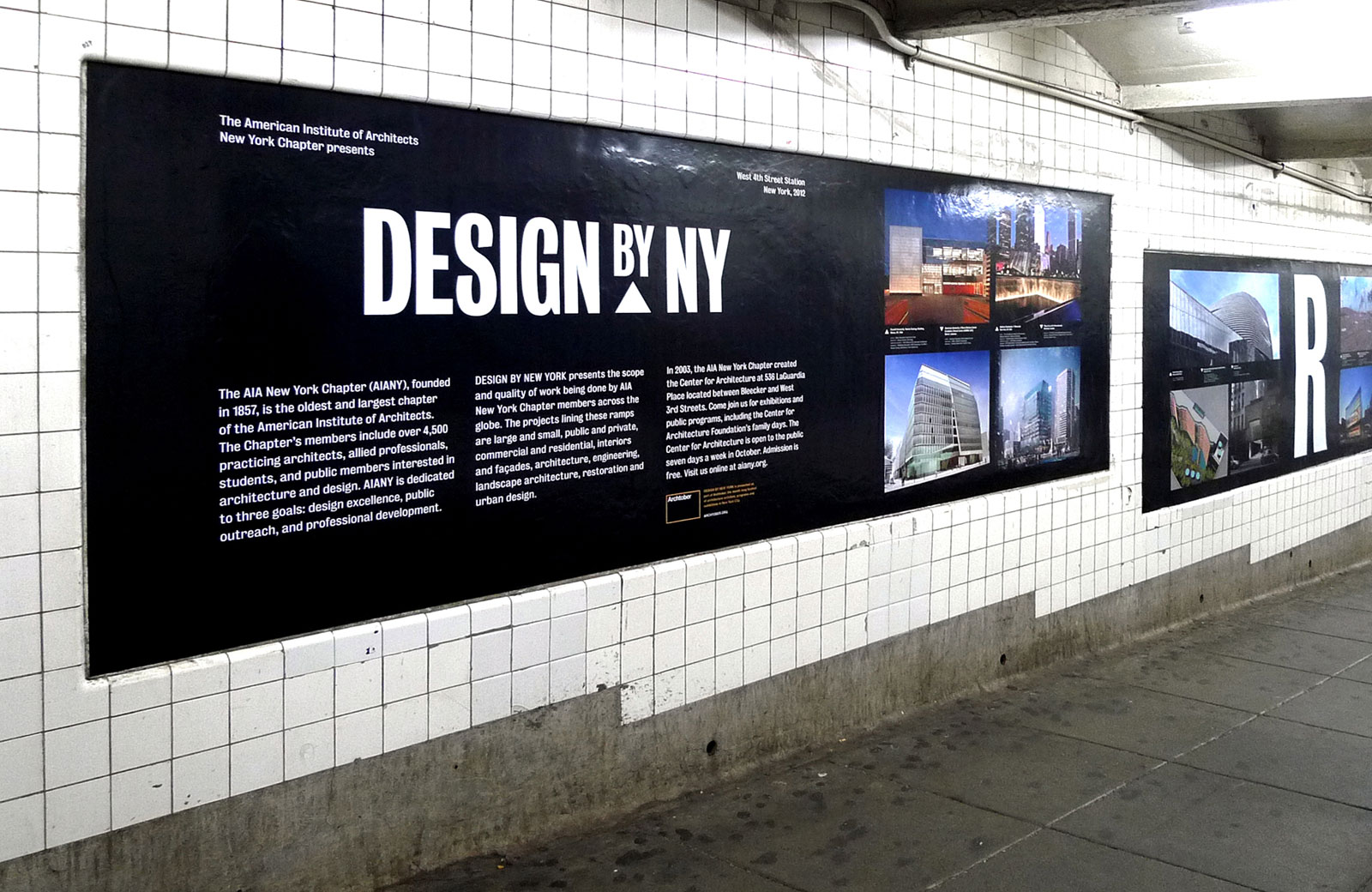
Exhibition design, 2012
Cynthia Kracauer, Managing Director, AIA NY
Rosamond Fletcher, Director of Exhibitions
Juliana Barton, Exhibitions Coordinator
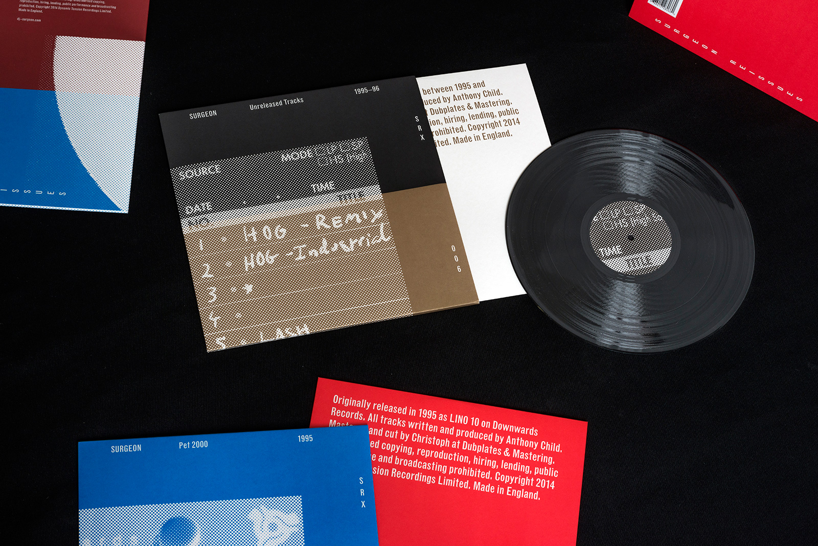
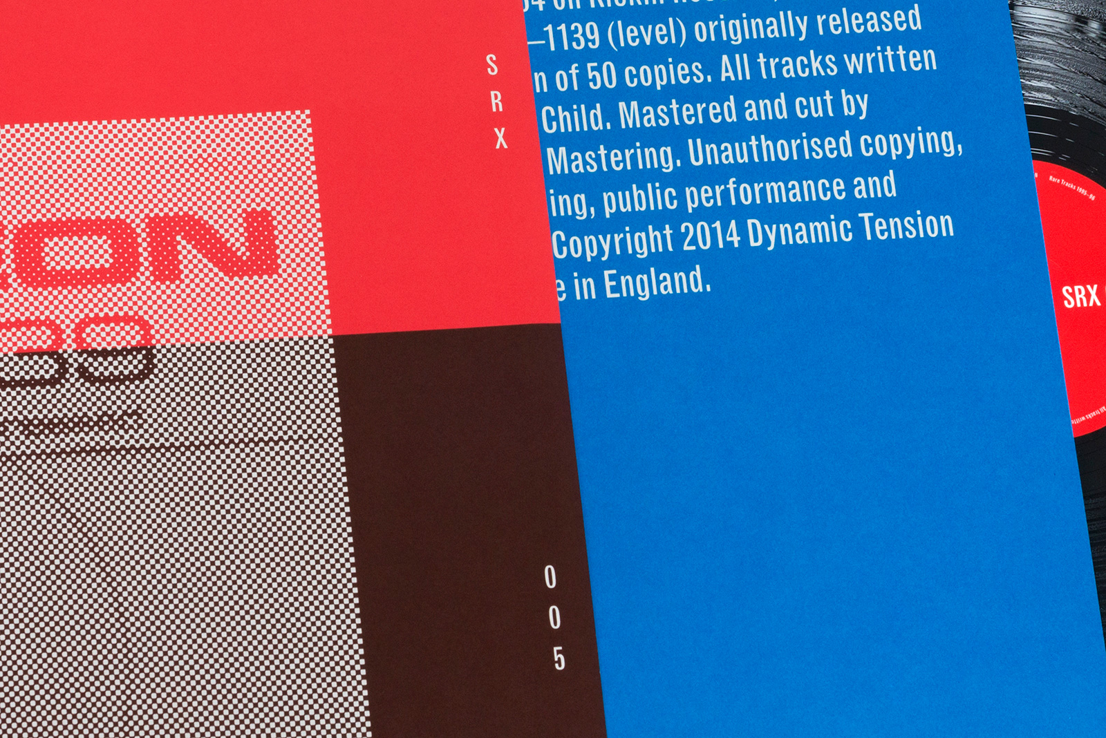
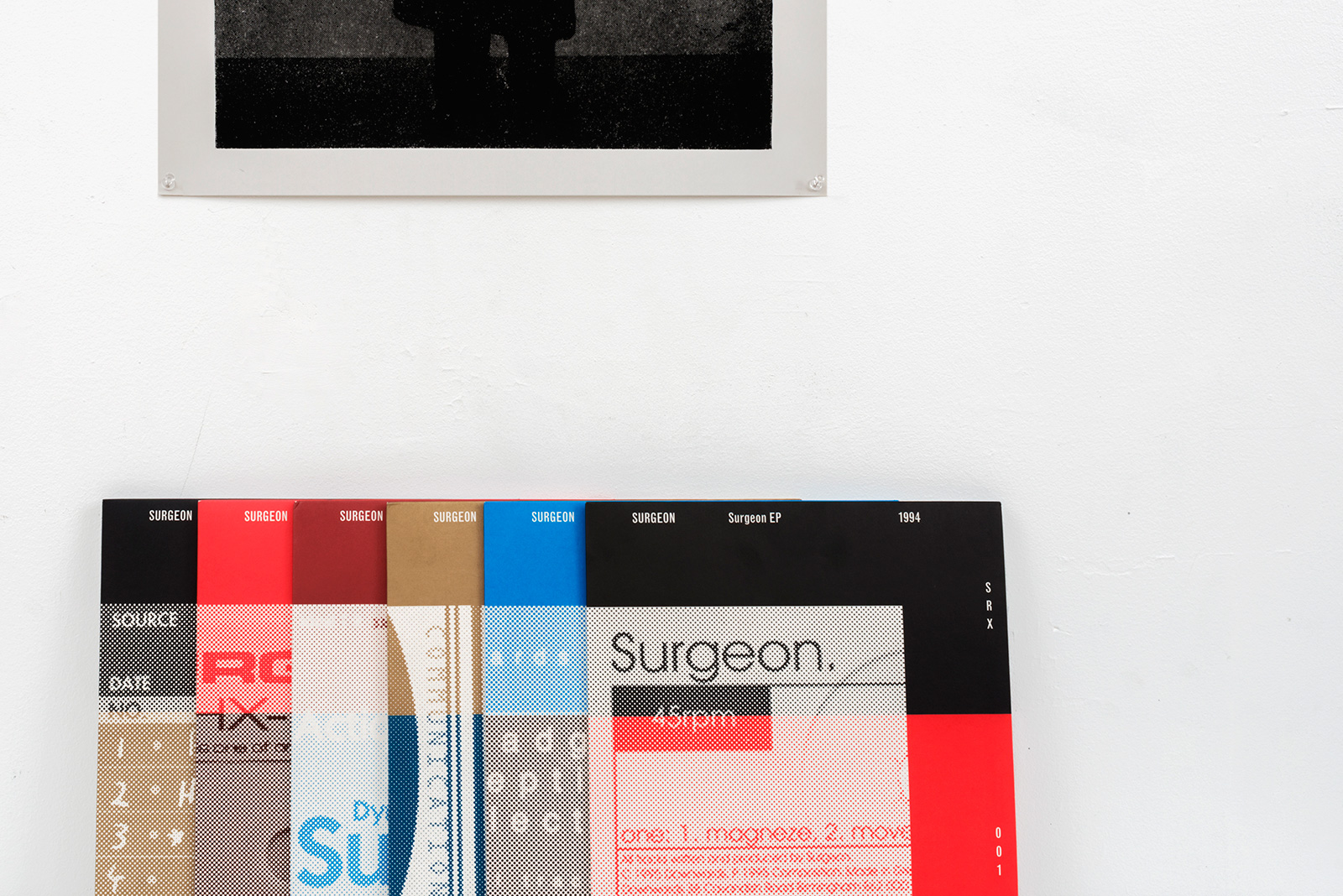
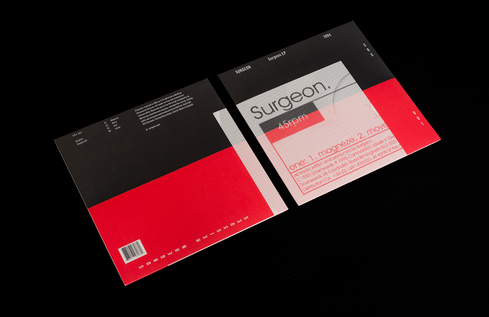
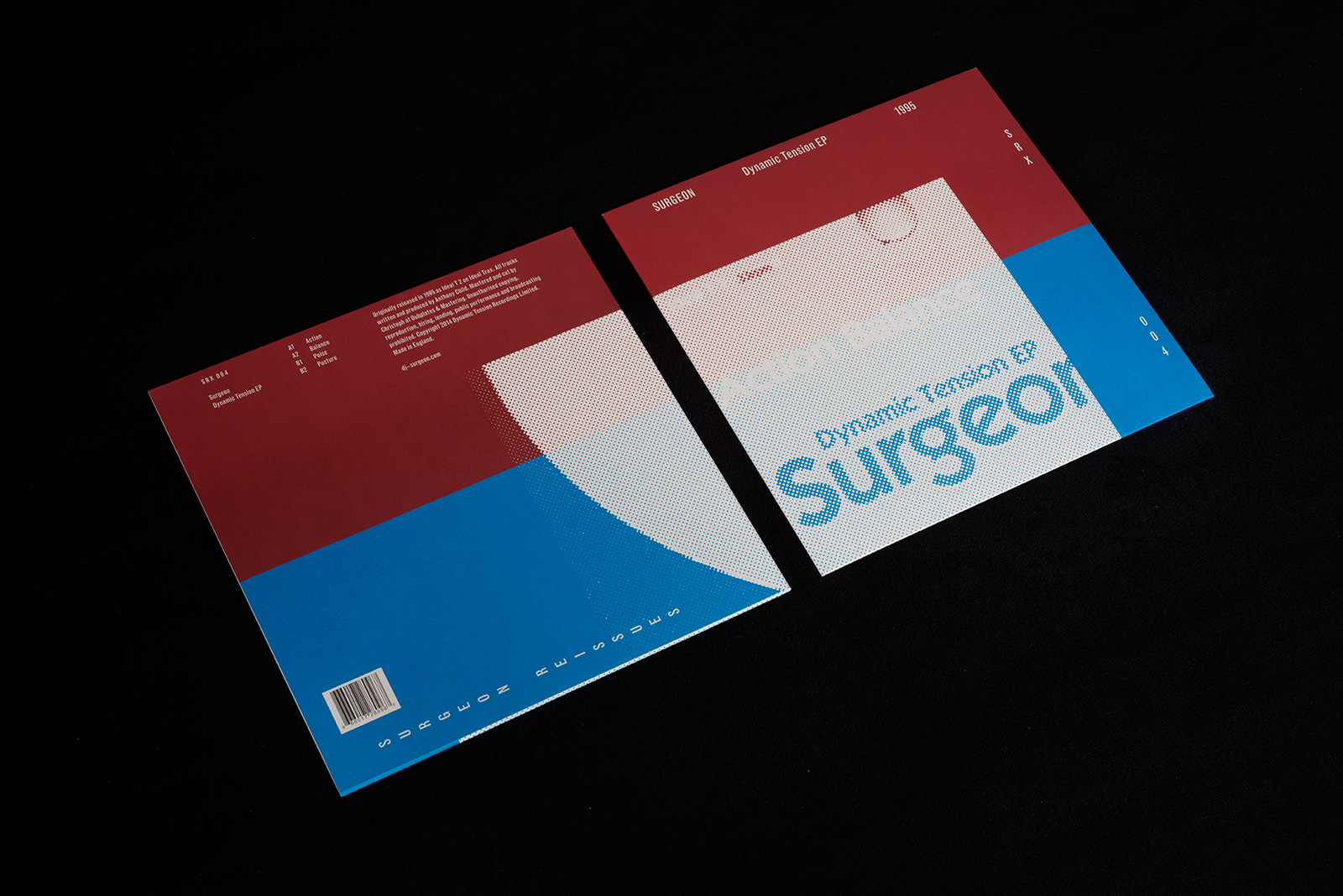
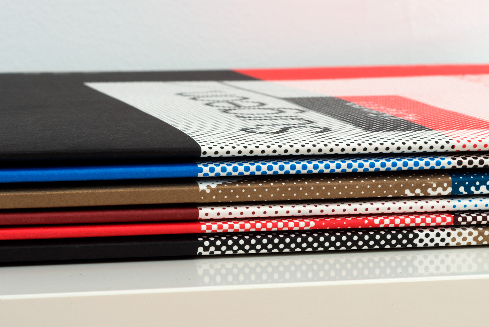
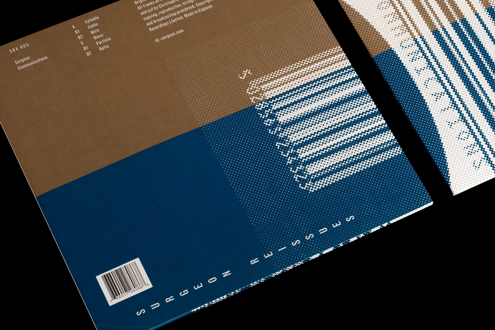
IDENTITY SYSTEM and LABEL ART for SURGEON REISSUES X — This limited set of reissues presents newly remastered versions of Surgeon’s early releases, including rare and previously unreleased material. Part of the concept was to pay homage to the original sleeves without simply reprinting them, and also devise a format that allowed colors to be mixed in different ways, varying the template incrementally over the course of the series.
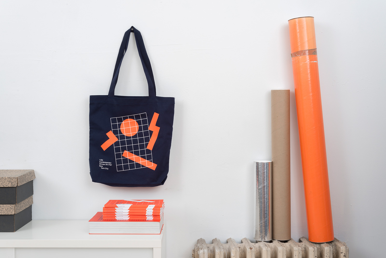
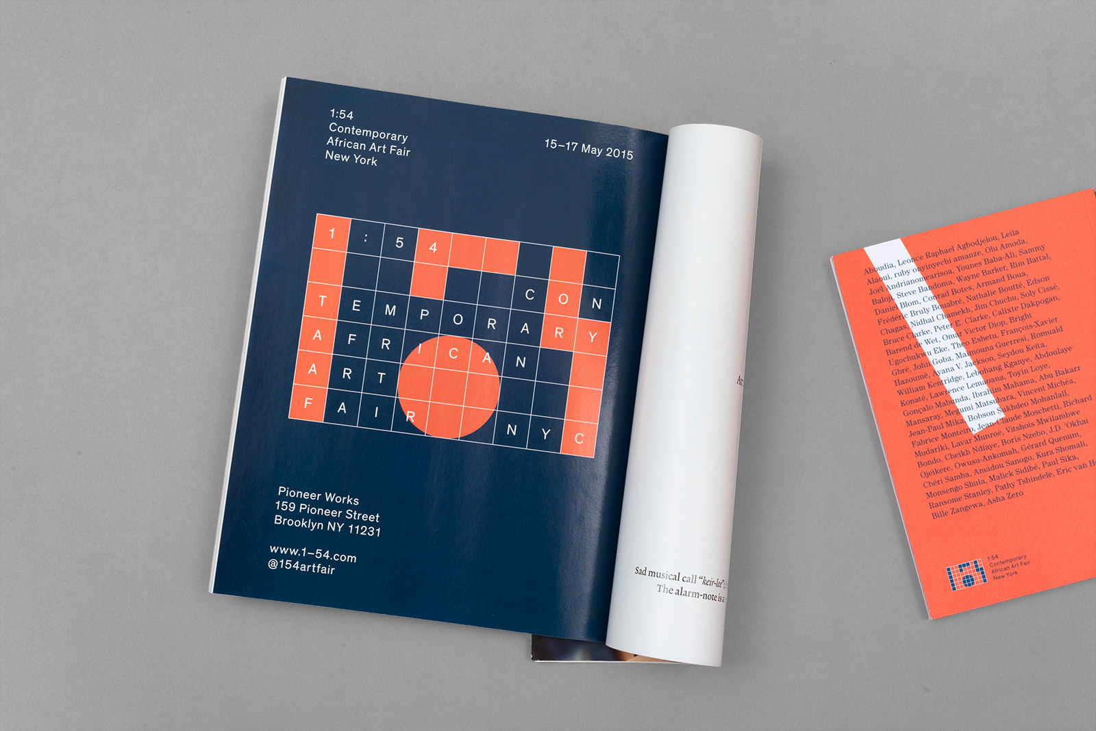
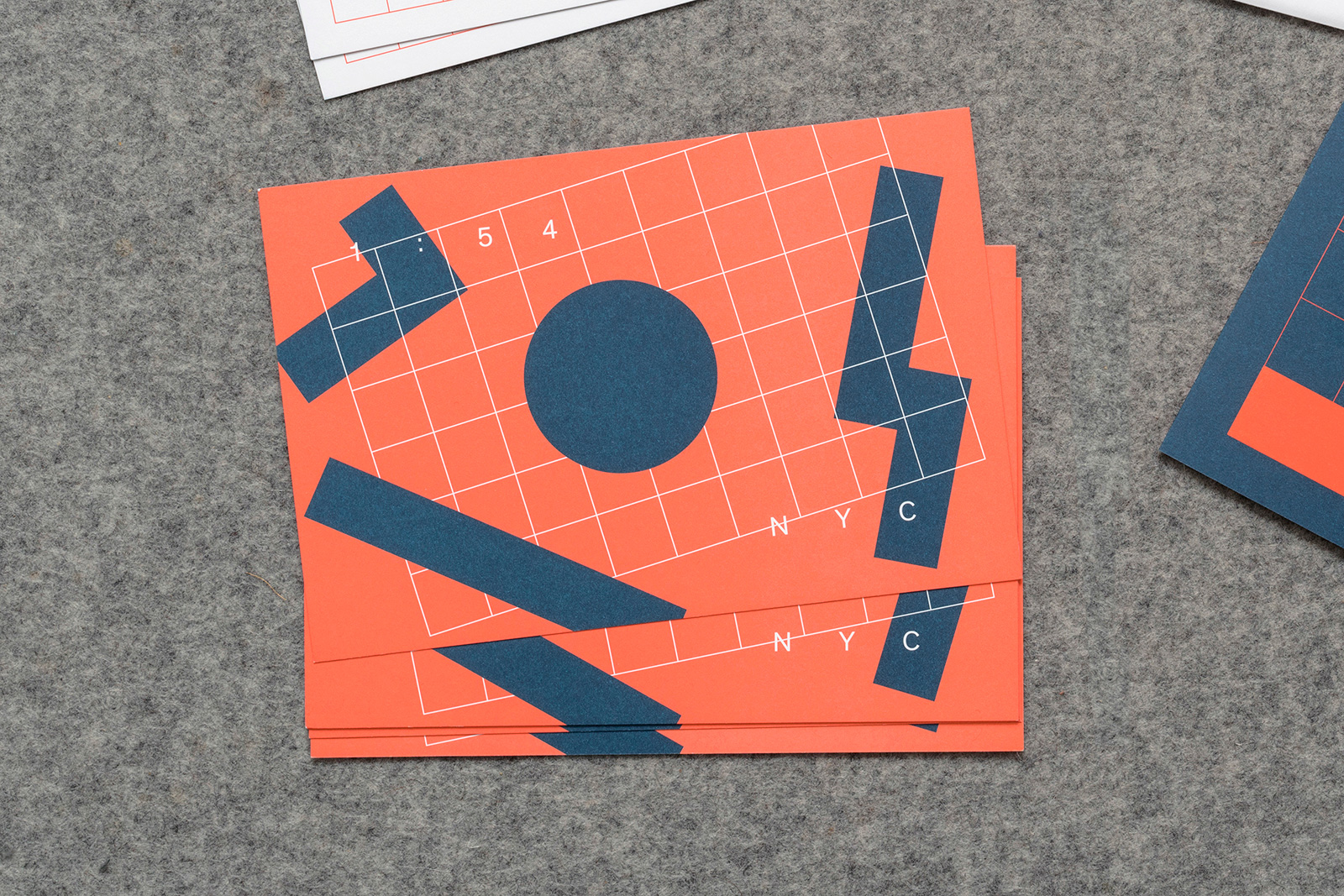
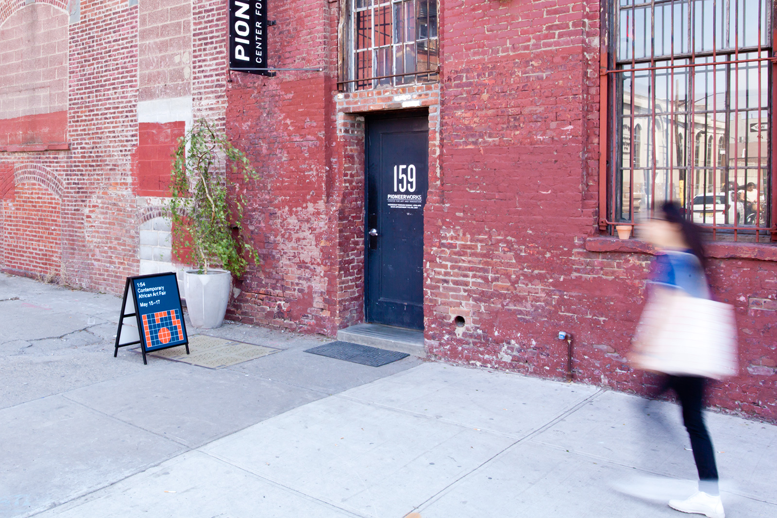
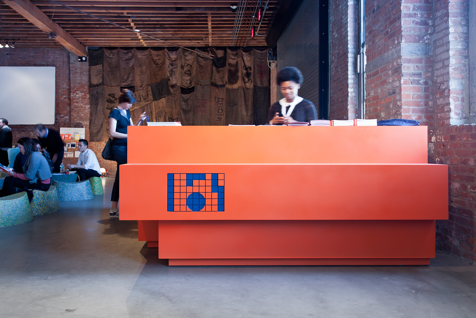
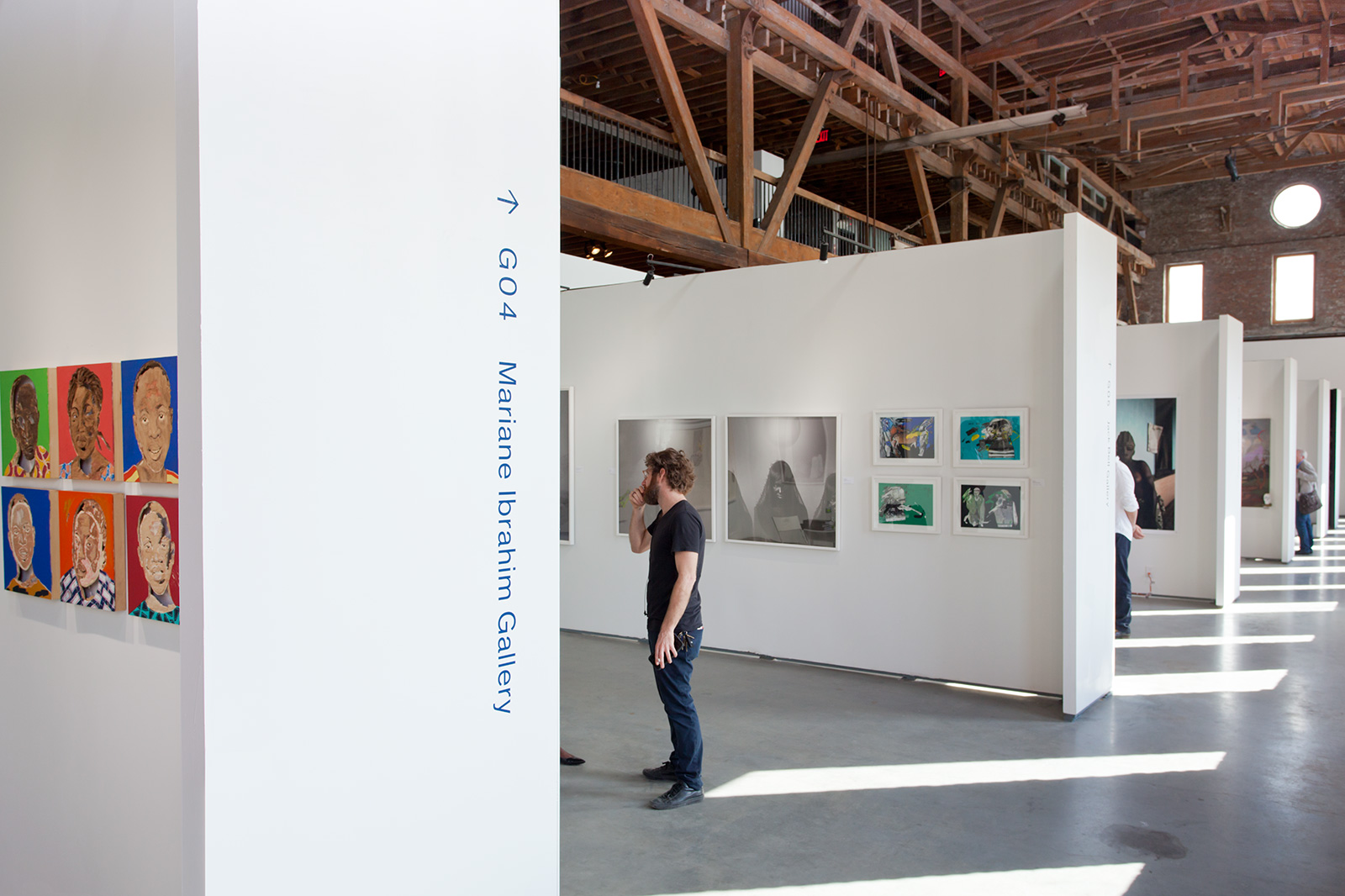
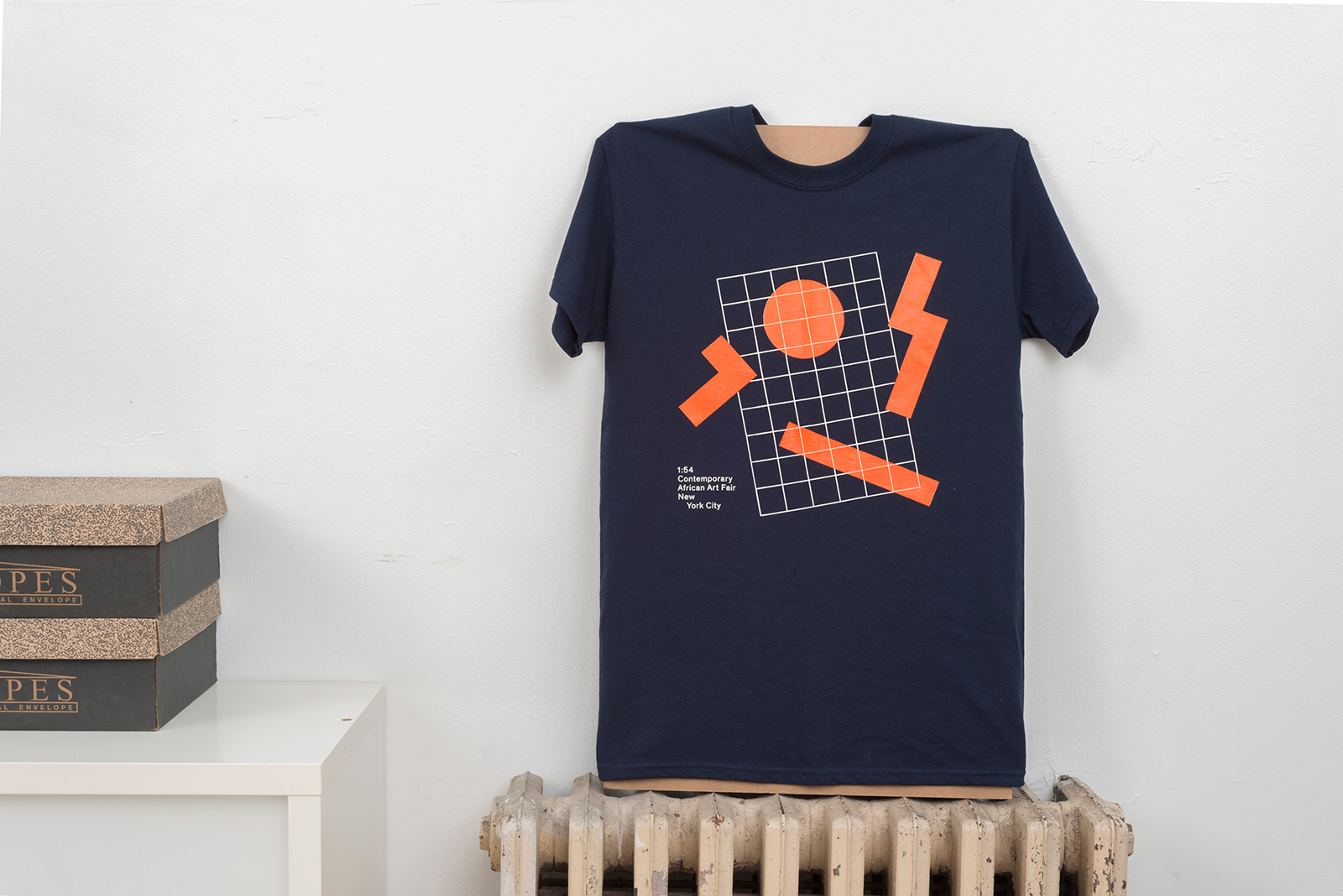
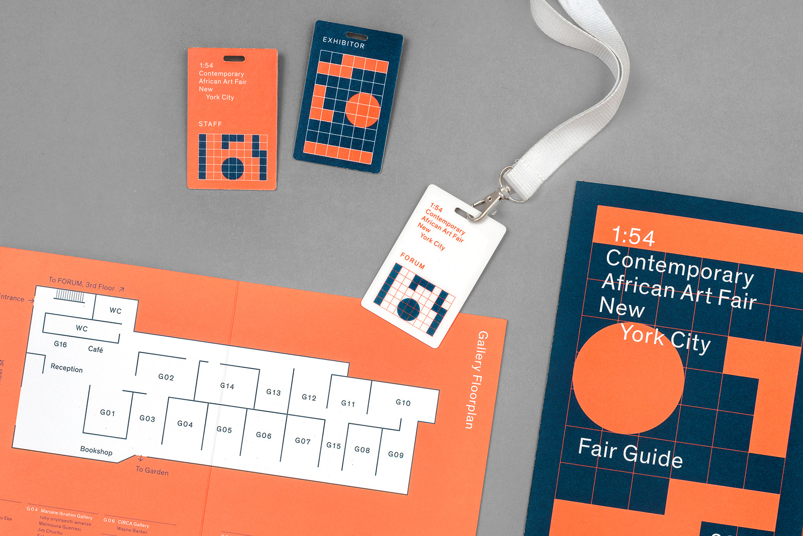
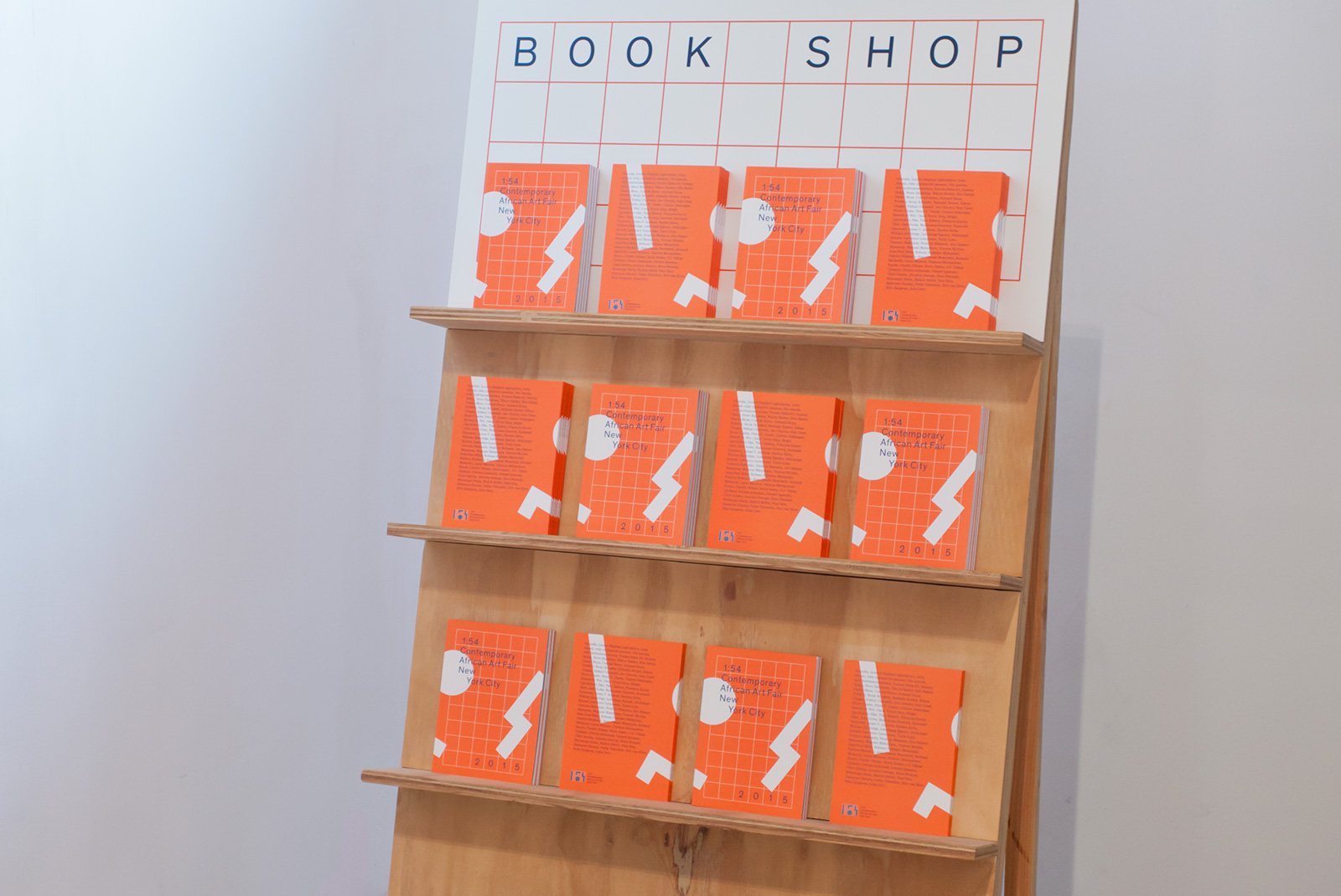
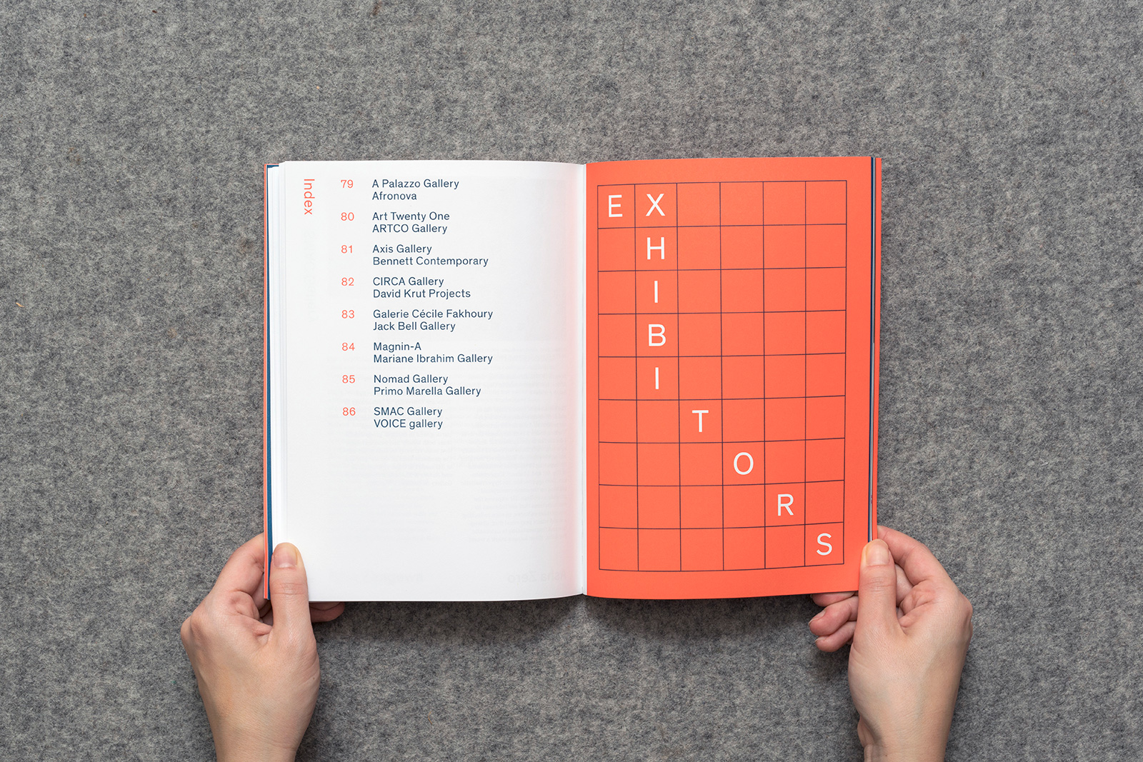
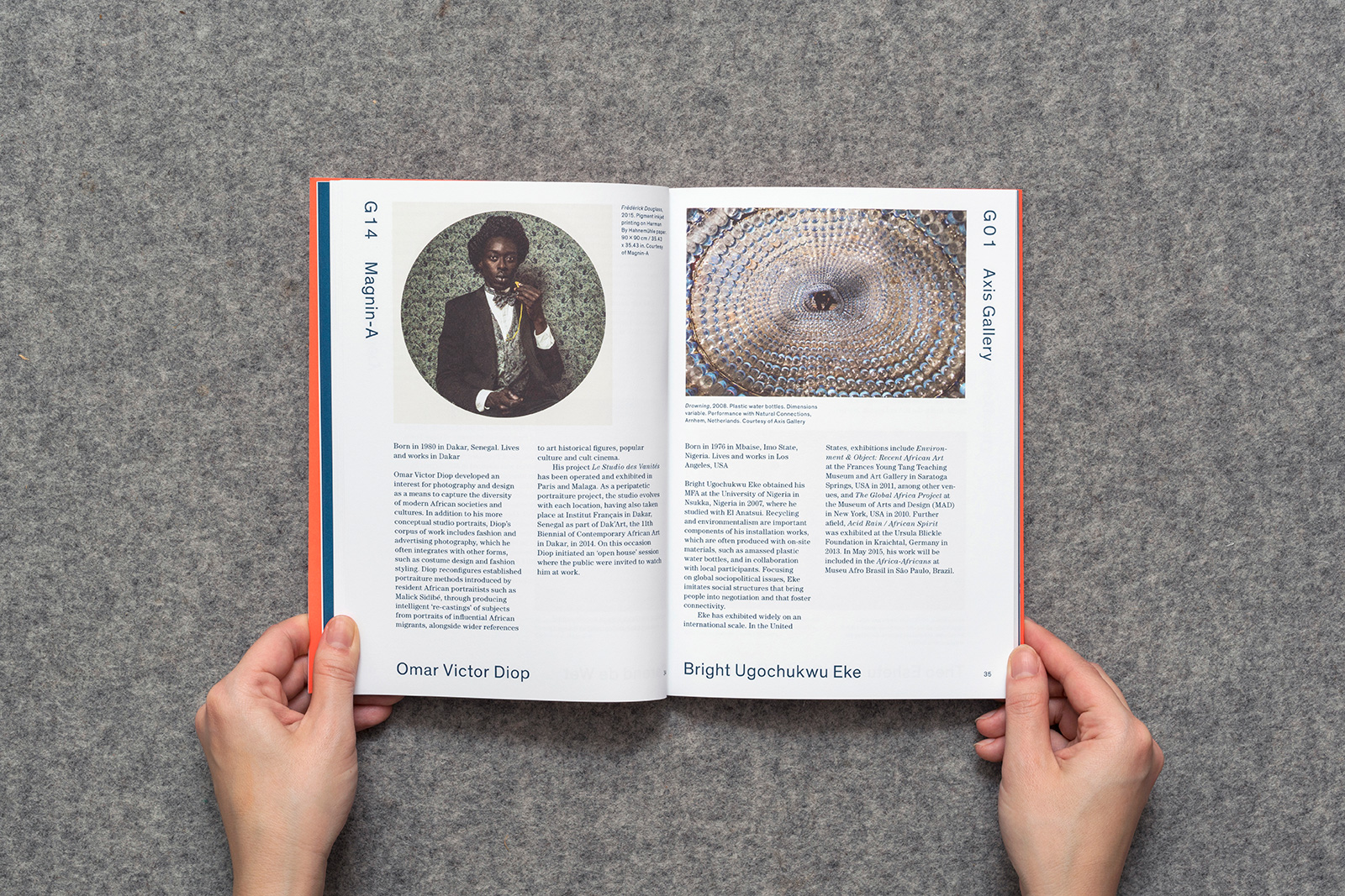
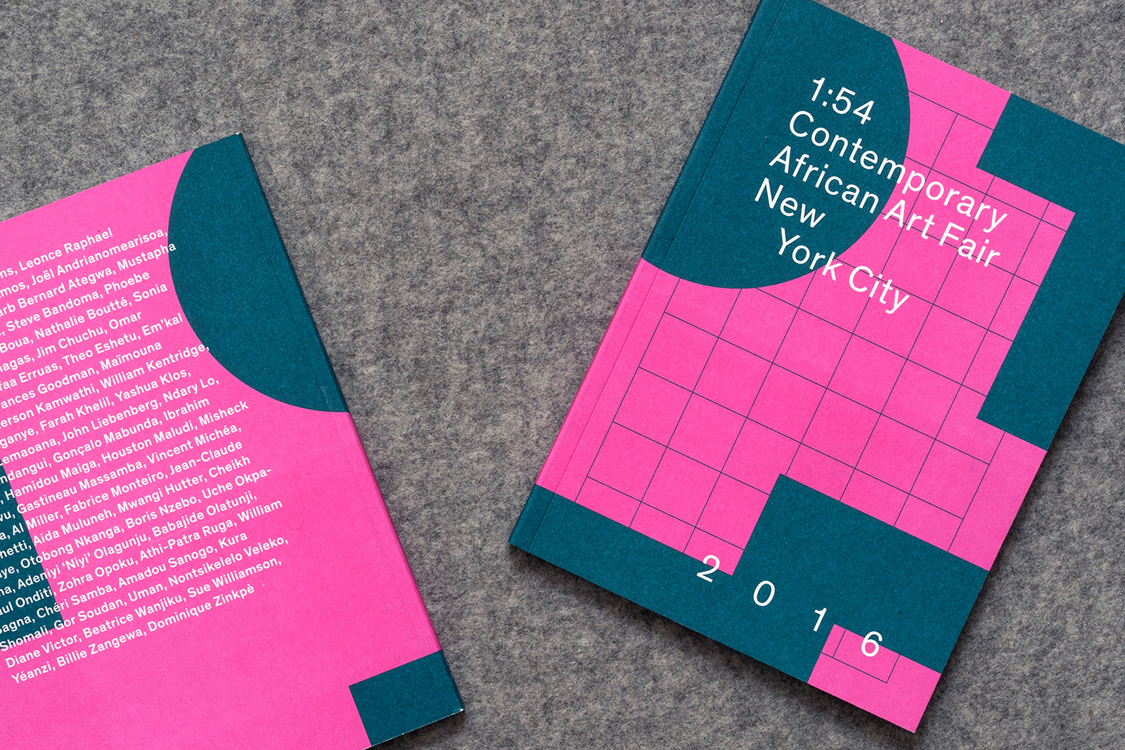
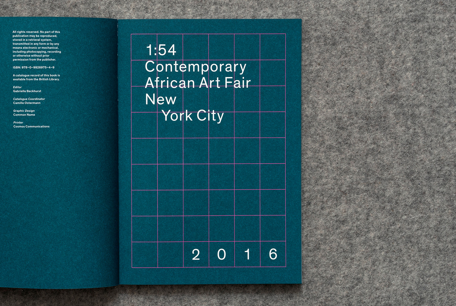
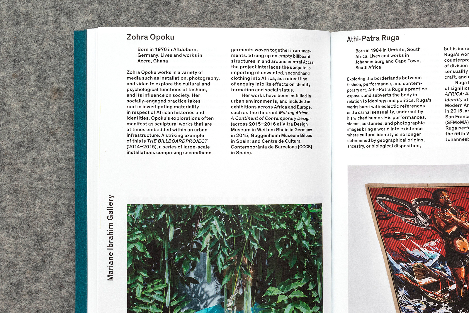
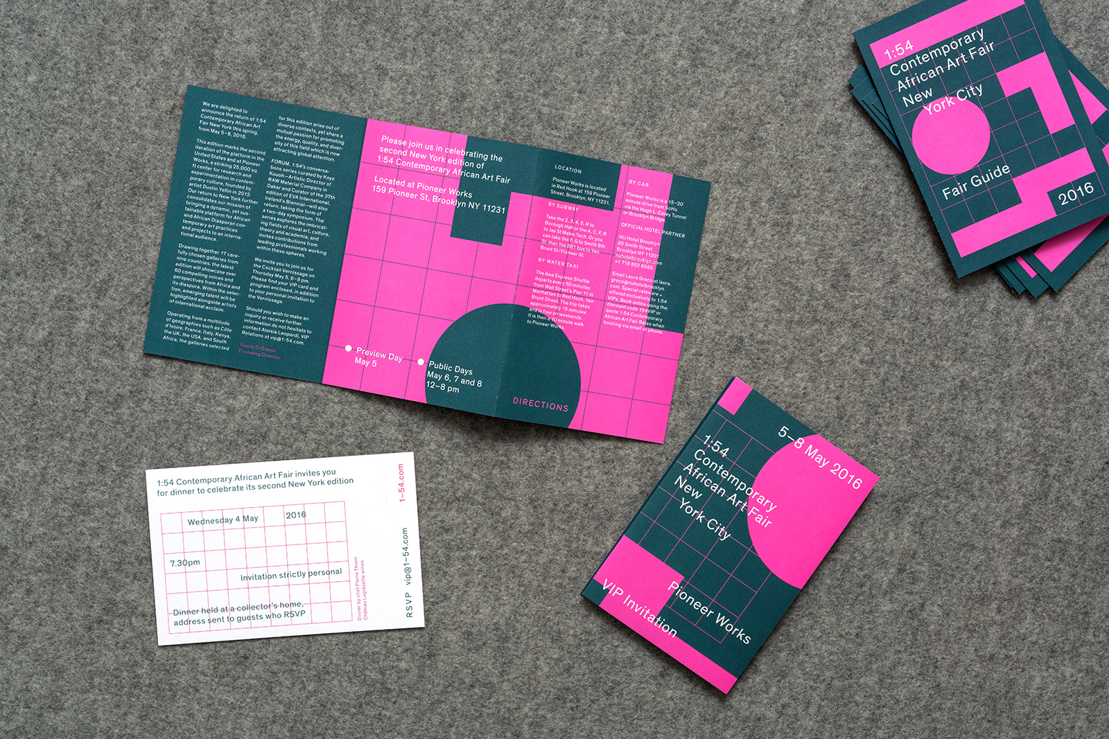
IDENTITY REFRESH, WEBSITE, and APPLICATIONS for 1:54 CONTEMPORARY AFRICAN ART FAIR — To mark the first two New York editions of 1:54 African Art Fair, it was important to establish a new sub-identity for the young, London-based organization, and set it apart from the more established fairs which come to the city every spring. Playing off the name, the number of countries in Africa serves as a basis for the underlying grid used to design the original logo. The approach was to expose that grid, and use it as a scaffolding upon which a variety of textual information and graphics can be hung.
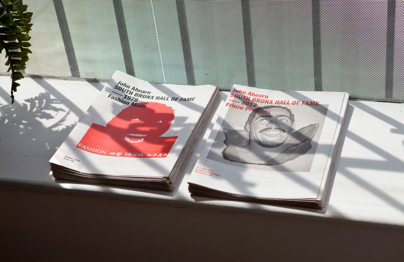
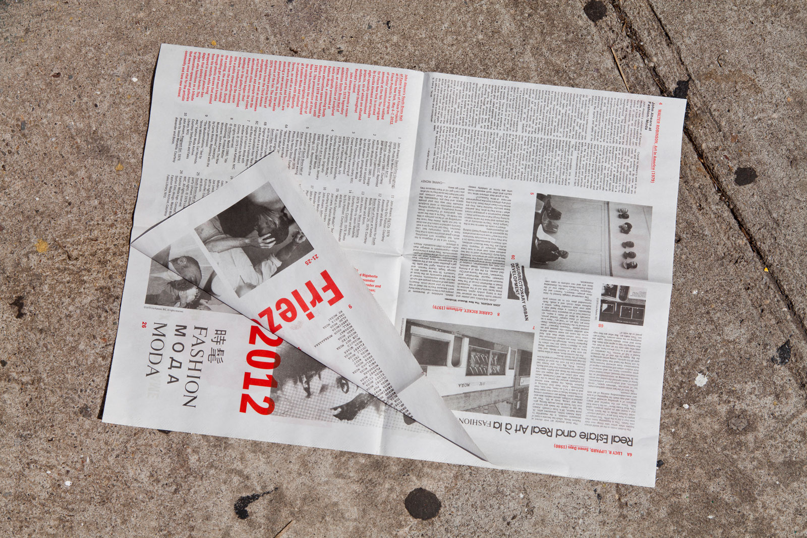
JOHN AHEARN: SOUTH BRONX HALL OF FAME for FRIEZE PROJECTS —— For the inaugural New York edition of London’s Frieze Art Fair, John Ahearn presented a reconstruction of his legendary 1979 exhibition South Bronx Hall of Fame. This show of sculptural casts was originally presented at Fashion Moda, a pioneering South Bronx gallery founded by Stefan Eins in 1978. The updated Frieze installation included a series of sculptures originally displayed at Fashion Moda and realized in collaboration with Rigoberto Torres, as well as a casting station where Ahearn and Torres made a new series of commissioned portraits, live for the duration of the fair.
Newsletter interior
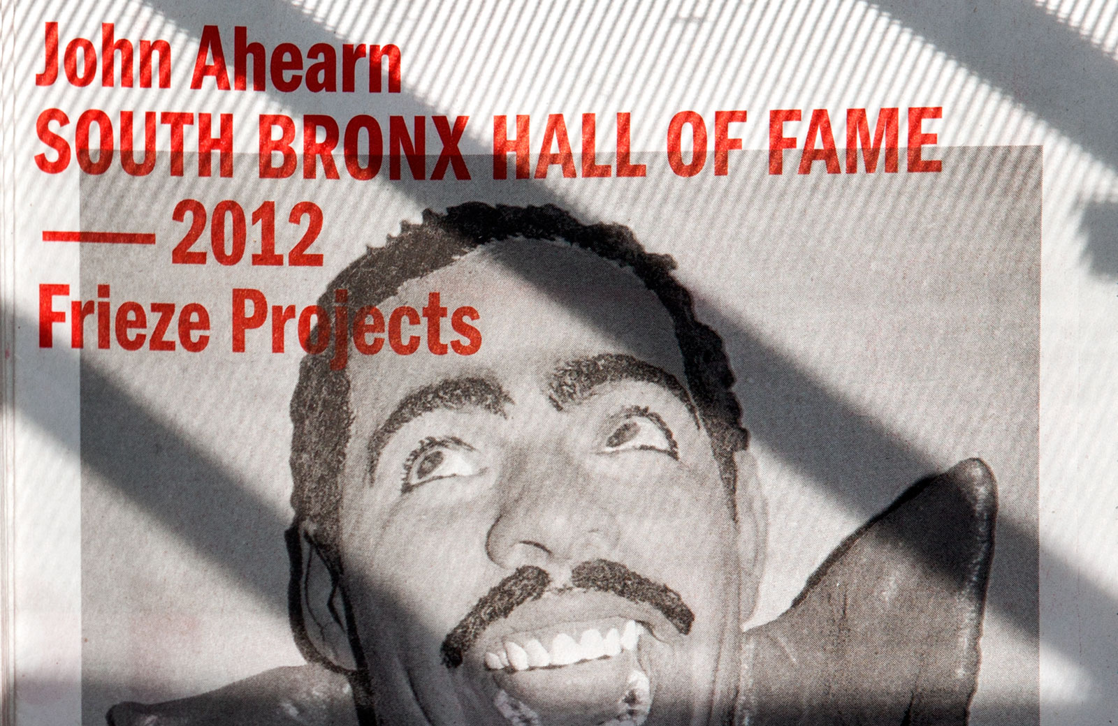
Cover detail
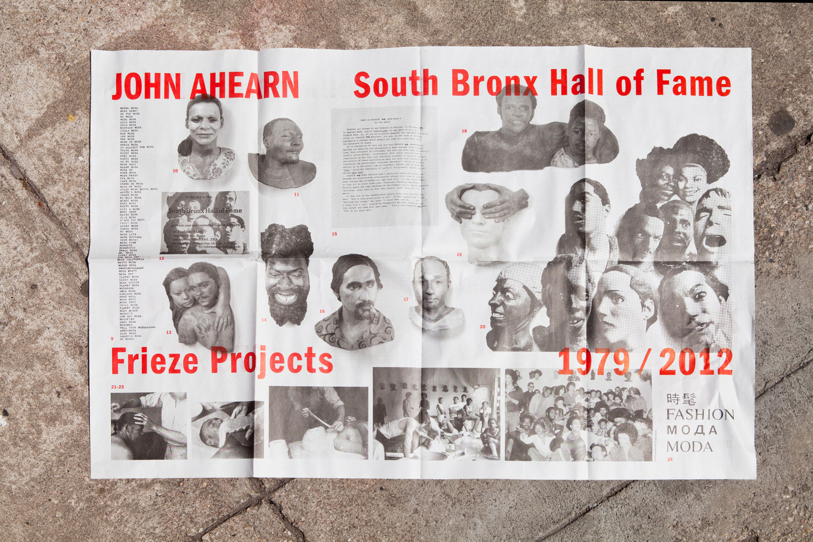
Exhibition poster
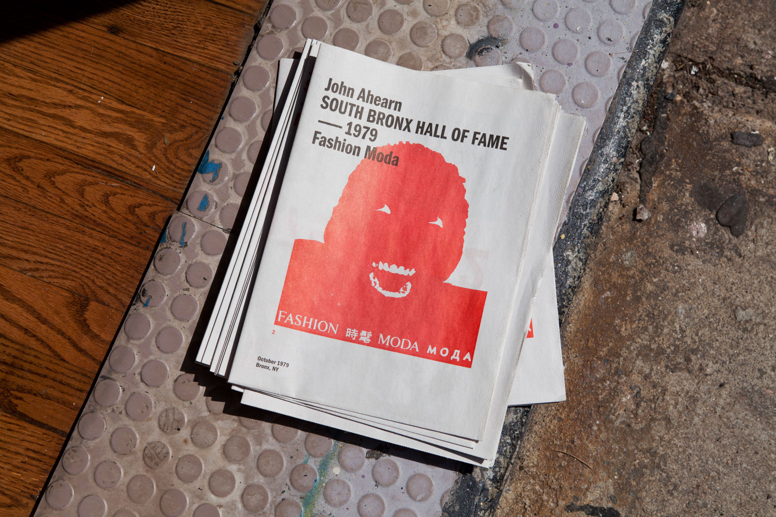
Alternate cover
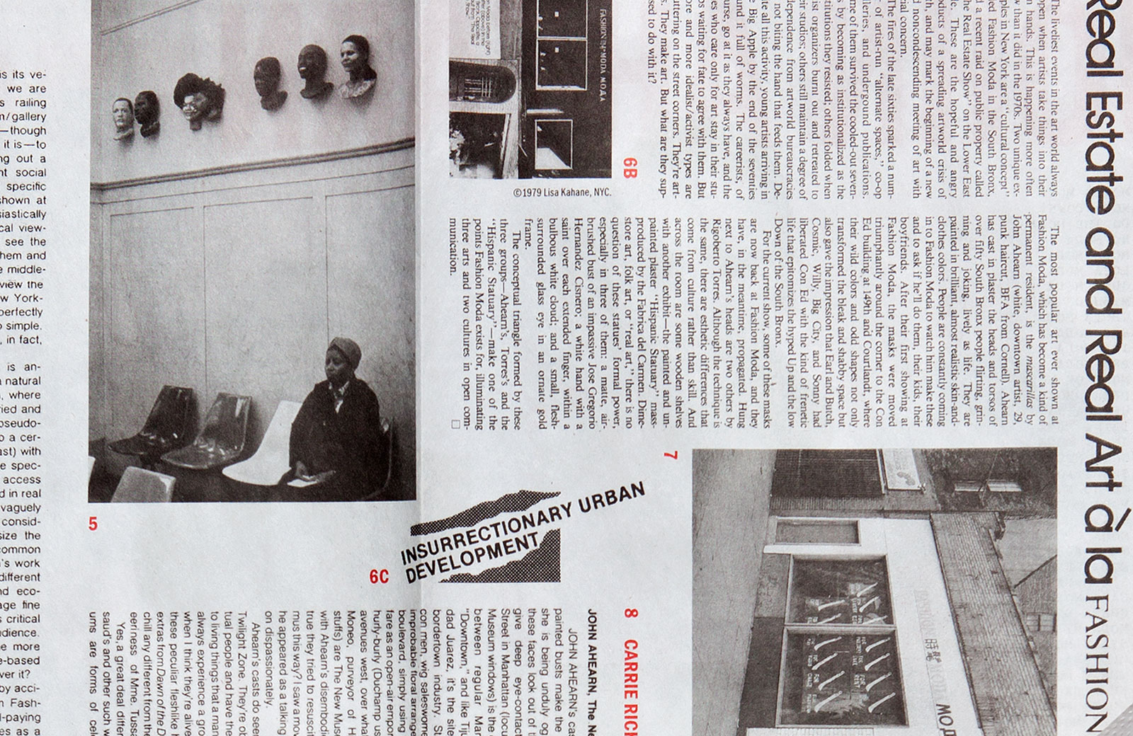
Newsletter design, 2012
Frieze Projects: Cecilia Alemani, Curator
Natalie Bell, Curatorial Assistant
16.5×22.75 in (419×578 mm)
Newsprint
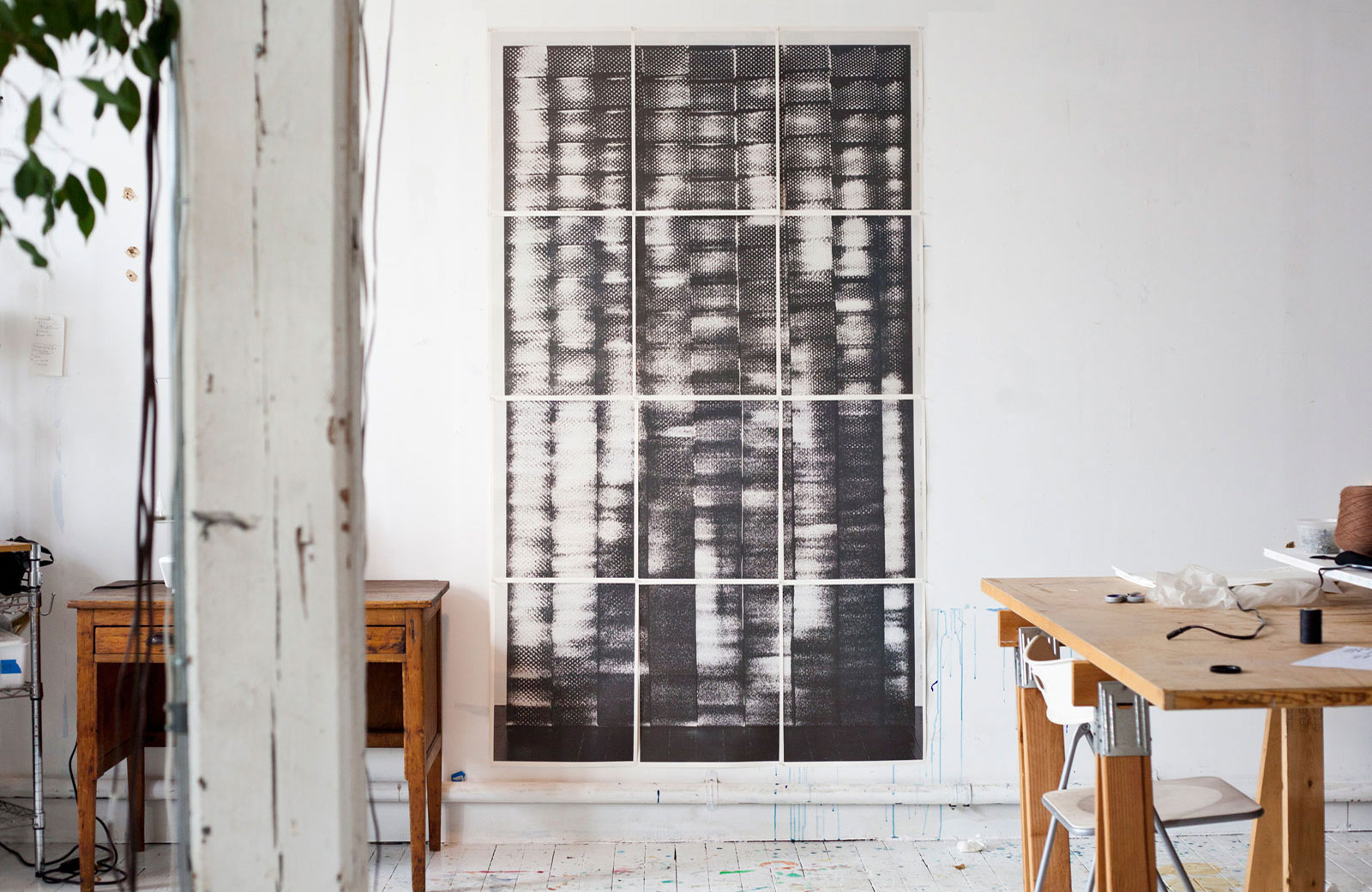
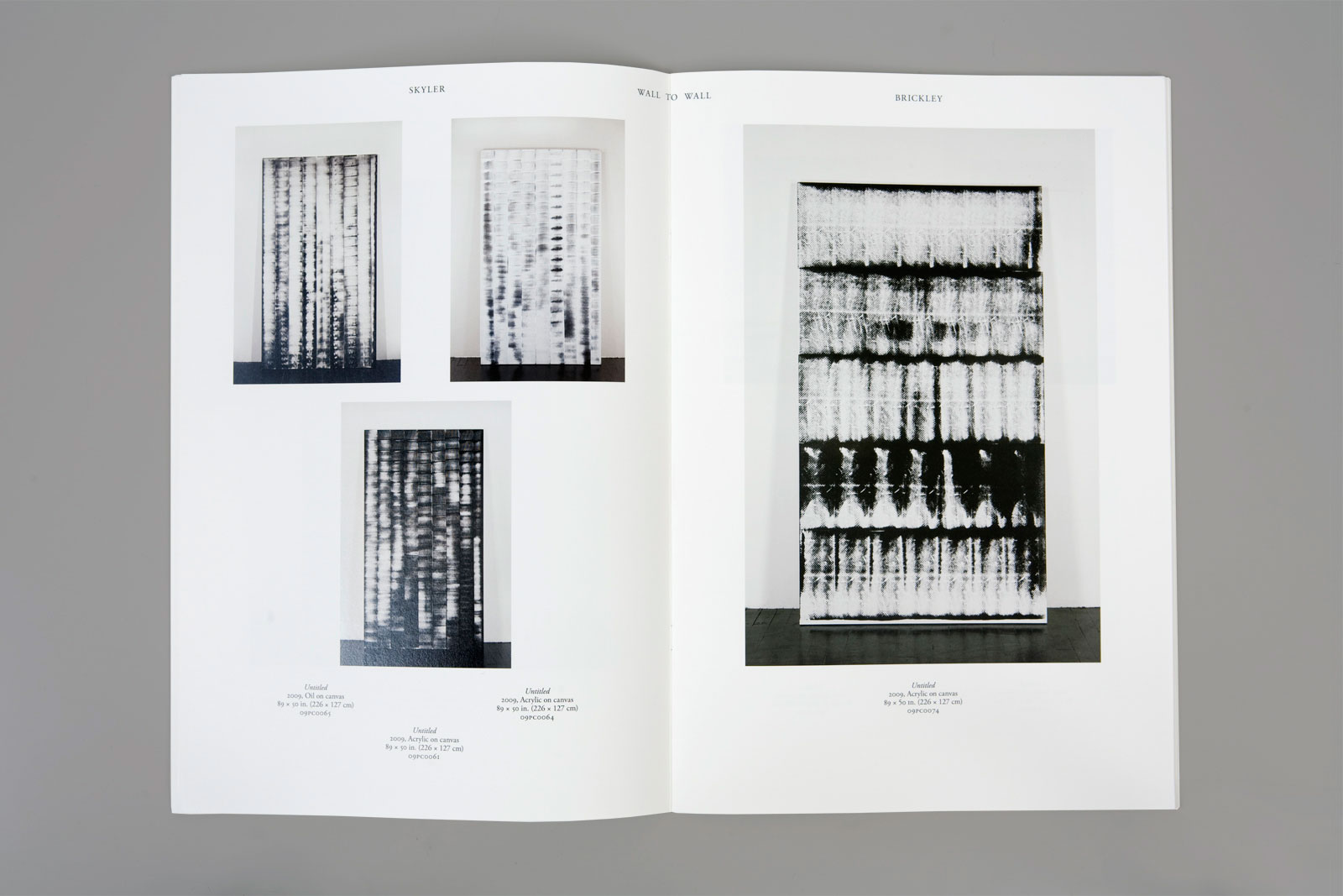
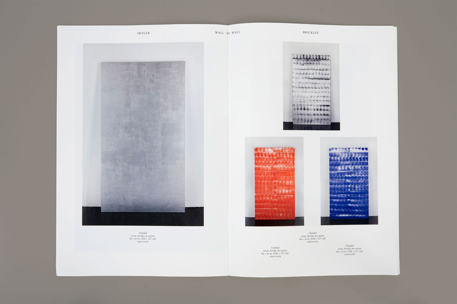
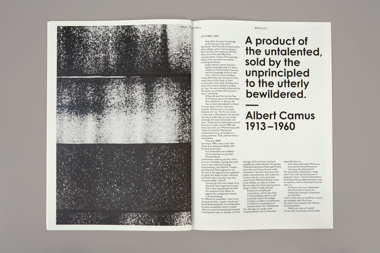
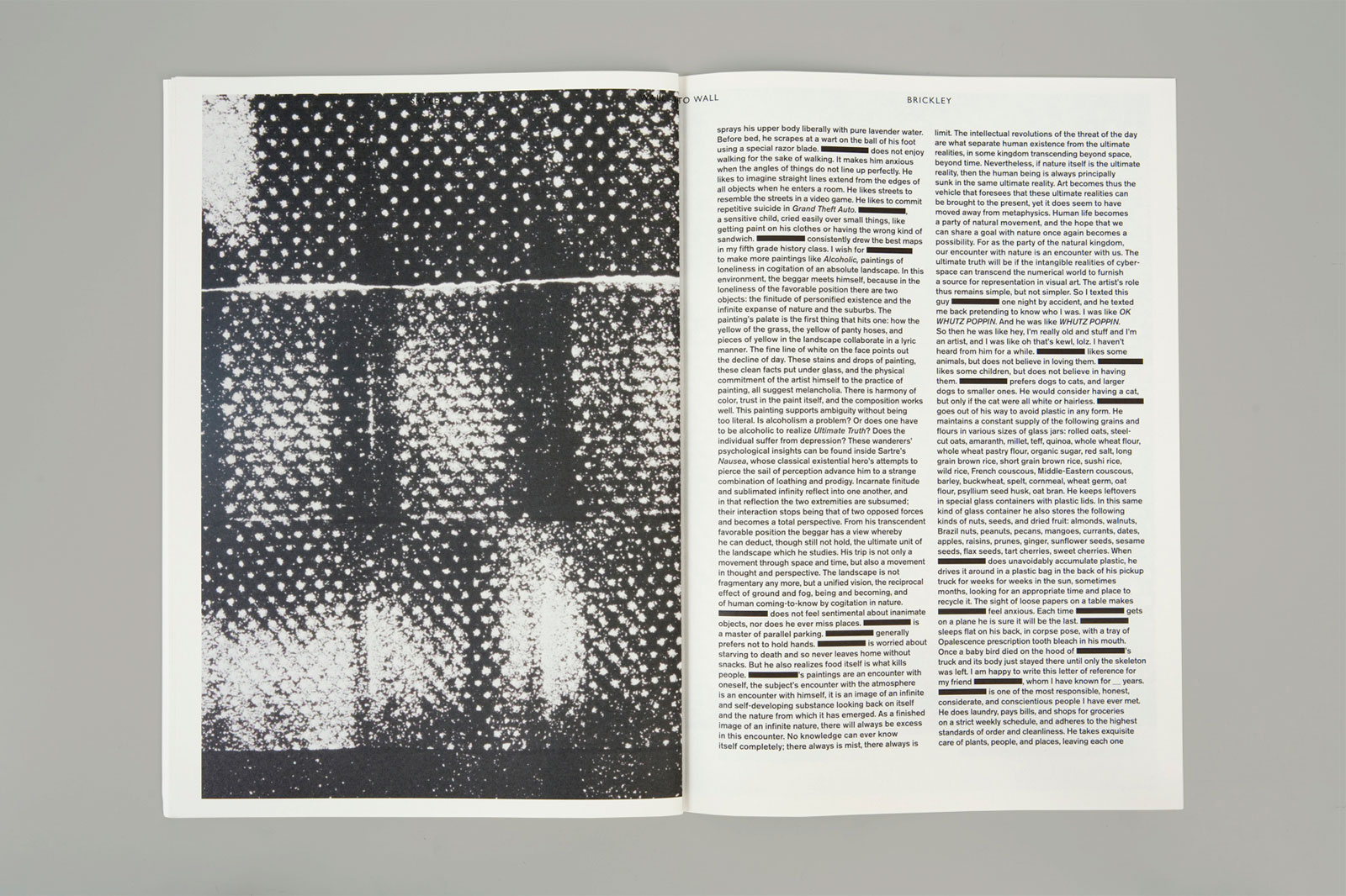
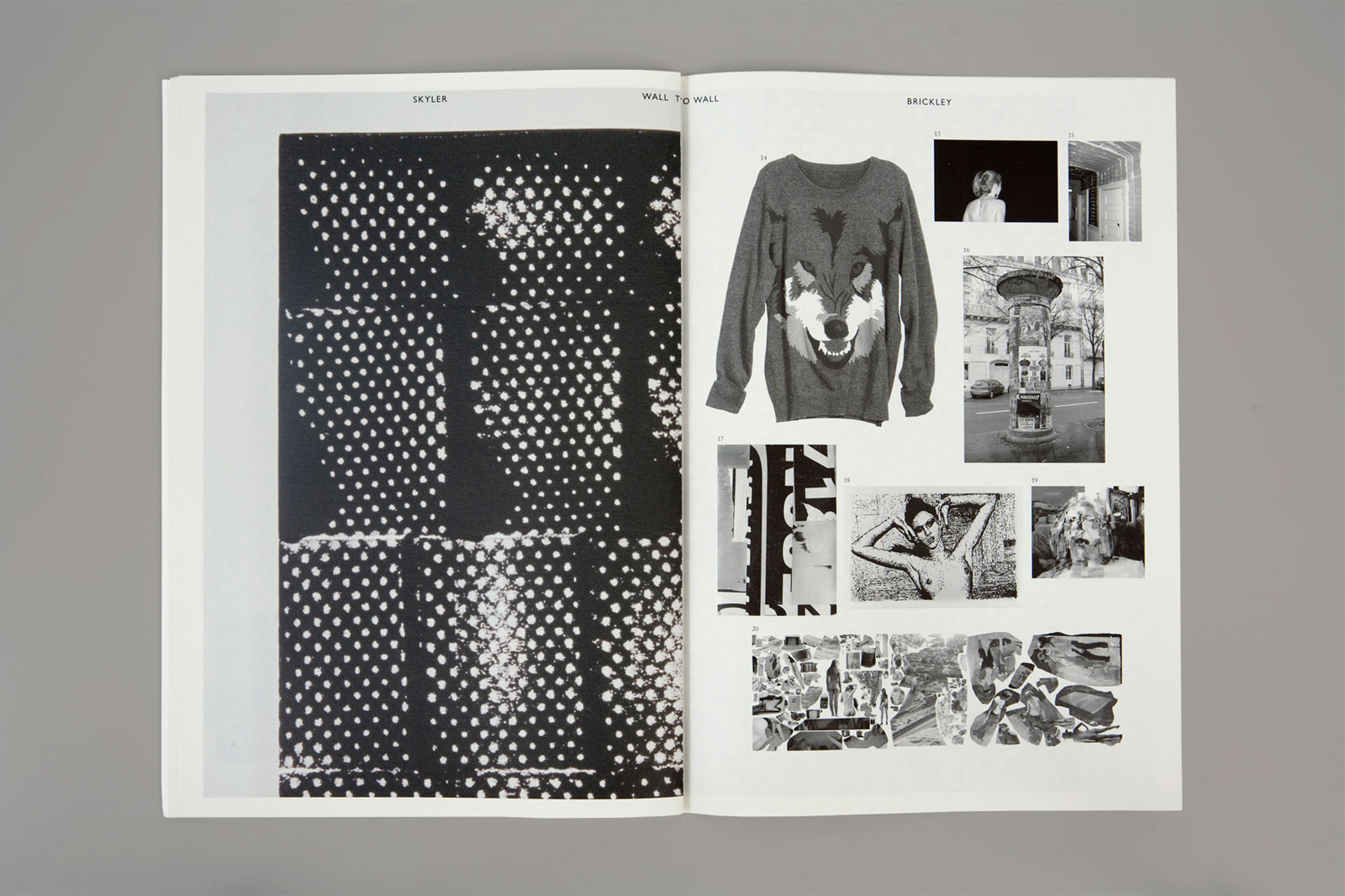
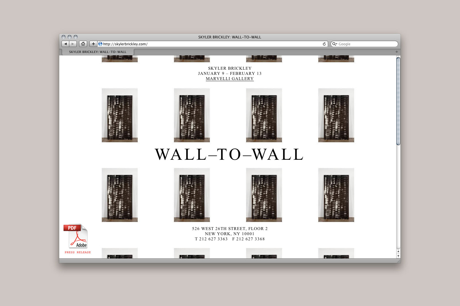
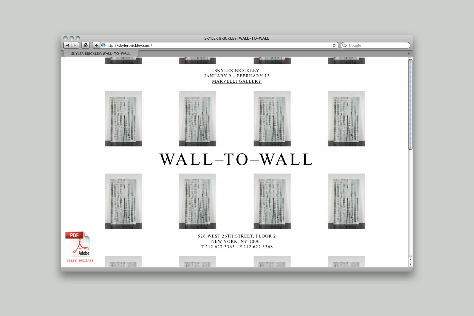
WALL-TO-WALL for SKYLER BRICKLEY and MARVELLI GALLERY —— In his show Wall-to-Wall, the artist Skyler Brickley explores notions of analog reproduction and how the effects of age, translation, and the environment can lead to uniquely imperfect copies. His works are large, system-driven paintings, recalling enlarged Xerox prints or filmstrips. We were asked to catalog these works into a single volume, positioning them alongside an archive of reference texts, found imagery, and interviews. Like the work itself, the book is fragmentary; it can be spilt into two distinct catalogs, read out of sequence, or reshuffled into a single, life-sized print.
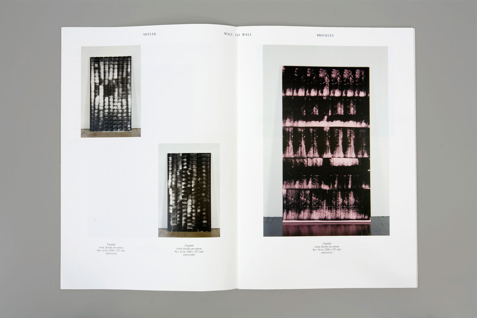
Plates section
References section
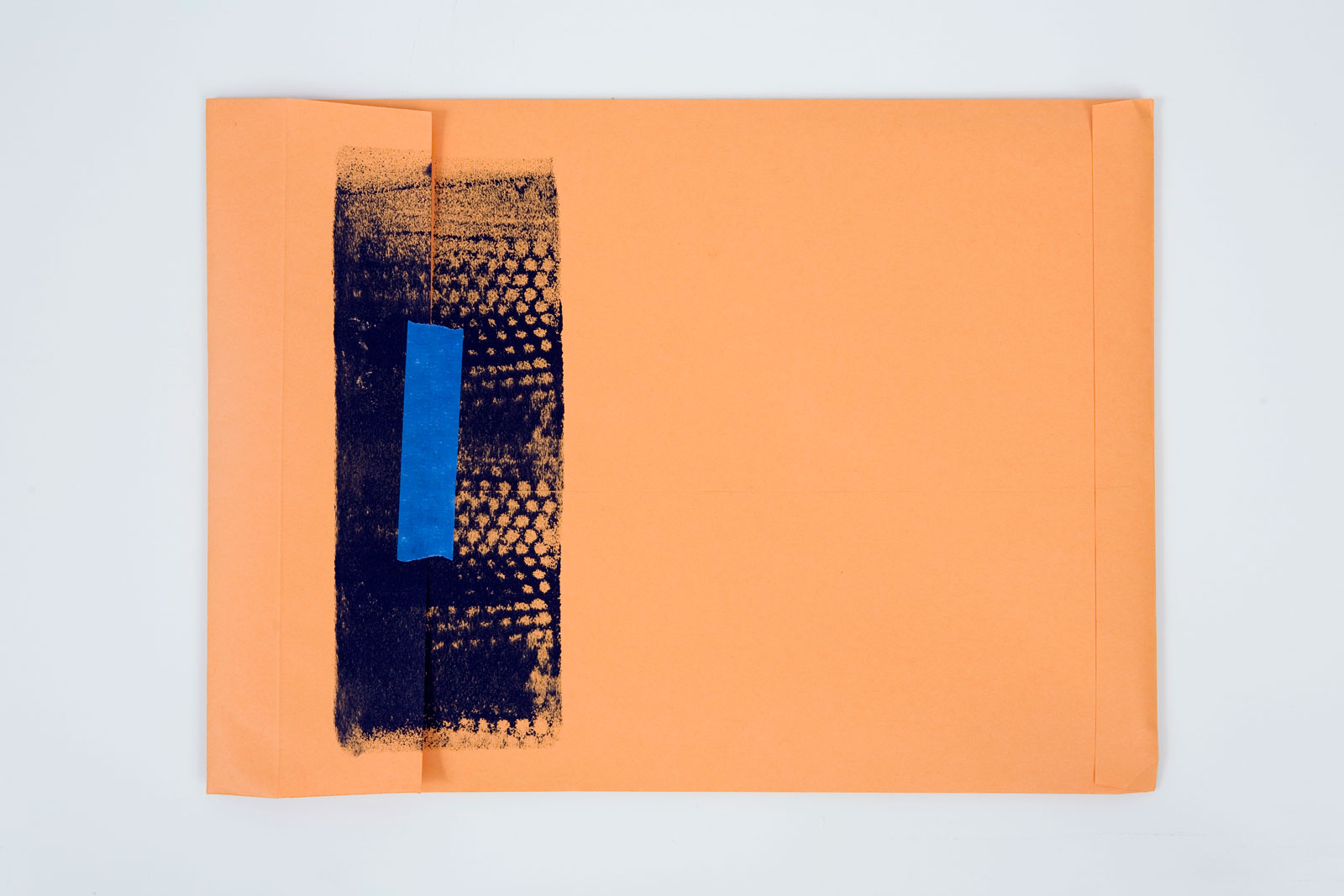
Packaging
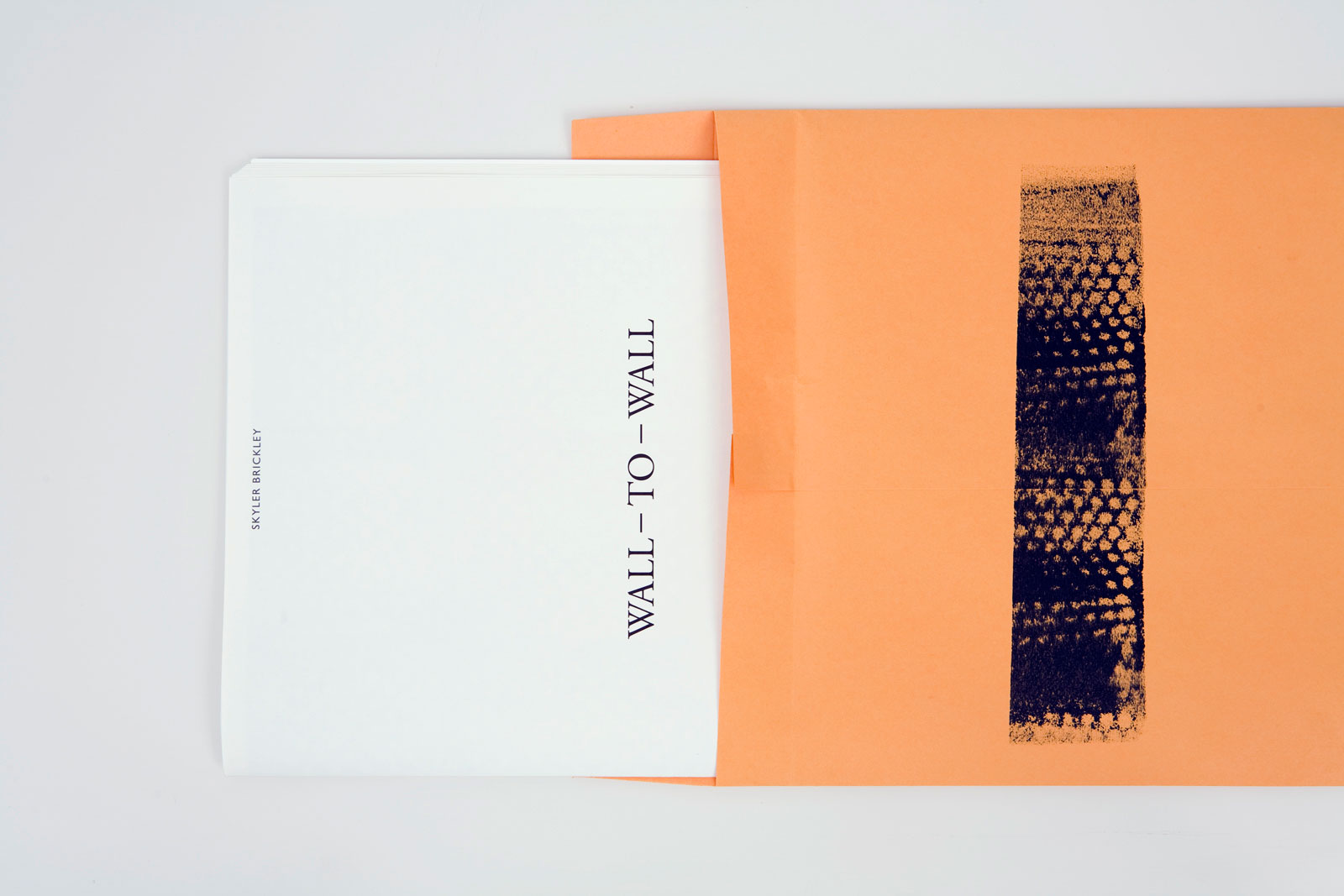
Catalog and web invitation, 2010
11×16 in (279×411 mm), 70 pages
Offset print, saddle-stitched
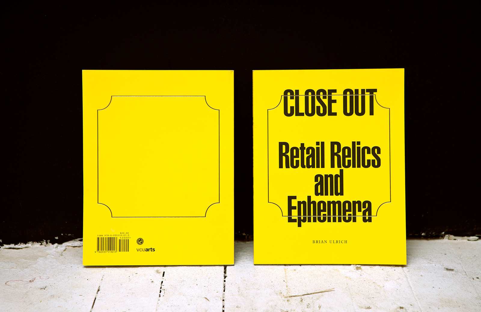
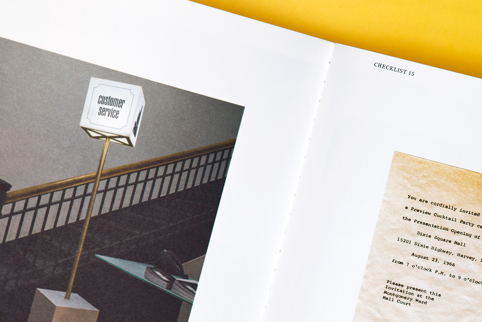
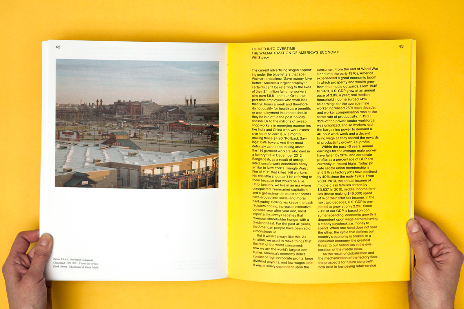
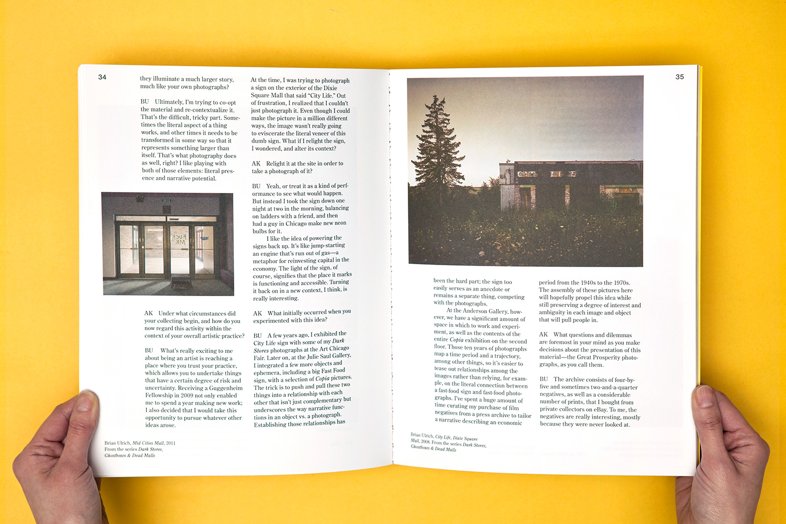
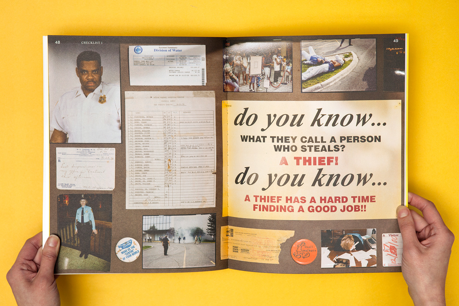
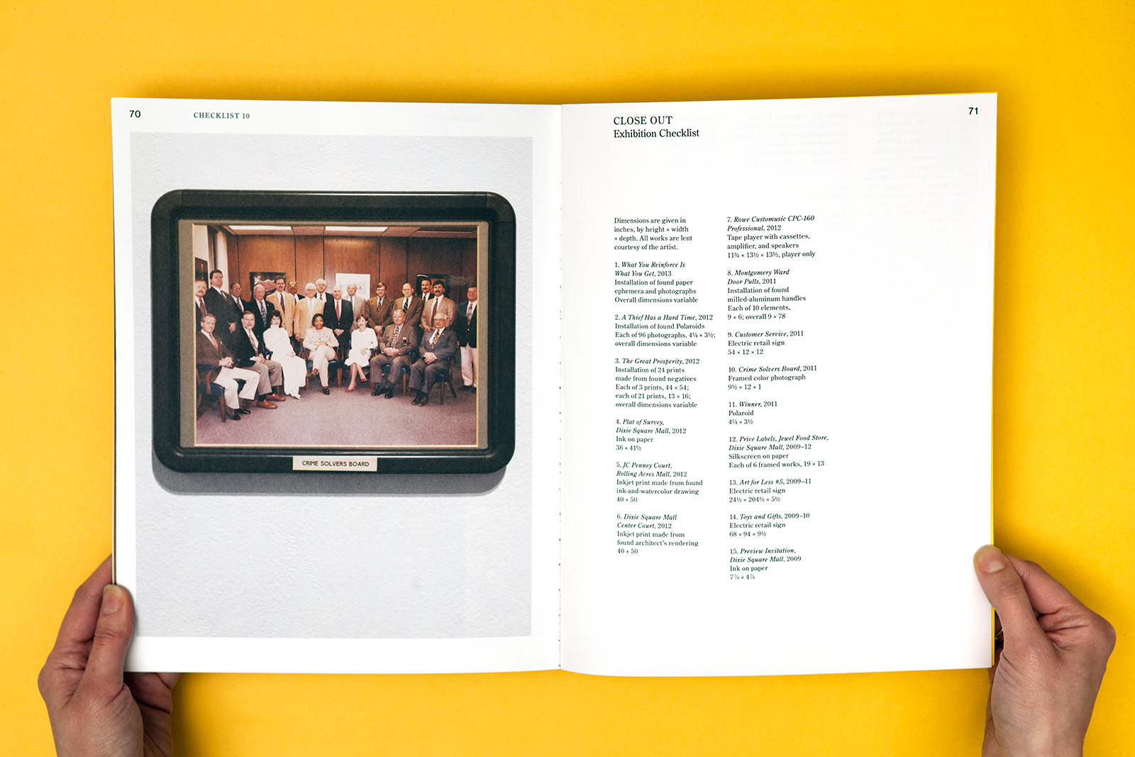
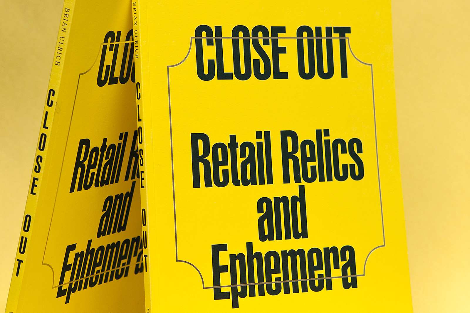
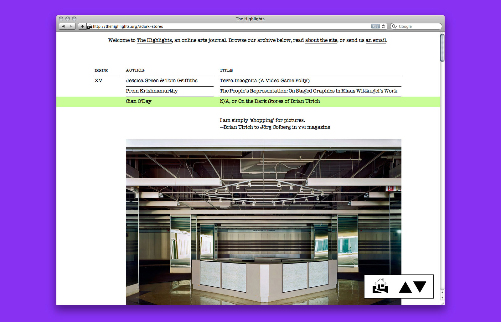
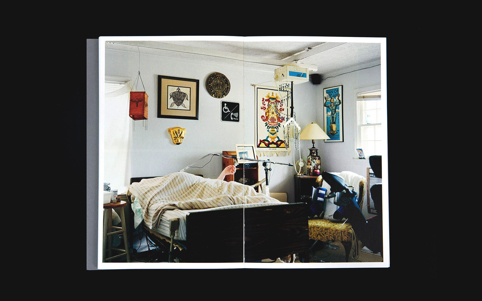
CLOSE OUT for BRIAN ULRICH and VCU ANDERSON GALLERY — The photographer Brian Ulrich is known to document the effects of post-war capitalism through the lens of America’s fascination with shopping. As part of a show at Virgina Commonwealth’s Anderson Gallery, Ulrich gathered a series of found images and objects, placing them alongside his retail photographs and images of disused spaces. This cache of ephemera from the period of ‘Great Prosperity’ when malls and supermarkets were frequented poses a stark contrast to the images he takes today, which detail the steep decline of America’s large-scale shopping complexes.
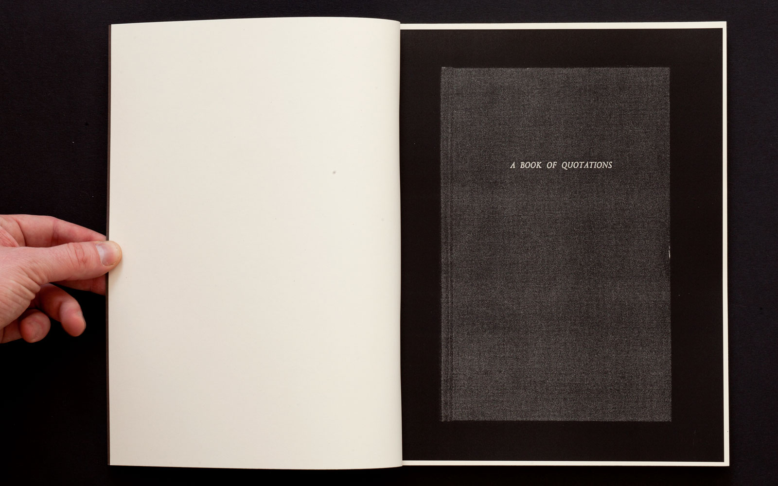
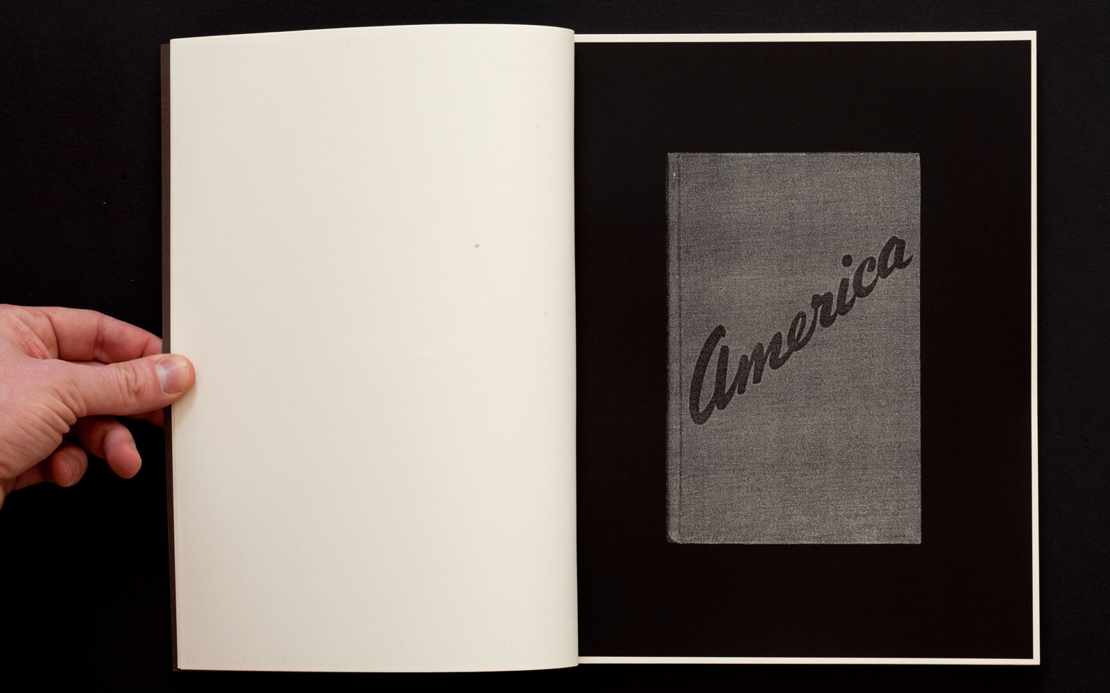
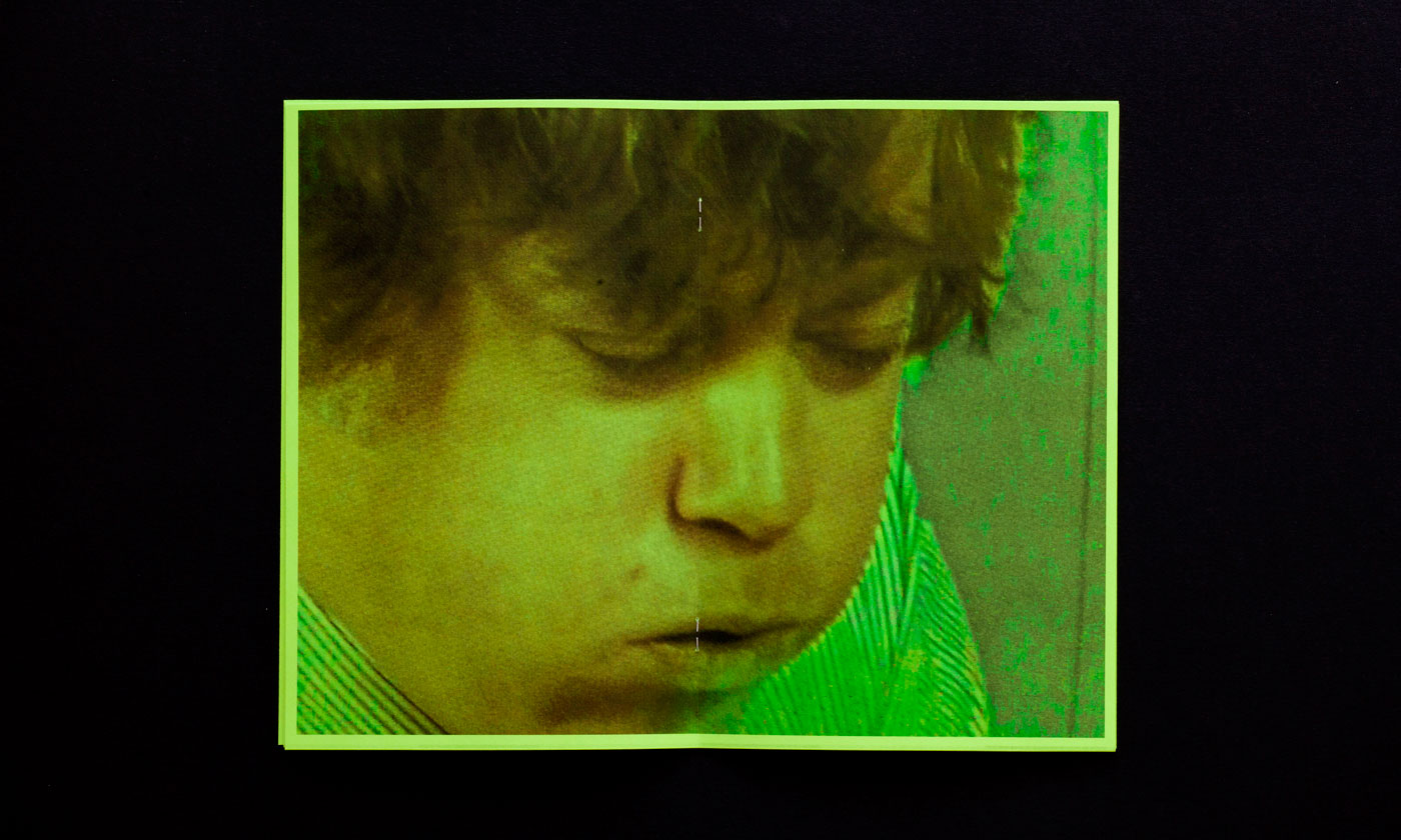
VARIOUS TITLES for HORSES THINK PRESS —— Horses Think Press is a Brooklyn-based imprint founded in 2010 by artist Ofer Wolberger. Initially begun as a self-publishing project with the release of Wolberger’s 12 Books series, the roster now includes the work of other like-minded artists. Our collaboration with Horses Think spans nine separate titles, including Fractures and Other Injuries, Visitor, and Covers (Symbols & Color).
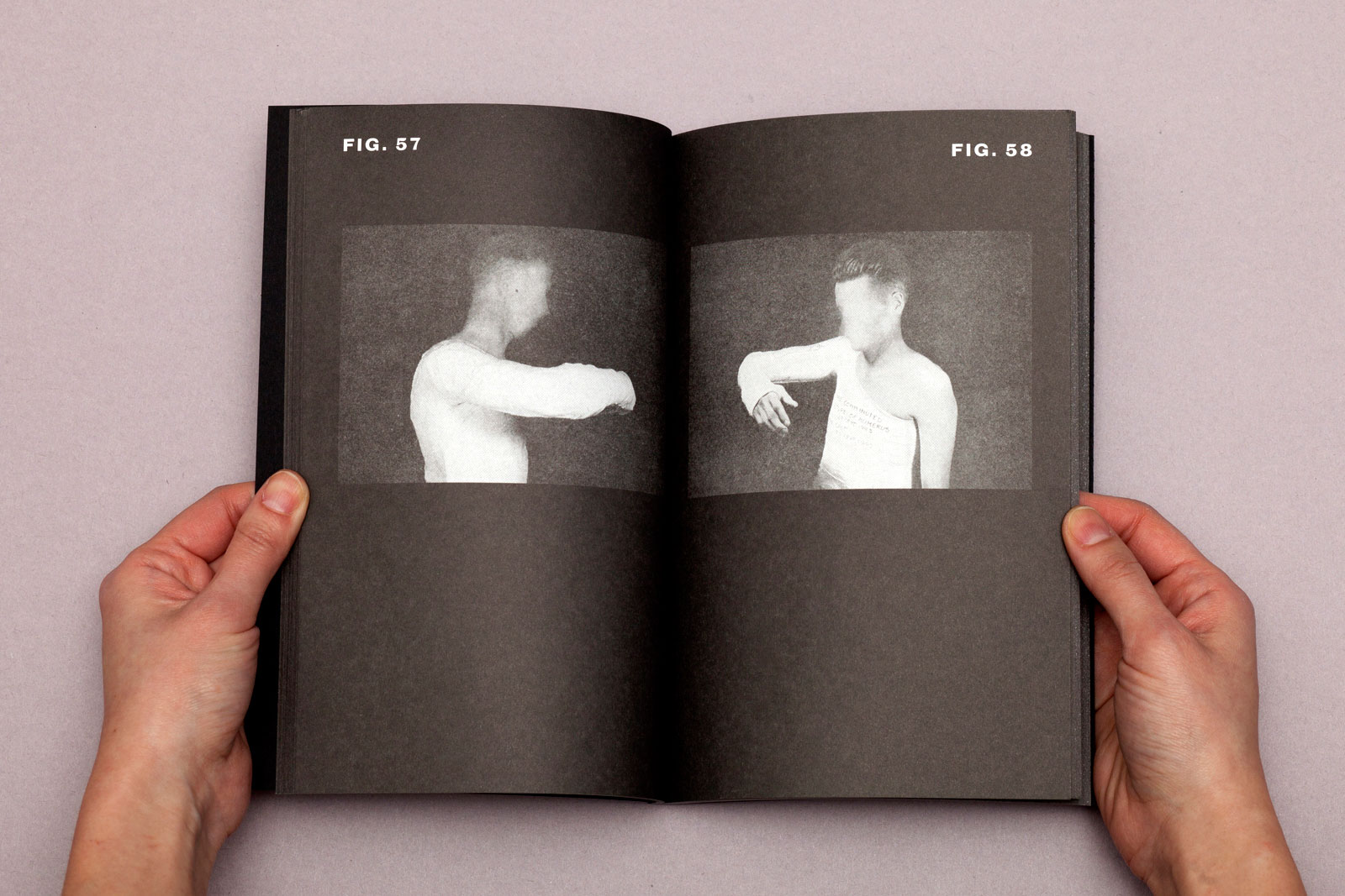
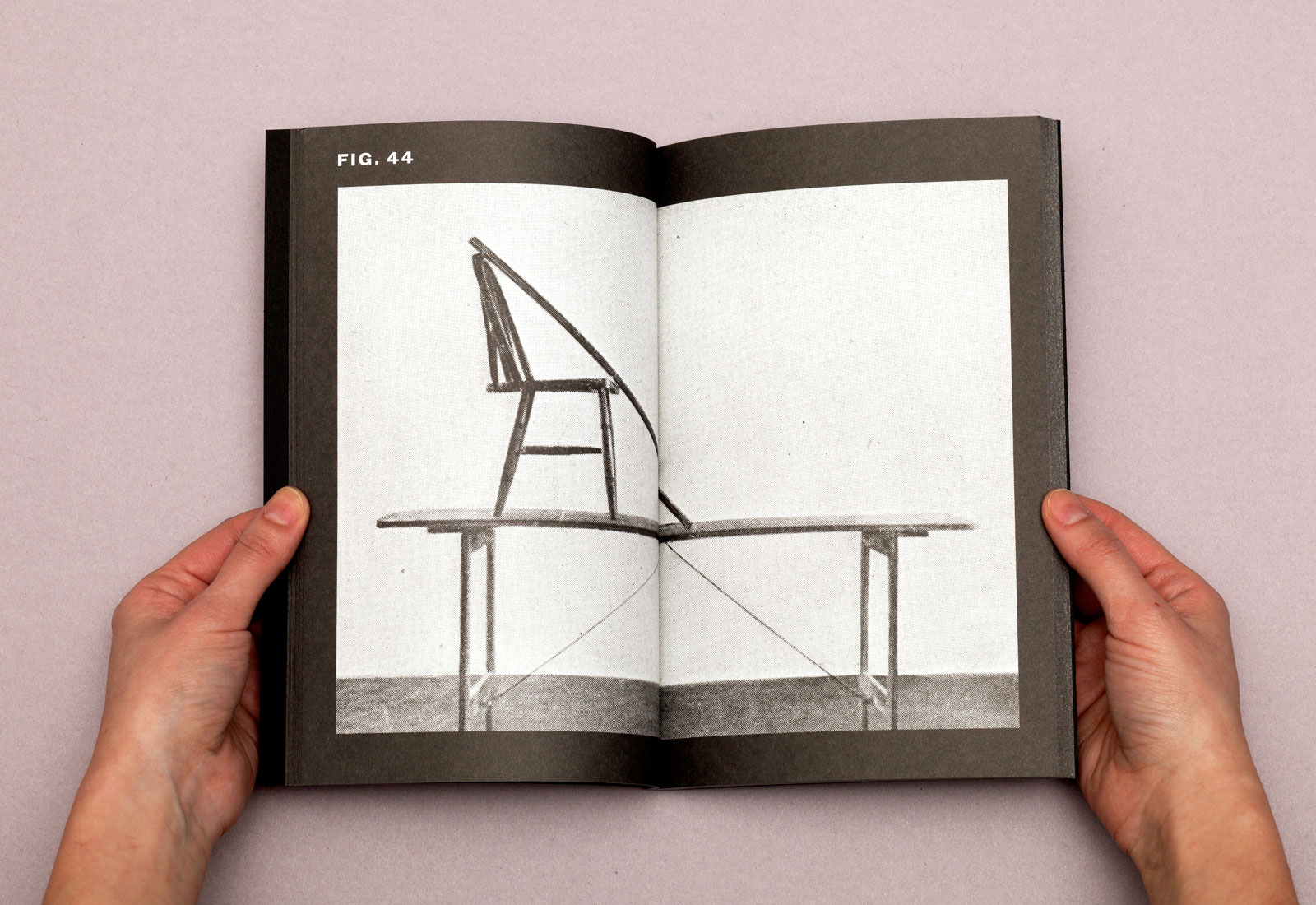
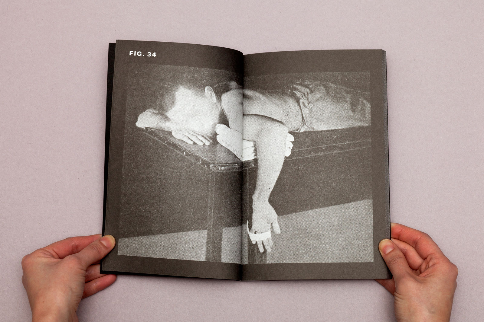
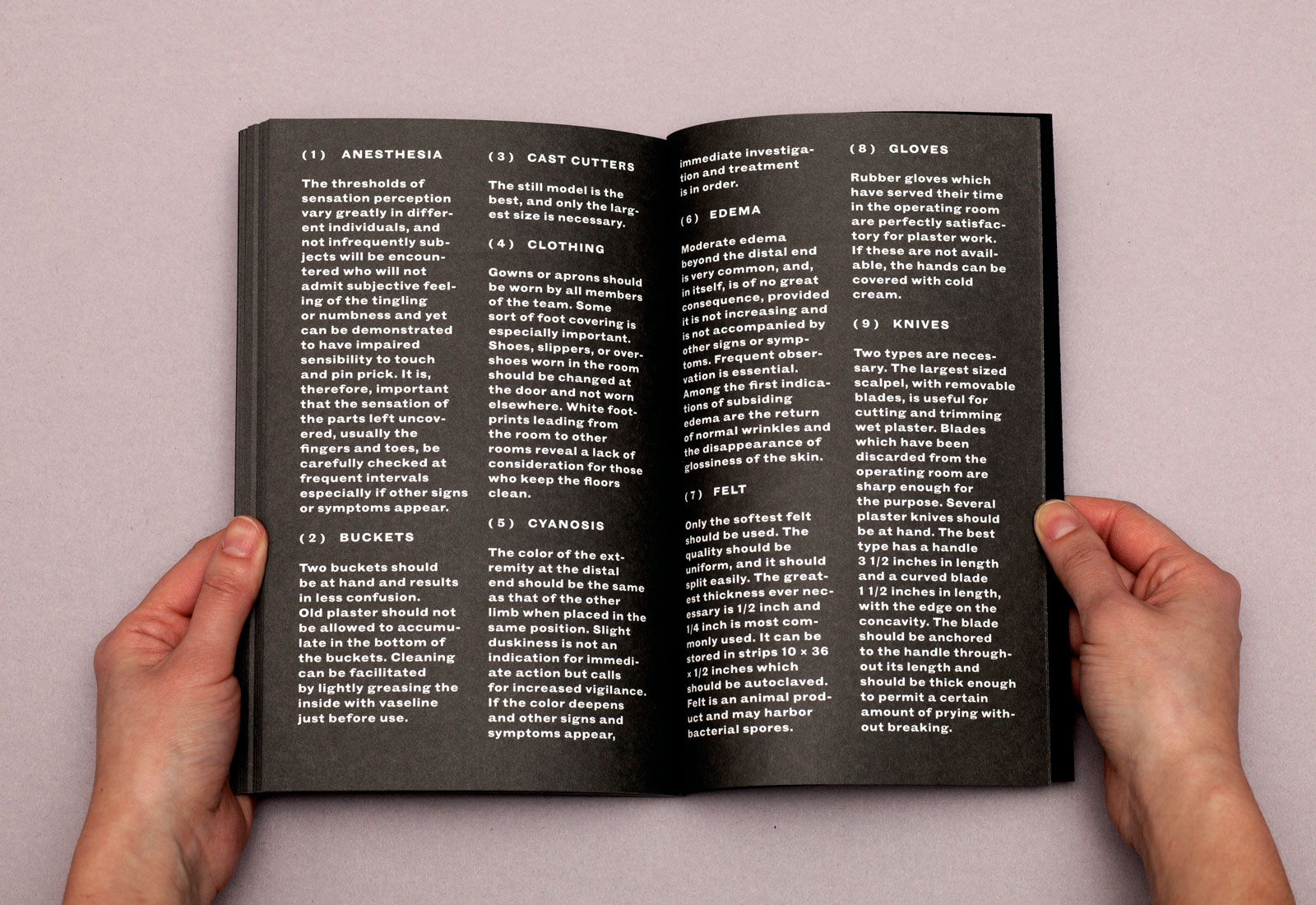
Fractures and Other Injuries, 2012 — A series of stark black and white photographs of faceless men, uncomfortably propped, bandaged, and seemingly held prisoner in dungeon-like spaces. The book concludes with an appendix of symptoms and tools.
X
5.5×8.5 in (140×215 mm), 80 pages
Offset print, perfect-bound
Edition of 125
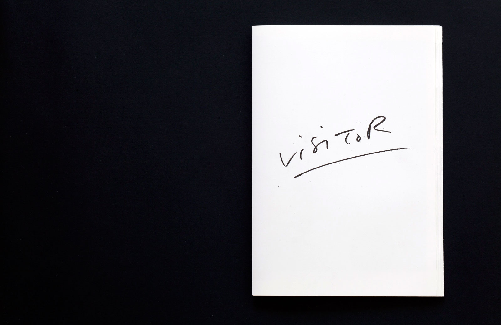
Visitor, 2011 — A portrait project depicting the same unidentified woman during the course of a few years. The project uses as its material the crude, disposable security photos that are taken automatically when one enters an office building as a visitor.
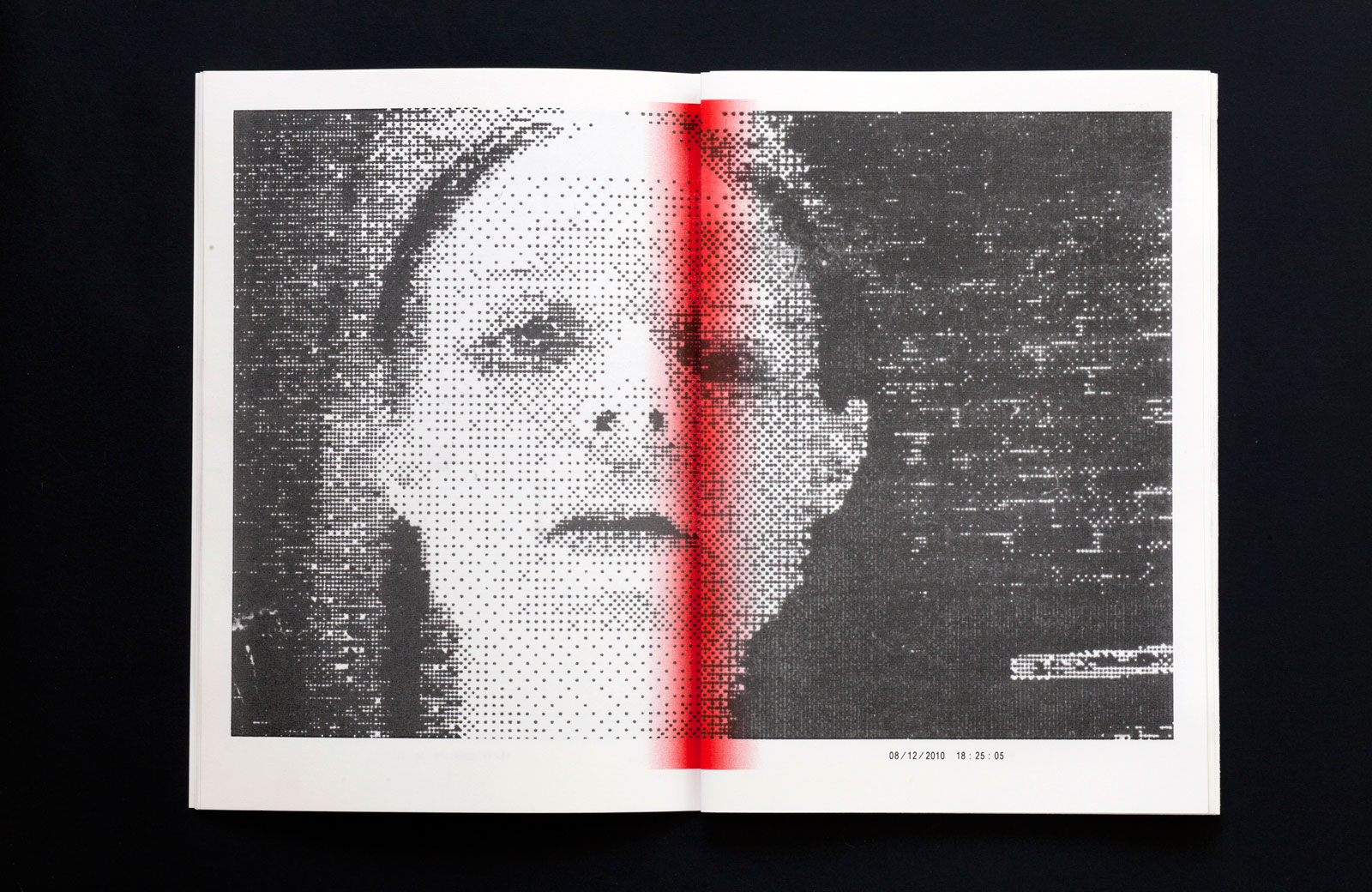
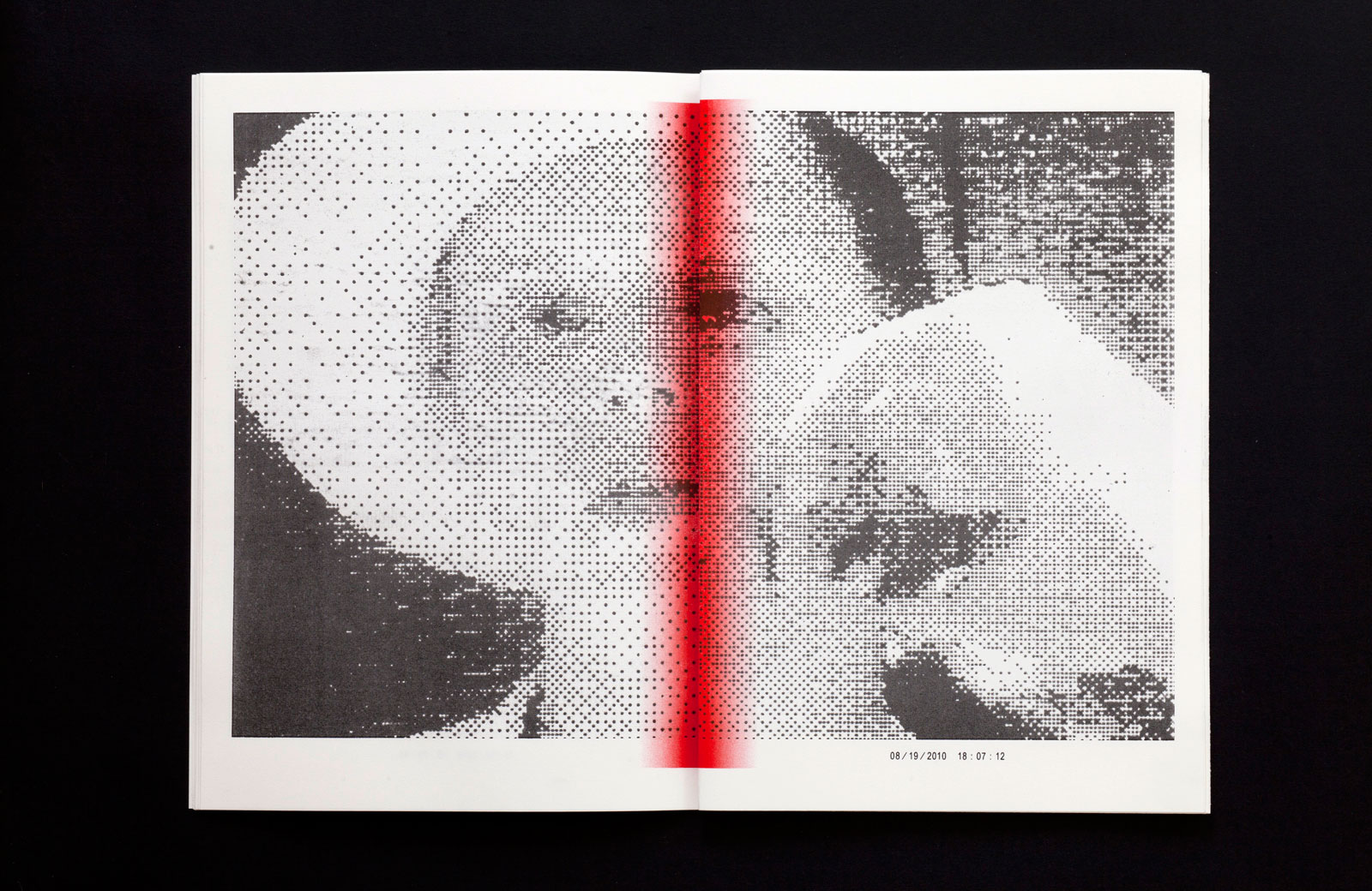
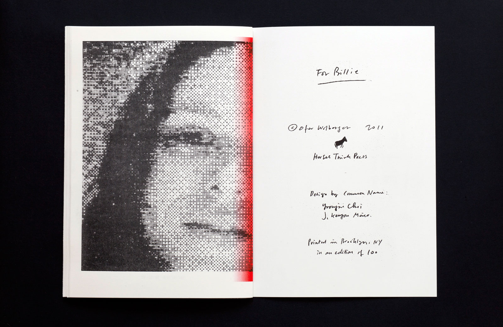
VIII
8.5×12.5 in (216×317 mm), 48 pages
Risograph, unbound
Edition of 100
Covers (Symbols & Color), 2012 — This title collects and reinterprets the designs of actual book covers using a two-color risograph duplicating machine. Each book is represented as a single page in this staple-bound volume. All entries are presented in alphabetical order with a full index of titles at the back.
XI
8.5×11 in (216×279 mm), 48 pages
Risograph, staple-bound
Edition of 100
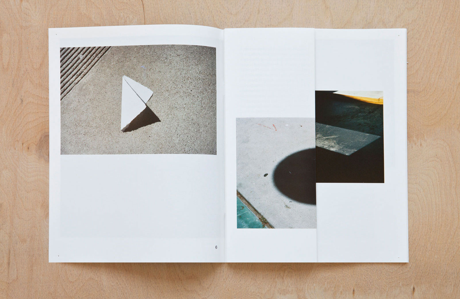
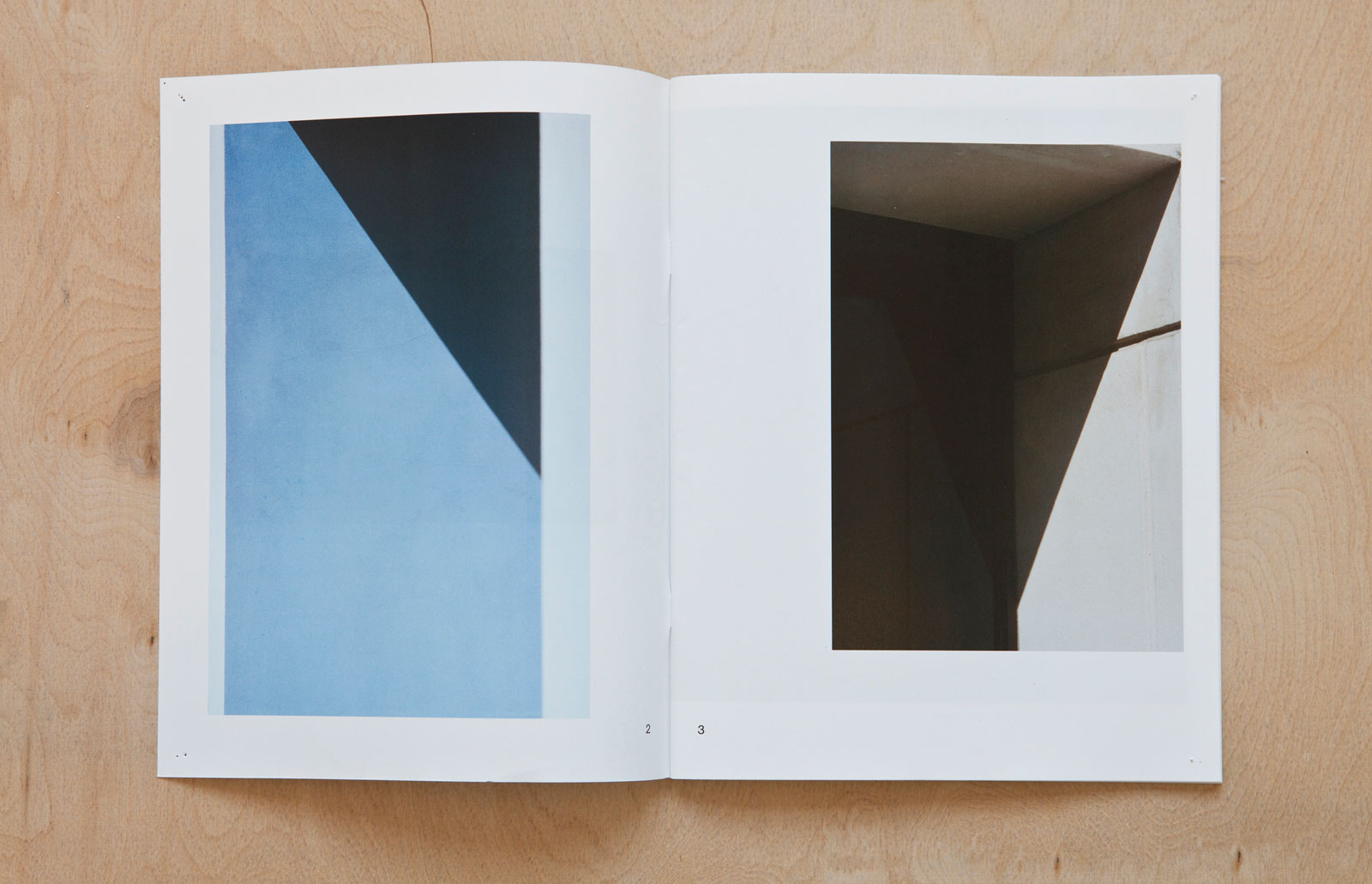
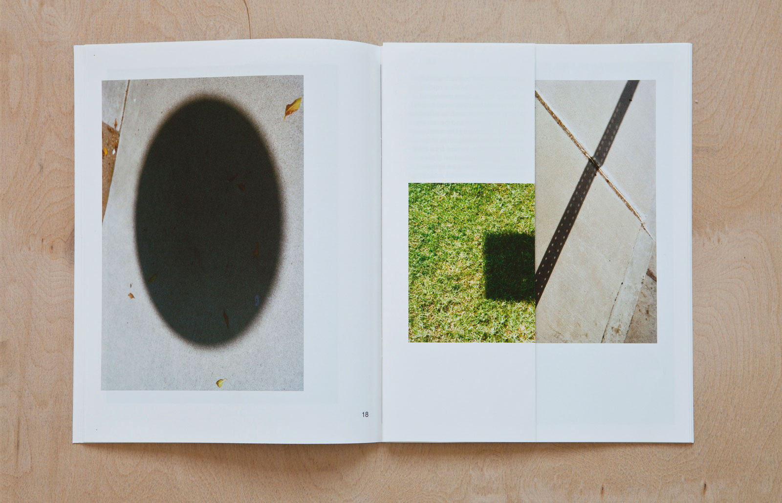
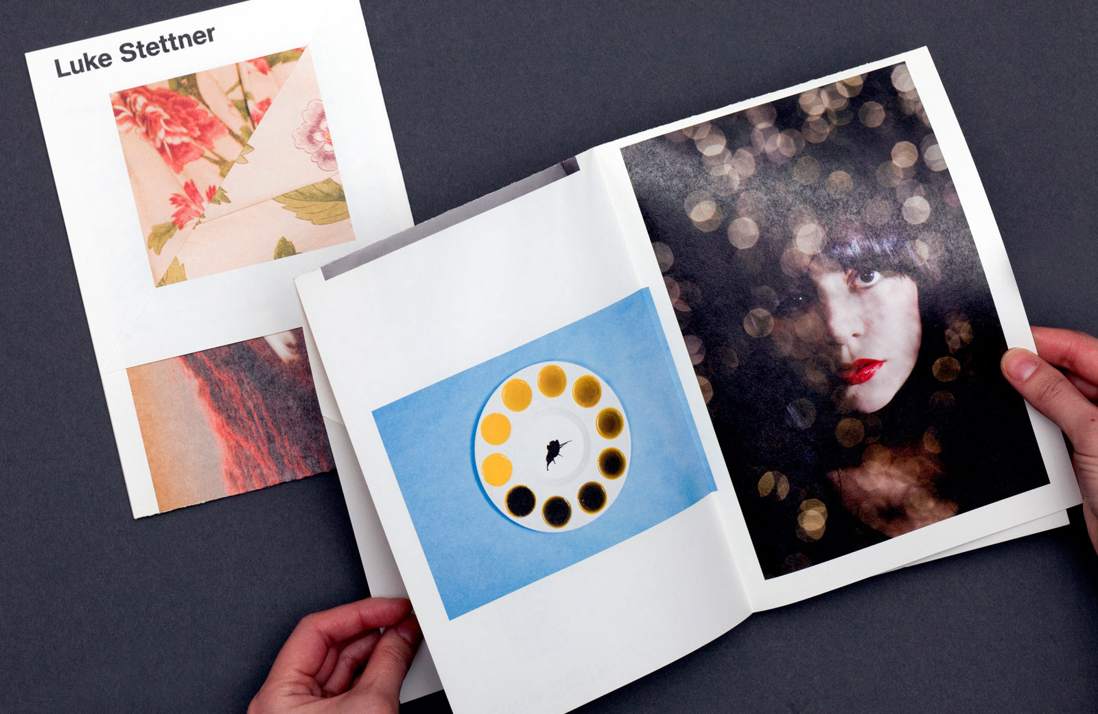
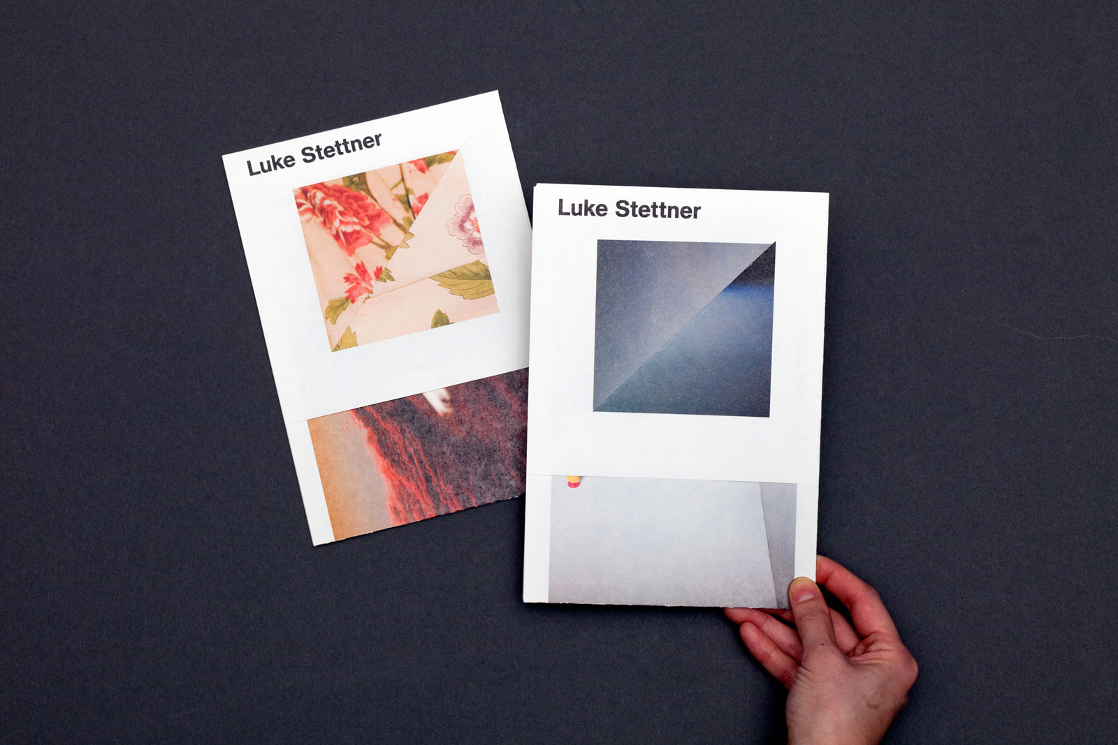
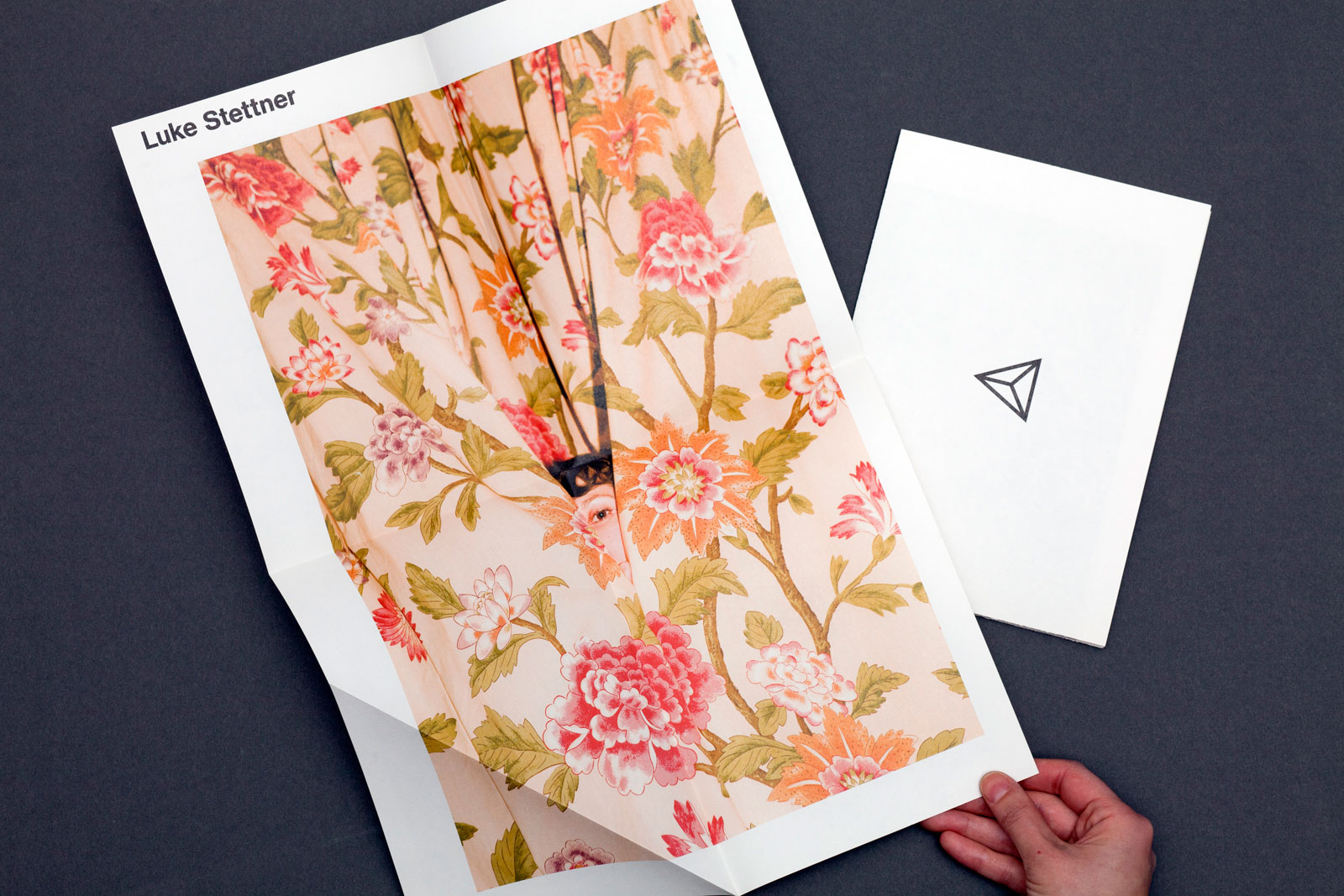
EYES THAT ARE LIKE TWO SUNS for LUKE STETTNER and KATE WERBLE GALLERY —— Luke Stettner’s first solo show in New York, Eyes That Are Like Two Suns, is a meditation on different forms of memory. In this book (more a stand-alone artist’s project than a traditional catalog) Stettner compiles photographs that play with light and shadow, surface and depth, to challenge the viewer’s perceptions and create alternate visual worlds. Our design employs a series of folds to both hide and reveal content, creating unexpected pairings between images and heightening the ethereal, unreal nature of the photographs.
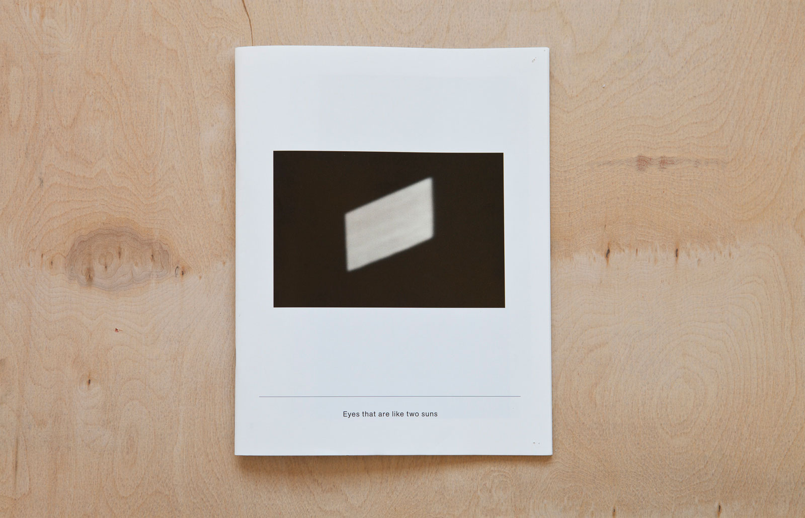
Catalog design, 2011
8.5×11 in (216×279 mm), 48 pages
Offset print, saddle-stitched
Edition of 250

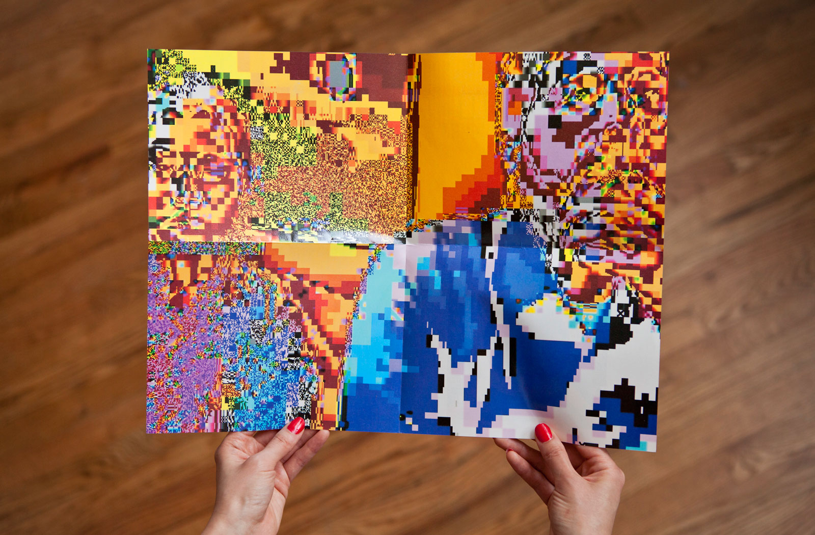
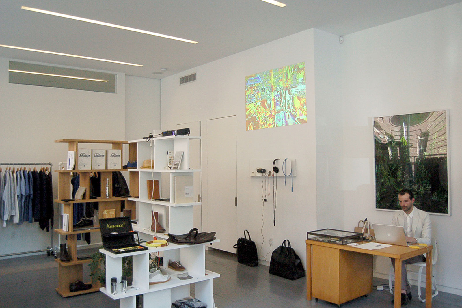
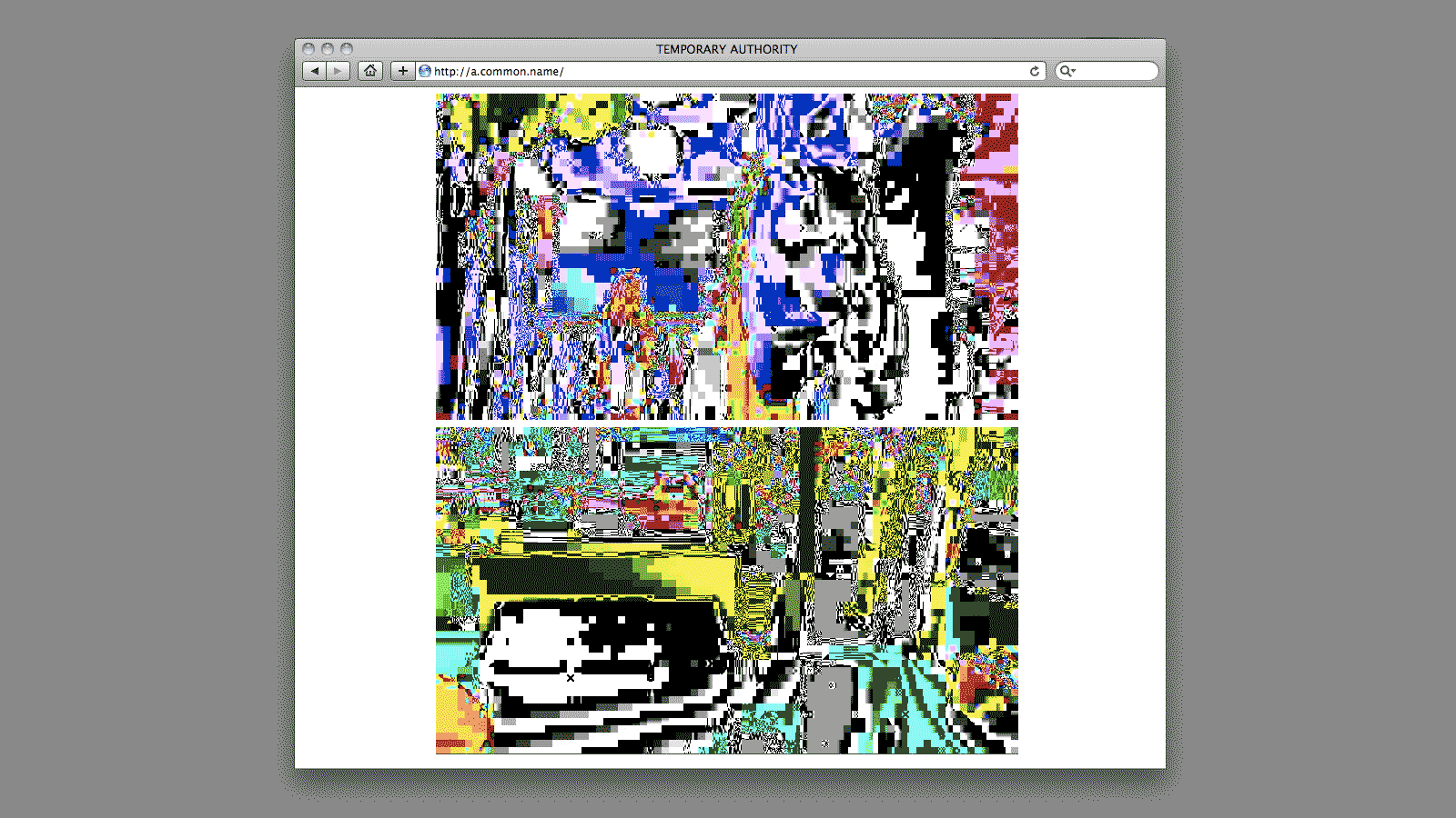
TEMPORARY AUTHORITY for MANNAM and PROJECT NO. 8 —— The first known webcam went live in 1991, broadcasting the fill status of a coffee pot at Cambridge University. Known as XCoffee, the camera was eventually linked to the internet and ran continuously until 2001, when it was disconnected and sold at auction. Today, consumer webcams are used primarily to enable real-time communication between people, or to display live images of public space. This project connects two New York boutiques (Project No. 8 and 8b) via a customized web feed, rendering each location in abstract, technicolor graphics.
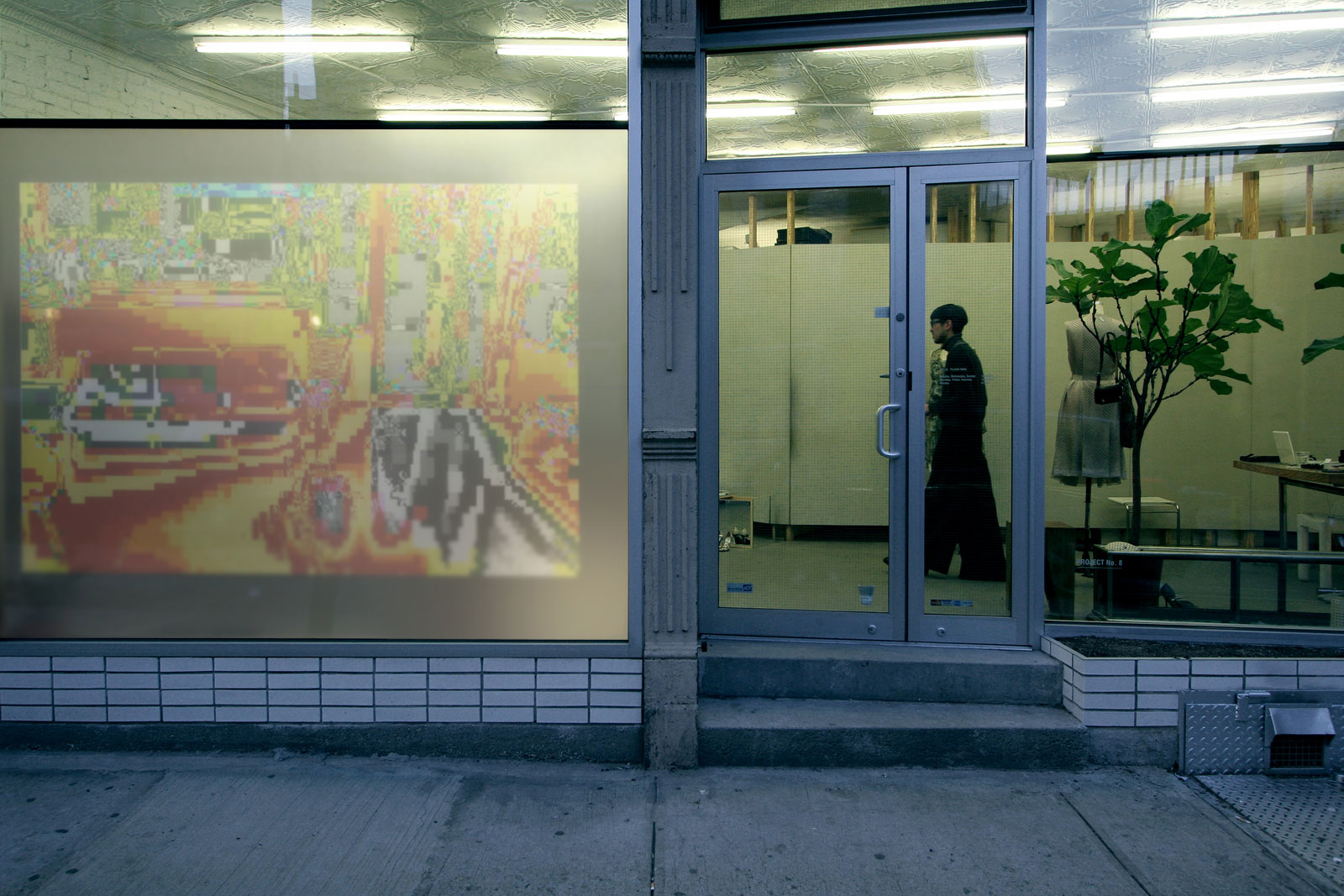
Installation view, Project No. 8

Wheatpasted posters, Essex Street
Leaflet
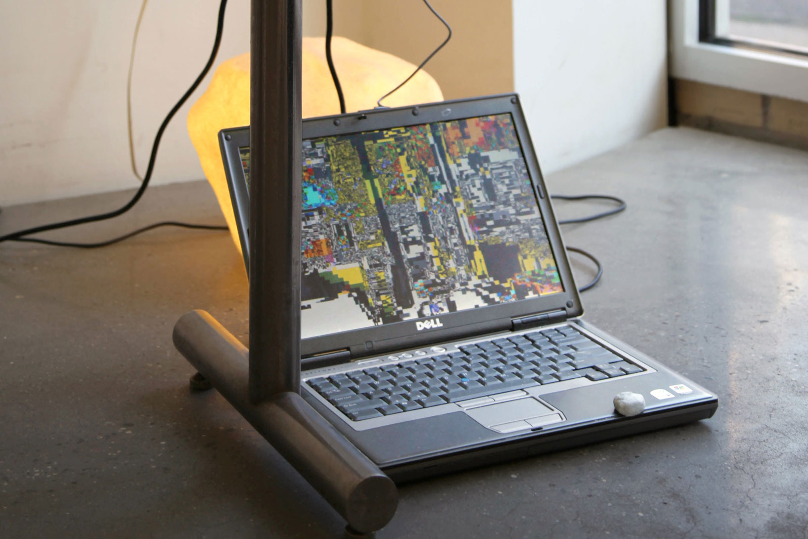
Webcam link
Compilation of portraits
Installation view, Project No. 8b
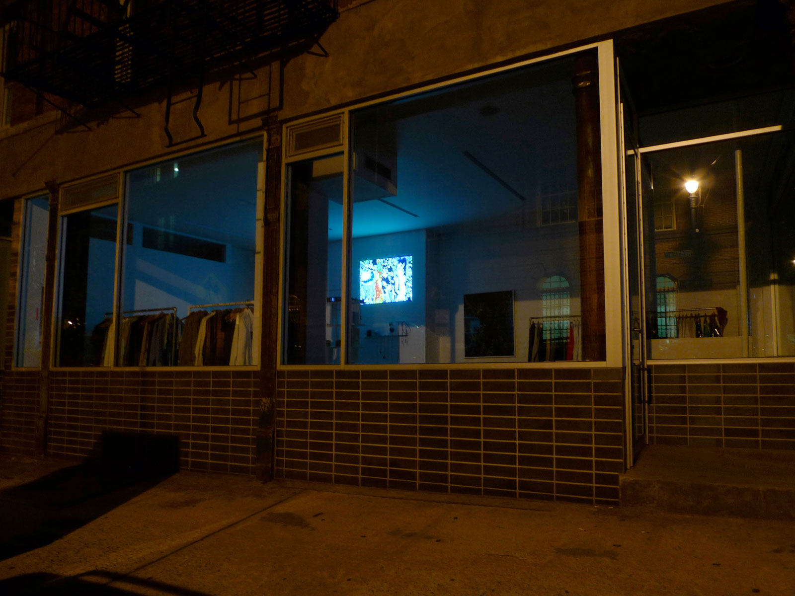
Installation view, Project No. 8b
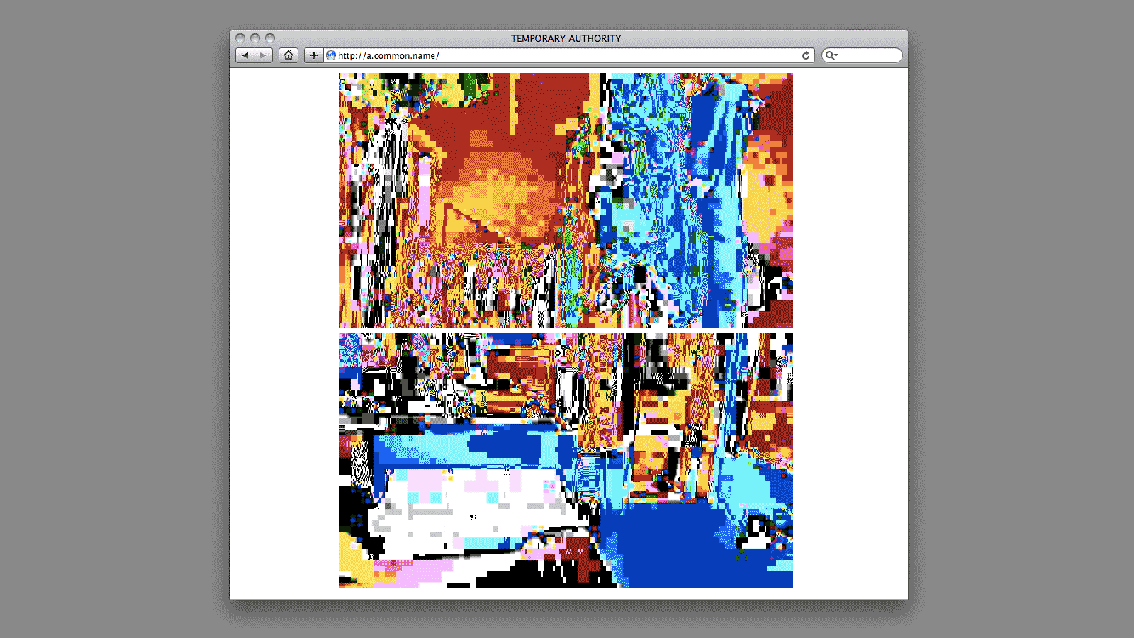
Project website
Installation, website, and posters, 2010
Series curated by Hoon Kim and Andrew Sloat
Technical assistance by Mike Brunner and Rob Casselman
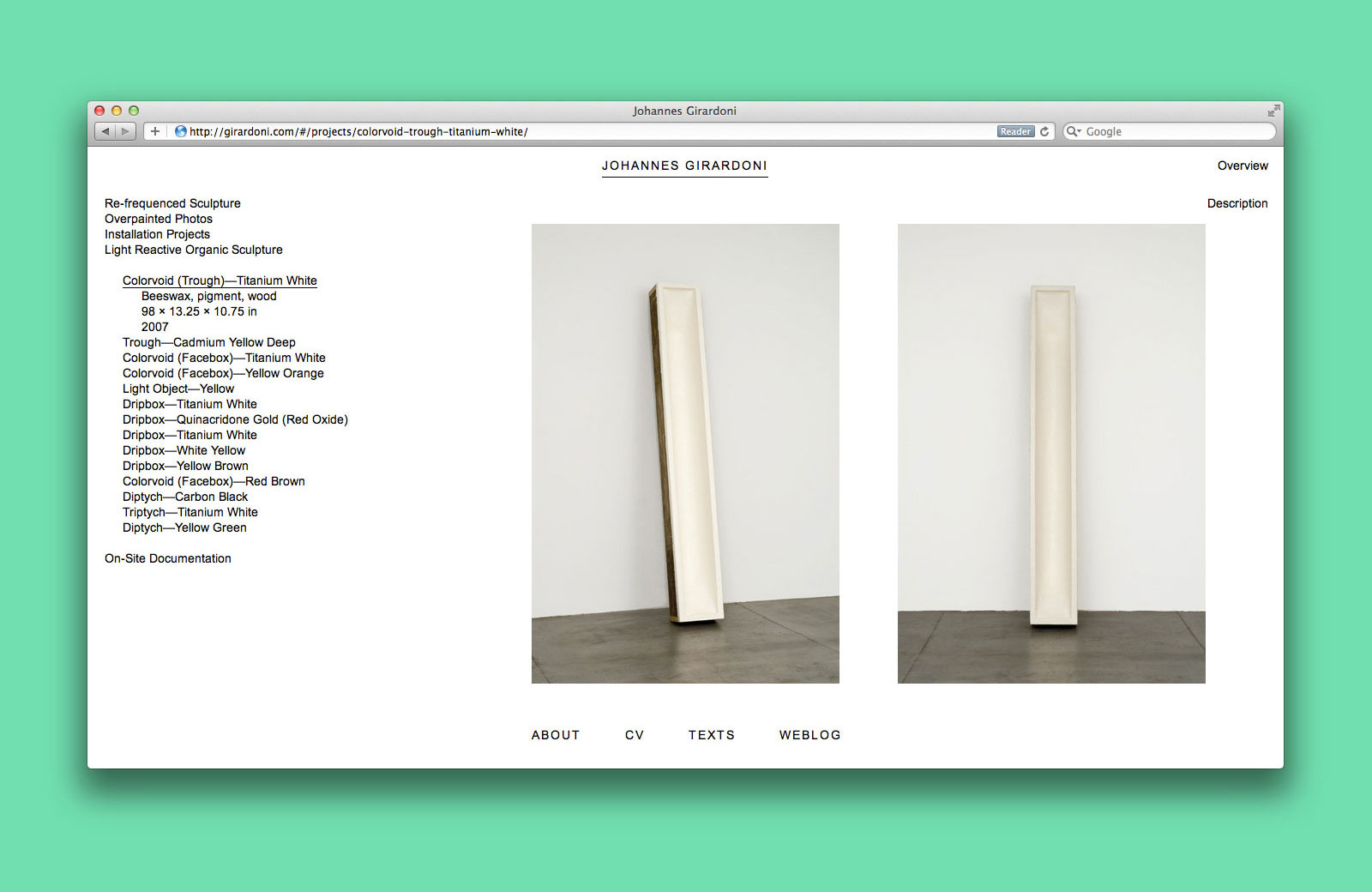
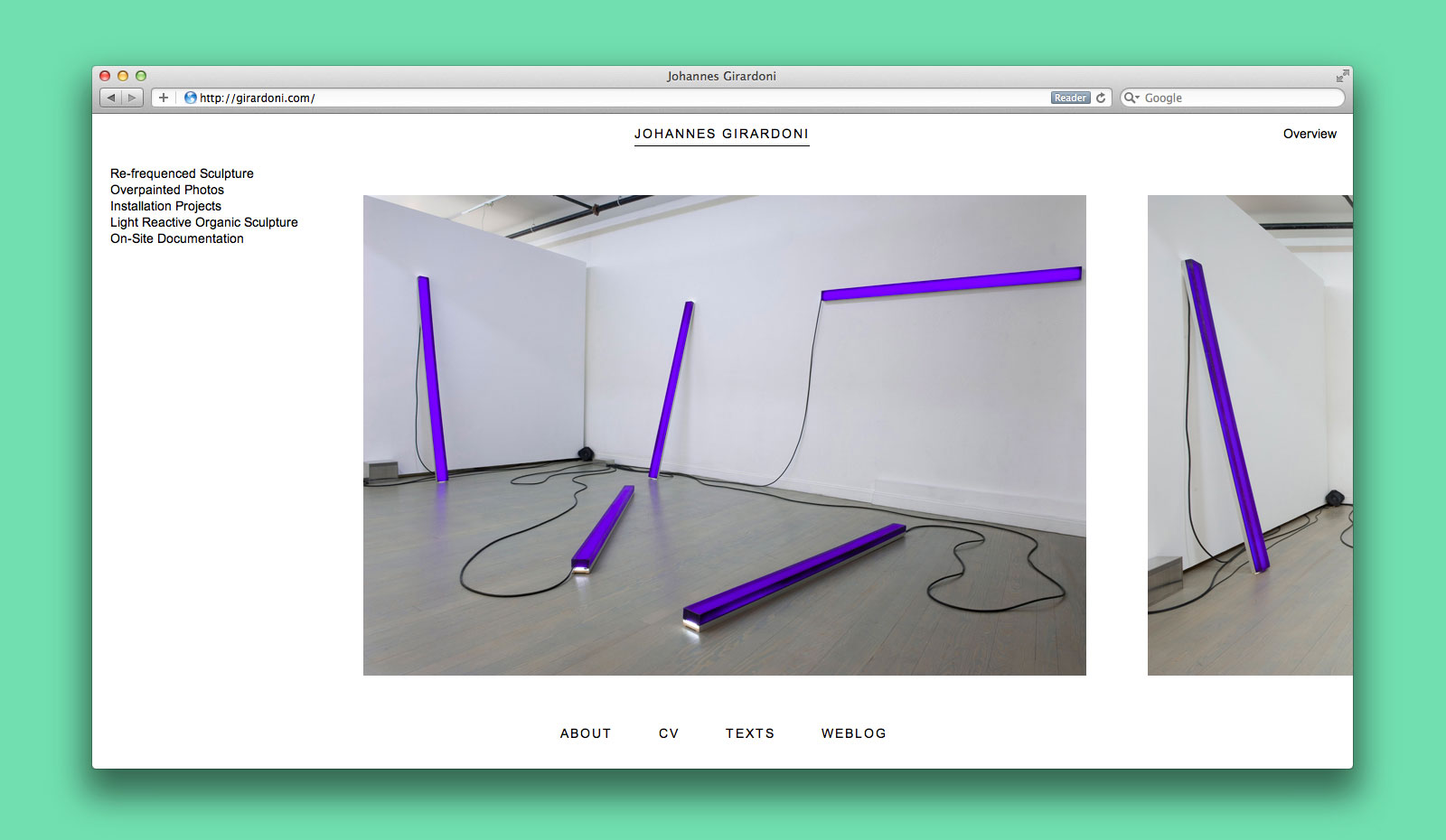
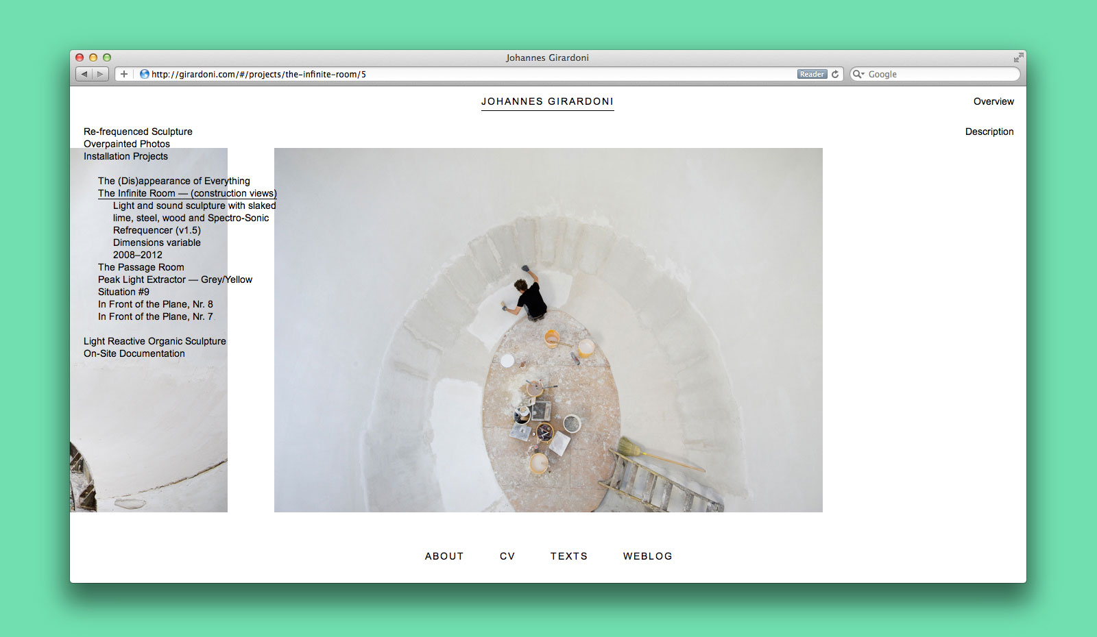
ARTIST WEBSITE for JOHANNES GIRARDONI —— Johannes Girardoni is a Los Angeles-based artist best known for his reductive investigations at the intersection of sculpture and painting. His works are often examinations of phenomenological processes, where a hollow or empty space turns out to be the actual center of the work. We were asked to design and build a portfolio site that would accentuate this sense of presence and absence, stand as an archive of past projects, and highlight connections between the artist’s various material interests.
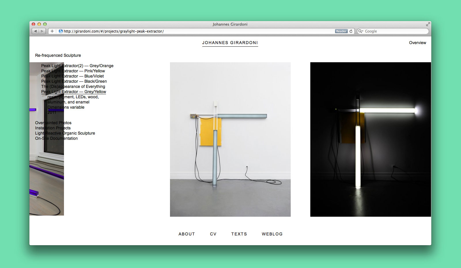
Re-frequenced sculpture
Installation projects
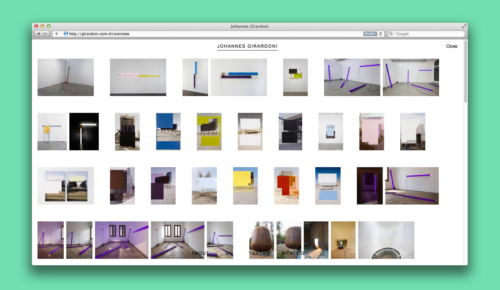
Overview
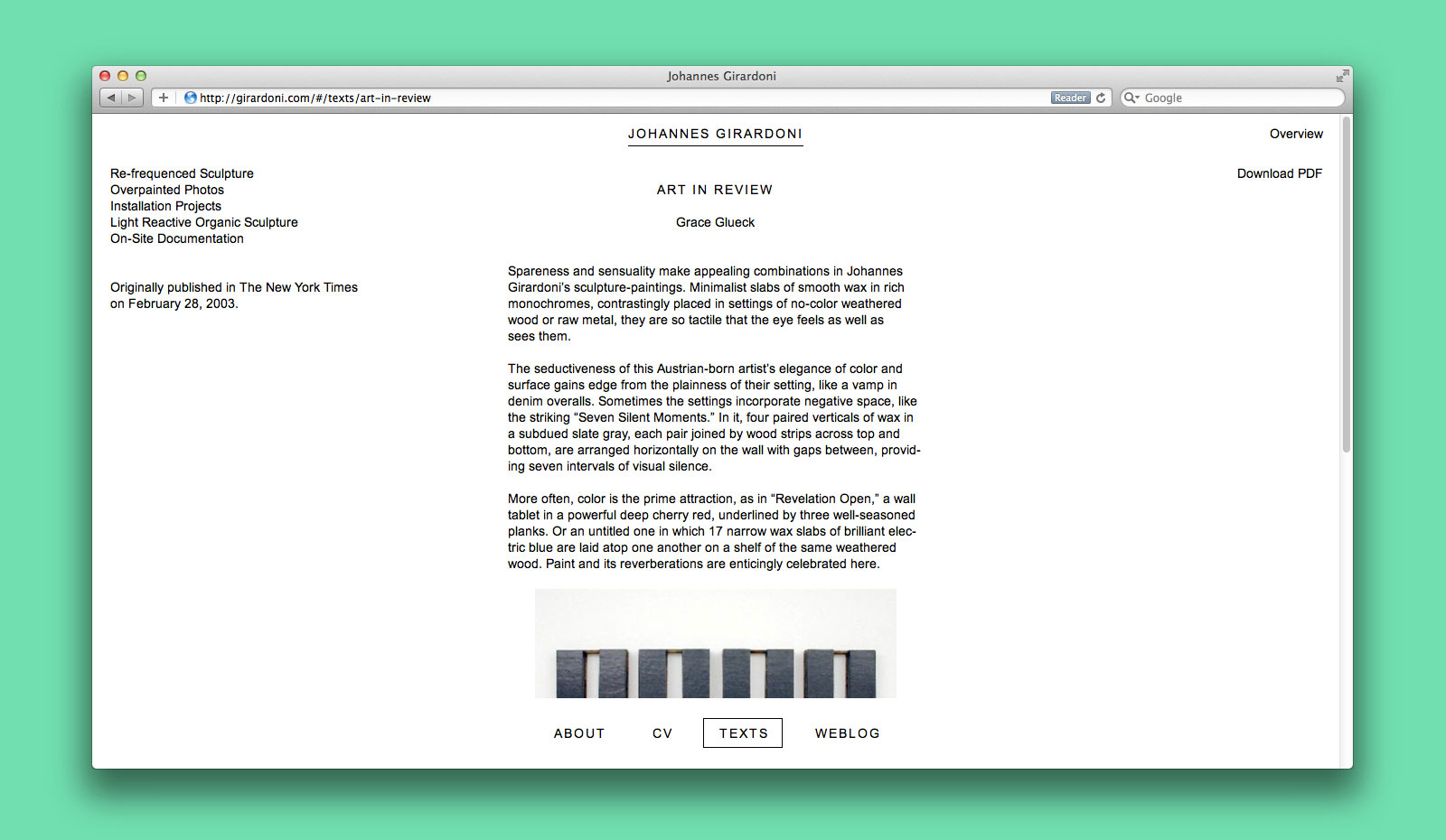
Texts section
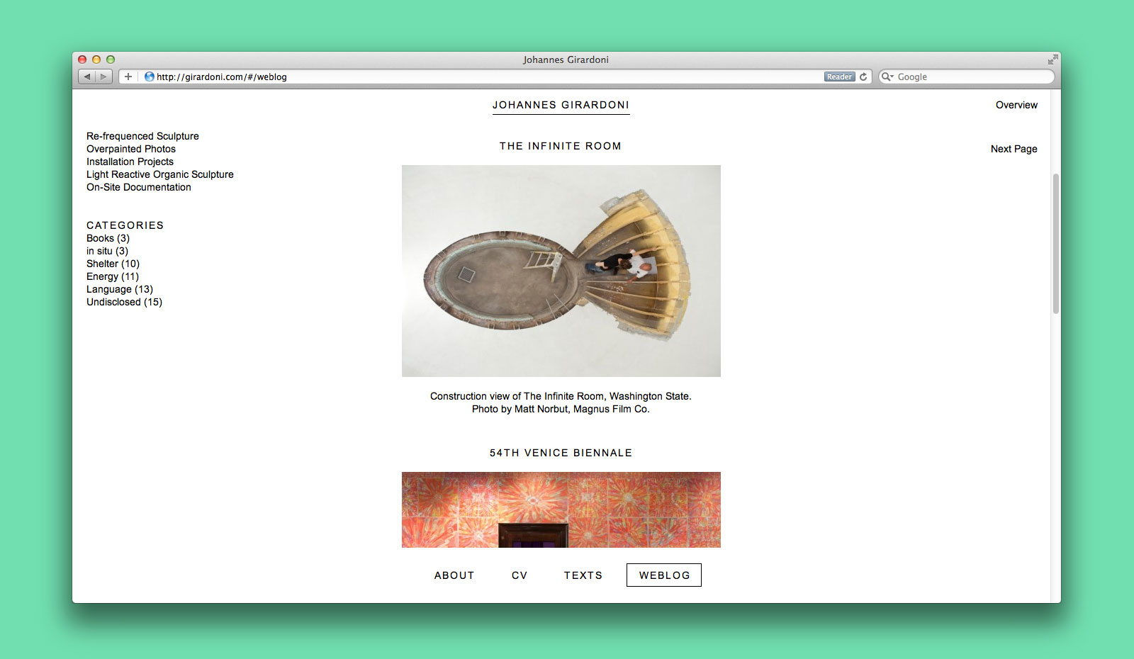
Weblog
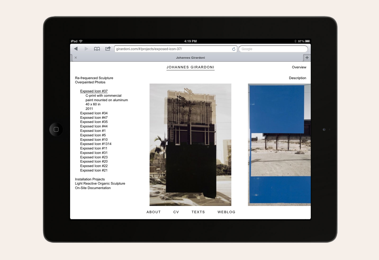

Website design, 2011
Website development by Dan Brewster
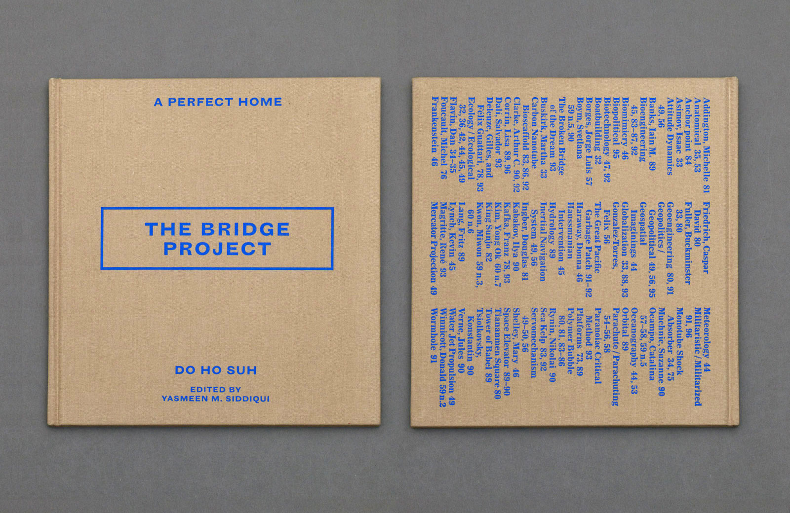
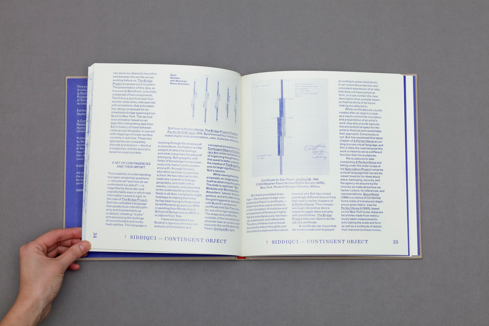
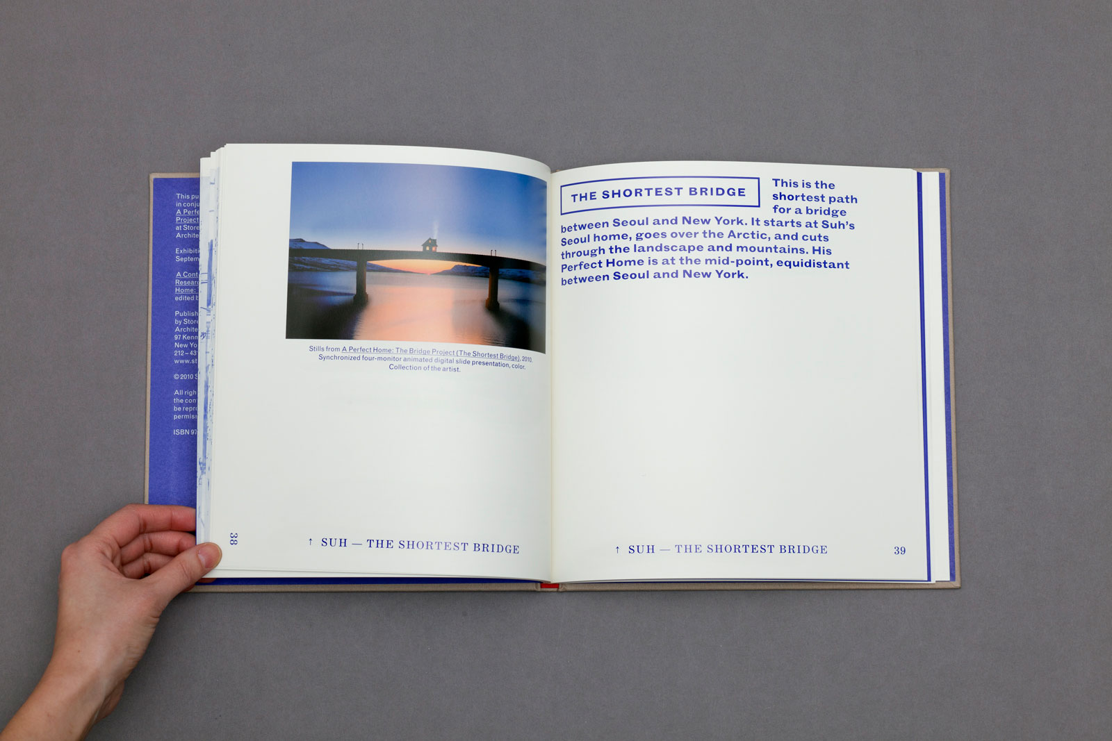
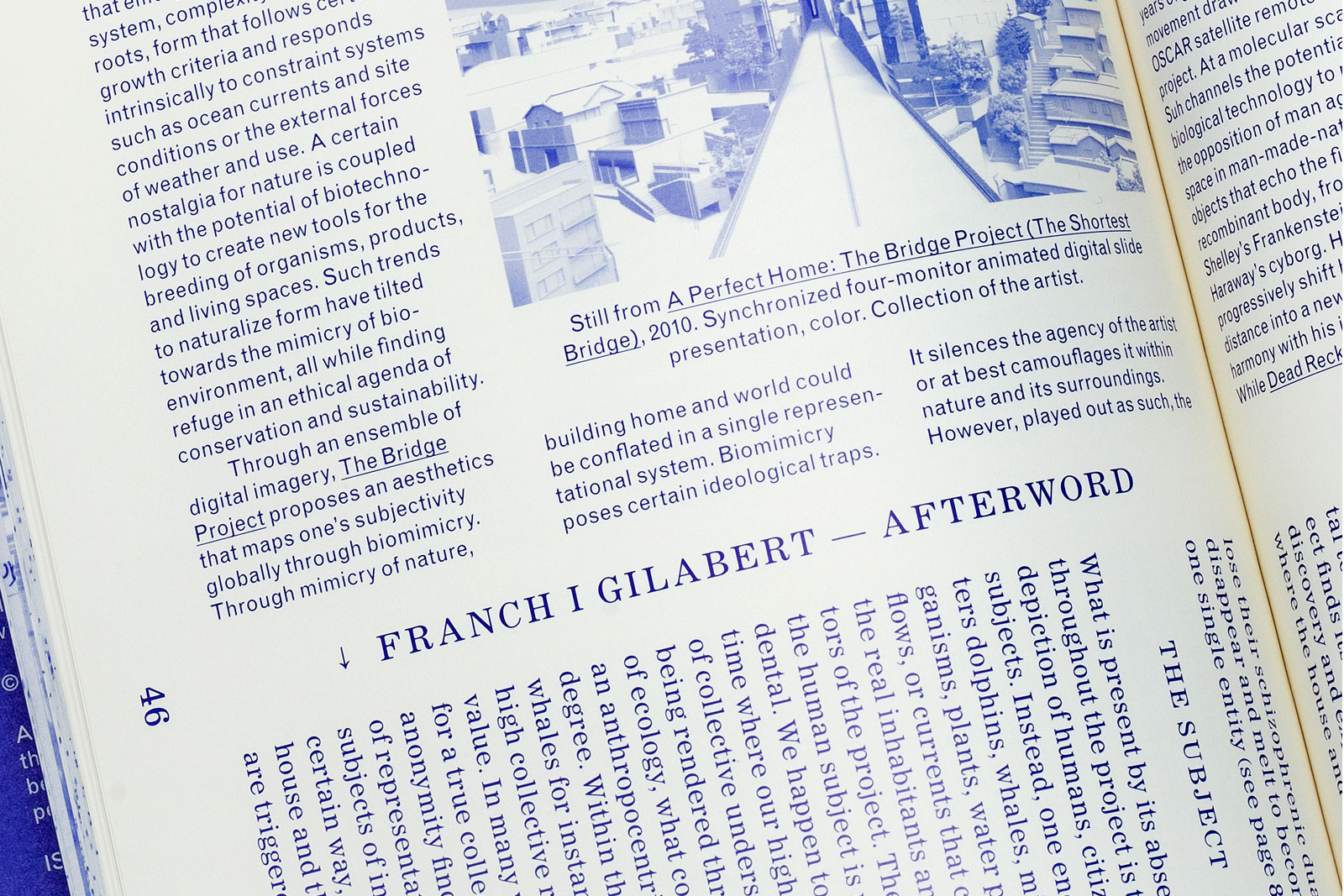
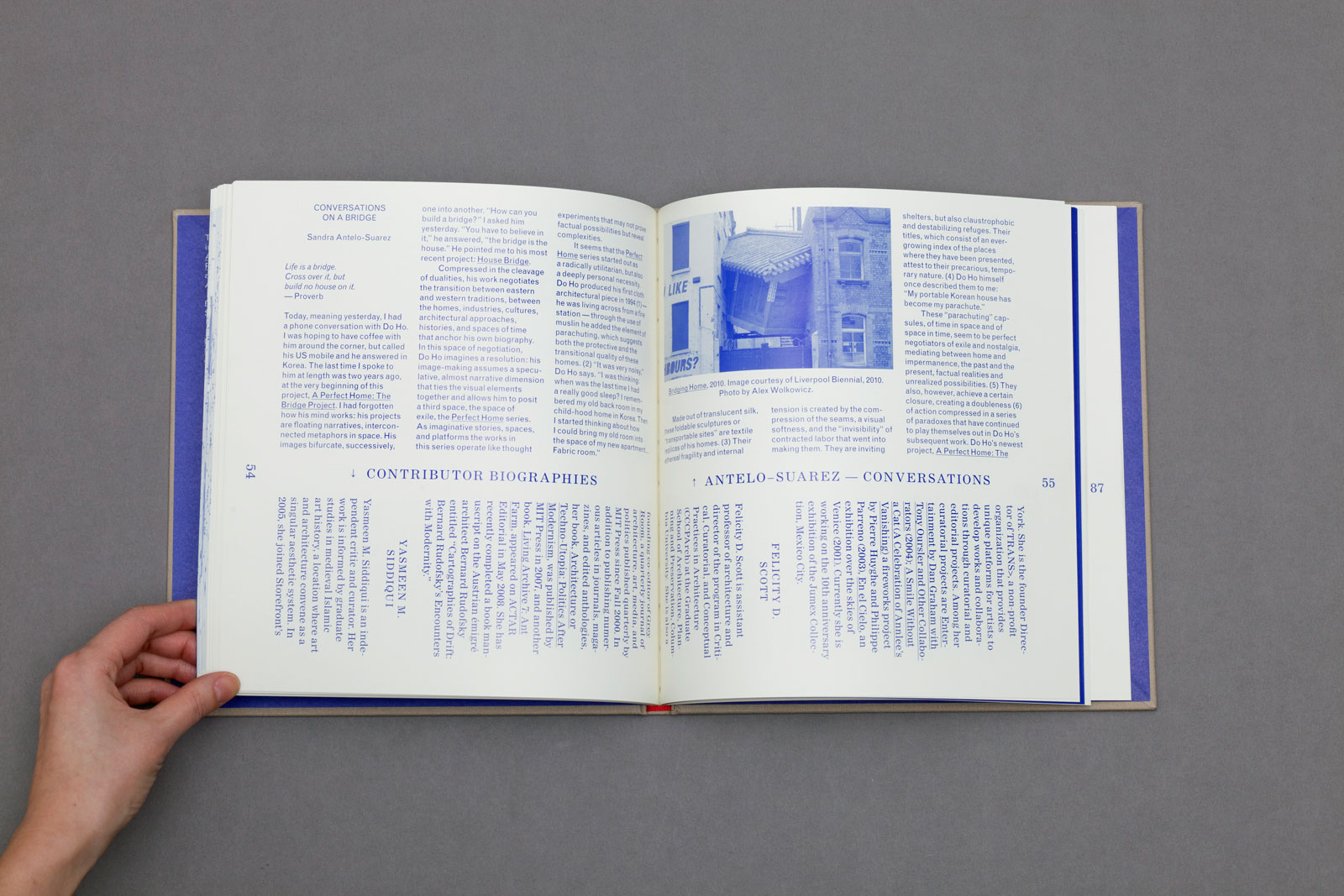
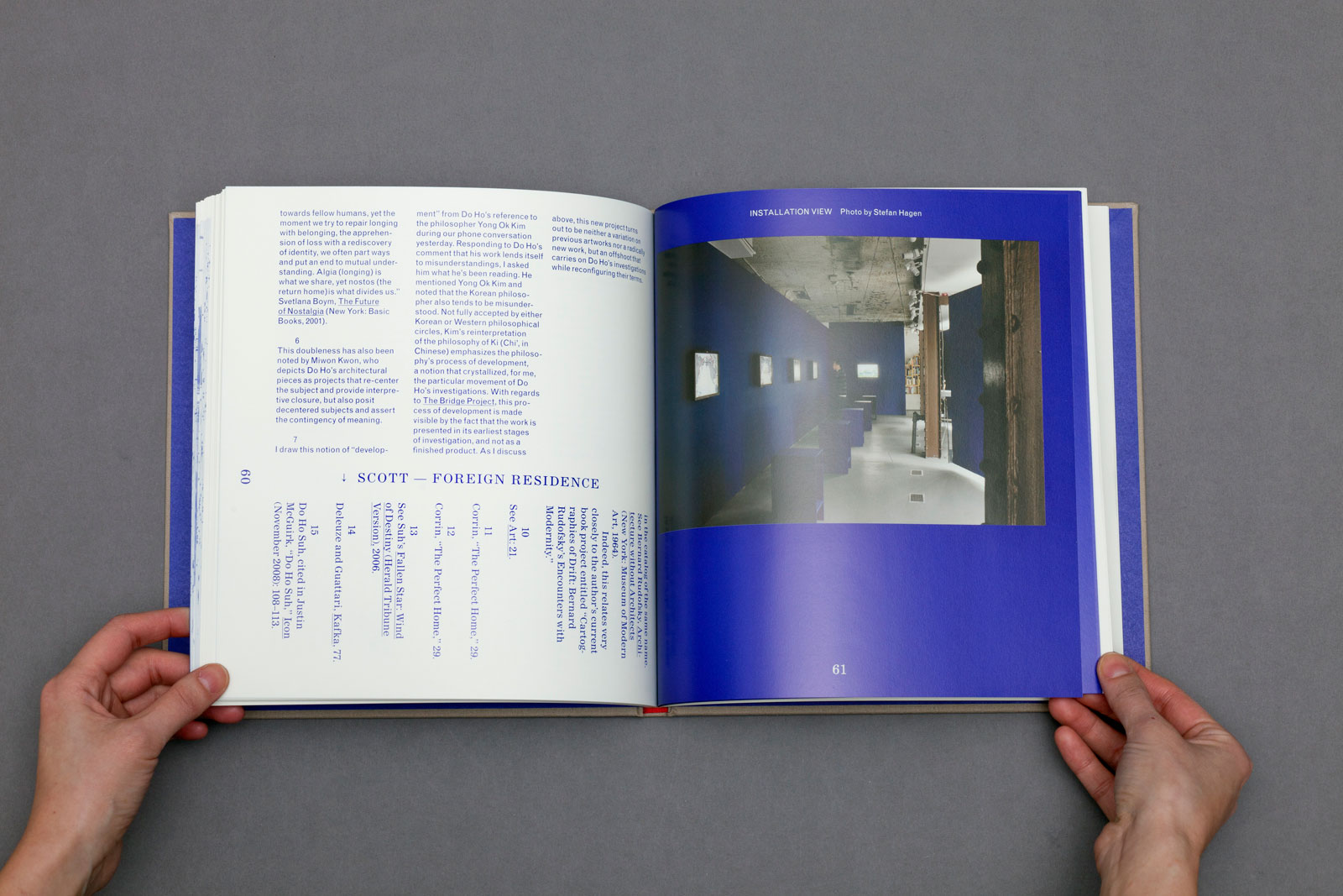
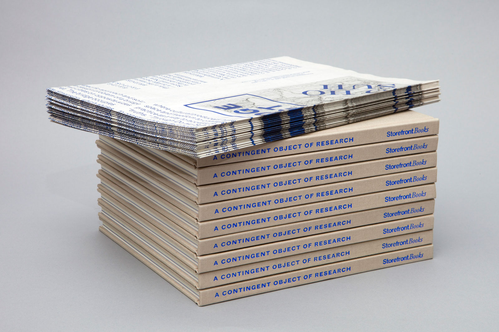
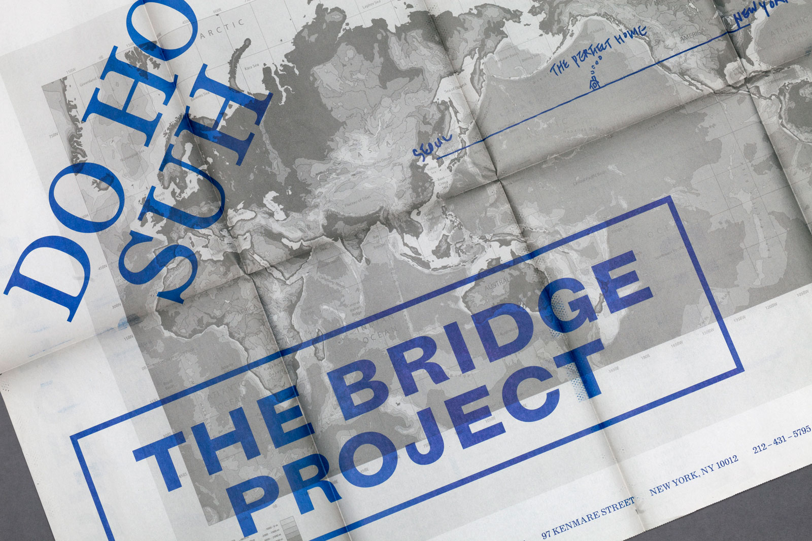
THE BRIDGE PROJECT for STOREFRONT FOR ART & ARCHITECTURE —— The Bridge Project is the most recent chapter in artist Do Ho Suh’s ongoing work, A Perfect Home. In collaboration with a team of researchers, architects, and designers, Suh generated four bridge designs that propose fantastical ways to connect Seoul and New York. This conceptual project imagines a physical link between the two cities, diminishing their spatial, temporal, and cultural distance. The accompanying bi-directional catalog, titled A Contingent Object of Research, includes a range of critical essays along with images of the exhibition content.
Introductory essay
Section divider
Essay detail
Bi-directional text
Installation views
Contributor essay
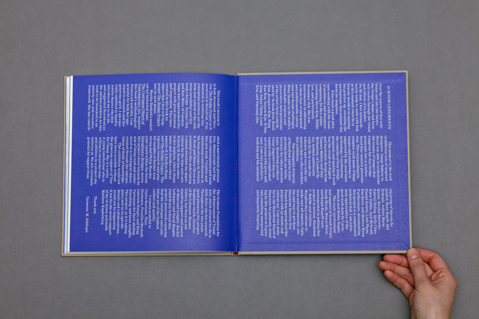
Acknowledgments
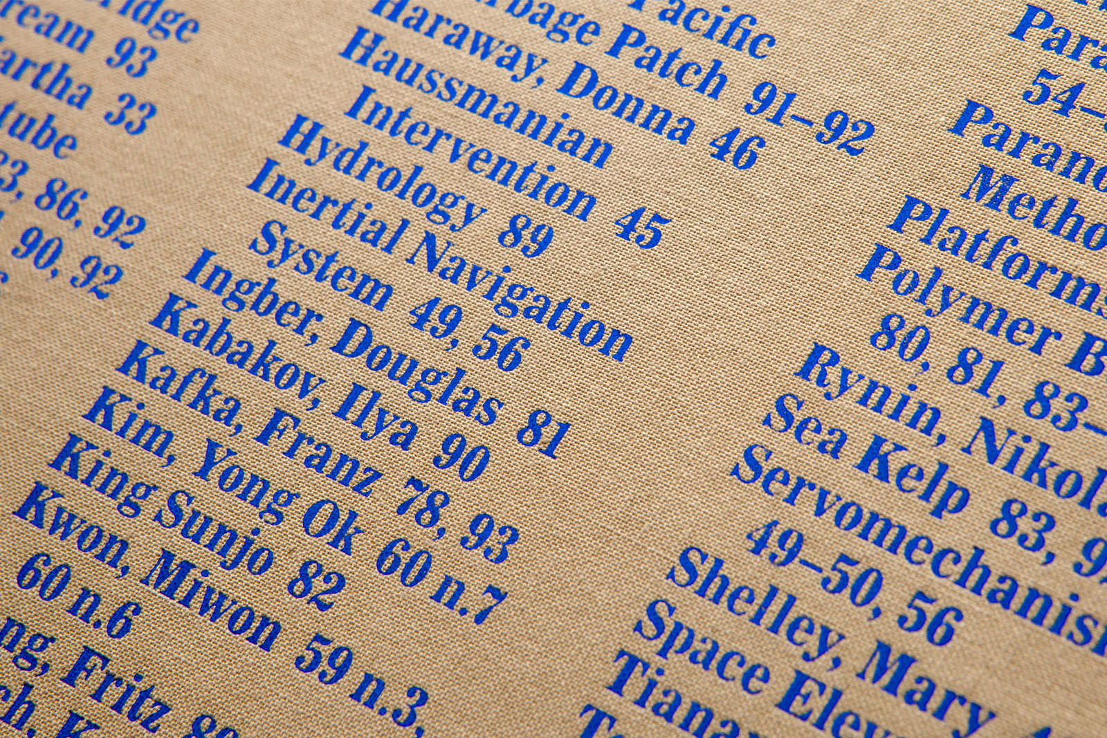
Back cover index
Newsletters and catalogs
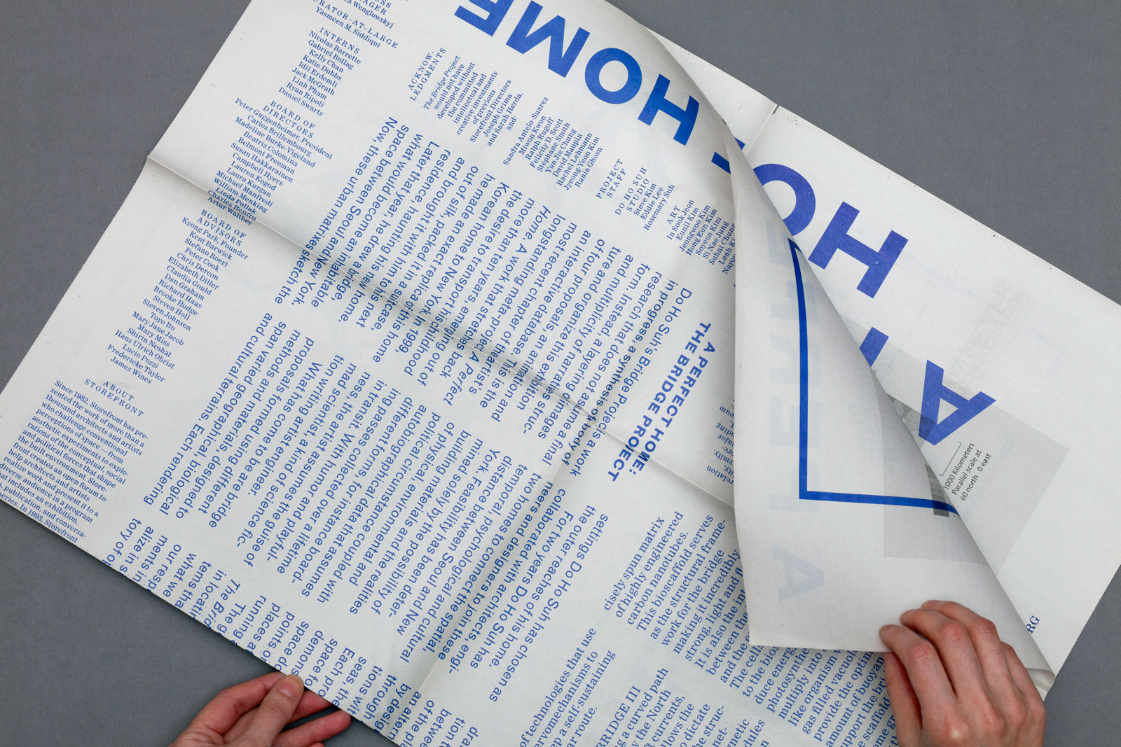
Newsletter exterior
Newsletter interior
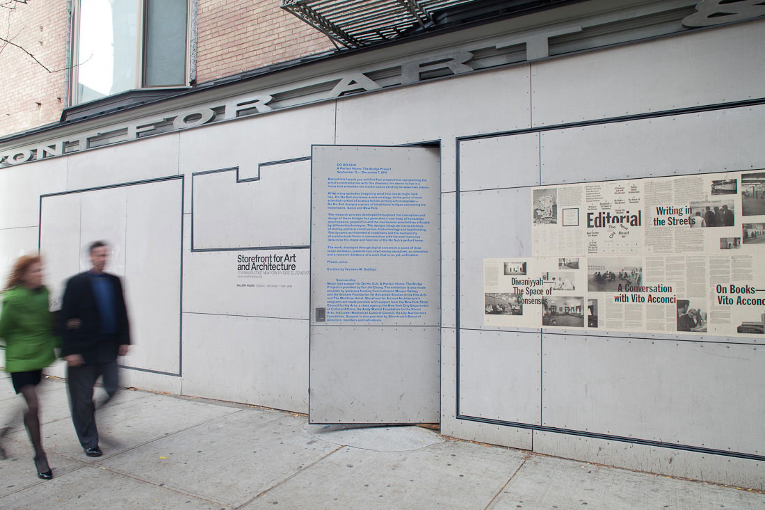
Façade signage
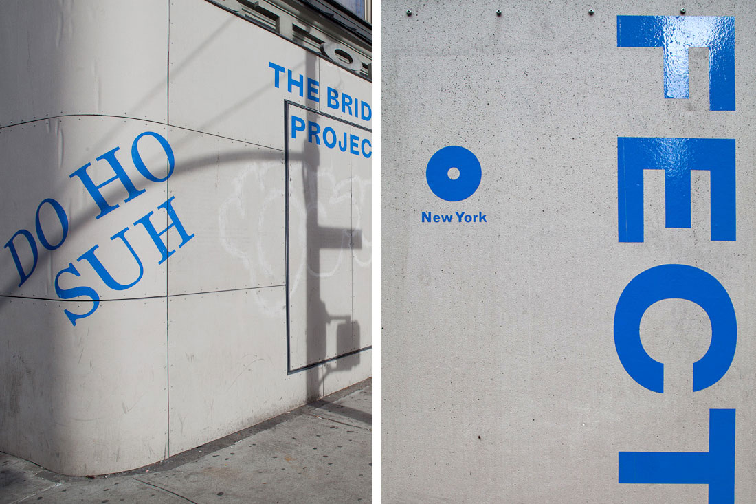
Signage details
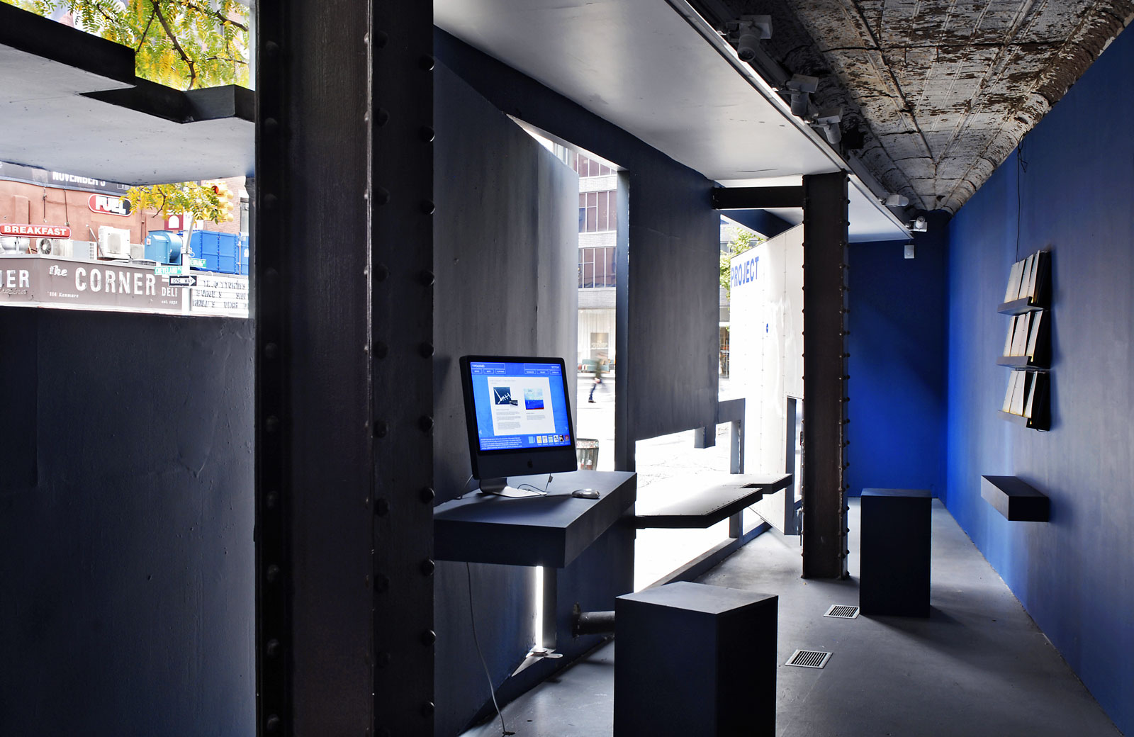
Catalog, newsletter, and signage, 2010
Edited by Yasmeen Siddiqui
Essay by Felicity D. Scott
Published by Storefront Books
8.9×9.3 in (225×237 mm), 96 pages
Offset print, sewn case binding
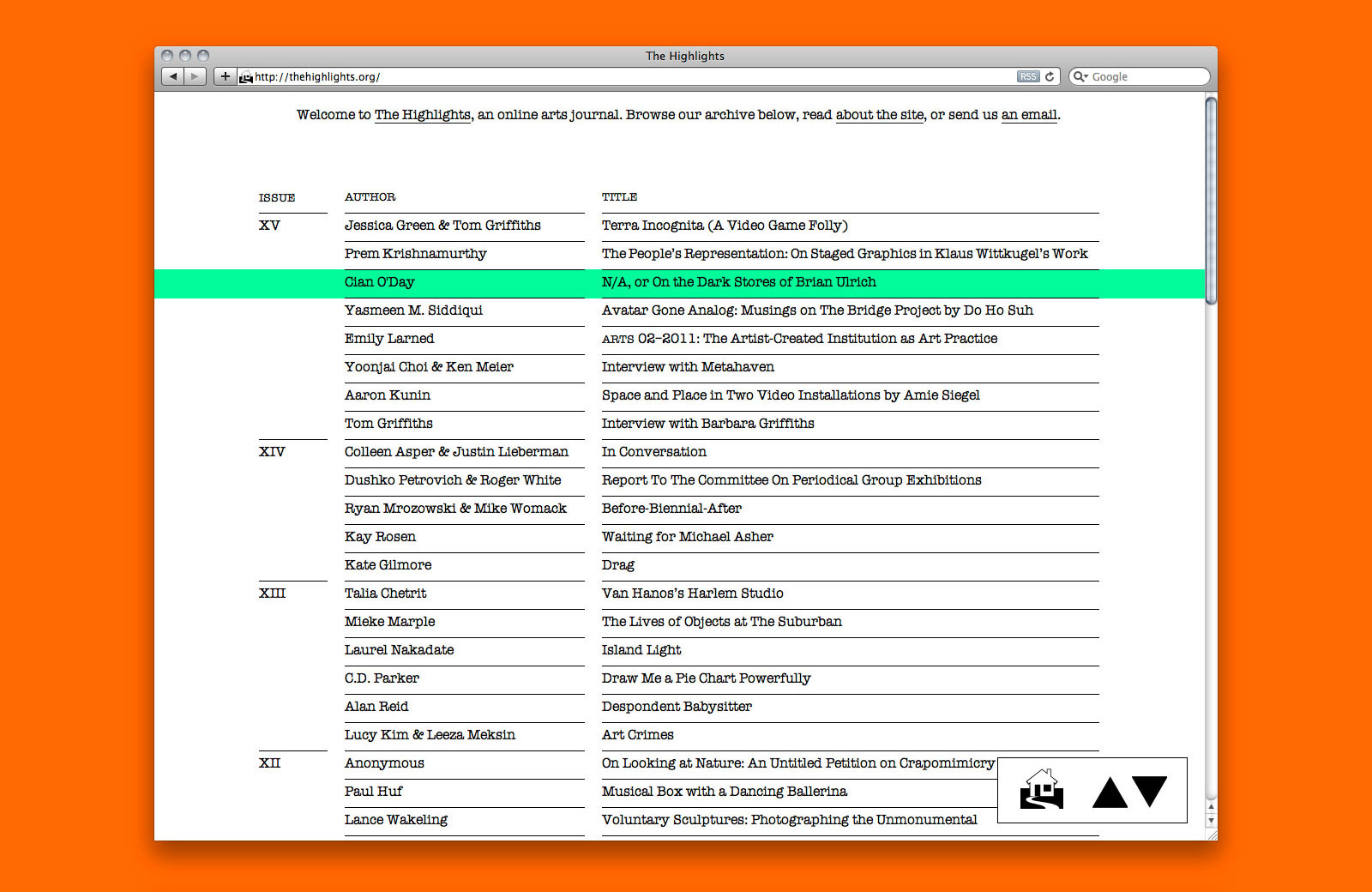
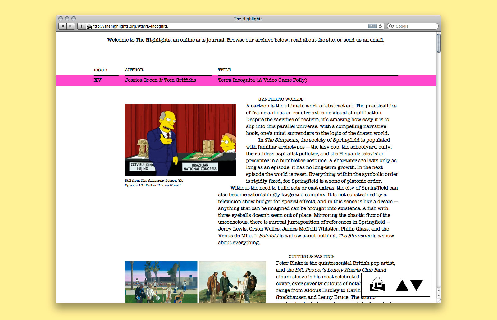
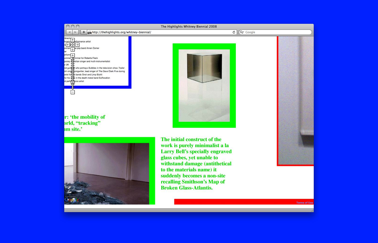
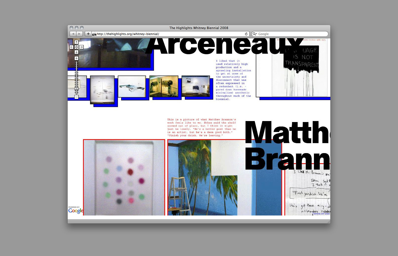
IDENTITY, WEBSITE, and POSTERS for THE HIGHLIGHTS —— The Highlights began as a response to the journalistic bent in art reviews, offering artists an outlet to engage in unconventional criticism. Since that time, the publication has grown to include experimental text and digital media projects. These works are an extension of the artists’ own practice and consist of image-based essays, original videos, interviews, as well as fictional, biographic, and diaristic writing. All completed projects are stored permanently in the online archive where they are available for browsing. In addition to designing the site, we also guest-edited issue XV.
Accordion-style index page
Visit site
Article page
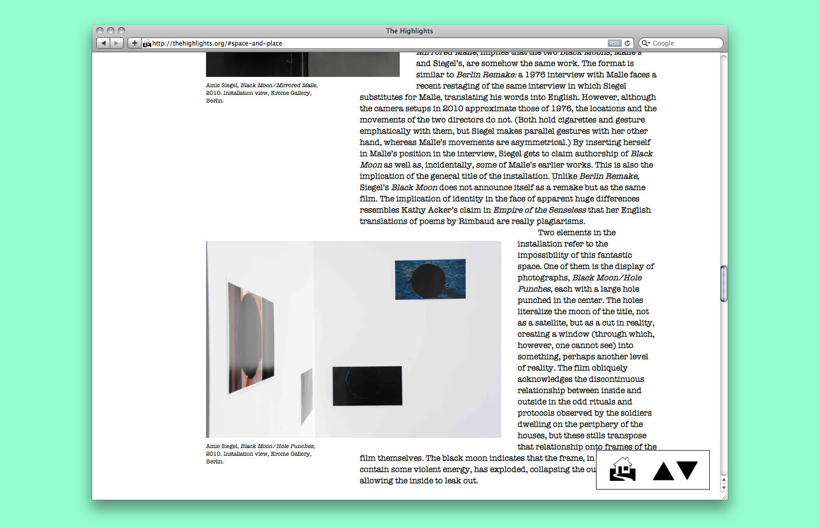
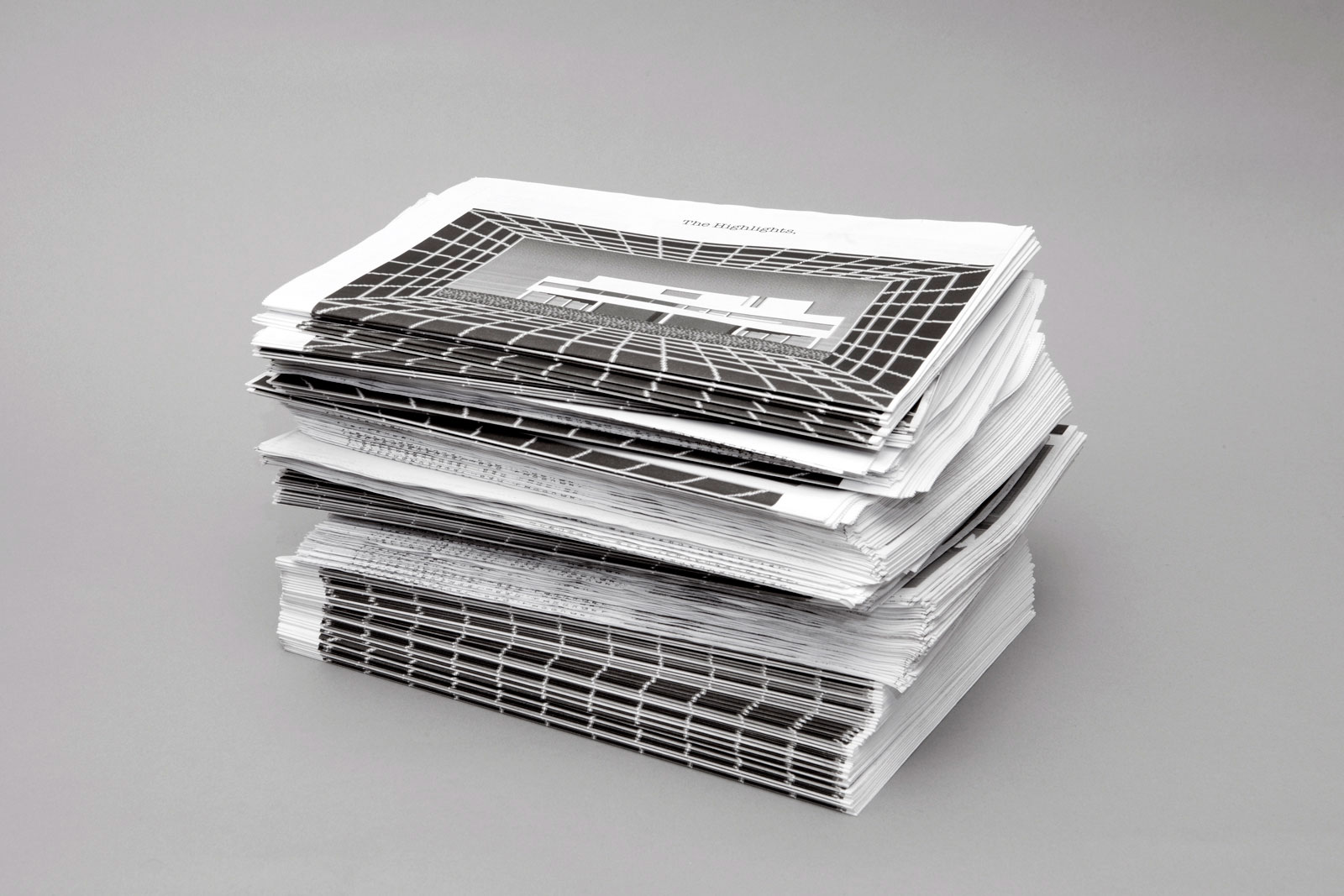
Newsprints
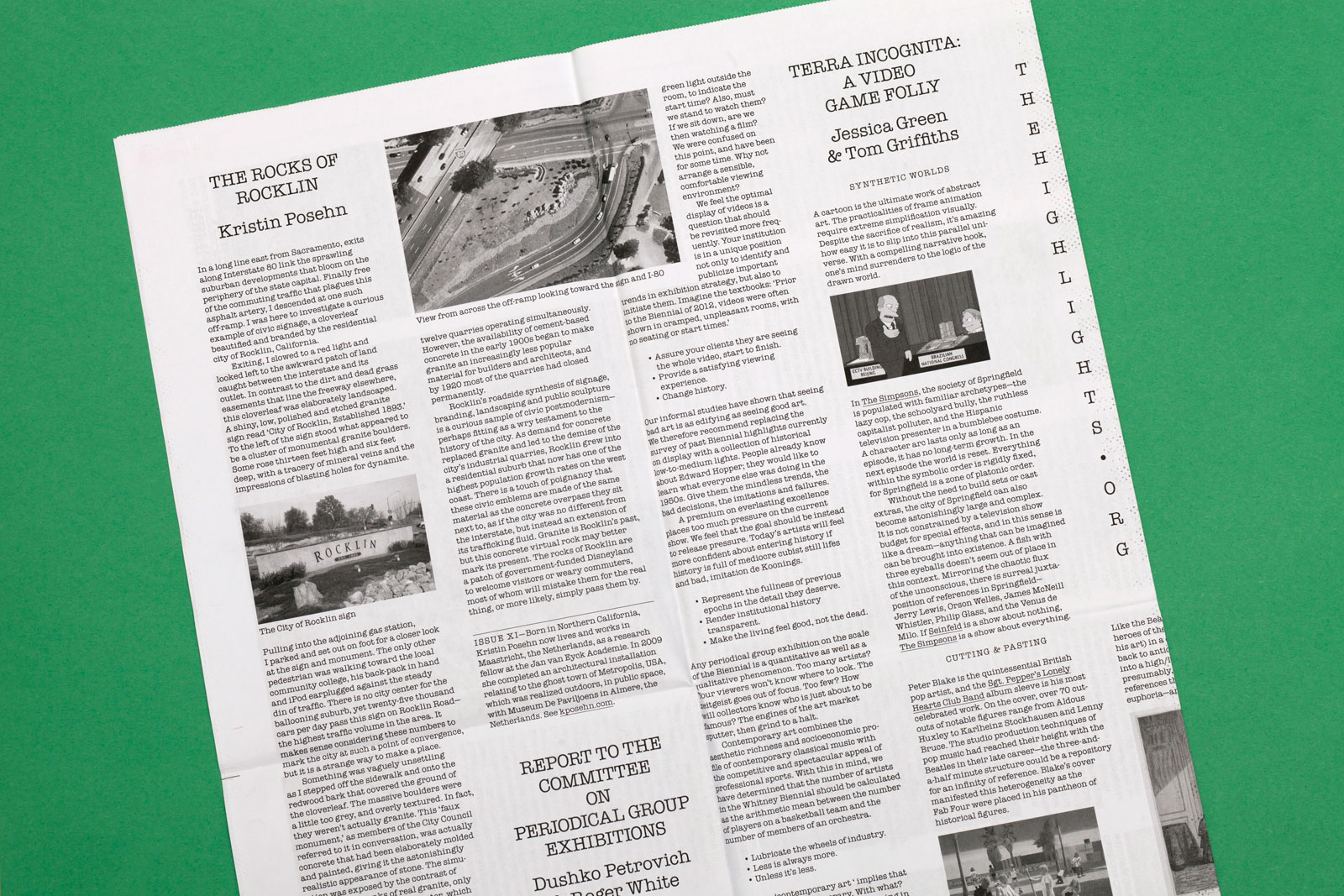
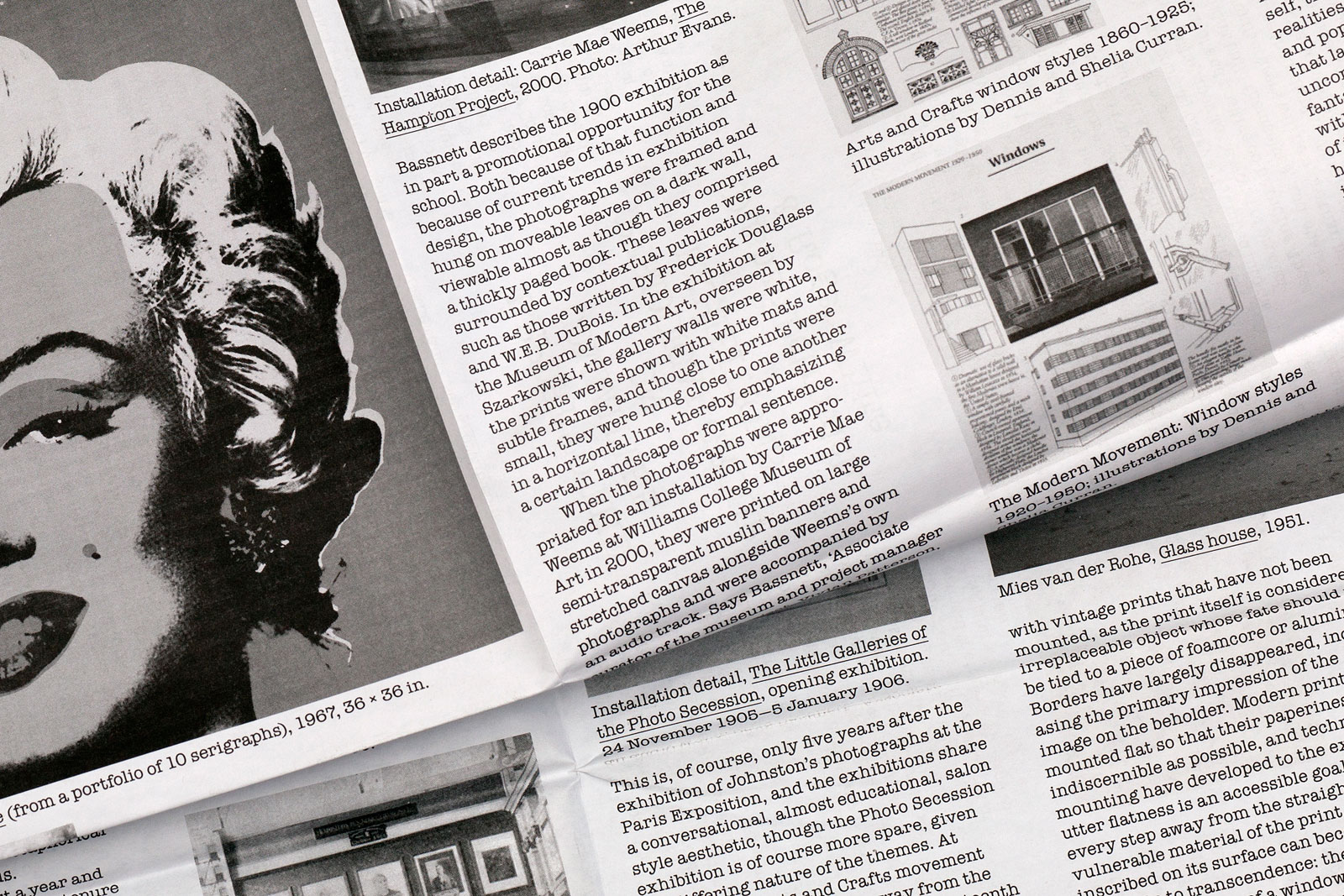
Newsprint detail
Interactive feature

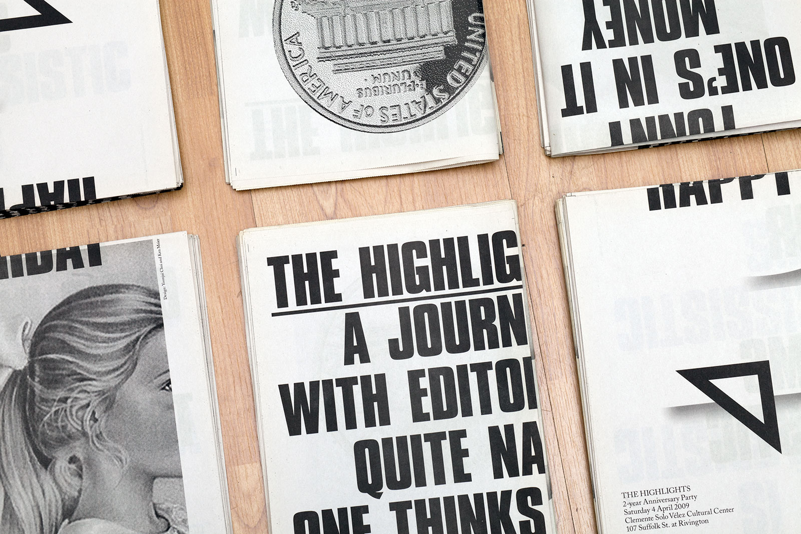
Birthday posters
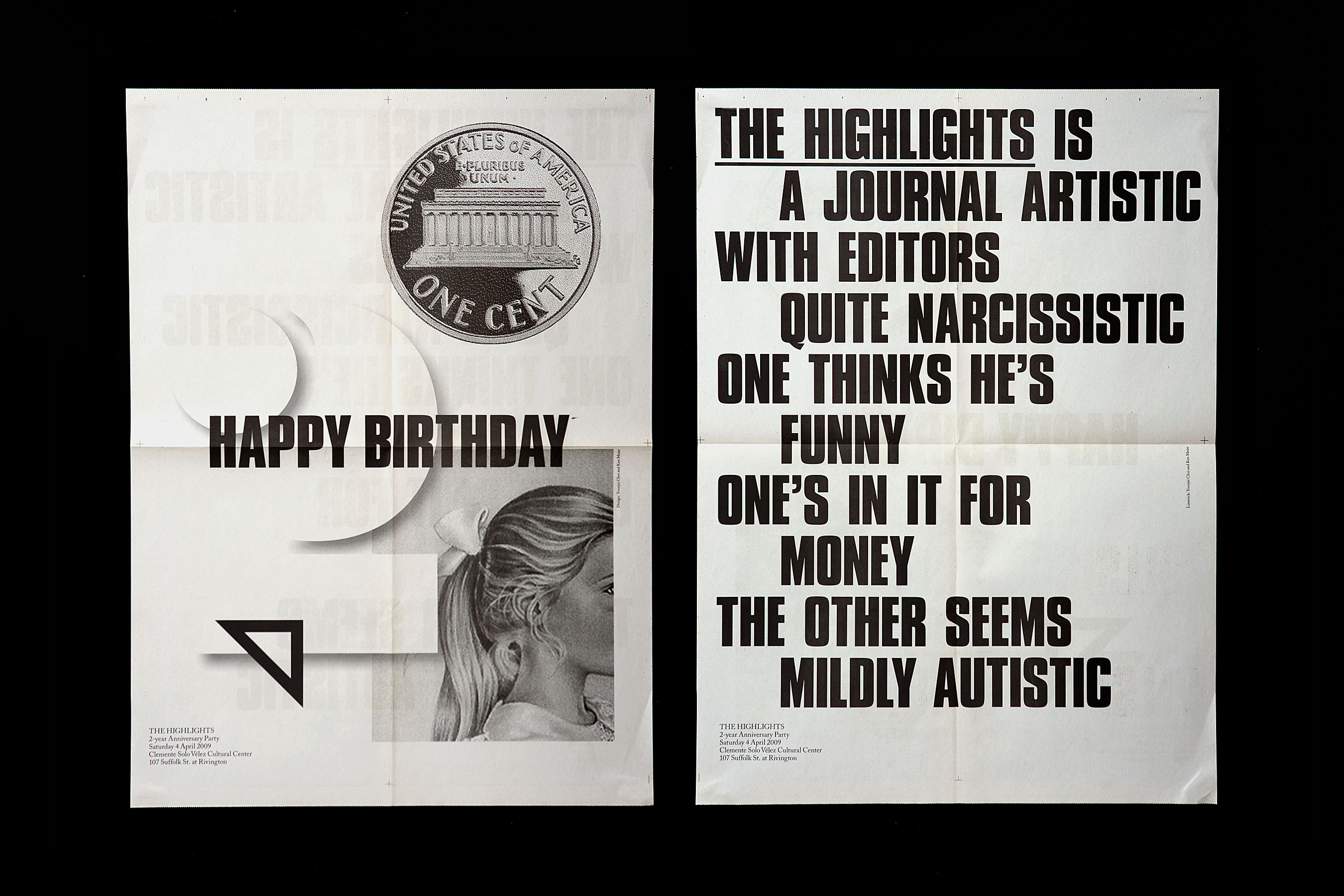
Identity, website, and posters, 2010
Edited by Ethan Greenbaum and Luke Stettner
Website development by Mike Bingaman
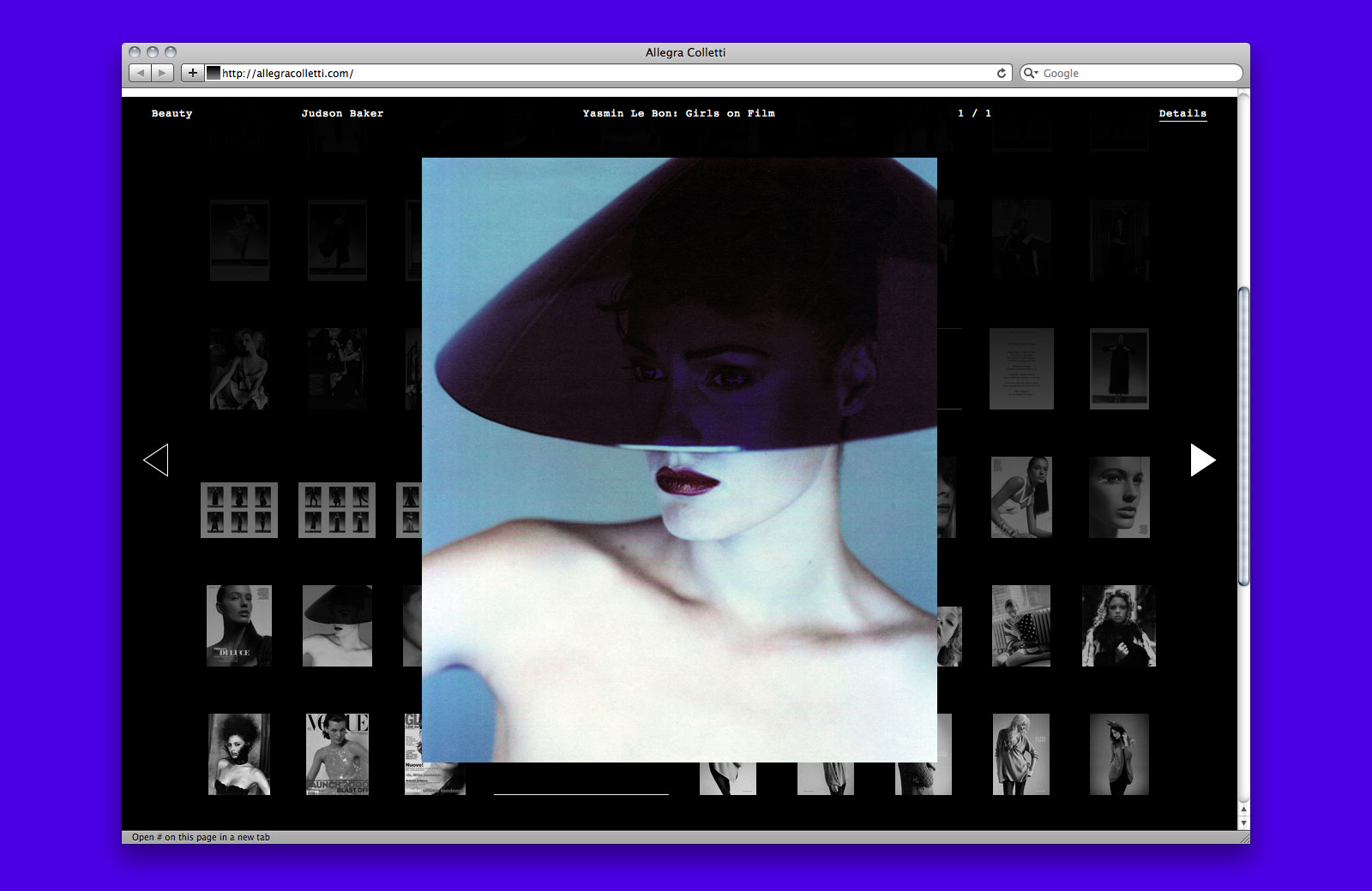
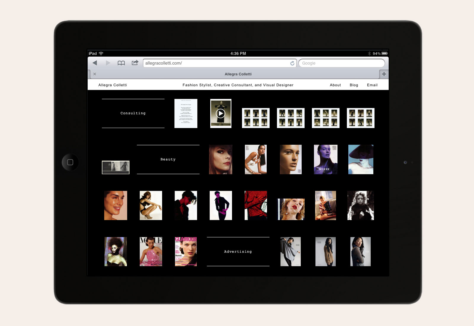
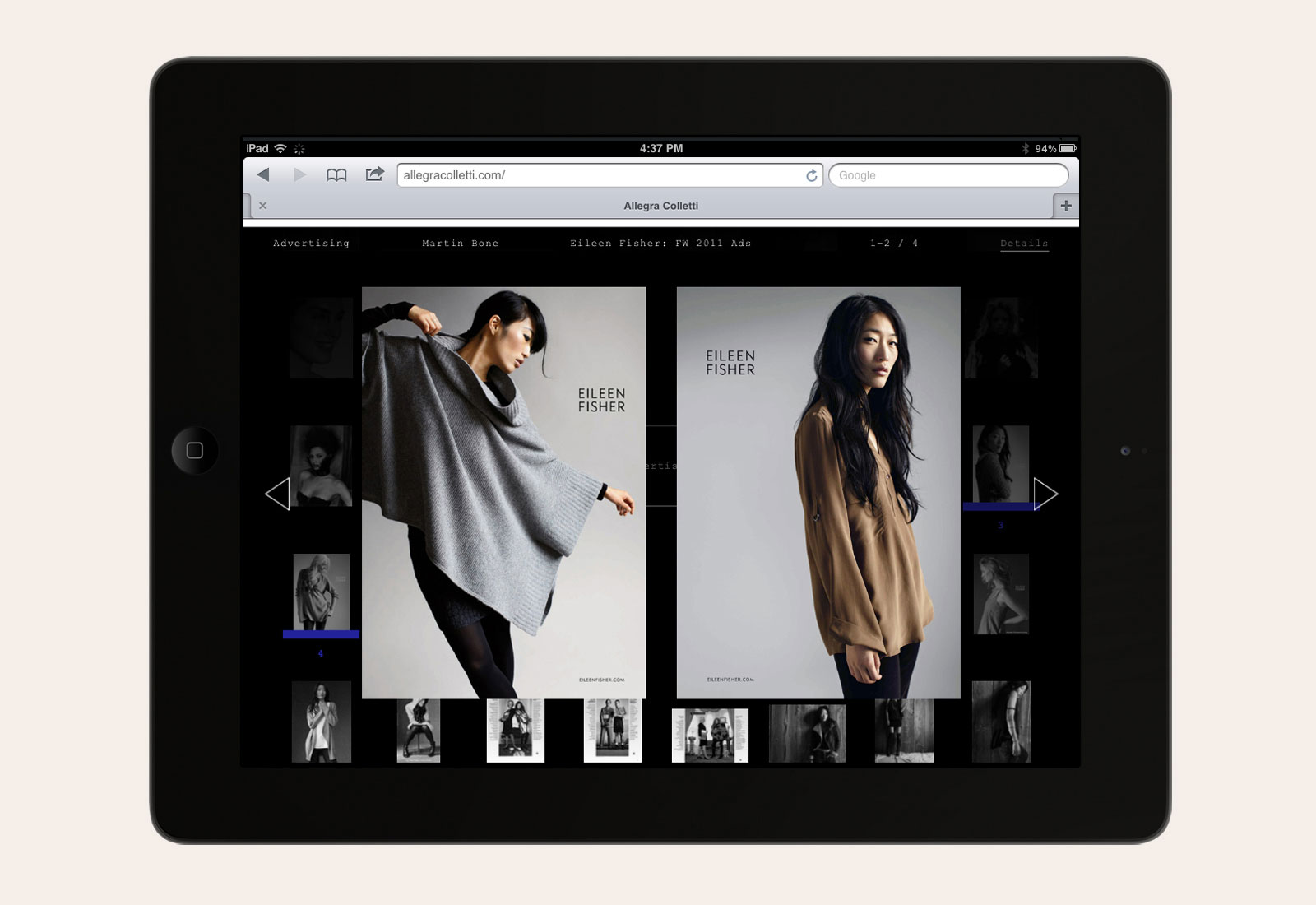
PORTFOLIO WEBSITE for ALLEGRA COLLETTI —— Allegra Colletti is a New York-based fashion stylist and consultant whose work ranges from the repositioning of established brands to the designing and launching of new labels. Her approach strikes that delicate balance between art and commerce, favoring bold, graphic imagery that creates a strong visual narrative. We were asked to design a website that would highlight her ability to work across disciplines, as well as emphasize the tendency of her images to operate in pairs, as in the spread of a magazine.
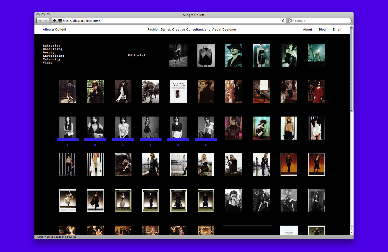
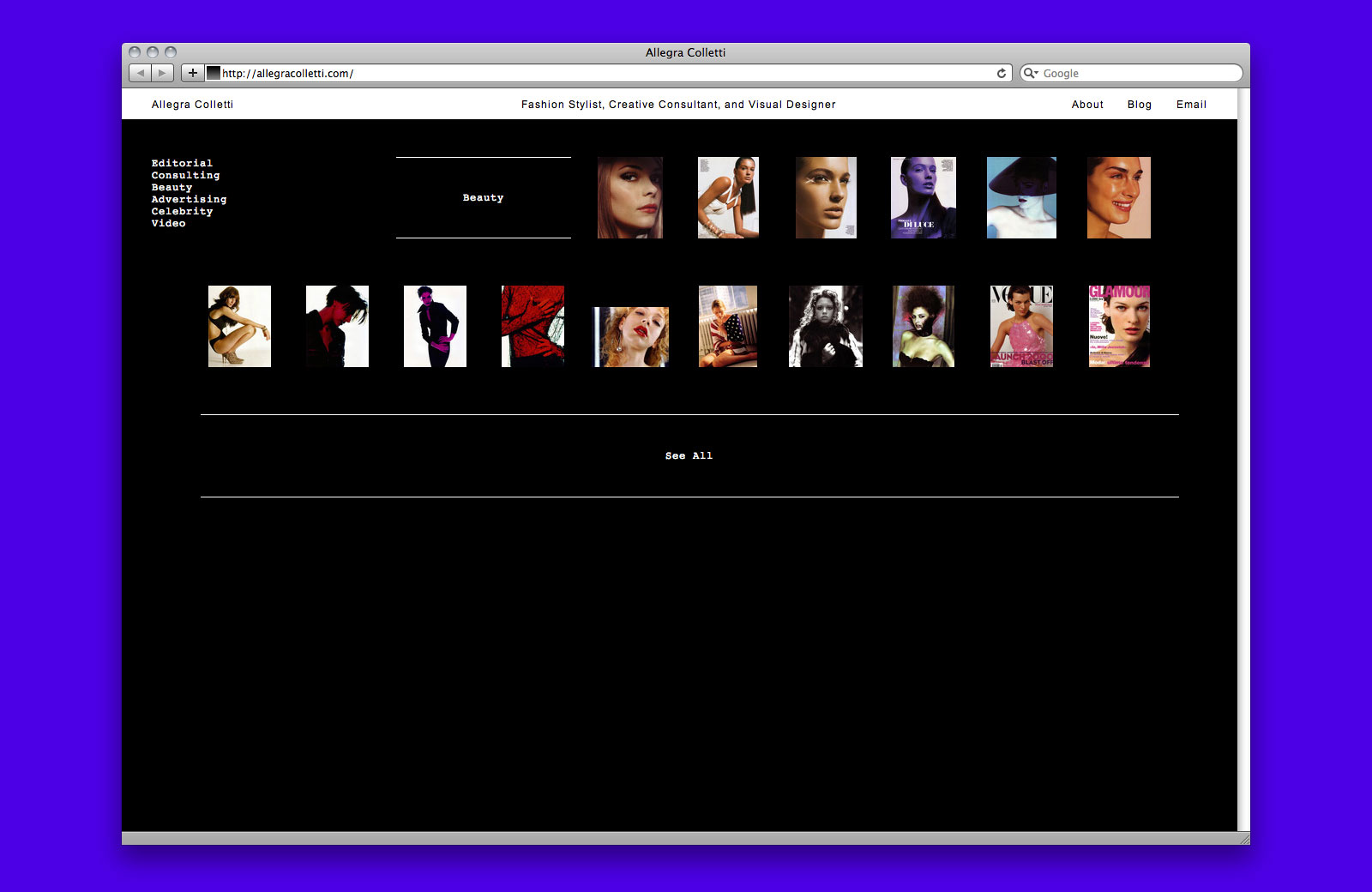
Sort by category
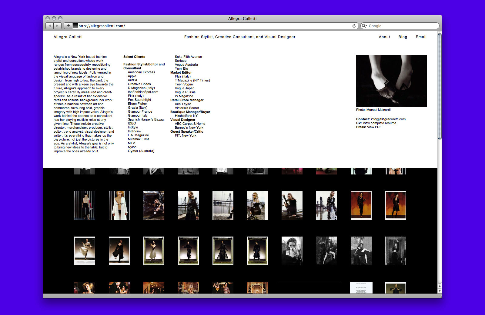
About page
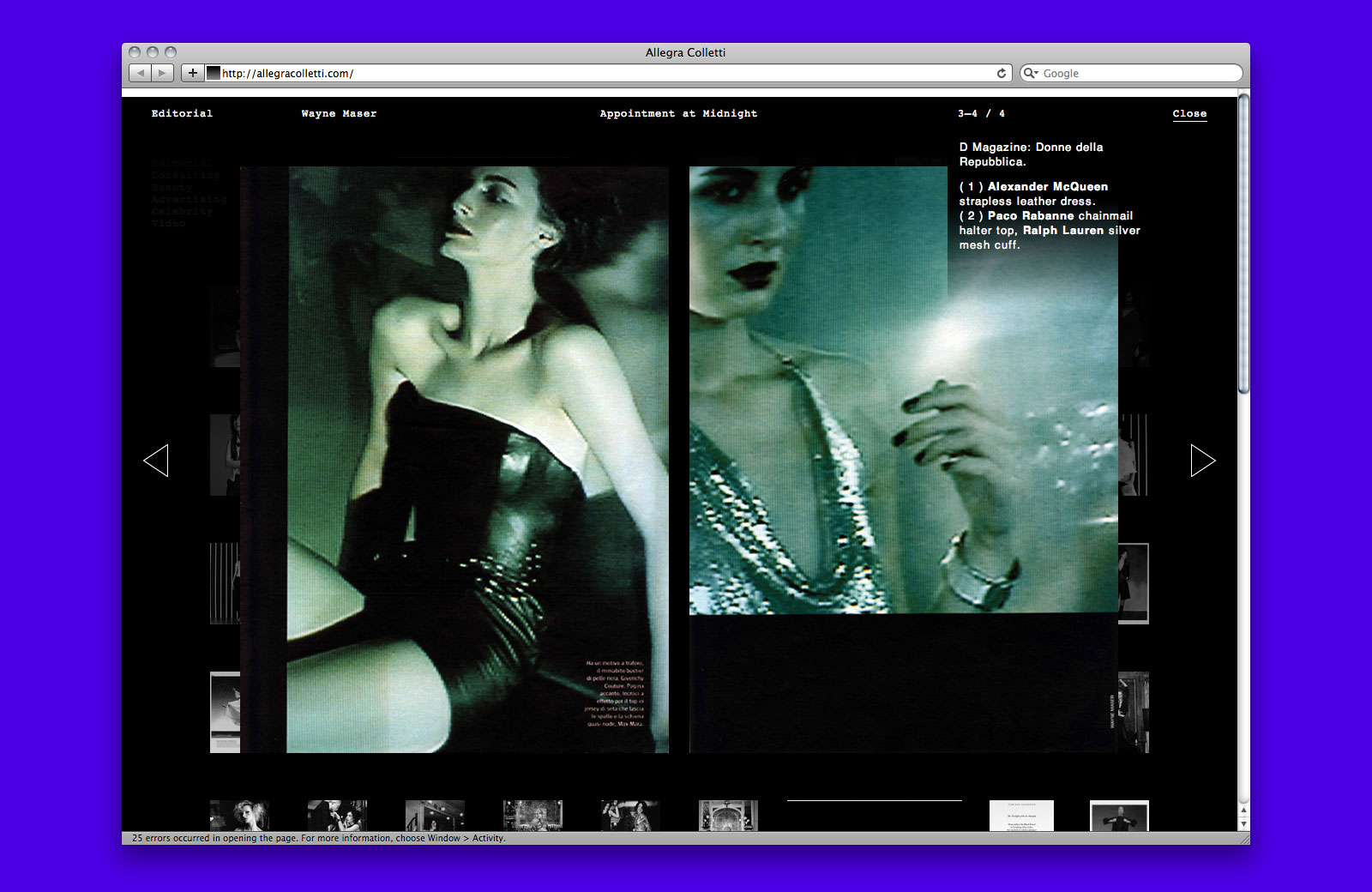
Image details
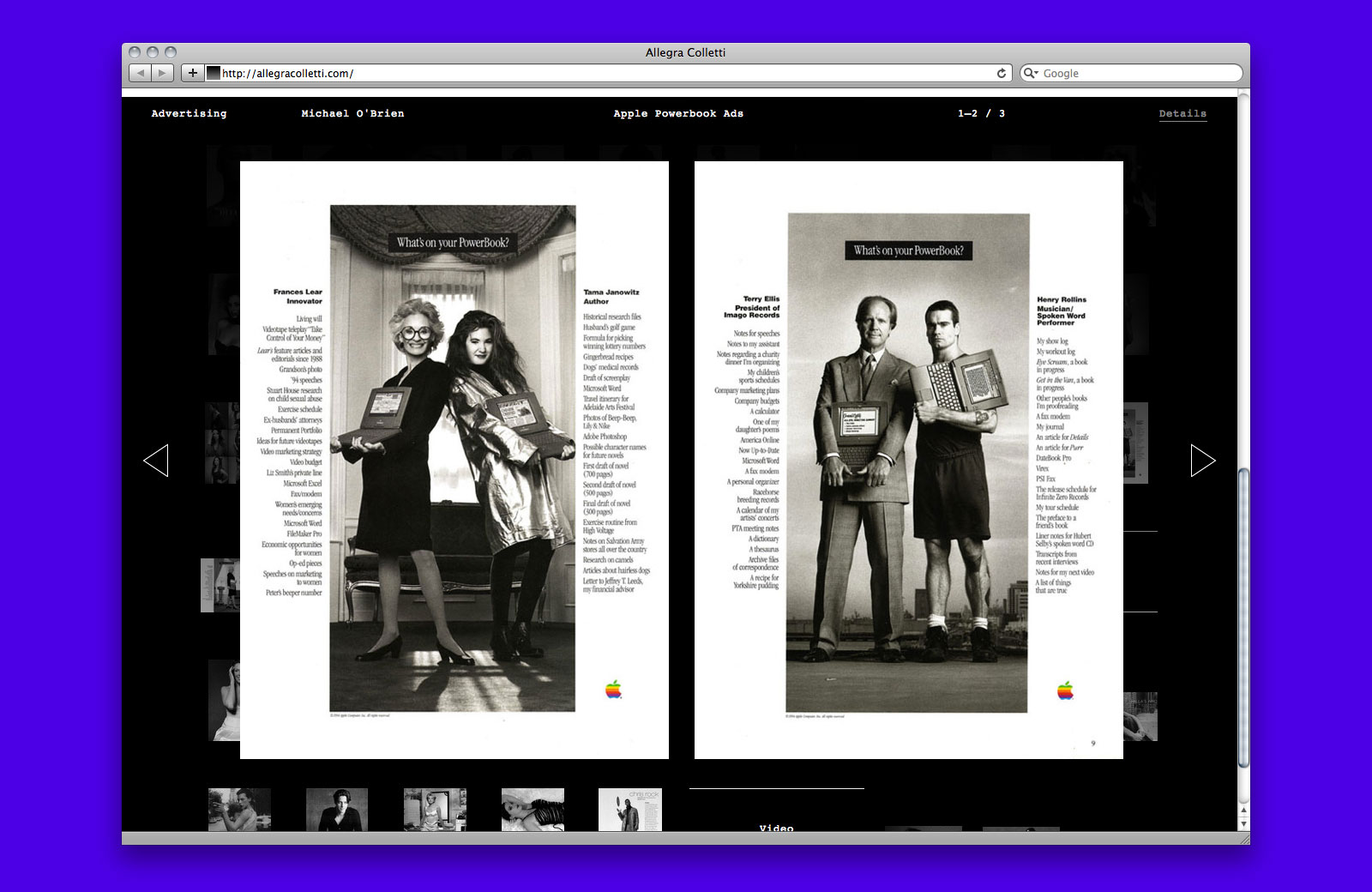
Image spread
Website design, 2012
Website development by Dan Brewster
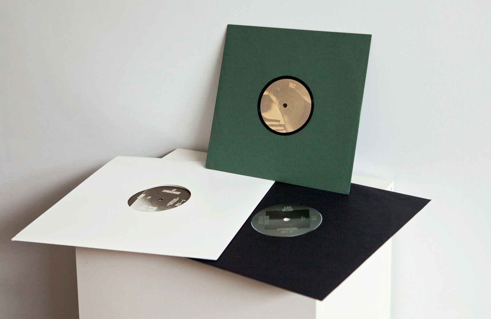
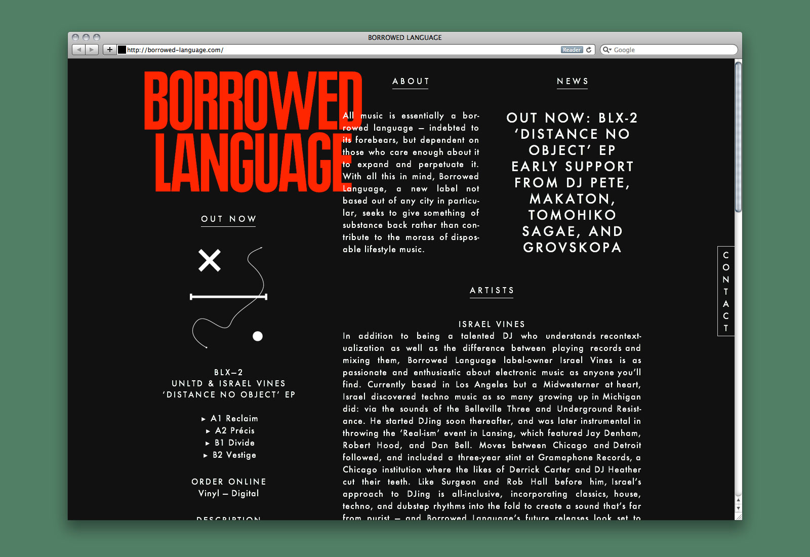
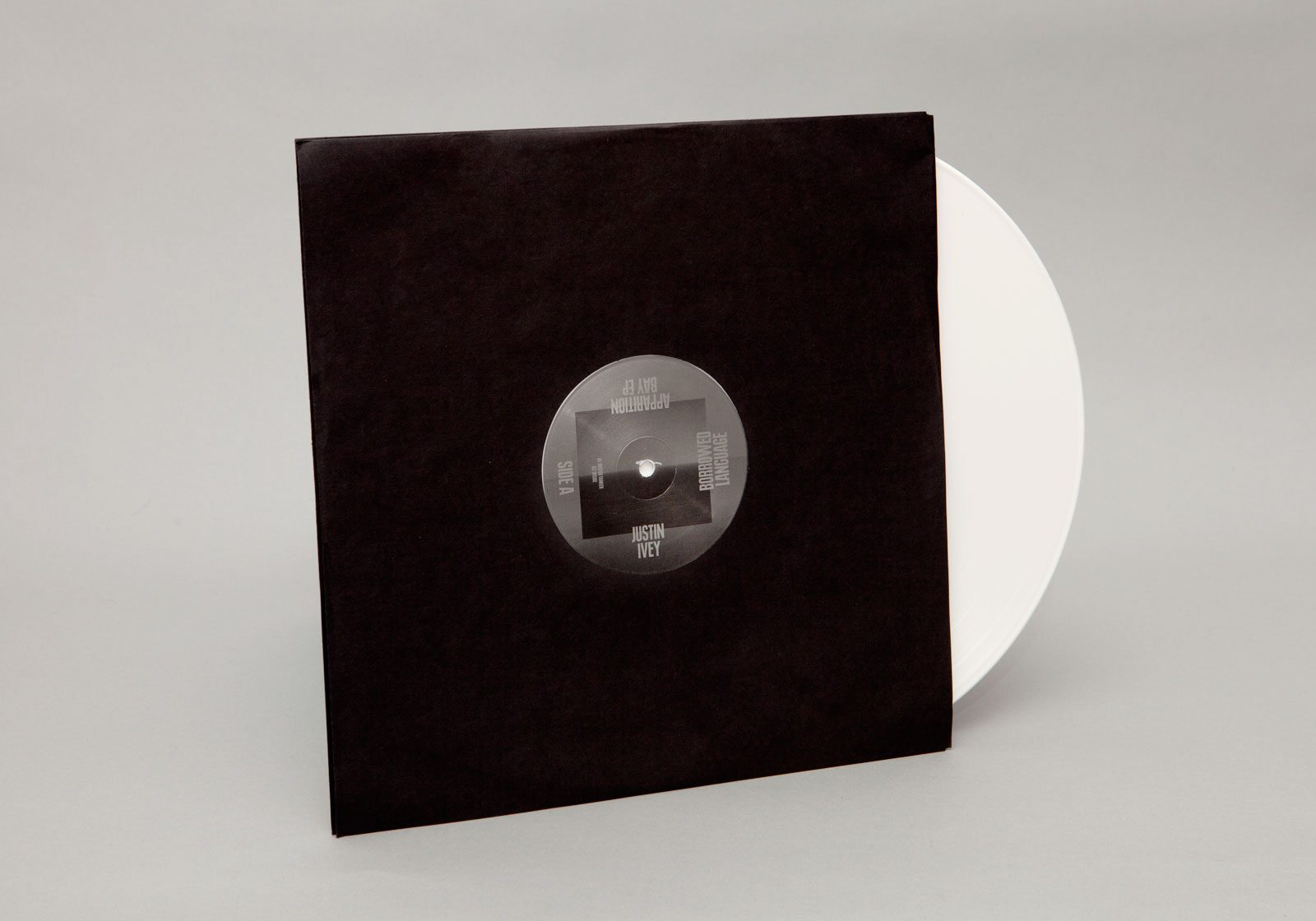
IDENTITY, WEBSITE, and LABEL ART for BORROWED LANGUAGE —— All music is essentially a borrowed language, indebted to its forebears but dependent on those who care to expand and perpetuate it. With this in mind, Borrowed Language, a label not based out of any city in particular, seeks to give something of substance back rather than contribute to the morass of disposable lifestyle music. Built on a robust typographic system, the design of each release incorporates a range of visual sensibilities through the repurposing of found imagery.

BLX-5
Jeff Pietro & Israel Vines
Disintegrate EP
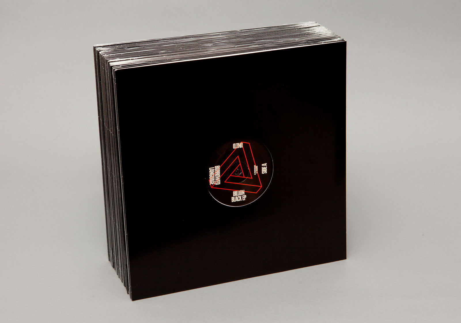
BLX-1
UNLTD
Billion Black EP
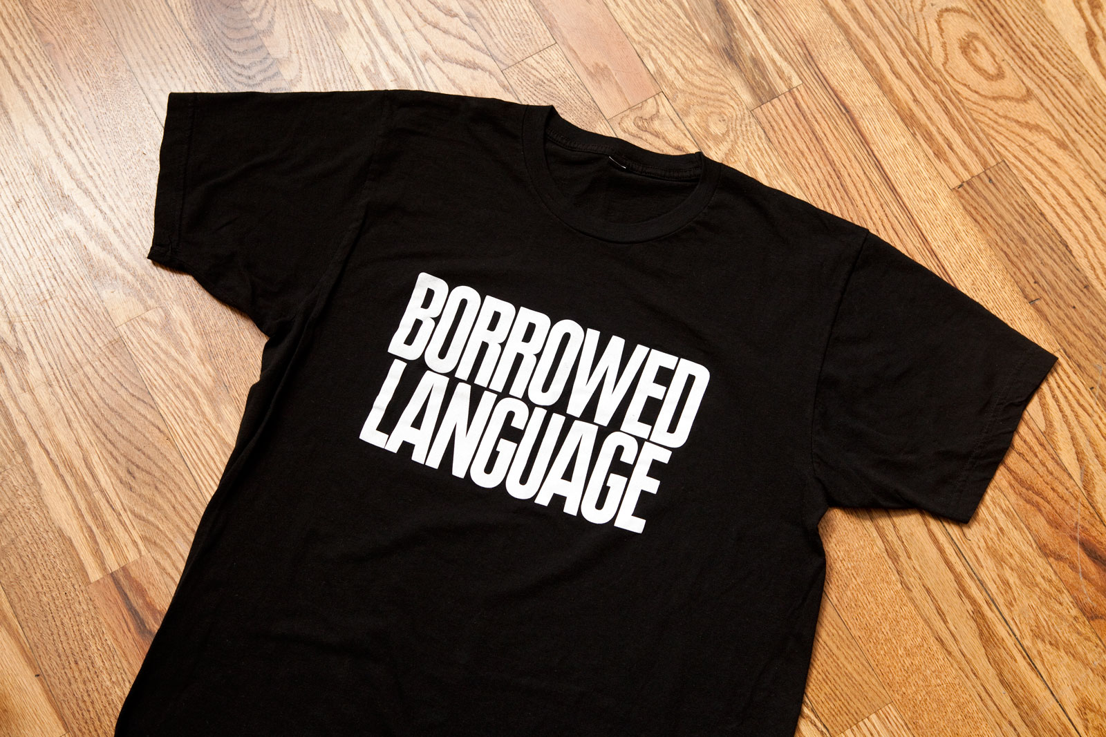
T-shirt
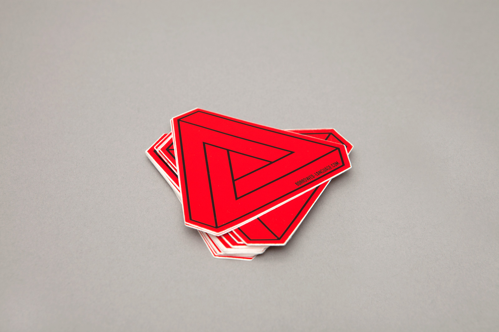
Stickers
Identity system, website, and label art, 2012
Website development by Mike Bingaman
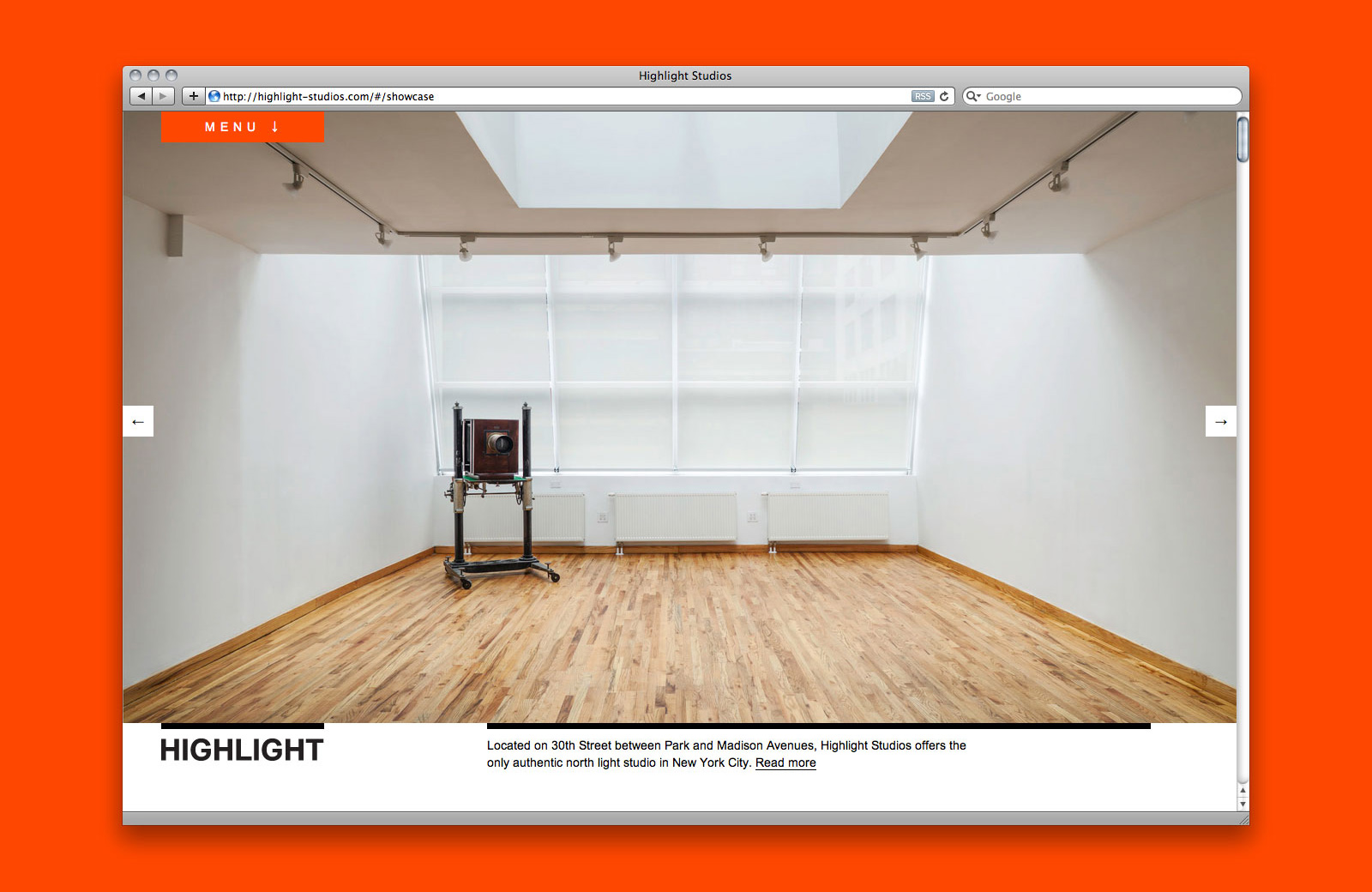
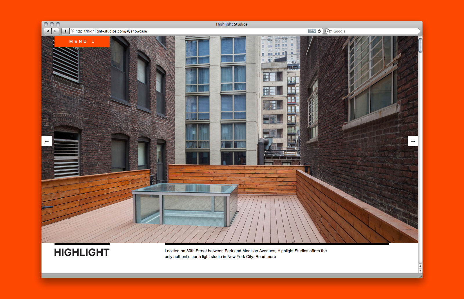
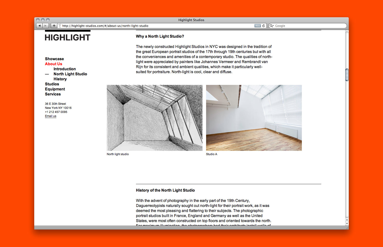
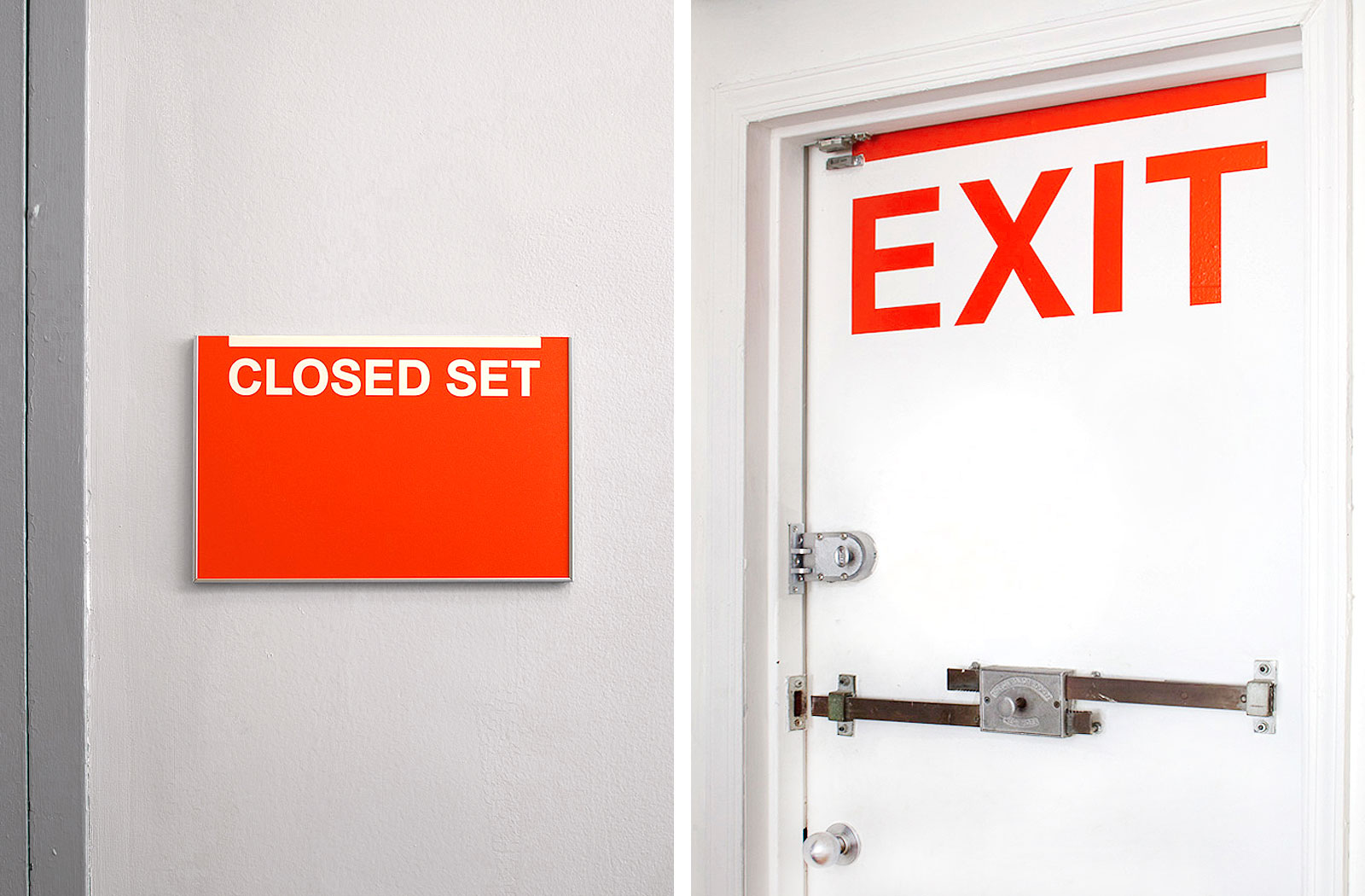
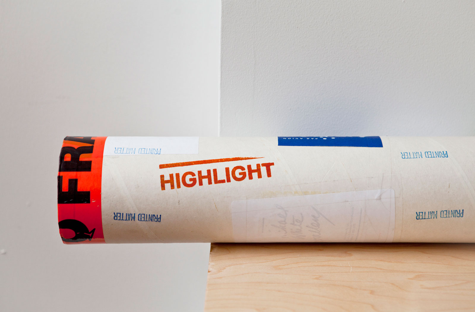
IDENTITY SYSTEM, WEBSITE, and APPLICATIONS for HIGHLIGHT STUDIOS —— Part of a complex including the Penumbra Foundation and Center for Alternative Photography, Highlight offers the only authentic north-light studio in New York City. With all of the conveniences of a modern studio, Highlight was built to optimal specifications as established by icons such as Nadar, Irving Penn, and Richard Avedon. In addition to the overarching identity and web presence, we also implemented a signage program, stationery, merchandise, and other promotional materials.
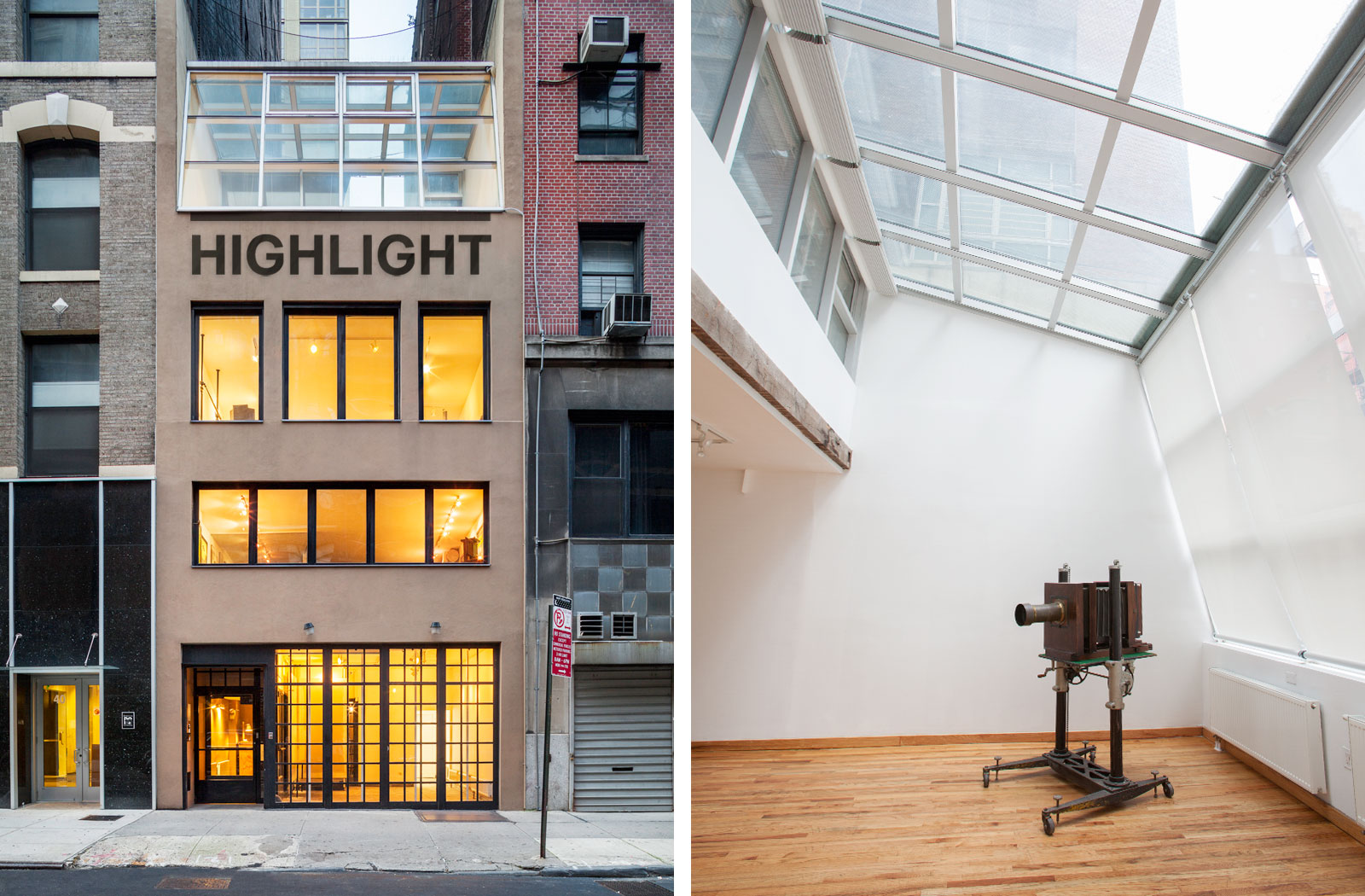
Exterior and interior views
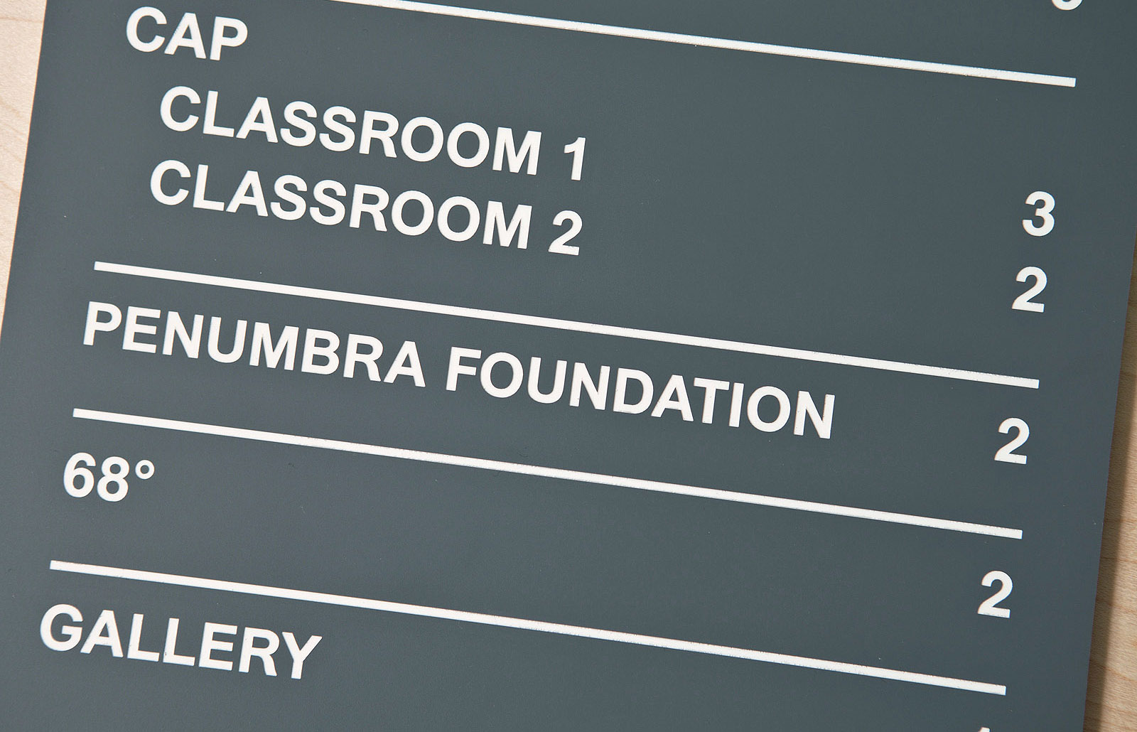
Signage detail
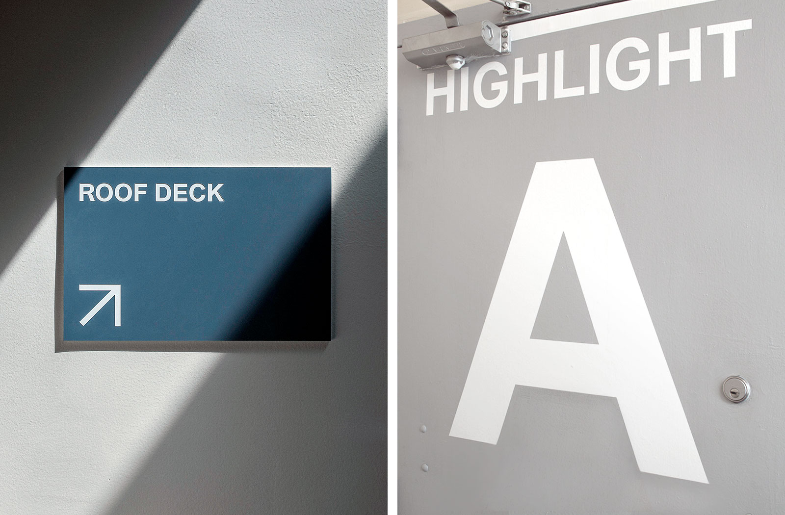
Various signage
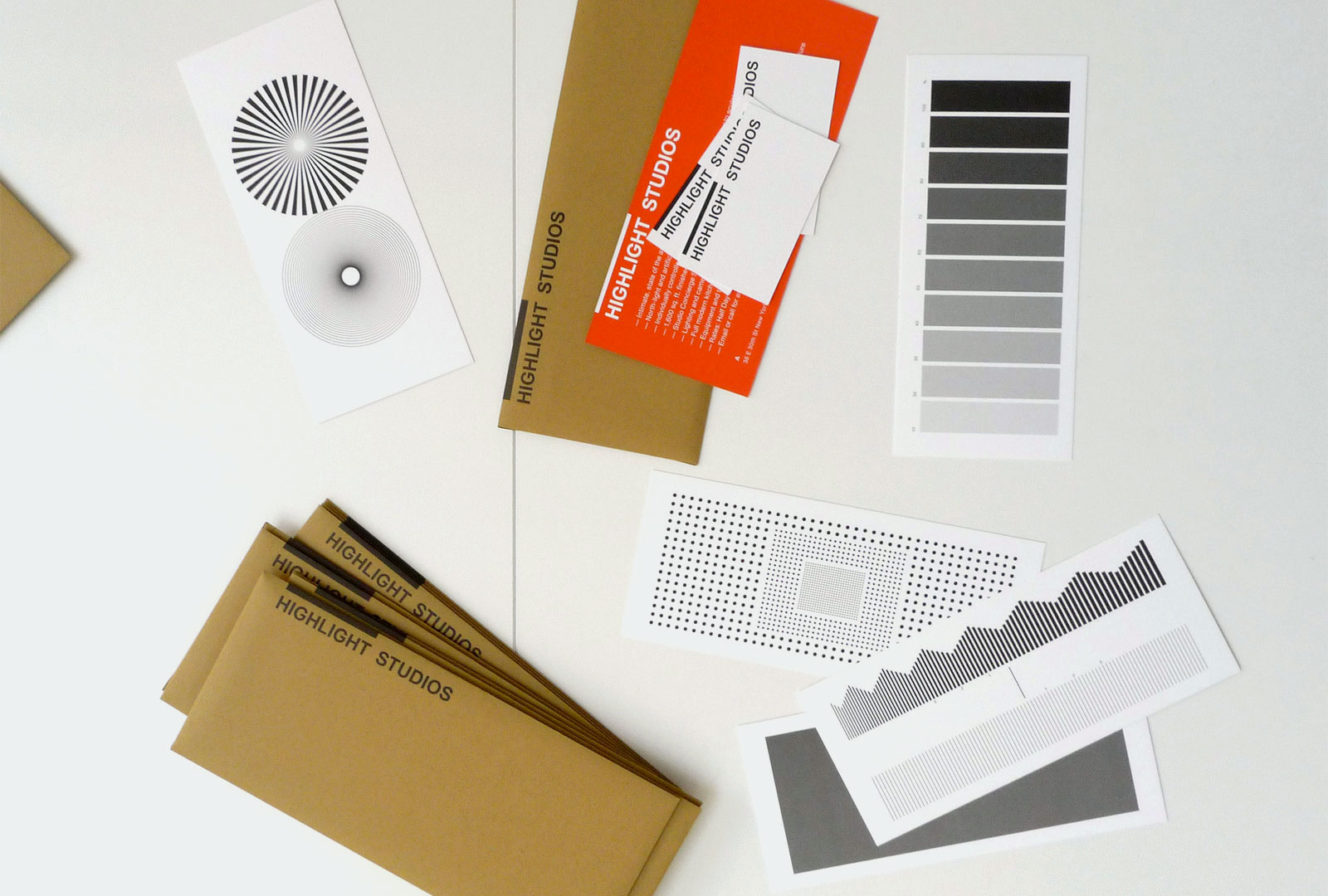
Stationery set inspired by optical tools used in photography
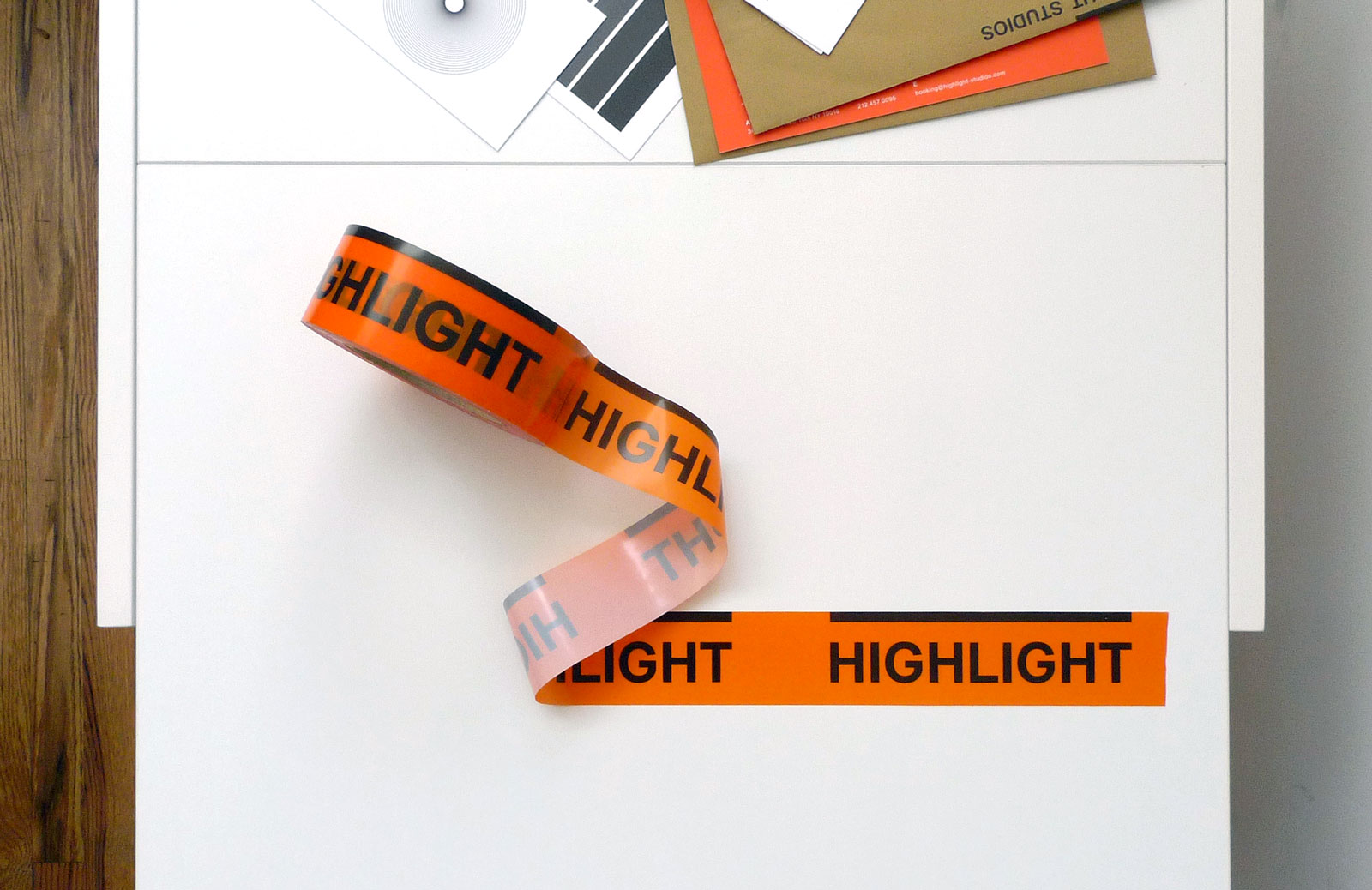
Custom tape
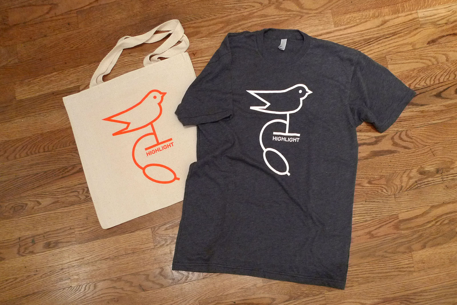
T-shirt and tote bag
Custom stamp
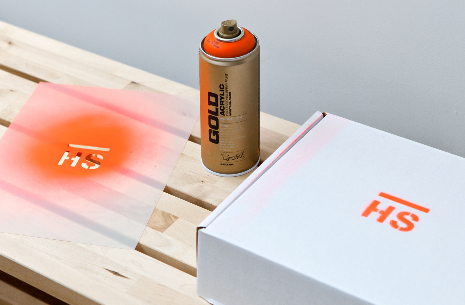
Identity system, website, and applications, 2012
Website development by Dan Brewster
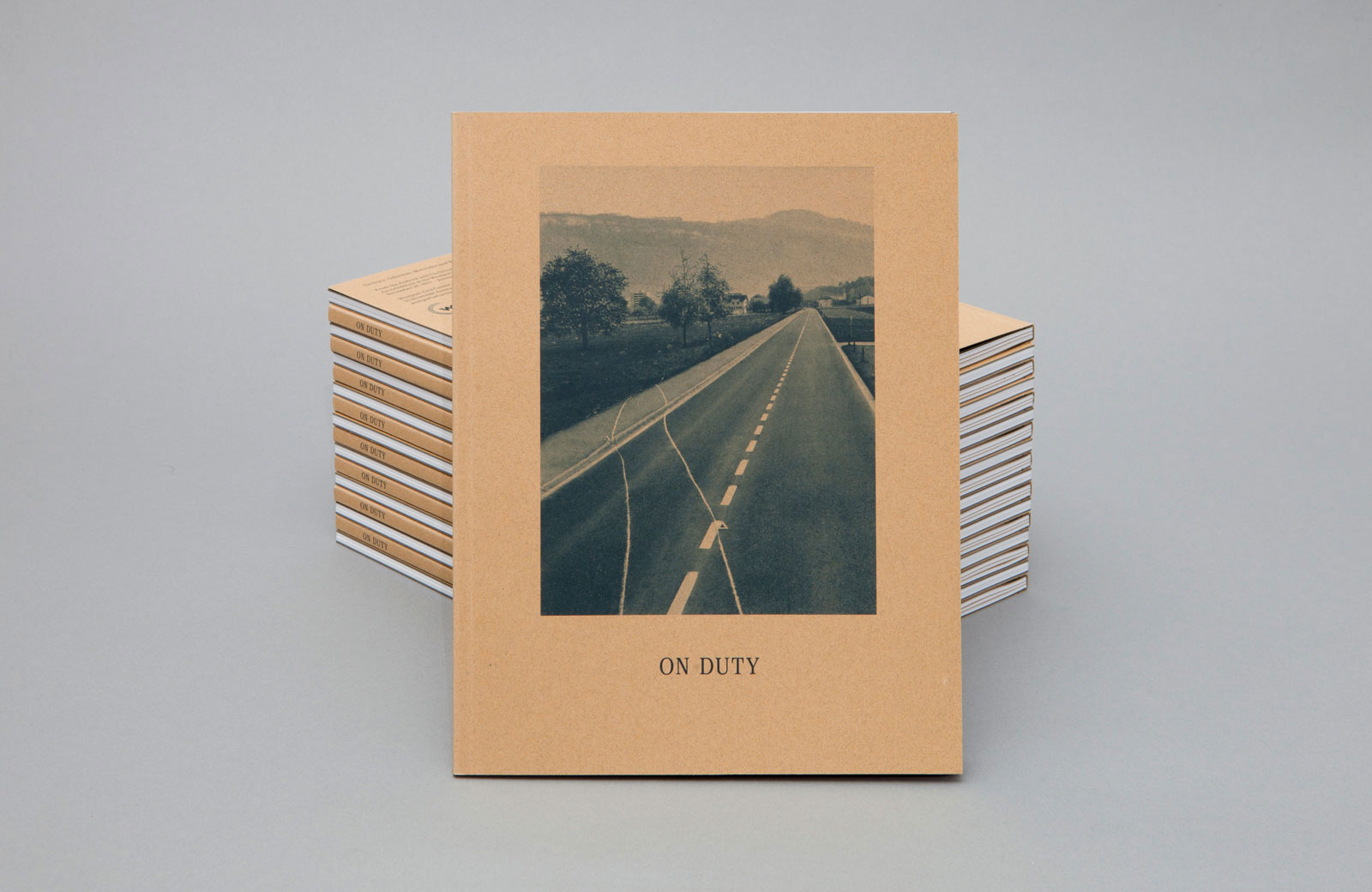
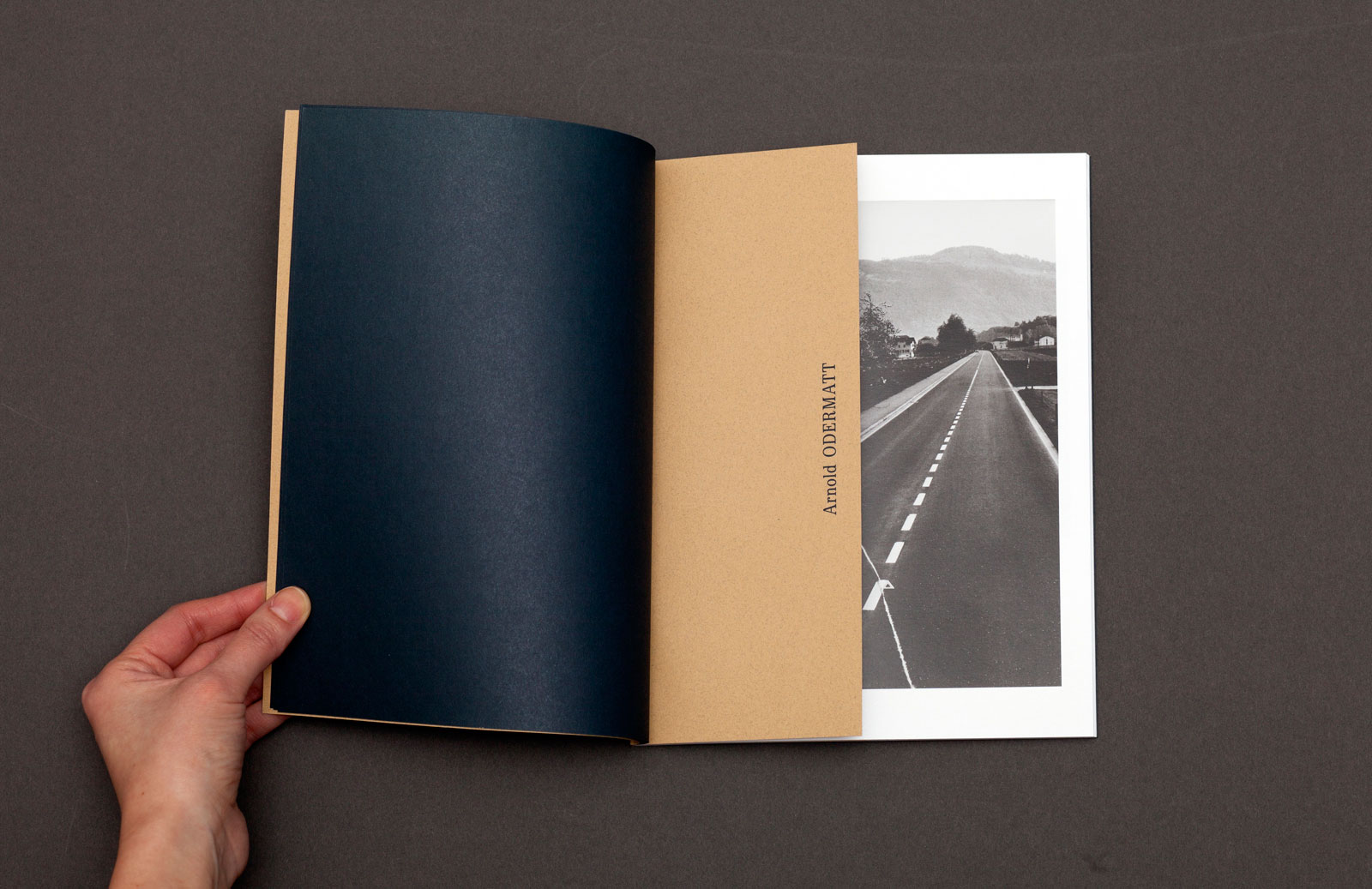
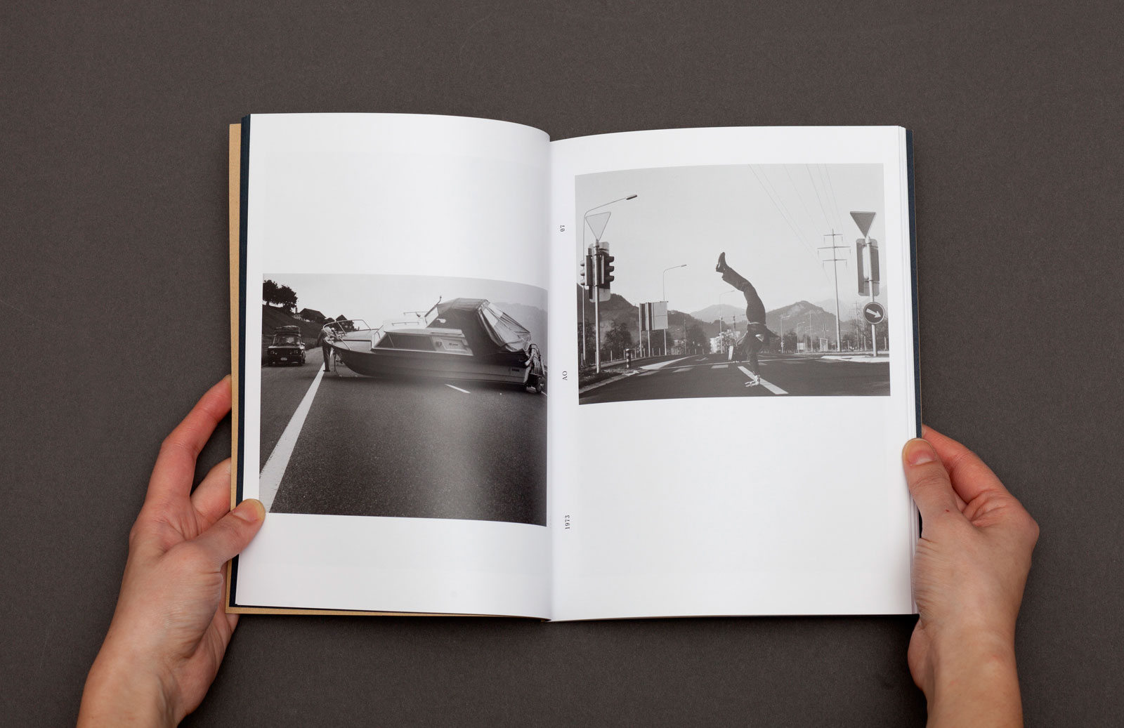
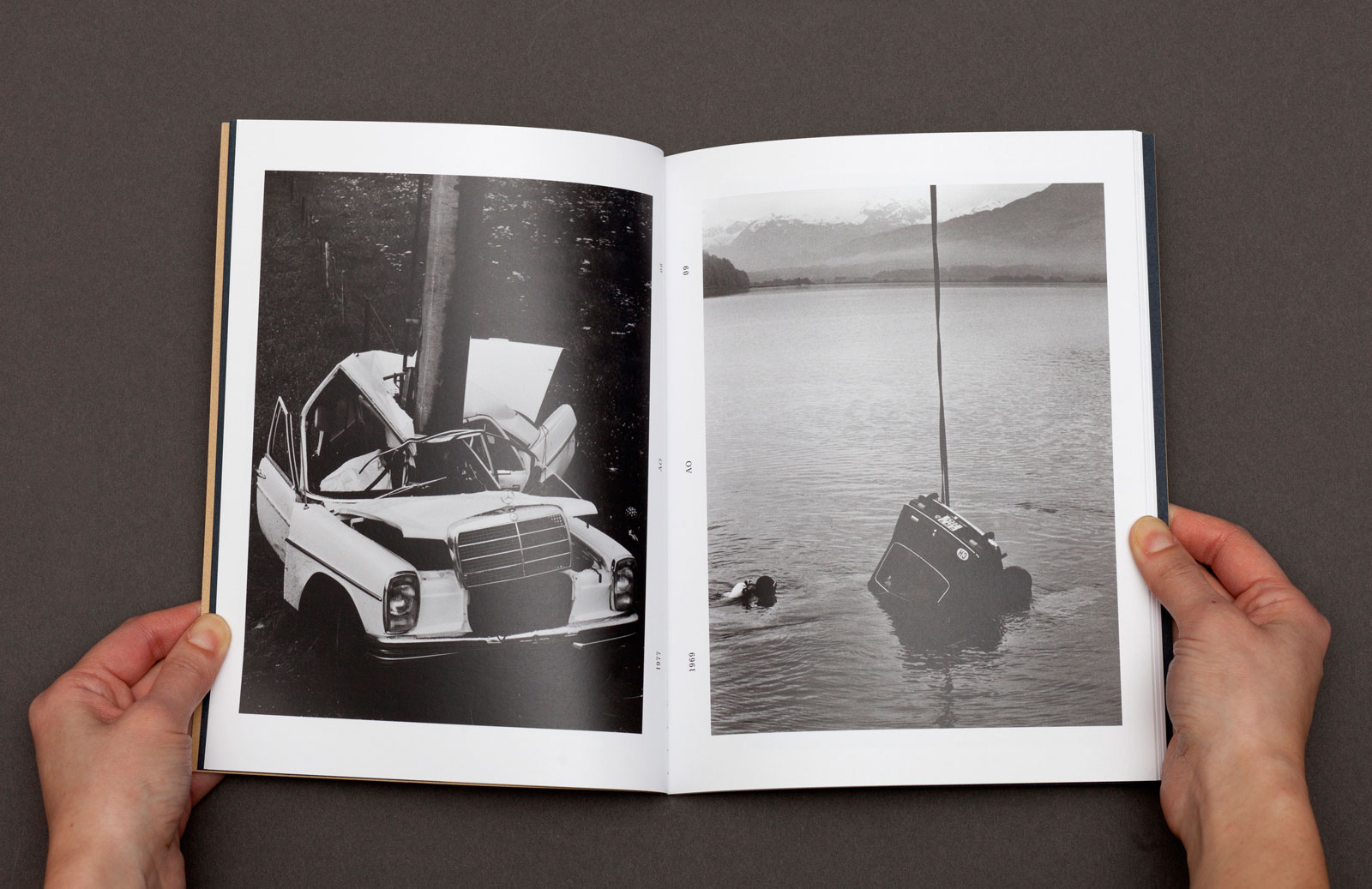
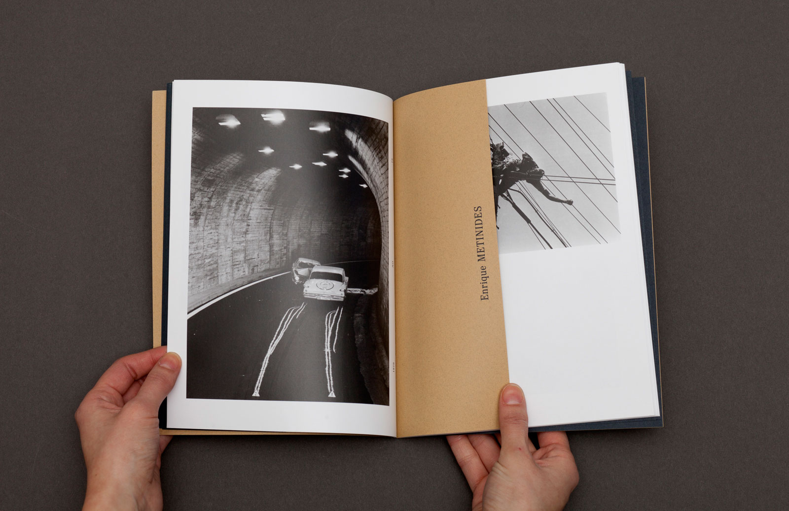
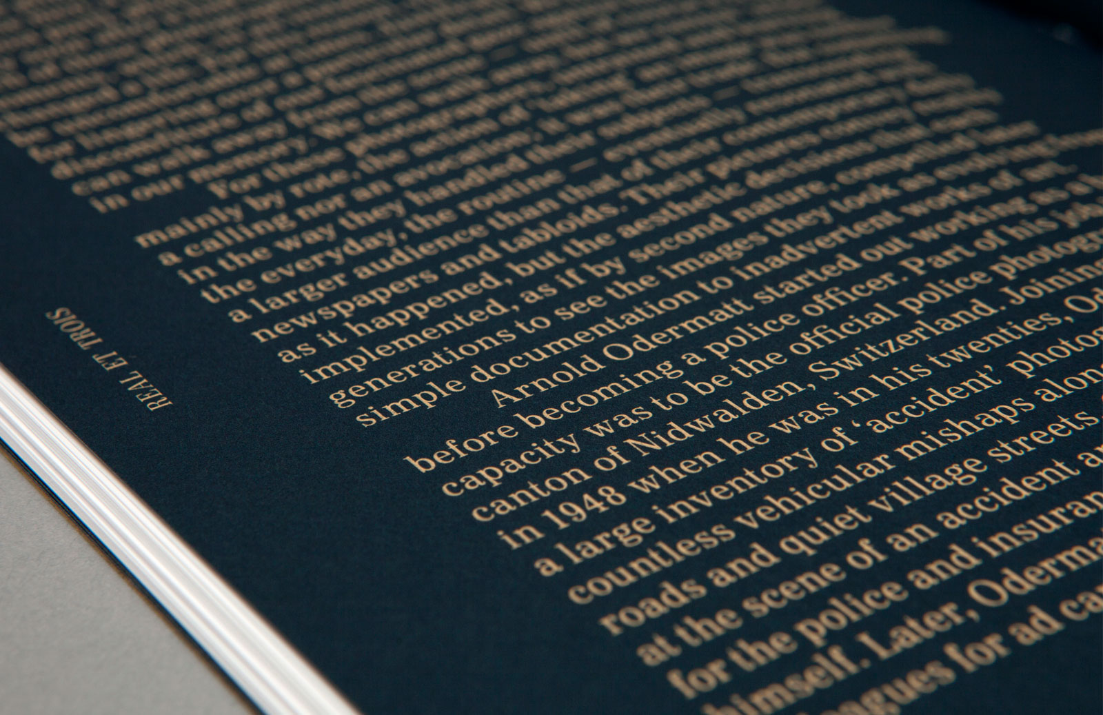
ON DUTY for LEO KOENIG and DERNEBERG PUBLICATIONS —— A catalog created for an exhibition of work by three atypical photographers: a Swiss policeman, Arnold Odermatt; a Mexican photojournalist, Enrique Metinides; and New York’s Arthur Fellig, known as Weegee. All three, while on duty in their respective professions, crossed the line of simply documenting accidents and day-to-day mayhem. The content of the imagery, often tragic, transcends the rawness of the event and moves into the realm of a profound modernist aesthetic.
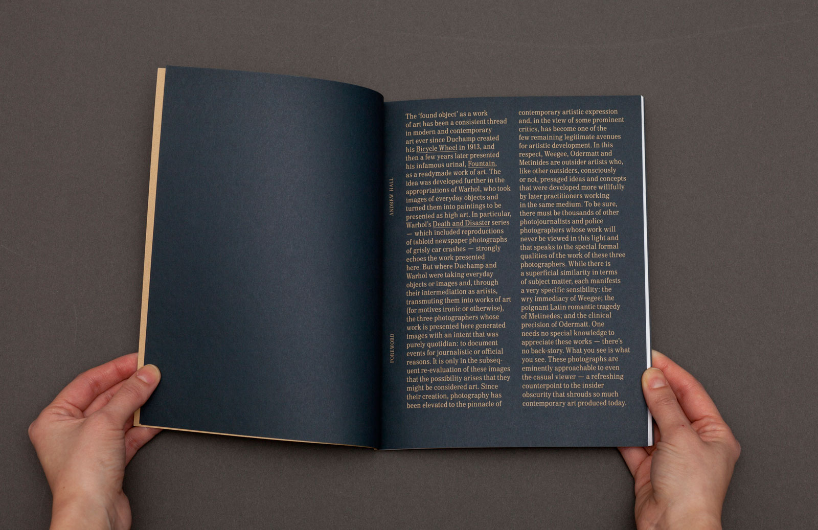
Introductory essay
Section divider
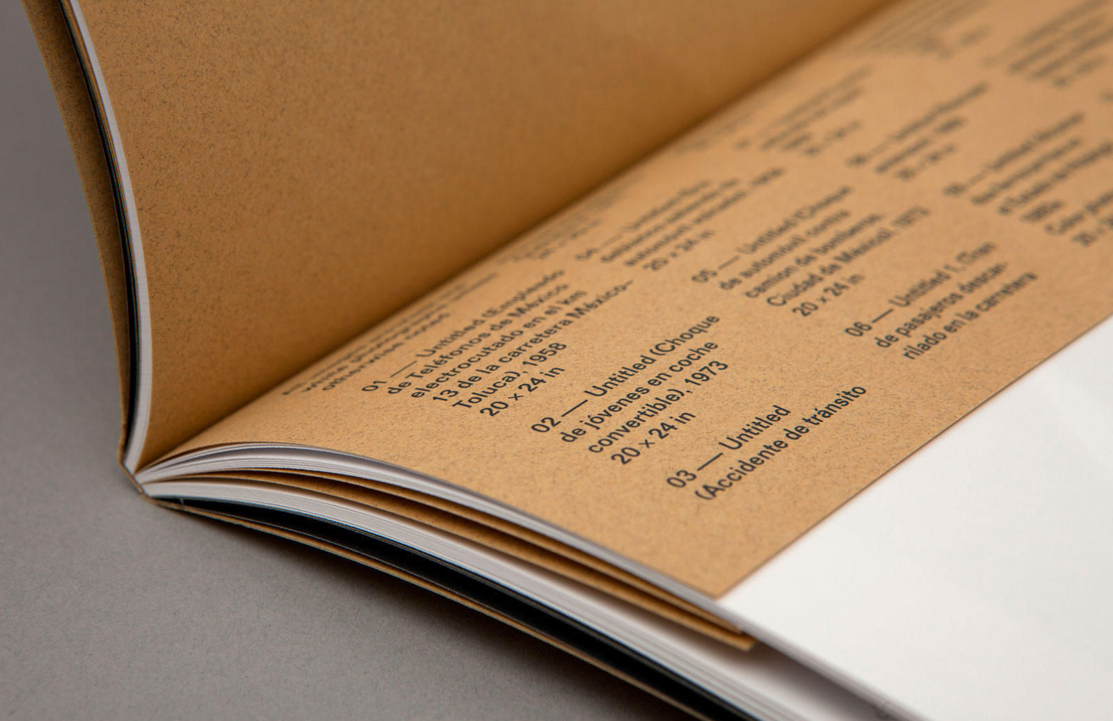
Caption detail

Catalog design, 2012
Edited by Leo Koenig
Published by Derneburg Publications
6.7×8.6 in (170×219 mm), 72 pages
Offset print, perfect-bound
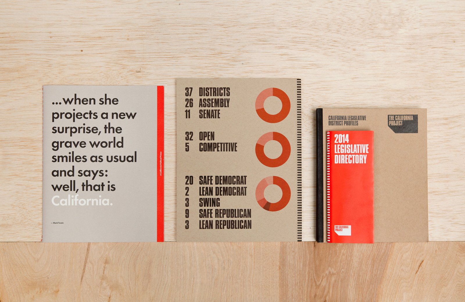
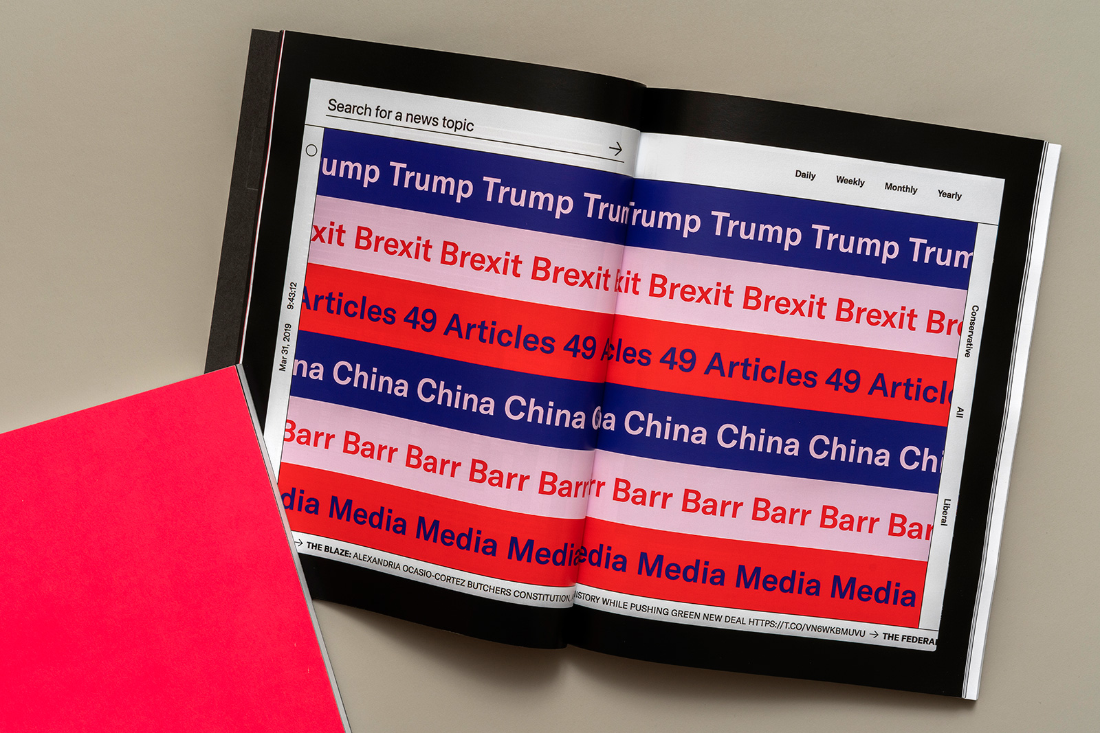
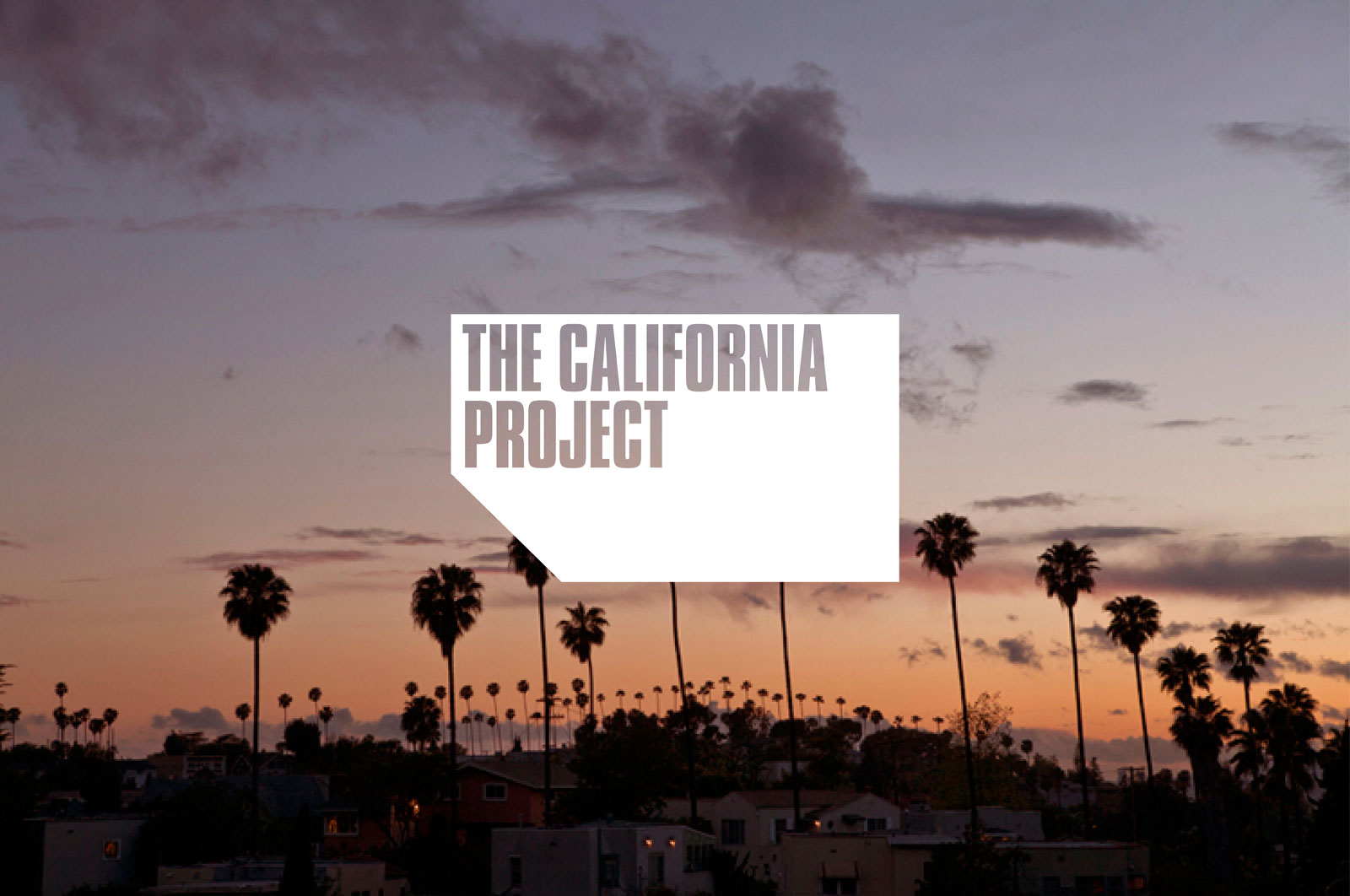
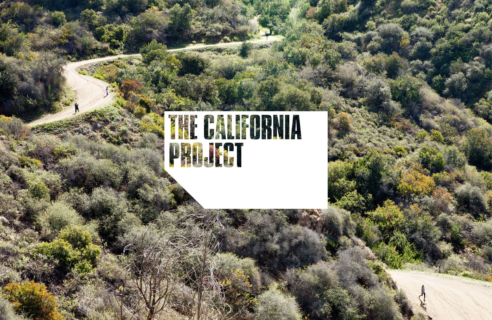
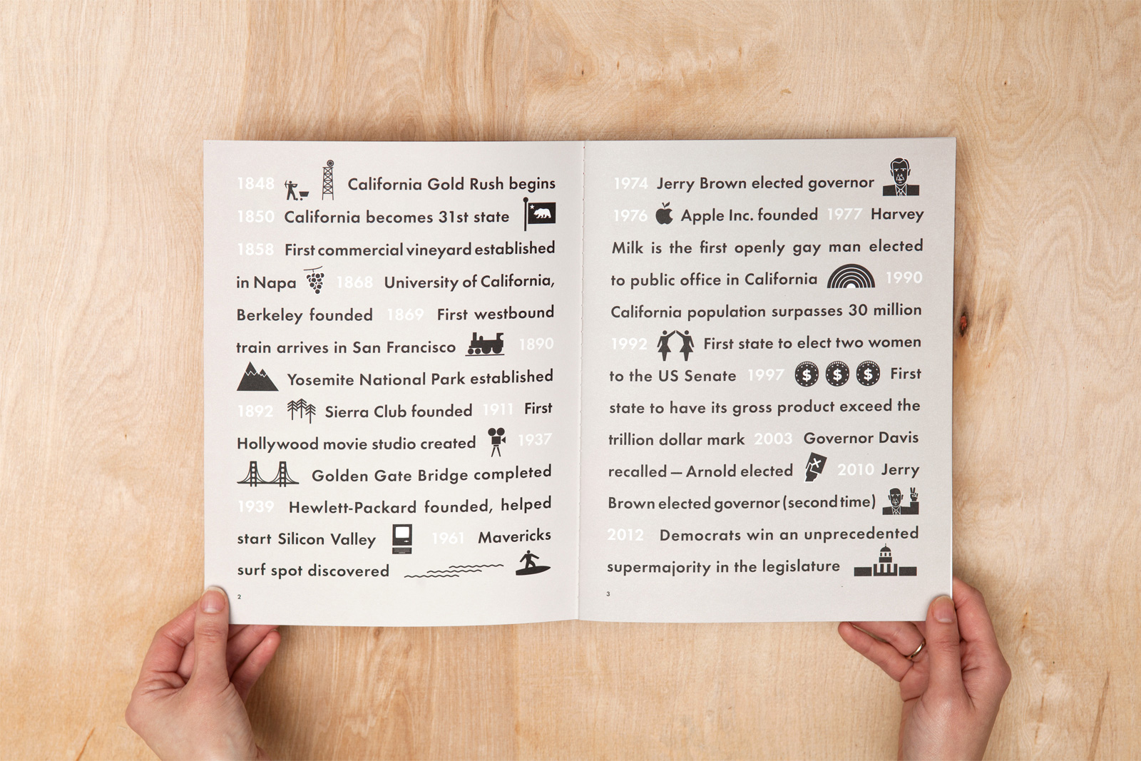
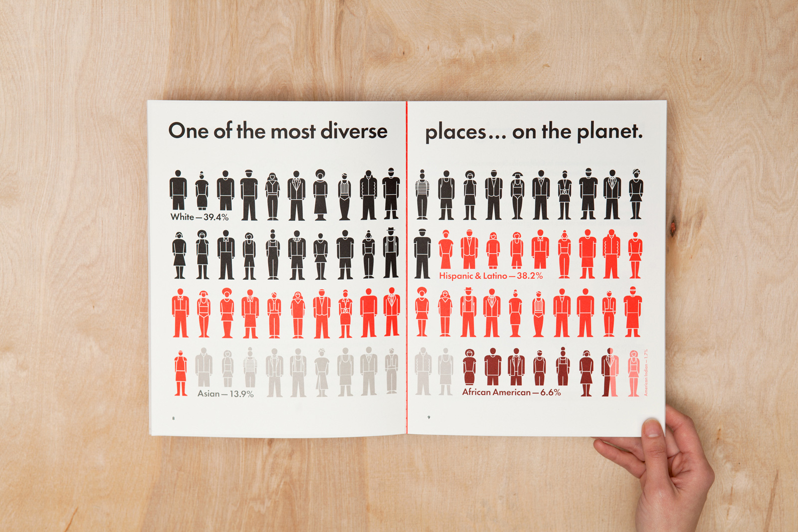
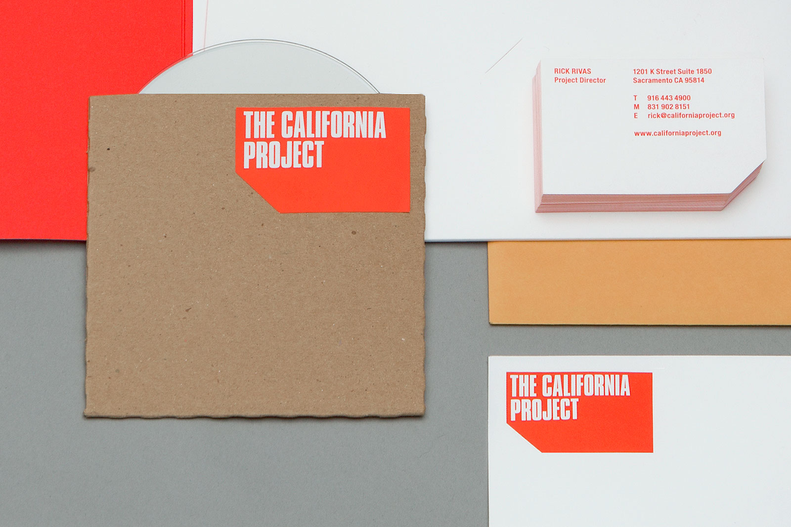
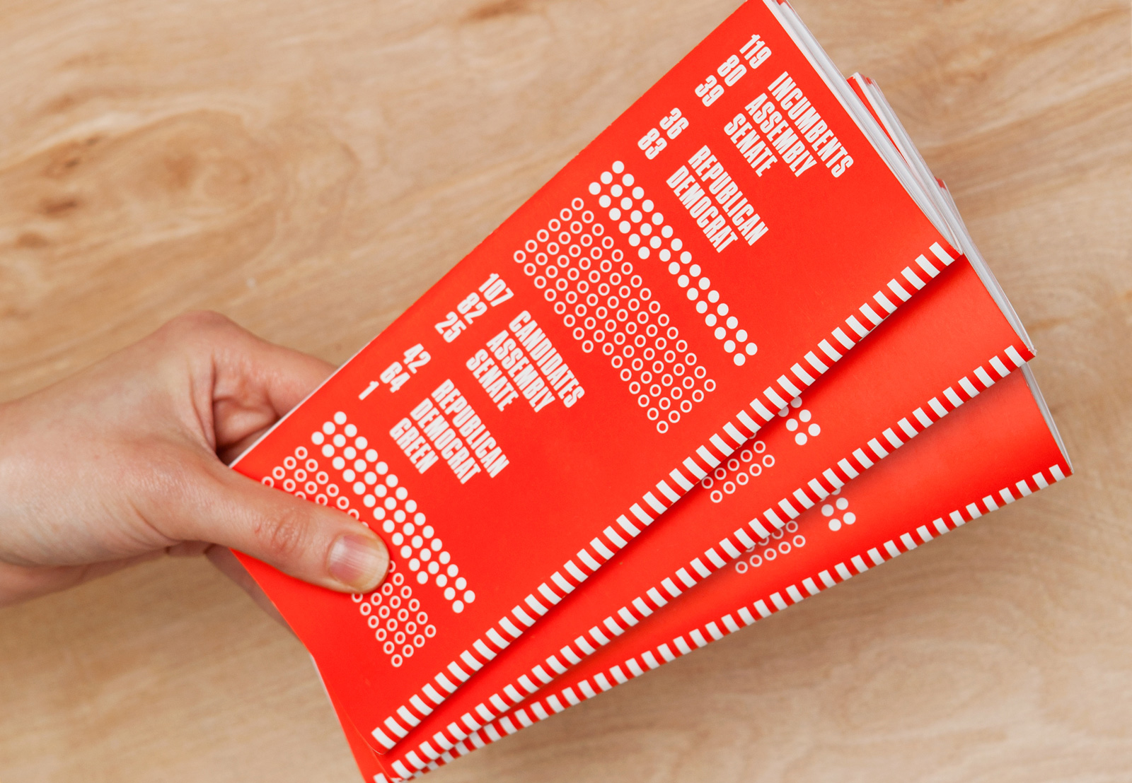
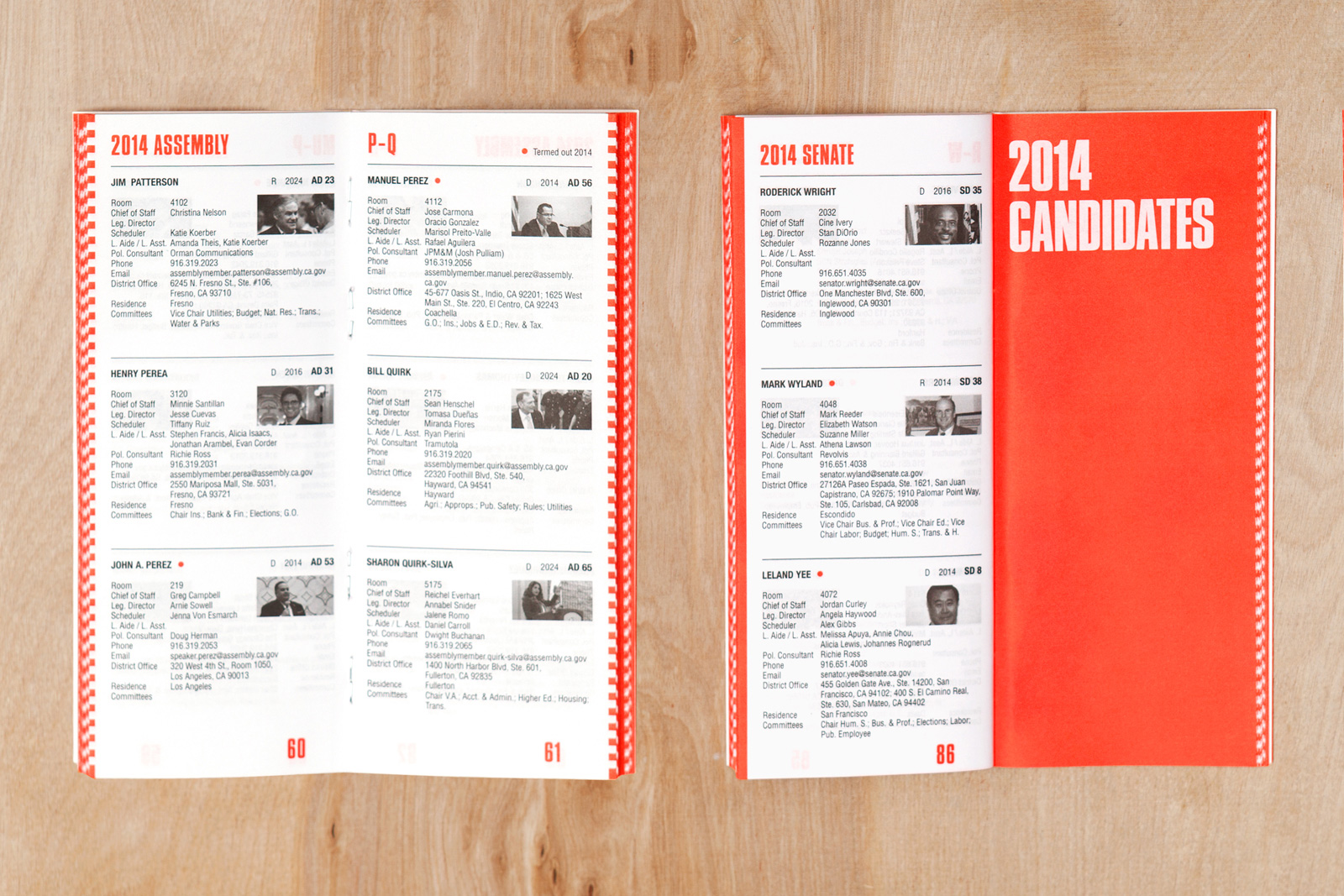
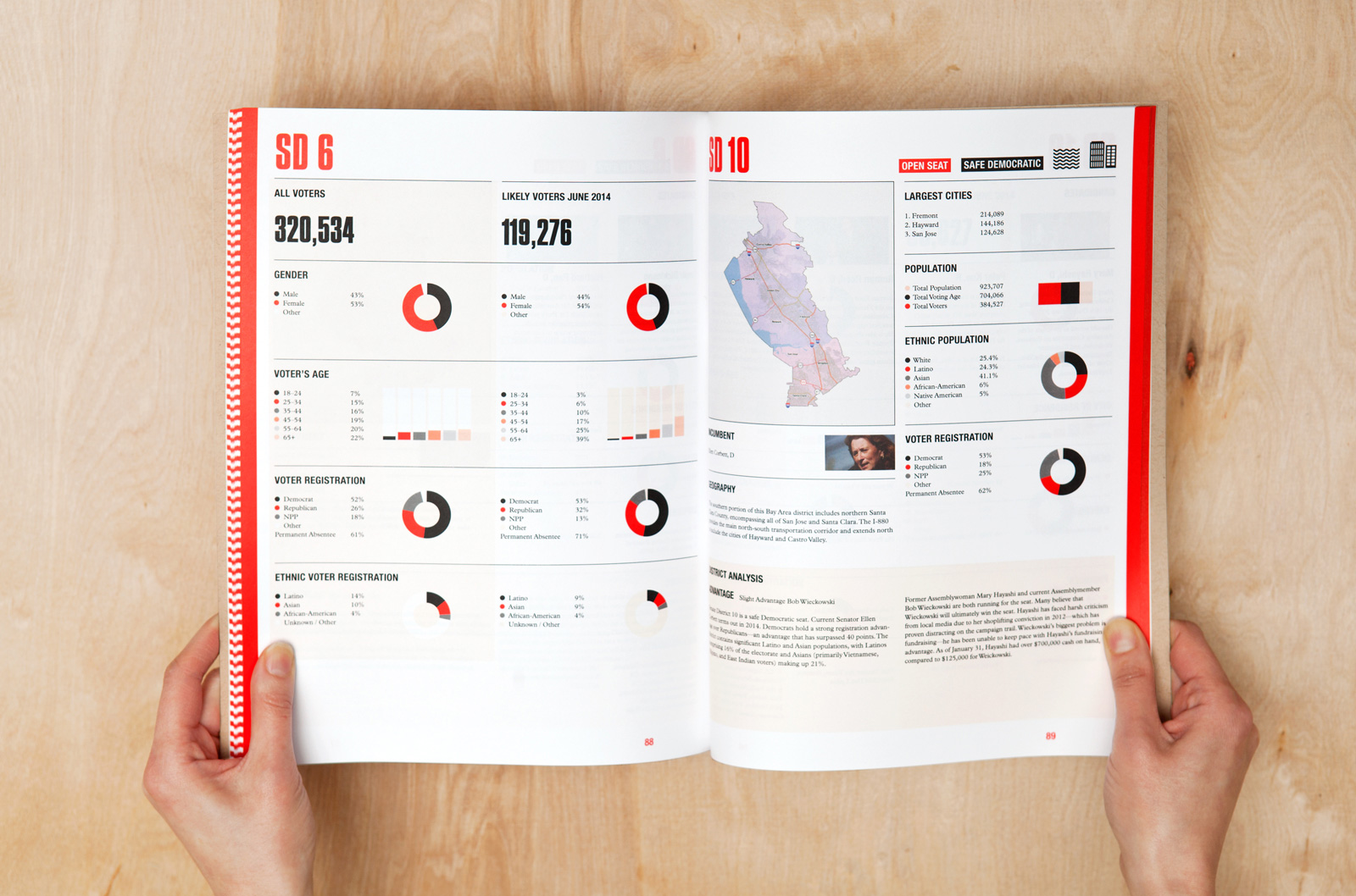
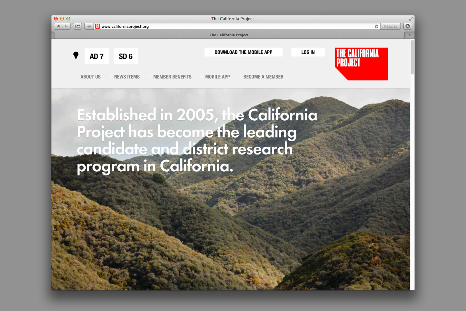
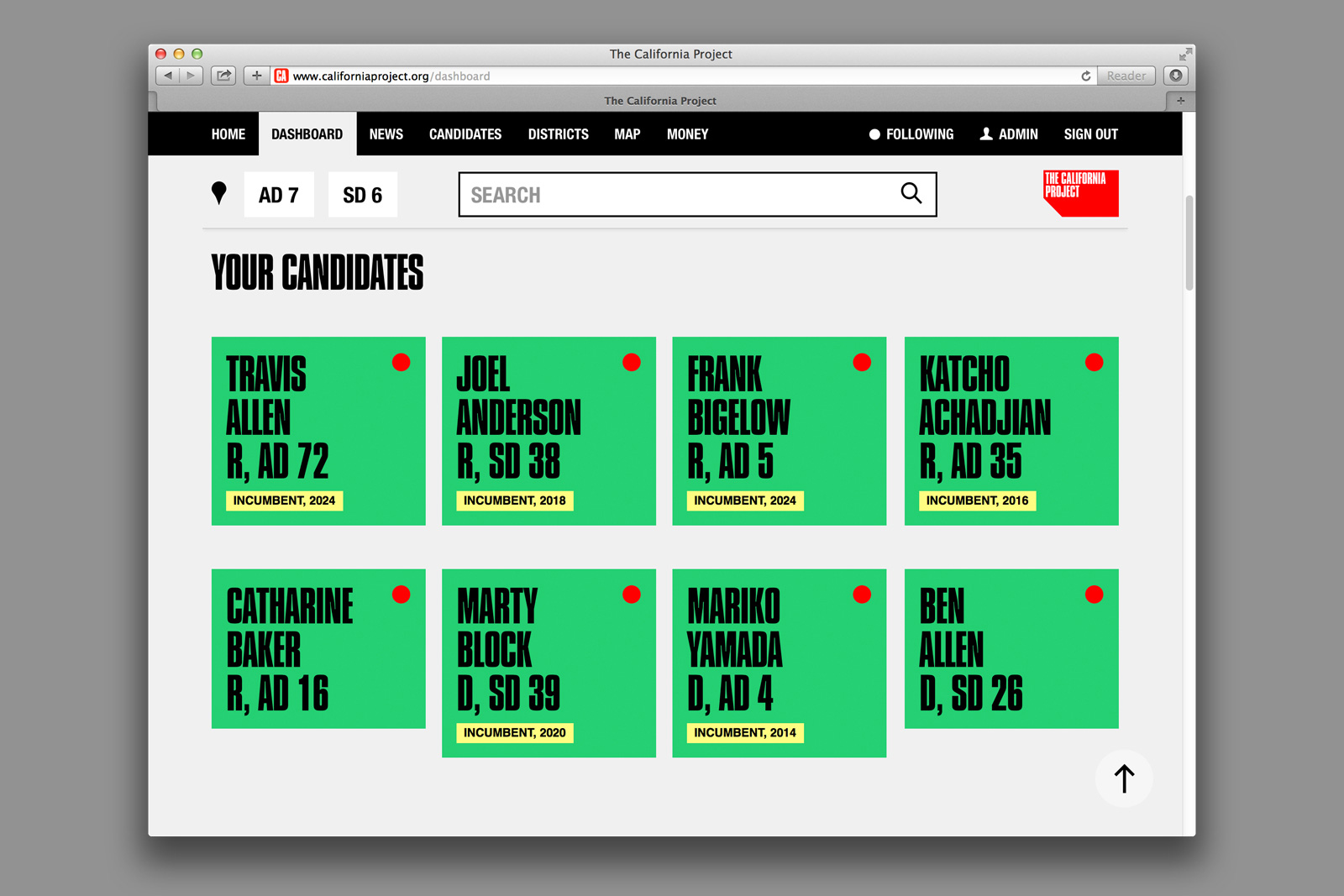
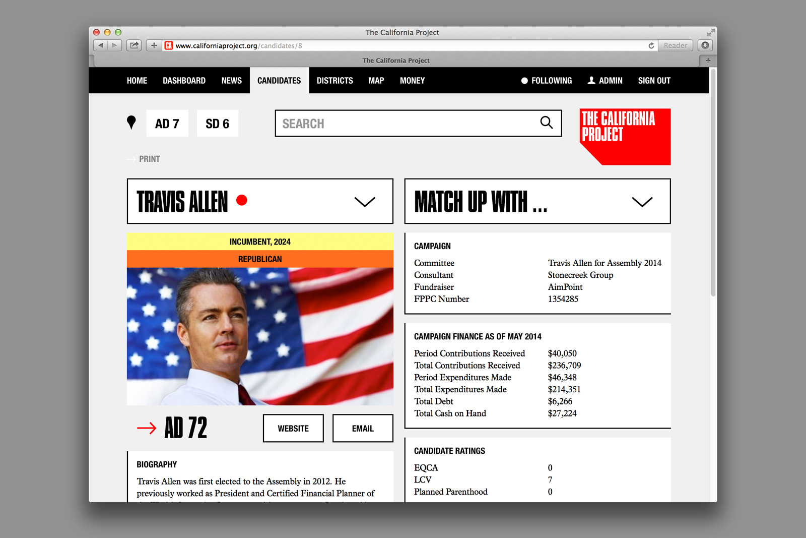
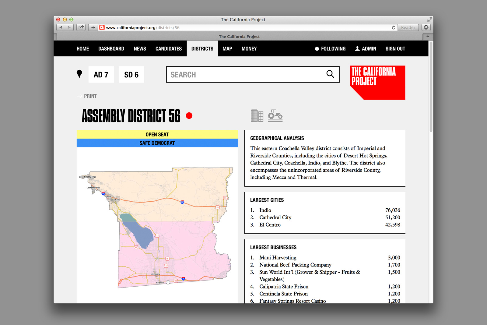
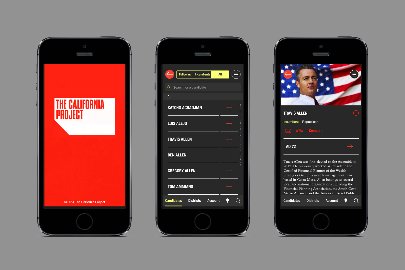
IDENTITY SYSTEM, WEBSITE, CUSTOM CMS, and MOBILE APP for THE CALIFORNIA PROJECT —— Originally established in 2005, The California Project has evolved into the leading candidate and district research program in California. Conducting research the traditional way, TCP meets with local elected officials, business leaders, labor groups, and key opinion leaders in communities across California to gain a strong understanding of the state-wide political dynamic. The organization also tracks local media to stay on top of the latest campaign news and key issues in each district.
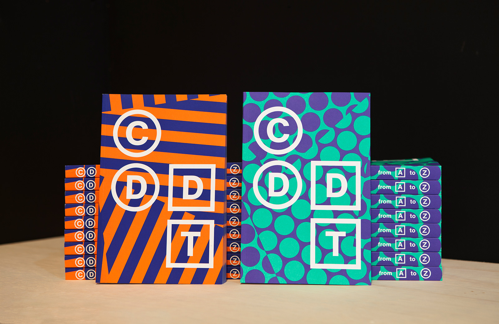
COMMUNICATION DESIGN CATALOG for PARSONS SCHOOL OF DESIGN — One of the largest and most active discliplines at Parsons, the Communication Design program is continually evolving. As it focuses increasingly on digital, screen-based work alongside the print and spatial design it’s so well-known for, the needs for how the program documents student achievements have also changed. What used to be a large-scale but short-lived exhibition is now a series of books and websites which chronicle the results of the students’ year-long thesis explorations.
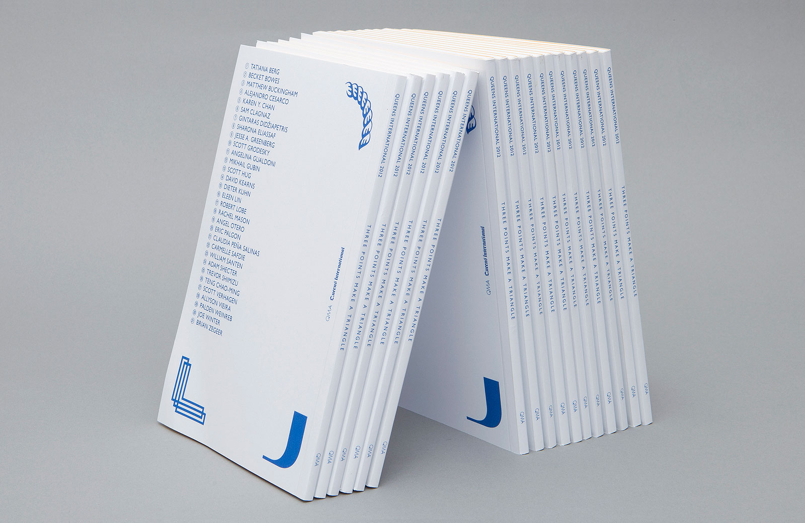
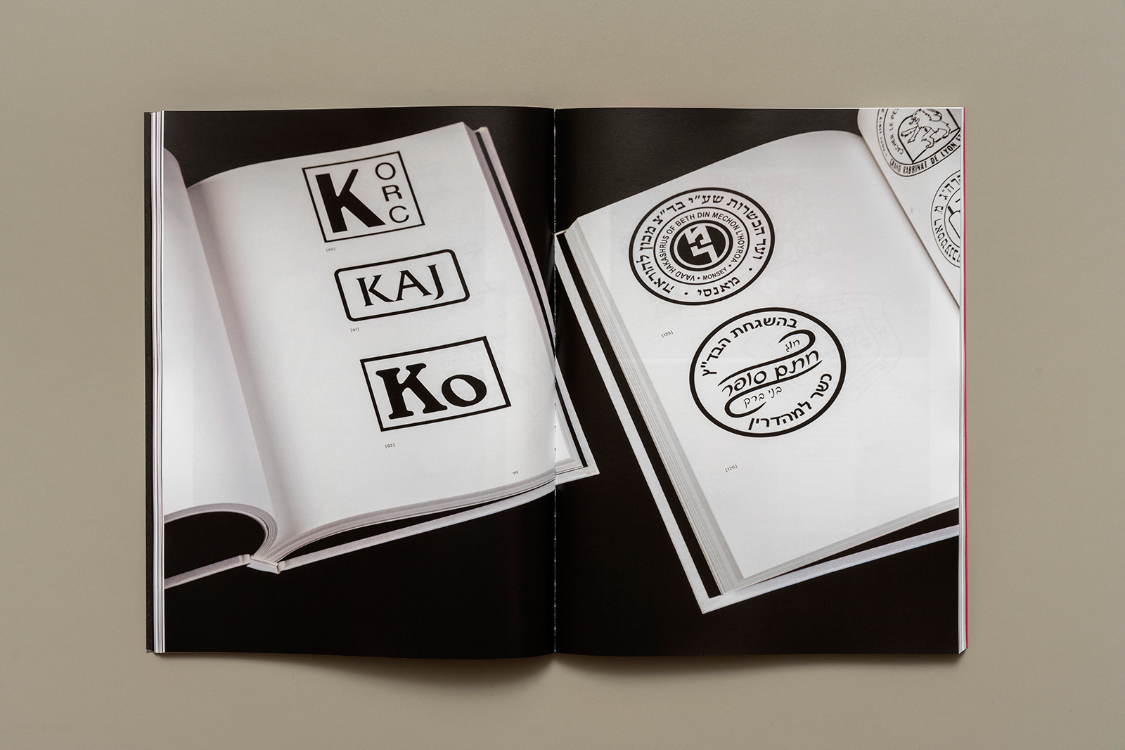
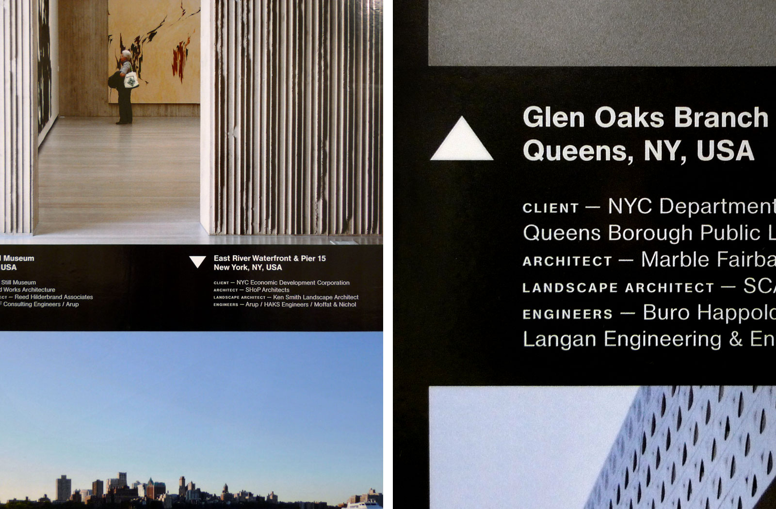
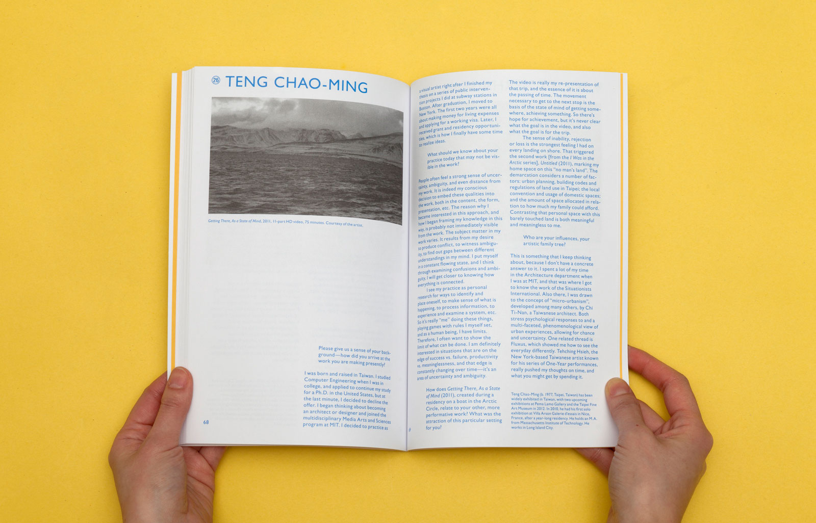
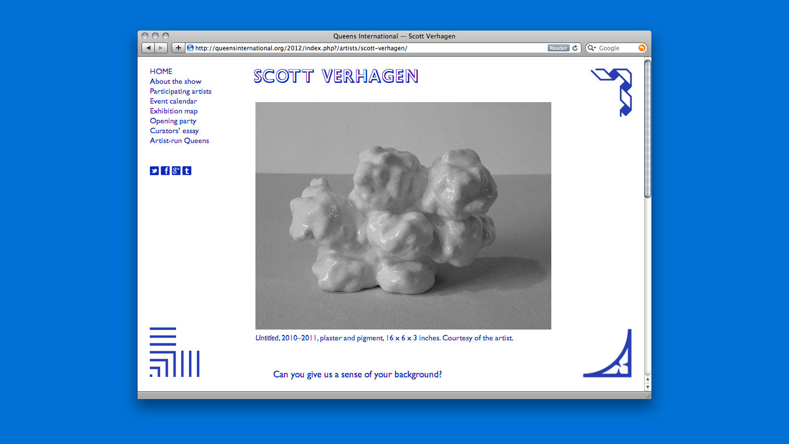
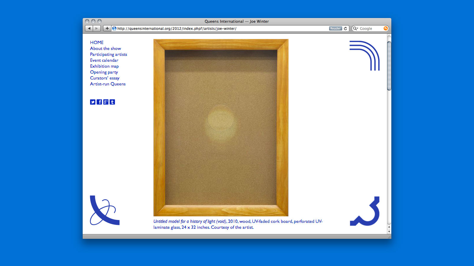
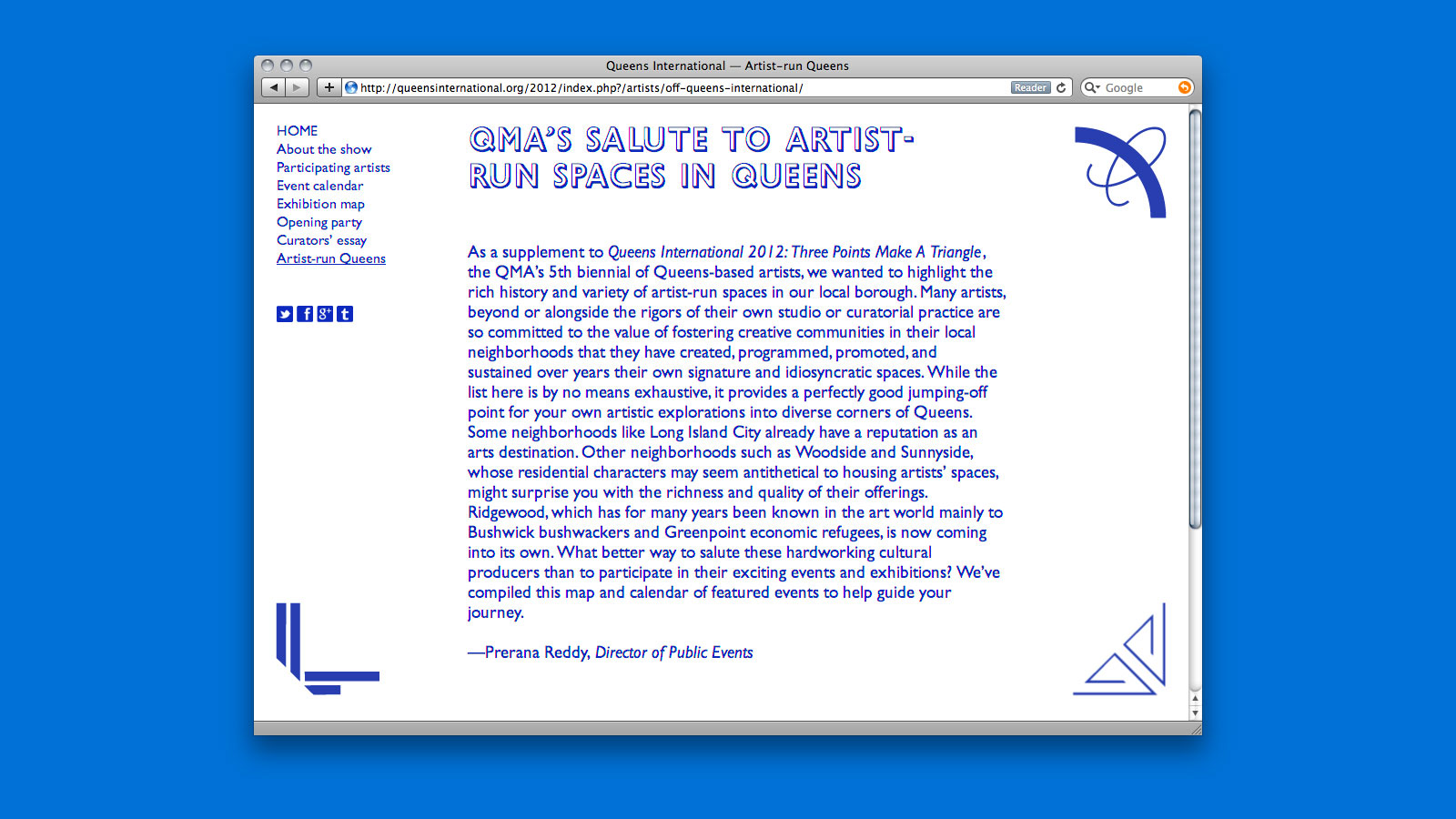
IDENTITY, CATALOG, SIGNAGE, and WEBSITE for QUEENS MUSEUM OF ART —— Subtitled Three Points Make a Triangle, this is the fifth iteration of the biennial Queens International, showcasing those living or working in the borough. Featuring 31 artists, the exhibition explores a wide range of media and practice. Many of these artists experiment with forms of abstraction and collage, combining the rational and the emotional, from the midst of a daily life permeated by technology.
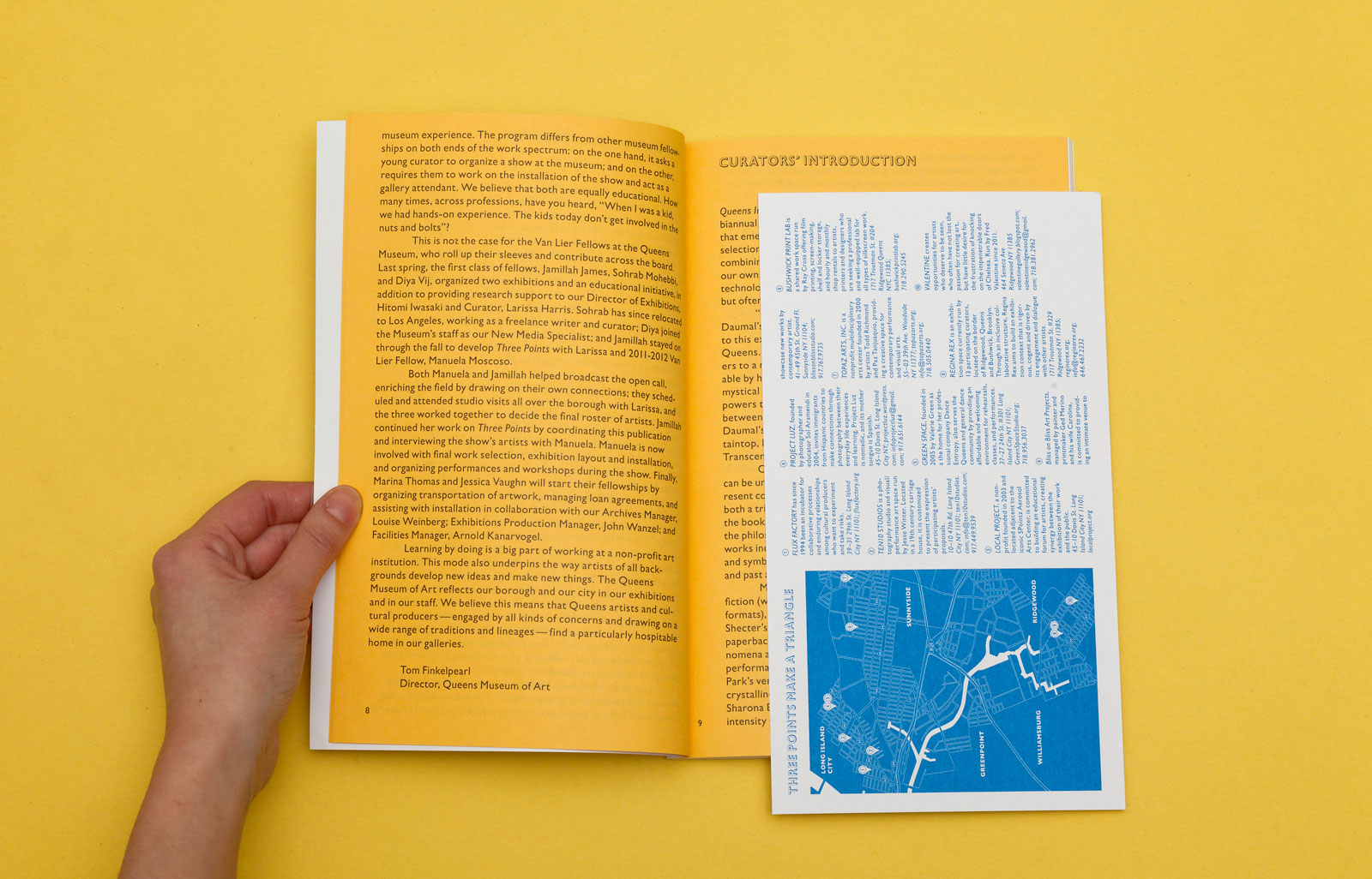
Introductory text and exhibition map
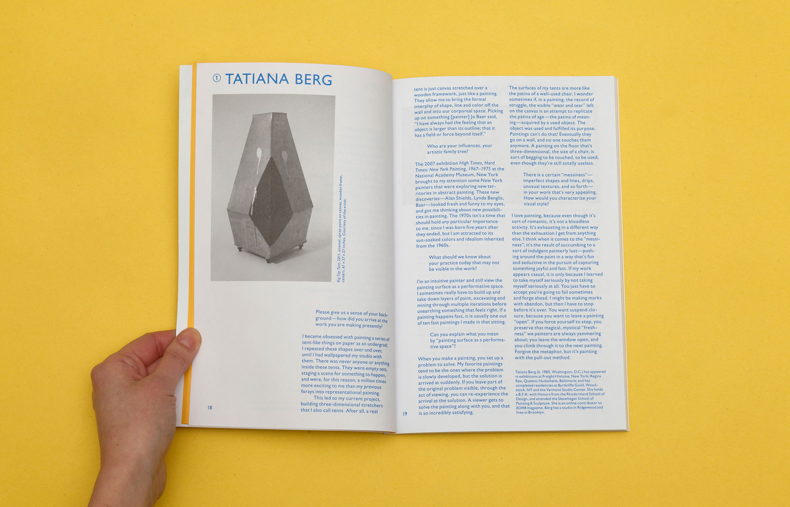
Artist interview
Glossary of terms
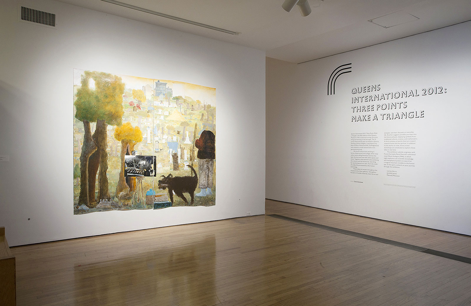
Identity, catalog, signage, and website, 2012
Queens Museum of Art: Larissa Harris, Curator
Jamillah James, Curatorial Fellow
Manuela Moscoso, Curatorial Fellow
Web development by Zak Klauck
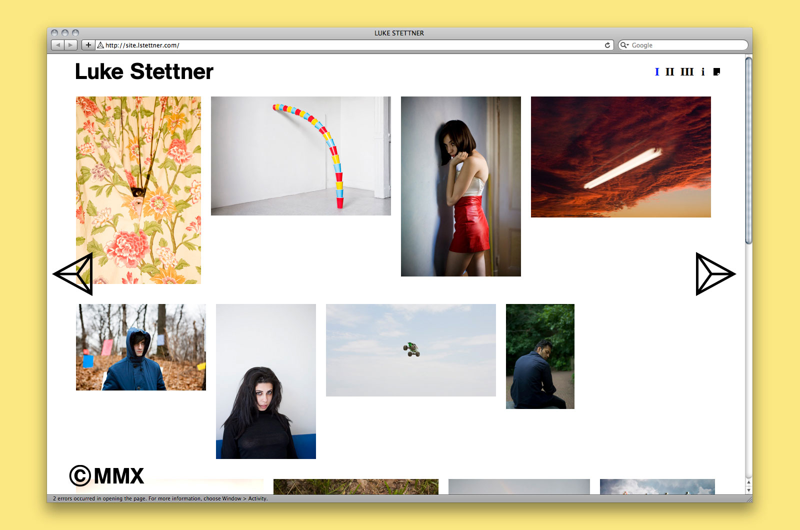
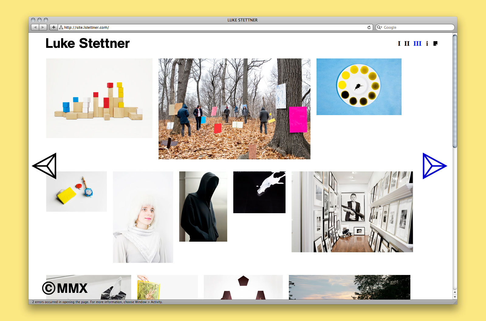
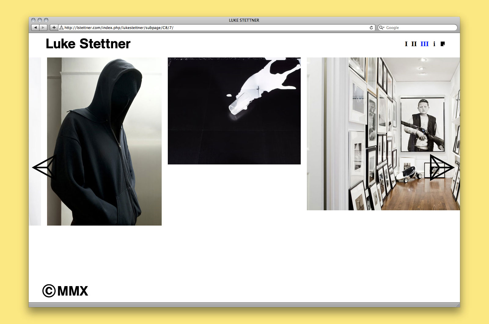
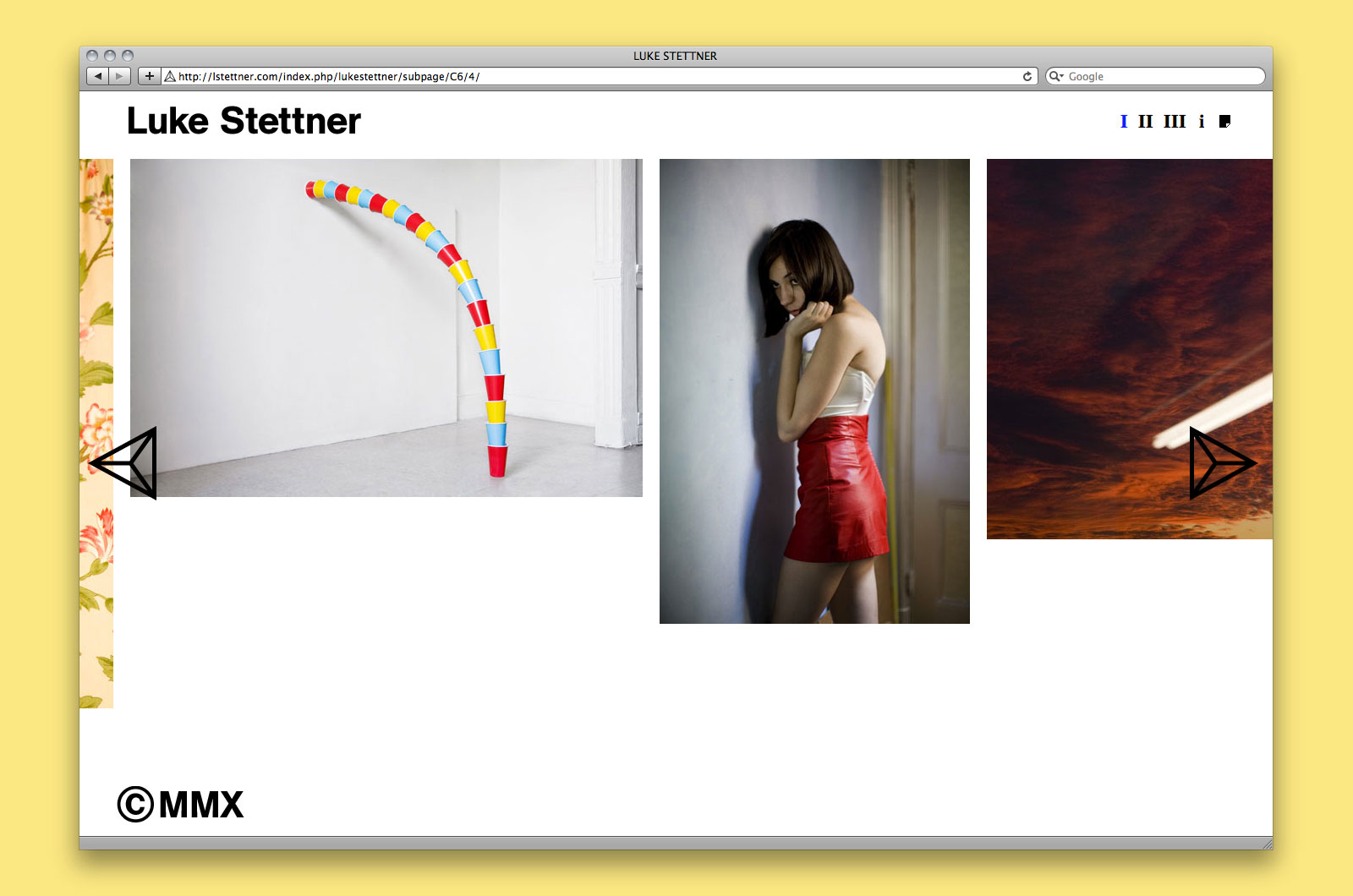
WEBSITE and PROMOTIONAL MAILER for LUKE STETTNER —— Luke Stettner is a Brooklyn-based photographer and photo editor operating under the pseudonym John Luke. Employing a range of media, including photography, sculpture, and installation, Stettner has perfected an aesthetic strategy in which the discrete, minimal, and formal complement the content of his work. We were asked to design a website for the artist — one which showcases his commercial photography and editorial work, grouped loosely by theme — as well as a promotional mailer.
Mailer detail

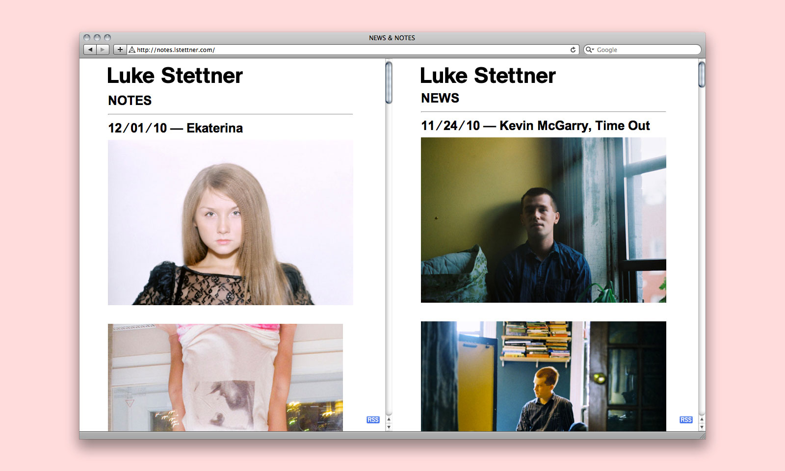
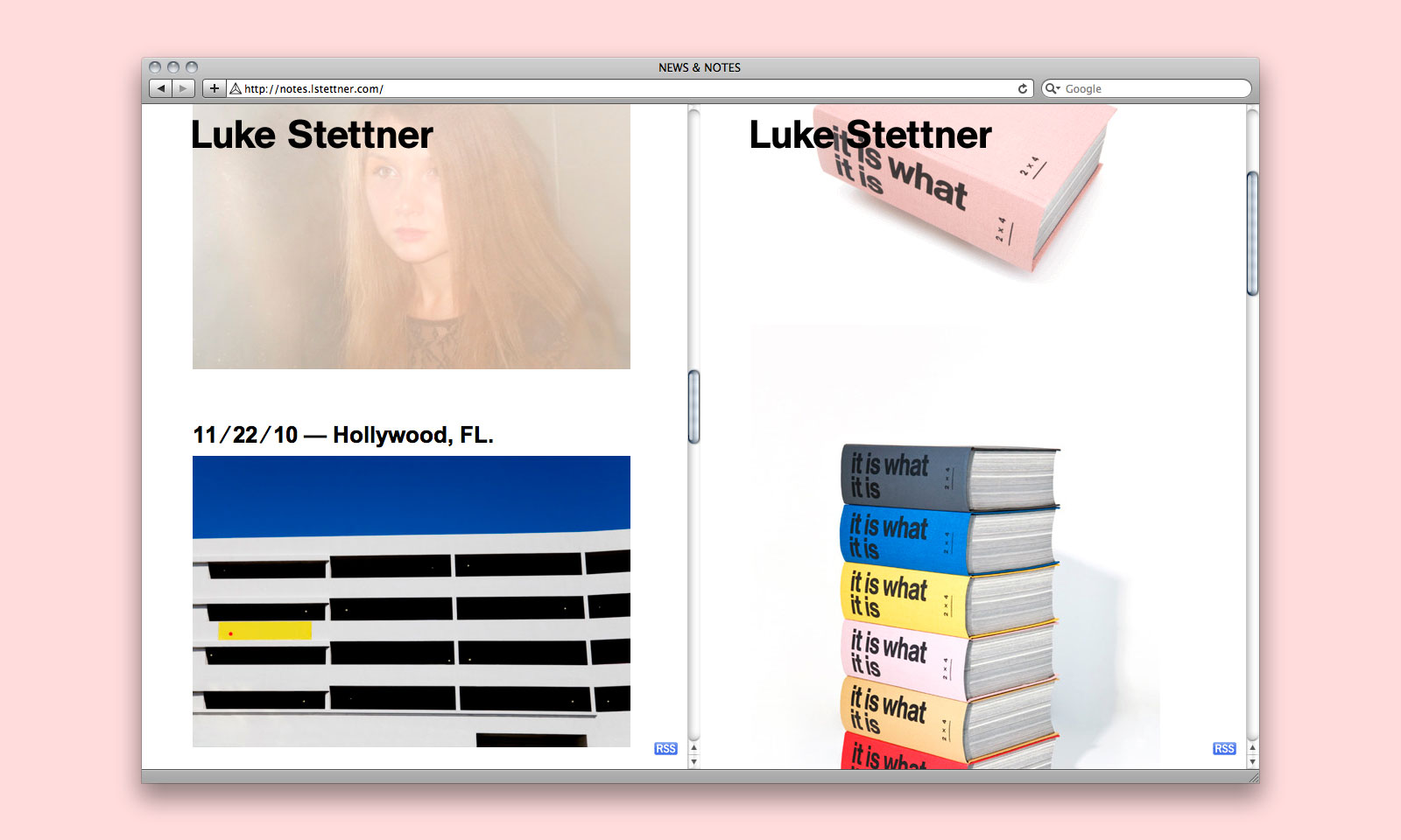
Website and promotional mailer, 2010
Website development by Caspar Lam
Special thanks to Zak Klauck and Kostadin Krajcev
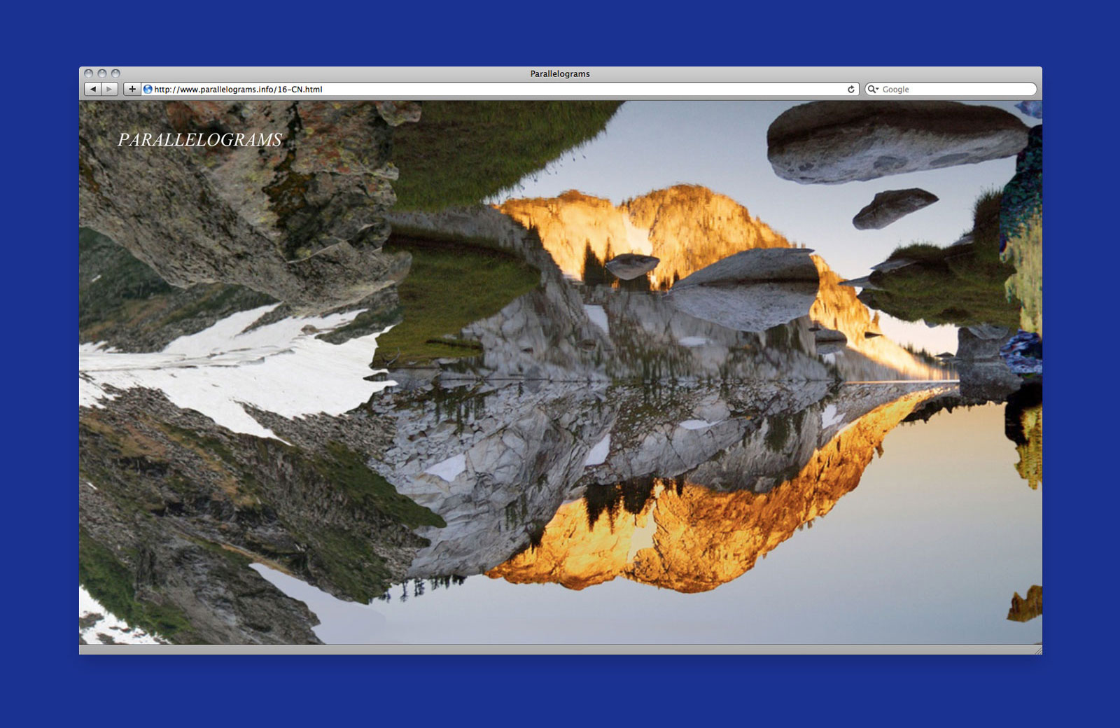
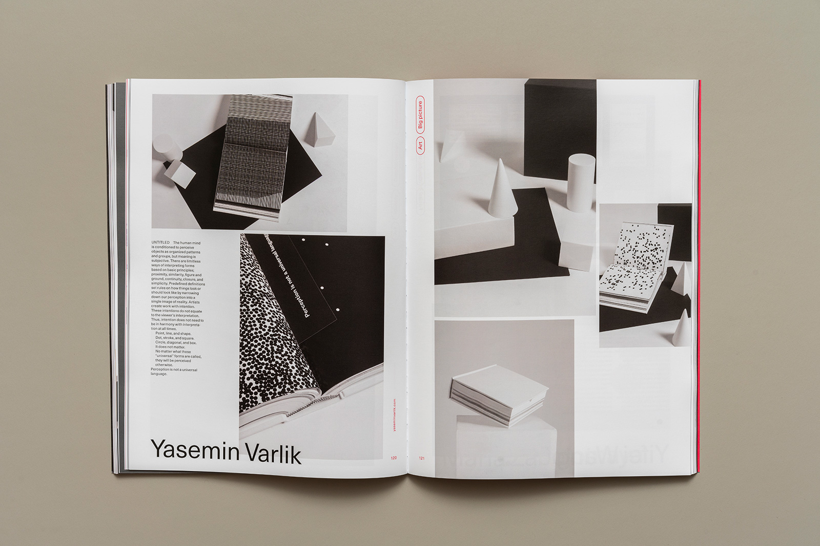
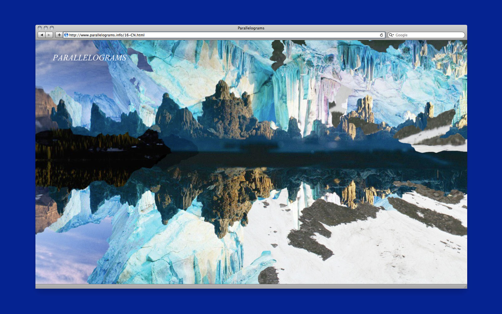
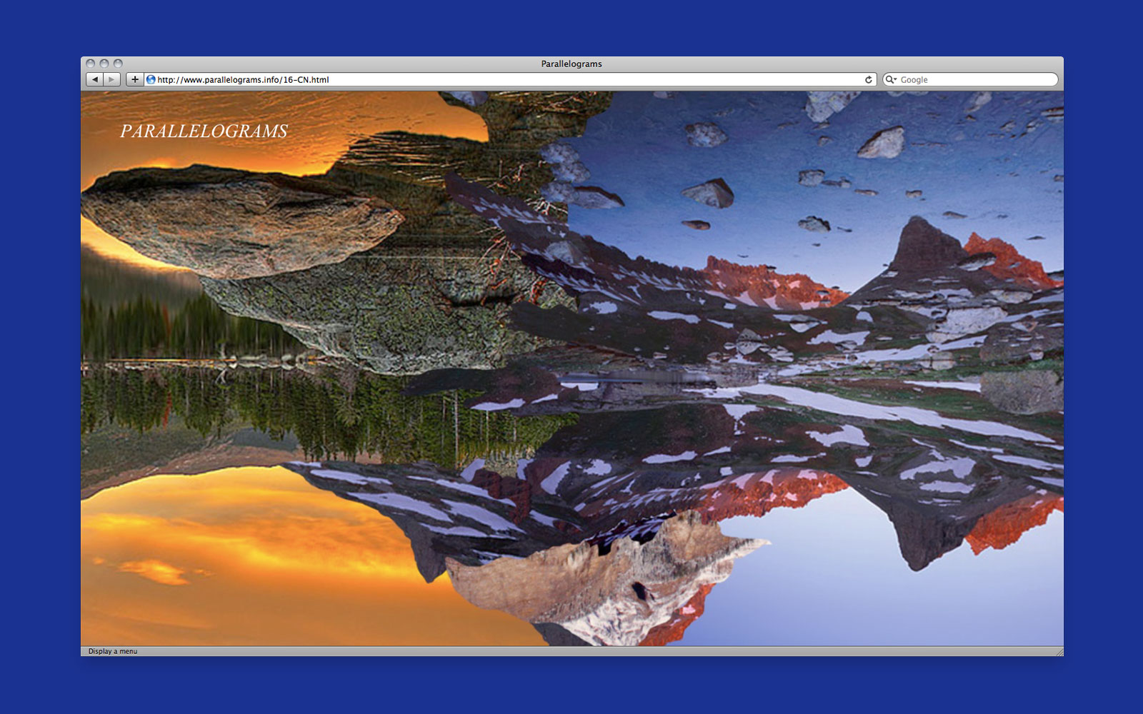
INFINITE LANDSCAPE for PARALLELOGRAMS —— Parallelograms is an online publication and multi-artist project exploring the relationship between images and interpretation. Each week, an artist, writer, designer, or collaborative team is presented with an image found online. The curators then ask each participant to craft a unique web project in response to the assigned image. New projects are published at the beginning of the week, with past projects archived chronologically.
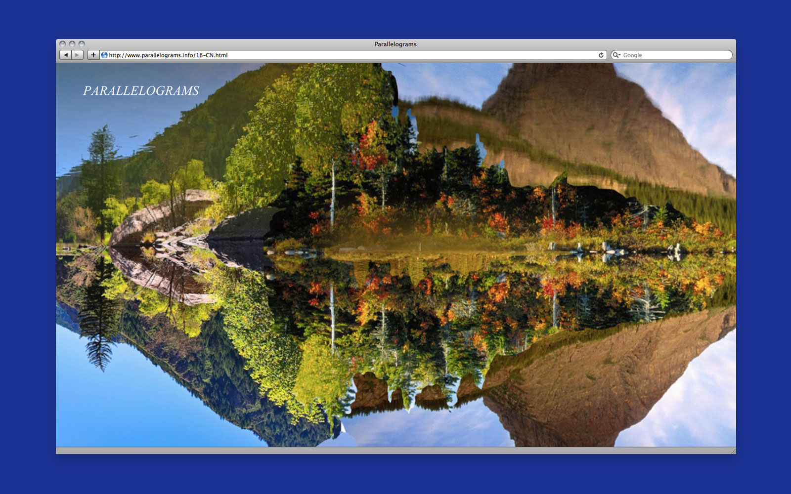

Web project, 2011
Special thanks to Leah Beeferman and Matthew Harvey
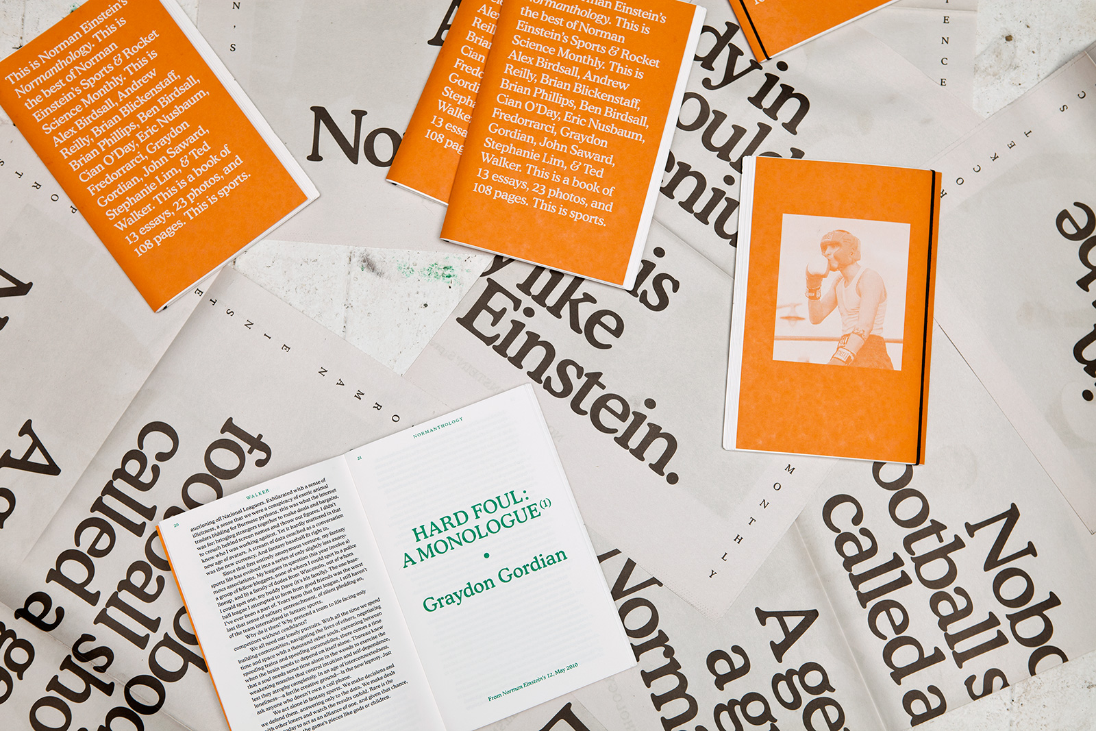
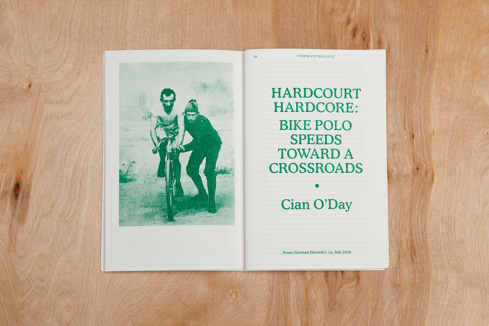
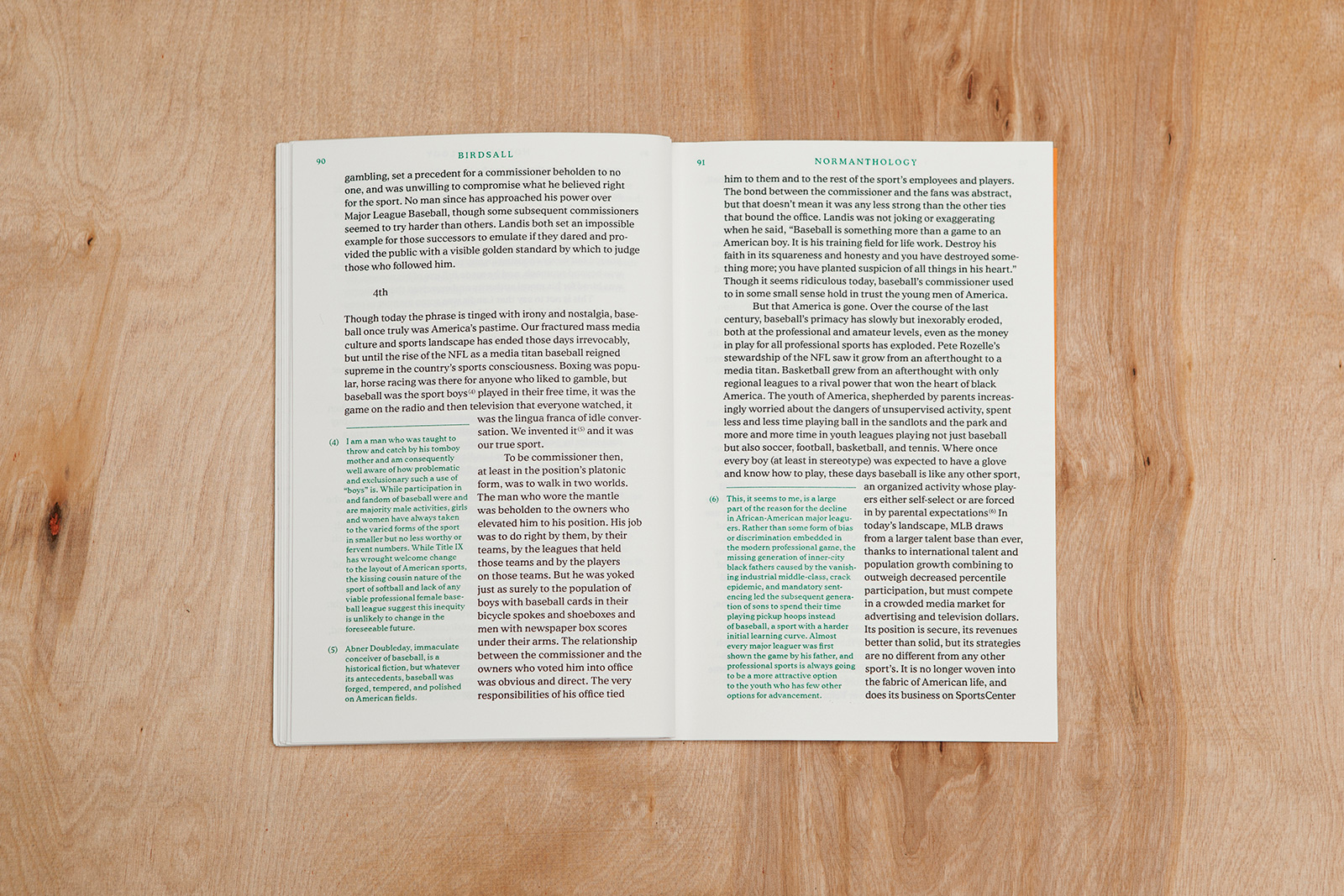
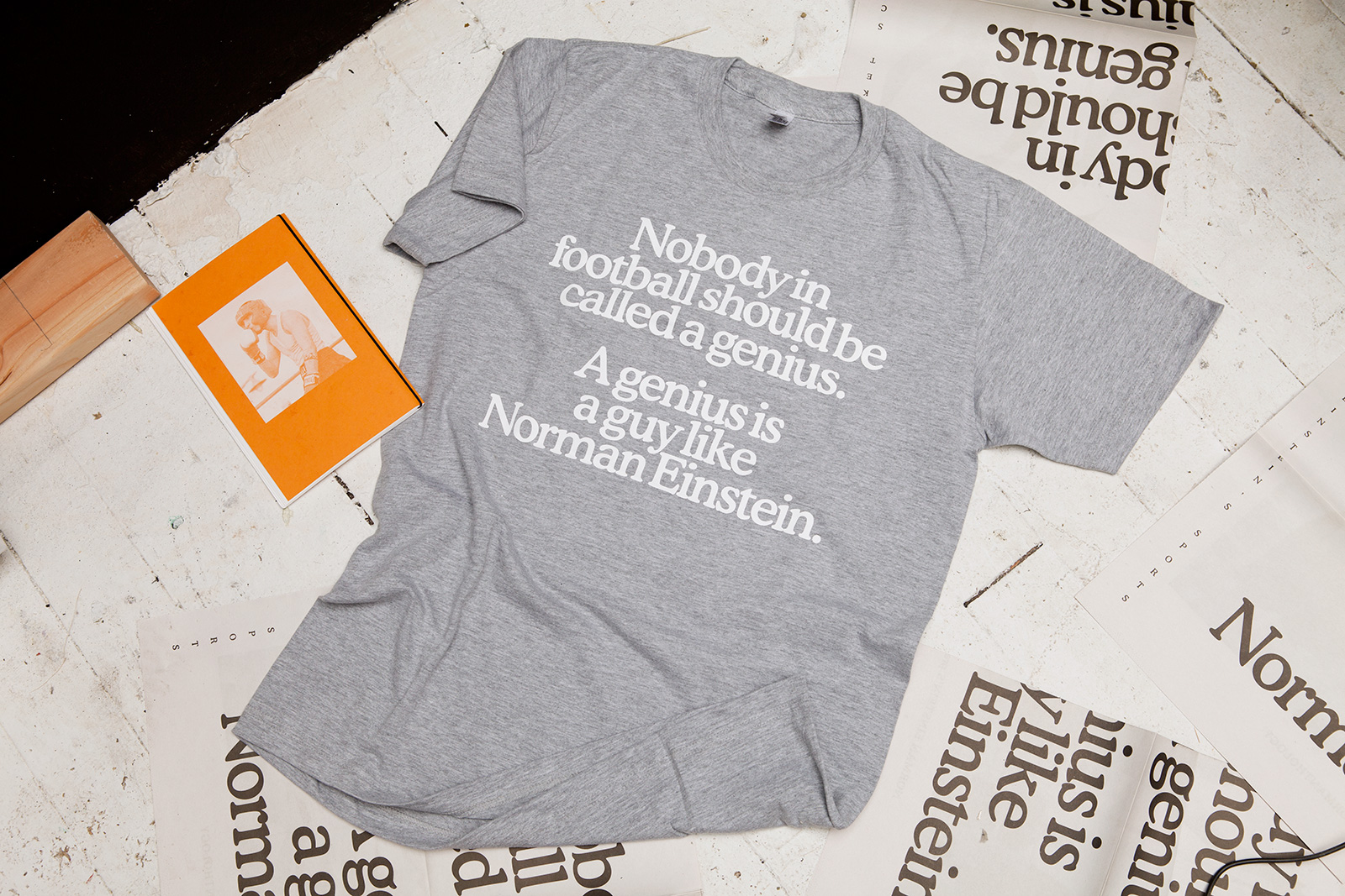
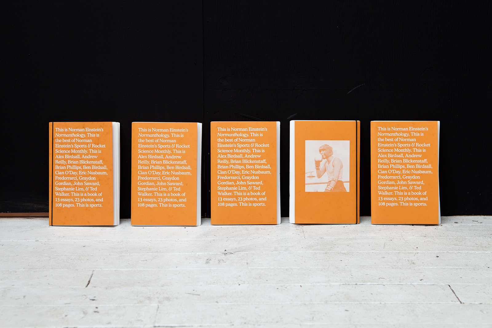
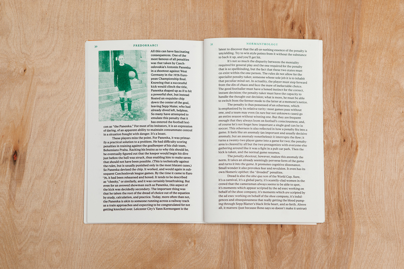
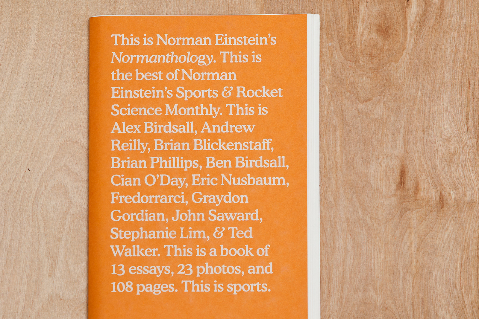
NORMANTHOLOGY for NORMAN EINSTEIN’S — When you think of professional sports, you think of huge stadiums, rabid fans, extensive merchandising, and maximalist visuals. Instead of playing to expectations, Norman Einstein’s Sports & Rocket Science Monthly retained a quietly DIY aesthetic over its 21 issues, befitting its modest start as an online magazine run by a small group of sports writing enthusiasts. With the design of their first-ever print anthology, the goal was to put the writing in a more collegiate, even academic context by housing it in a loosely-bound, paperback-sized, RISO-printed volume. There was some merch, too, because the world certainly needs another heather grey tee with big Cooper text on it.
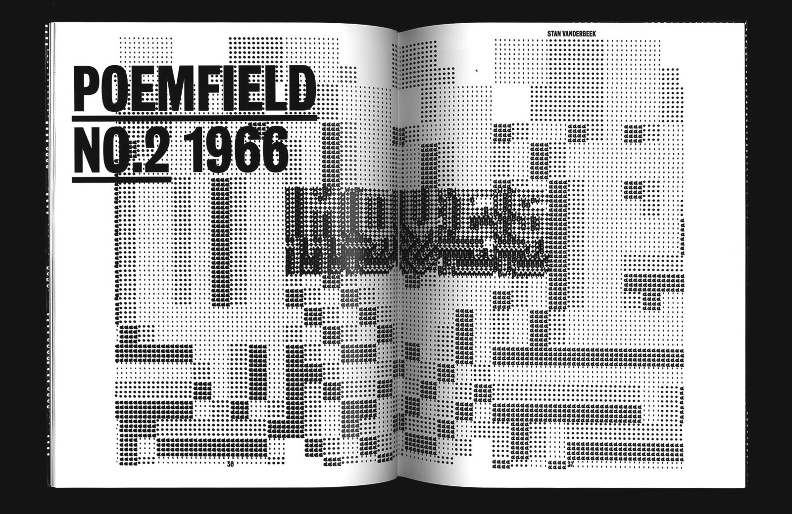
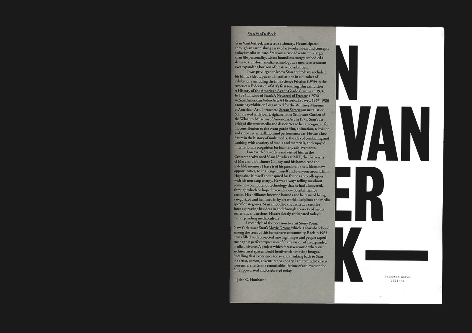
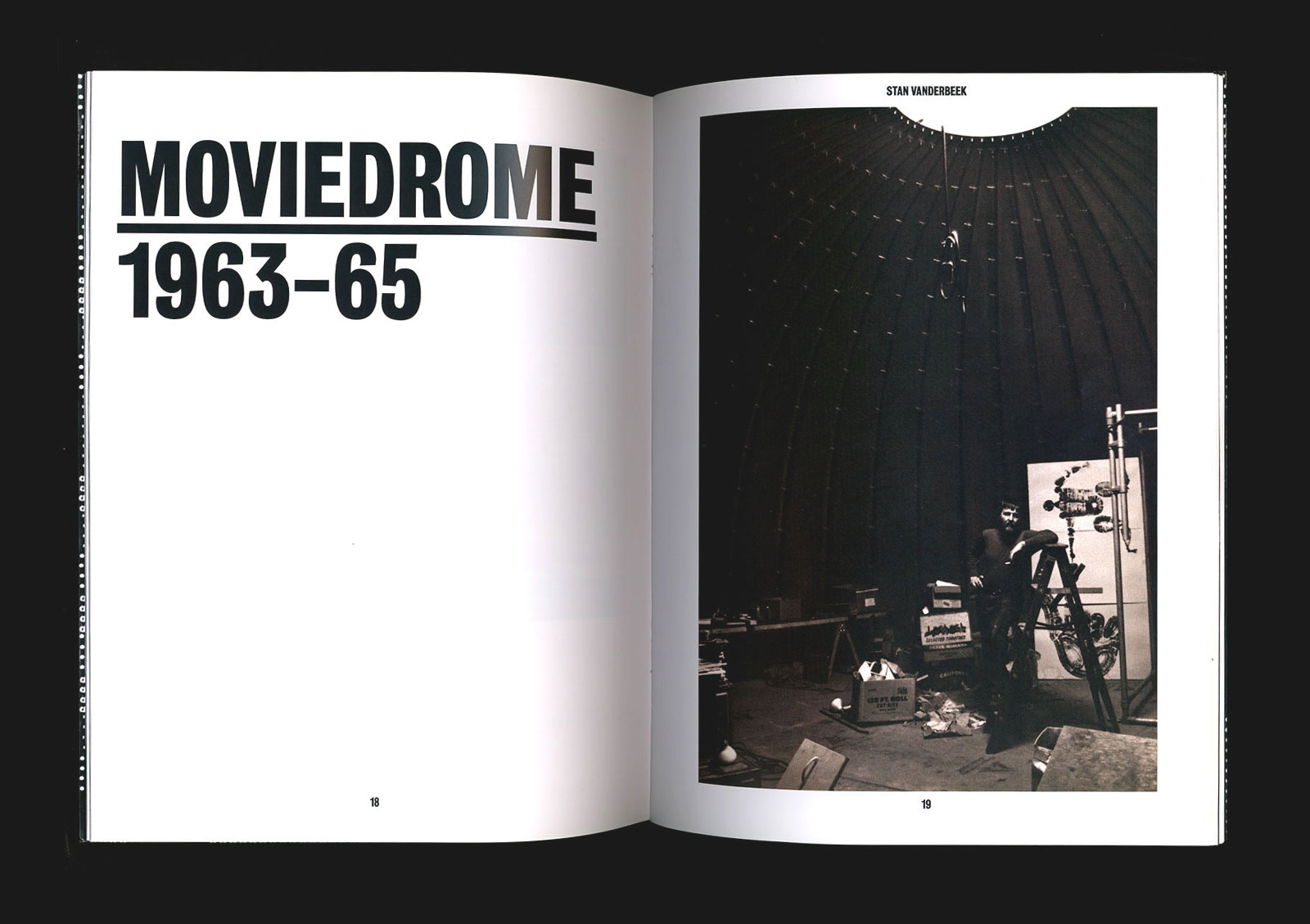
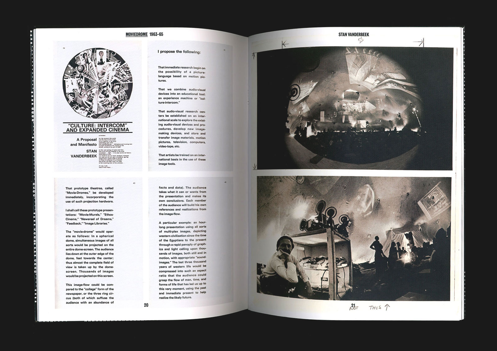
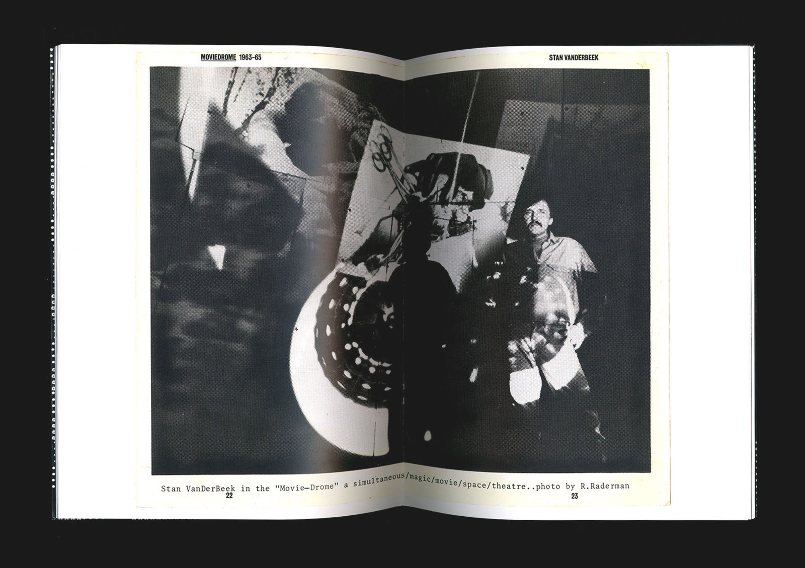
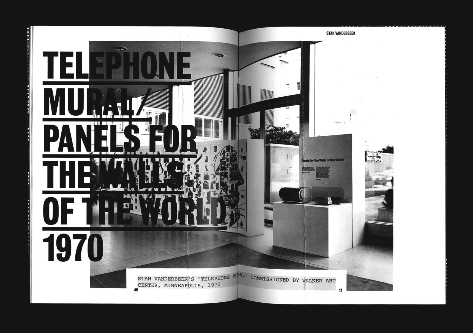
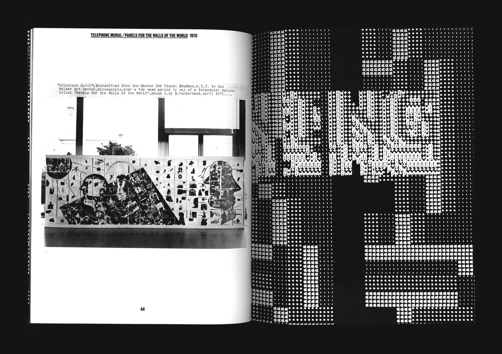
STAN VANDERBEEK: SELECTED WORKS for GUILD & GREYSHKUL —— This publication, released in a small edition by Guild & Greyshkul gallery, presents collages, writings, and documentation of works by artist and experimental filmmaker Stan Vanderbeek (1927-1984). Featured prominently are stills from his Poemfield series, early computer-generated animations authored by Vanderbeek in collaboration with Bell Labs’ Ken Knowlton.
Cover detail
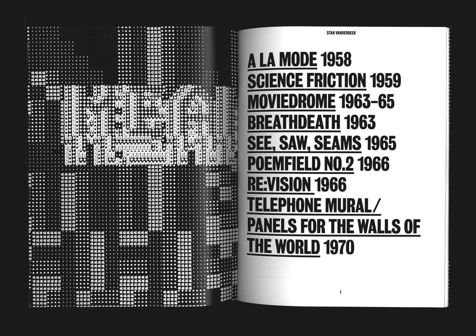
Table of contents
Section title
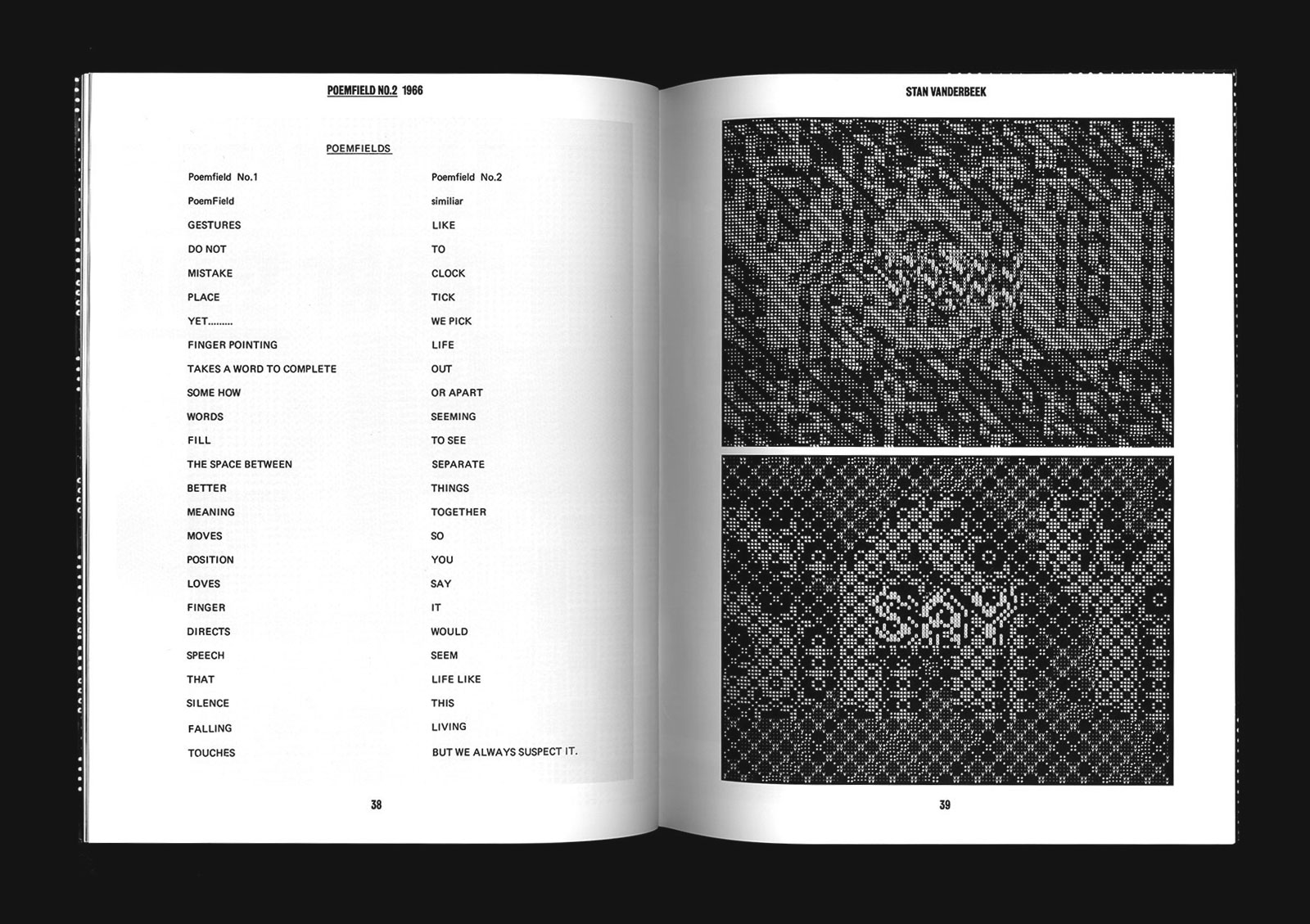
Animation stills
Catalog design, 2008
Designed at Project Projects
Published by Guild & Greyshkul
8.5×11 in (216×279 mm), 48 pages
Digital print, saddle-stitched
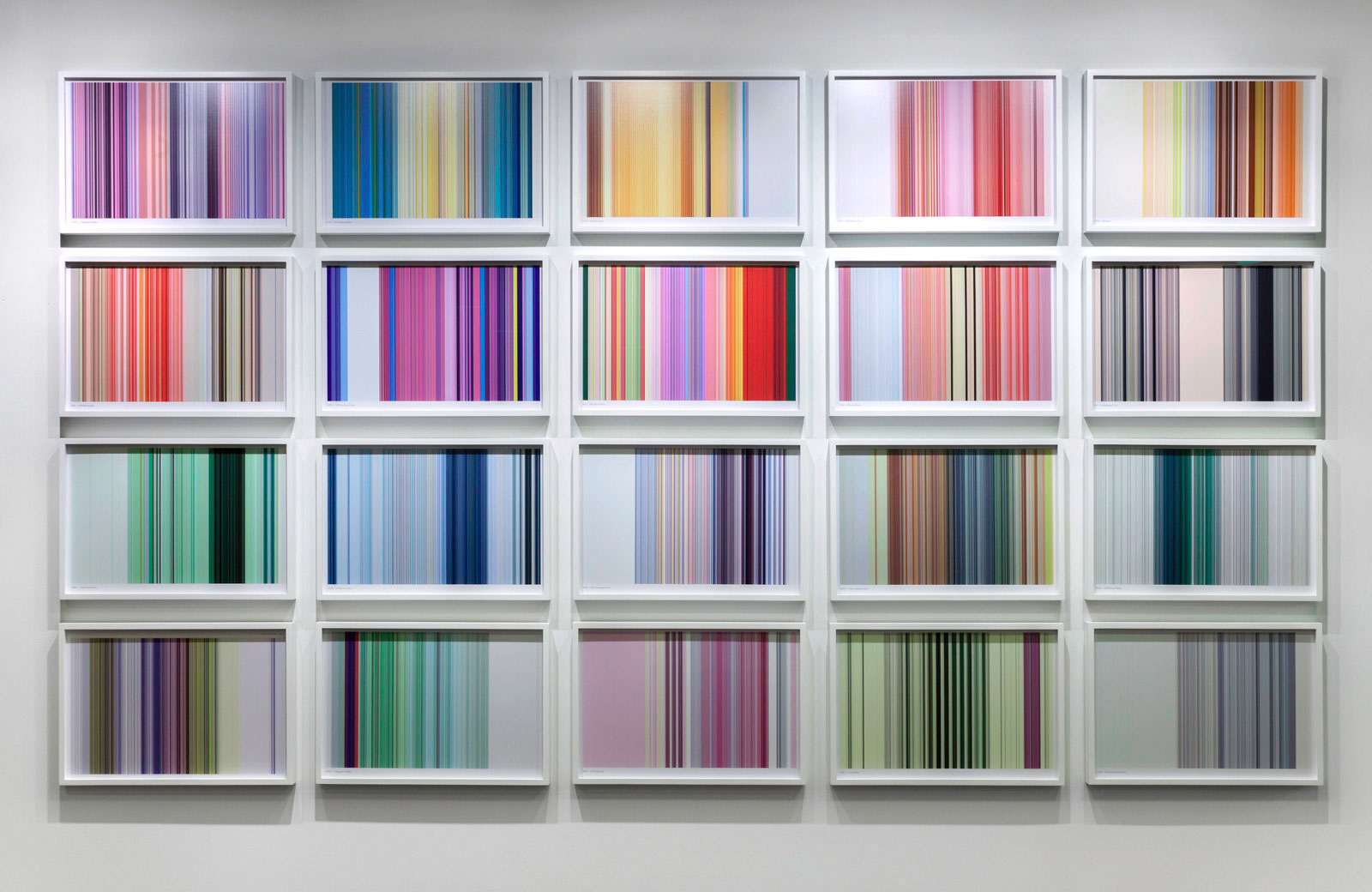
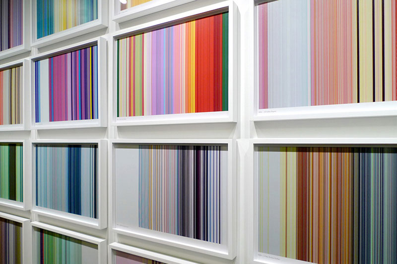
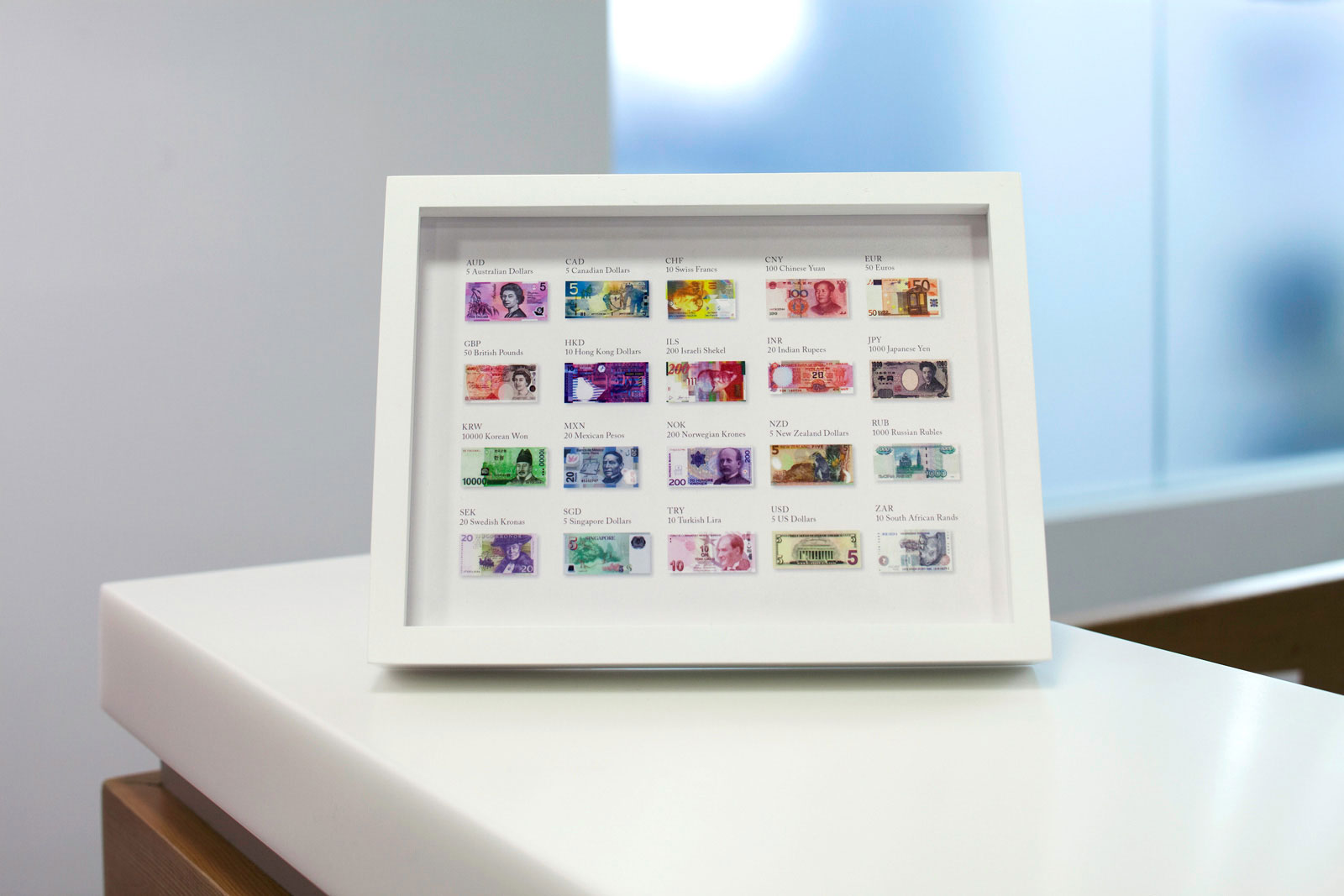
TWENTY NOTES for TRAIANA —— Traiana is a leader in foreign exchange, offering post-trade processing, client servicing, and trading partner integration for financial institutions around the world. Our installation in their Bryant Park office is inspired by the varied color palettes of global bank notes, with each frame representing one of the twenty most traded global currencies. Arranged alphabetically, the abstraction is created by extracting a single pixel line from each bill, and stretching it vertically to the height of the frame. A key showing the original design sits adjacent to the installation.

Installation view
Frame detail

Japanese Yen

Norwegian Krone
Installation and signage, 2010
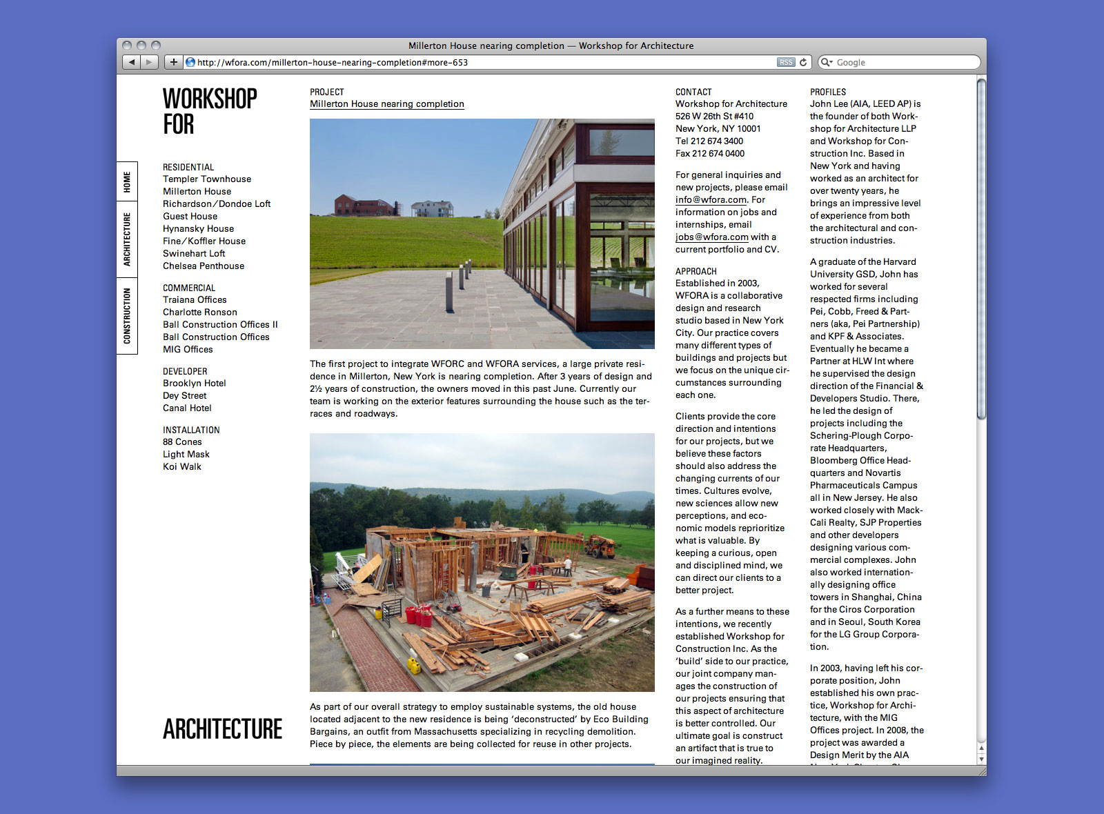
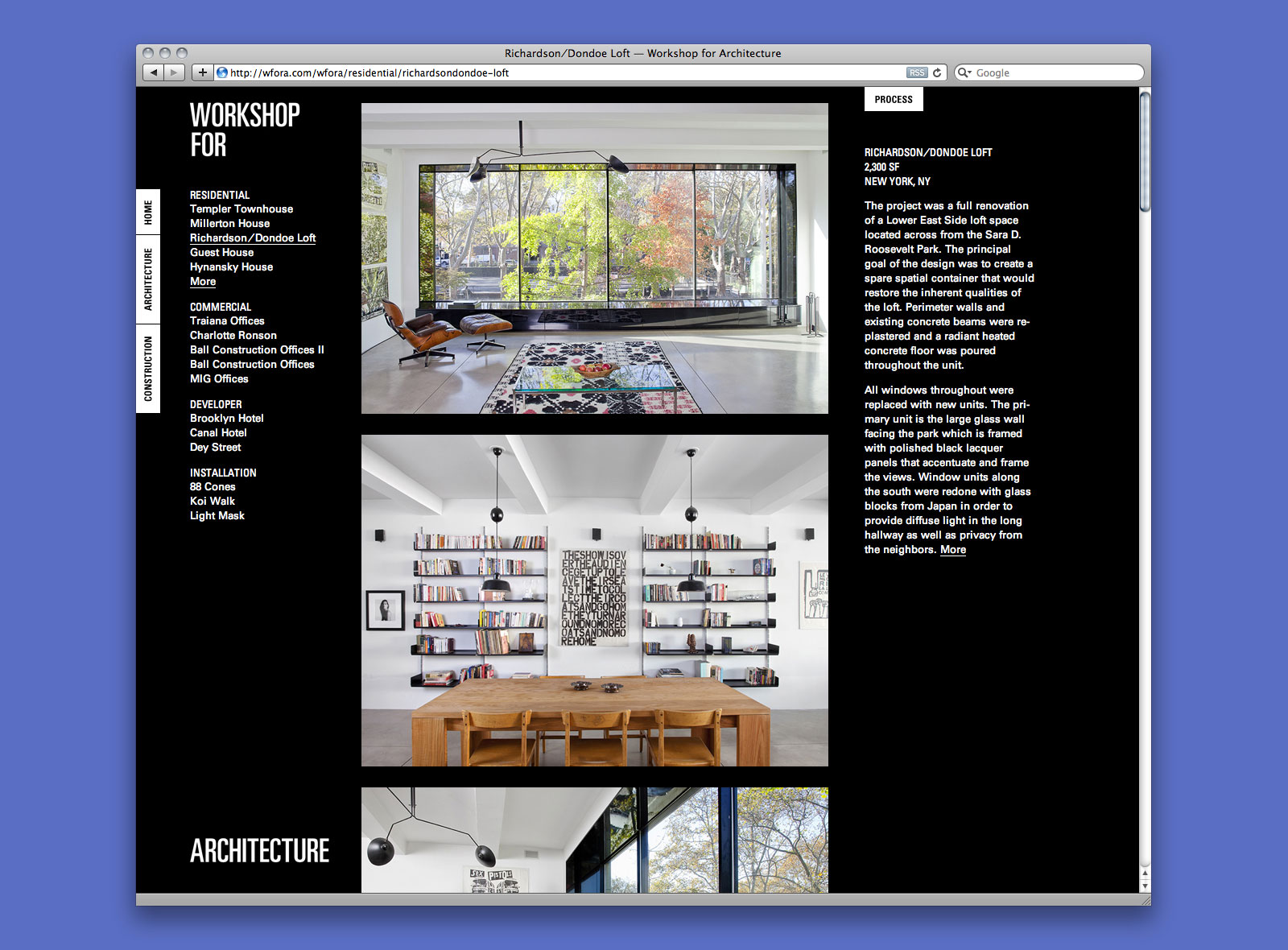
Workshop for Architecture: John Lee, Principal
Jaime Hernandez, Project Architect
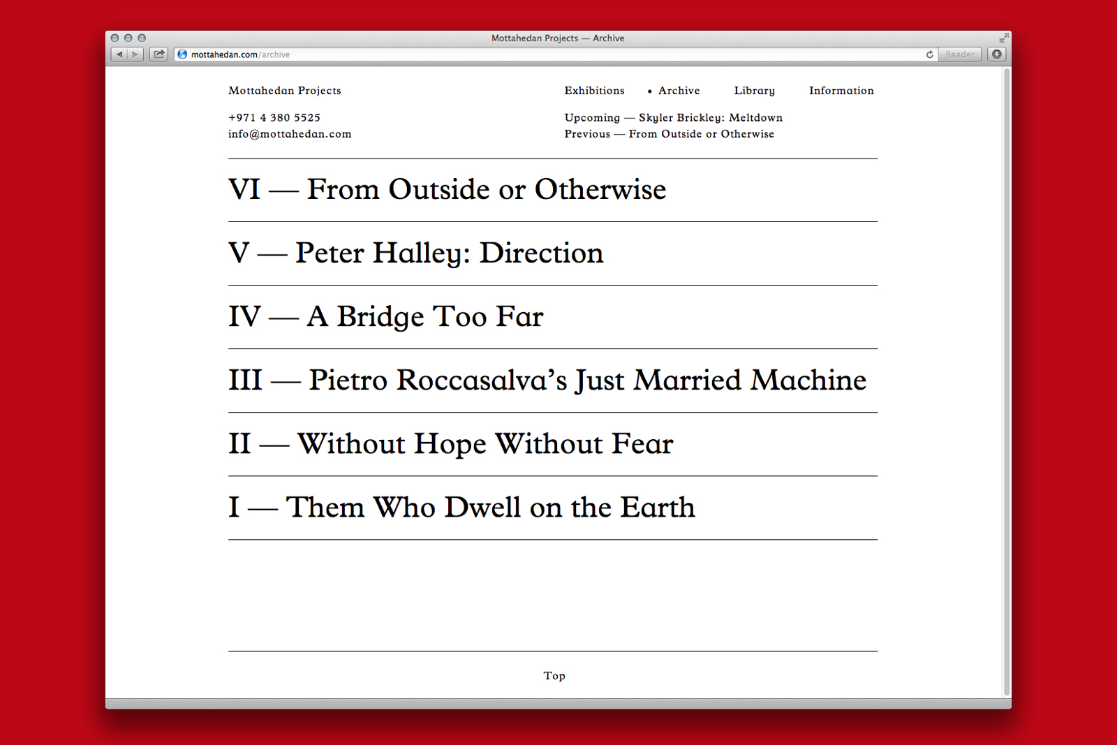
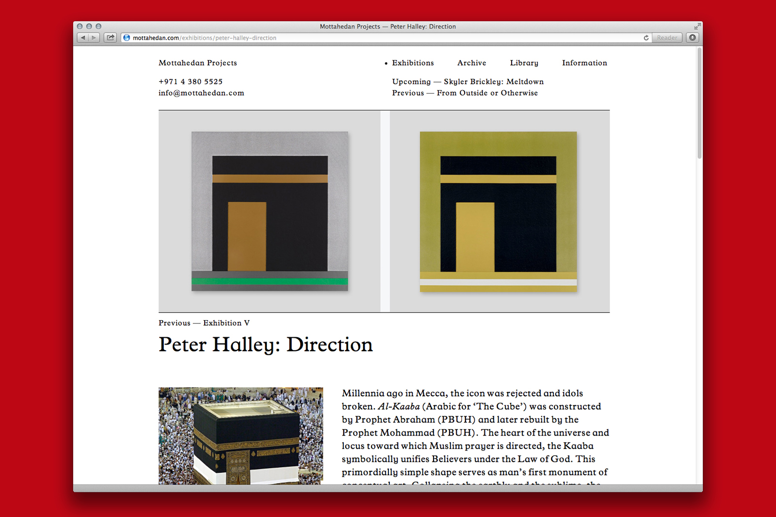
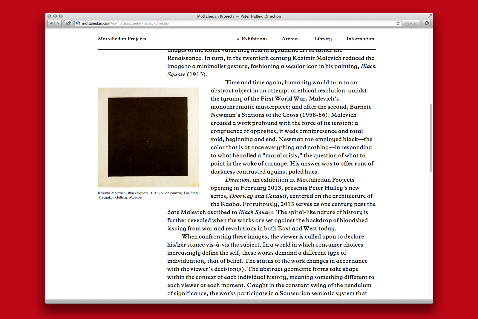
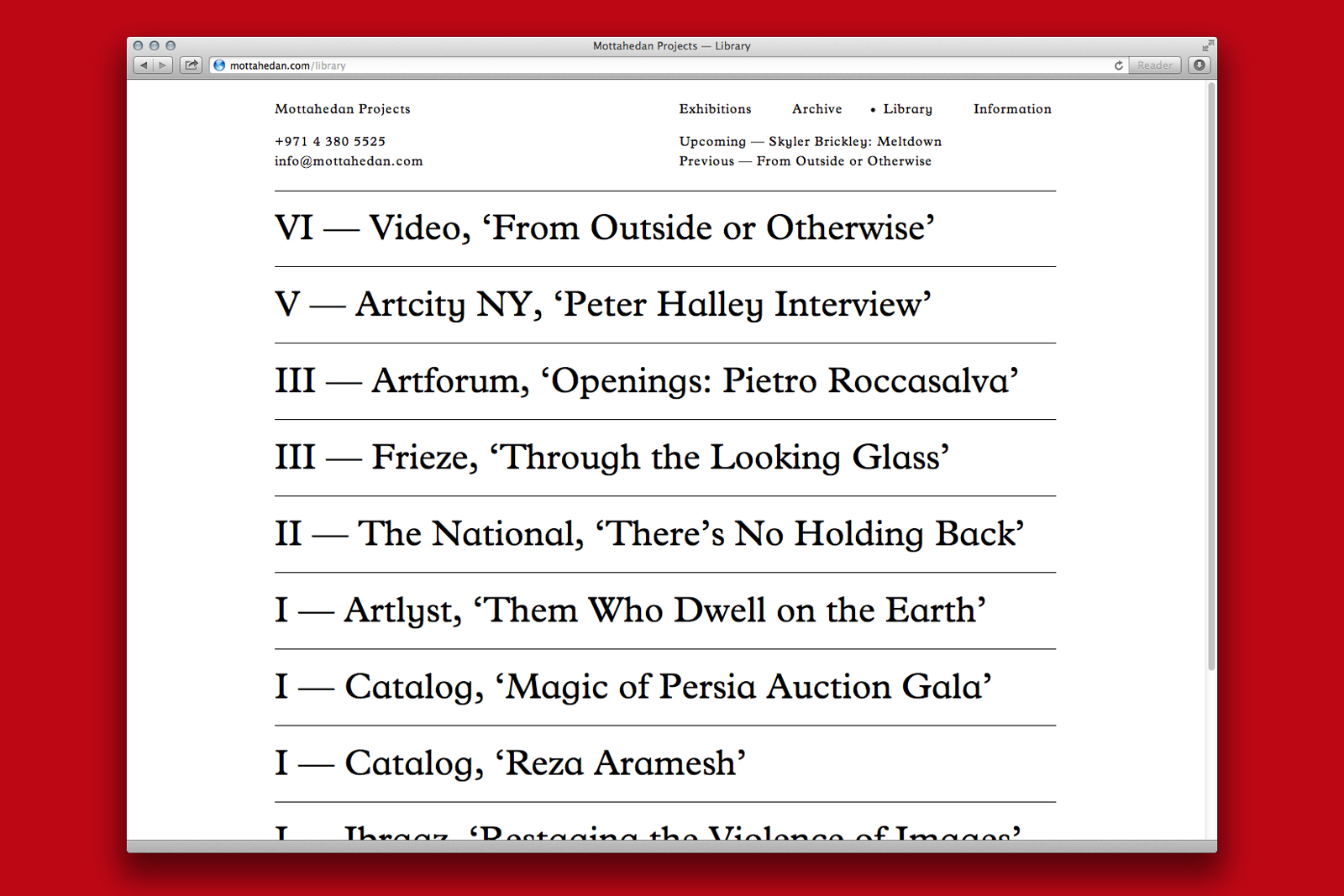
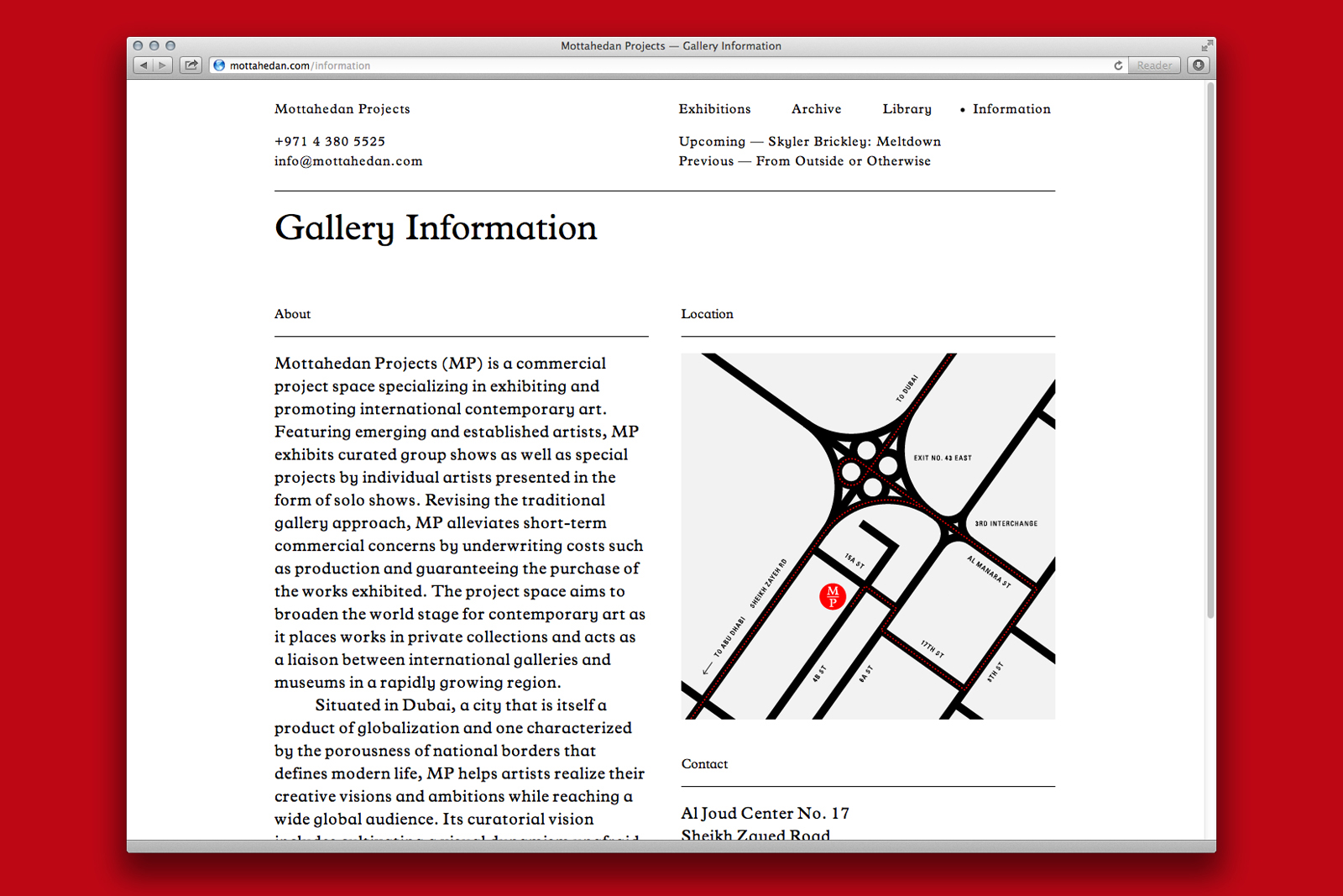
IDENTITY and WEBSITE for MOTTAHEDAN PROJECTS —— In his show Wall-to-Wall, the artist Skyler Brickley explores notions of analog reproduction and how the effects of age, translation, and the environment can lead to uniquely imperfect copies. His works are large, system-driven paintings, recalling enlarged Xerox prints or filmstrips. We were asked to catalog these works into a single volume, positioning them alongside an archive of reference texts, found imagery, and interviews. Like the work itself, the book is fragmentary; it can be spilt into two distinct catalogs, read out of sequence, or reshuffled into a single, life-sized print.
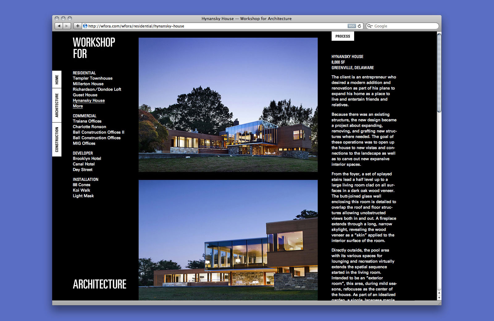
IDENTITY SYSTEM, WEBSITE, and APPLICATIONS for WORKSHOP FOR ARCHITECTURE —— Workshop for Architecture is a New York-based design practice founded in 2003. Since its inception, the studio has completed projects including private residences, developments, commercial interiors, and installations. In order to gain control over unpredictable implementation, the firm recently established a partner company, Workshop for Construction. The design of the identity system and website reacts to this duality by employing a shared typographic approach but with an inverted color palette.
Project page
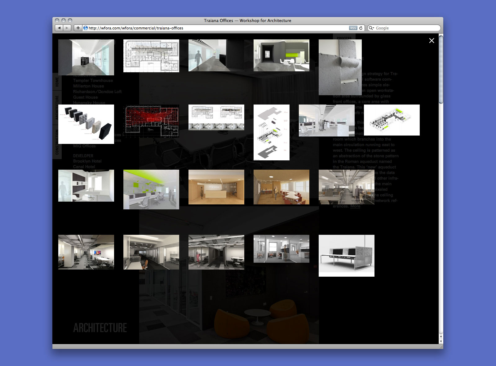
Process overlay
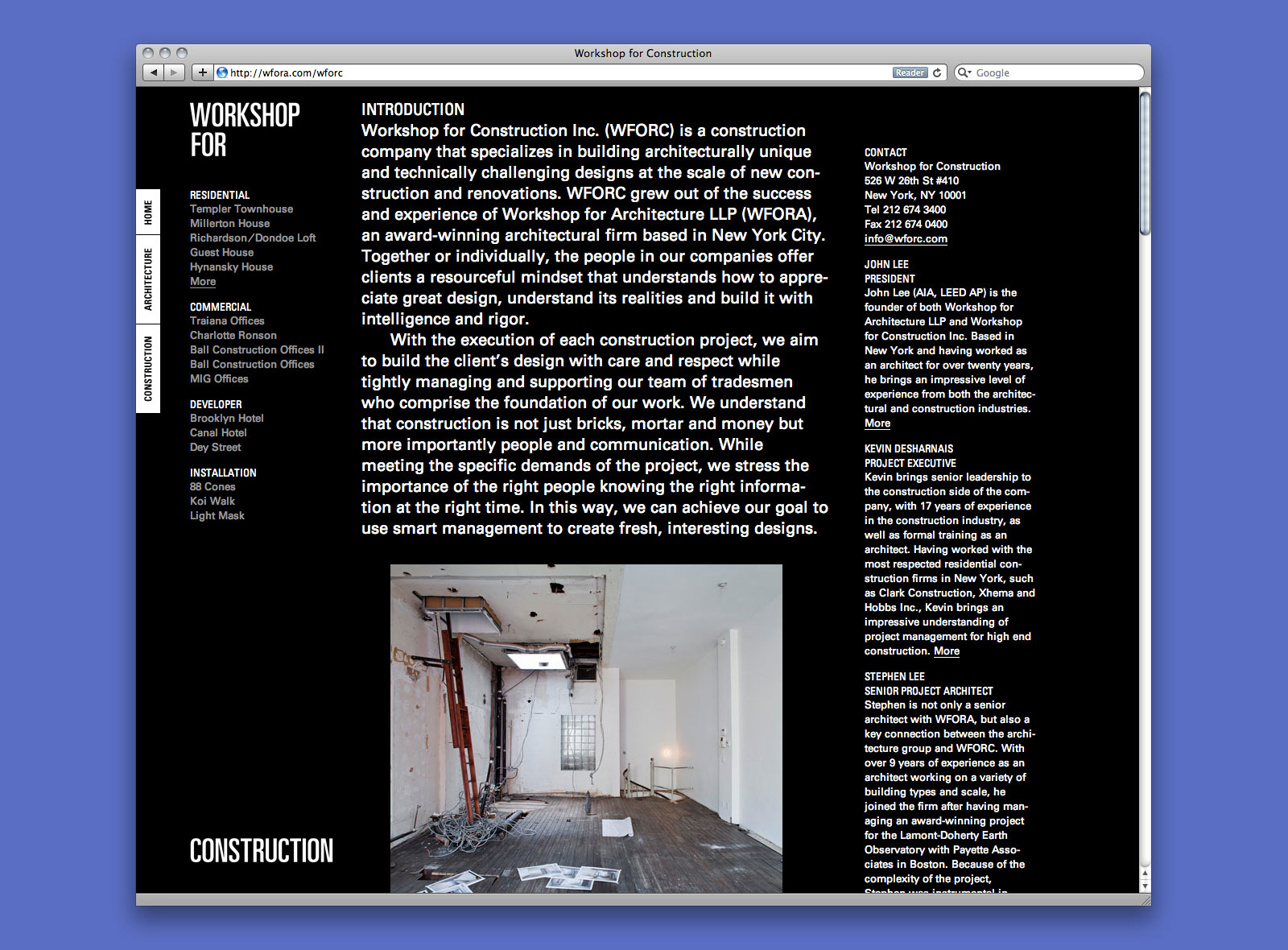
Workshop for Construction page
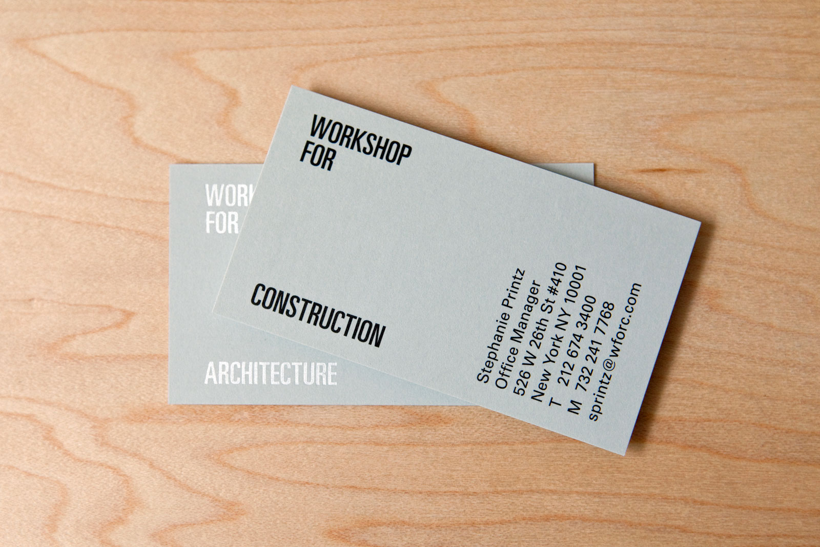
Business cards
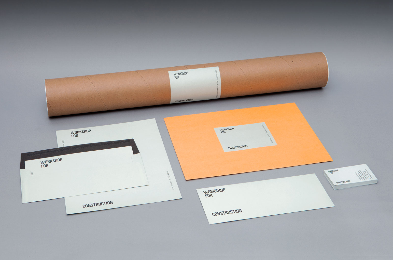
Identity system, website, and applications, 2011
Website development by Mike Bingaman
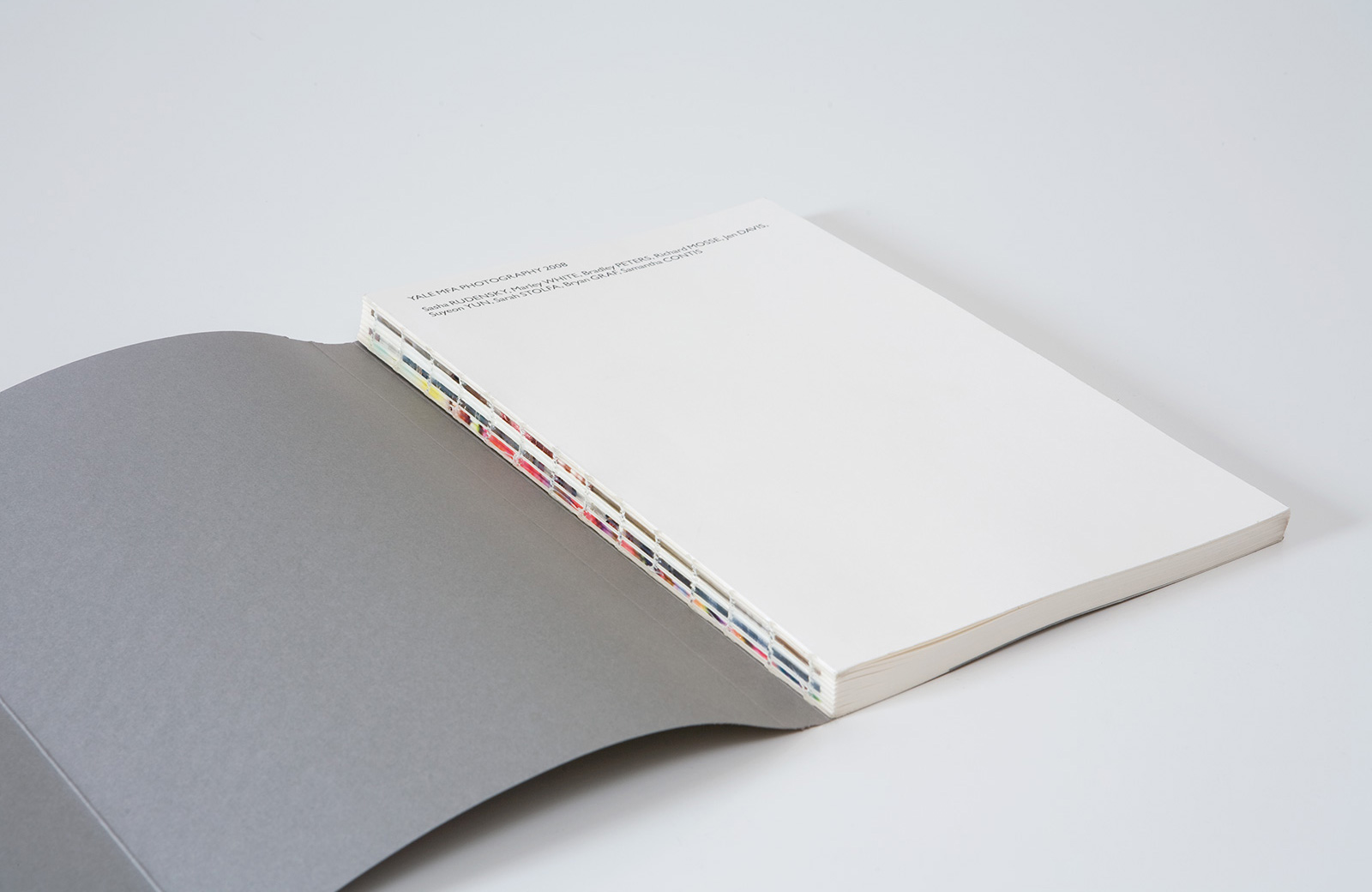
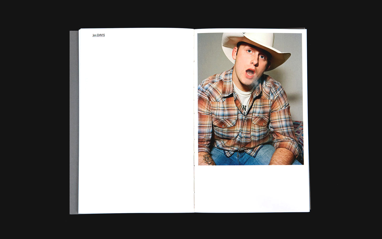
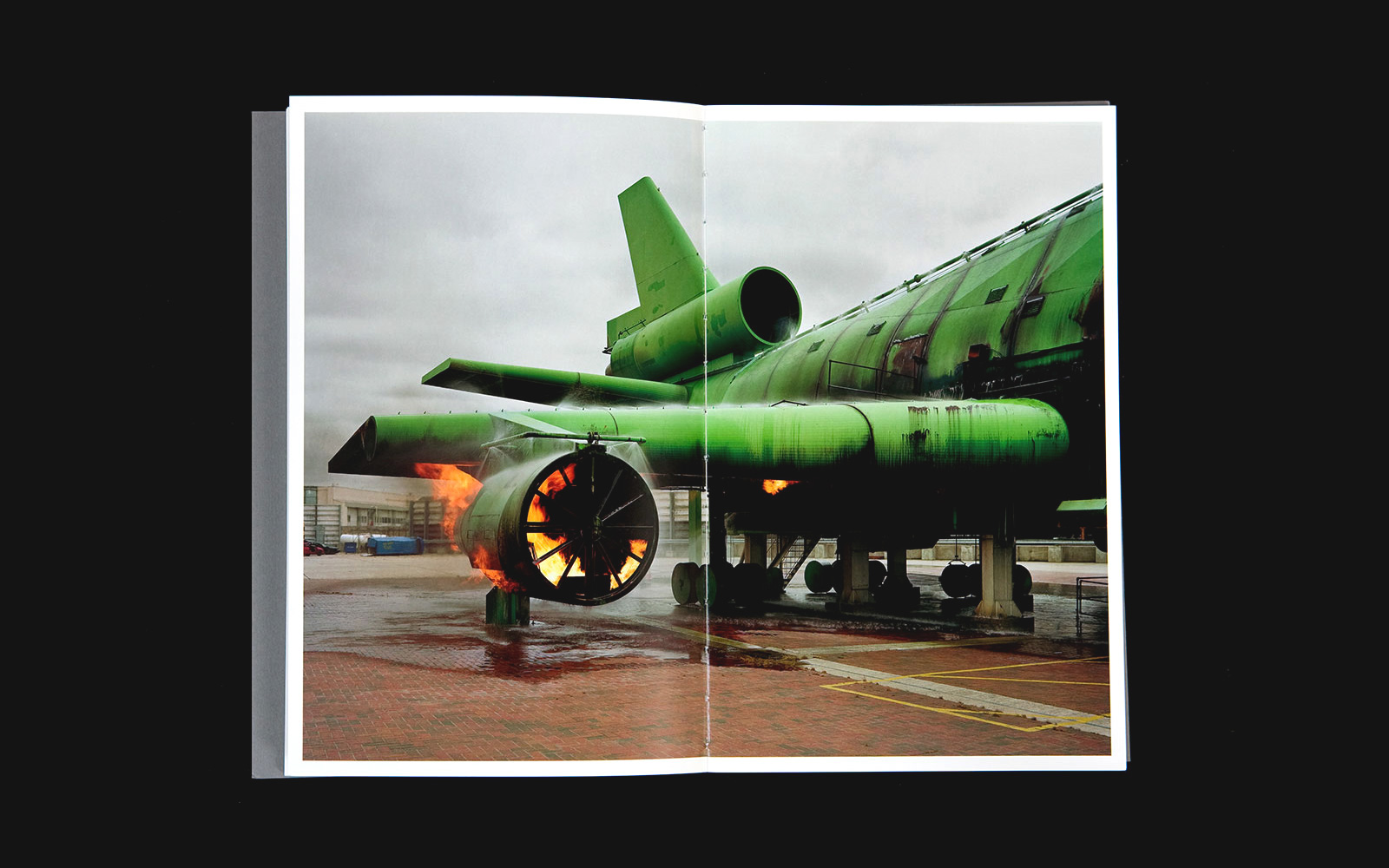
YALE MFA PHOTOGRAPHY 2008 for YALE SCHOOL OF ART —— Each year, the graduating MFA photography students at Yale School of Art assemble a group exhibition and catalog. This book compiles their work: Samantha Contis, Jen Davis, Bryan Graf, Richard Mosse, Bradley Peters, Sasha Rudensky, Sarah Stolfa, Marley White, and Suyeon Yun. The tall format responds to the dimensions of the work; bound with dust jacket, covering an exposed, smythe-sewn binding.
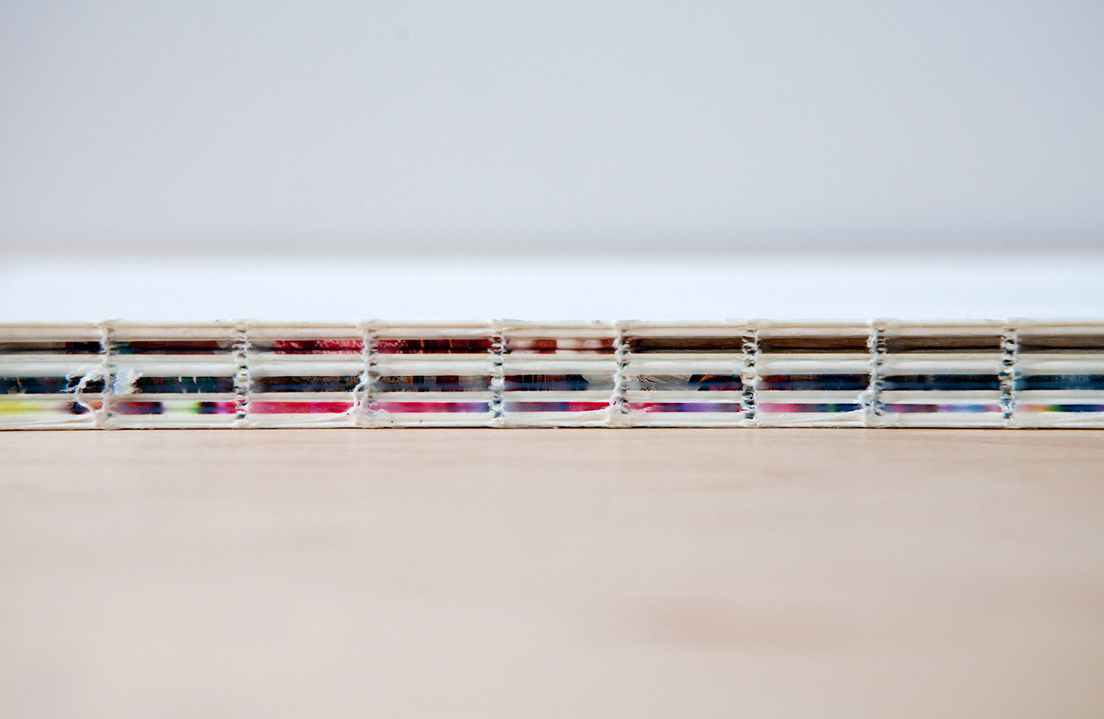
Binding detail

Catalog design, 2008
Designed with Bethany Powell
6.5×10.5 in (165×267 mm), 100 pages
Offset print, smythe-sewn
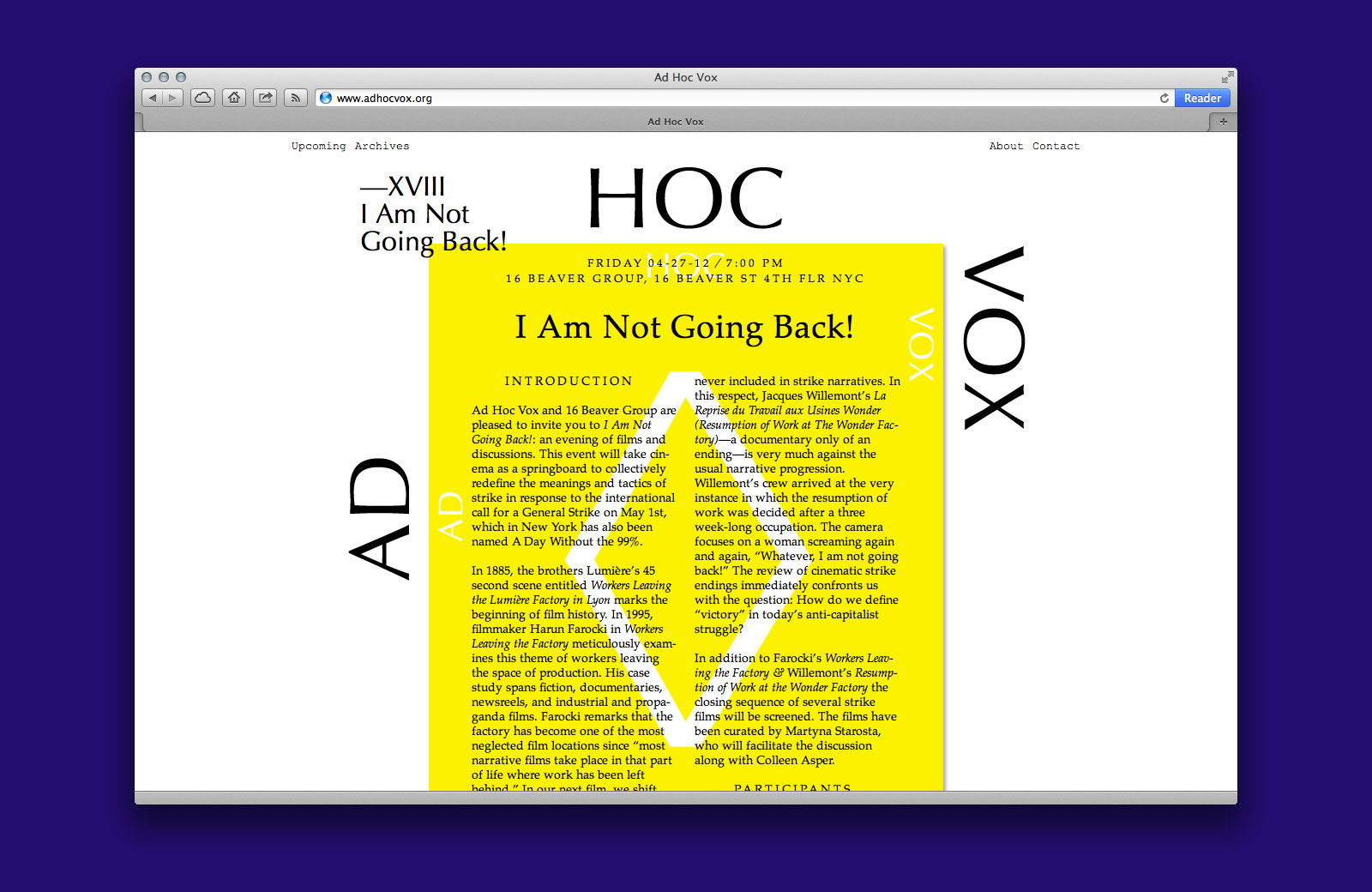
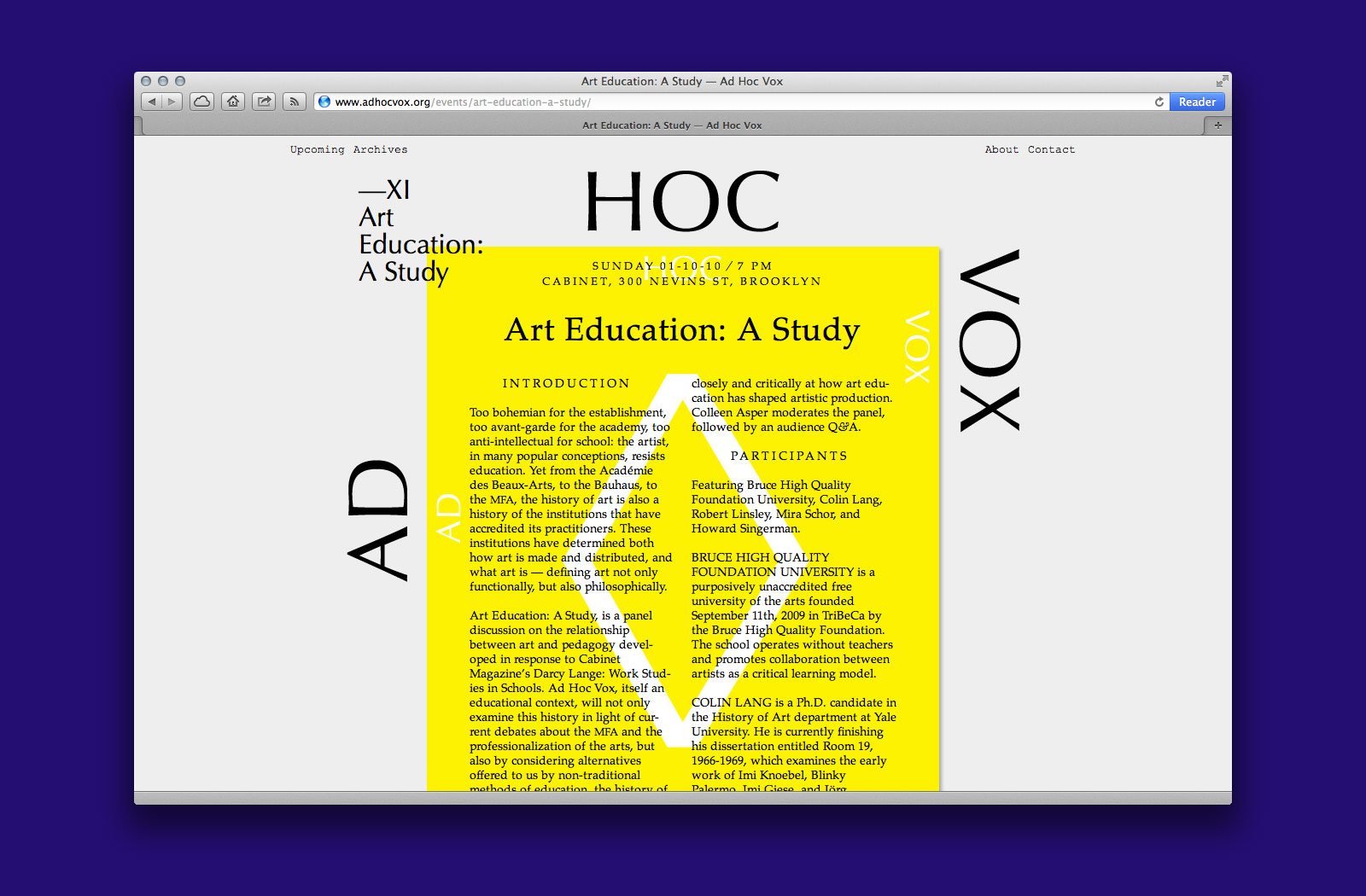
IDENTITY and WEBSITE for AD HOC VOX —— Organized by artists Colleen Asper and Jennifer Dudley, Ad Hoc Vox is an itinerant series of events and discussions, concerning a wide range of issues in contemporary art. Since 2007, they’ve hosted panelists such as Hal Foster, Robert Storr, Keller Easterling, David Graeber, and Wayne Koestenbaum, at a diverse array of galleries and locations including The Kitchen, Deitch Projects, Cabinet, PPOW, and The Drawing Center.
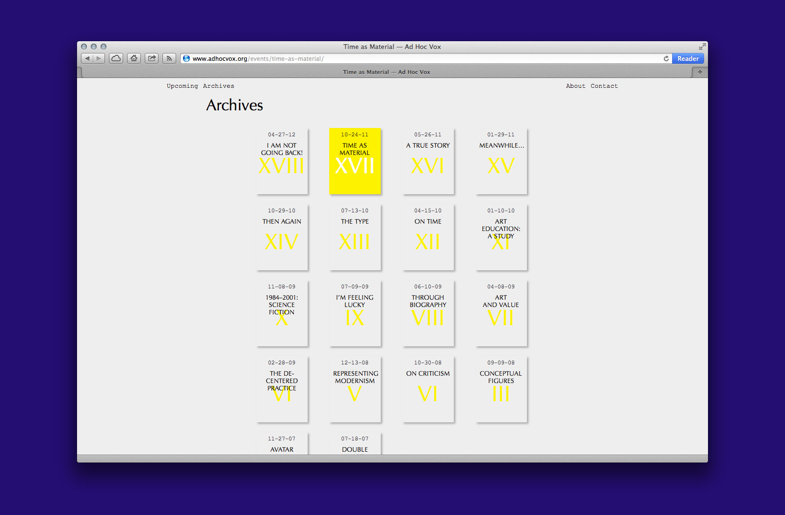
Event archives
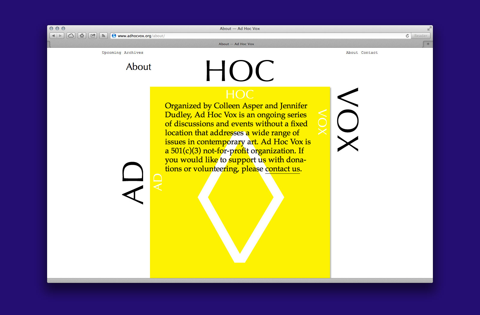
About page
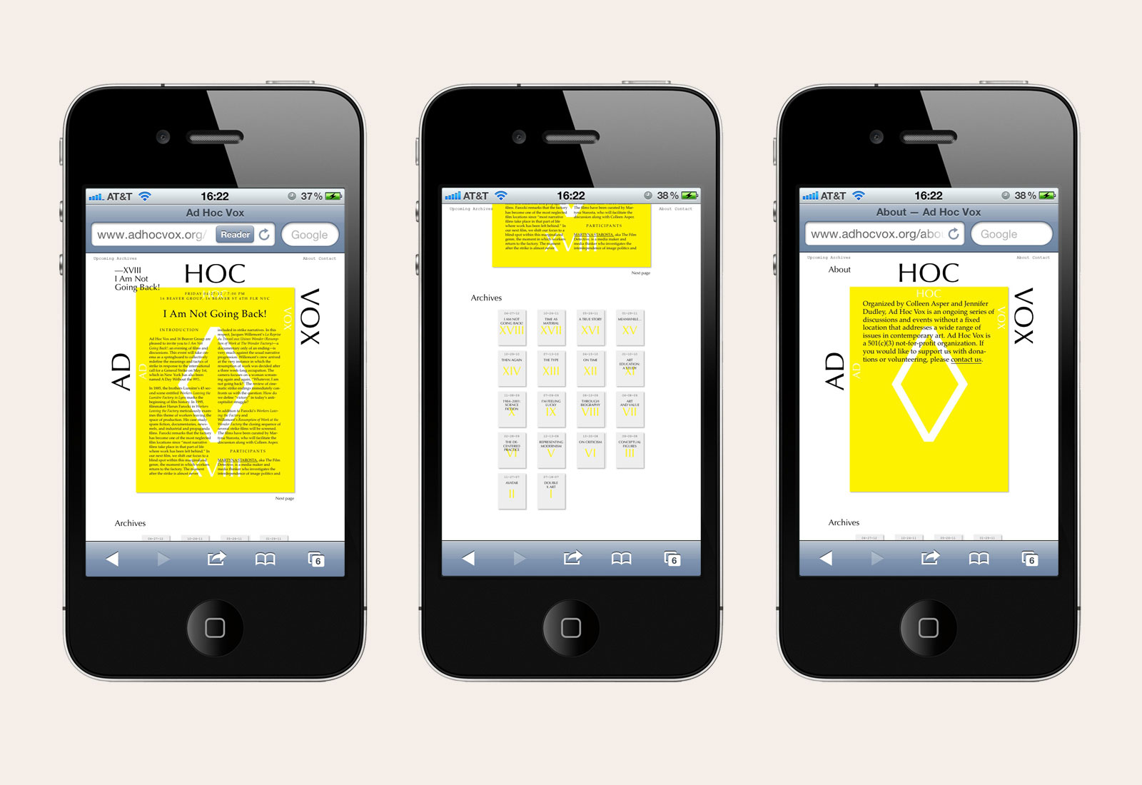
Identity and website, 2012
Web development by Ben Bunch
Special thanks to Dan Brewster
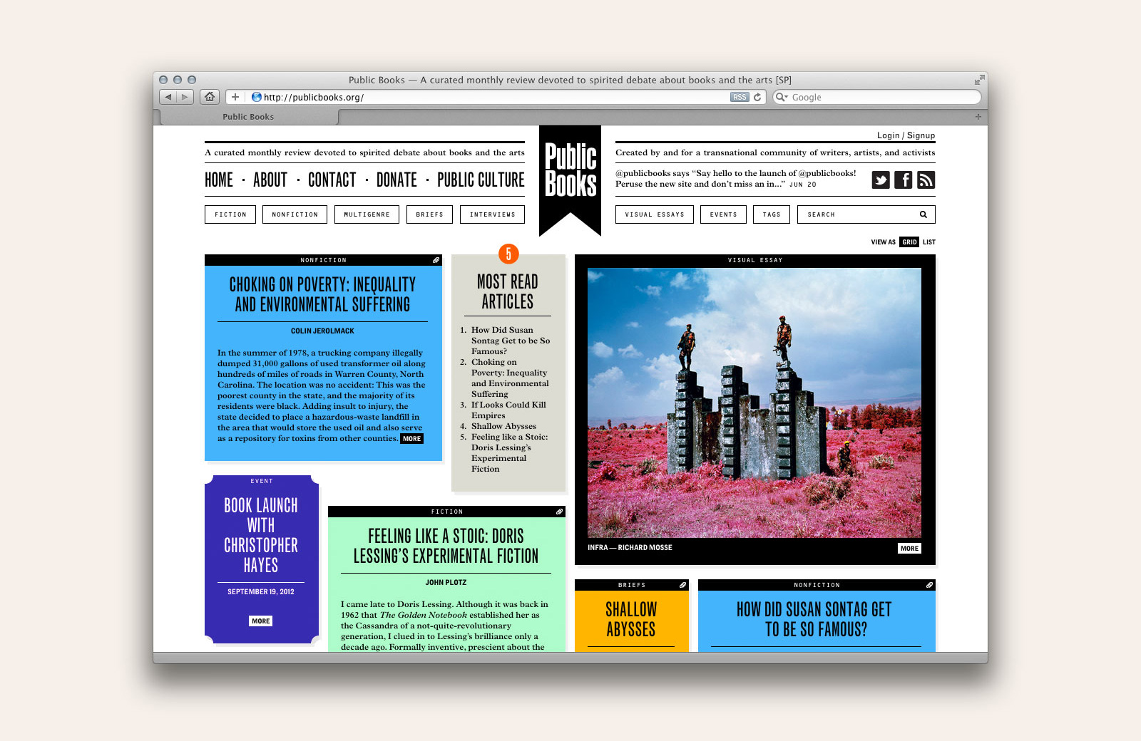
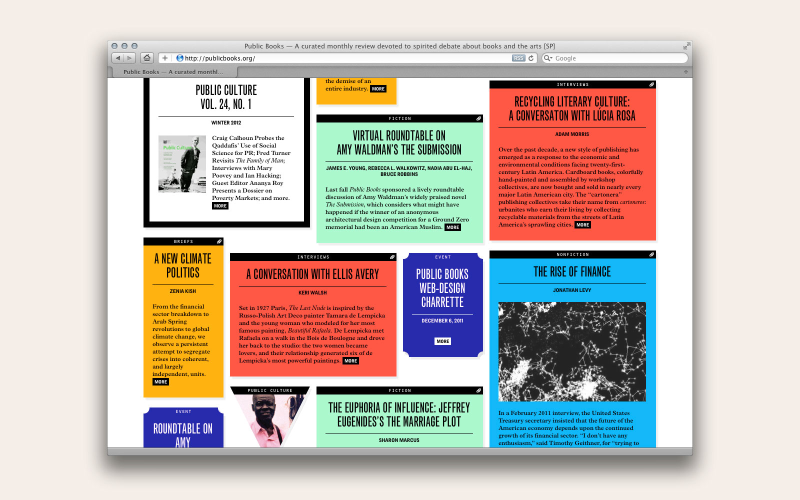
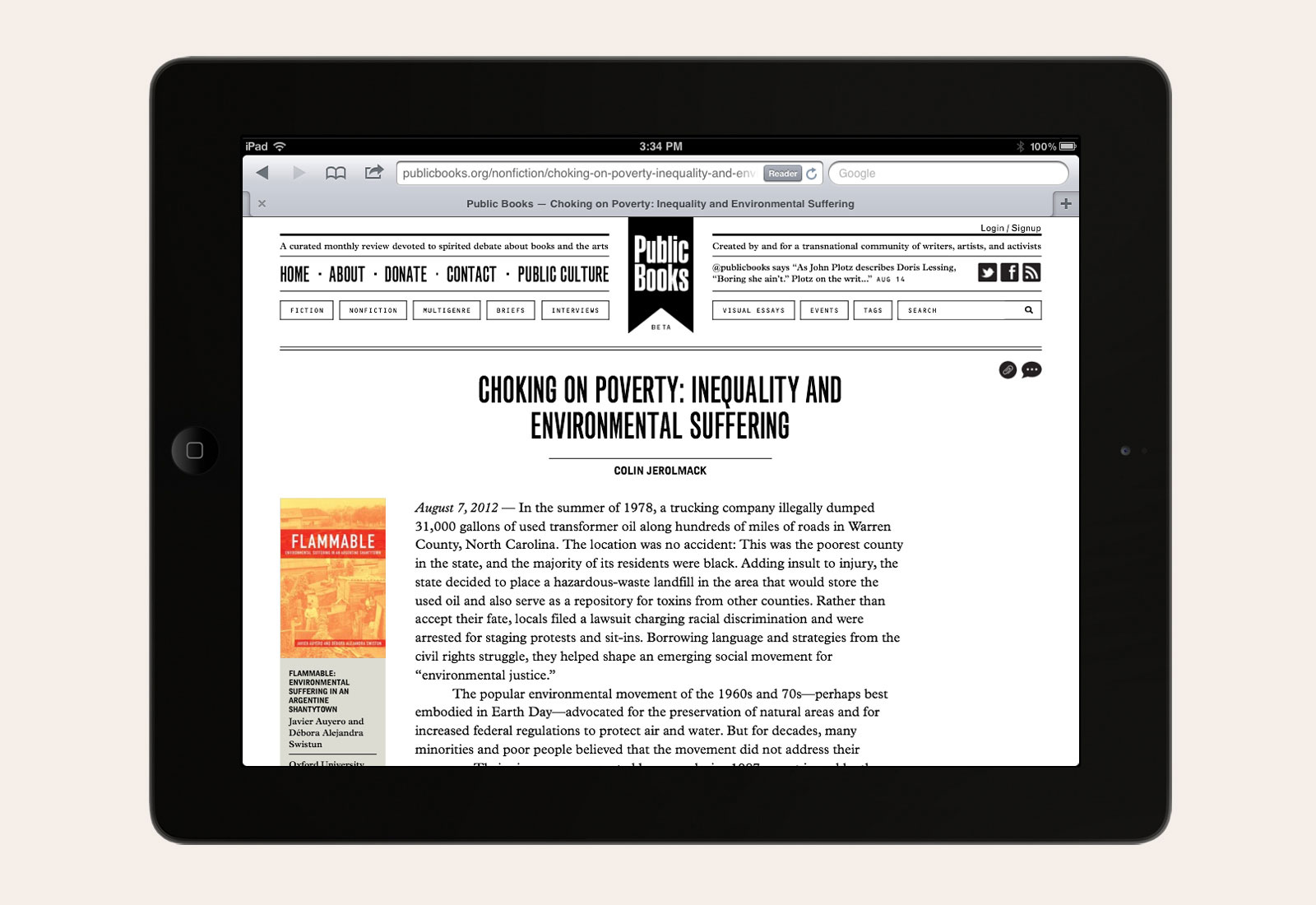
IDENTITY, WEBSITE, and CUSTOM CMS for PUBLIC BOOKS —— Public Books is a web-based affiliate of the academic journal Public Culture, a forum devoted to real-time debate about fiction, non-fiction, and emergent cultural trends. As part of an invited competition, we were asked to submit website concepts for this new literary enterprise. The challenge was two-fold: To present a wide range of writing and visual material in an engaging and digestible manner; and to grow the Public Culture audience by reaching into new territories of online content. Our solution was to create a dynamic and reconfigurable homepage, complete with modules accommodating writings, visual essays, comments, and events.
Color-coded homepage modules
Visit site
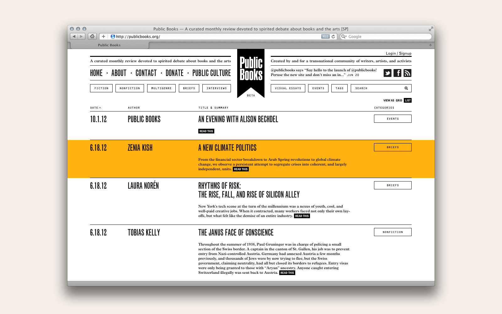
List view
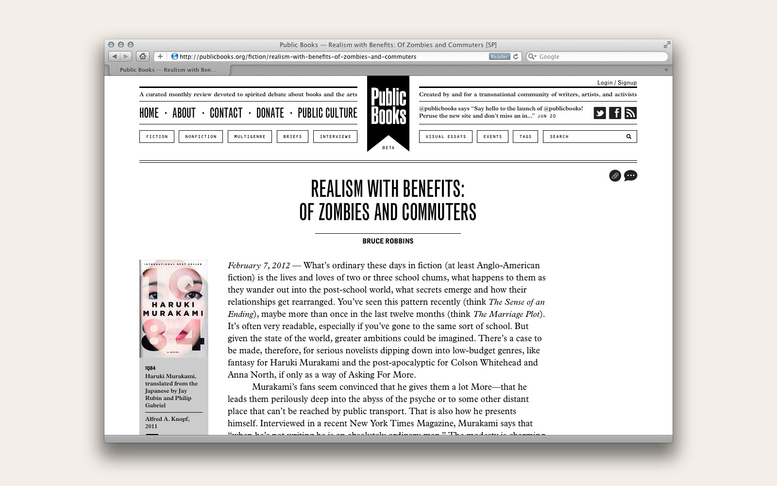
Article page
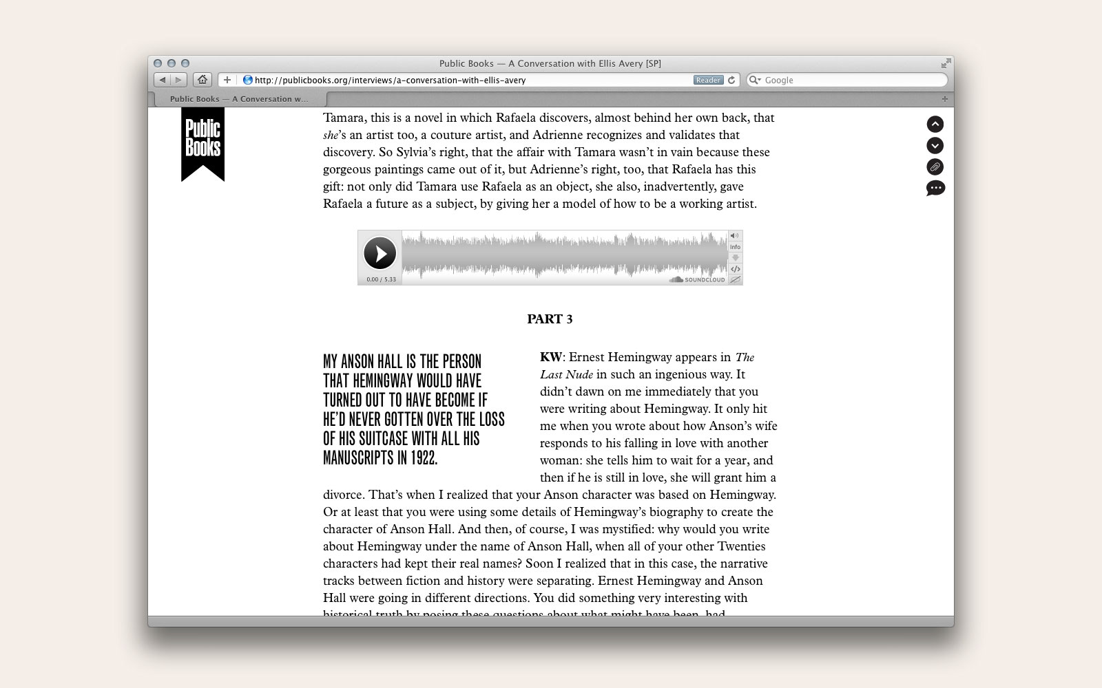
Pull quote and embedded media
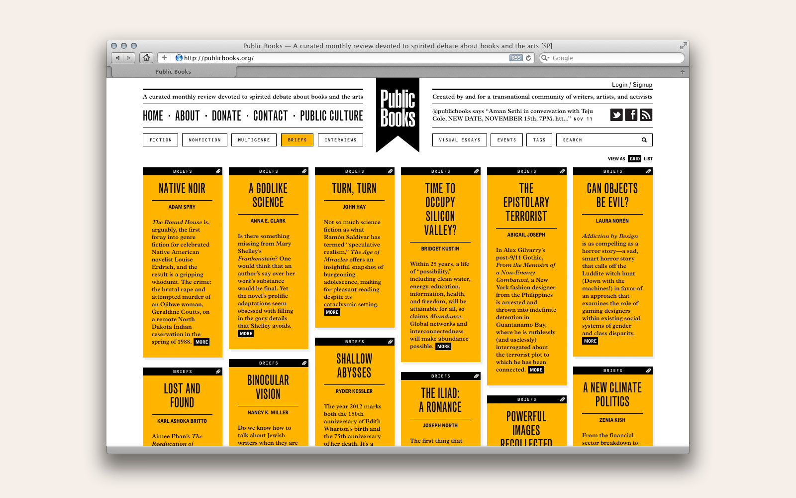
Filter by genre
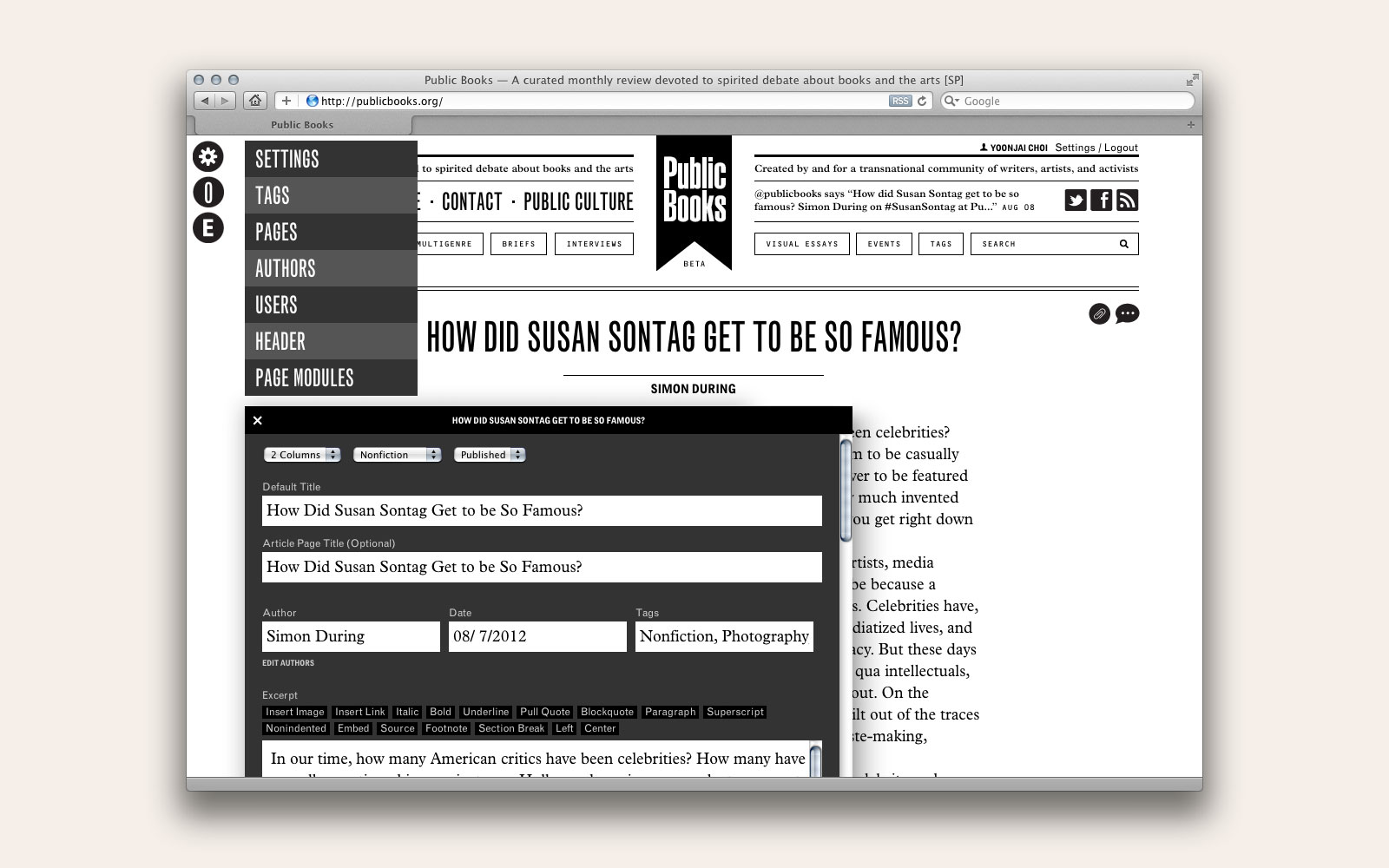
Content management system
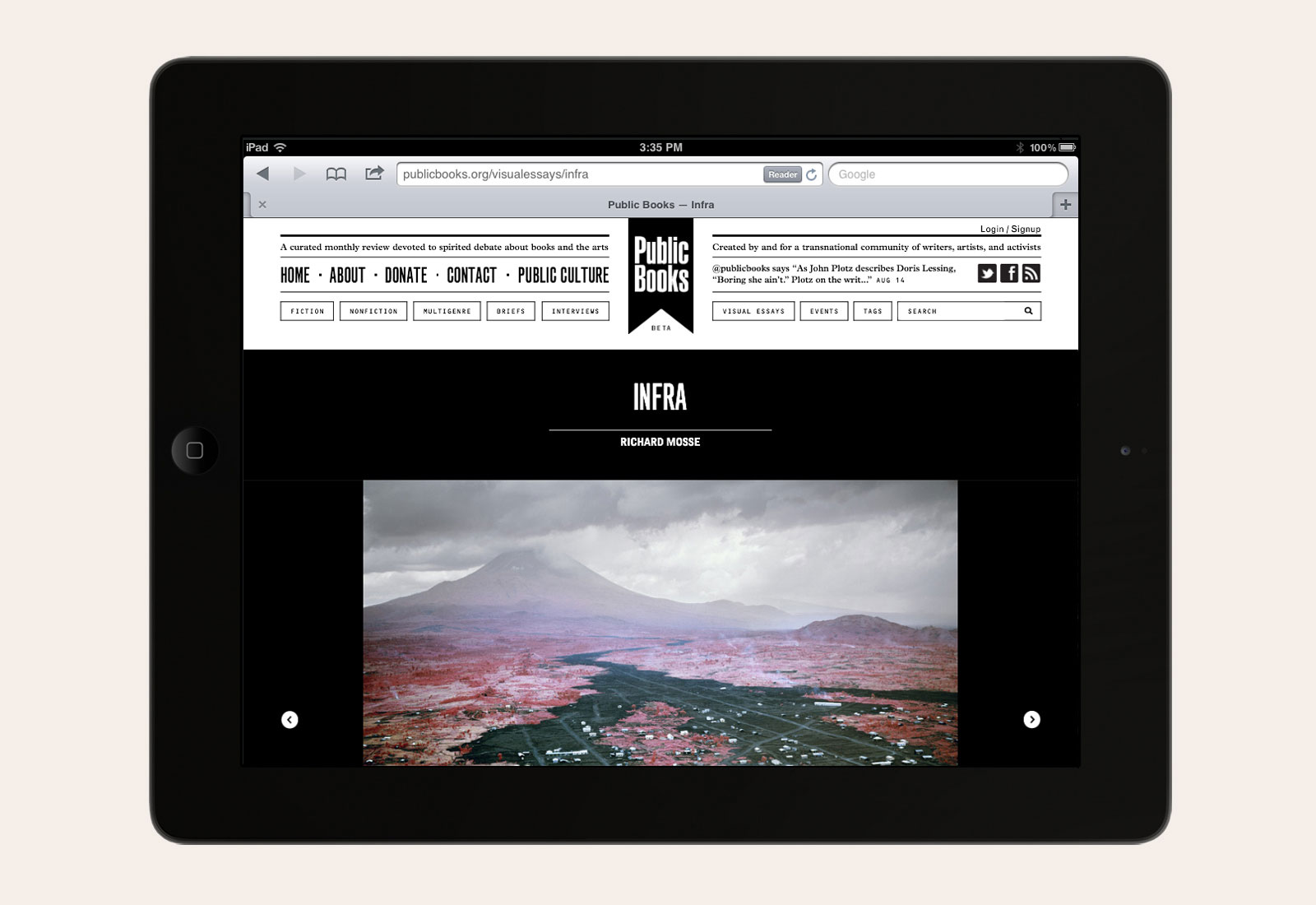
Visual essay
Identity, website, and custom CMS, 2012
Public Books: Plaegian Alexander, Managing Editor
Stephen Twilley, Associate Editor
Website development by Dan Brewster
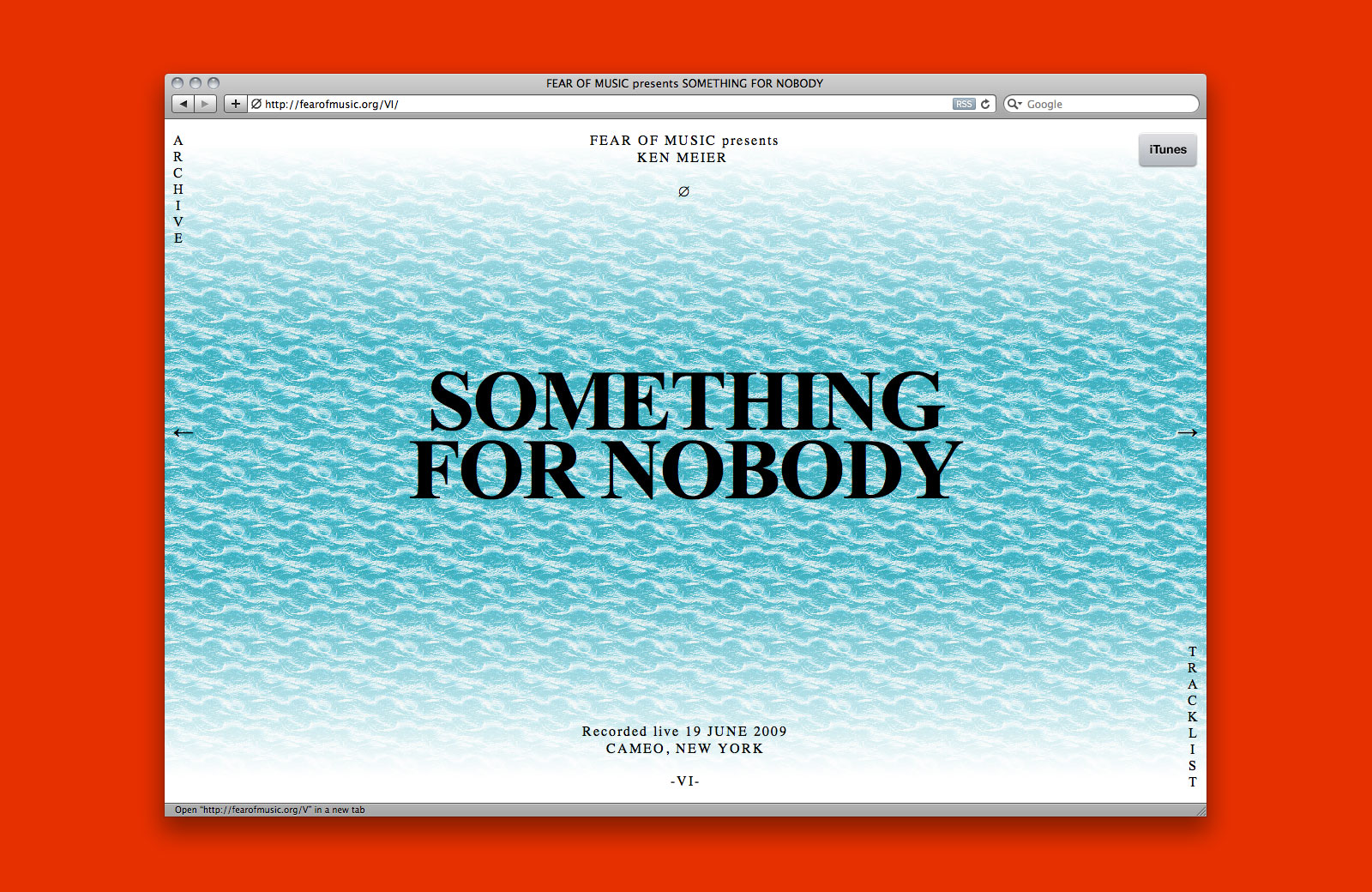
WEBSITE, PODCAST, and FLYERS for FEAR OF MUSIC —— Fear of Music is an electronic music podcast and occasional event series with contributors in New York, Chicago, and Los Angeles. Running since 2009, the project has grown to include a mailing list, shared server, and, more recently, a community record label.
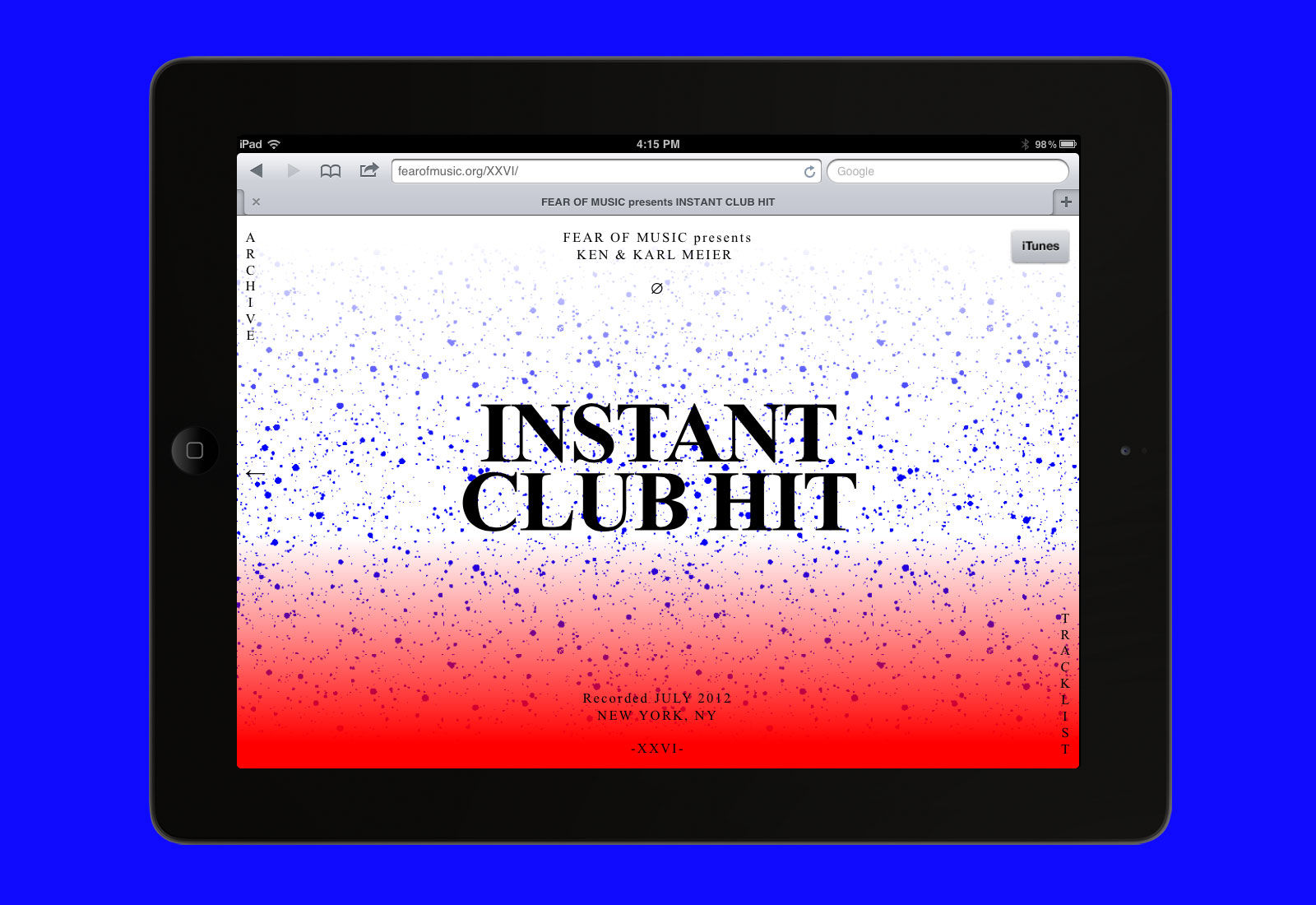
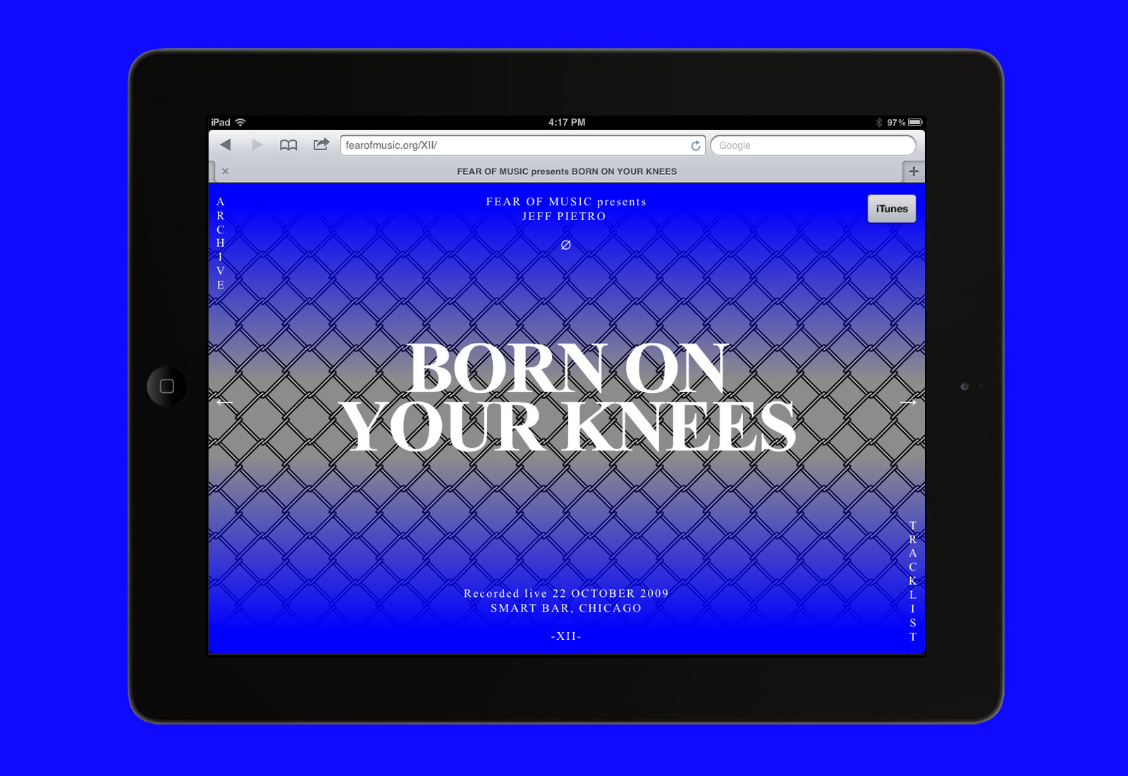
XII
Jeff Pietro, Born on Your Knees
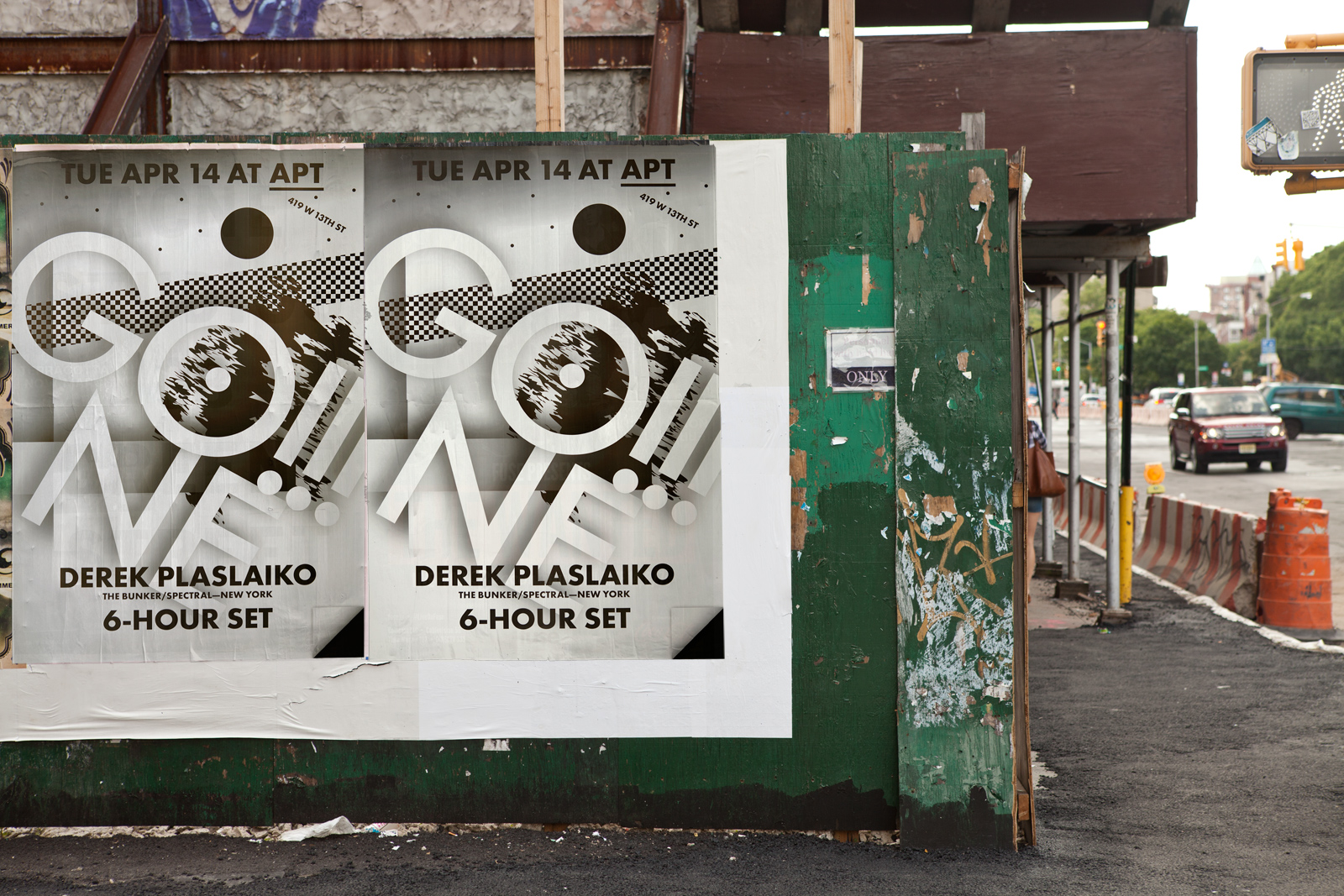
GO!!! featuring Derek Plaslaiko
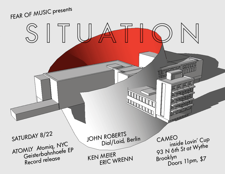
SITUATION featuring John Roberts
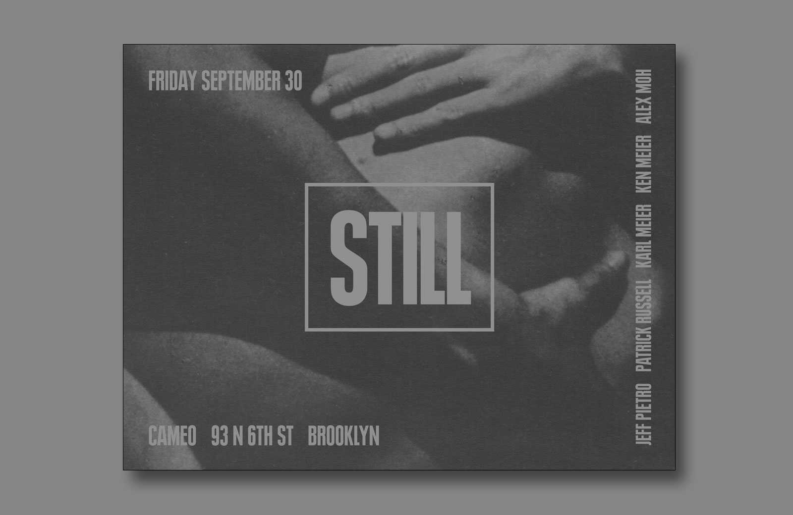
STILL featuring Jeff Pietro
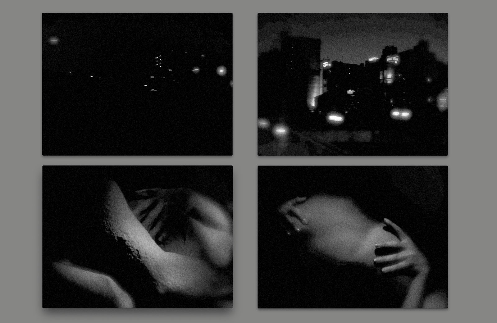
Video stills
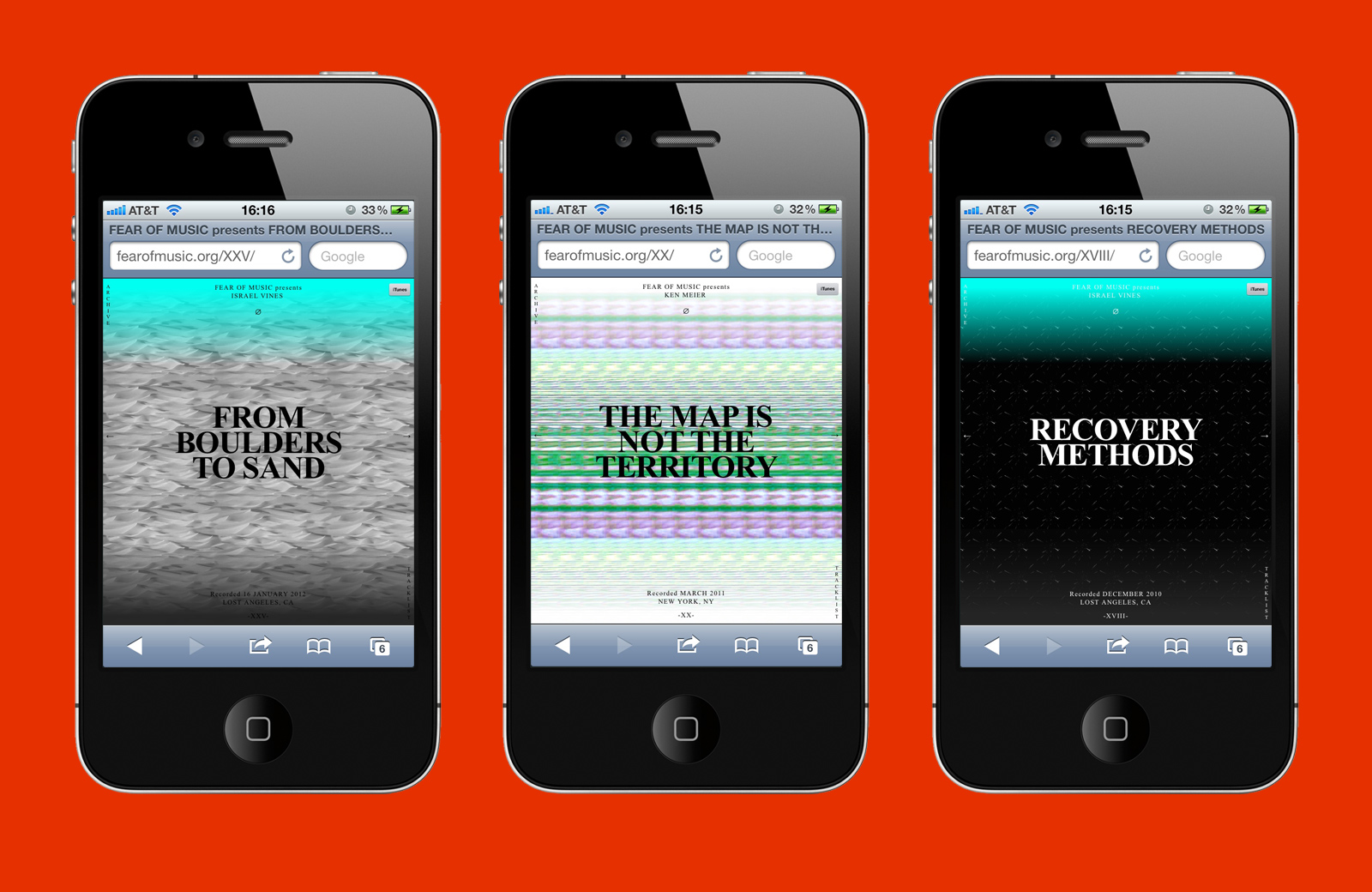
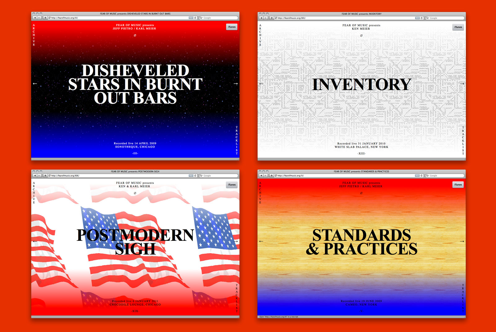
Website, podcast, and flyers, 2012
Special thanks to Karl Meier, Israel Vines, and Jeff Pietro
Website development by Dan Brewster
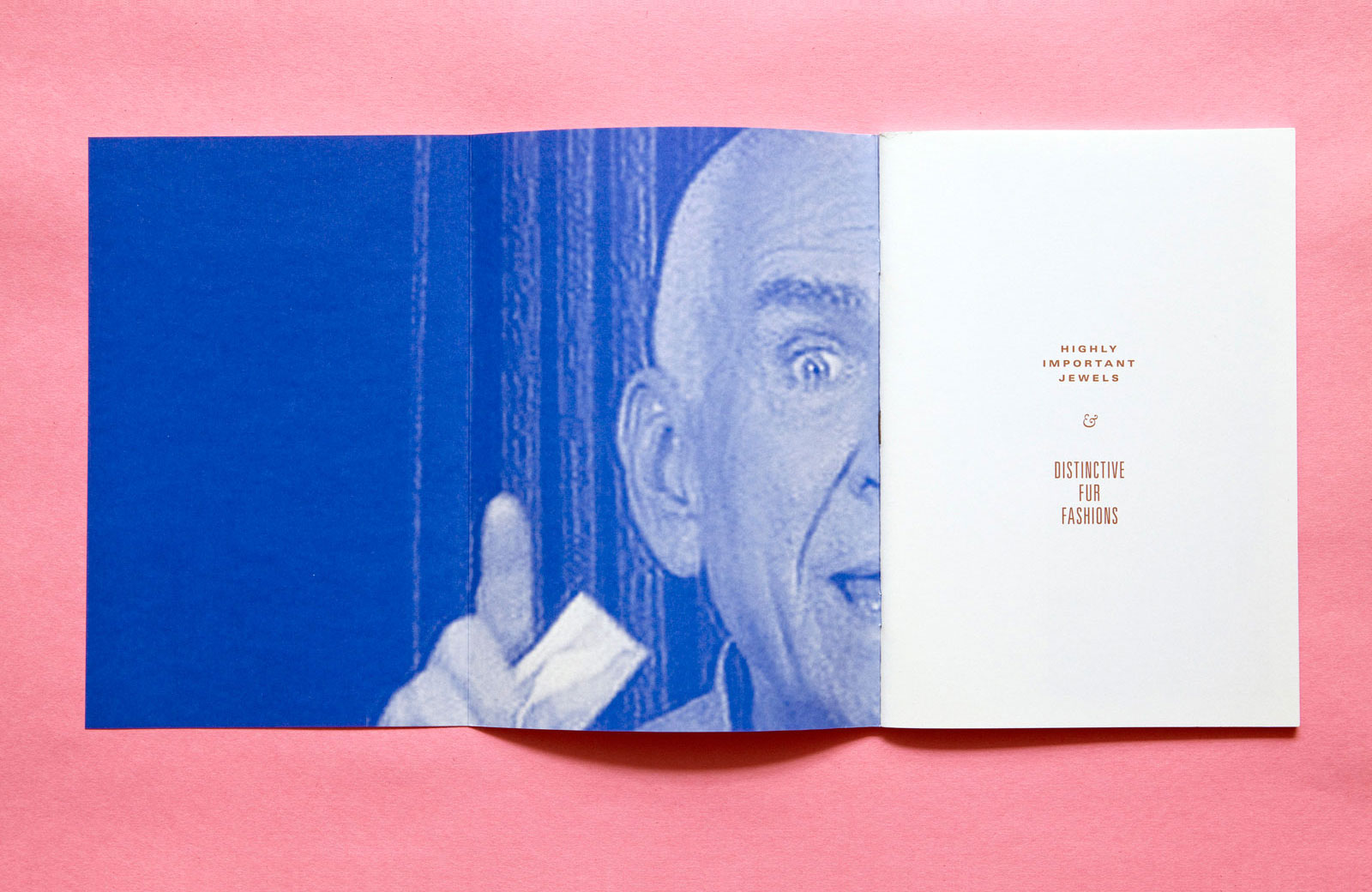
VARIOUS TITLES for HORSES THINK PRESS —— Horses Think Press is a Brooklyn-based imprint founded in 2010 by artist Ofer Wolberger. Initially begun as a self-publishing project with the release of Wolberger’s 12 Books series, the roster now includes the work of other like-minded artists. Our collaboration with Horses Think spans nine separate titles, including Covers, Color Me Beautiful, and Highly Important Jewels & Distinctive Fur Fashions.

Highly Important Jewels & Distinctive Fur Fashions, 2011 — The inherent ridiculousness of these collections has been taken to even greater heights by displaying them together. Photos of furs and jewels with little introduction or manipulation, rendered in the style of a catalog, and printed in metallic gold and blue.
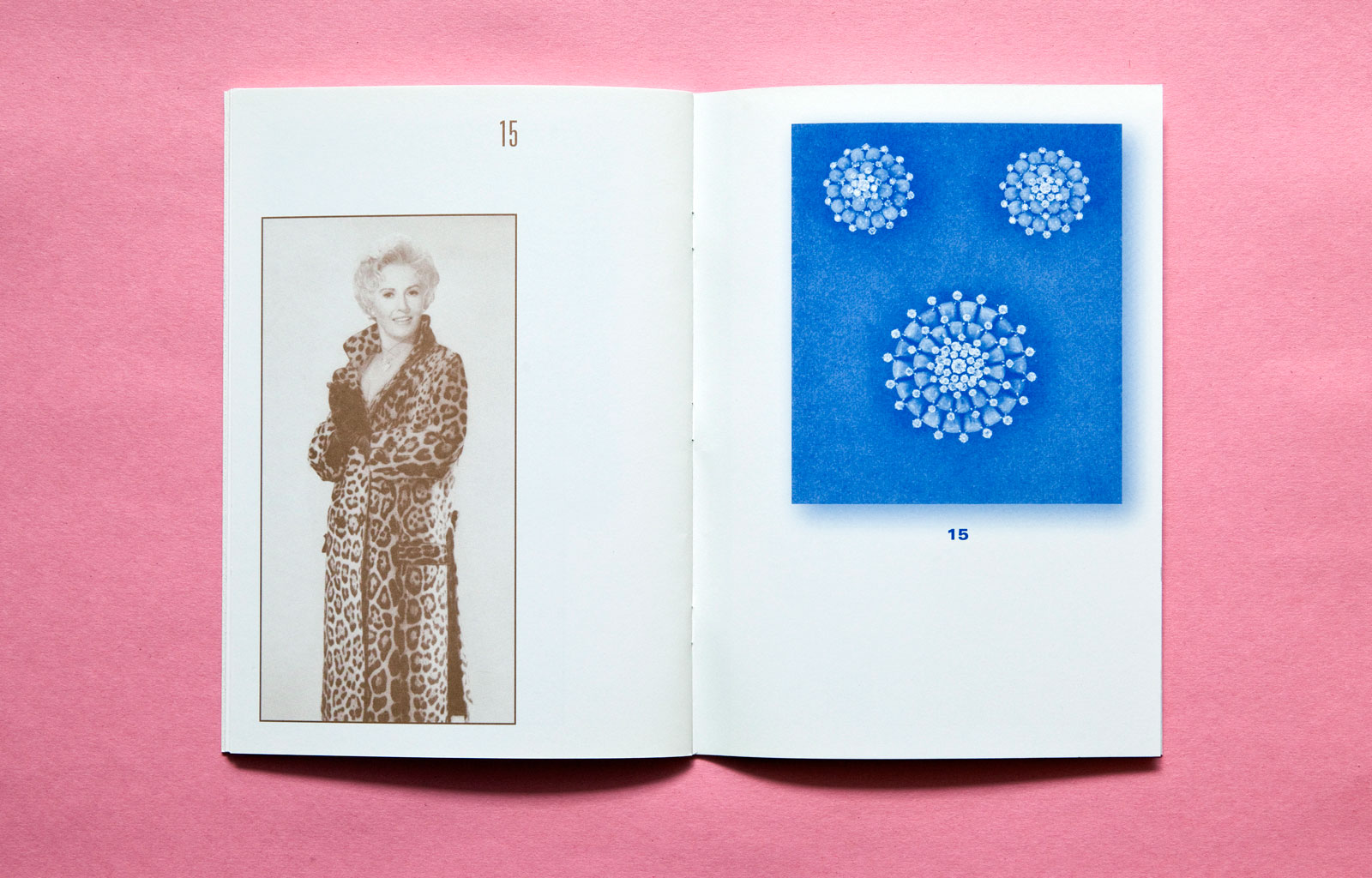
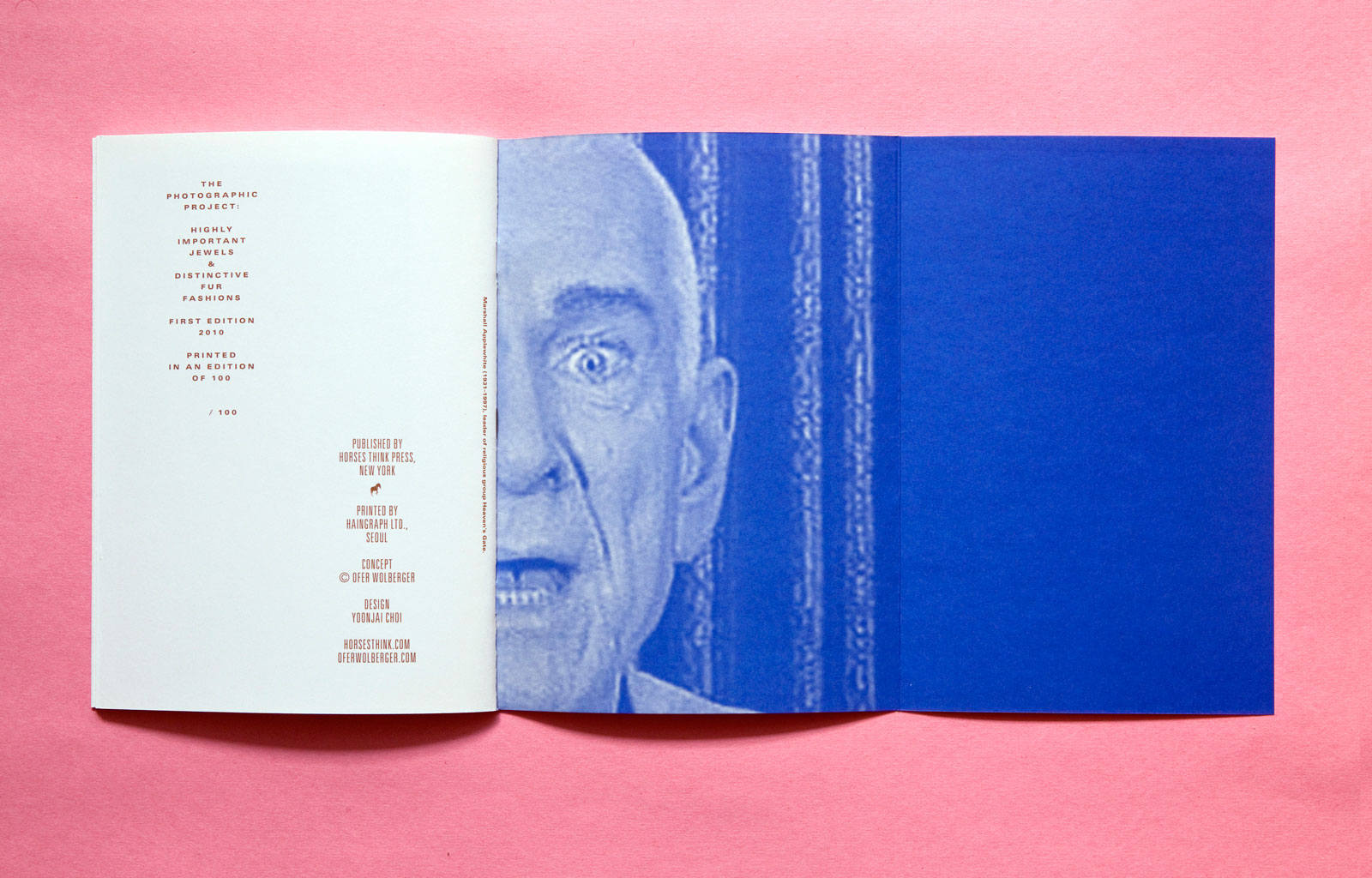
IV
6.5×9 in (165×230 mm), 36 pages
Offset print, saddle-stitched
Edition of 100

Color Me Beautiful, 2012 — Taking its aesthetic cues from Douglas Sirk and 1950s Hollywood melodramas, this title explores the strange world of color as it relates to feminine ideals and the concept of beauty.

IX
5.5×8.5 in (140×216 mm), 40 pages
Laser print, saddle-stitched
Edition of 75
Covers, 2011 — Found book covers are photocopied and presented alphabetically as pages in a staple bound book, serving as a physical archive and catalog of the artist’s collection. The project is now on its third edition, with each new publication expanding upon the last.
V
8.5×11 in (216×279 mm), 60 pages
Xerox print, staple-bound
Edition of 50
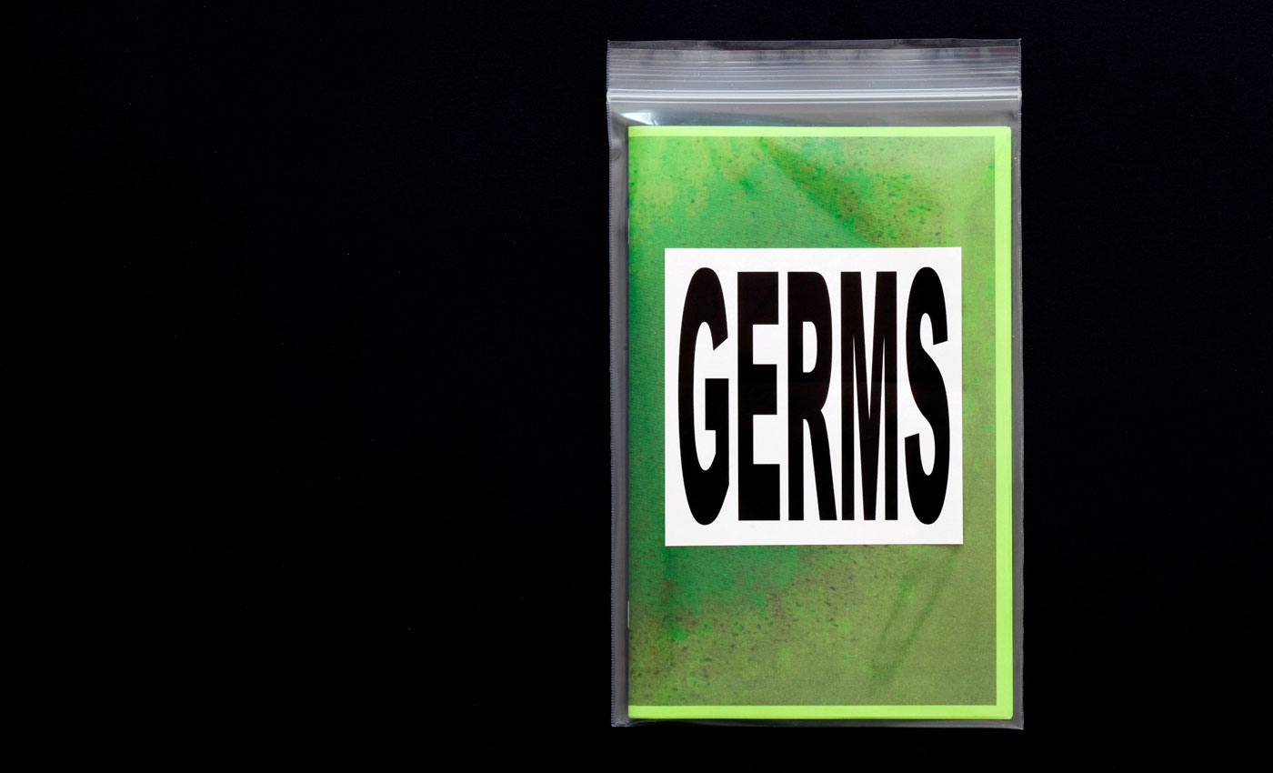
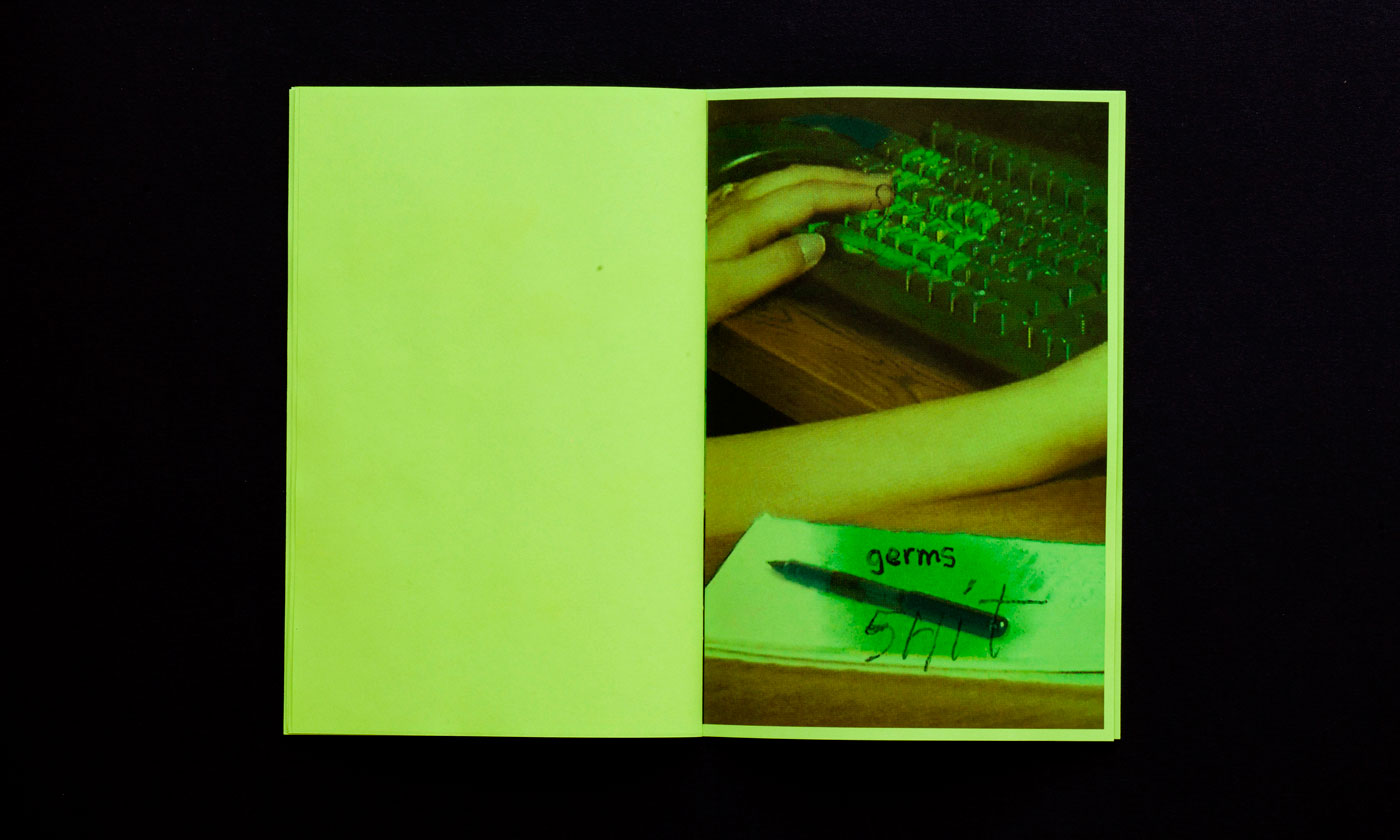
Germs, Shit, Colds and Flu, 2011 — Each laser-copied, saddle-stitched zine comes packaged in a resealable plastic bag with warning sticker attached.
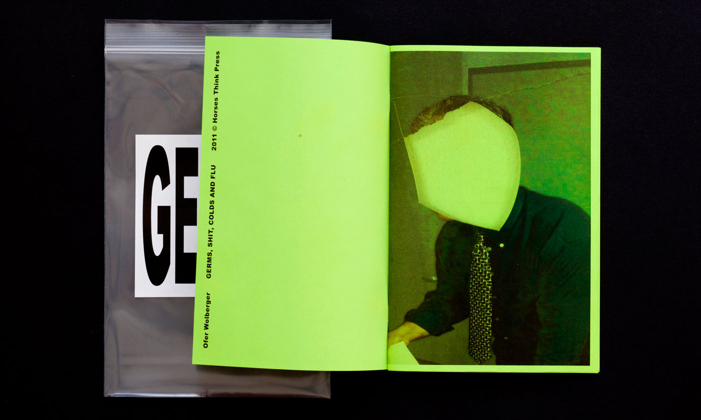
VII
5.5×8.5 in (140×216 mm), 32 pages
Laser print, saddle-stitched
Edition of 75
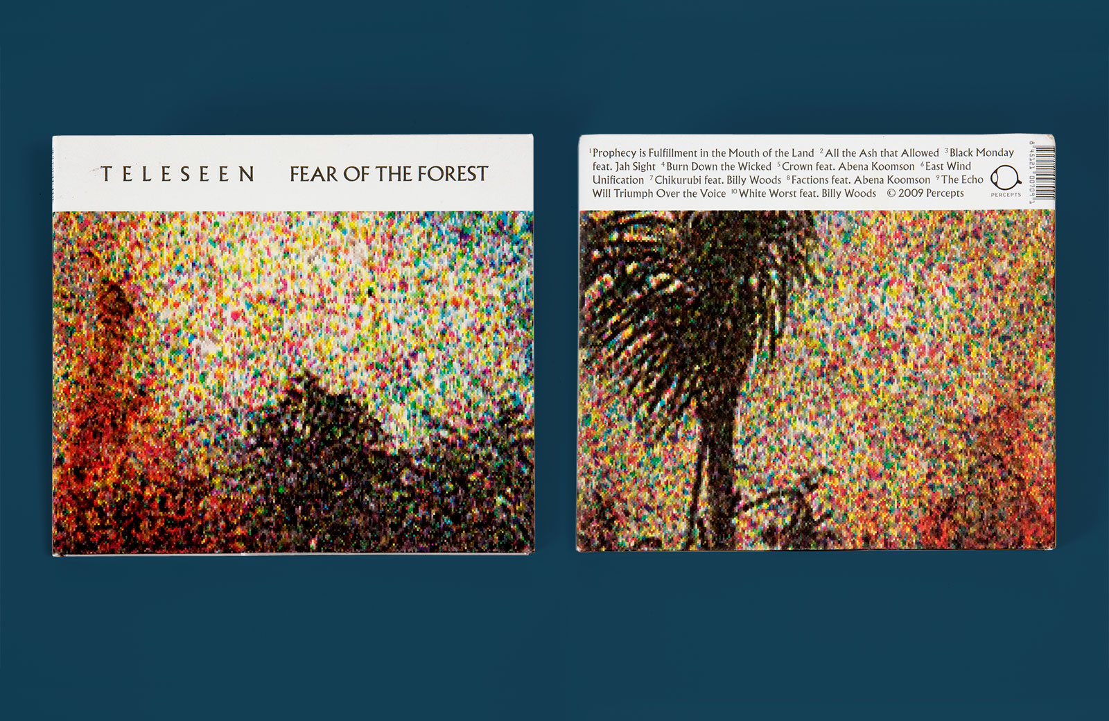
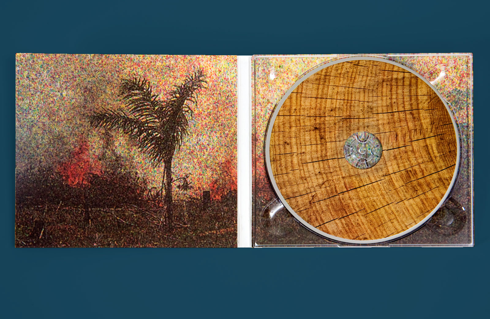
ALBUM ART and FLYERS for PERCEPTS —— Based in Brooklyn, Teleseen is the primary alias of producer and multi-instrumentalist Gabriel Cyr. He and the artists on his label, Percepts, combine dub and reggae elements with experimental electronic music, forgoing the familiar tropes of EDM, dubstep, and so-called dub techno. The label also hosts occasional events in New York, featuring like-minded performers such as Raster-Noton’s Kangding Ray and Bender.
Teleseen
Fear of the Forest LP
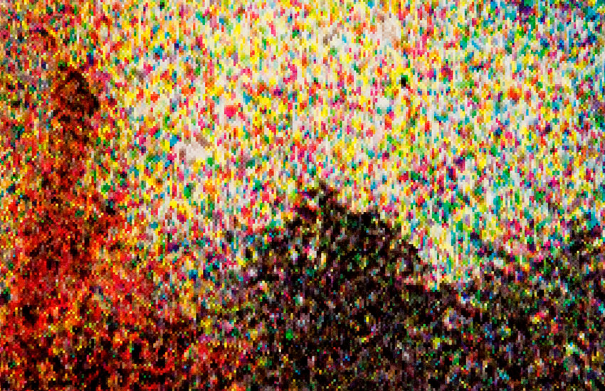
Cover detail
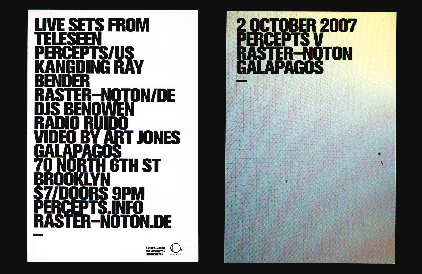
Event flyer
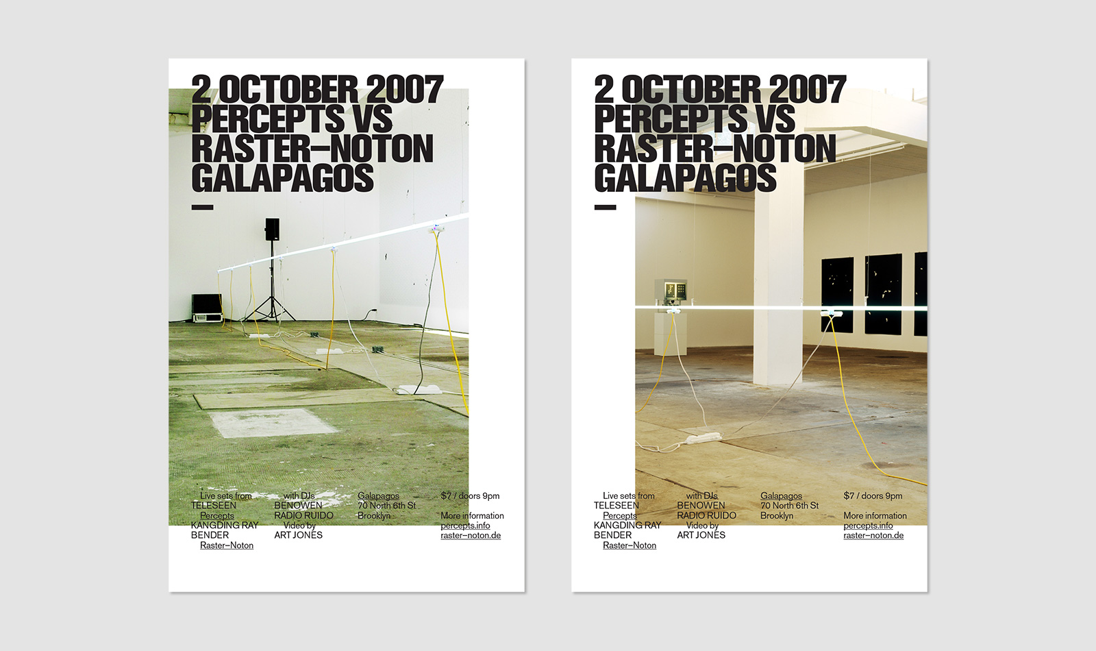
Event posters
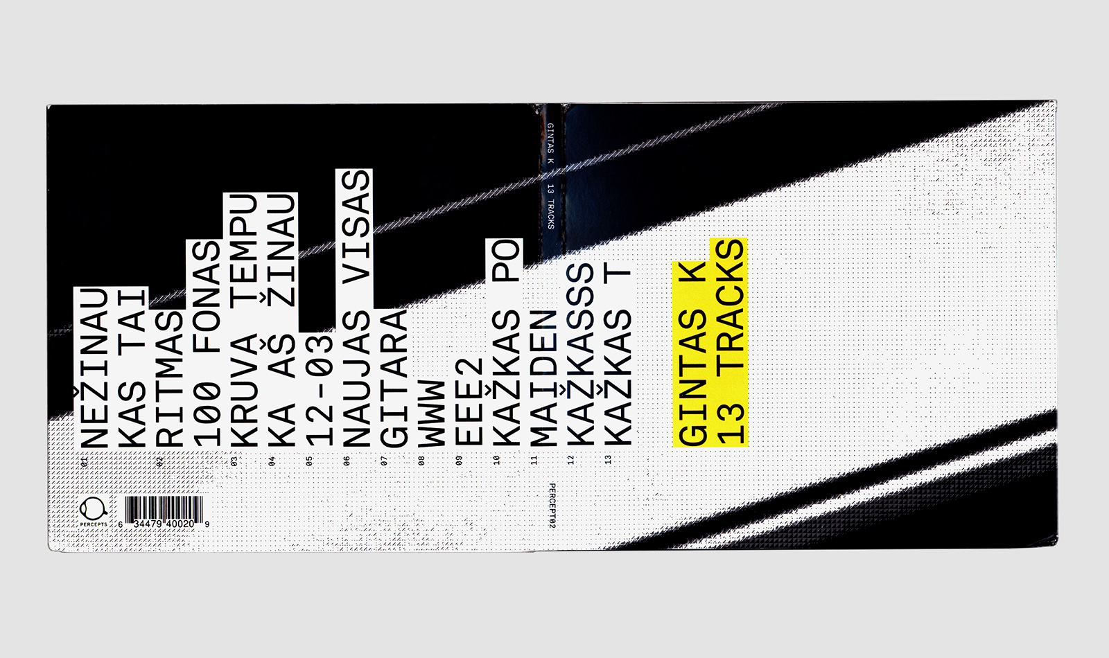
Gintas K
13 Tracks LP
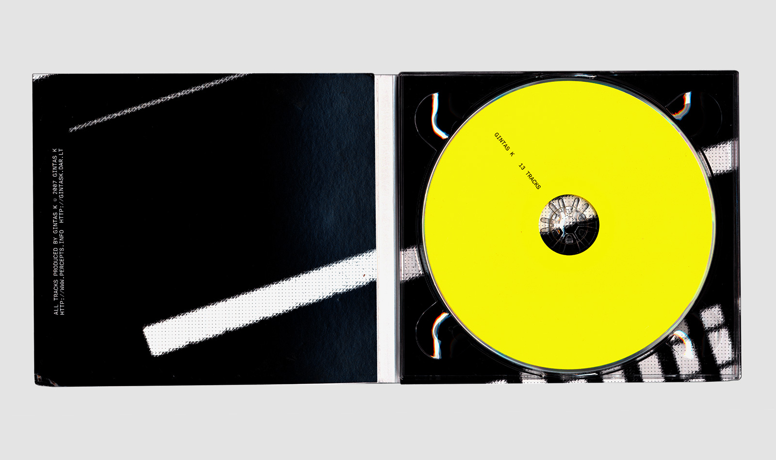
Album art and flyers, 2009
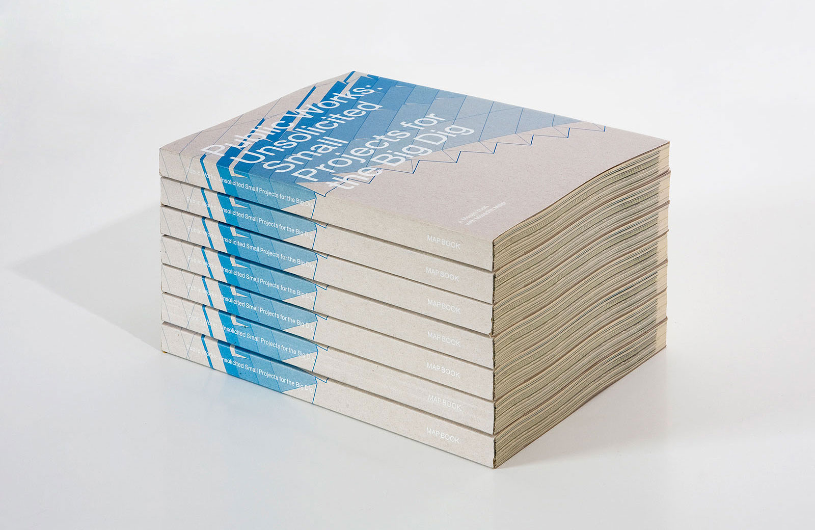
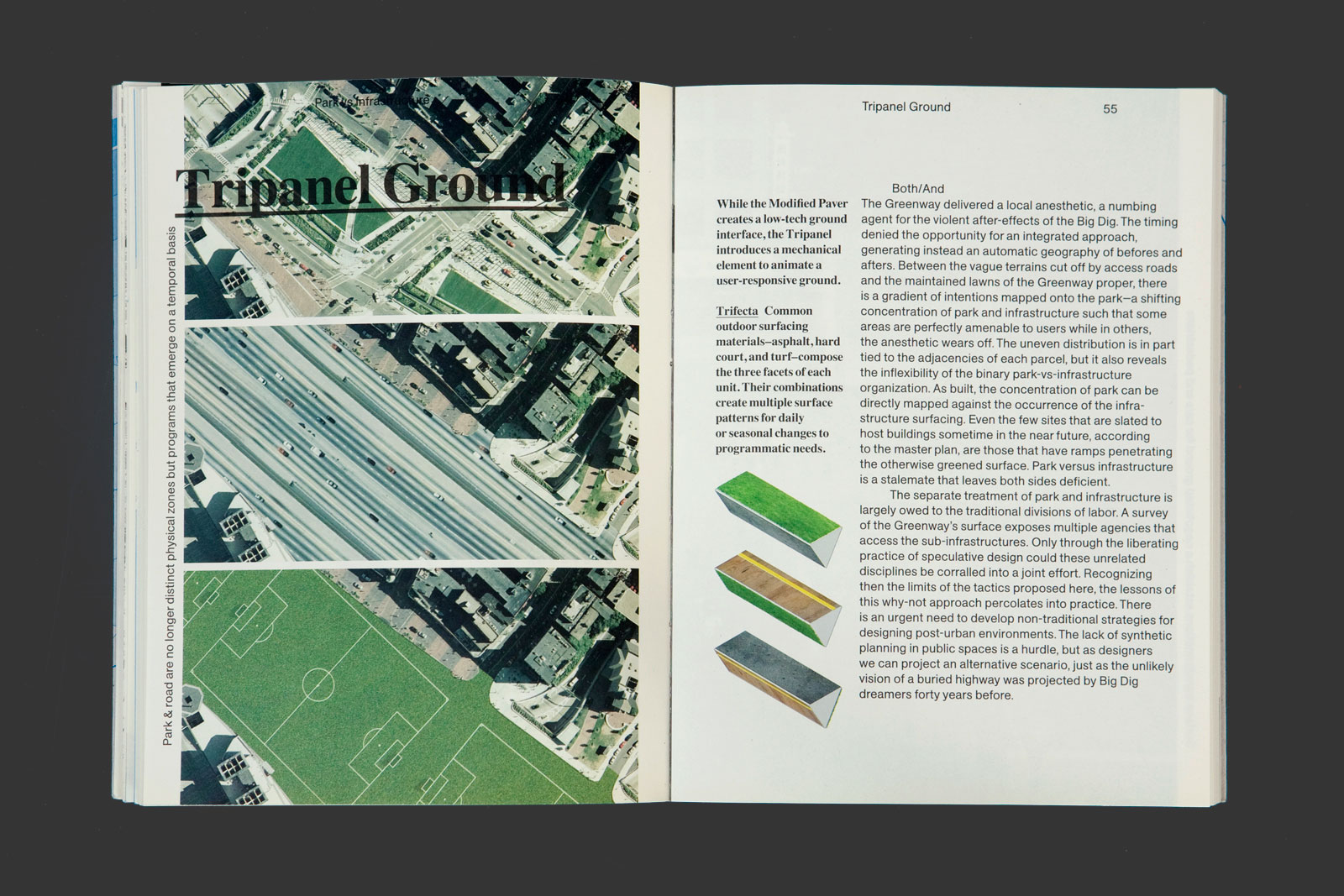
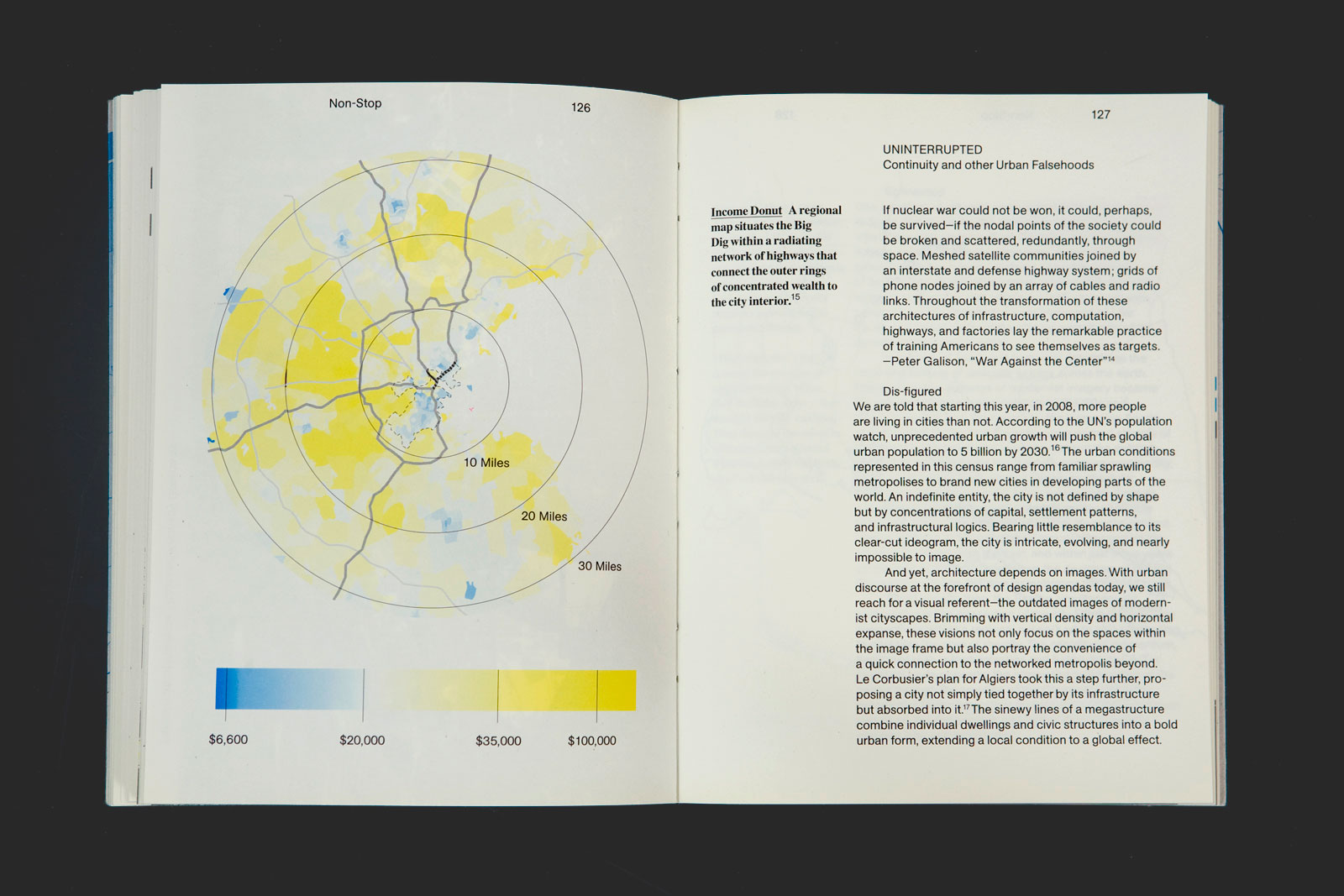
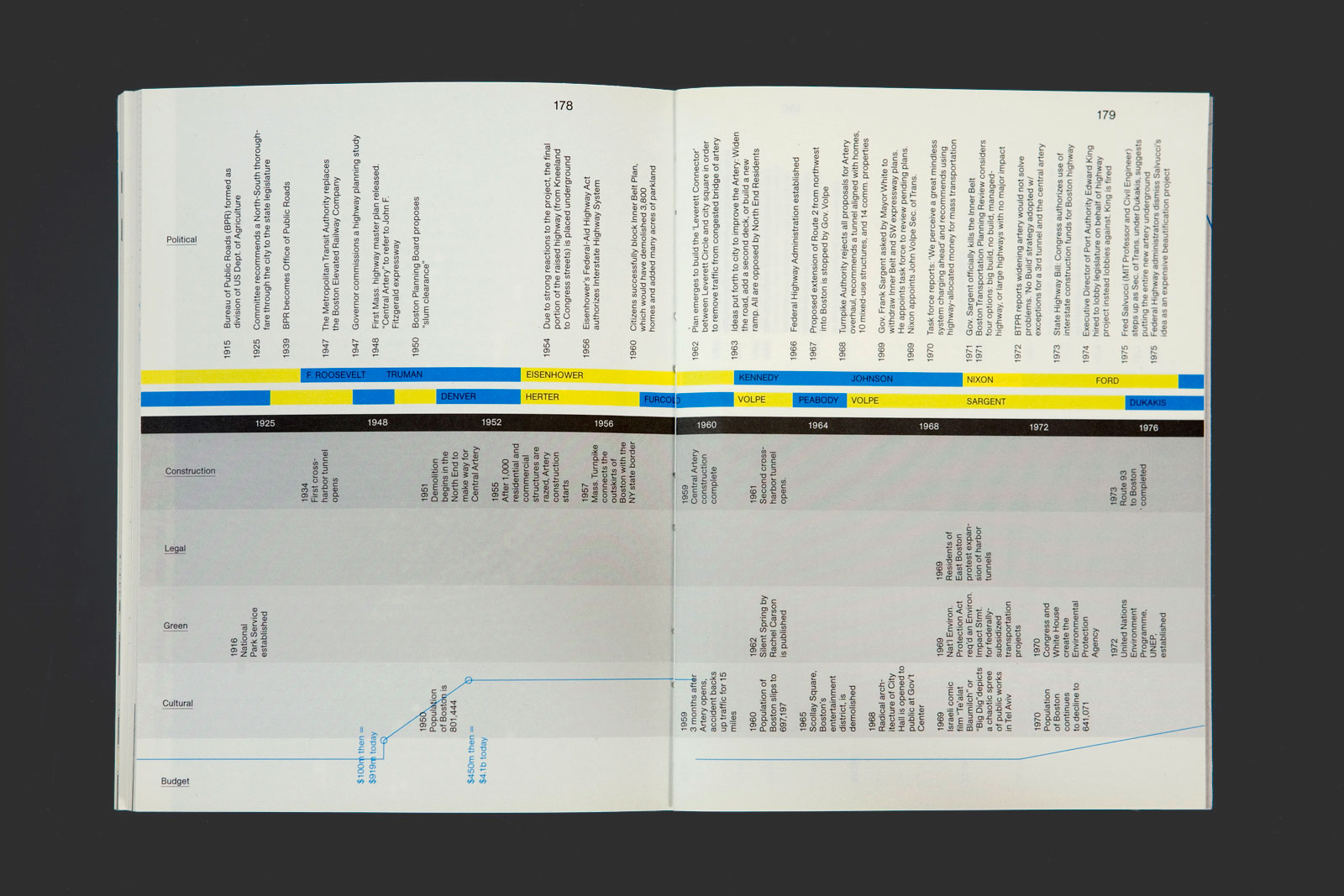
PUBLIC WORKS for MEEJIN YOON and MY STUDIO —— Boston’s Big Dig was the most expensive urban public work in U.S. history. The city’s elevated highway, called the Central Artery, and the two tunnels under Boston Harbor, were some of the most congested, accident-prone motorways in the United States. Public Works presents a series of modest, speculative interventions by the Boston-based MY Studio, a multidisciplinary design firm operating in the space between architecture, art, and landscape. Collectively, their interventions expose and reconfigure the relationship between these expressways and the new parks that emerged in the Big Dig’s wake.
Chapter opening
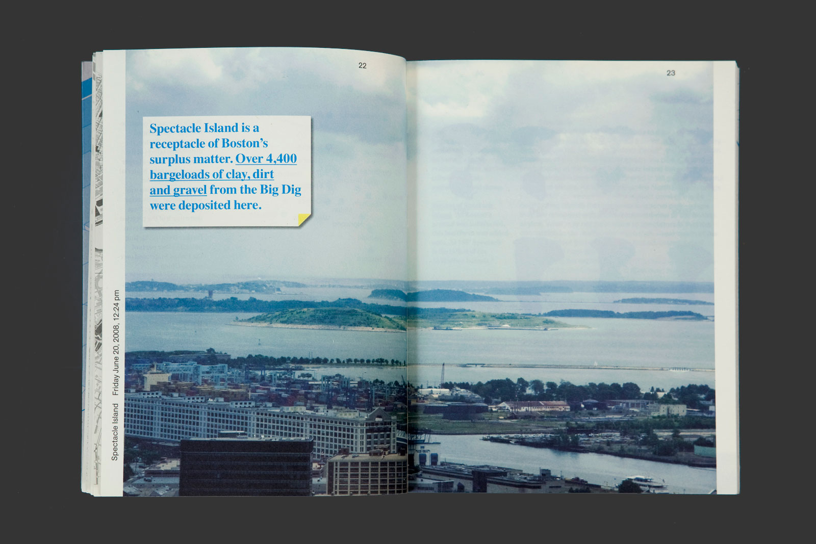
Pull quote with featured image
Diagram
Book design, 2009
Edited by Meejin Yoon and Meredith Miller
6.4×8.4 in (164×214 mm), 192 pages
Offset print, perfect-binding