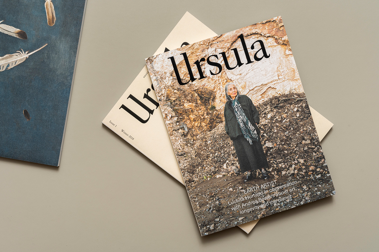
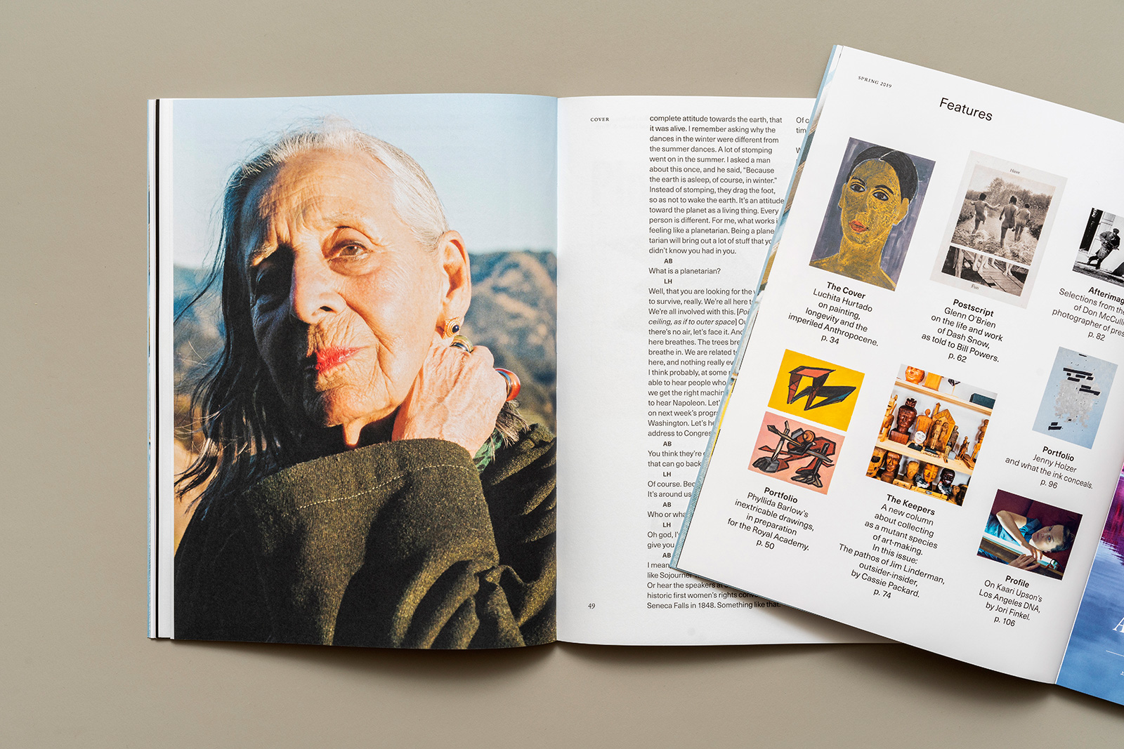
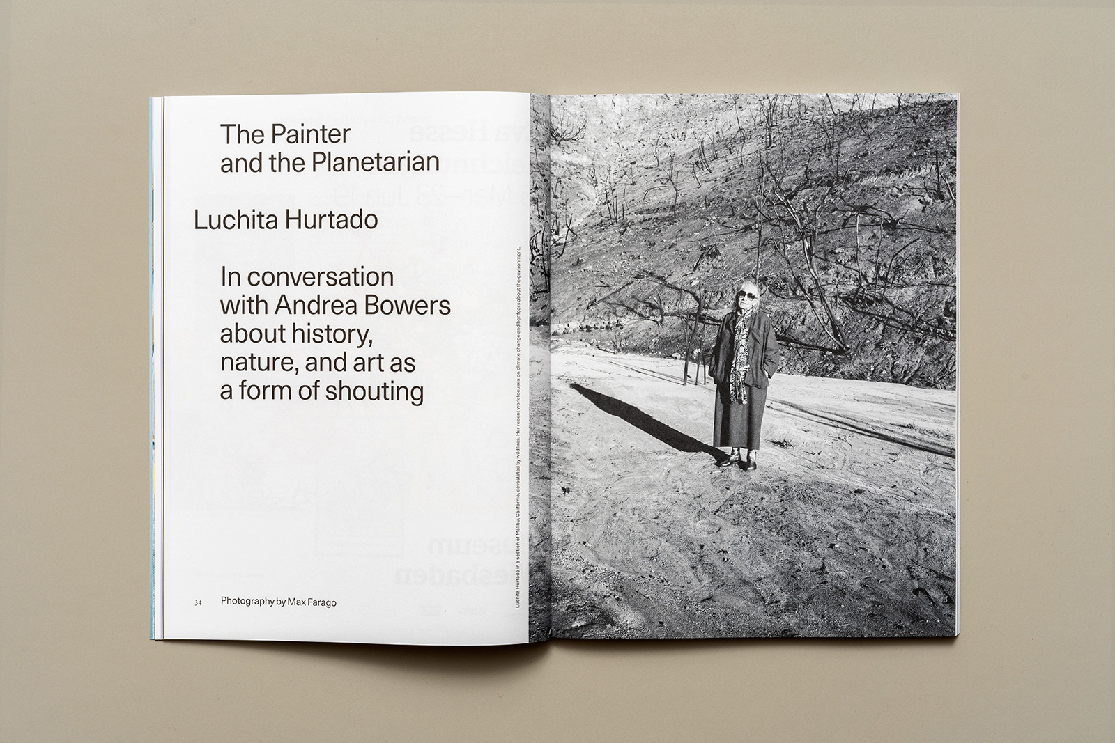
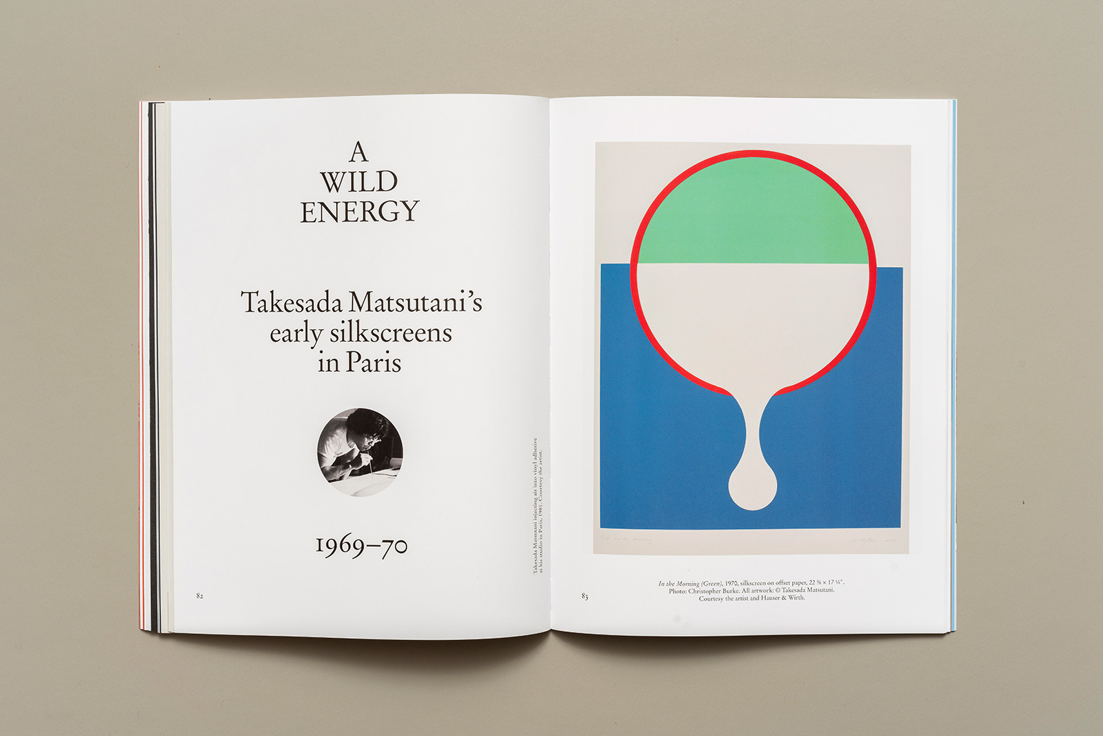
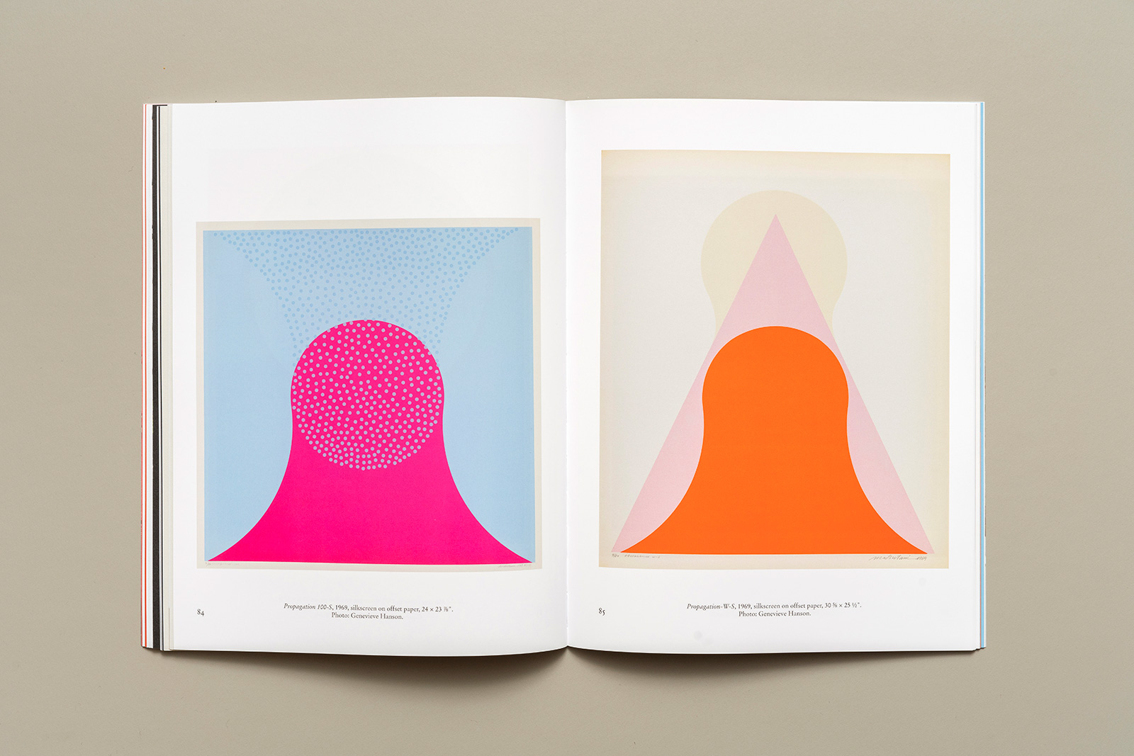
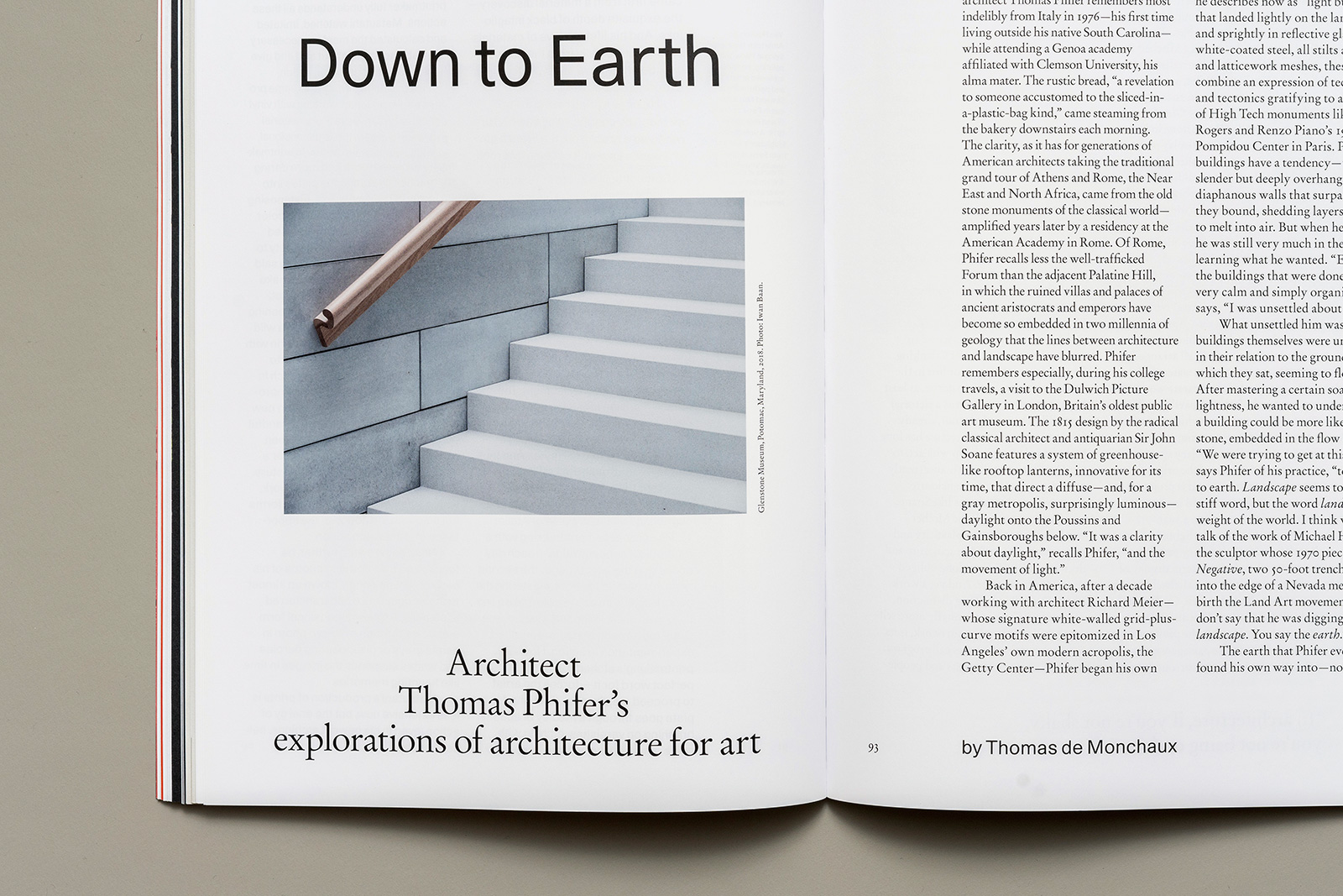
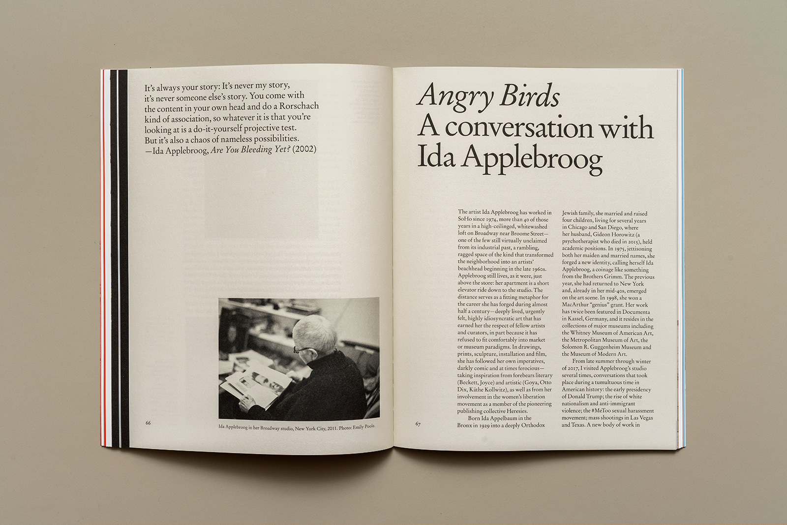
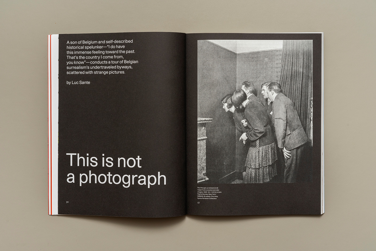
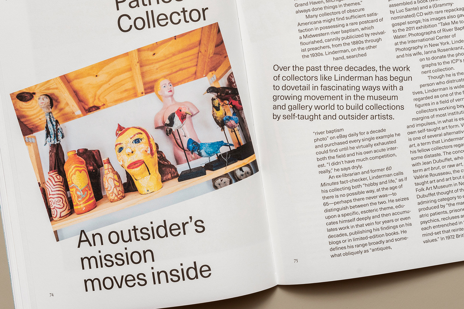
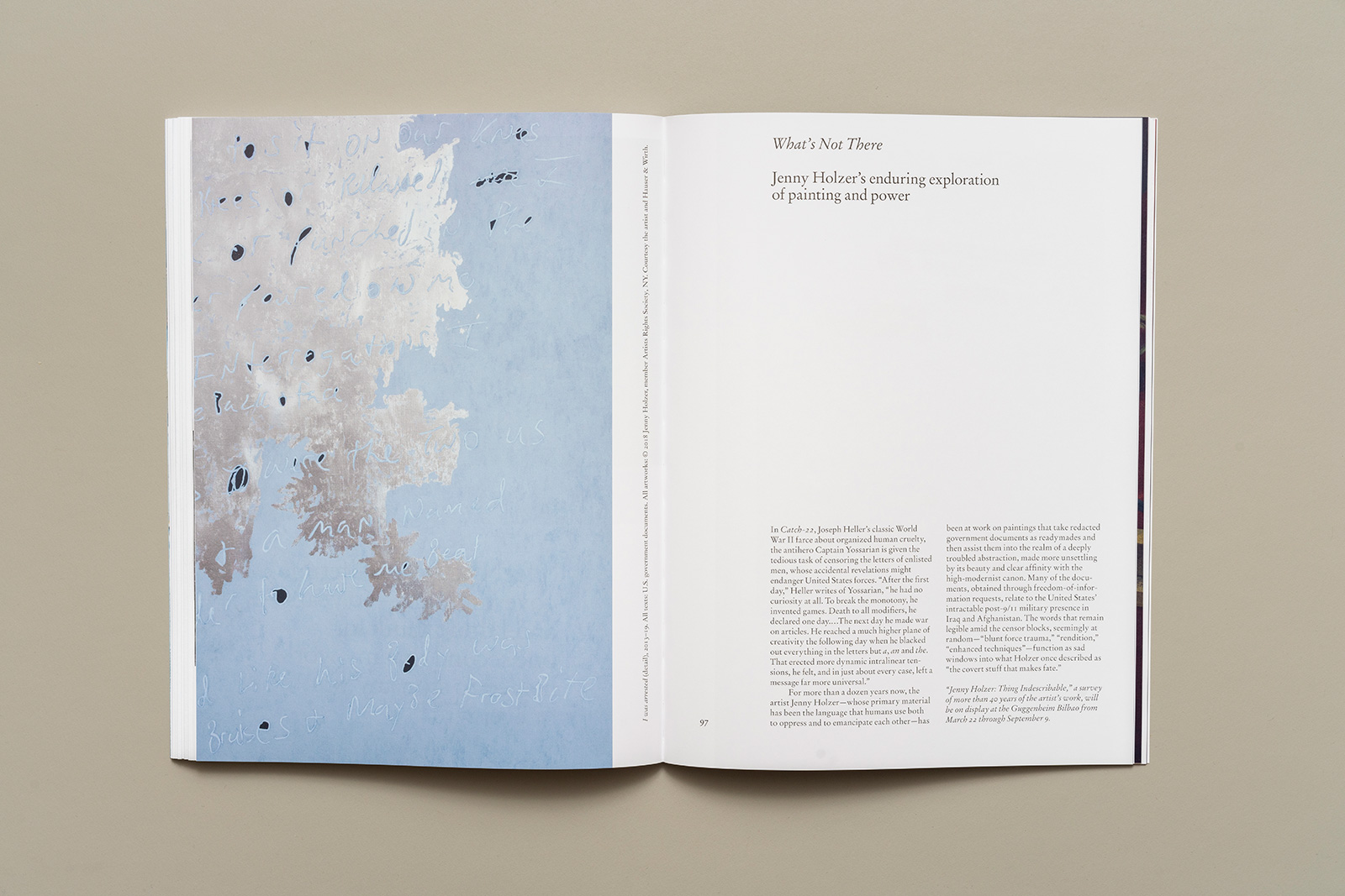
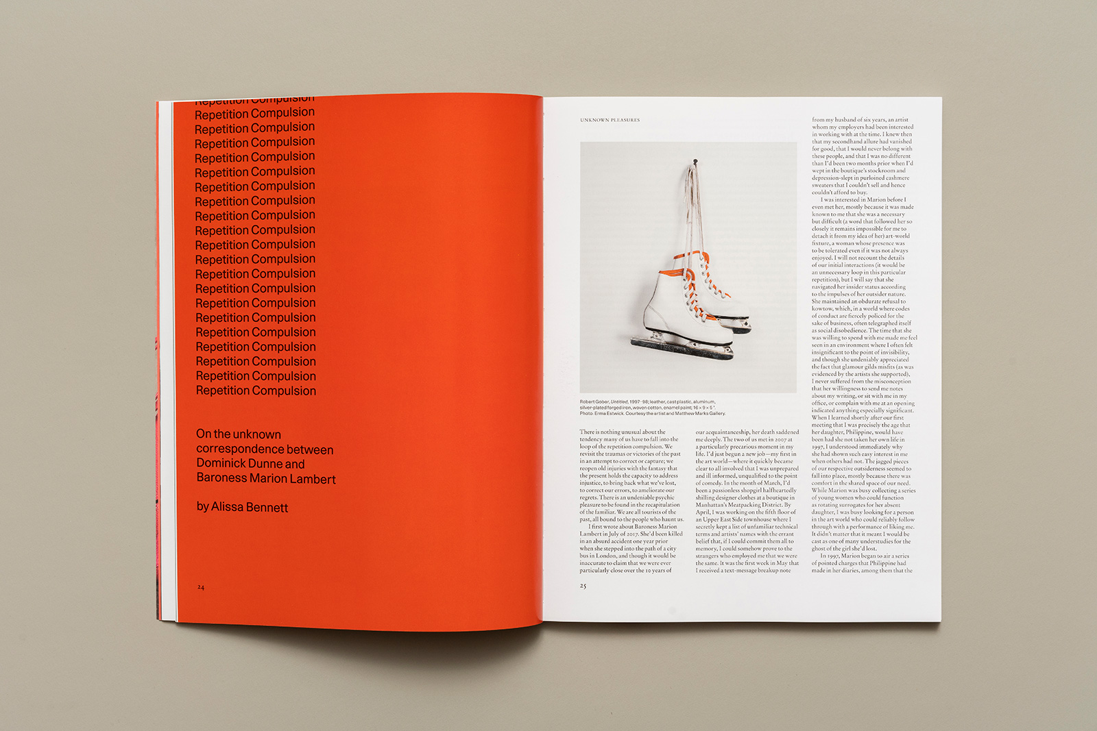
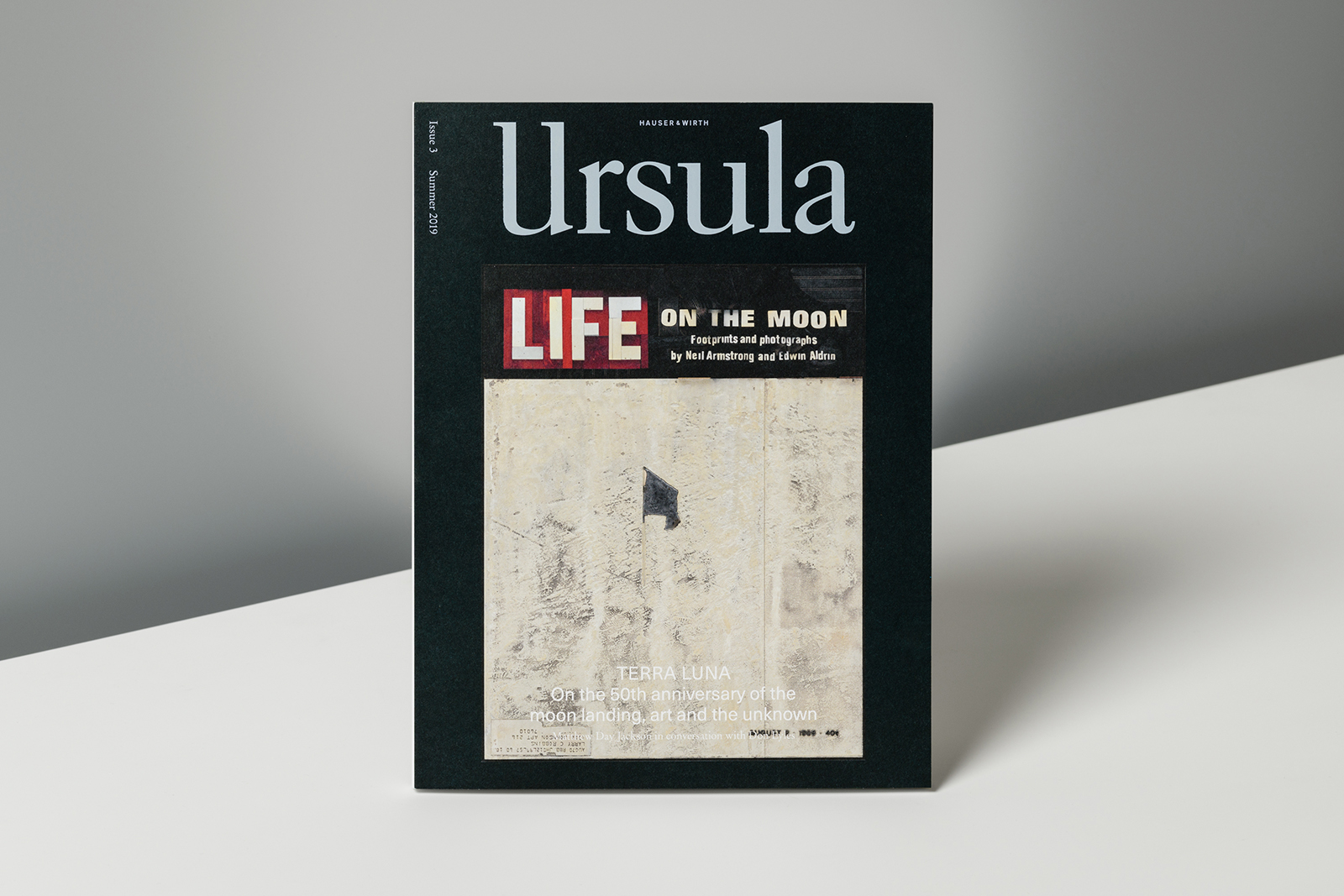
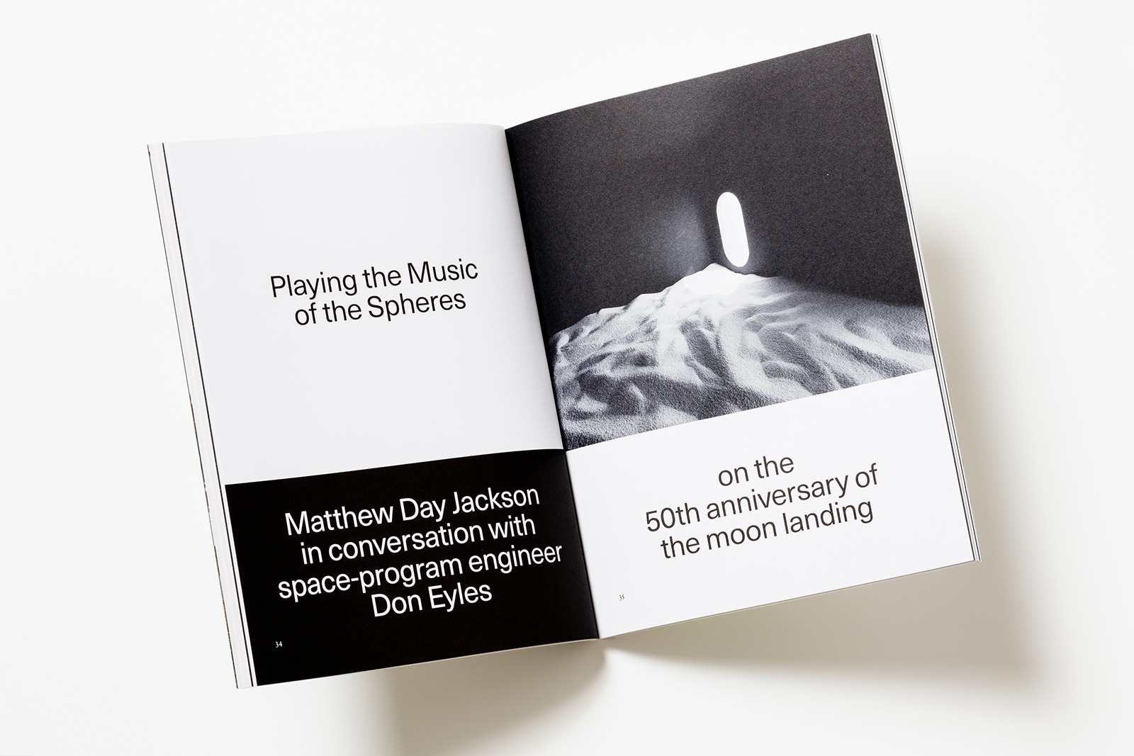
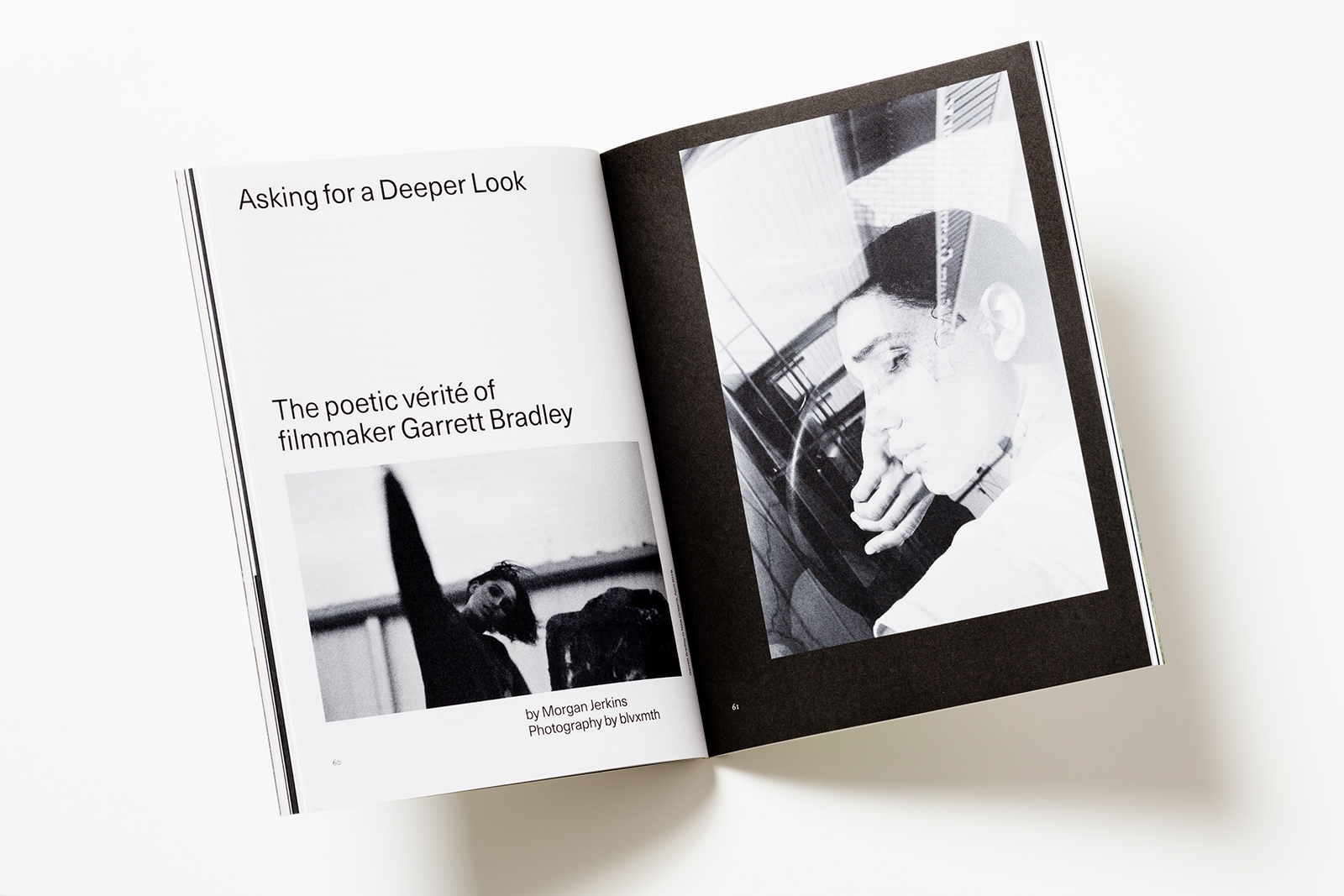
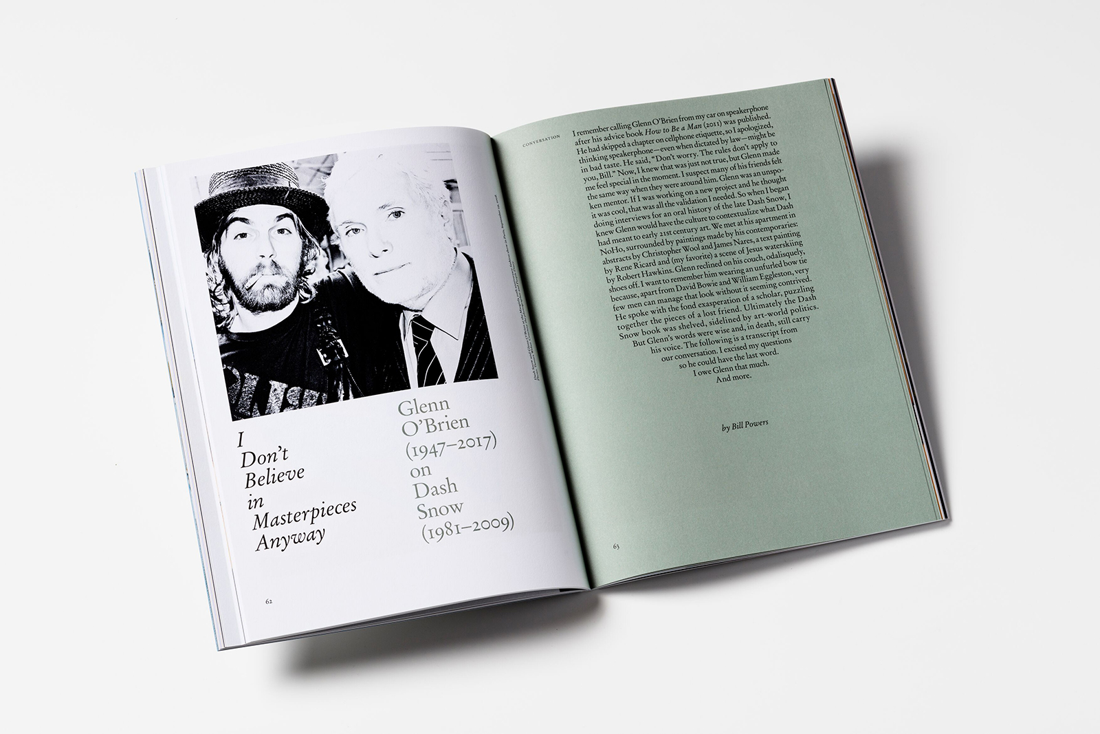
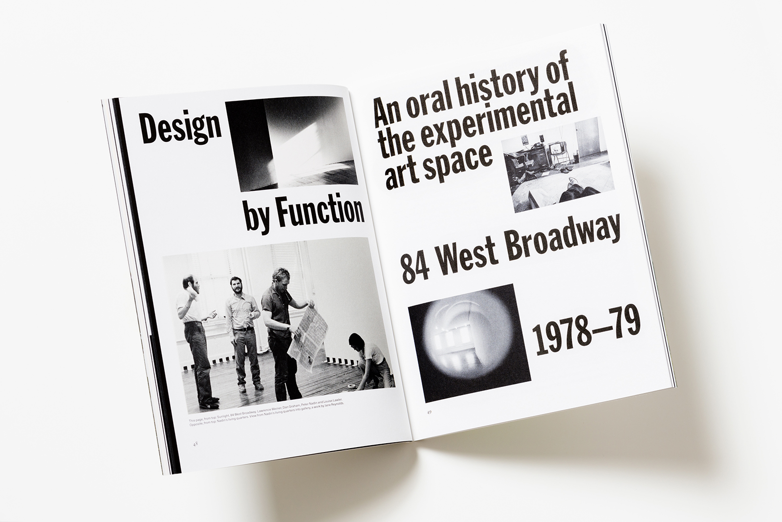
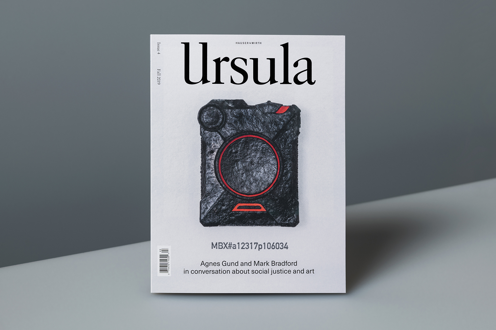
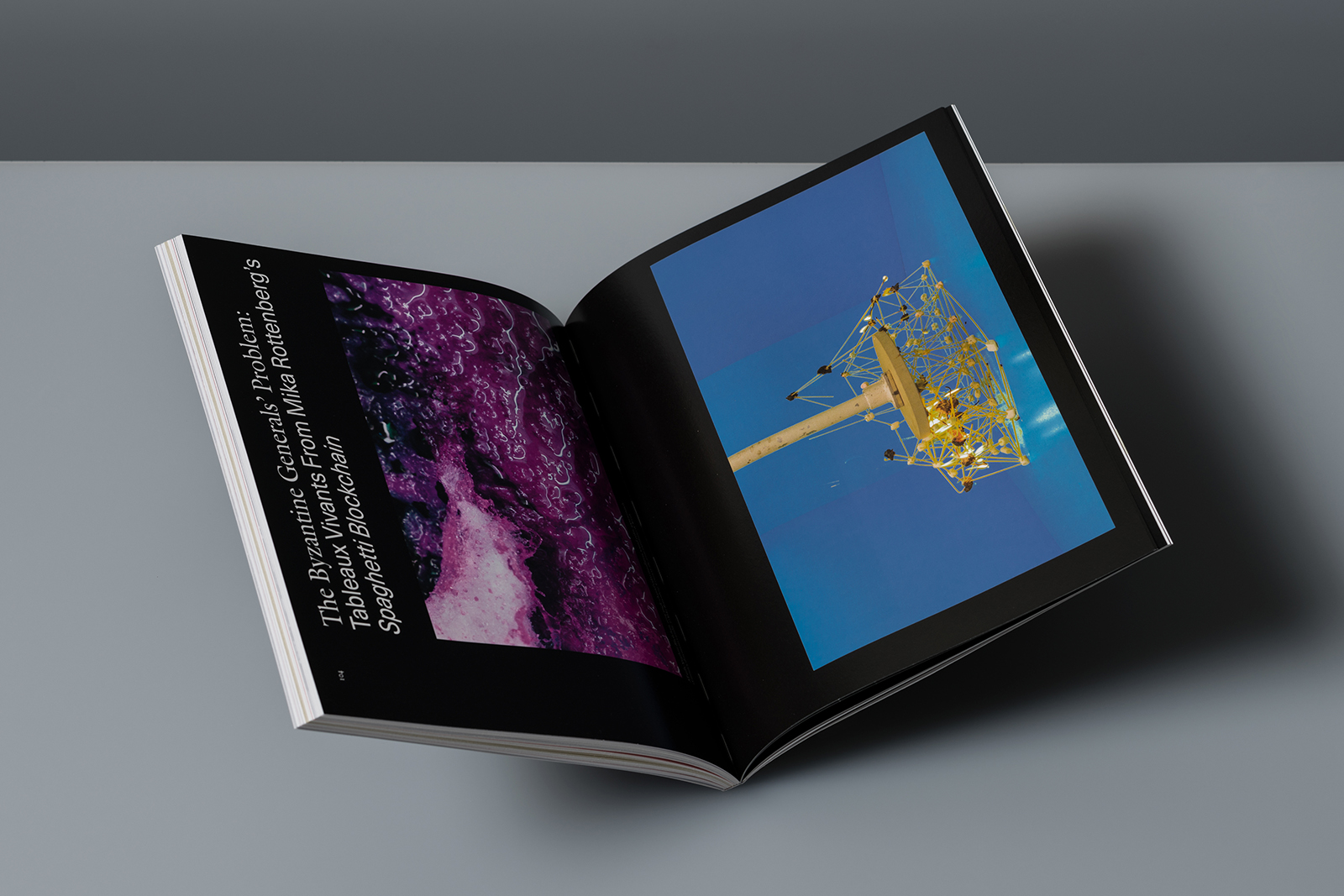
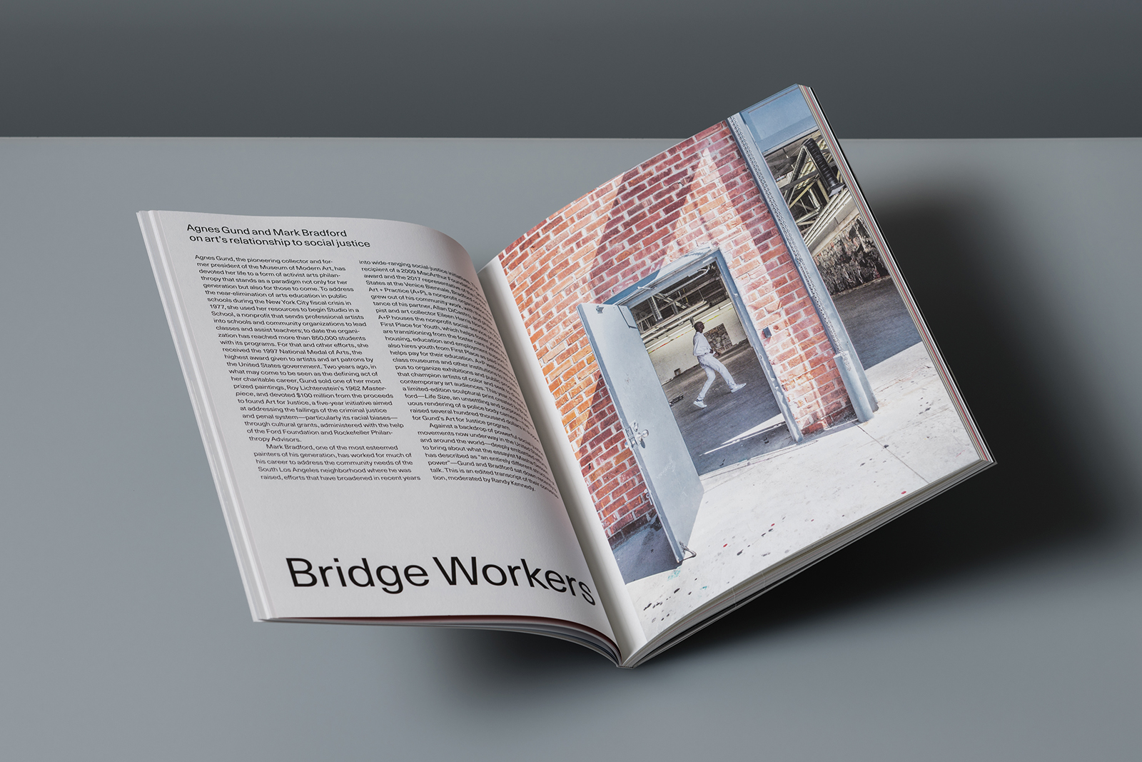
IDENTITY and MAGAZINE DESIGN for URSULA — Hauser & Wirth’s quarterly magazine celebrates the artistic spirit and the power of art to move the world. In addition to artists historically associated with the gallery, it explores likeminded figures in art and adjacent fields including architecture, film, theatre and literature. Featuring in-depth profiles, interviews and original portfolios as well as essays by esteemed writers, the magazine reflects the famously eclectic visual tendencies and diverse artistic perspectives of the gallery.


Randy Kennedy, Editor in Chief
Catherine Davis, Managing Editor
Anna Shinbane, Editorial Assistant
Common Name, Art Direction
Christine Stricker, Production Manager
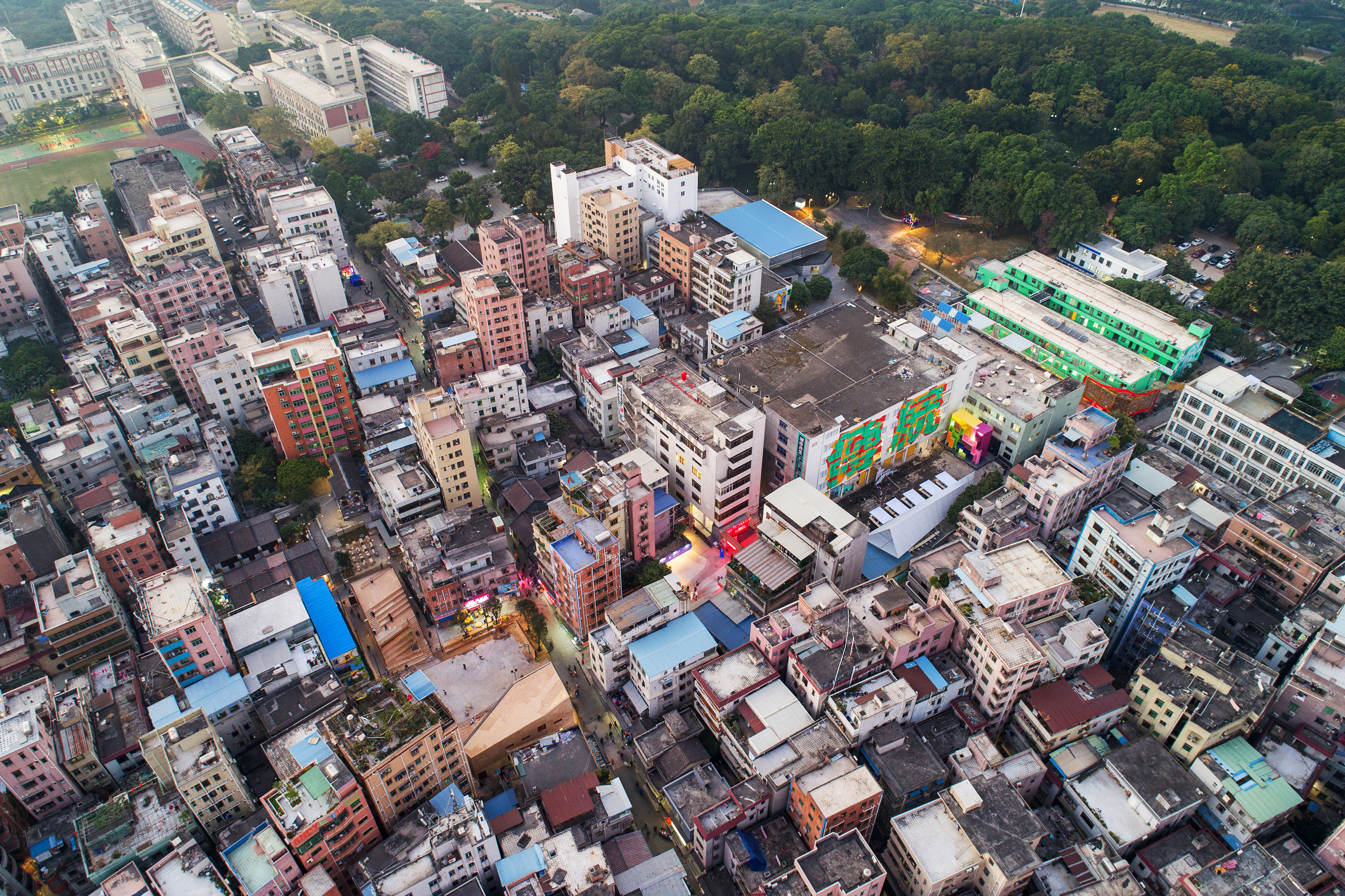
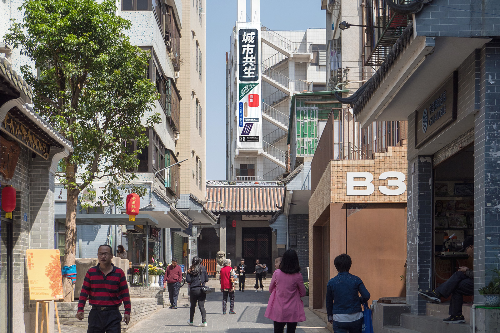
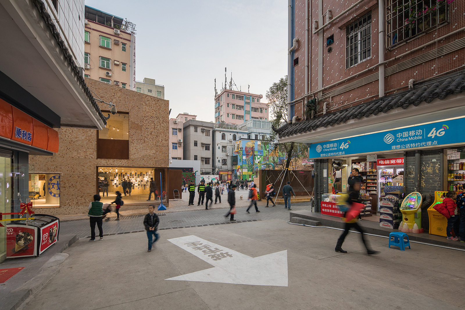
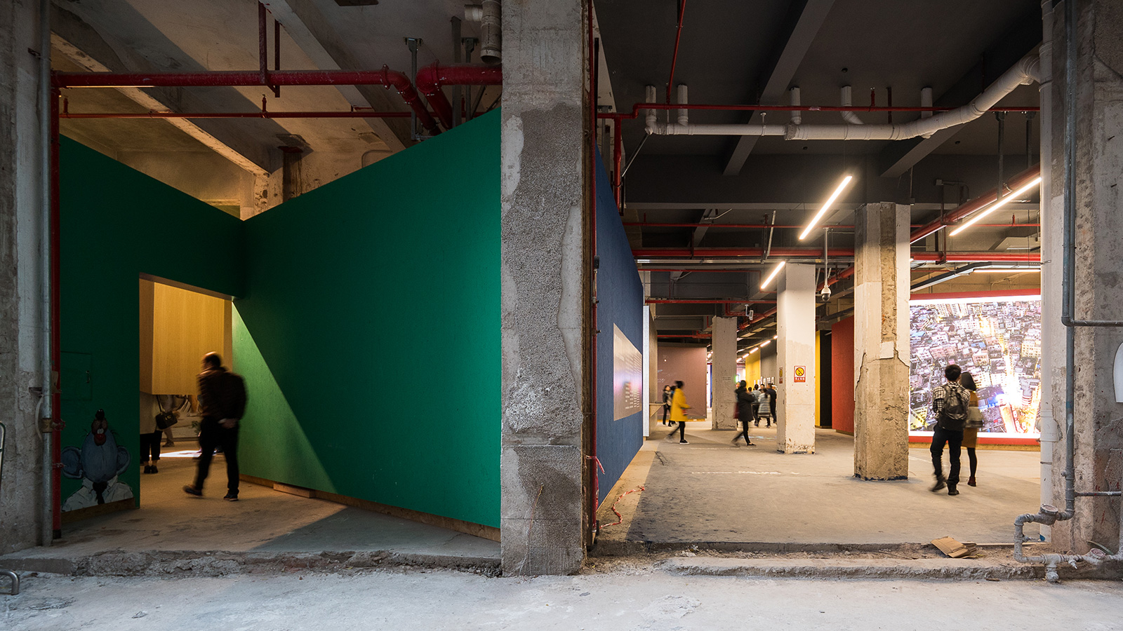
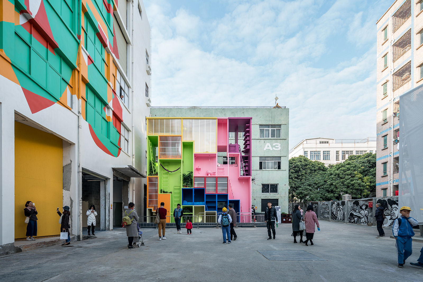
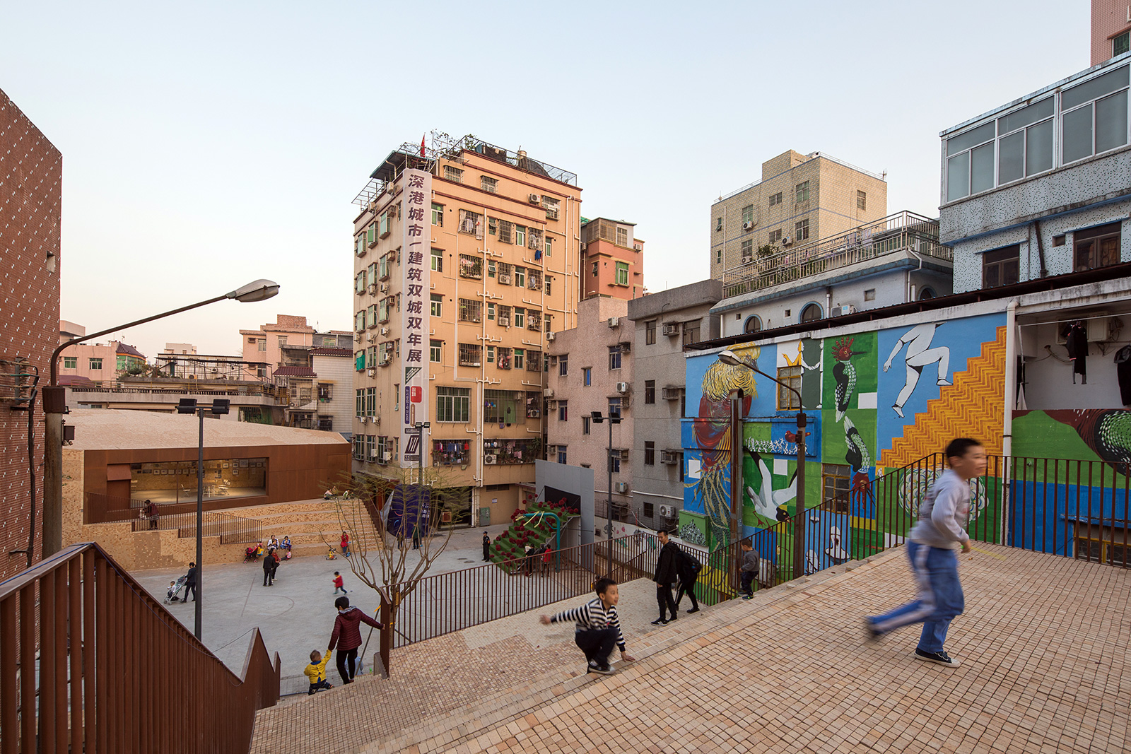
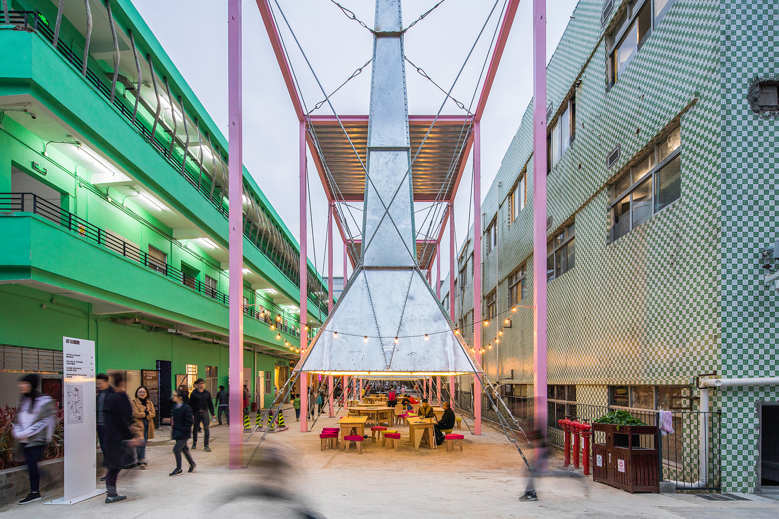
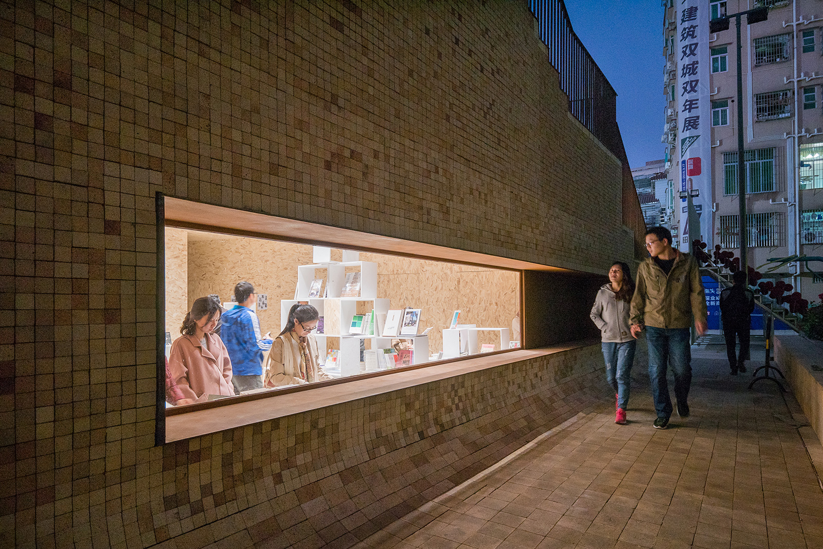
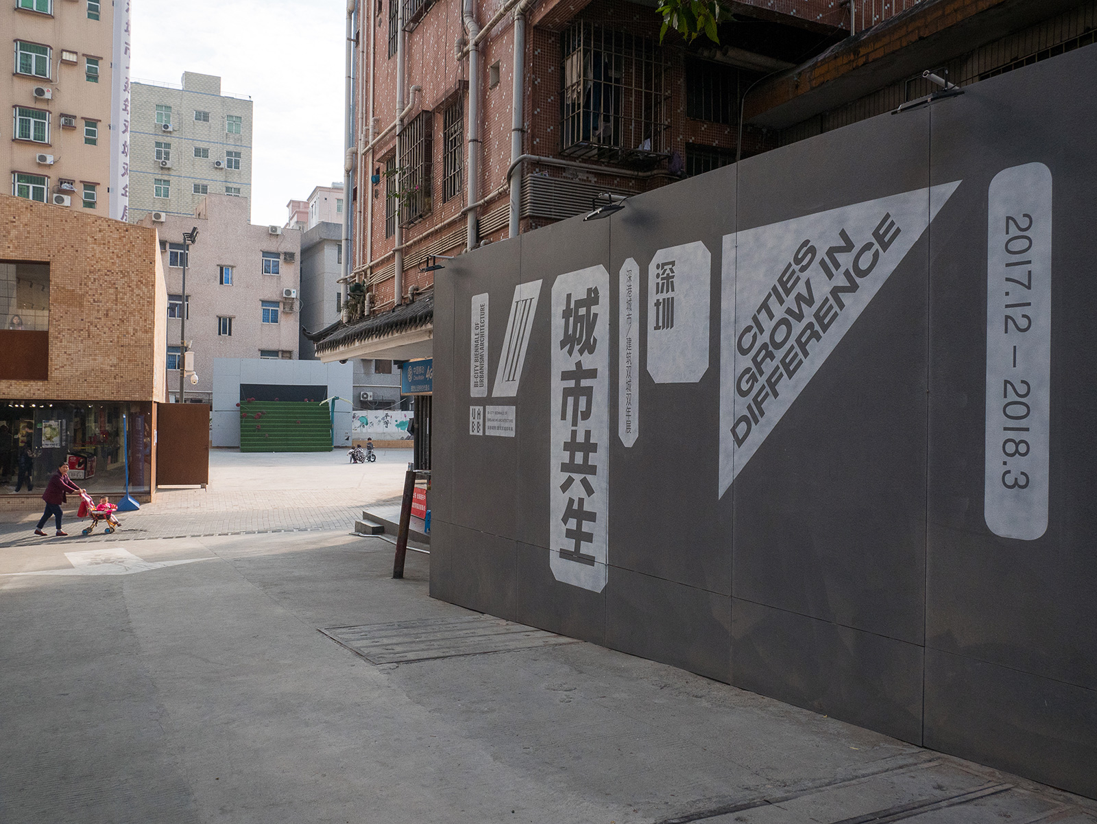
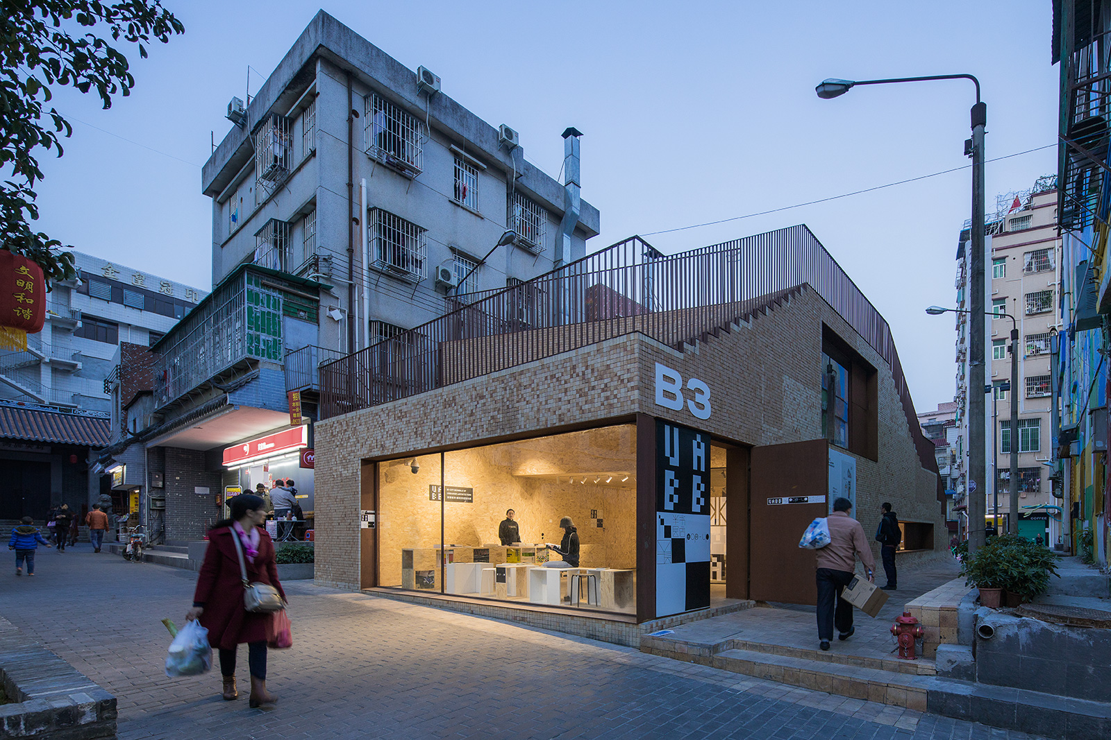
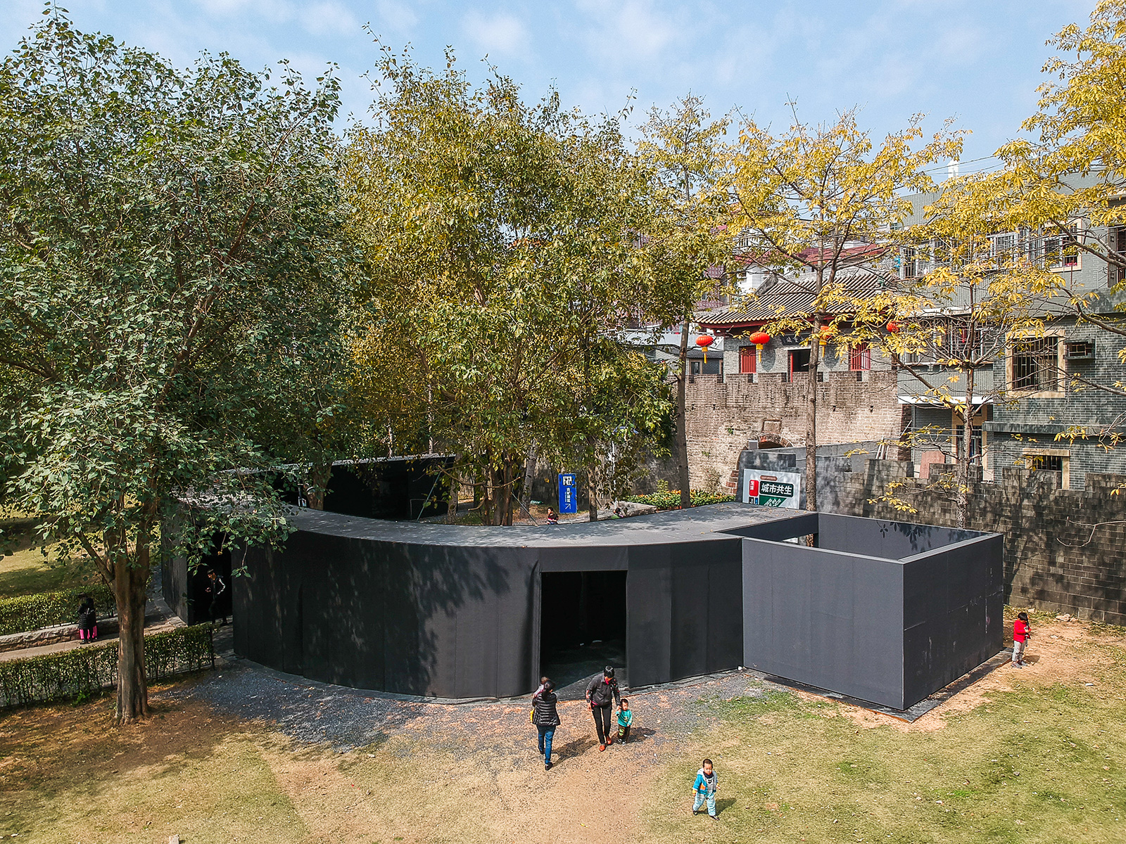
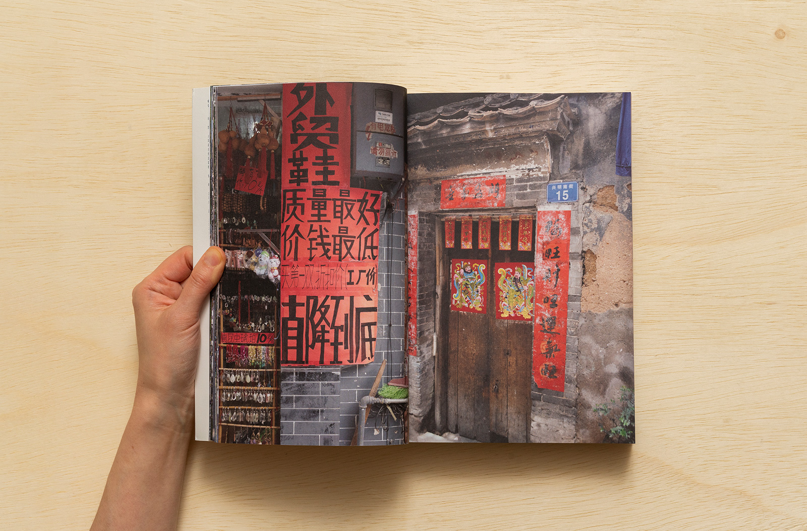
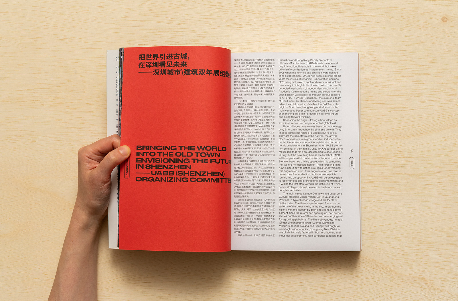
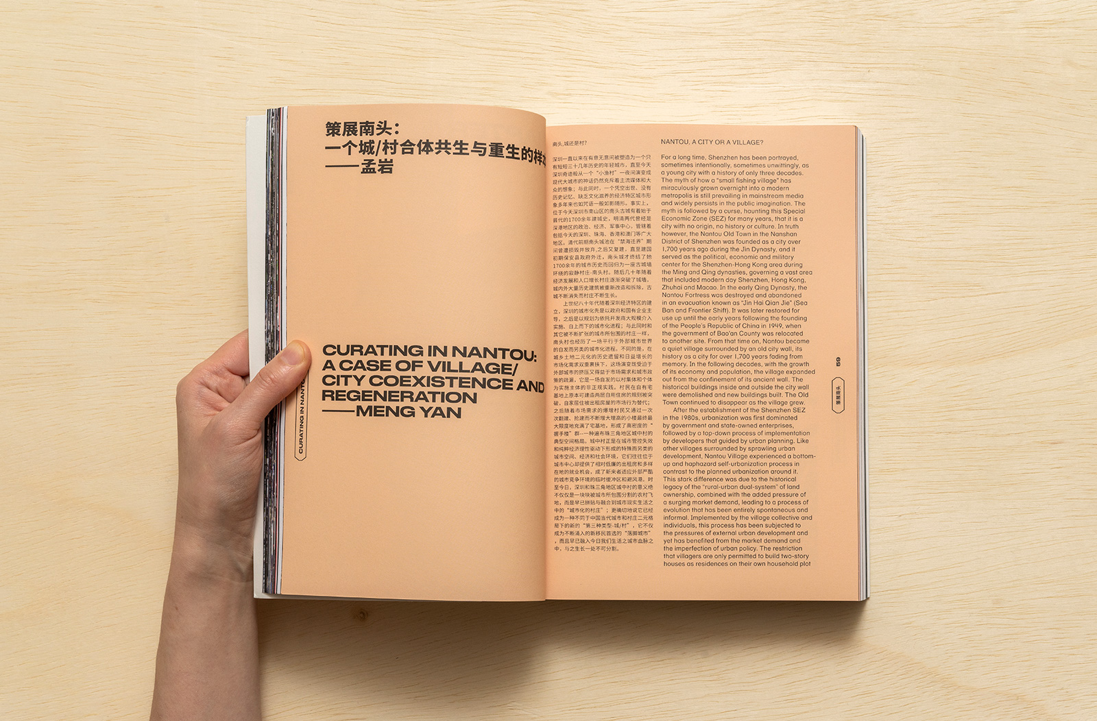
CITIES GROW IN DIFFERENCE for URBANUS & UABB — The 2017 edition of the Shenzhen Bi-City Biennale of Urbanism & Architecture was situated in the historic neighborhood of Nantou Old Town. This area, a tight network of streets and alleyways, is one of the city’s urban villages — a byproduct of intense urbanization in China, where diverse, mostly lower-income residents live in densely packed, low-rise concrete structures. The architects and curators of the exhibition located it here to call attention to the dismantling of these neighborhoods as the city continues to develop and gentrify. Our approach for the identity and exhibition graphics highlighted this lack of certainty and consistency by rearranging itself in every application, a strategy which also helped accommodate a wide range of spaces, substrates and physical installation types.




For Urbanus:
Yan Meng & Xiaodu Liu, Curators
Ye Zhu, Co-Curator
Yujun Yin, Assistant Curator
Common Name, Graphic Design
Sure Design, Production Design
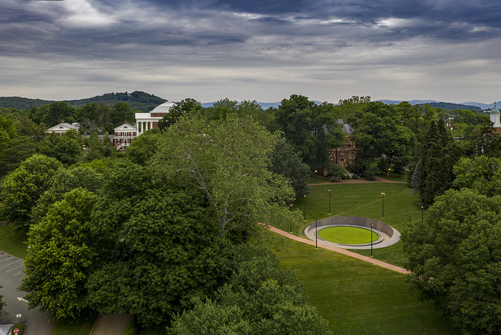
MEMORIAL FOR ENSLAVED LABORERS for UNIVERSITY OF VIRGINIA — The Memorial to Enslaved Laborers at the University of Virginia honors the lives, labor and perseverance of the approximately 4,000 enslaved men, women and children who built and sustained the daily life of faculty and students at the University. The memorial, the result of a collaborative design process led by architects Höweler & Yoon and involving UVA students, the Charlottesville community and the descendants of the enslaved, is sited in the valley on the east side of the lawn, directly east of Jefferson’s famous rotunda. The interior wall of the memorial records the names of enslaved laborers who worked at UVA as well as ‘memory marks’ to signify those whose names were lost to historical record, while the center ring records an alternate timeline of events related to the construction of the University.
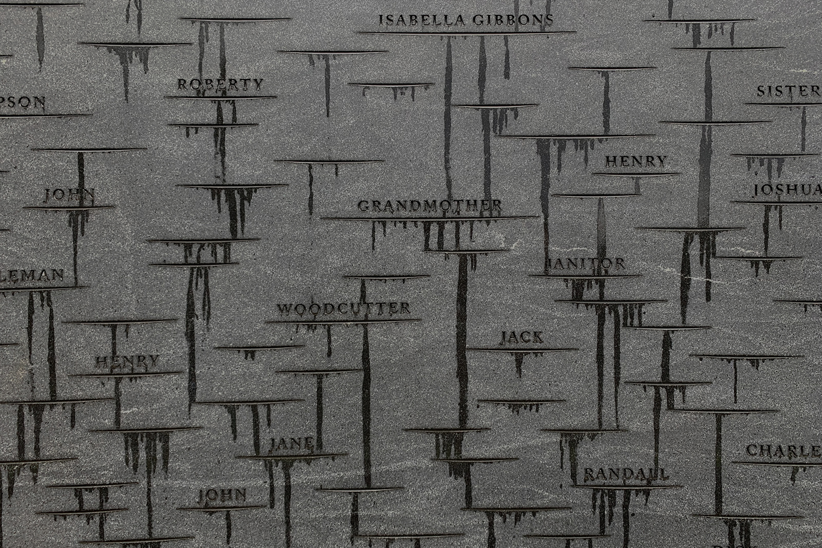
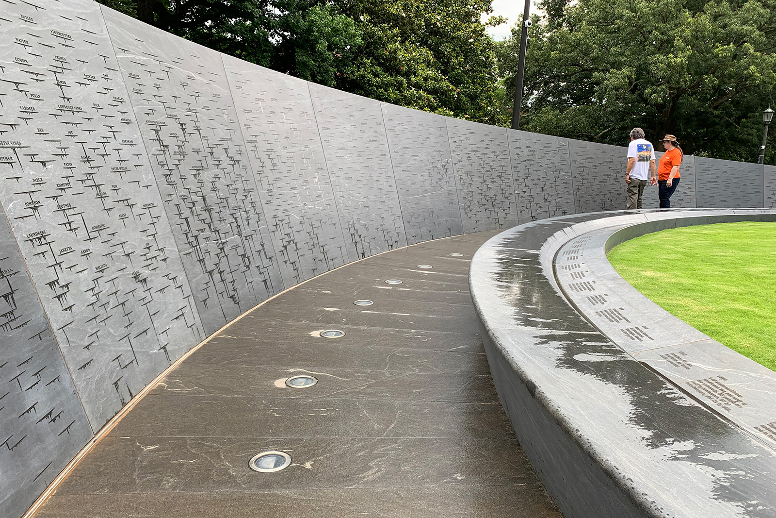
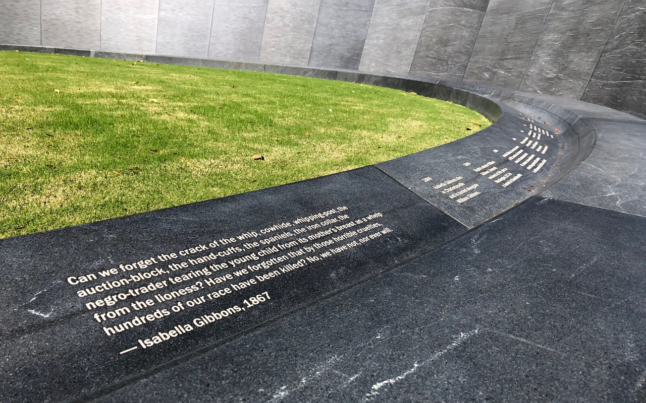
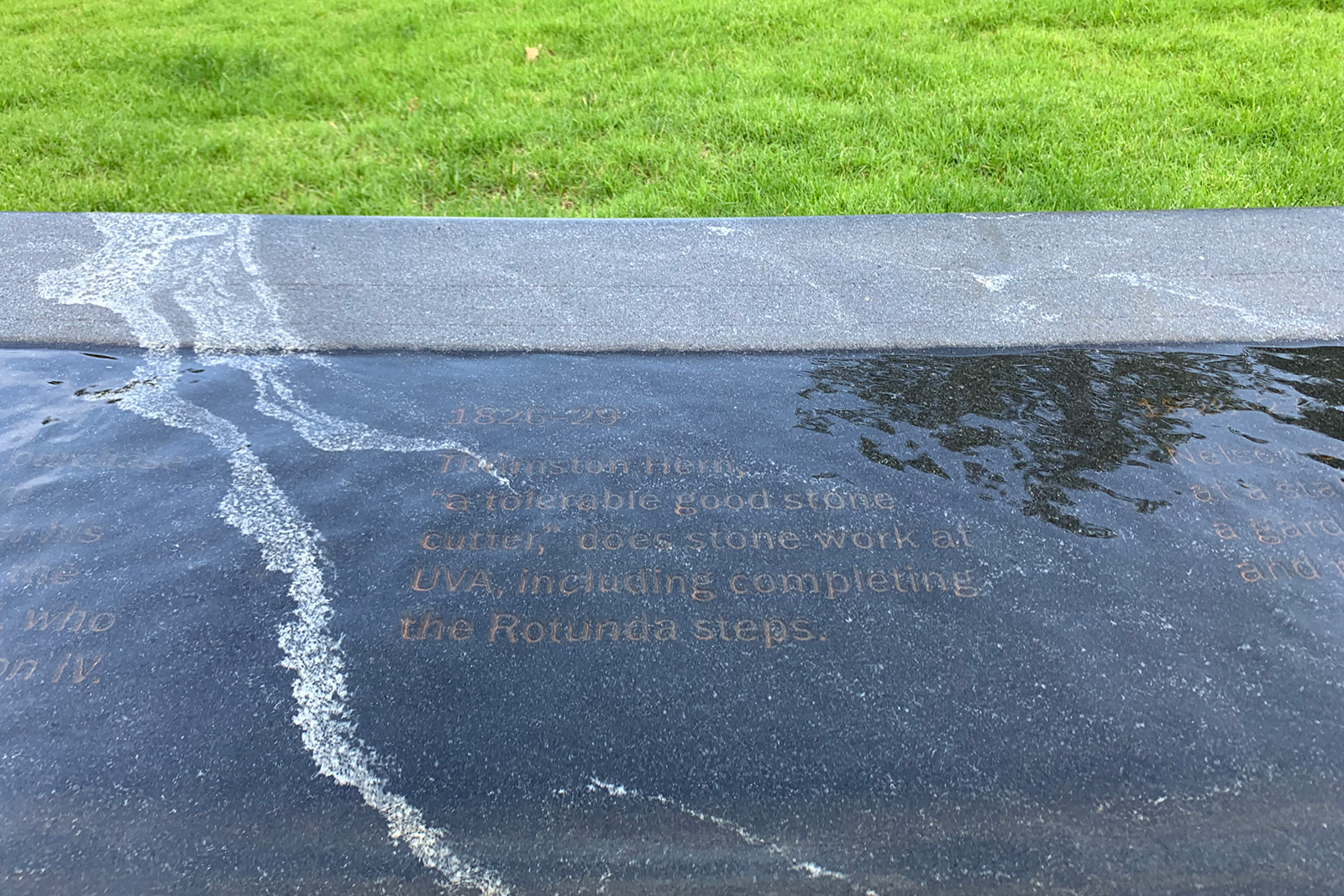
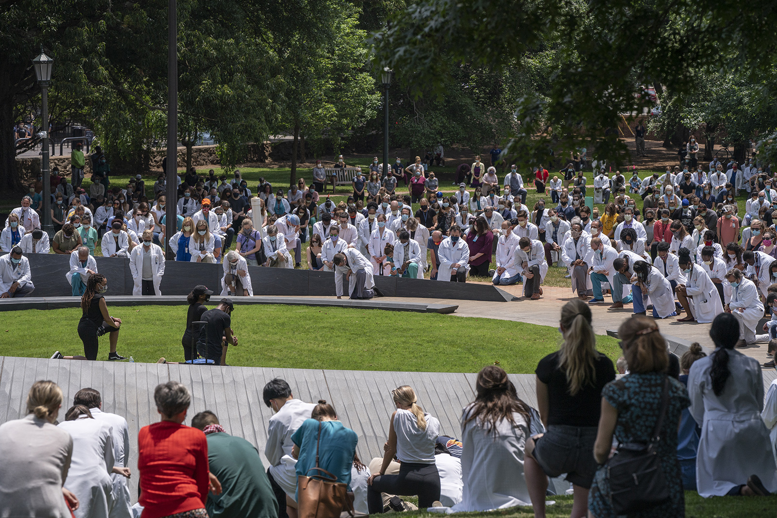
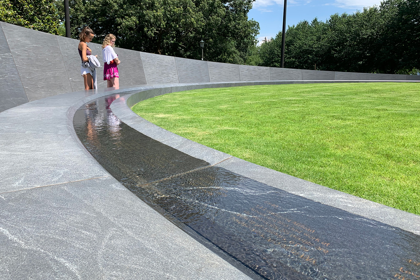
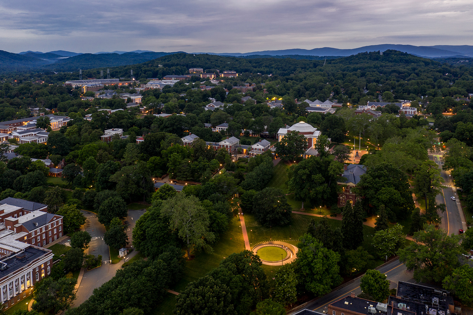
Photos by Sanjay Suchak, UVA Communications
Höweler & Yoon Architecture
Gregg Bleam Landscape Architect
Design by Höweler & Yoon Architecture, with
Dr. Mabel O. Wilson, Cultural Historian and Designer
Dr. Frank Dukes, Community Engagement Facilitator
Gregg Bleam Landscape Architect
Eto Otitigbe, Artist
Common Name, Typography
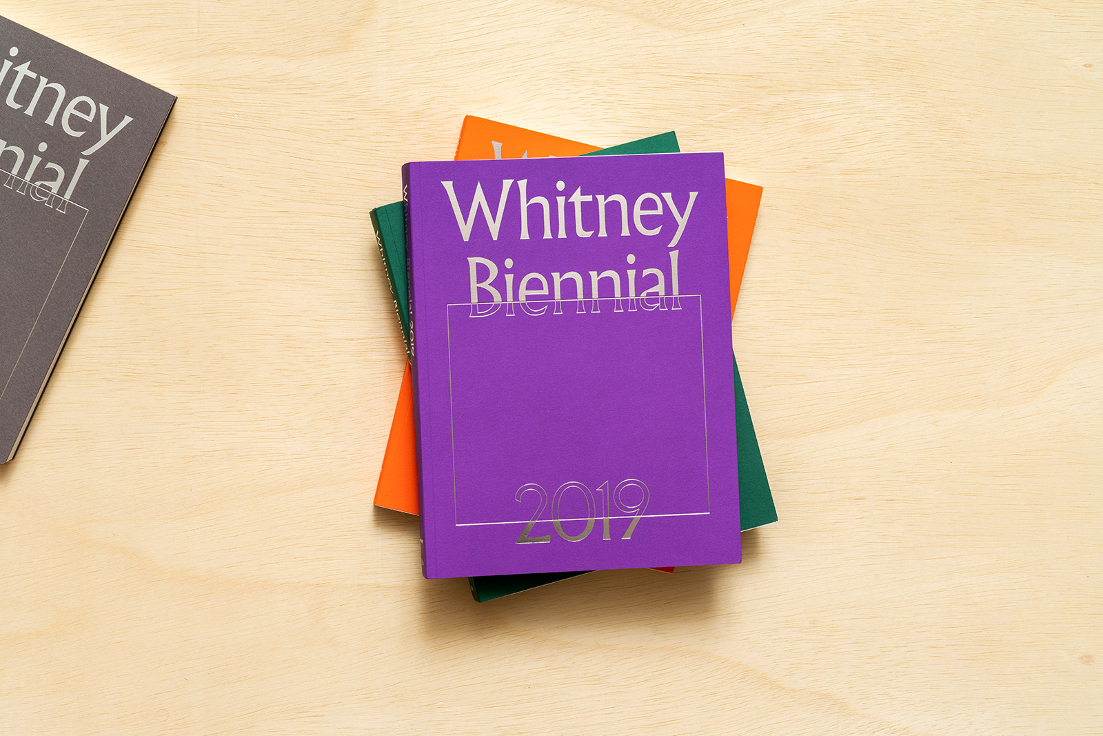
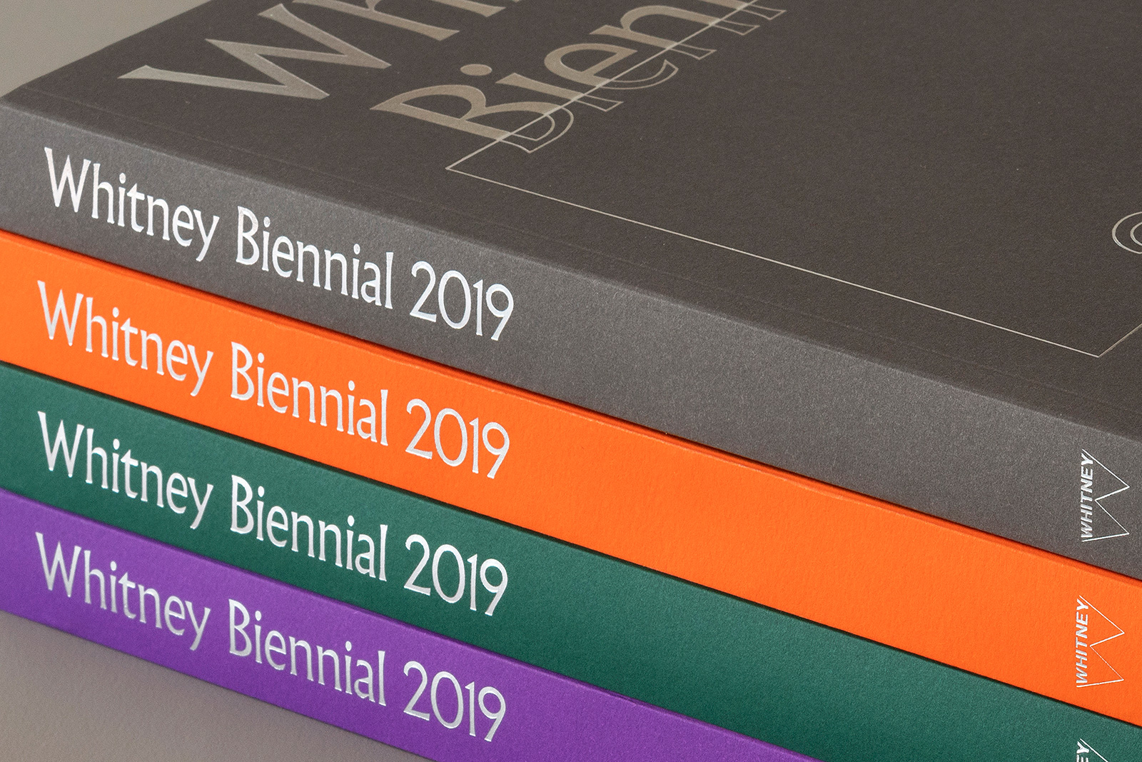
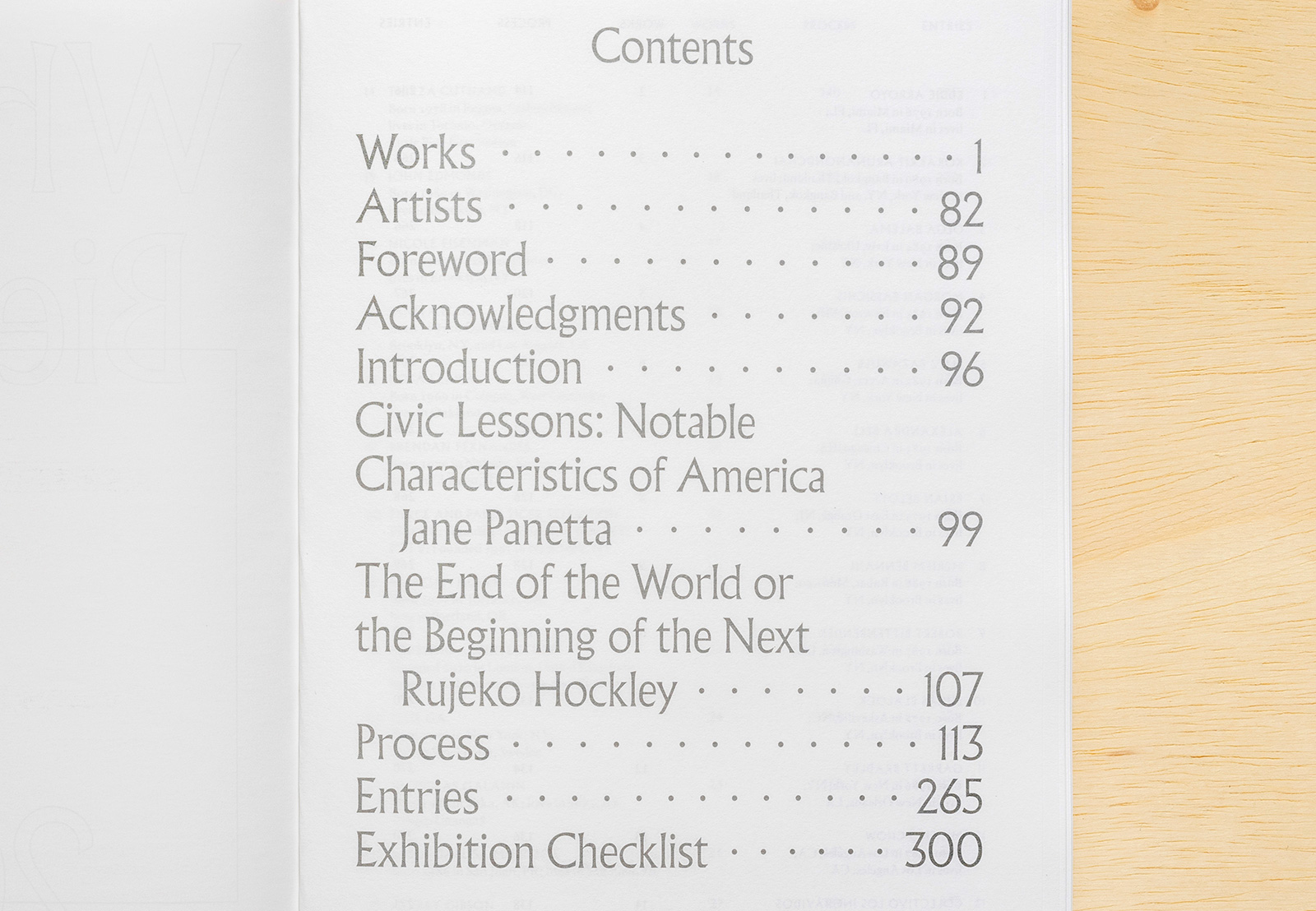
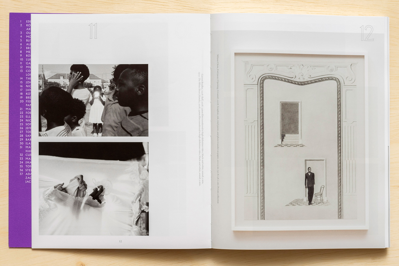
WHITNEY BIENNIAL 2019 for the WHITNEY MUSEUM OF AMERICAN ART — Since its introduction in 1932, the Whitney Biennial has consistently charted new developments in contemporary art. The 2019 Biennial was helmed by curators Rujeko Hockley and Jane Panetta, known for their record of working with up-and-coming artists and producing historically minded exhibitions. The catalog features process images and source material from each of the participants, in addition to a commissioned text on each and essays by the curators on the themes of the exhibition. Arriving in the midst of dramatic shifts in our cultural, social and political landscapes, the book serves as an important resource on present-day trends and emerging perspectives in American contemporary art.
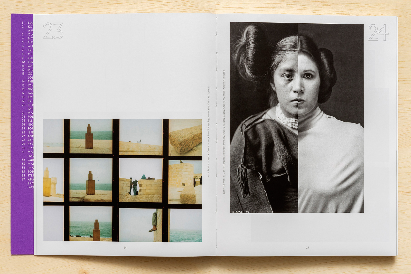
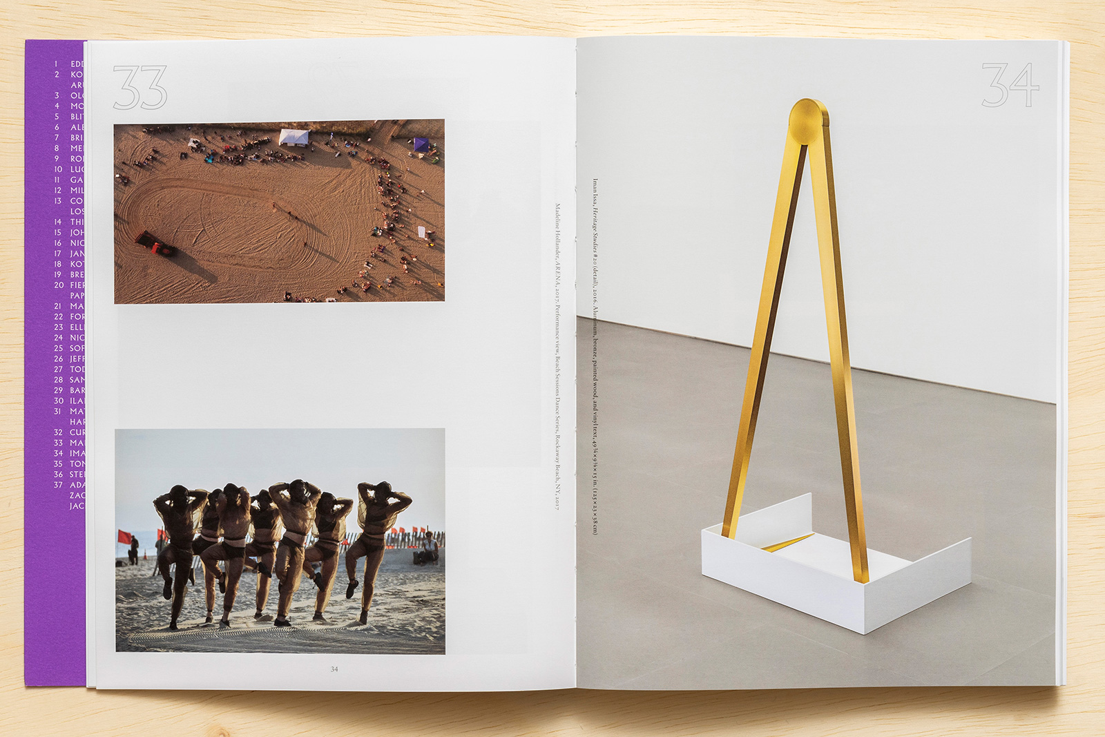

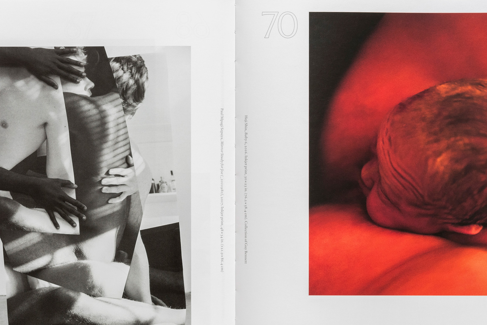
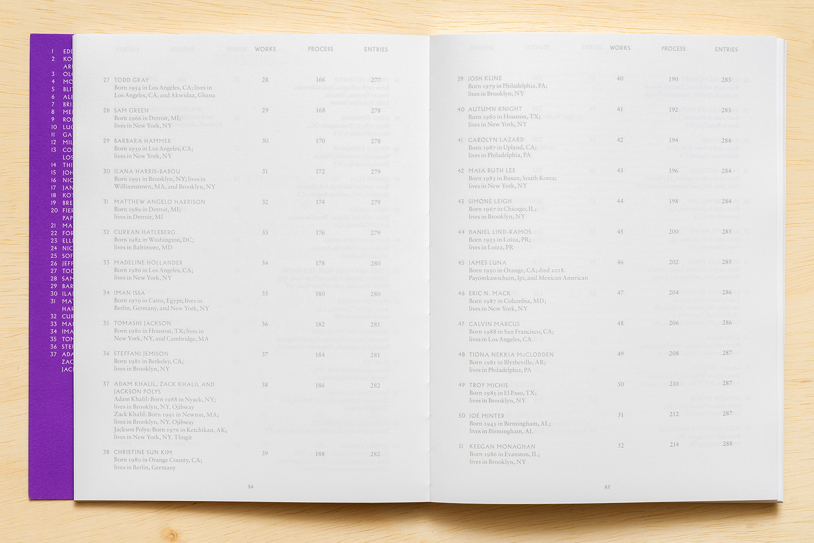
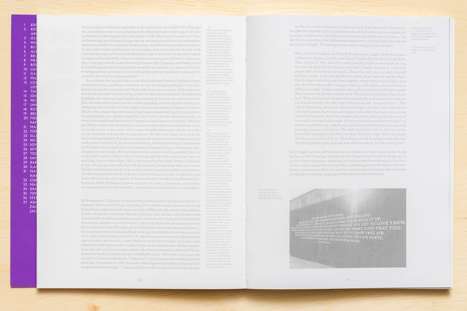
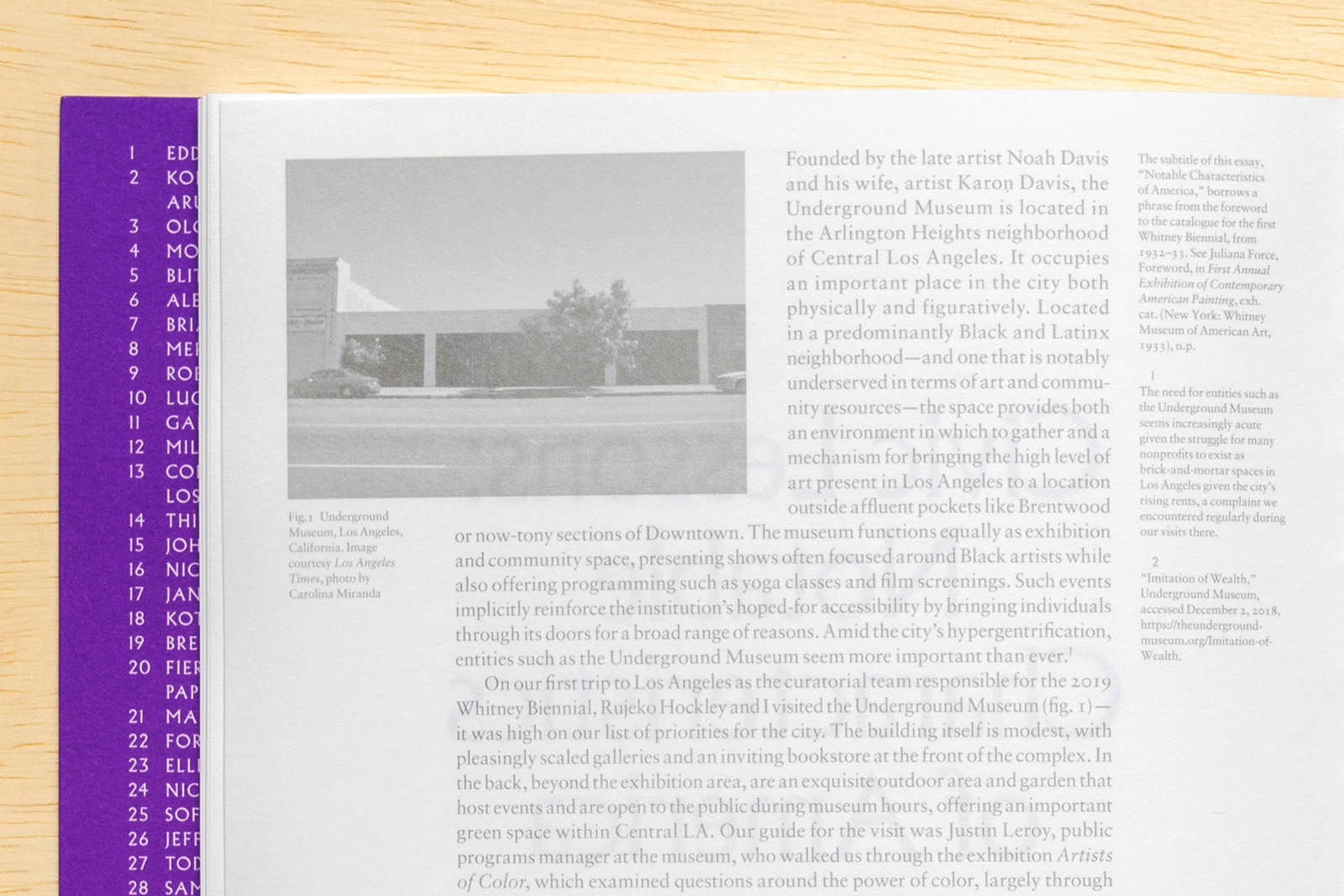
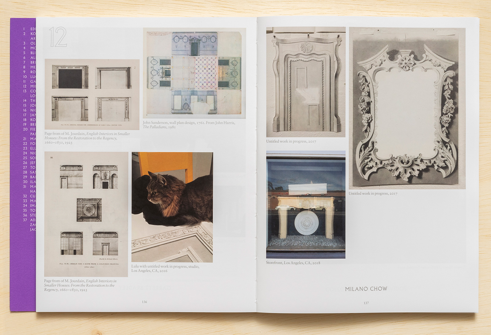
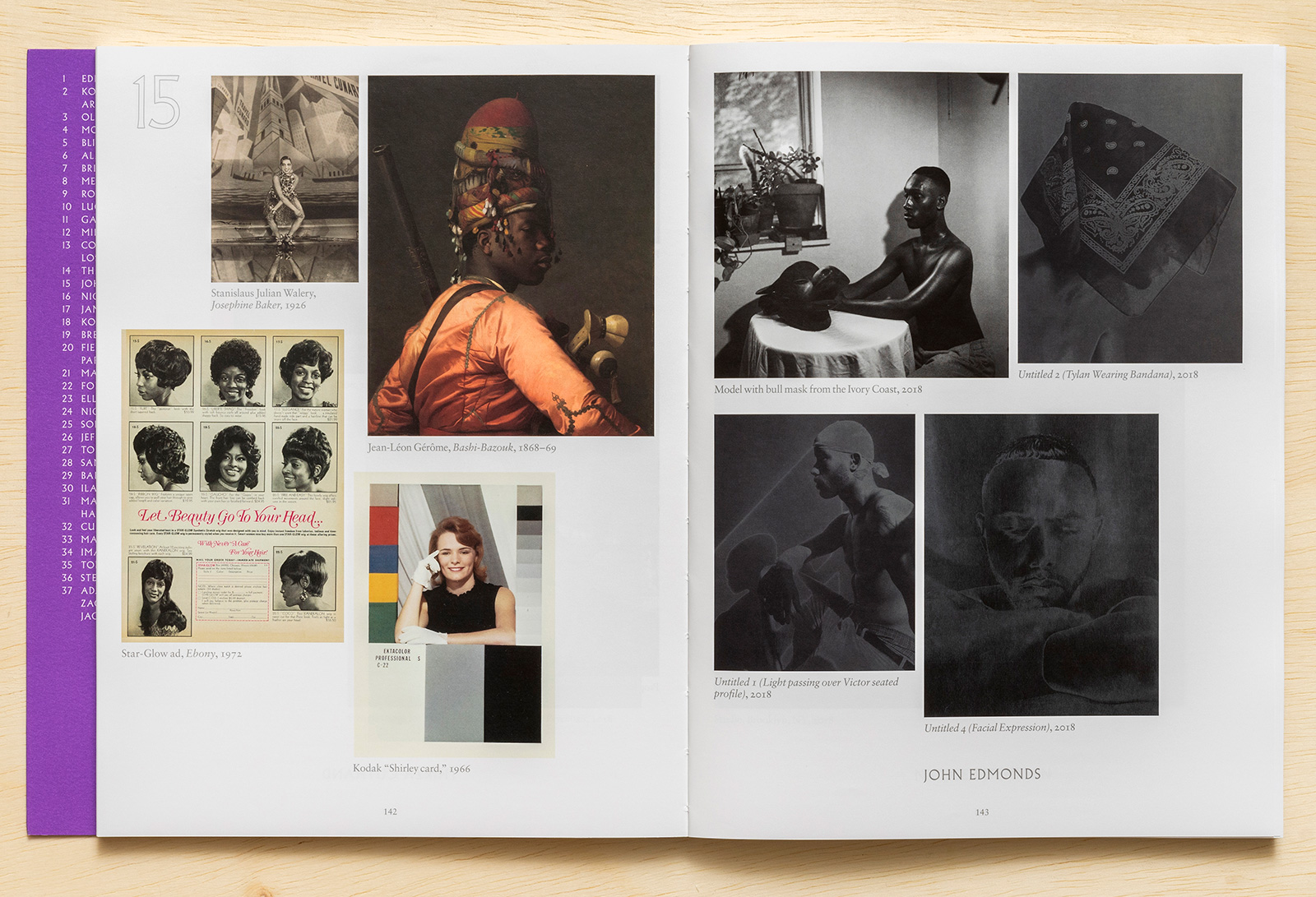
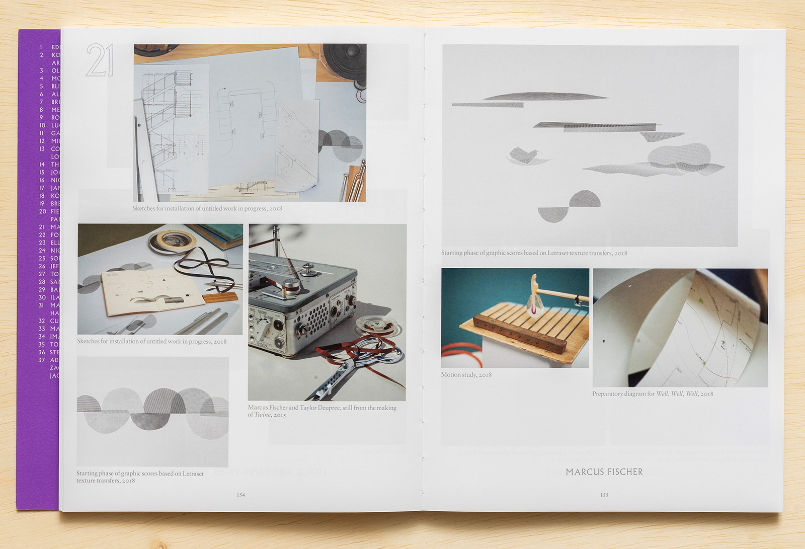
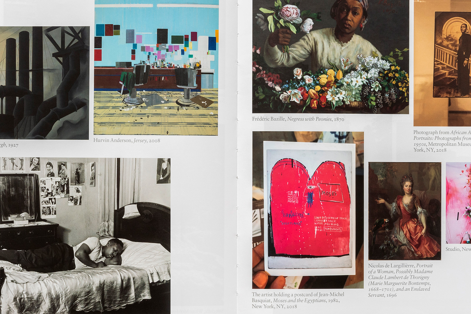
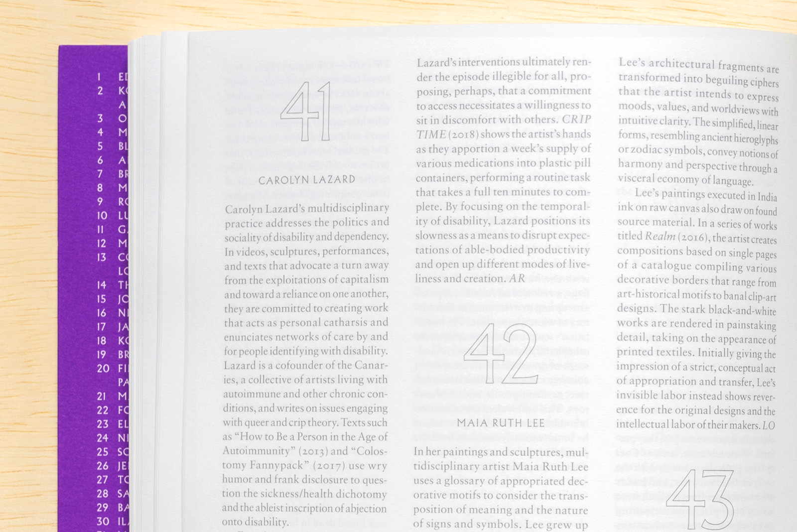
Jane Panetta and Rujeko Hockley, Curators, with Ramsay Kolber
Film program: Maori Karmael Holmes, Sky Hopinka, Matt Wolf
Performance program: Jane Panetta, Rujeko Hockley, Greta Hartenstein
Maura Heffner, Lindsey O’Connor, Exhibition Coordinators
Elizabeth Levy, Project Manager
Common Name, Graphic Design
Nerissa Vales, Sue Medlicott, Production Management
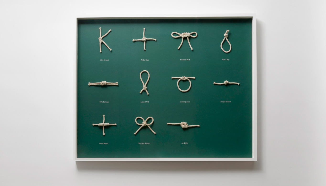
VICEROY VICEROY VICEROY with LUKE STETTNER at KATE WERBLE GALLERY — This is a collaborative exhibition — which is to say an exhibition conceived of and produced by 3 people, across continents — that makes subject of killing machines and their methods of linguistic categorization. We are humored and we are horrified at the way military vernacular expropriates the language of our animal and nature bound world. The hornet is an all-weather fighter jet; the badger is an artillery vehicle; the bloodhound is a surface-to-air missile (so is a scorpion); the flying fish is an Exocet missile; the barracuda is a submarine. And on it goes. The language of war is flooded with the classification of animal science — of land and sea, animals living and extinct — a phenomenon that normalizes armed violence and predation as something “natural” and affirms the environment and its sentient lives as one more resource to be colonized.
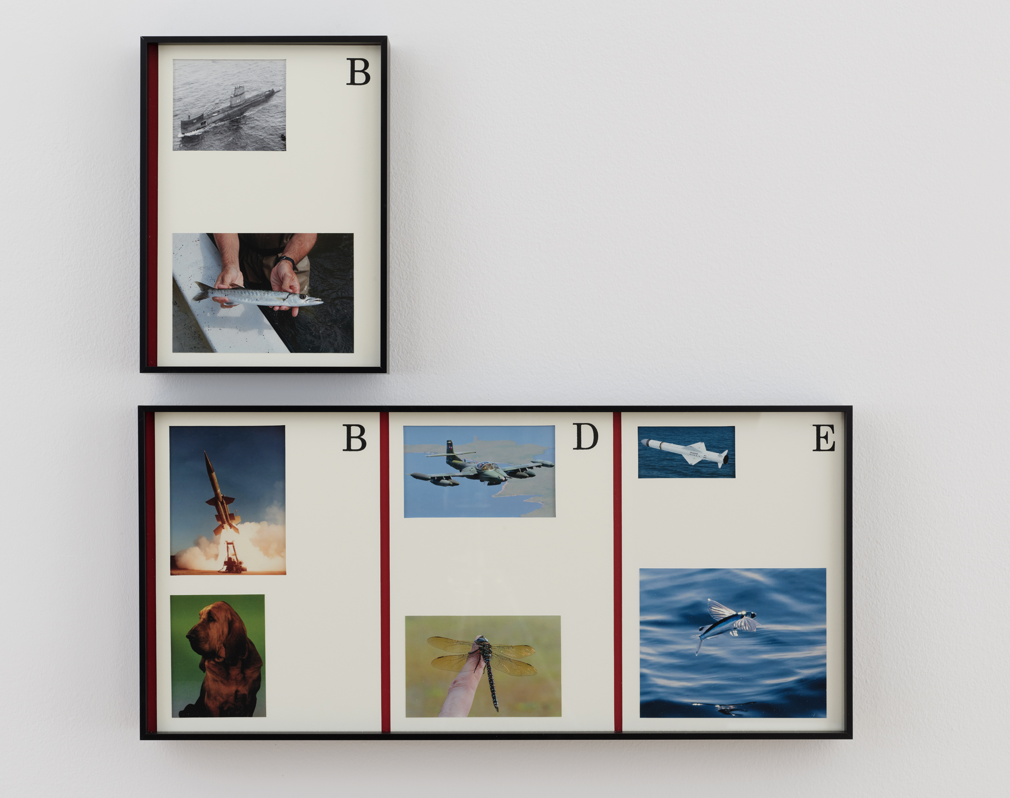
Barracuda
Bloodhound, Dragonfly, Exocet
2021
Photo collage and silkscreen
8.25×11.25 in
24.25×11.25 in
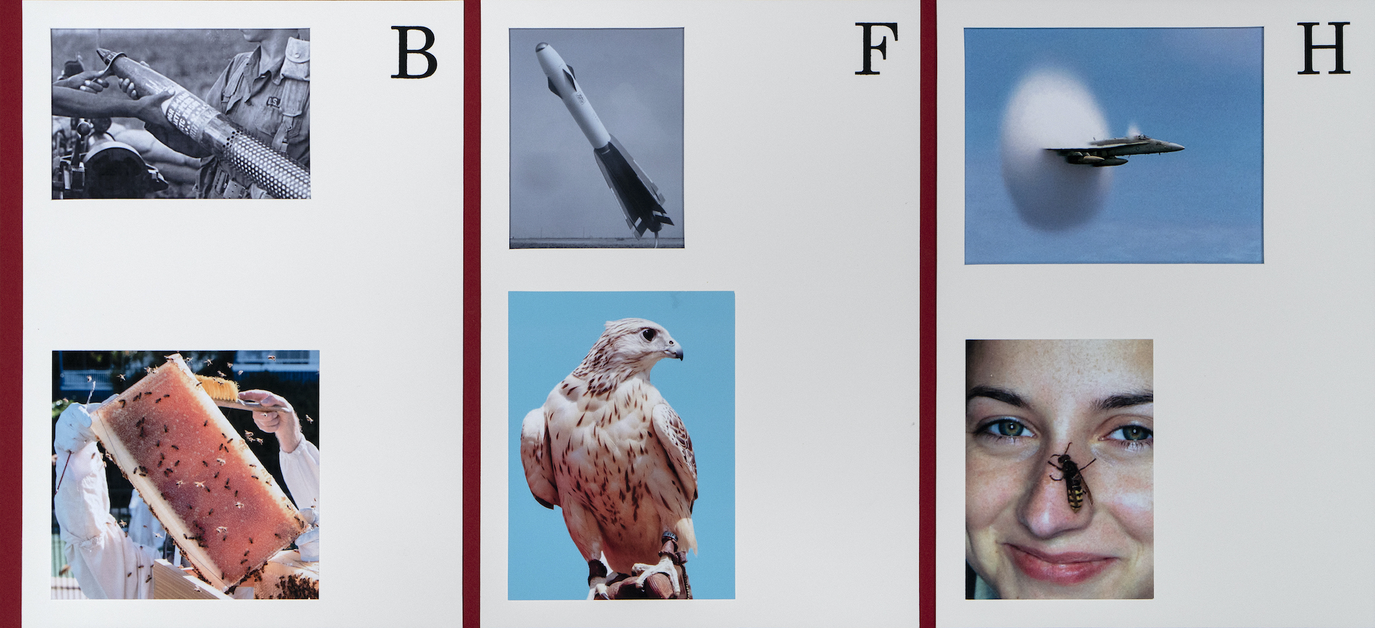
Detail of Beehive, Falcon, Hornet
2021
24.25×11.25 in
Photo collage and silkscreen

Luke Stettner & Common Name
Viceroy, Viceroy, Viceroy
Installation view, 2021
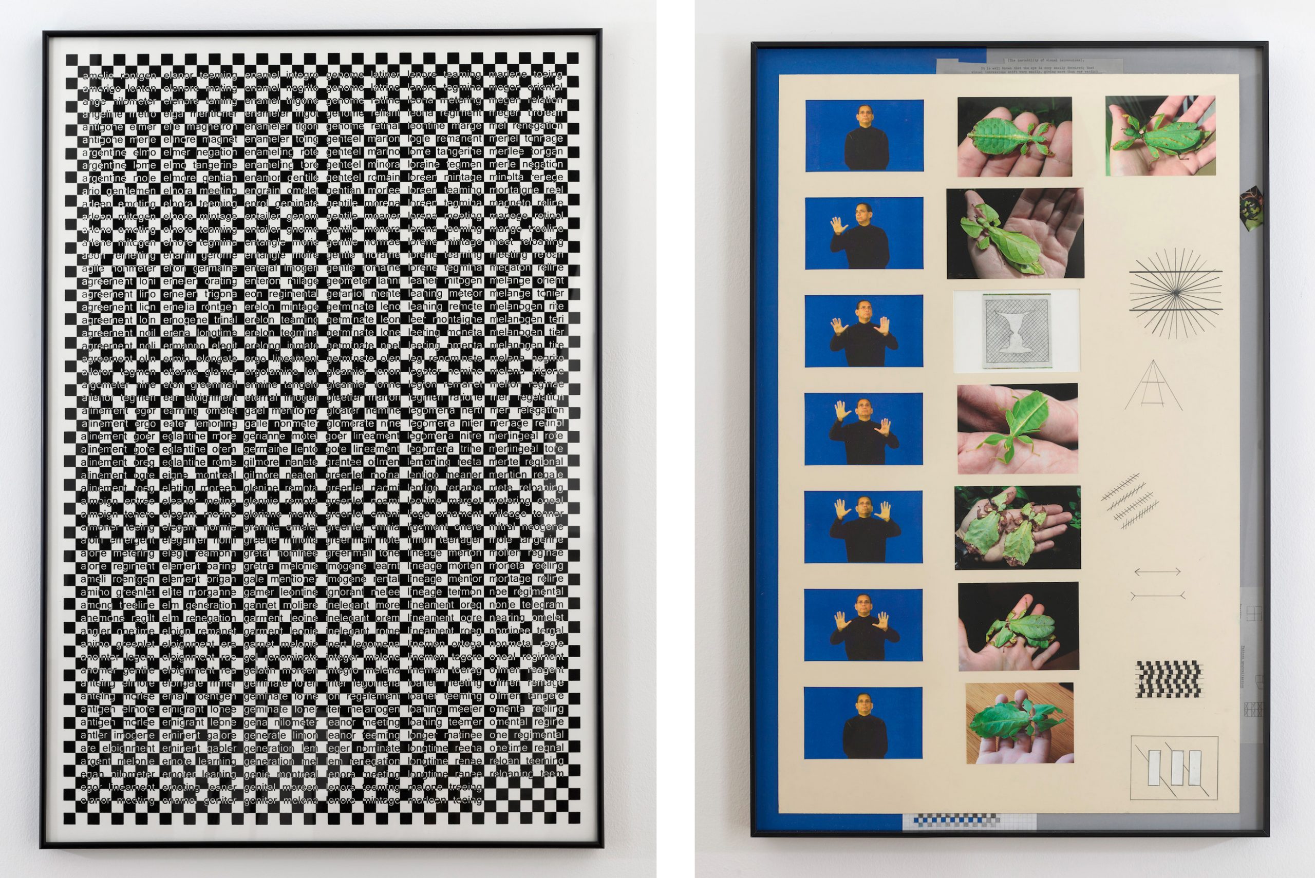
Noli Me Tangere (Two Word Anagrams)
2021
Silkscreen
29.25×42.75 in
Masquerade
2021
Mixed media
22.25×34.25 in
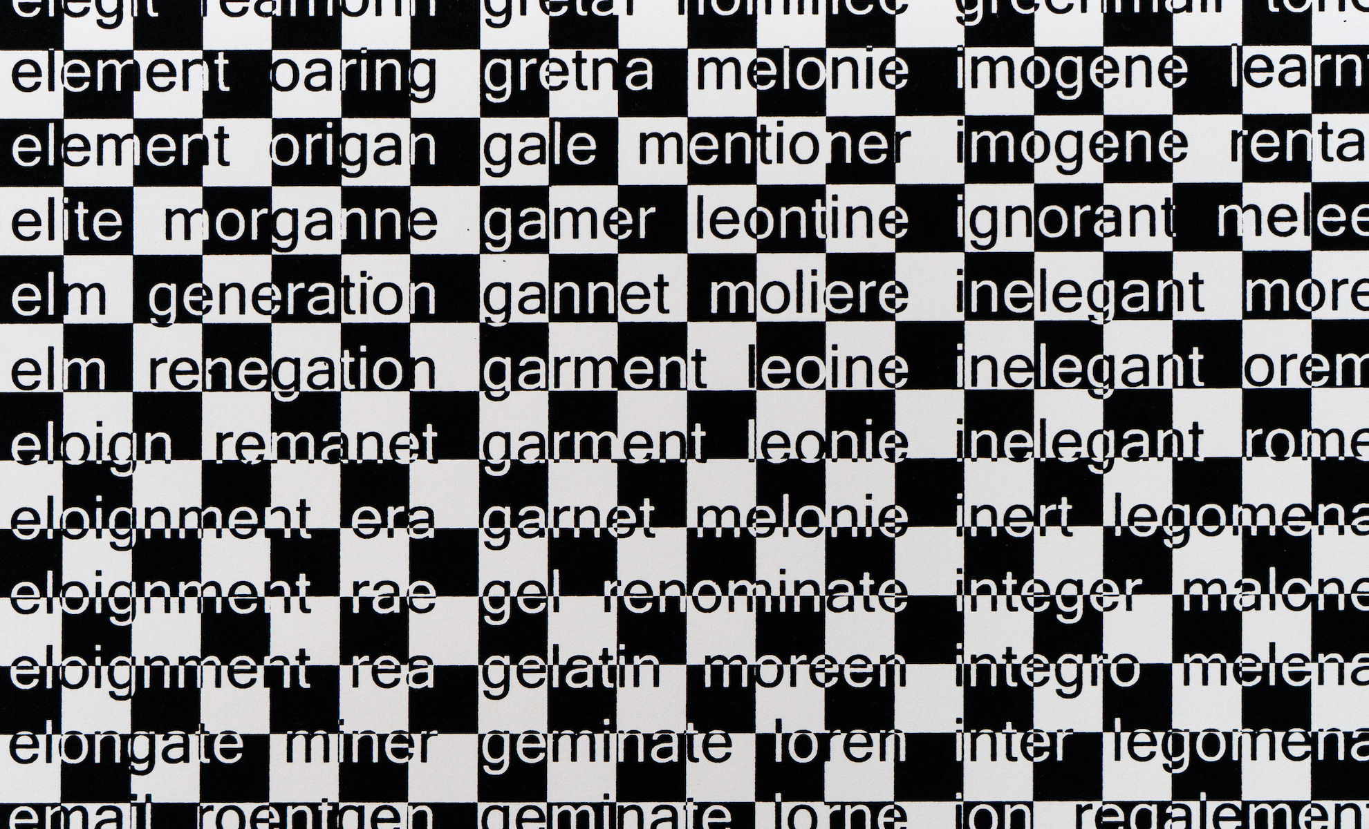
Detail of Noli Me Tangere (Two Word Anagrams)
2021
Silkscreen
29.25×42.75 in
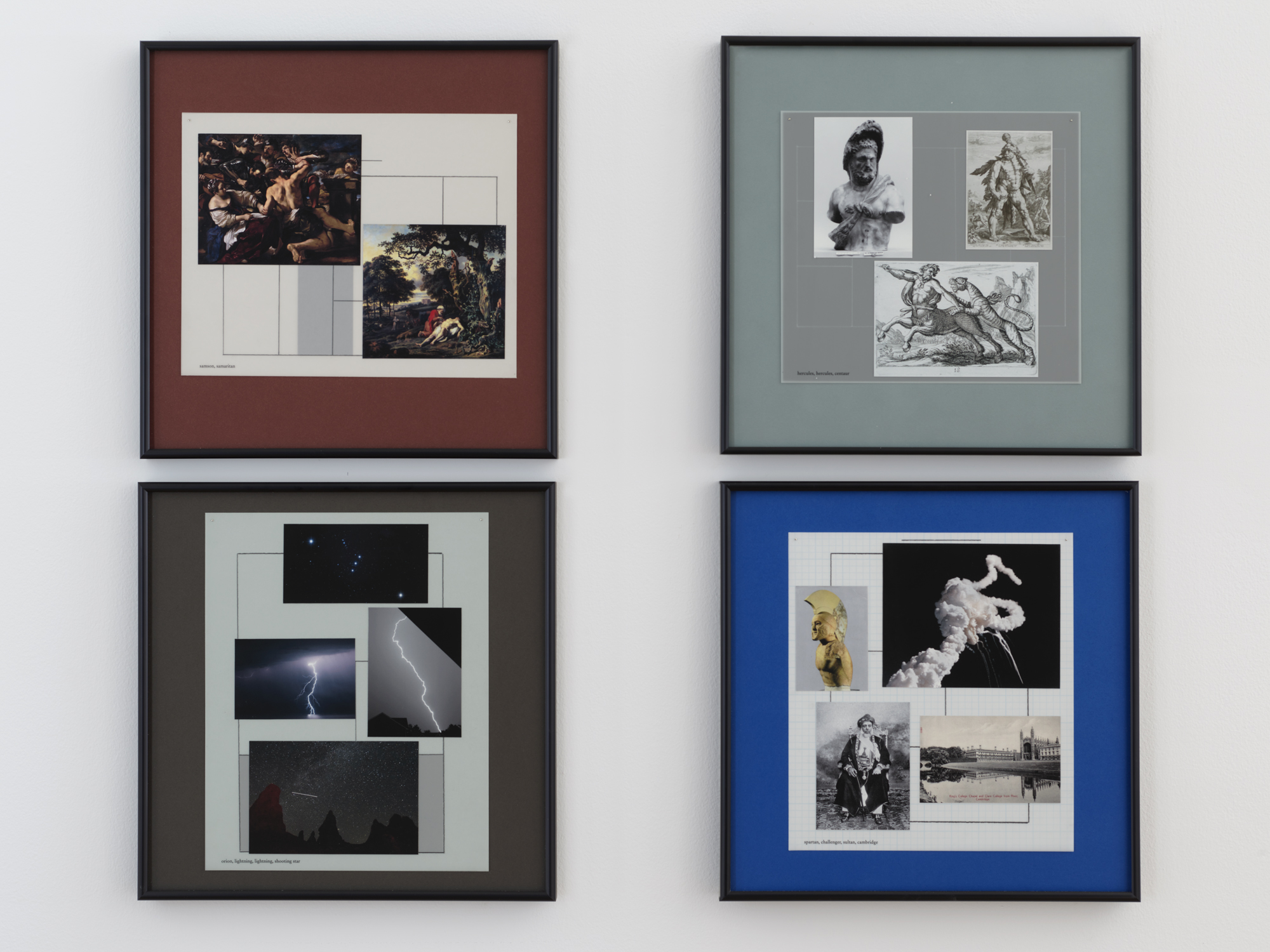
Spartan, Challenger, Sultan, Cambridge
Hercules, Hercules, Centaur
2021
Mixed media
15.25×15.25 in each
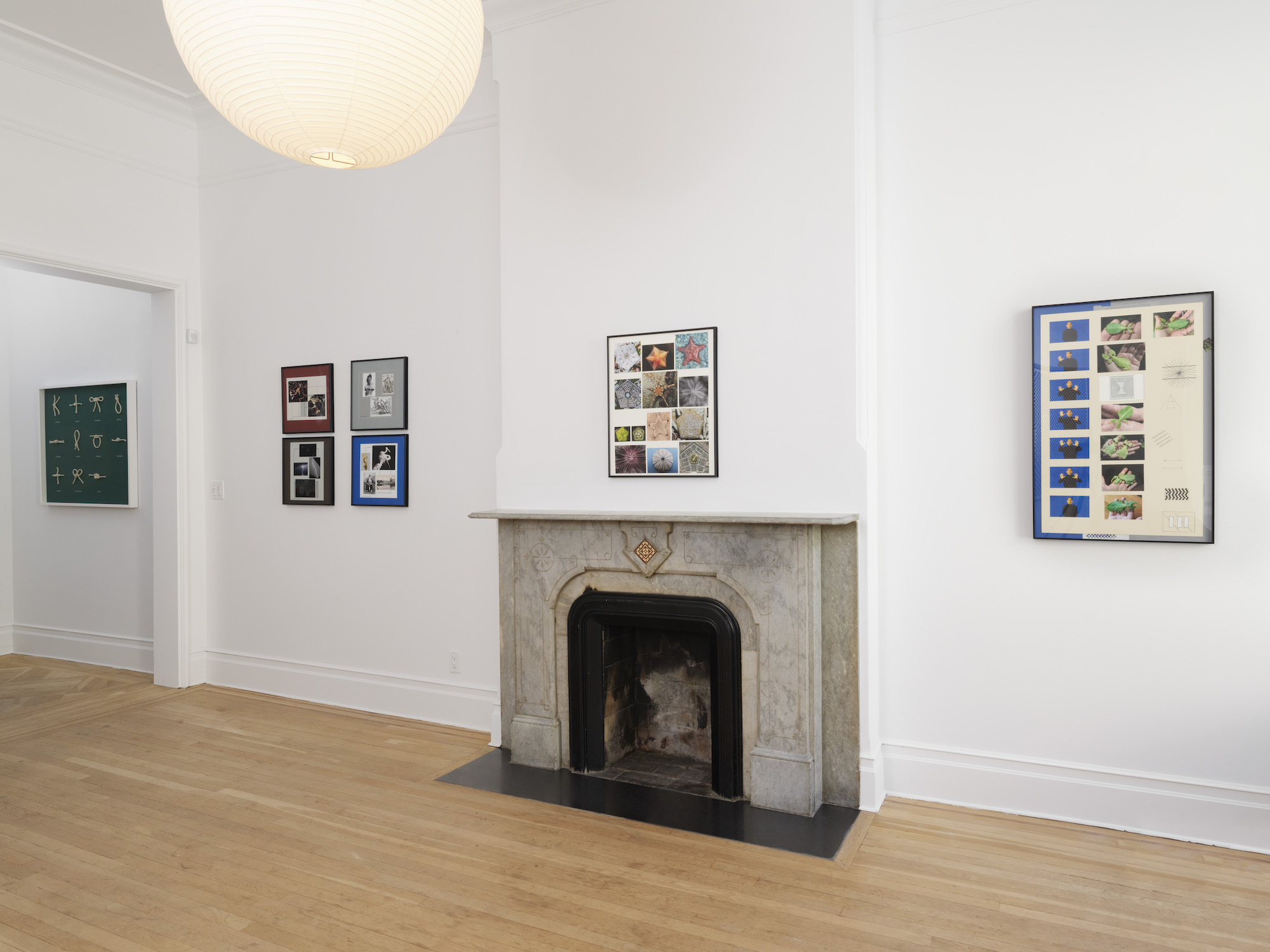
Luke Stettner & Common Name
Viceroy, Viceroy, Viceroy
Installation view, 2021

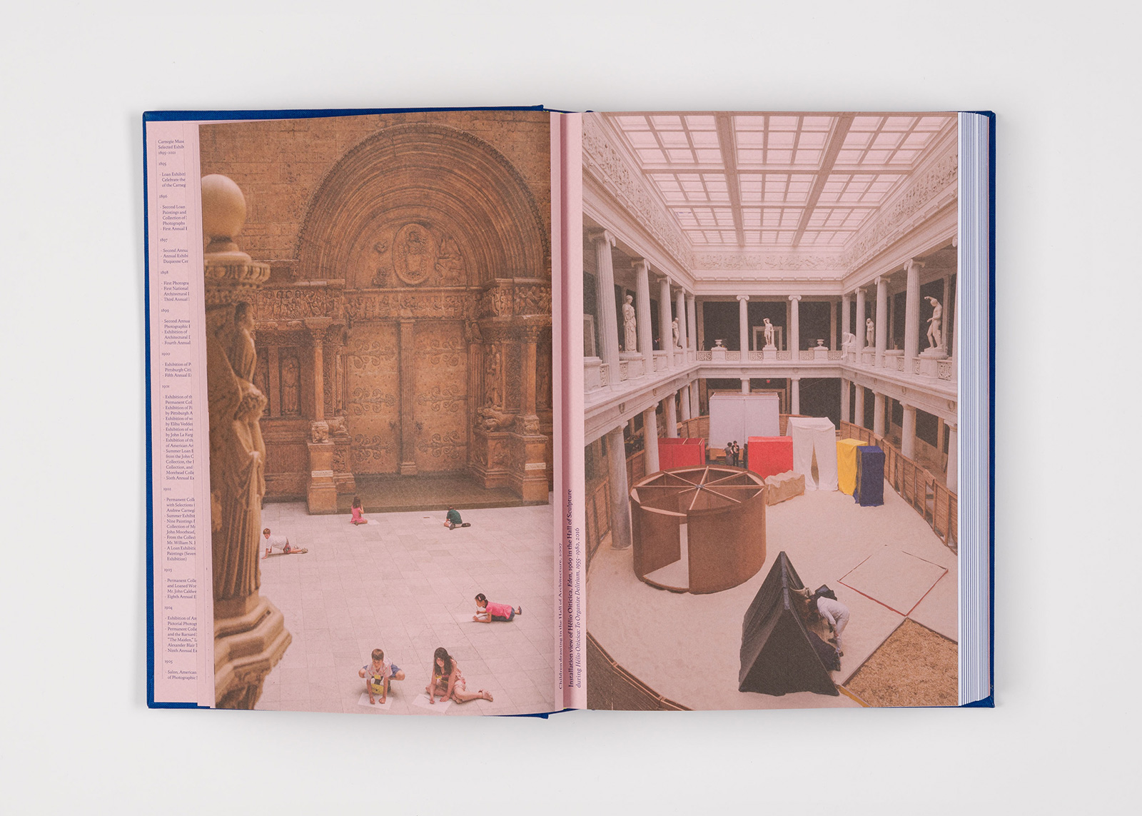
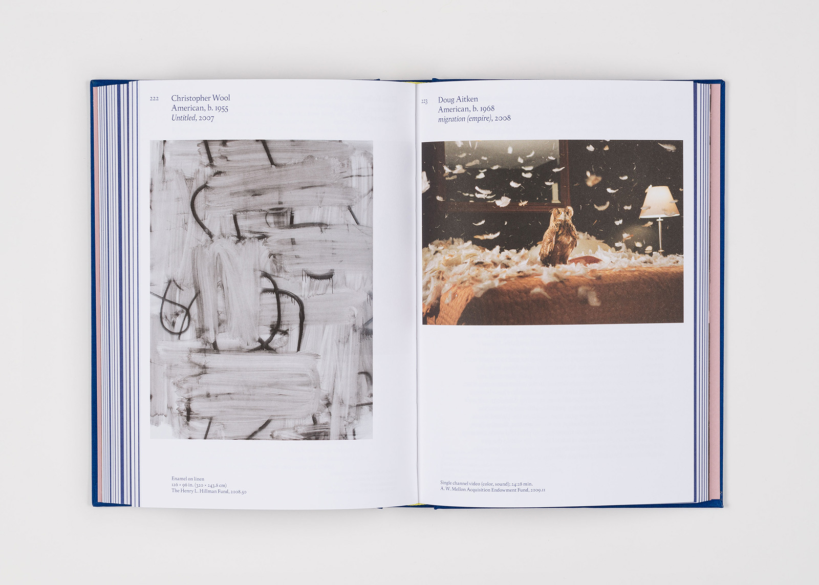
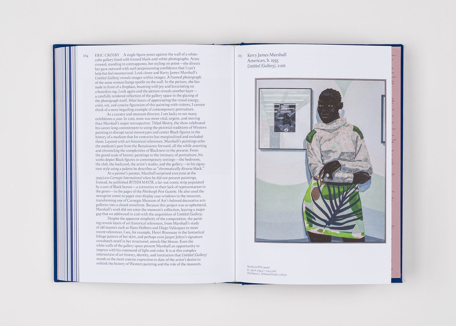
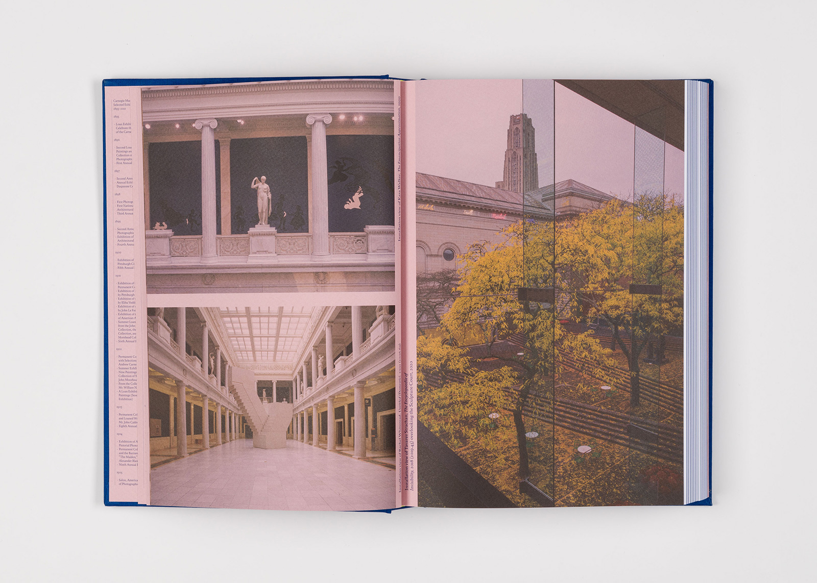
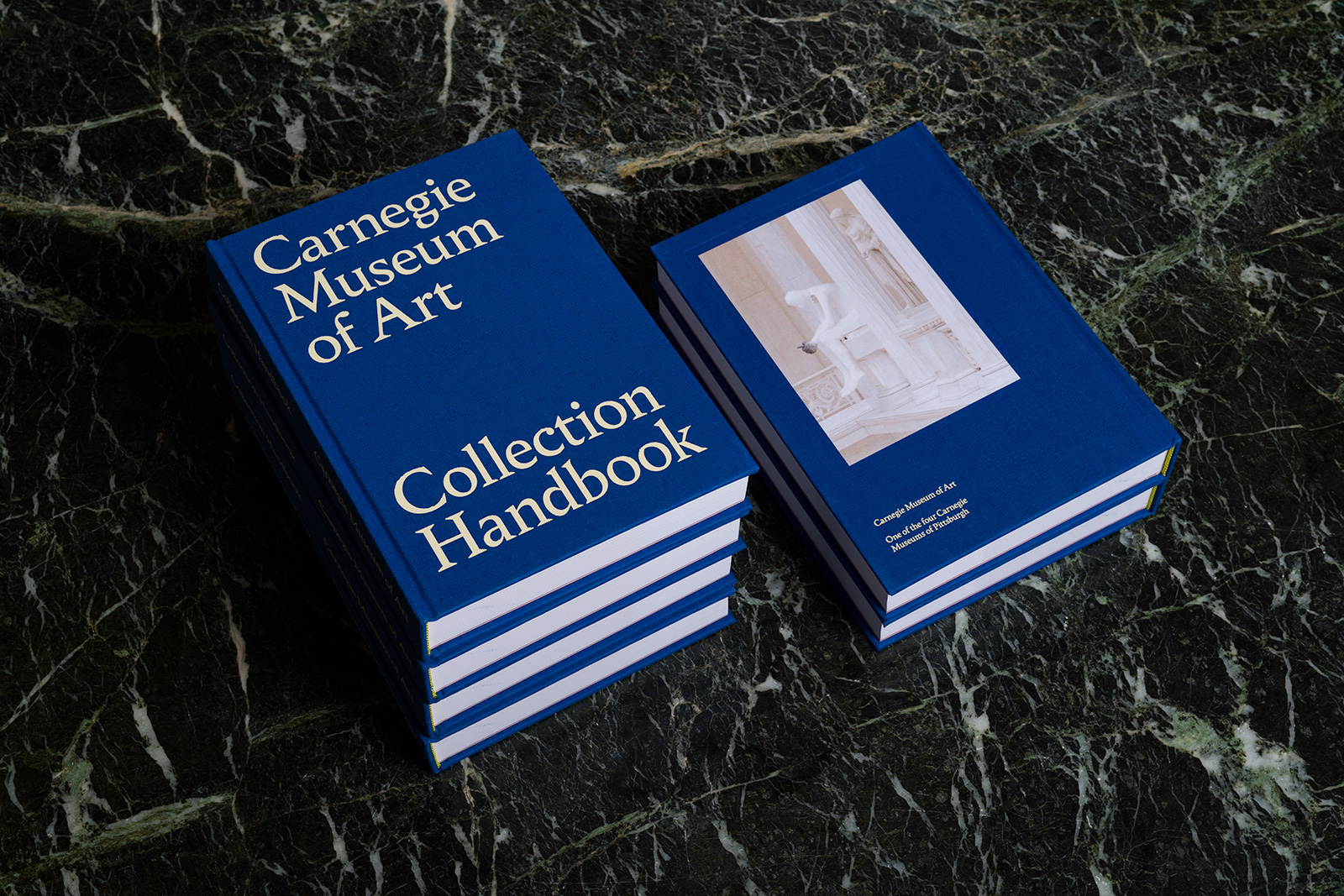
COLLECTION HANDBOOK for CARNEGIE MUSEUM OF ART — Published on the occasion of the the Carnegie Museum of Art’s 125th anniversary, this distinctive Collection Handbook features images of more than 200 works from the collection, with many introduced by museum staff, past and present, revealing the stories behind their creation and acquisition. Images of previously unpublished archival materials trace the history of the museum from the late 19th century, when the Carnegie Institute and Carnegie International were established. The book features works well-known to museum visitors alongside more recent acquisitions, laying the groundwork for future exhibitions.

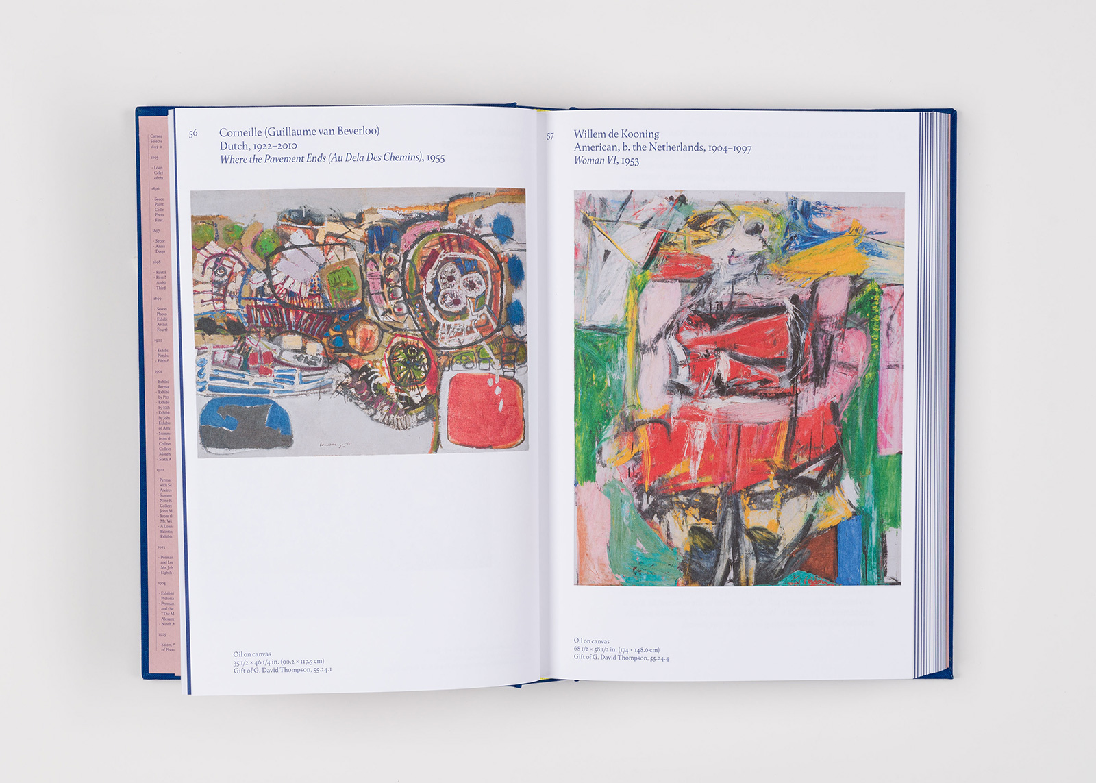


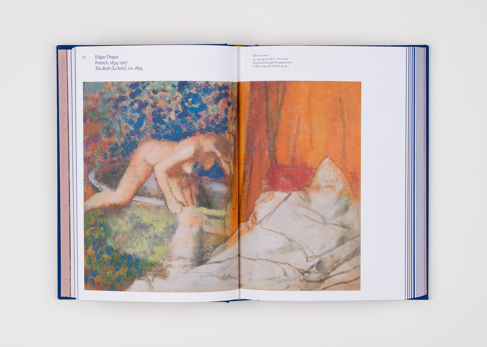
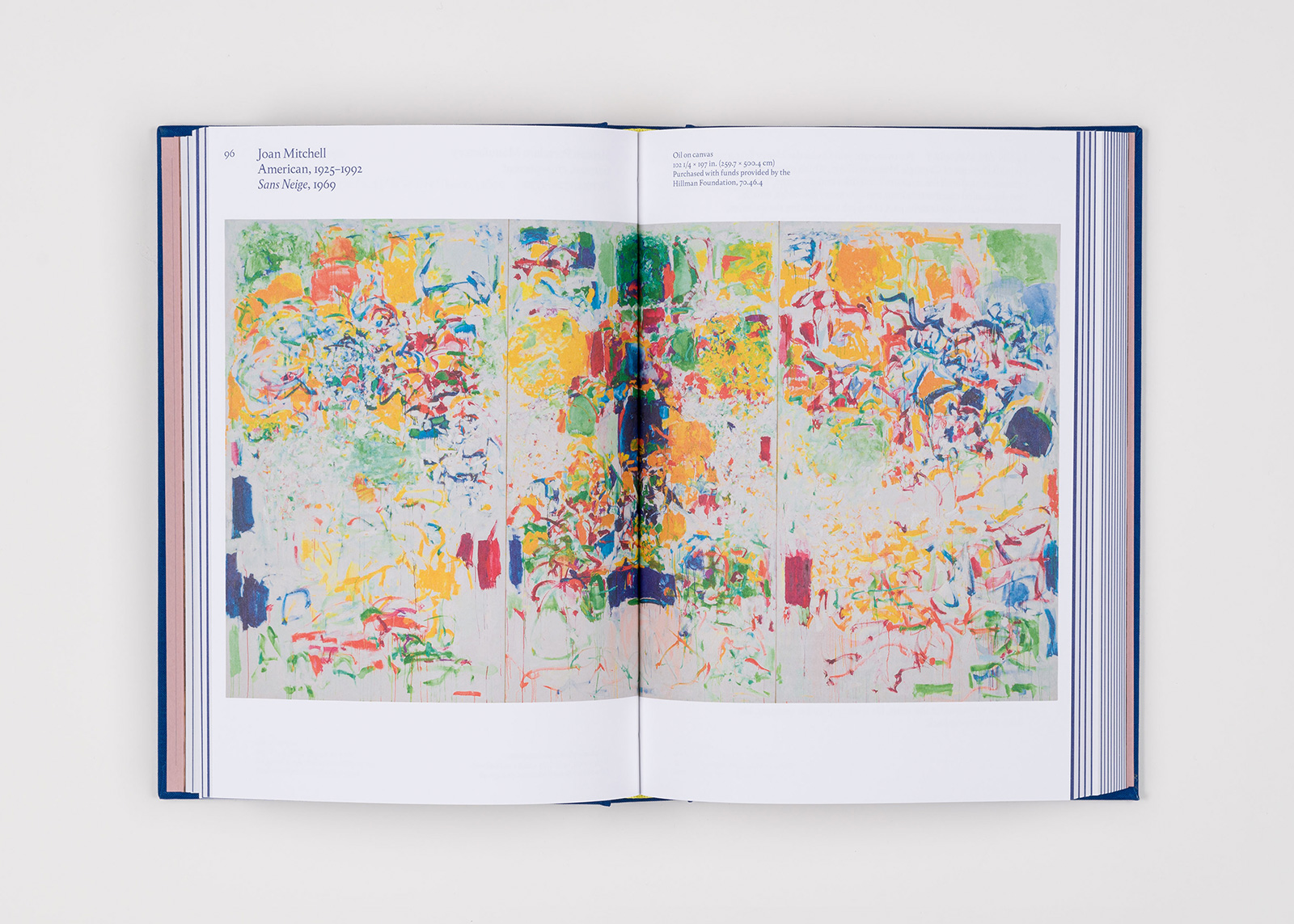
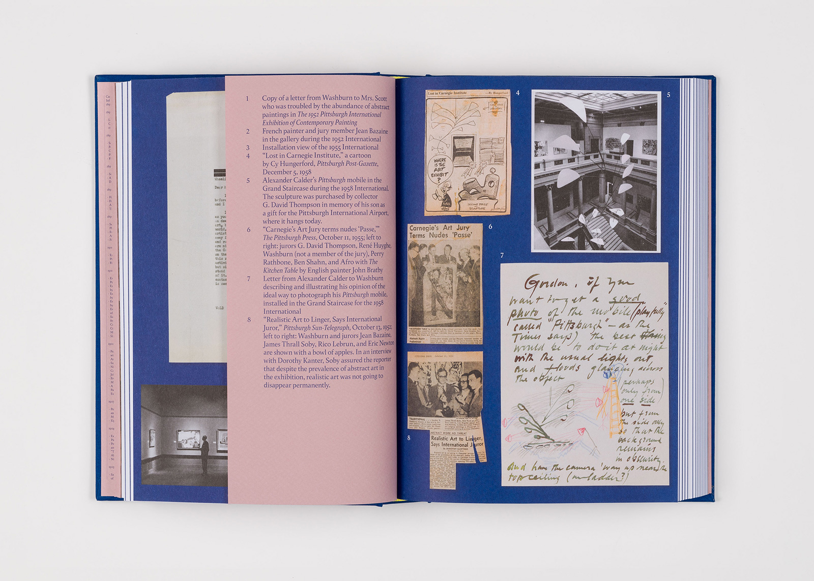
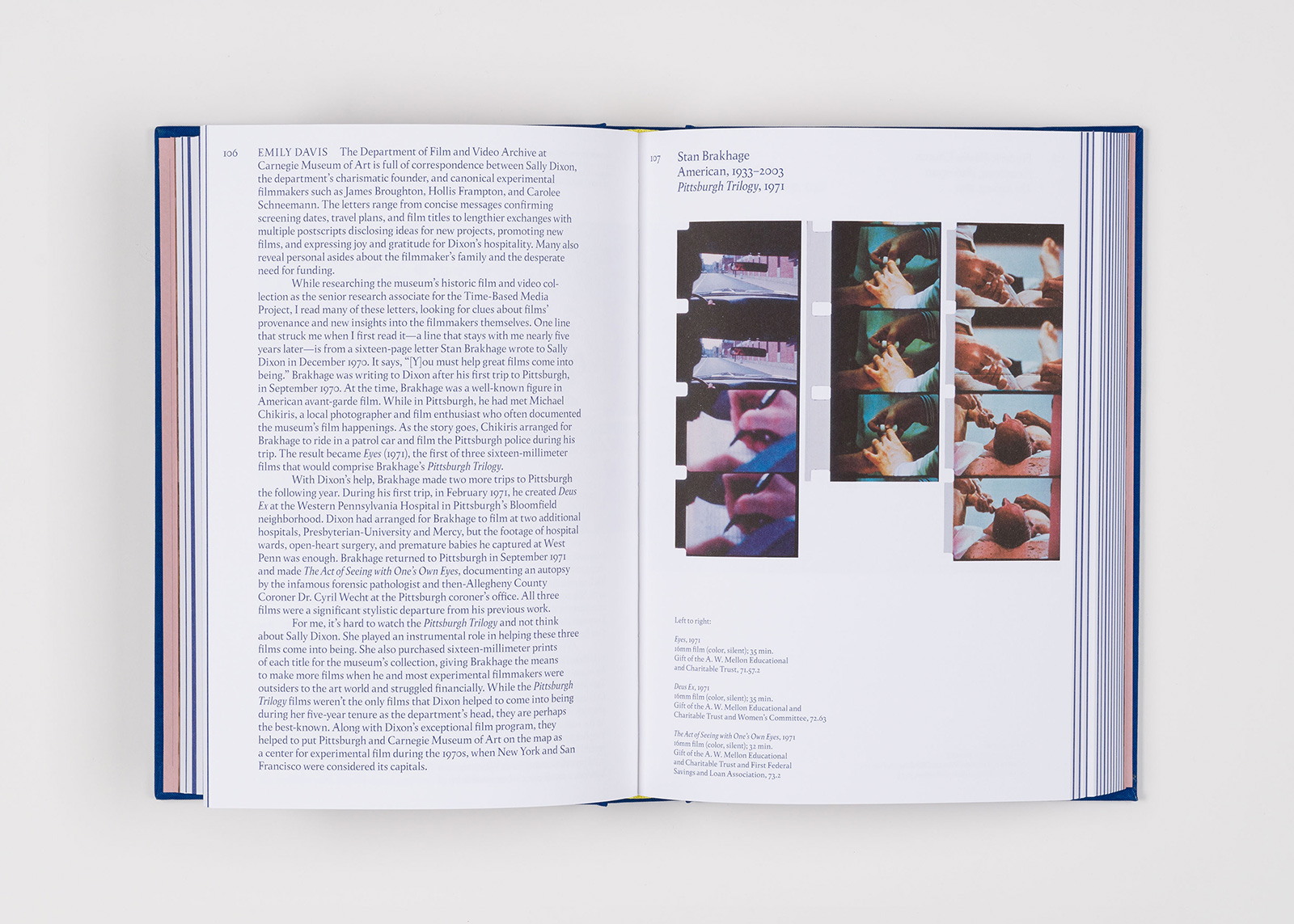
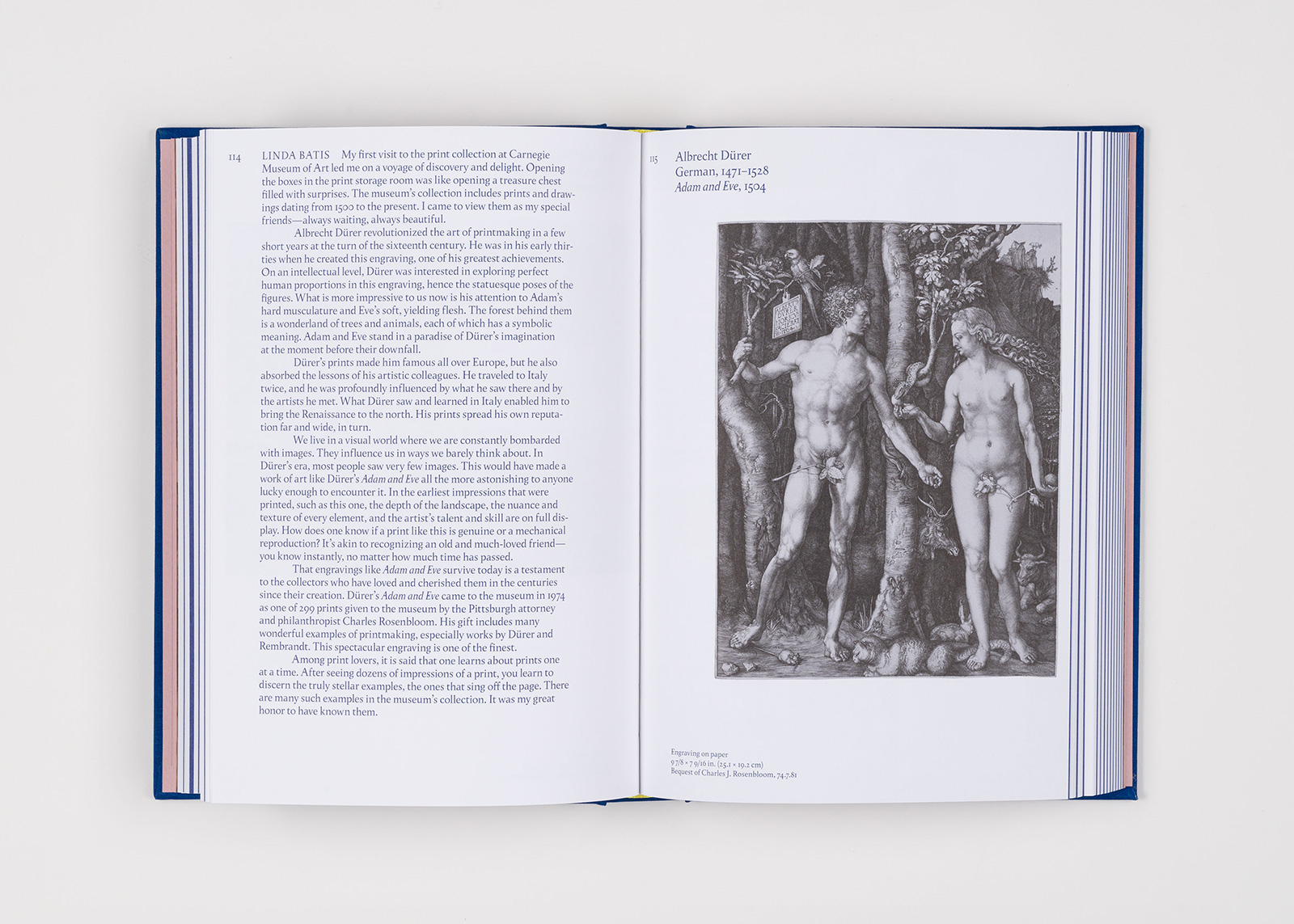
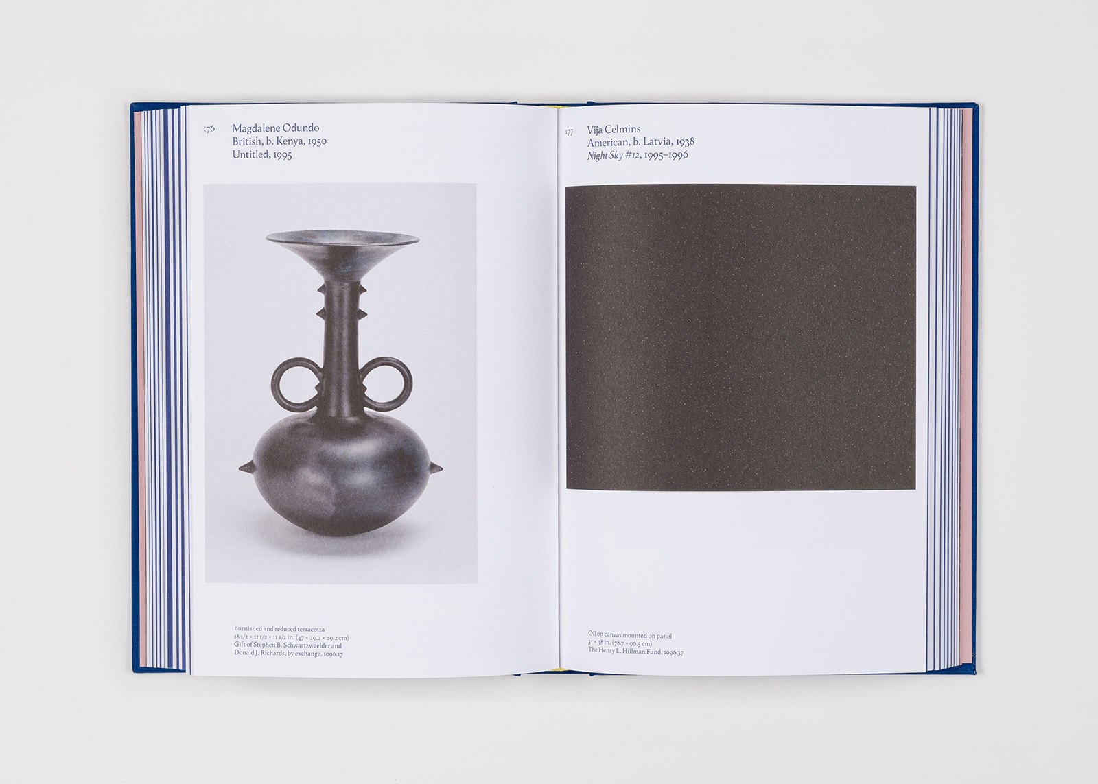
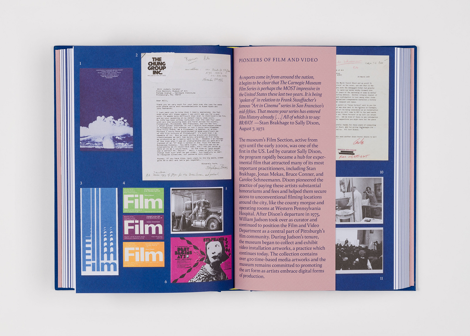
Eric Crosby, Henry J. Heinz II Director
Aryn Beitz, Director of Design and Publishing
Stephanie Rozman, Associate Editor
Bryan Conley, Photographer
Common Name, Book Design
Greg Beckel, Image Editor
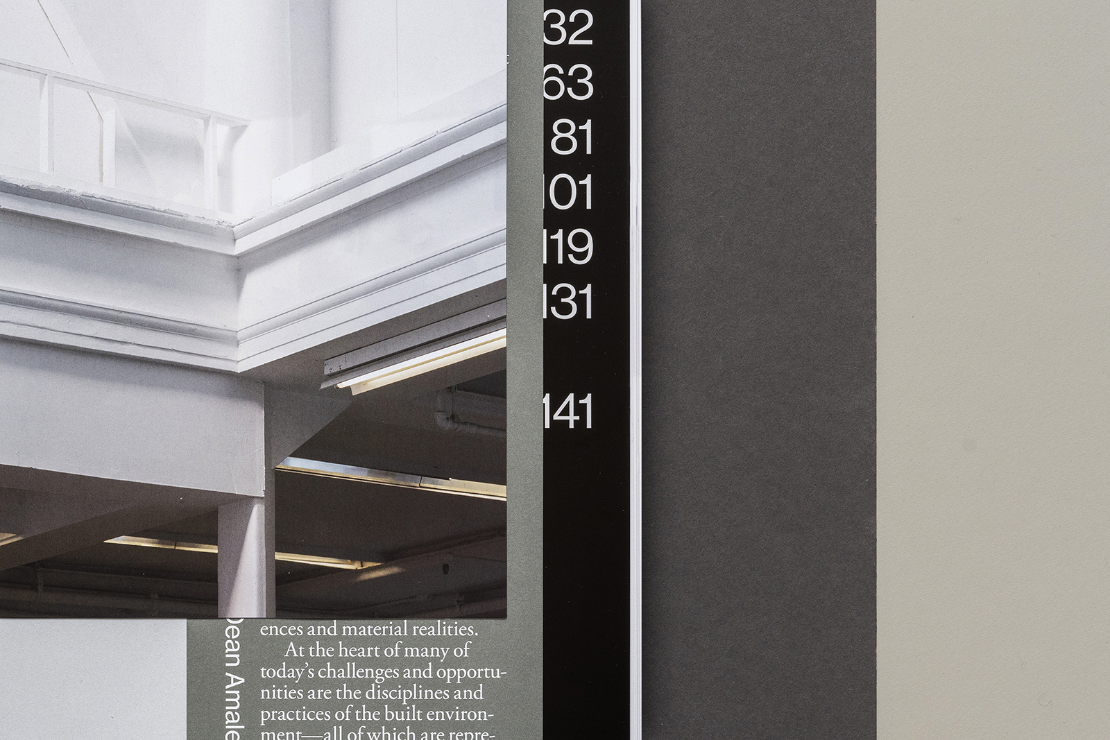
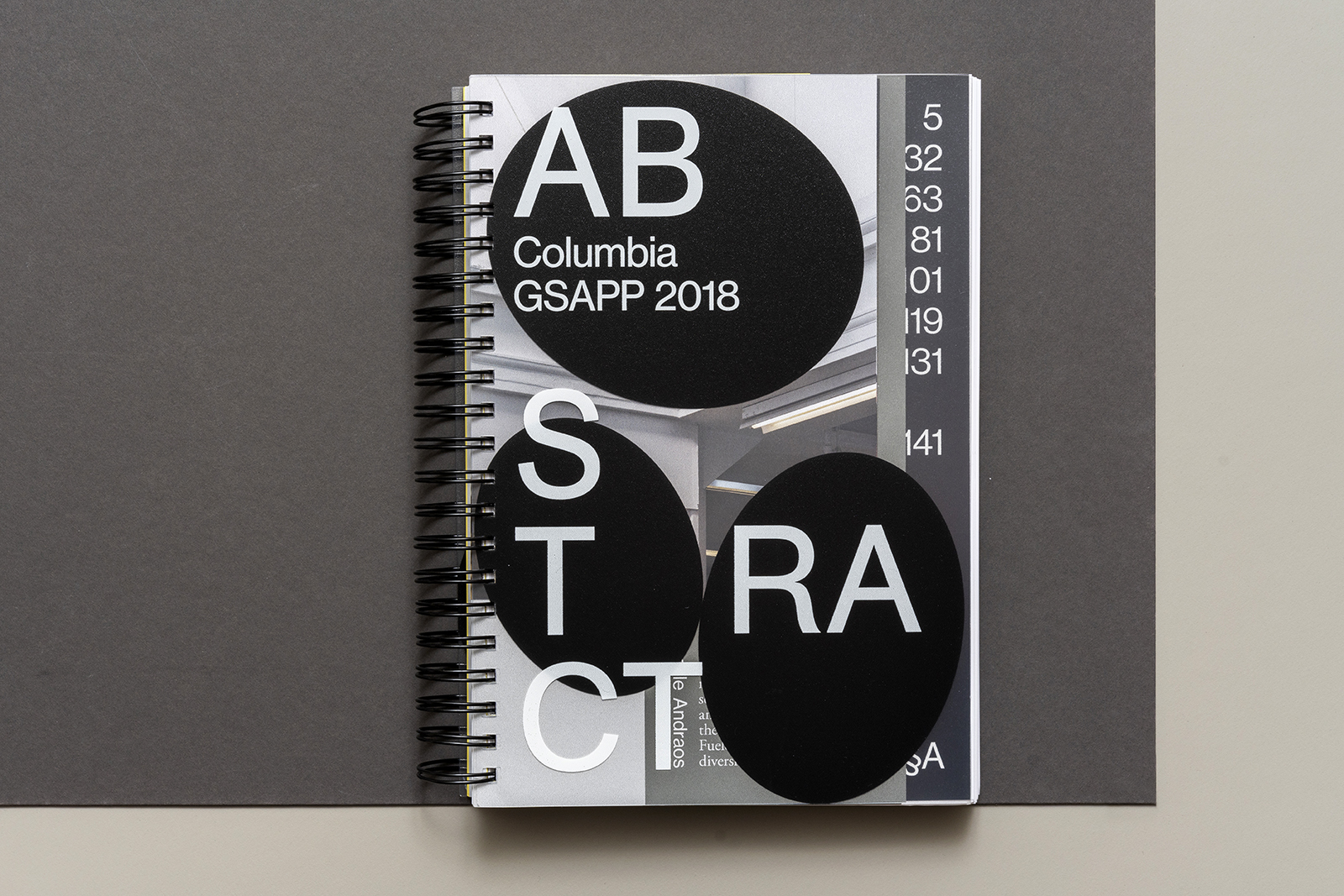
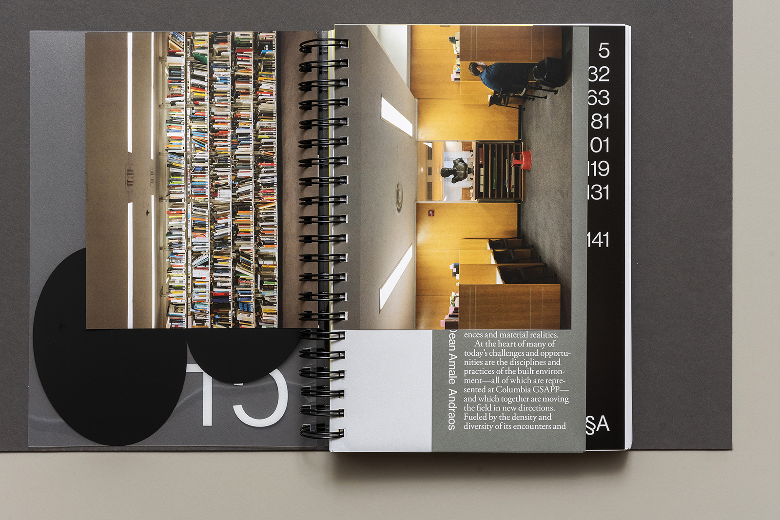
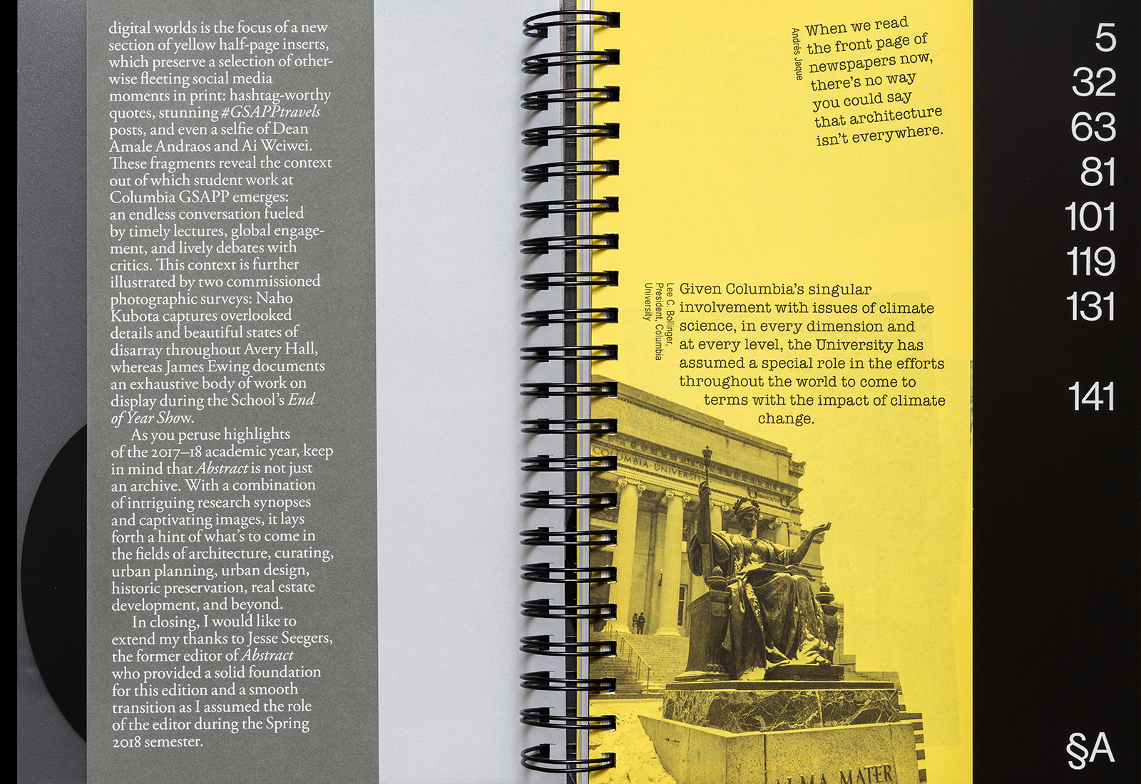
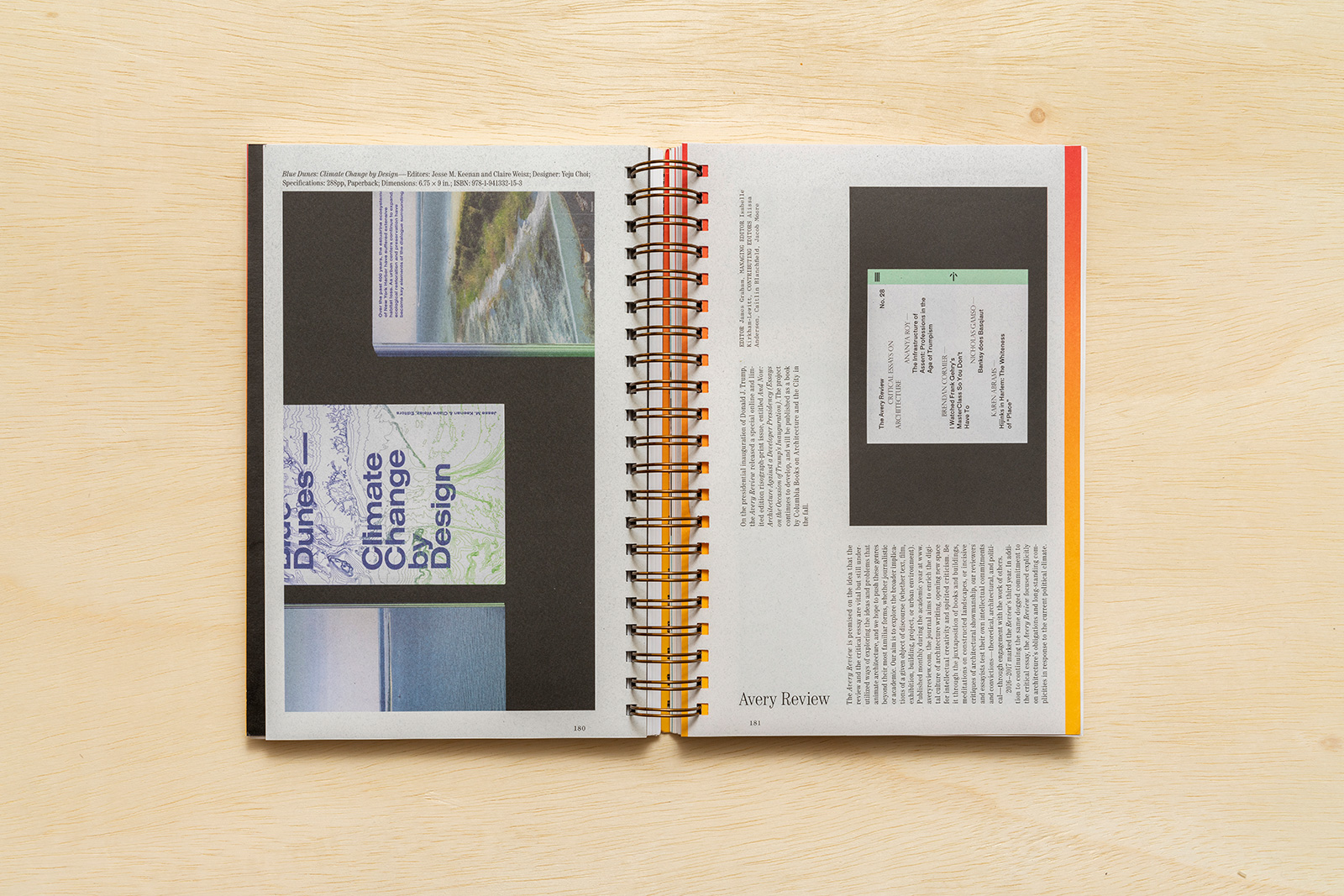
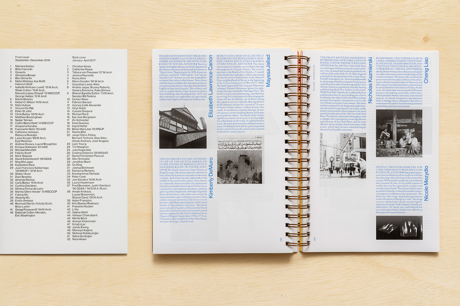
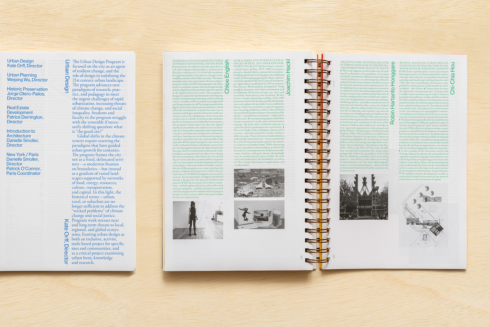
ABSTRACT 2018 for COLUMBIA GSAPP — Abstract is the long-running, annual compendium of student projects, applied research, events, and exhibitions from Columbia University’s Graduate School of Architecture, Planning, and Preservation (GSAPP). Overseen by the Office of the Dean, and edited in part by a growing list of notable faculty, Abstract showcases studios, electives, and departments from all across the school. Conceived of as a reflection of GSAPP’s unique organizational model, the book’s binding allows for multiple covers, multiple materials (and interruptions), and multiple points of entry.
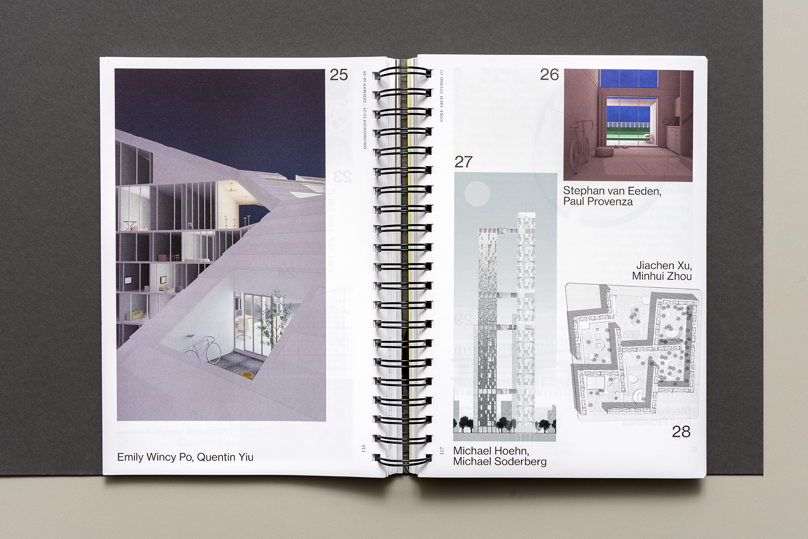
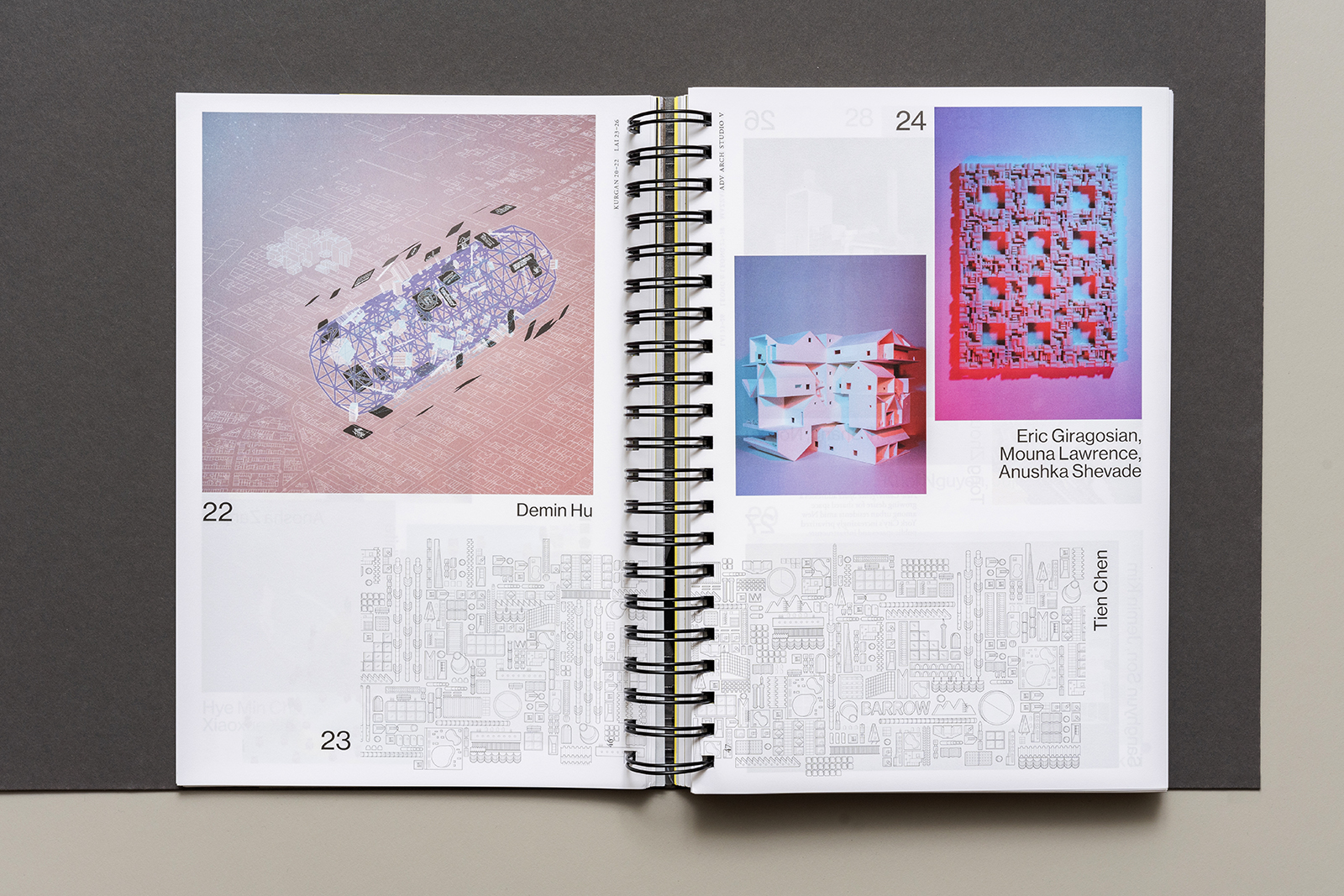
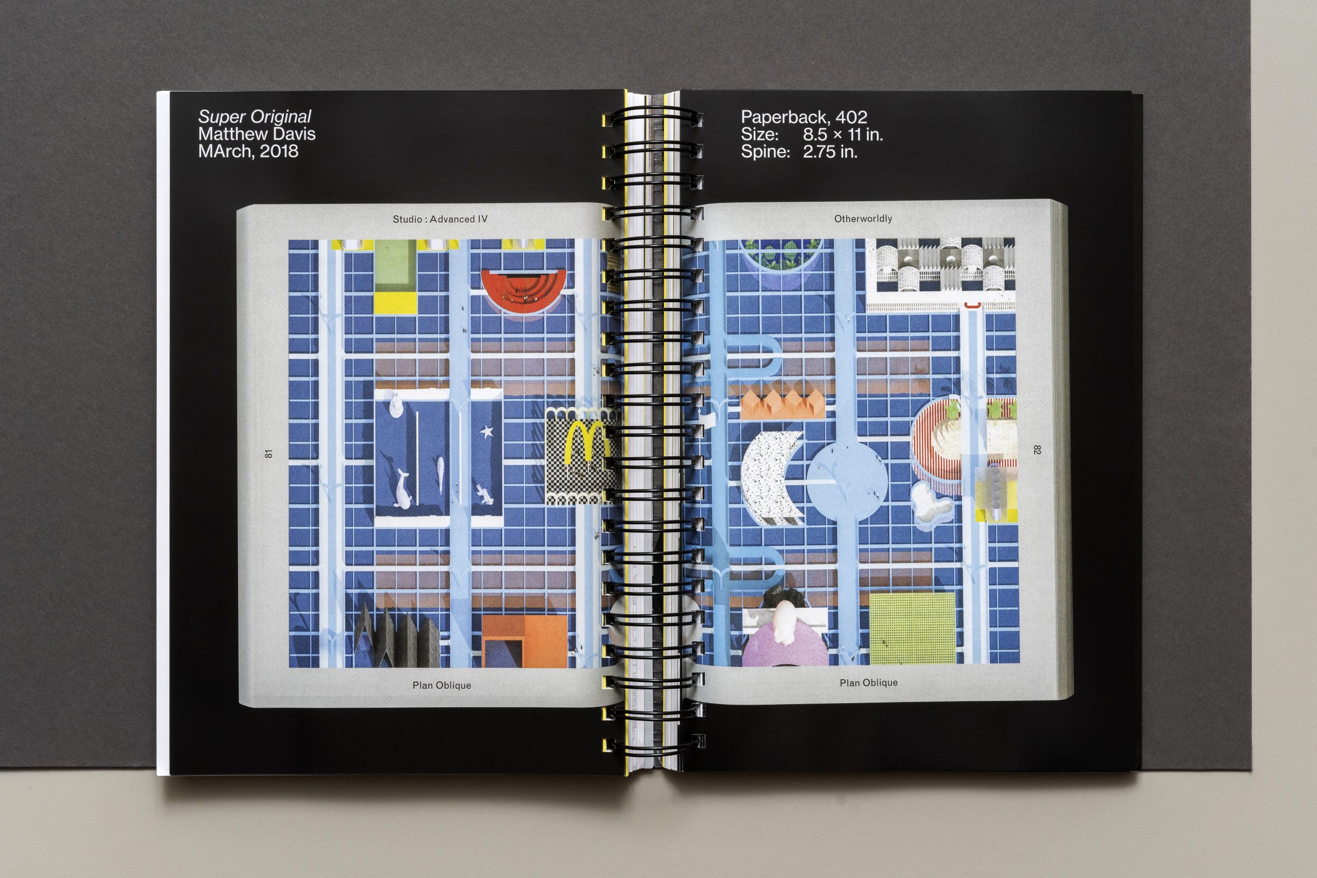
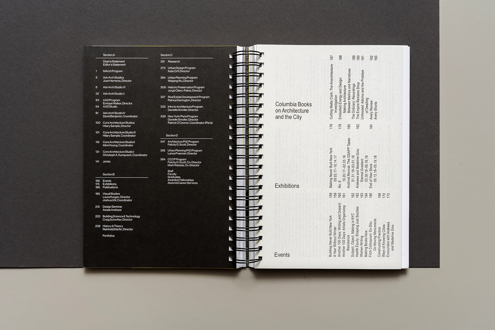
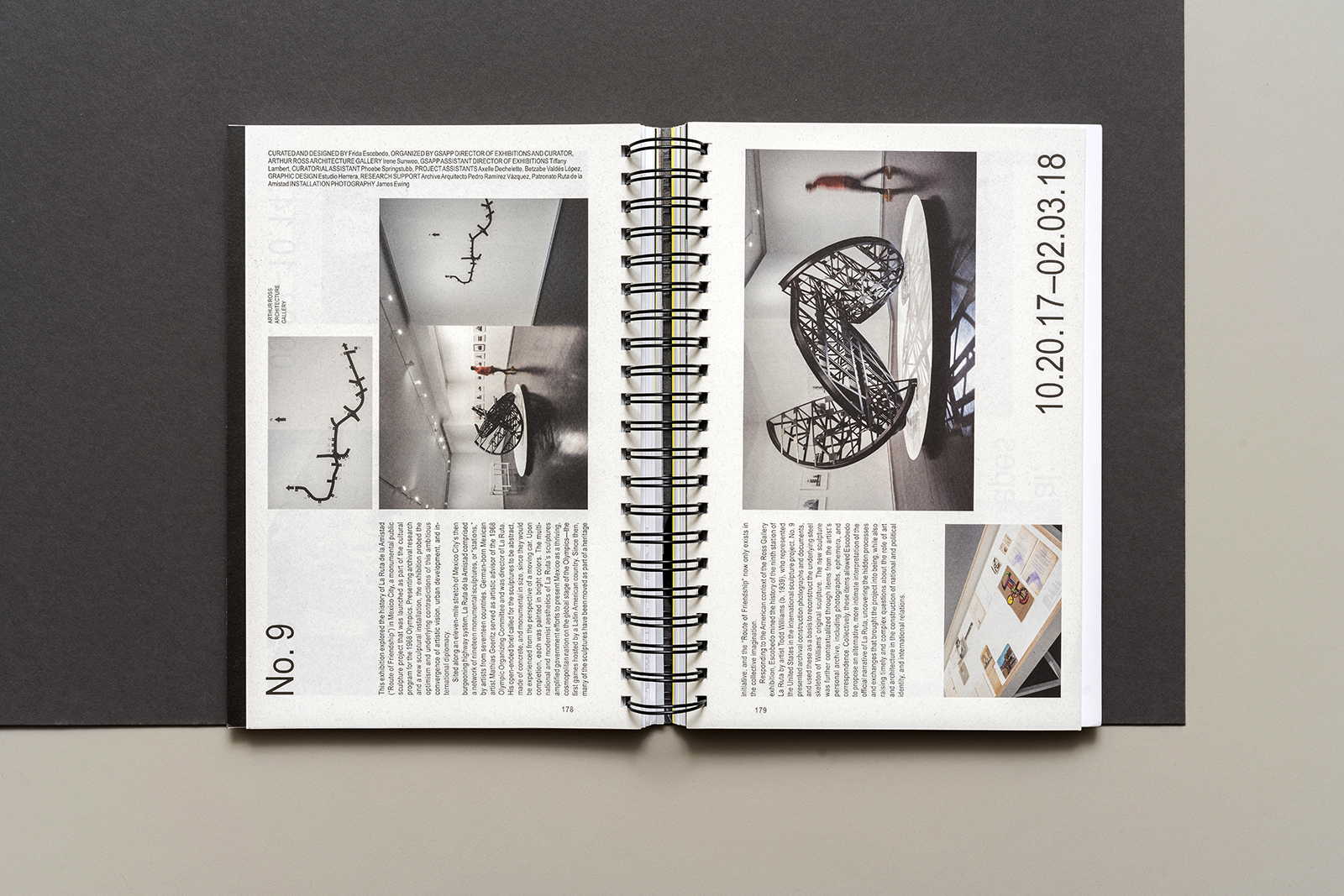

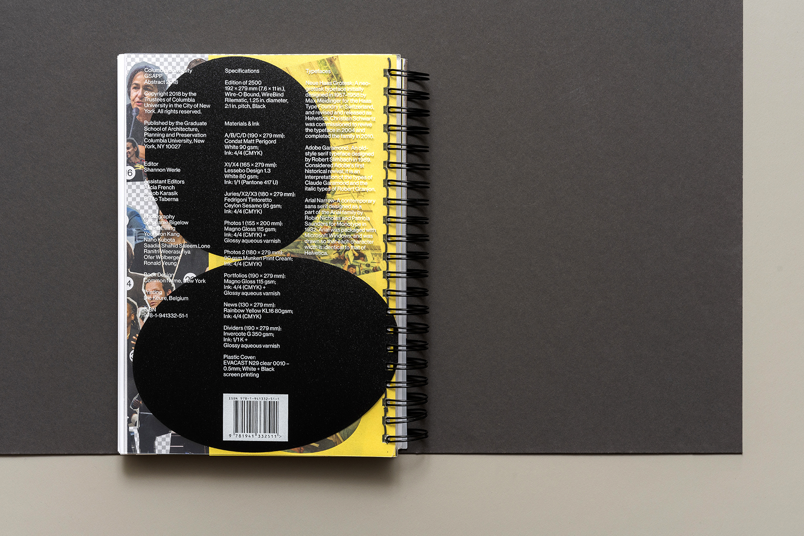
Amale Andraos, Dean, Columbia GSAPP
Shannon Werle, Editor
Common Name, Book Design
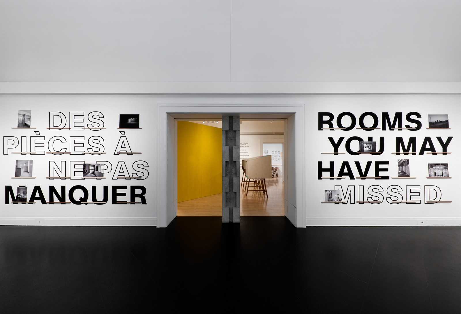
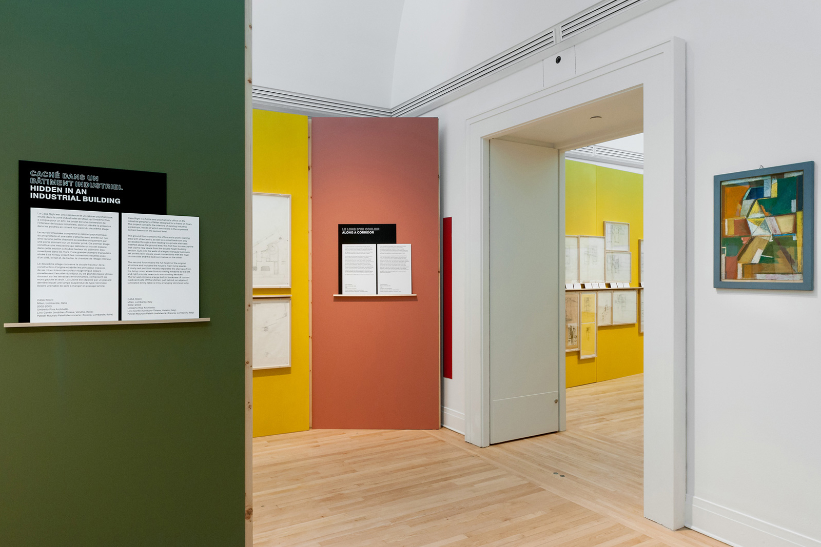
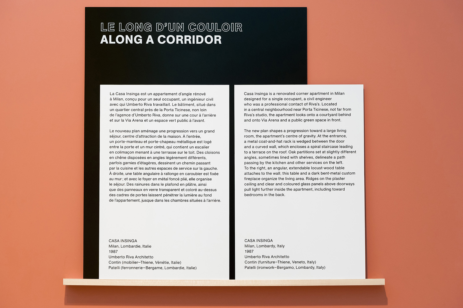
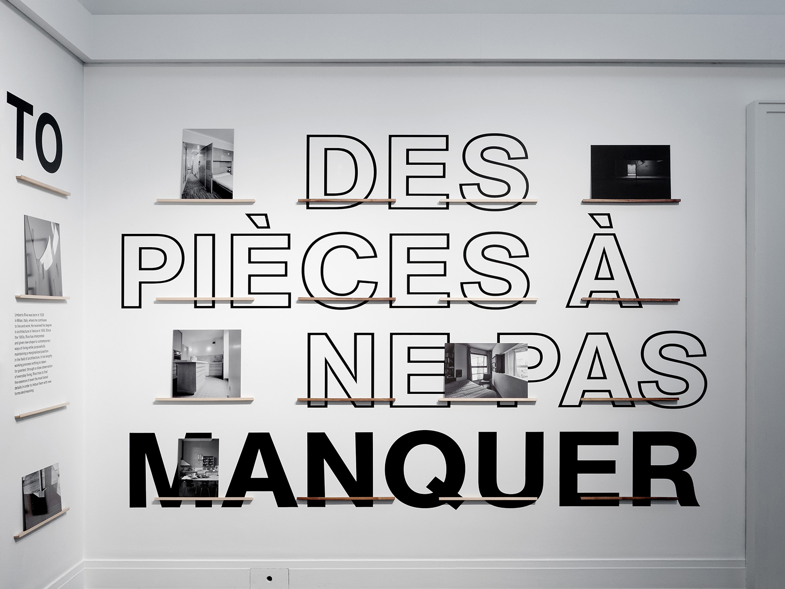
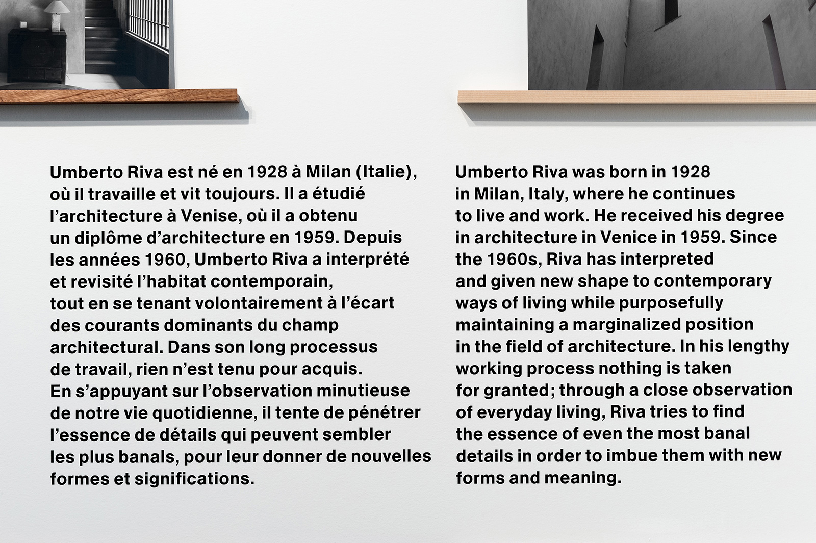
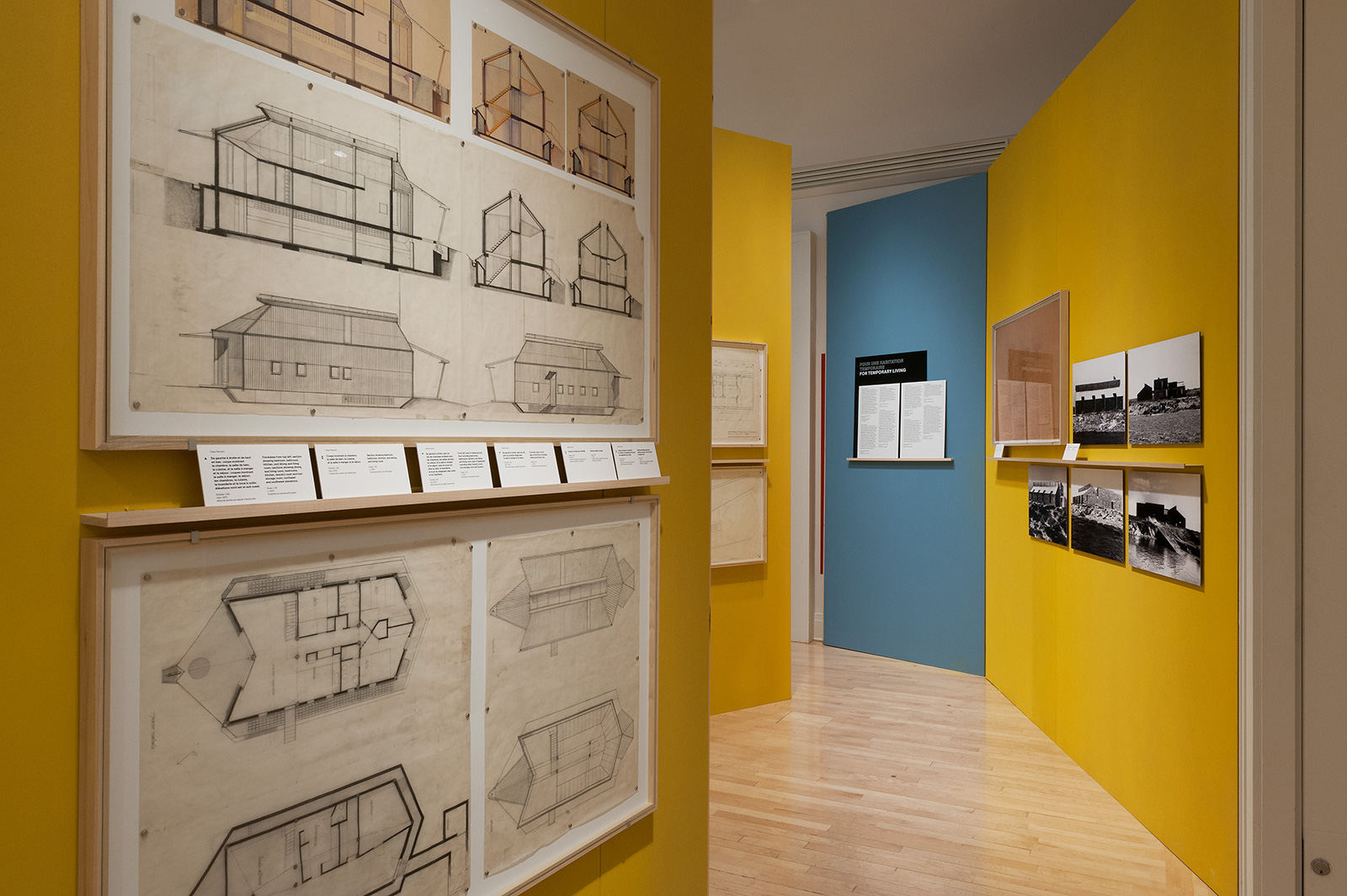
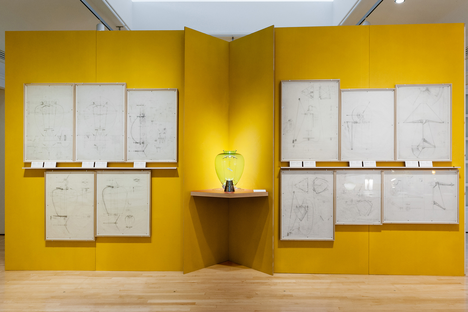
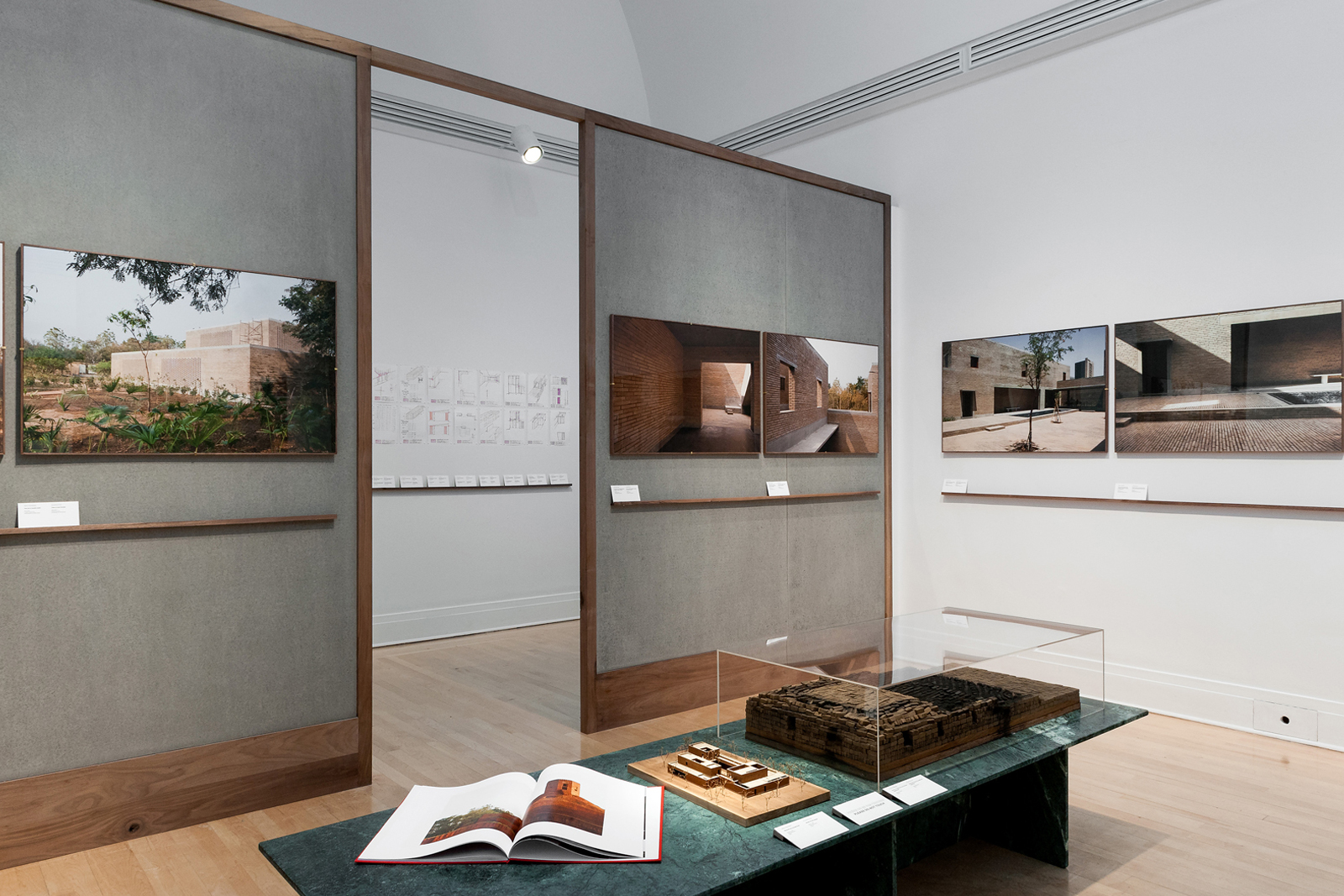
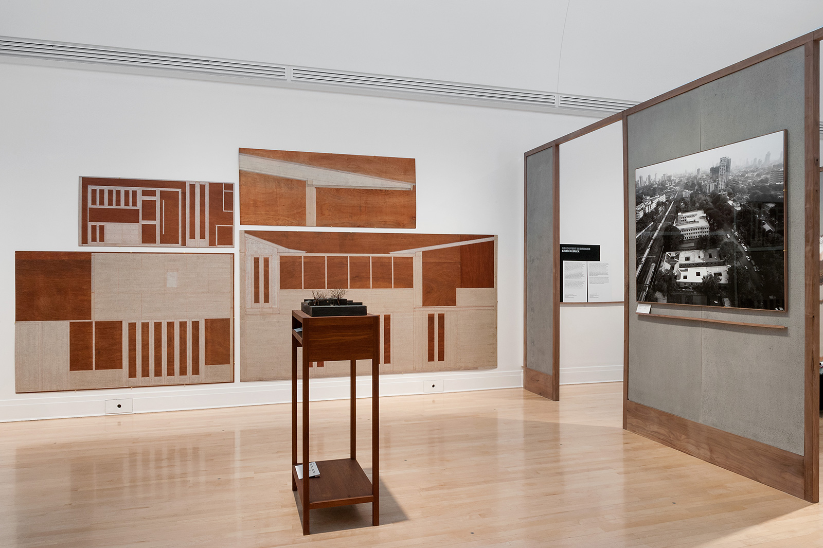
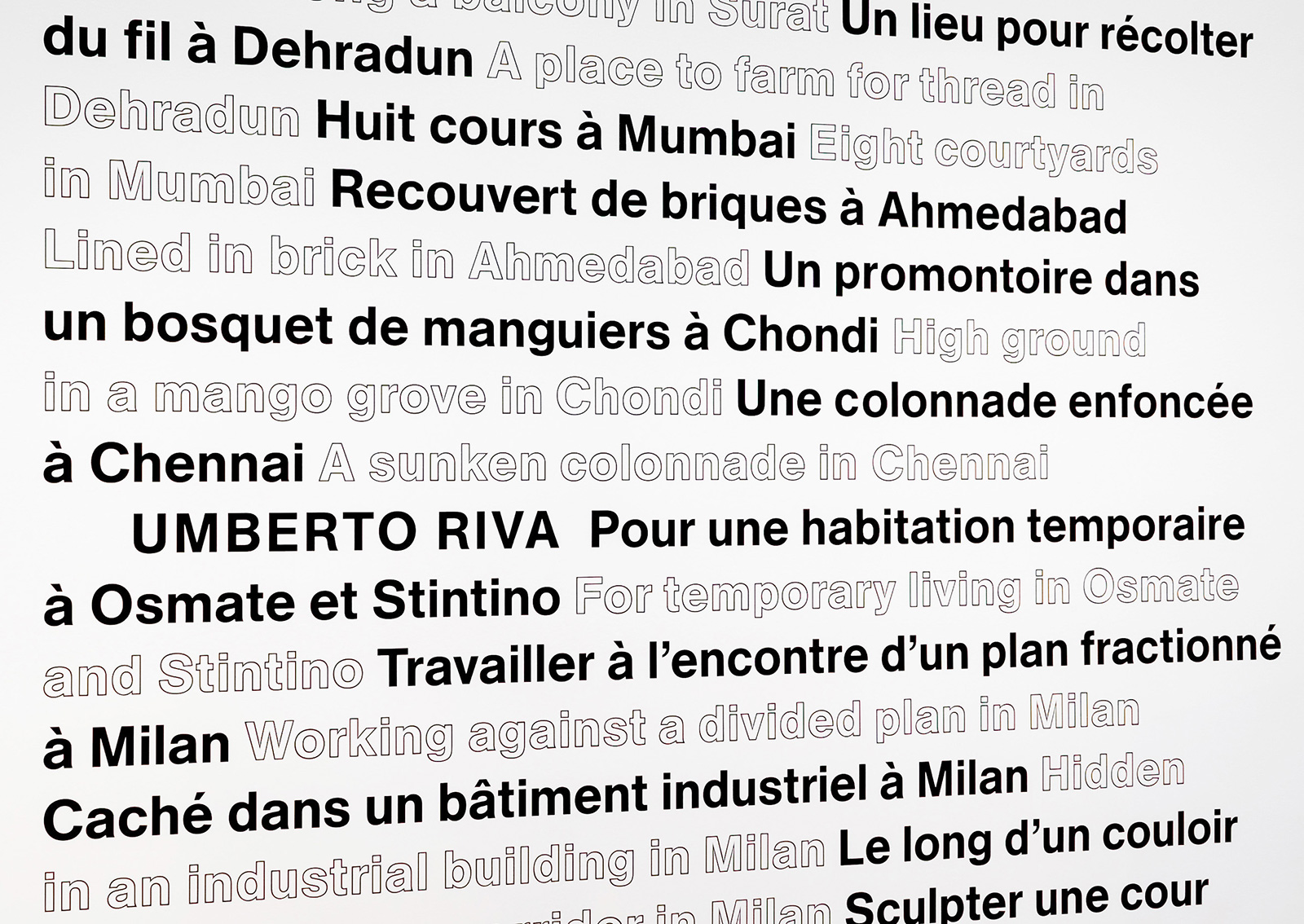
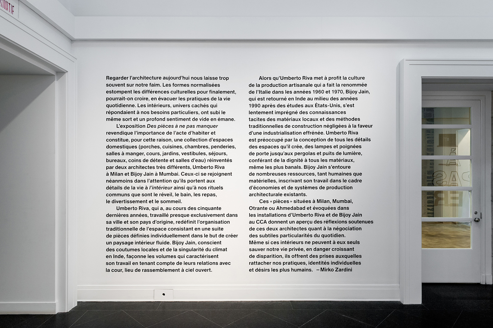
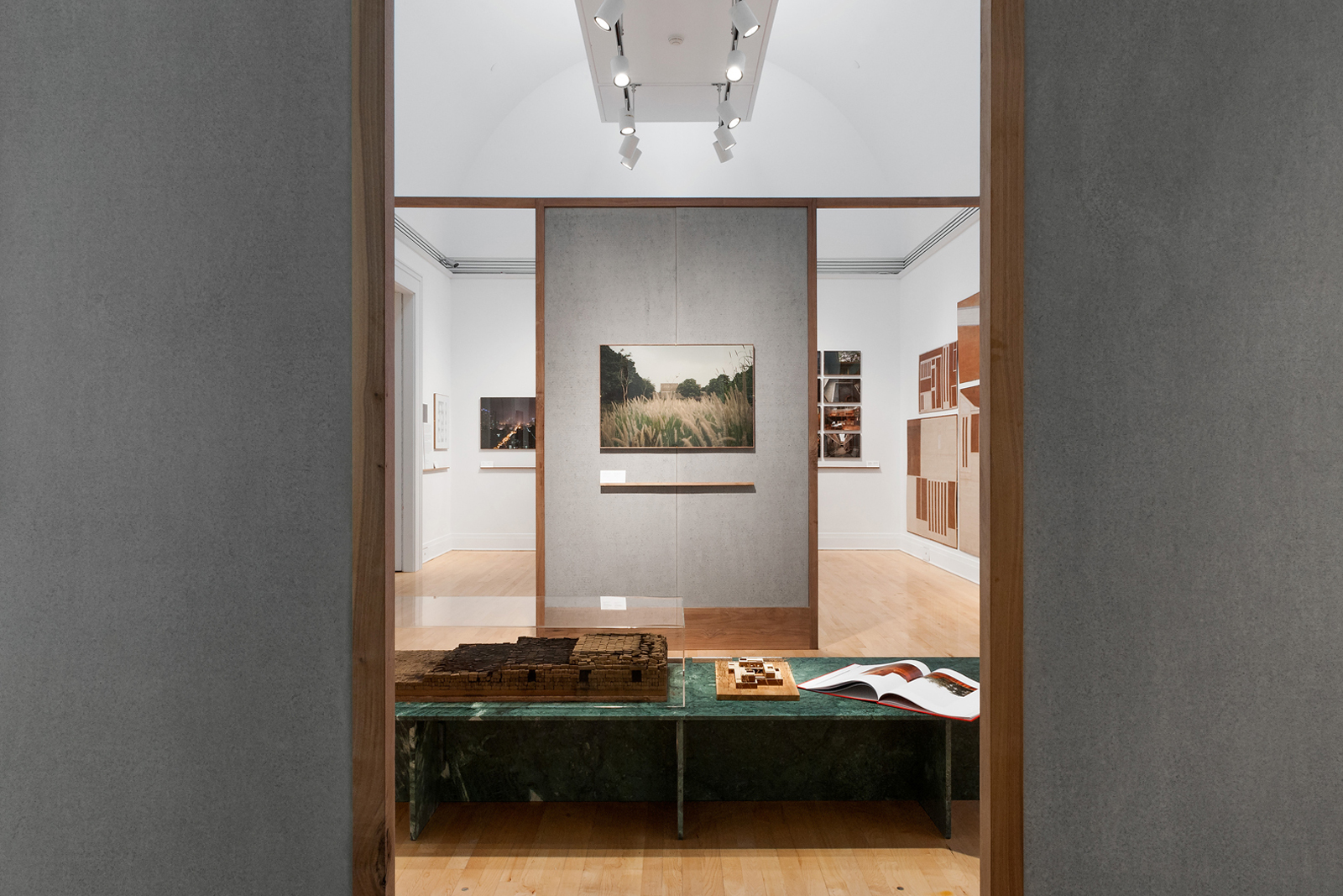
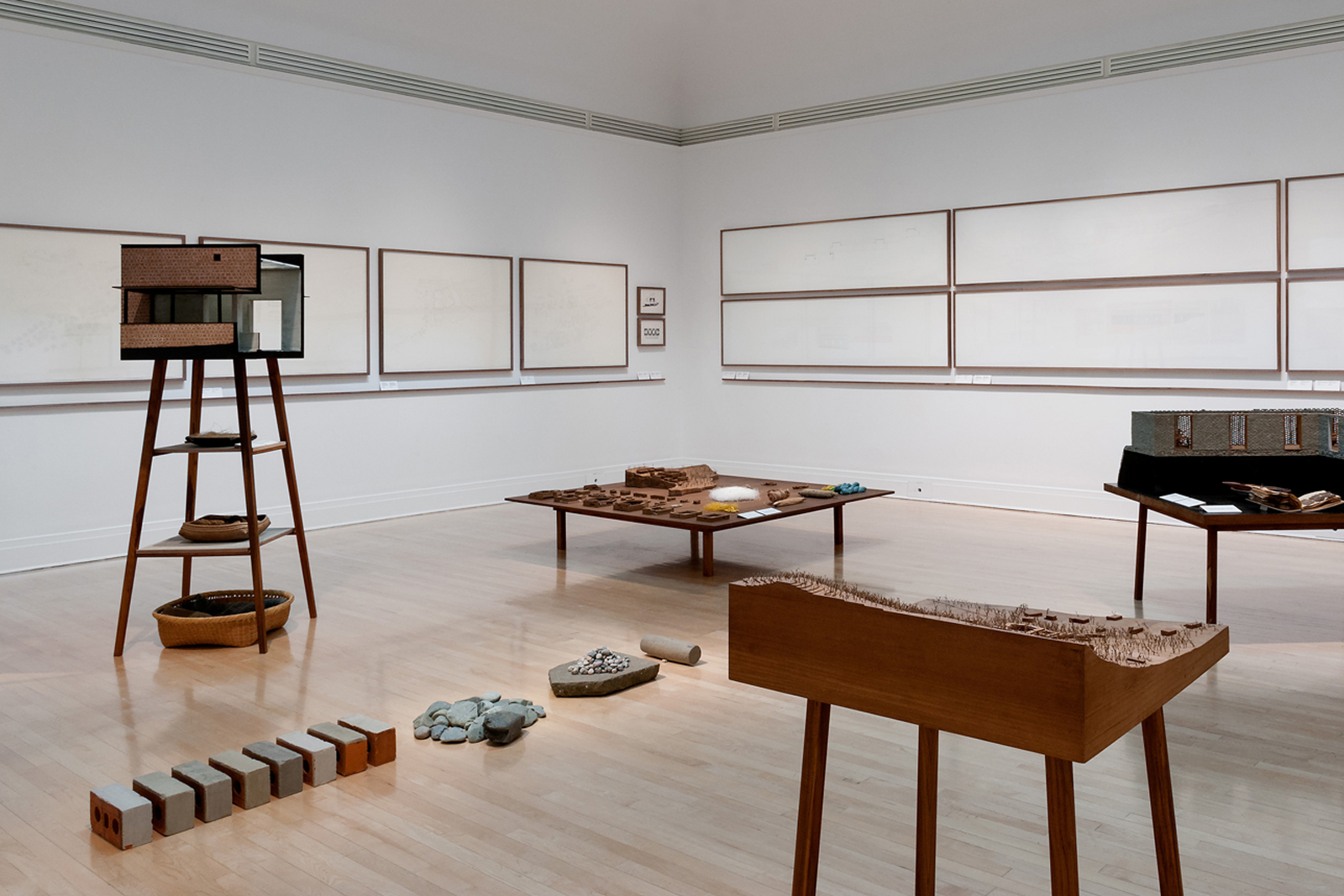
ROOMS YOU MAY HAVE MISSED for CANADIAN CENTRE FOR ARCHITECTURE — Architects from two distinct urban centers, Umberto Riva from Milan and Bijoy Jain from Mumbai, are brought together via their shared approach to domestic spaces, and a parallel interest in local artisans and construction techniques. The exhibition graphics seek to highlight latent similarities in their work by placing didactic texts and supporting materials on a unified shelf, connecting the two disparately designed galleries and providing a clear entry point for visitors.
Mirko Zardini, Curator
Umberto Riva with Emilio Scarano and Bijoy Jain with Mitul Desai, Installations
Common Name, Graphic Design
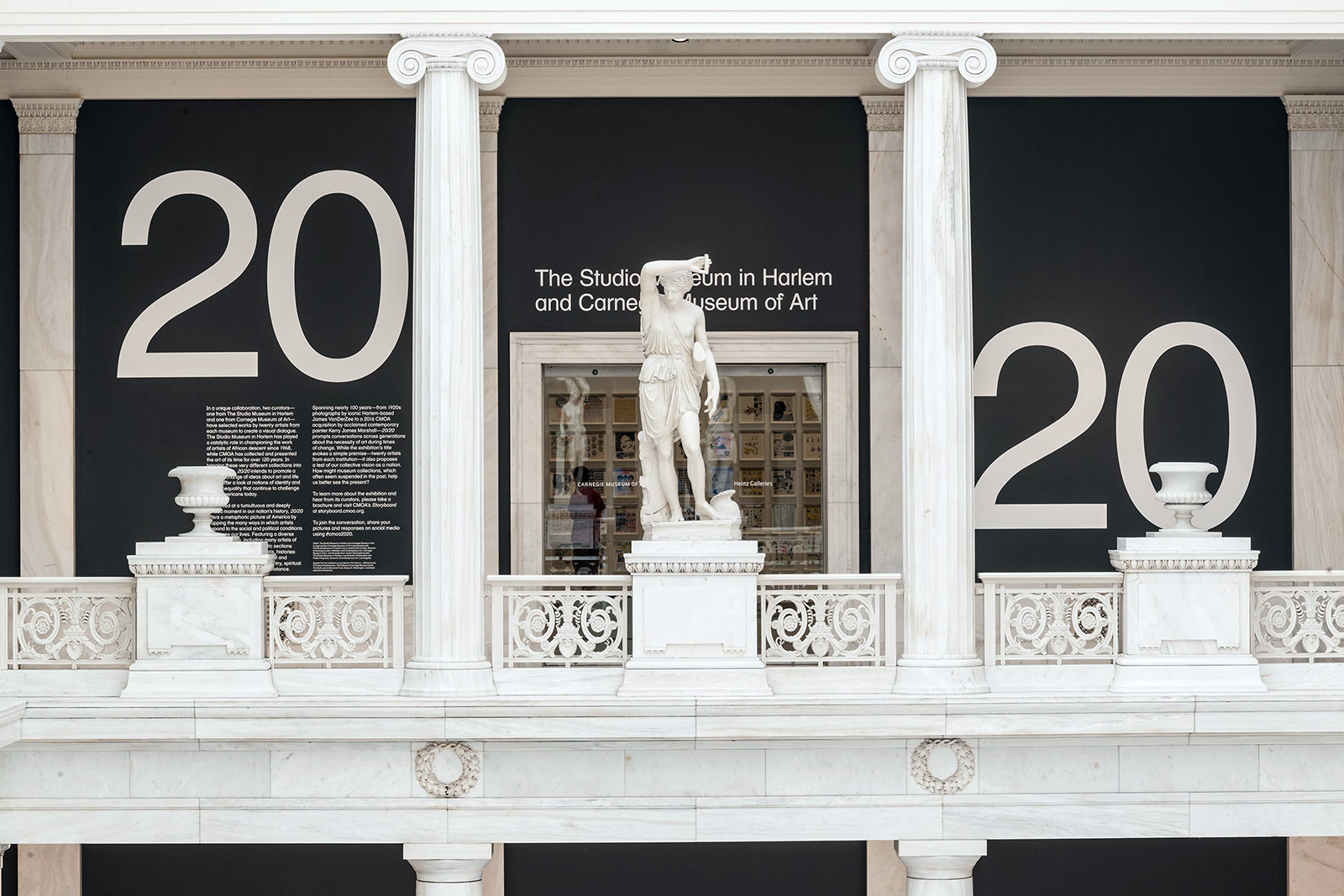
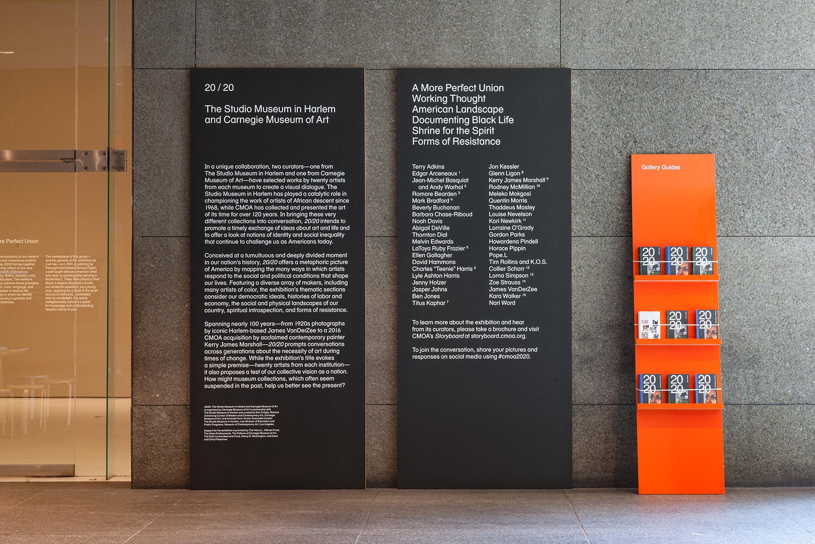
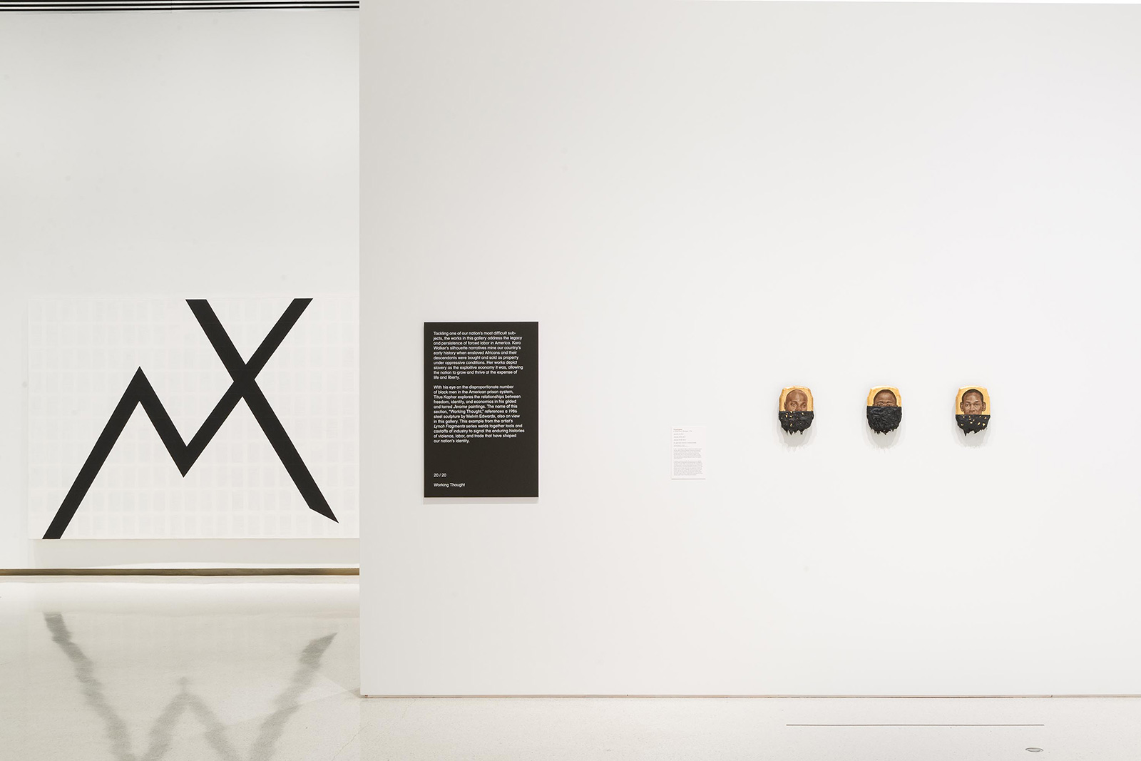
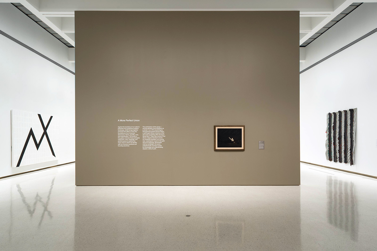
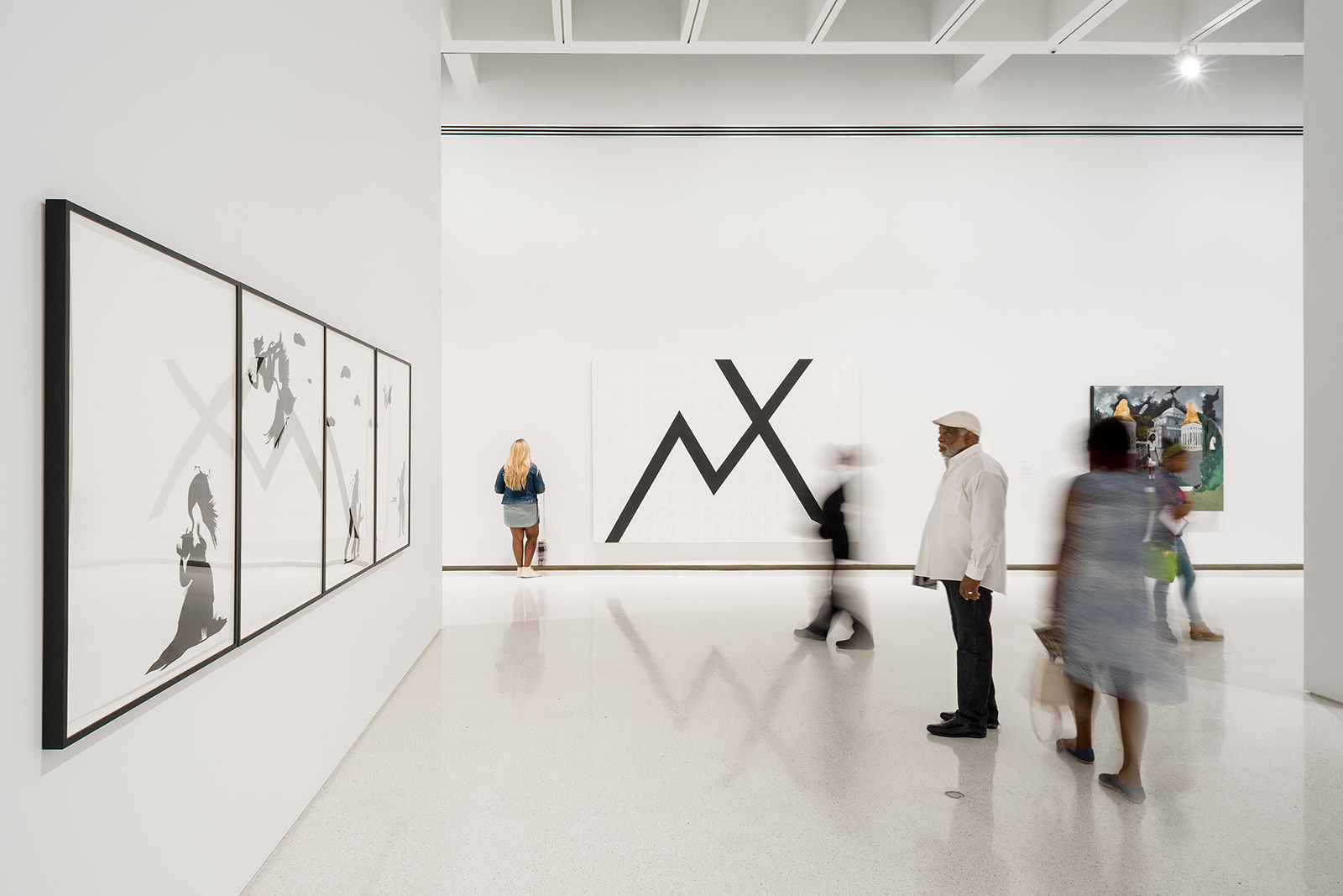
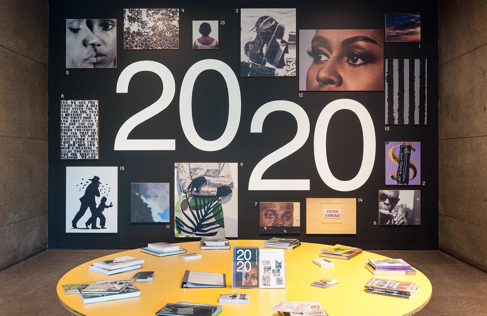
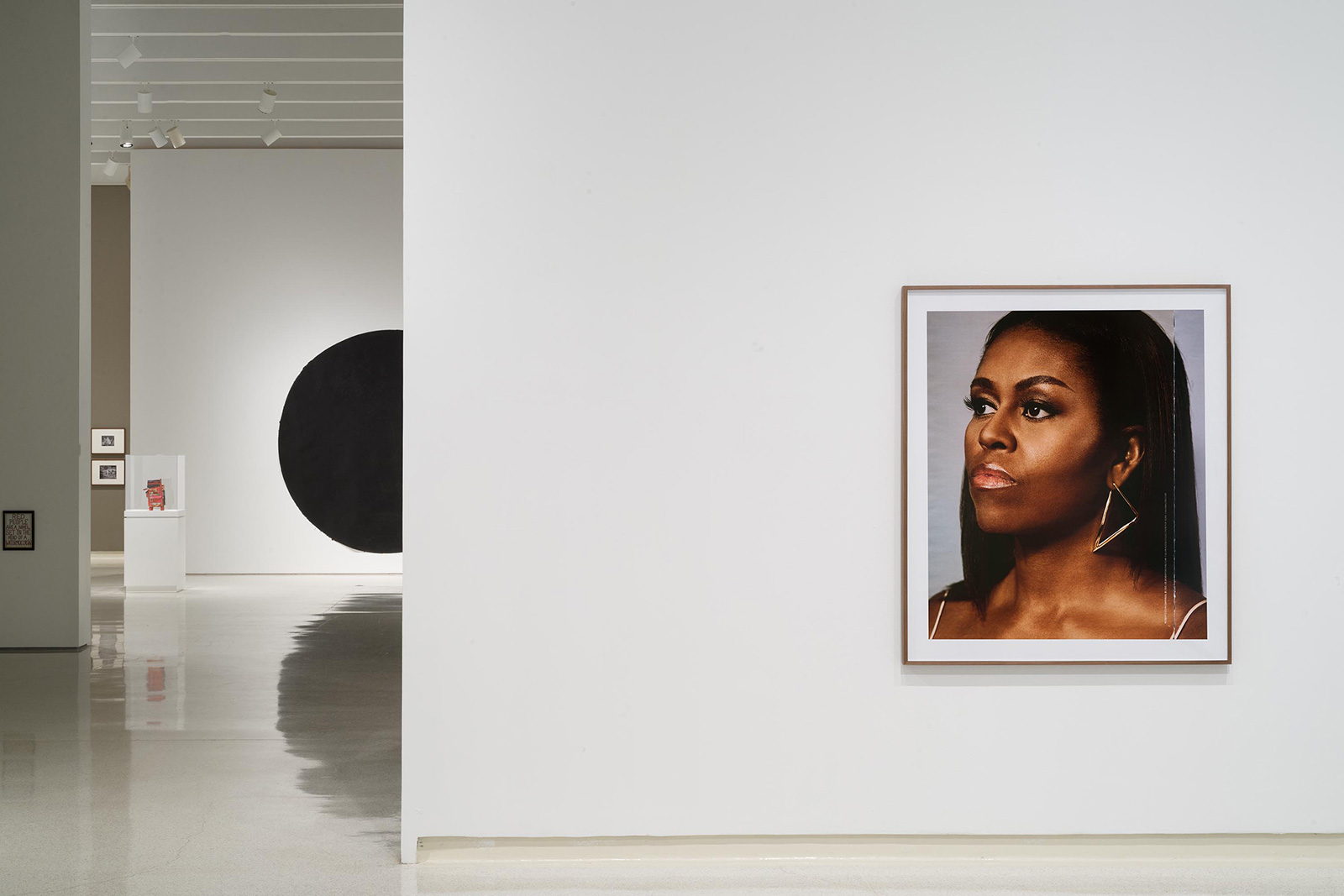
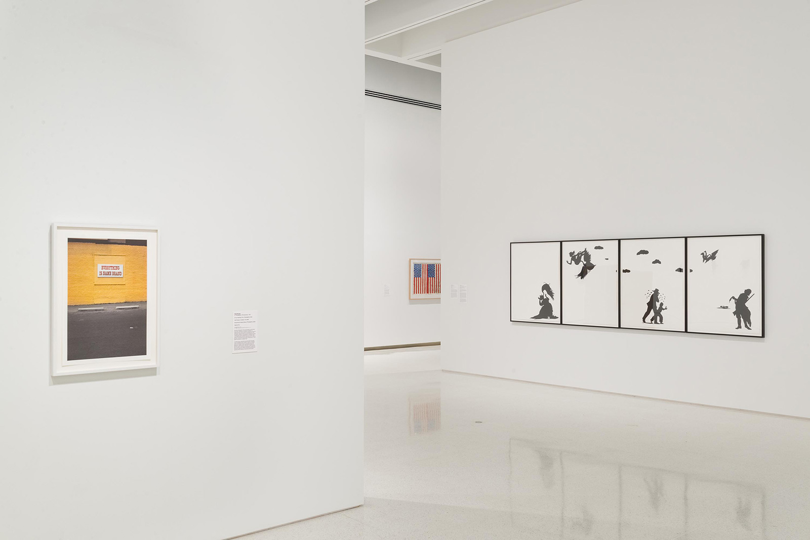
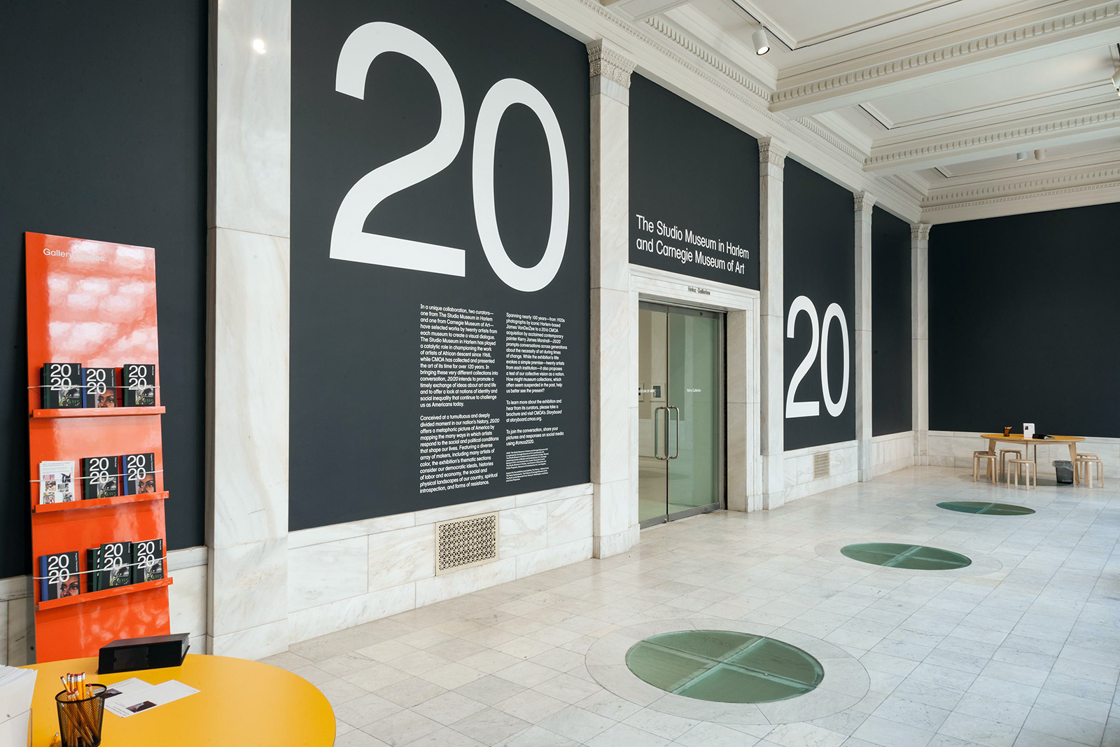
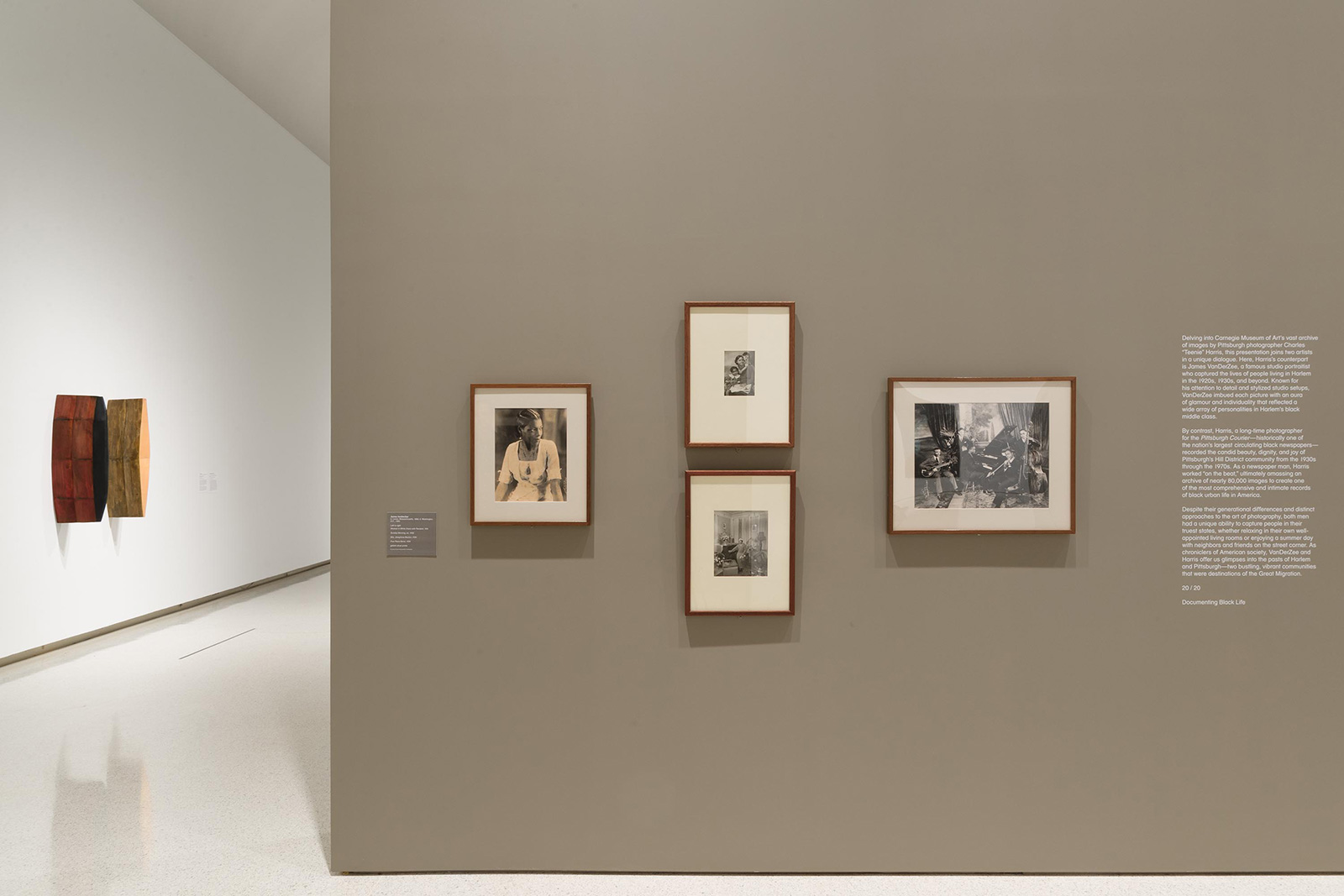
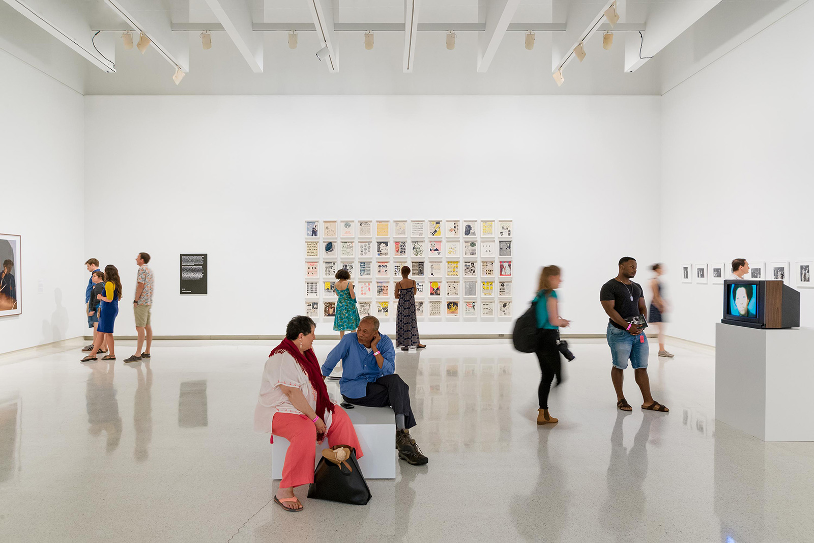
20/20 for CARNEGIE MUSEUM OF ART and STUDIO MUSEUM HARLEM — At a time of deep political and social discord in America, this wide-ranging exhibition mounts twenty works from each institution in a collaborative first, presenting an alternate history of the country exclusively through the lens of African-American artists. The exhibition graphics highlight the multitude of eras, styles, and perspectives included in the show by isolating disparate visual details which are then keyed to an index of participants in the entryway. Color coding on the edges of these details, on didactic panels, and in the accompanying gallery guide link visitors back to the over-arching themes which help organize the galleries.

Eric Crosby, Amanda Hunt, Curators
Katie Reilly, Publications Director
Stephanie Ford, Matthew Newton, Editors
Hannah Turpin, Doris Zhao, Curatorial Assistants
Laurel Mitchell, Photography Research
Common Name, Graphic Design
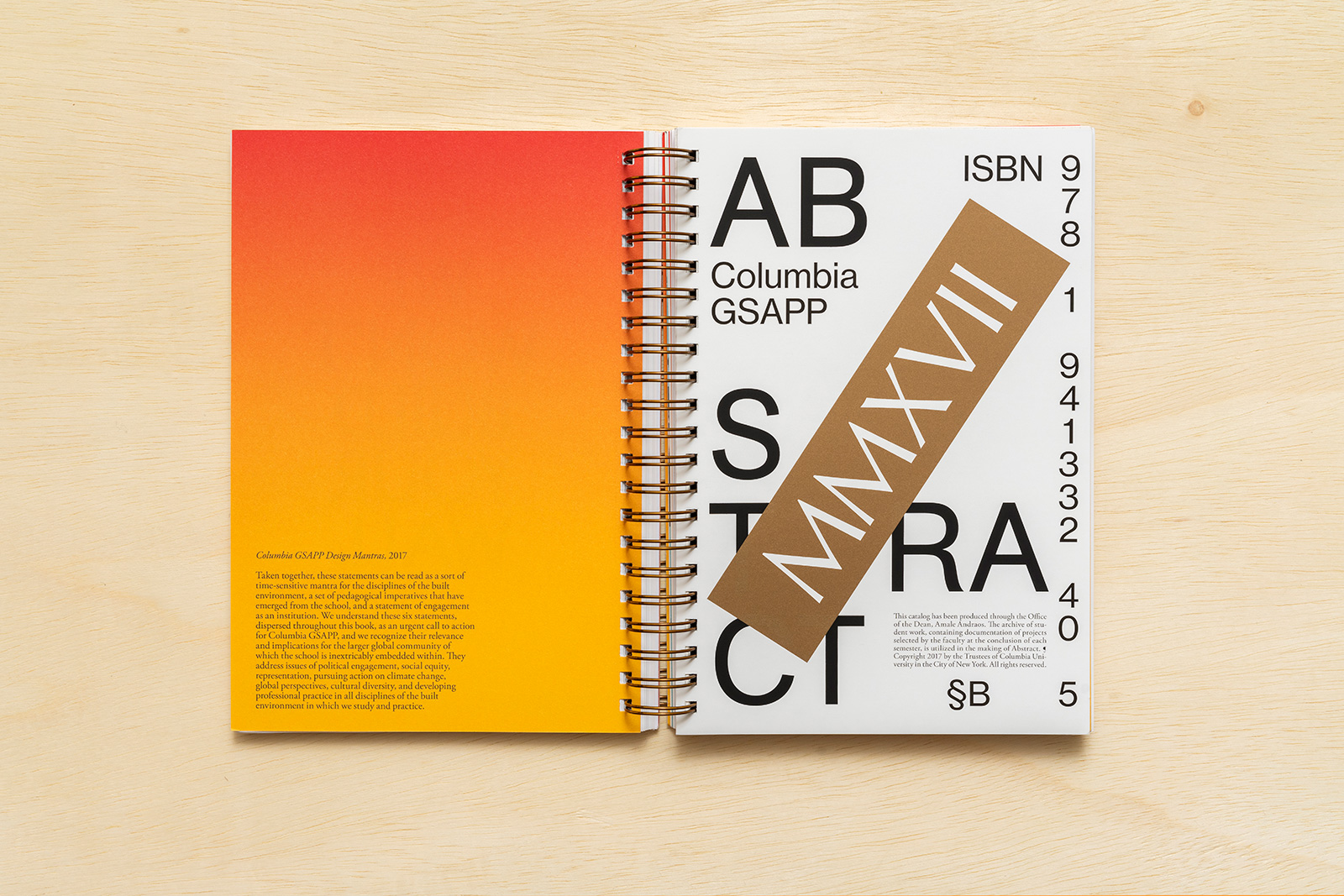
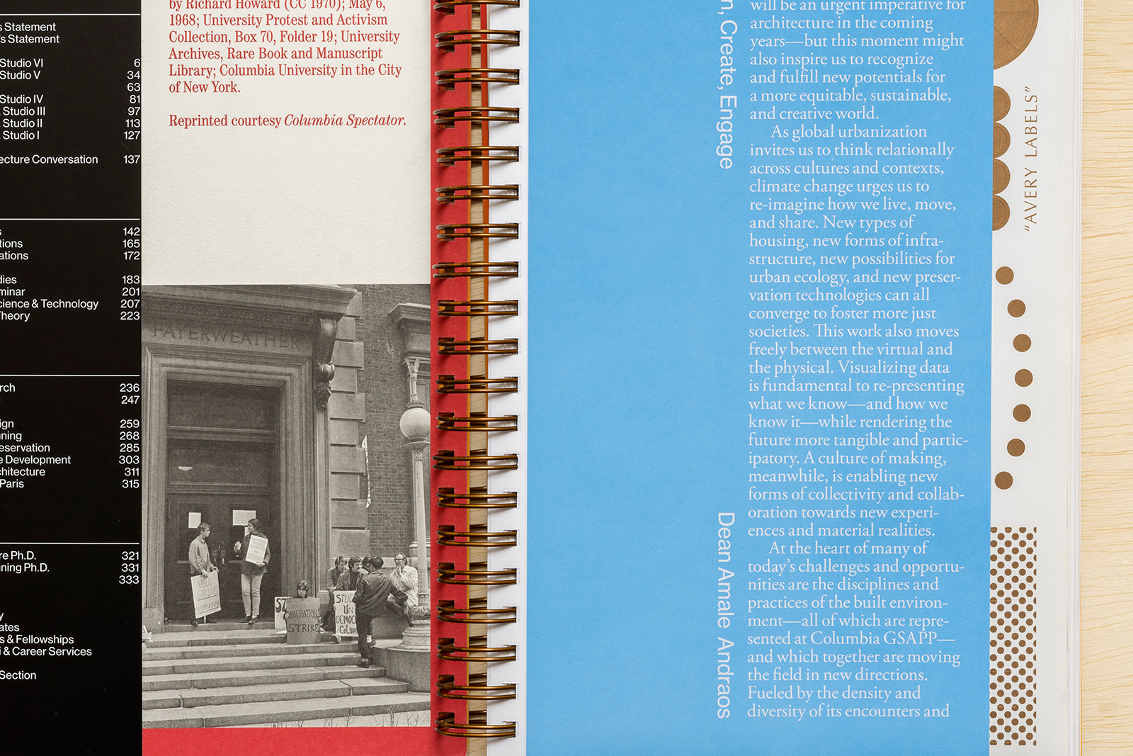
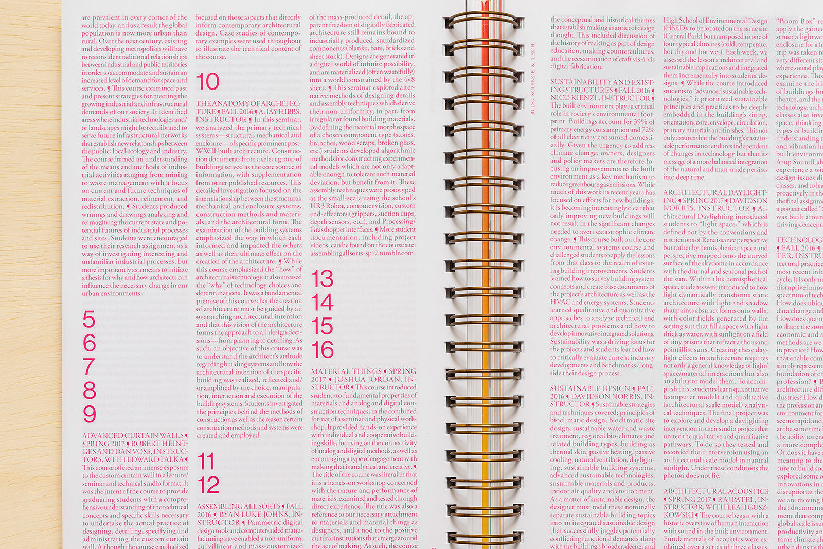
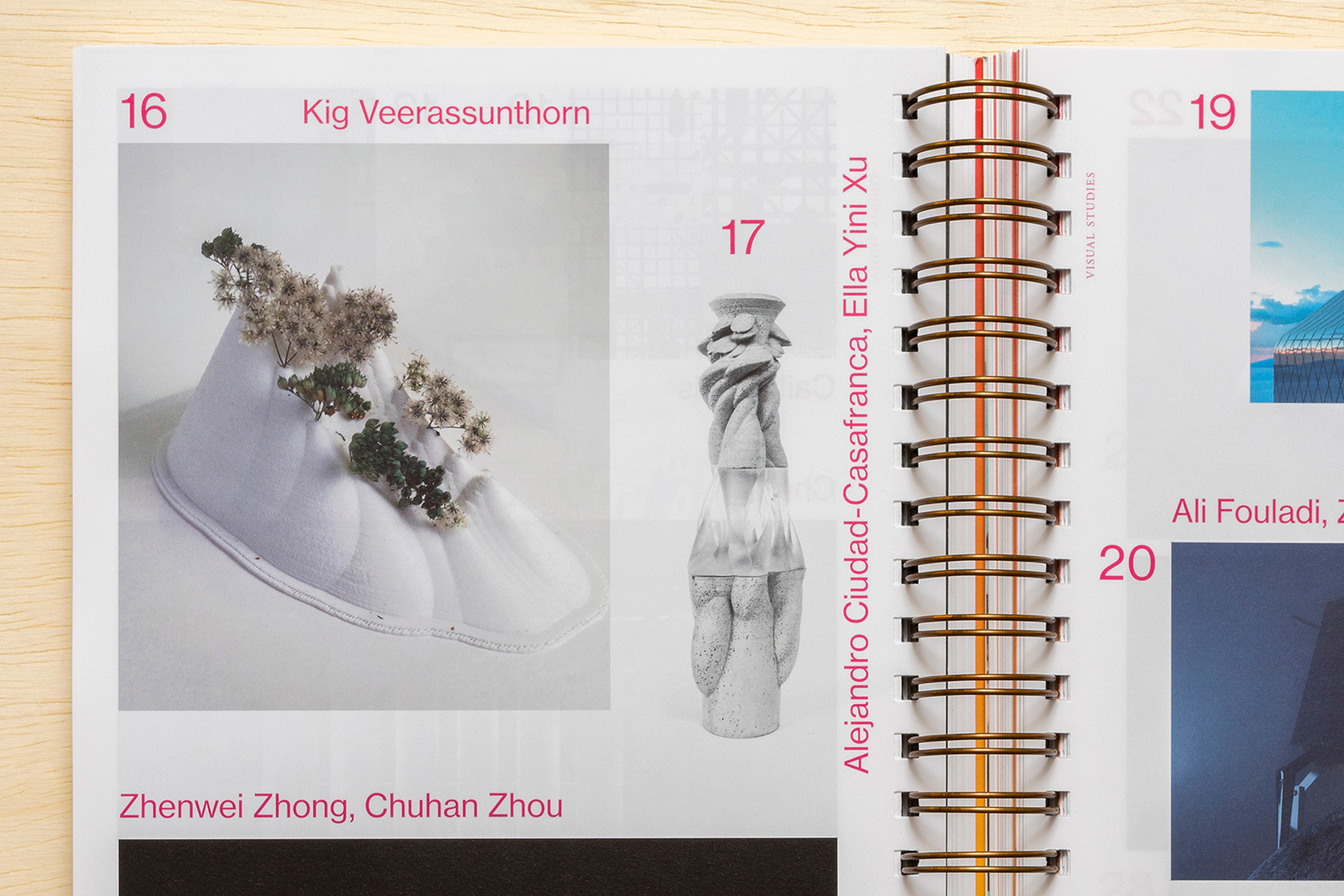
ABSTRACT 2017 for COLUMBIA GSAPP — Abstract is the long-running, annual compendium of student projects, applied research, events, and exhibitions from Columbia University’s Graduate School of Architecture, Planning, and Preservation (GSAPP). Overseen by the Office of the Dean, and edited in part by a growing list of notable faculty, Abstract showcases studios, electives, and departments from all across the school. Conceived of as a reflection of GSAPP’s unique organizational model, the book’s binding allows for multiple covers, multiple materials (and interruptions), and multiple points of entry.

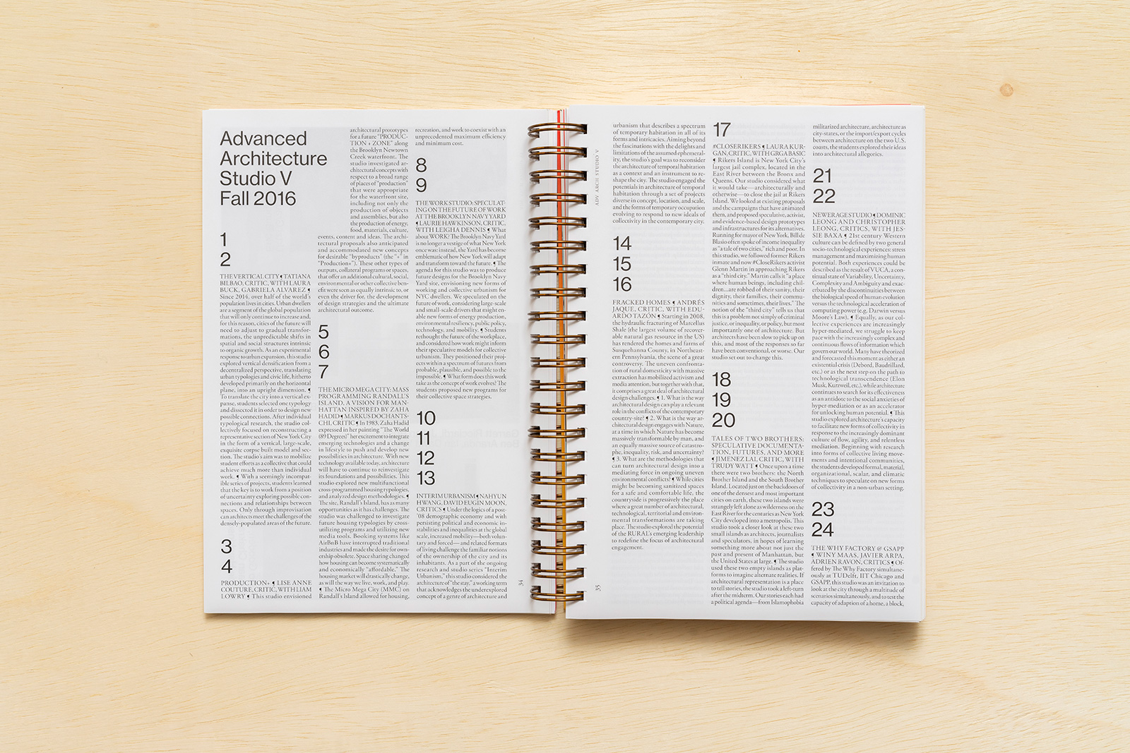
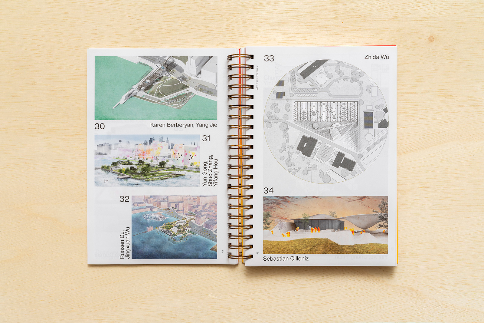
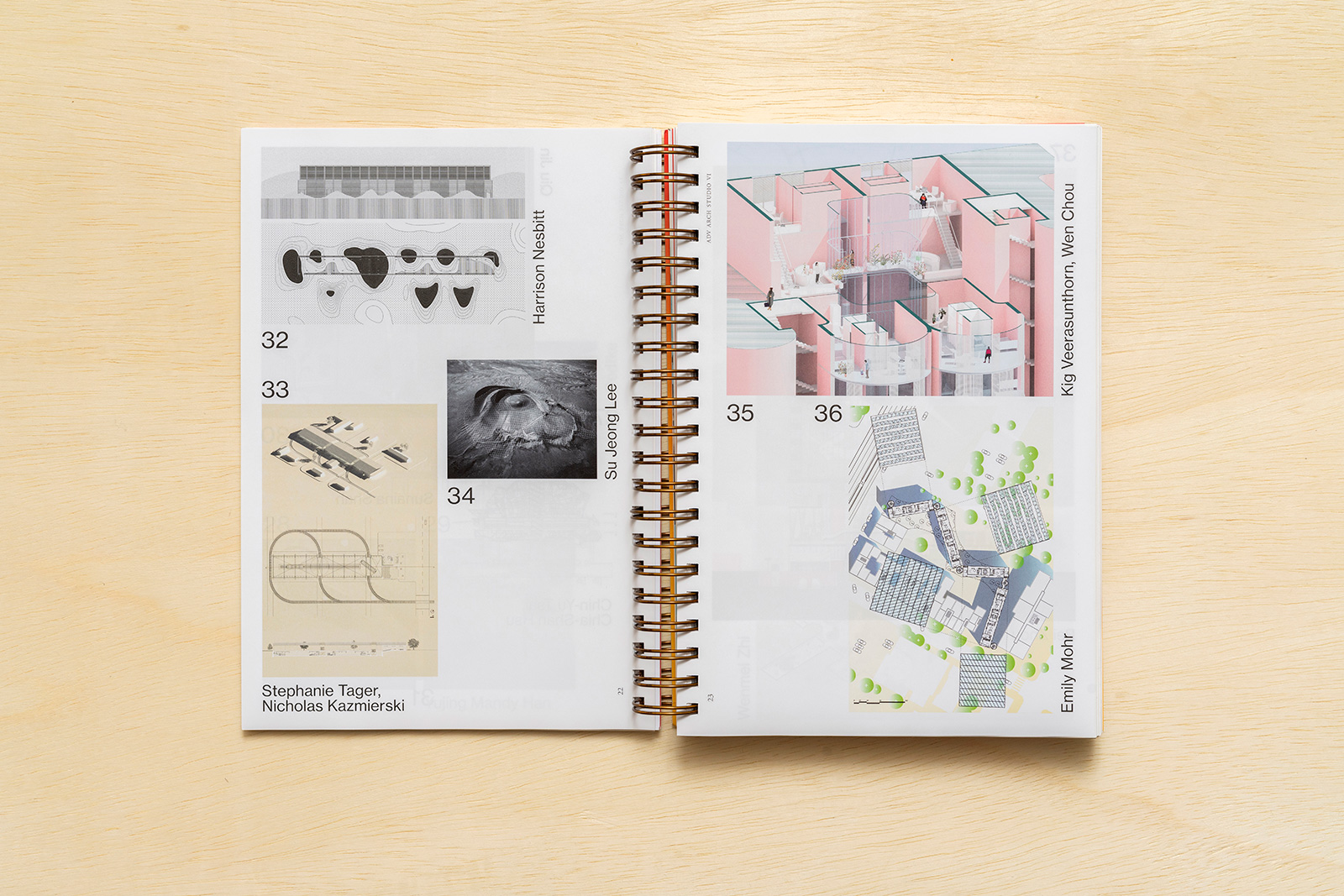
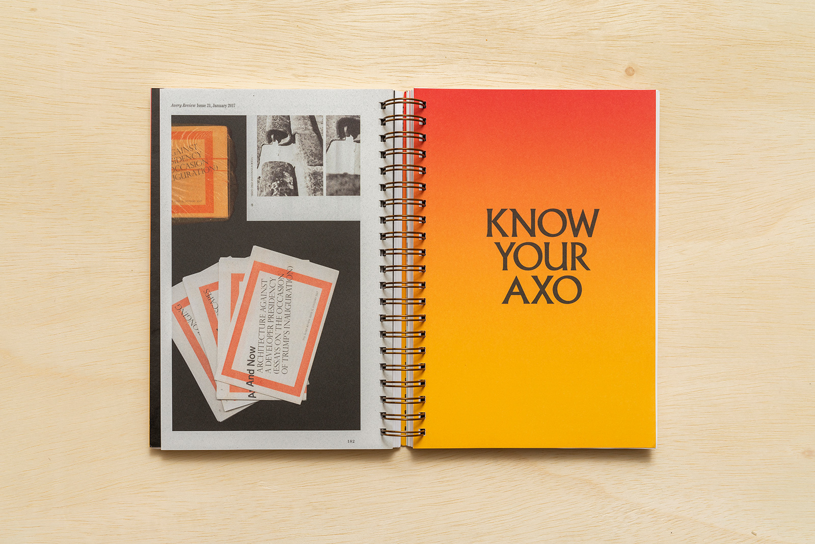
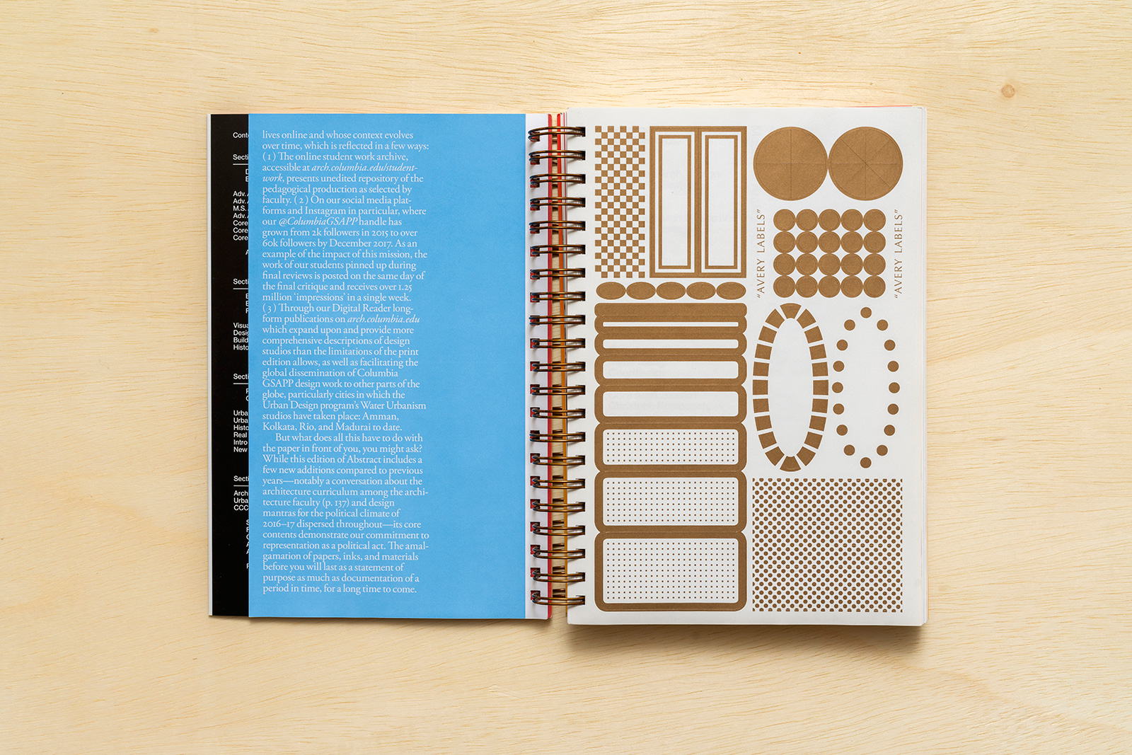
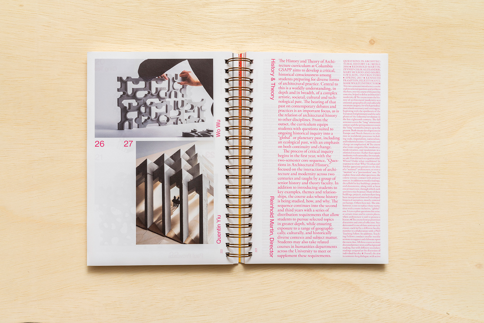
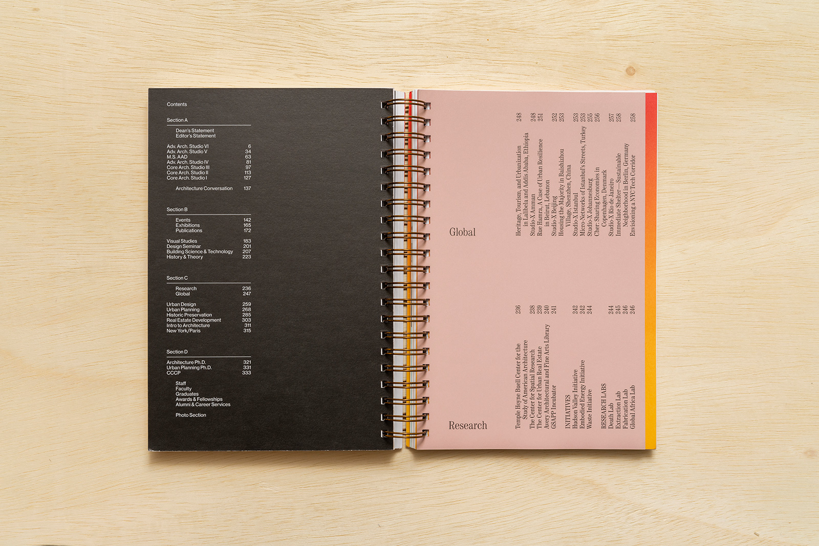
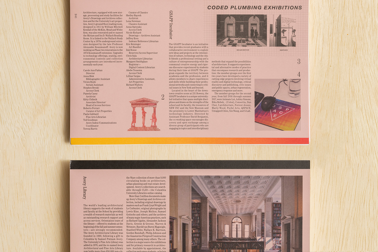
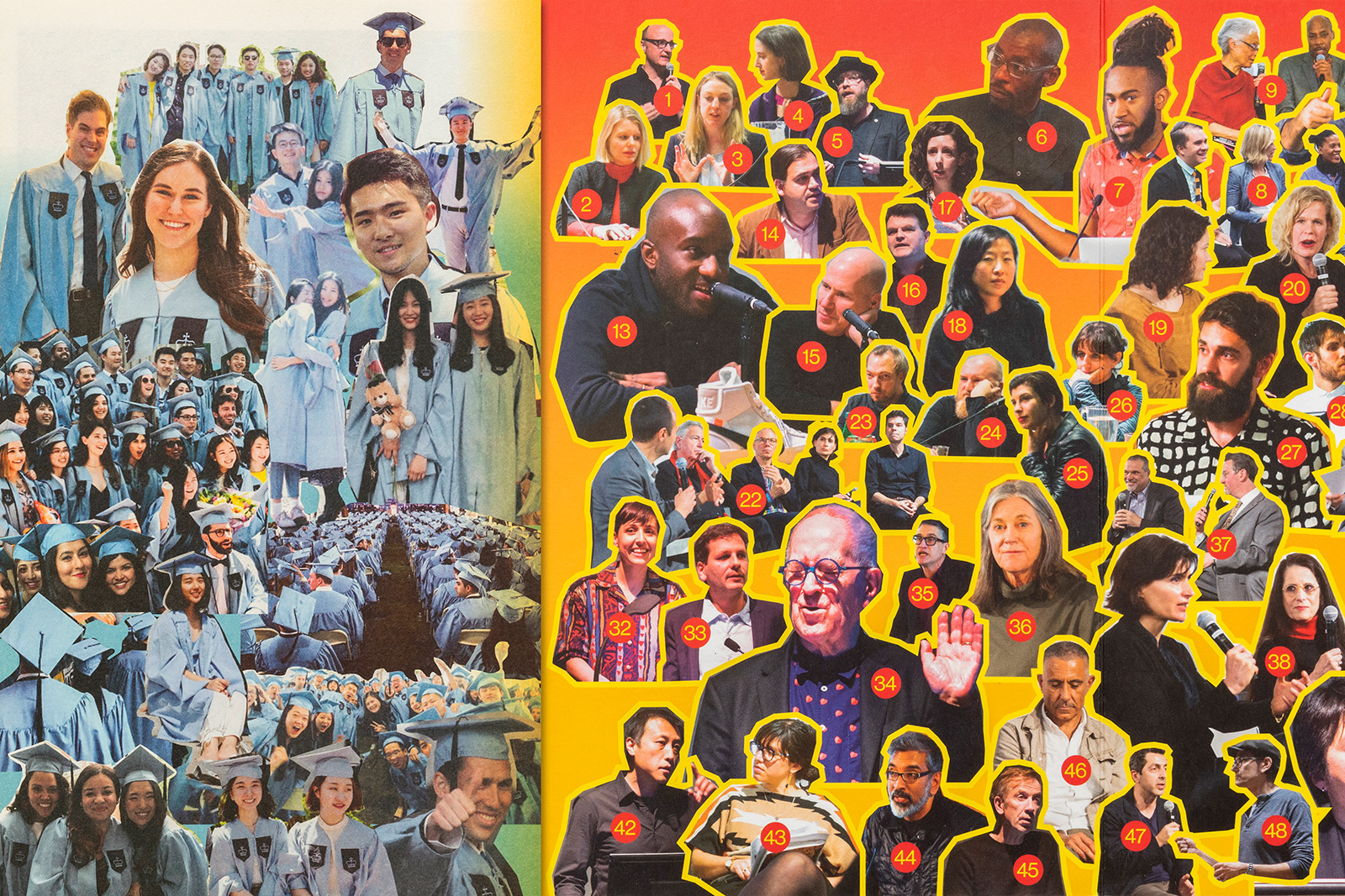
Amale Andraos, Dean, Columbia GSAPP
Shannon Werle, Editor
Common Name, Book Design

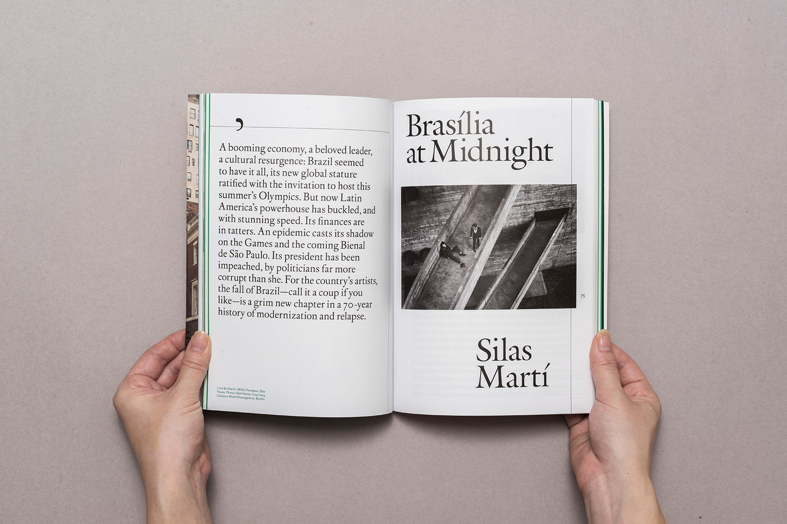
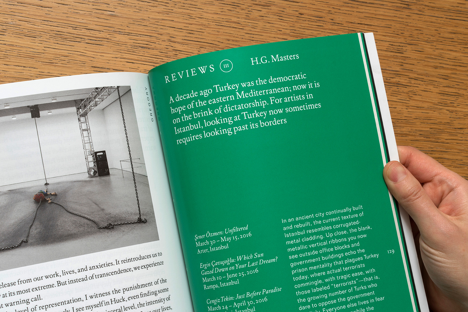
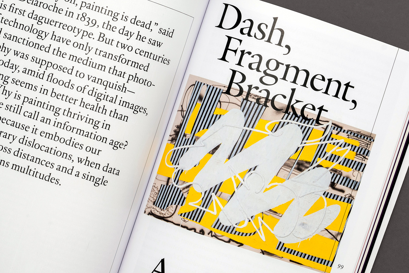
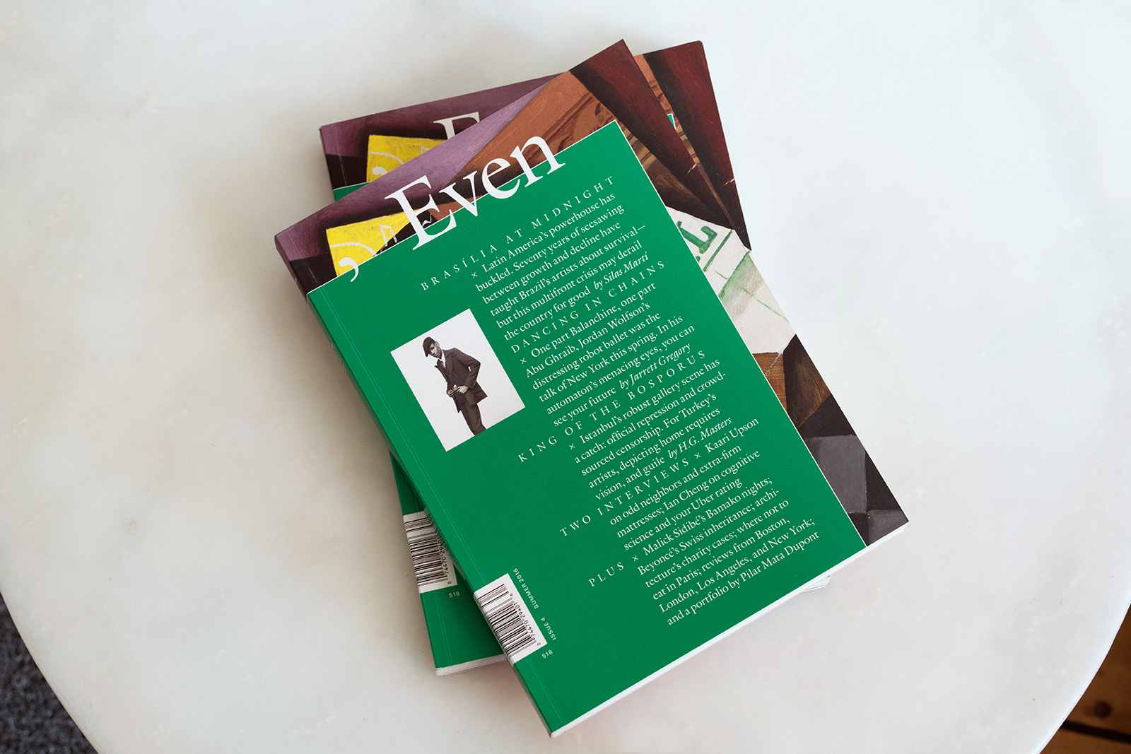
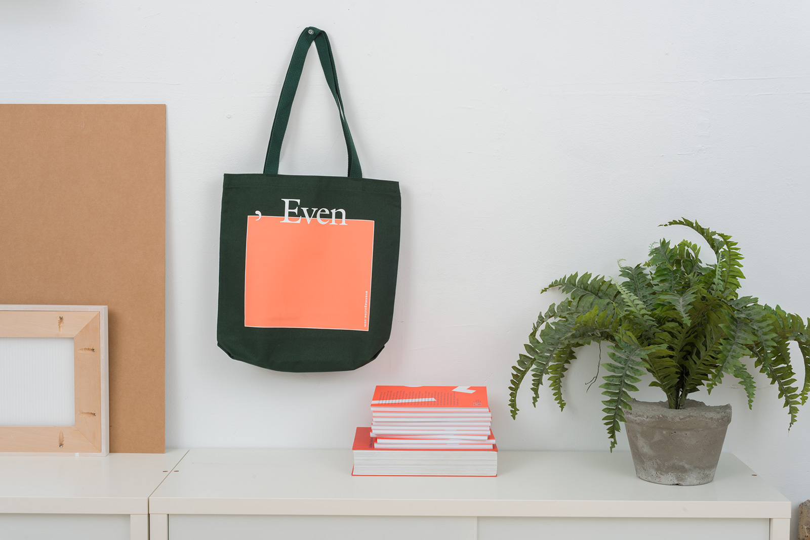
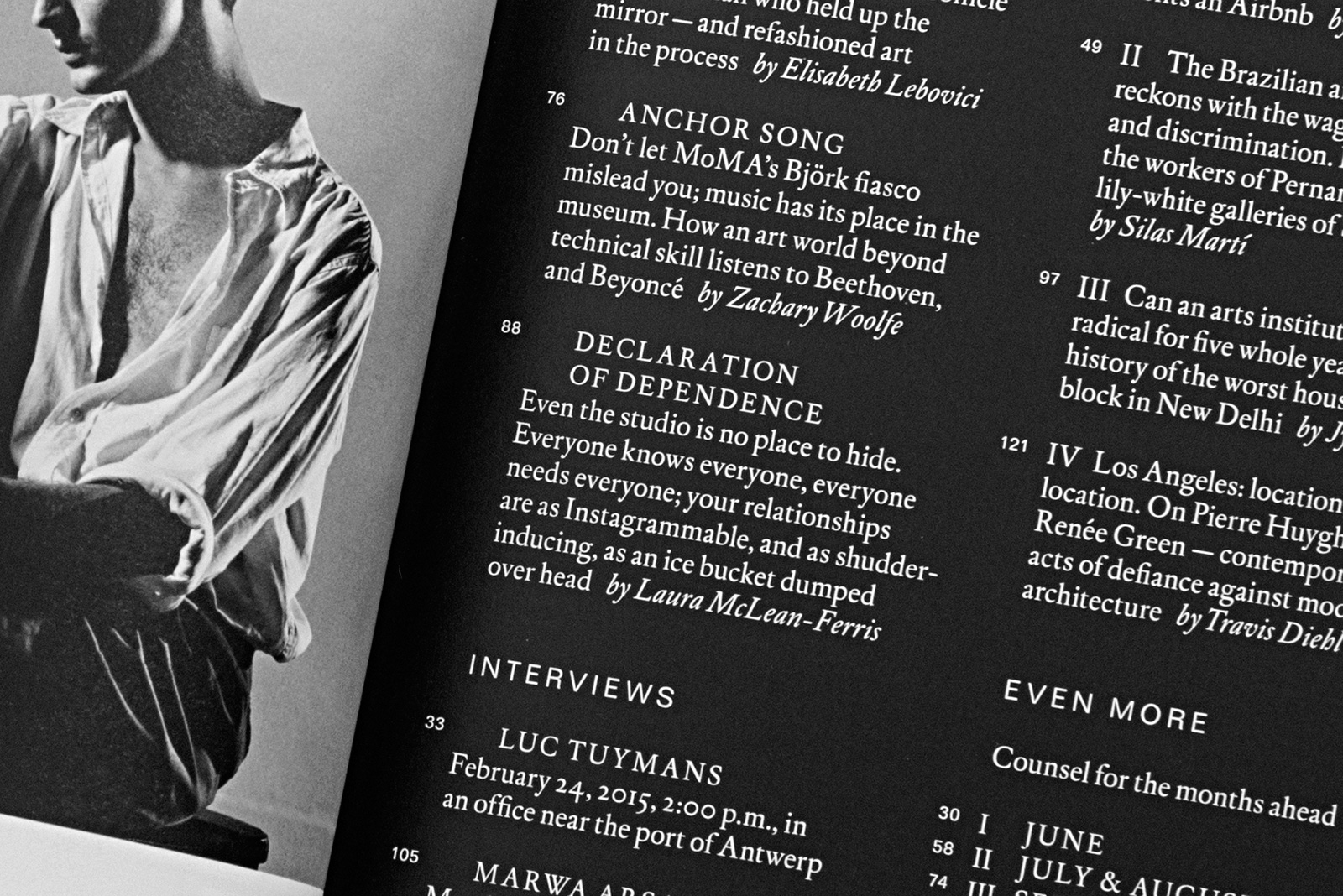
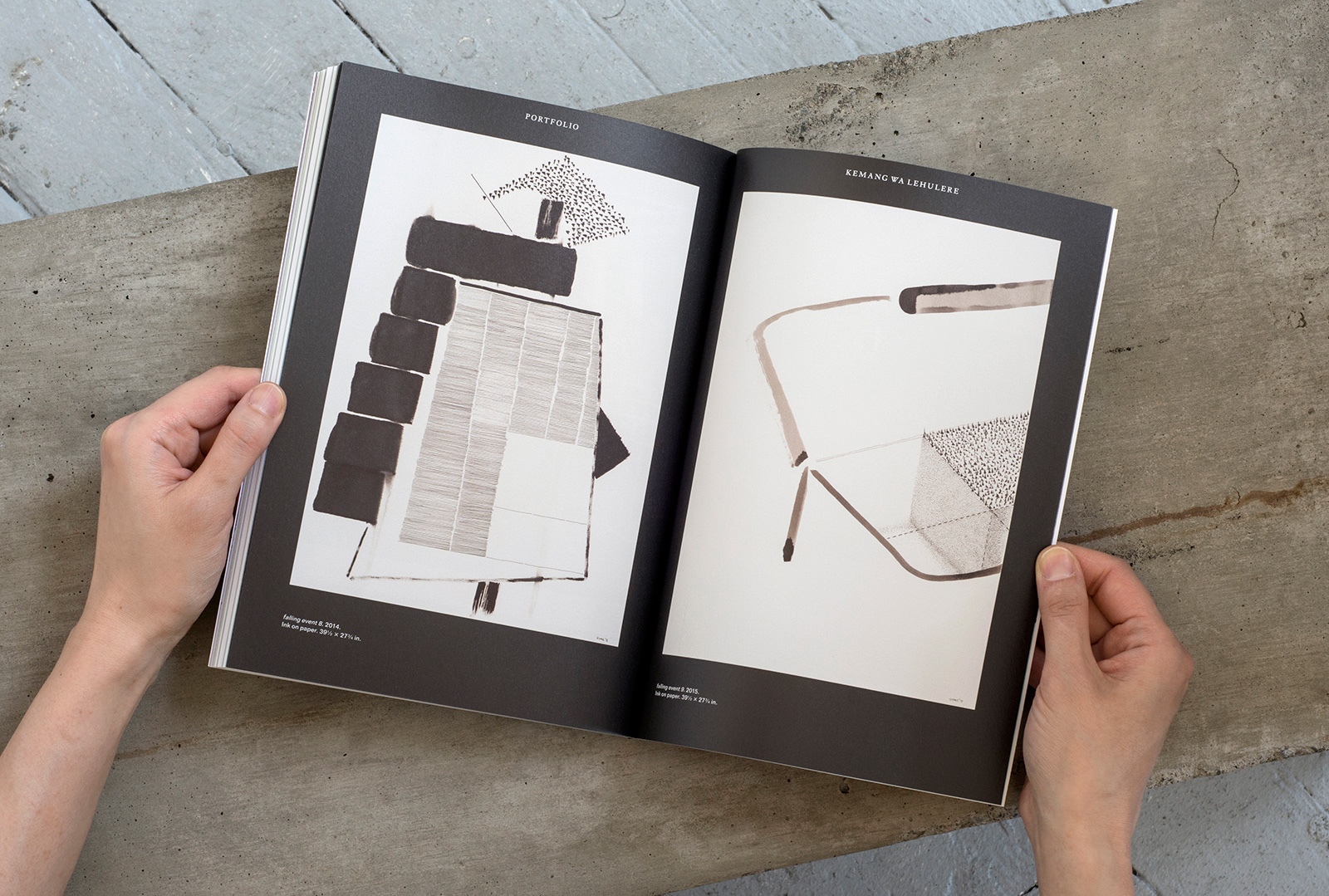
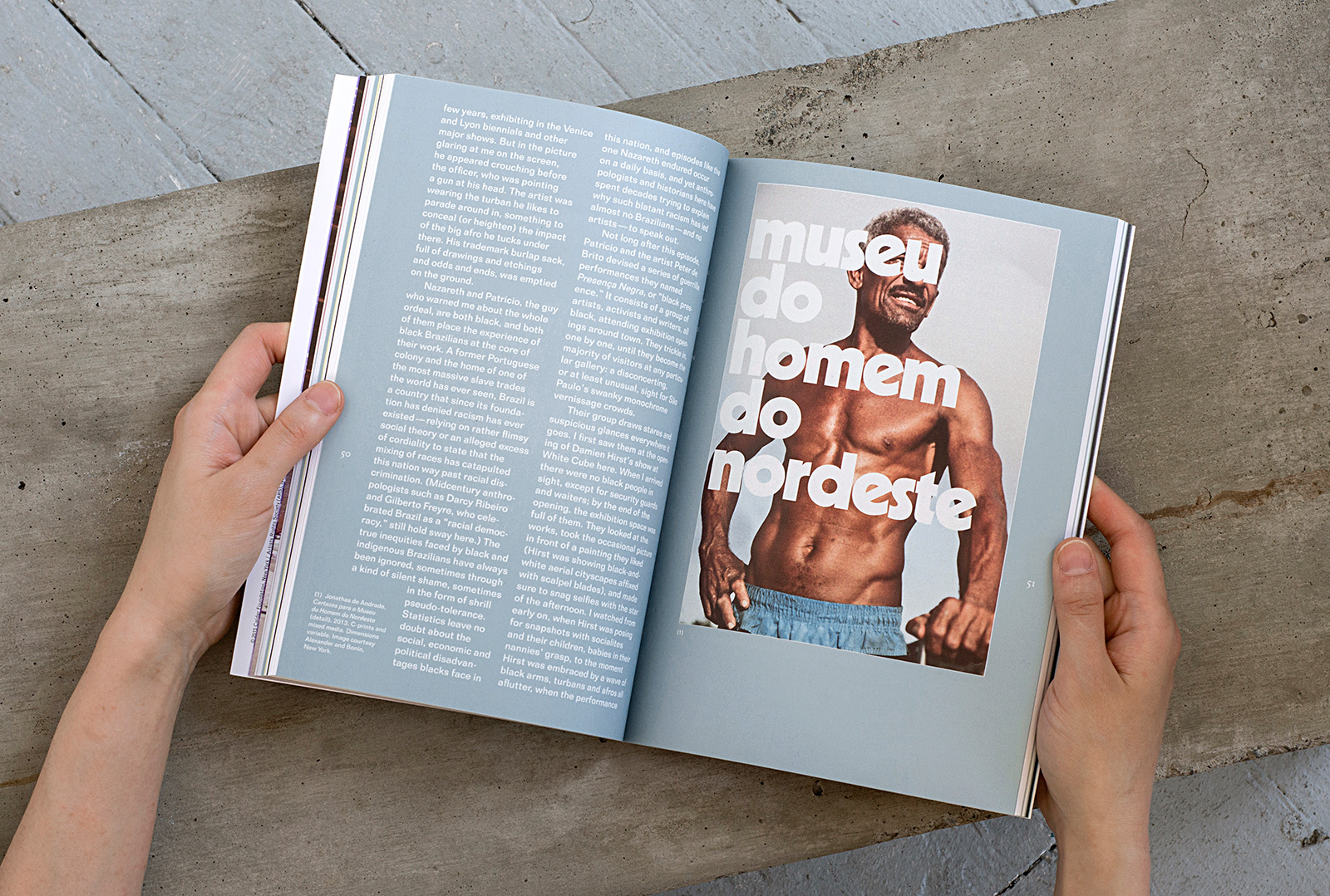
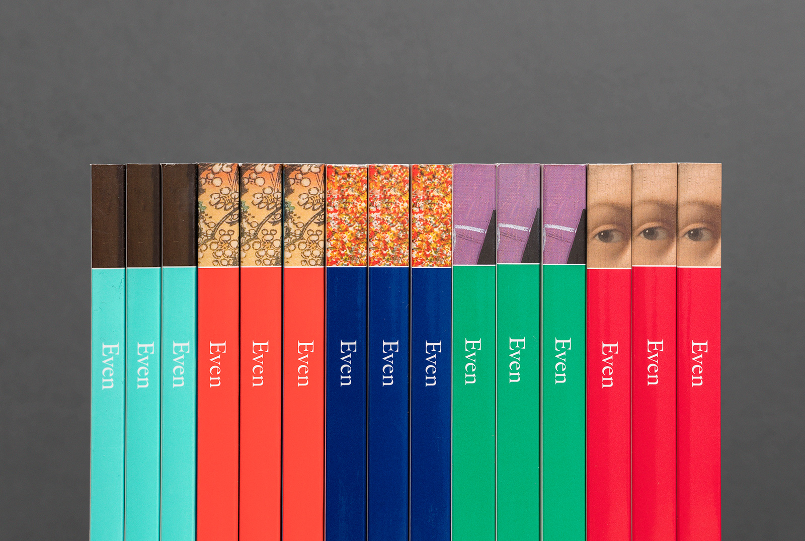
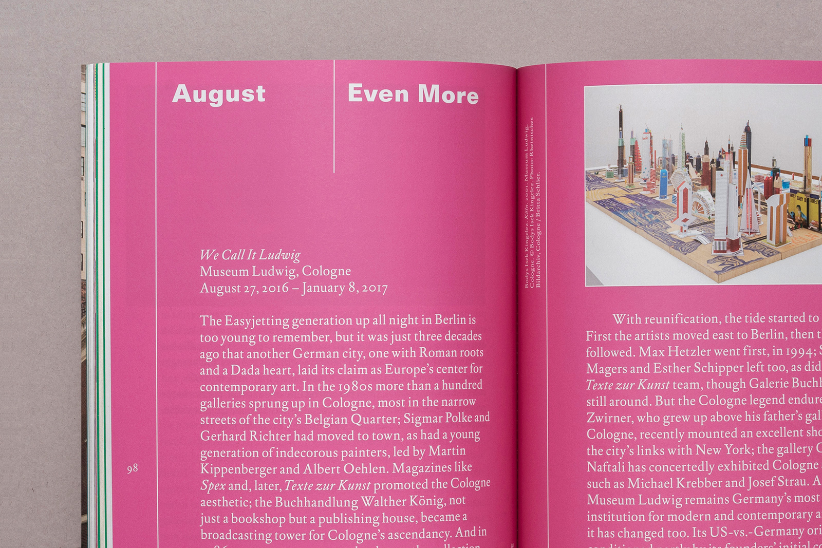
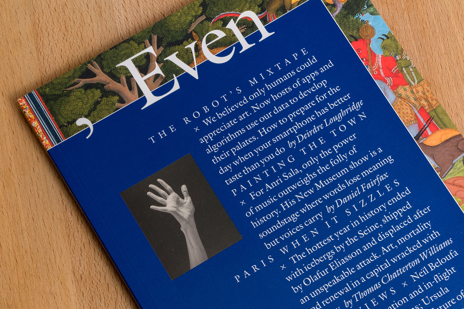
IDENTITY, MAGAZINE DESIGN, and WEBSITE for EVEN — Taking its title from one of Duchamp’s most iconic works, Even is a contemporary art periodical situated somewhere between the slick, coffee table set and and those dry, impenetrable academic journals. The magazine’s strength is in globally-focused long-form criticism, in-depth interviews, and emerging artist portfolios; they take a stand against the lazy reprinting of exhibition blurbs and installation shots culled from press releases that plague so many visual culture publications. The layout inverts the established hierarchy of an art magazine by foregrounding text over image, a strategy present right on the cover, where the table of contents redacts the primary image, only hinting at what’s in discussion on the interior.
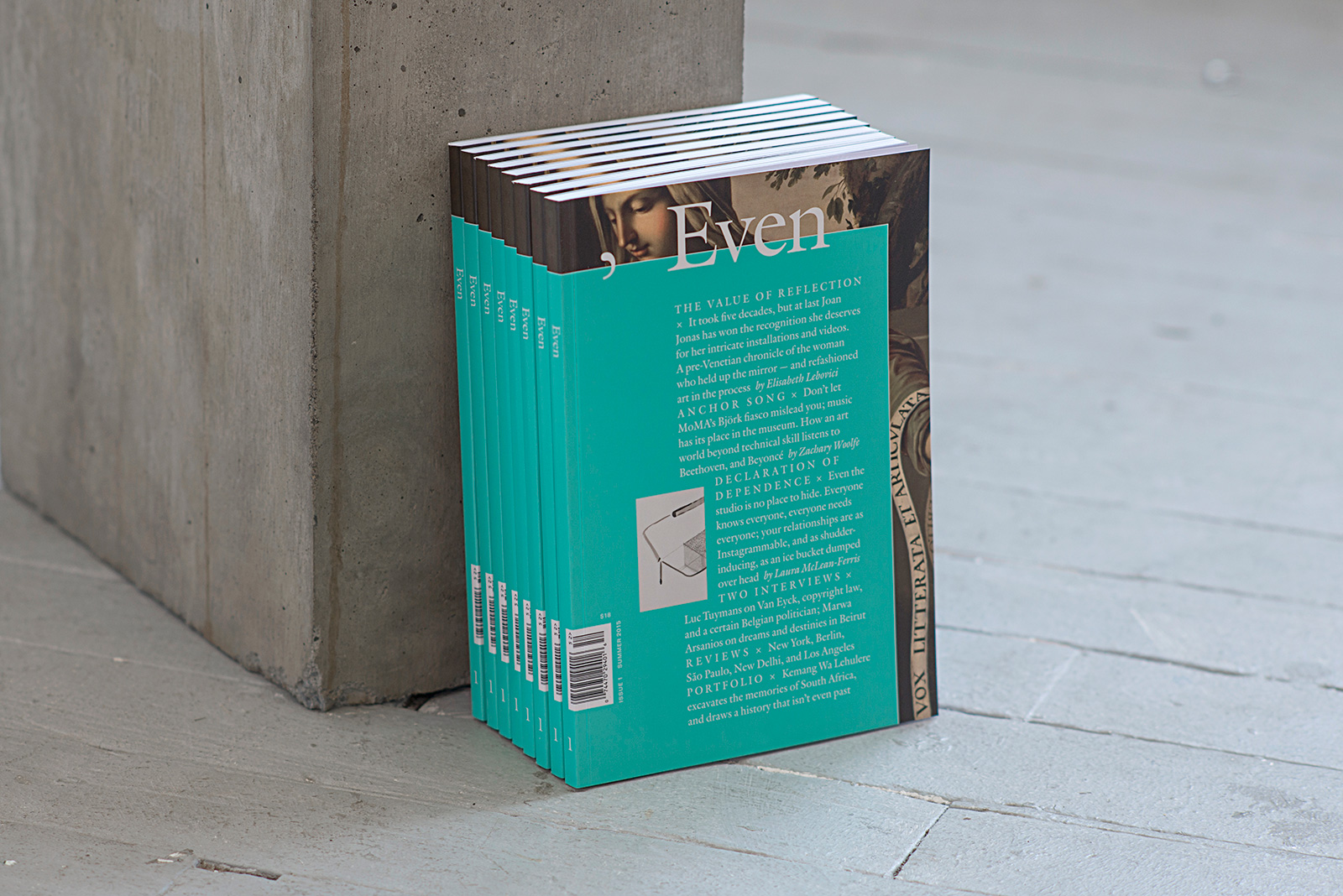
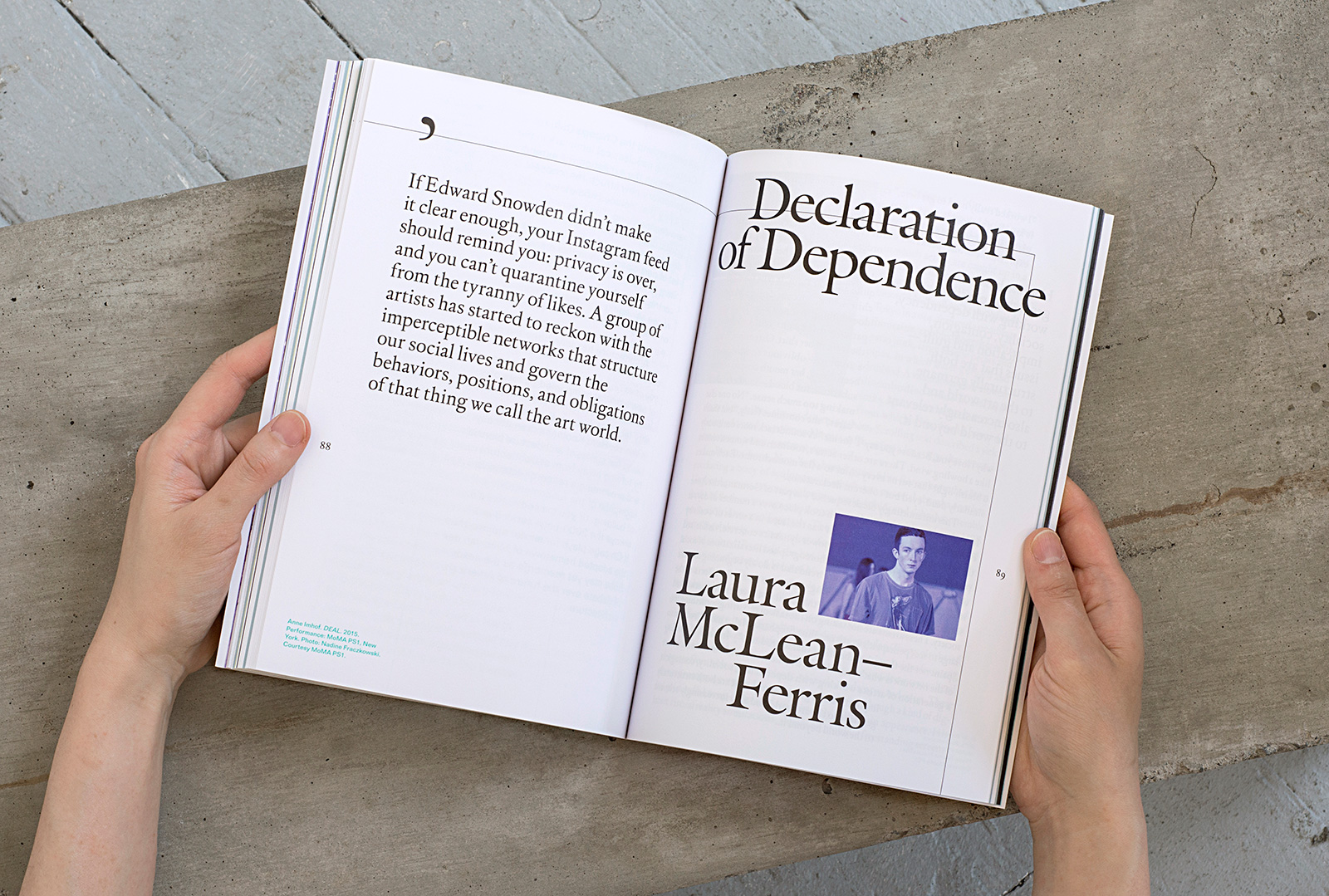
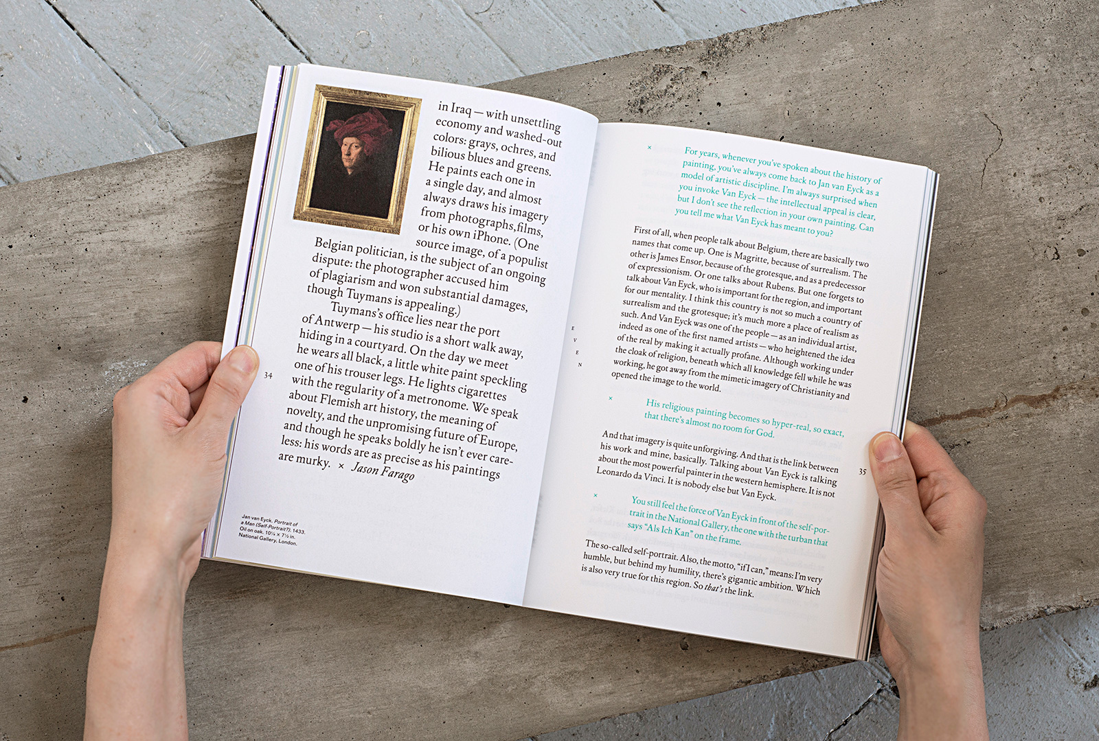
Jason Farago, Editor
Rebecca Siegel, Publisher
Abby Sandler, Producer
Rachel Poser, Editor-at-Large
Common Name, Graphic Design
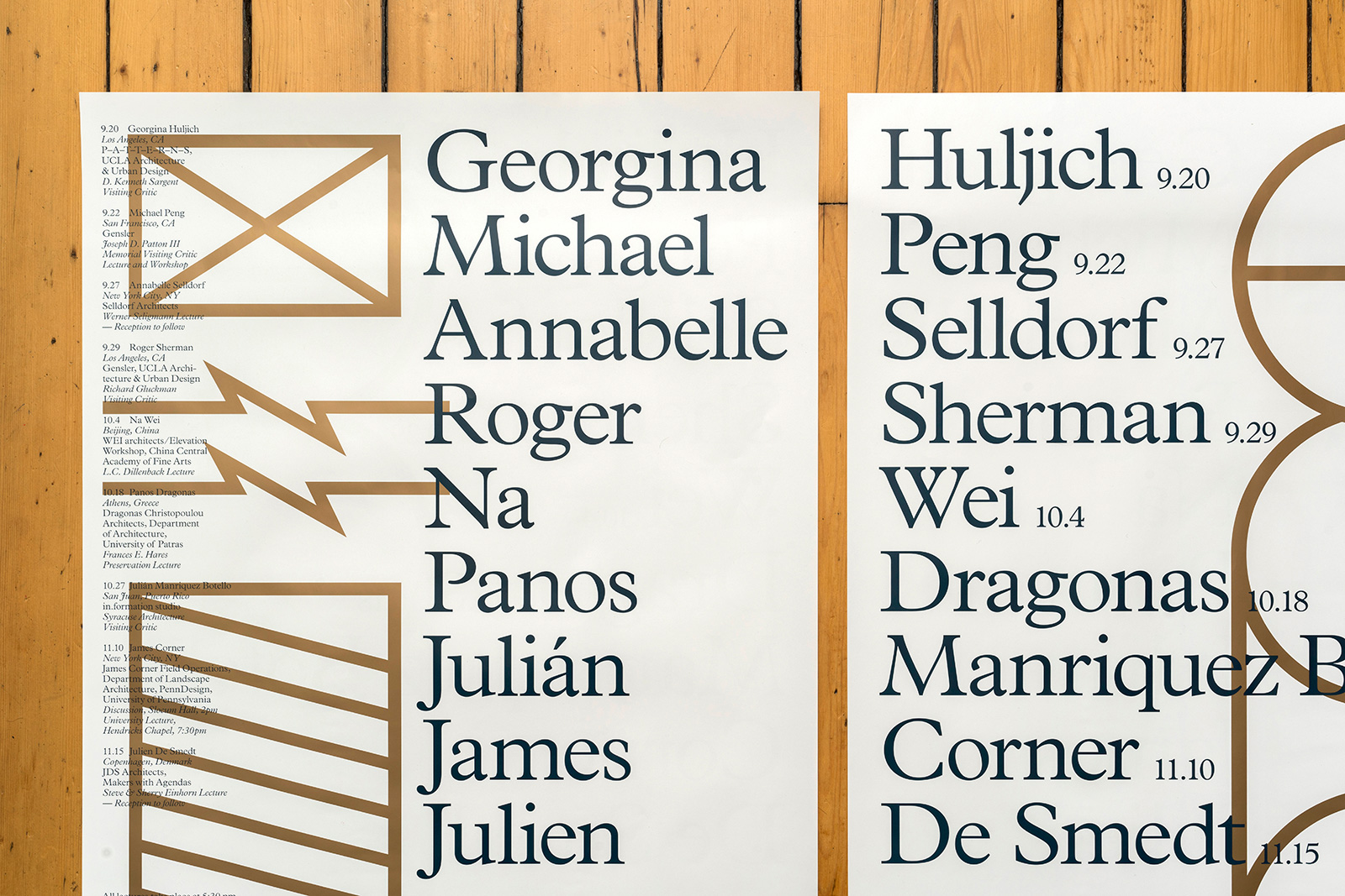
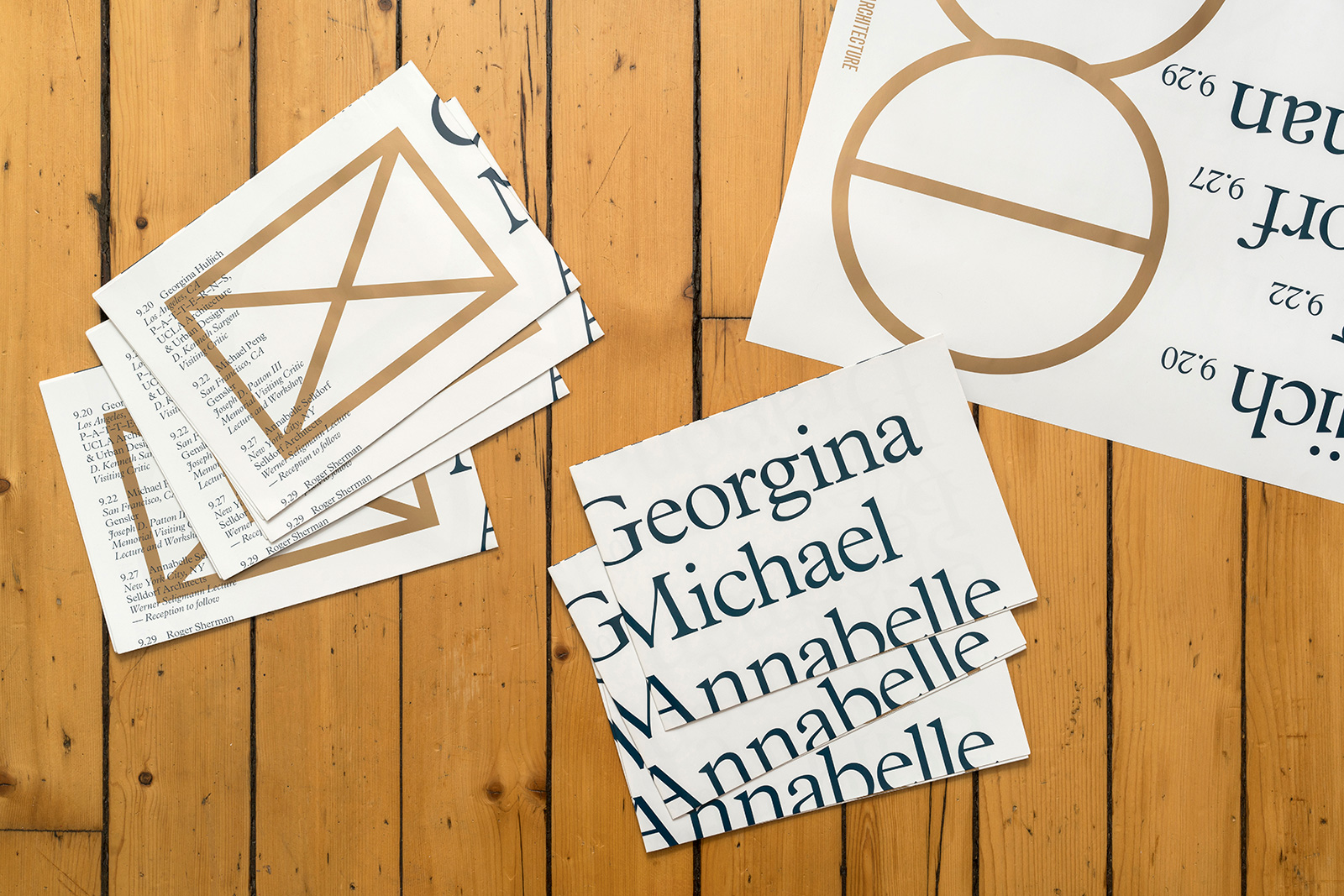
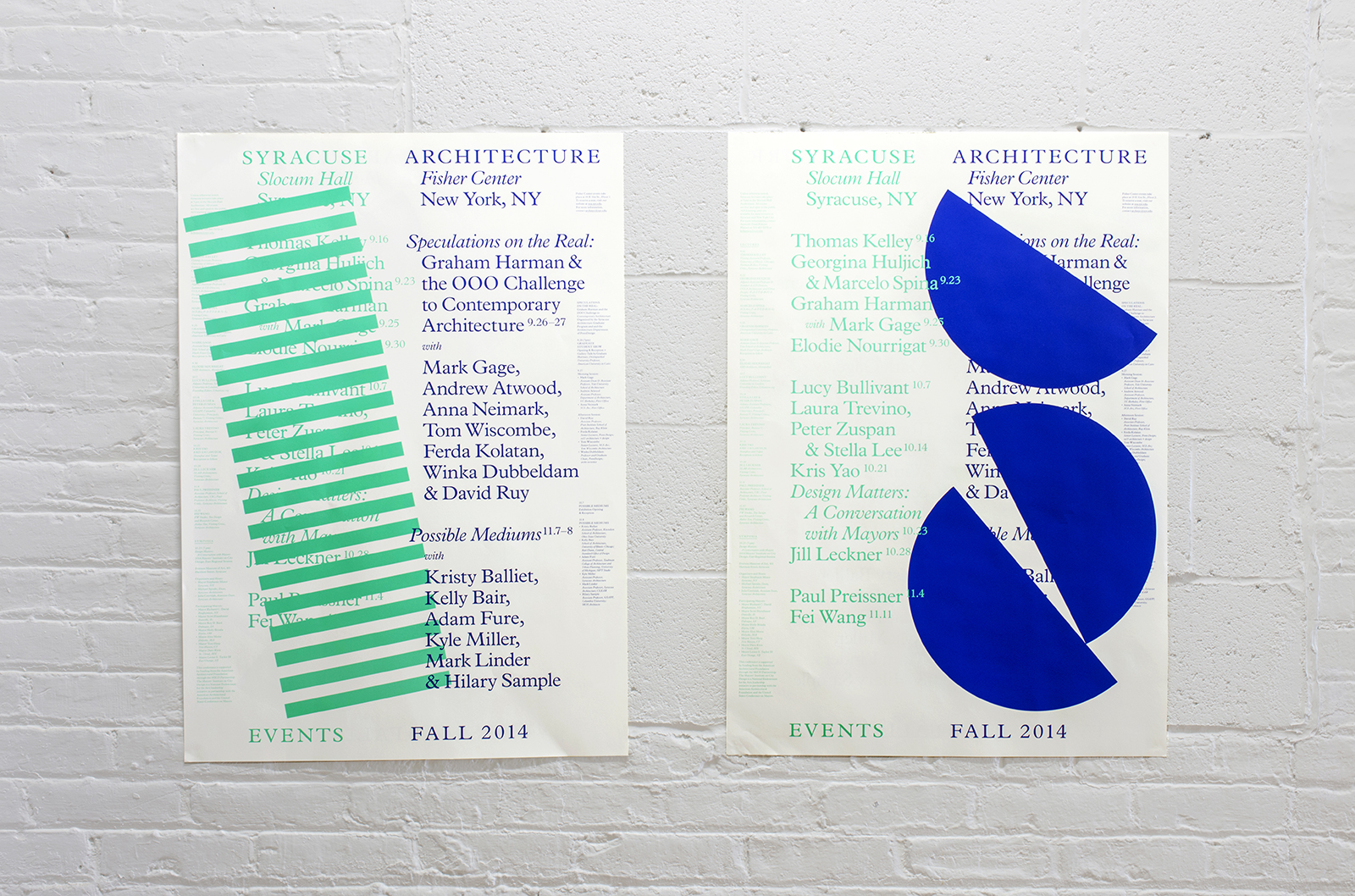
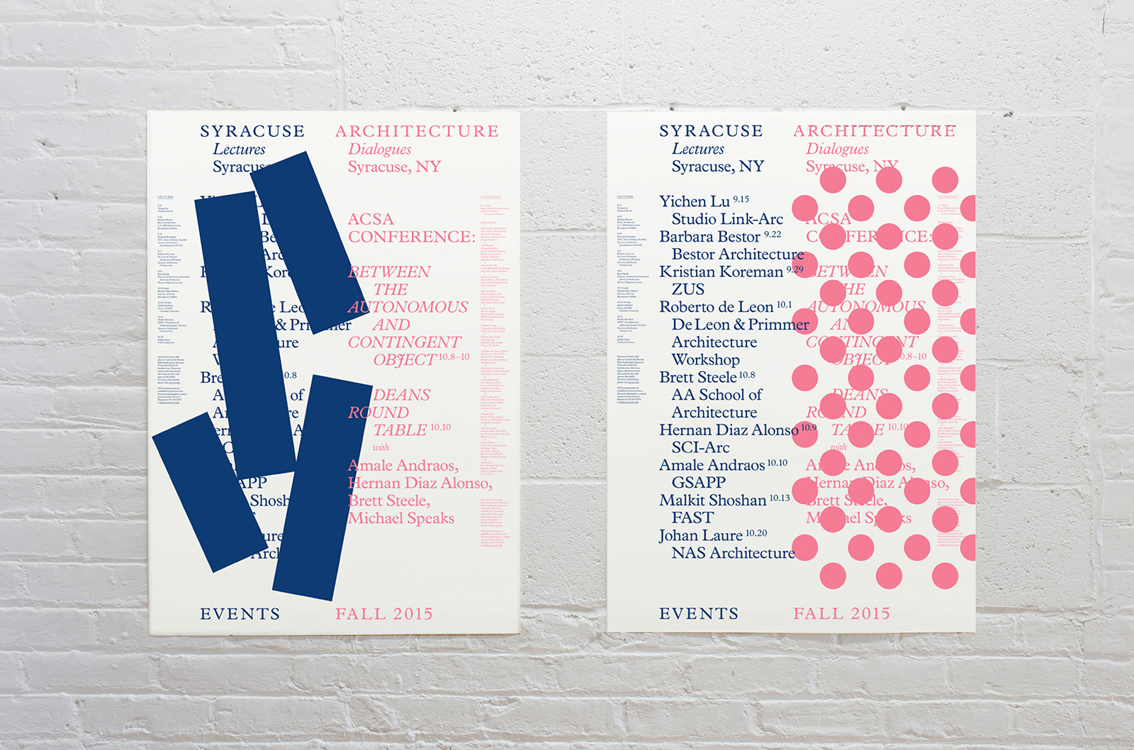
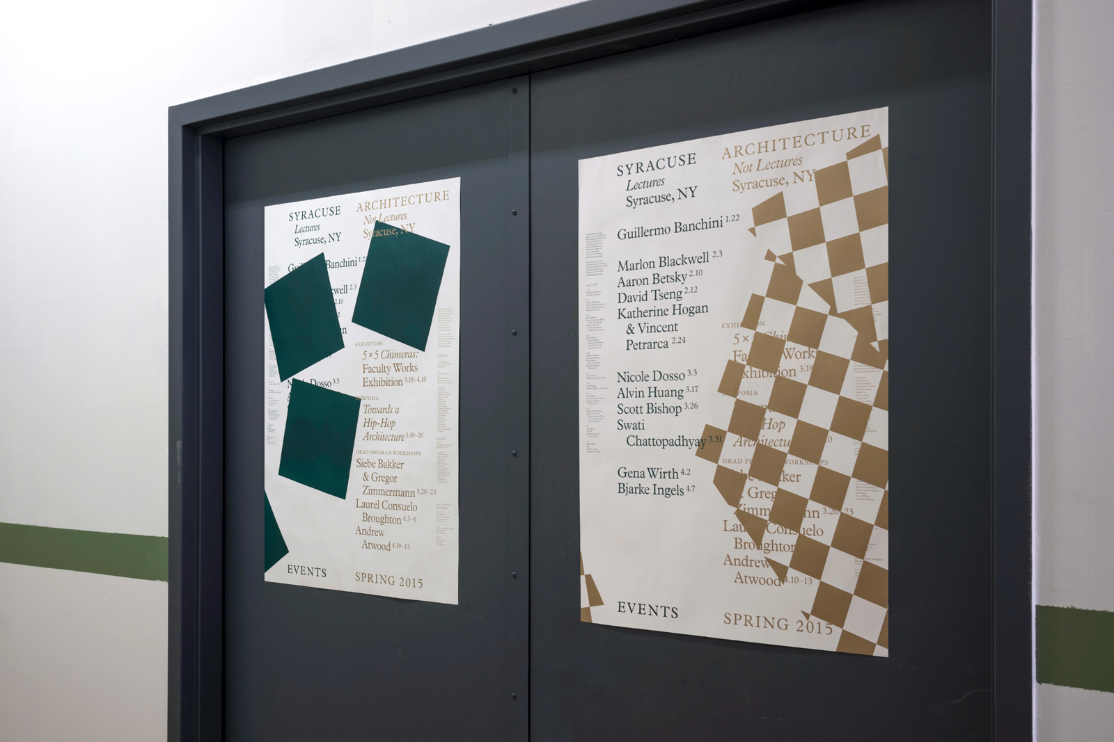
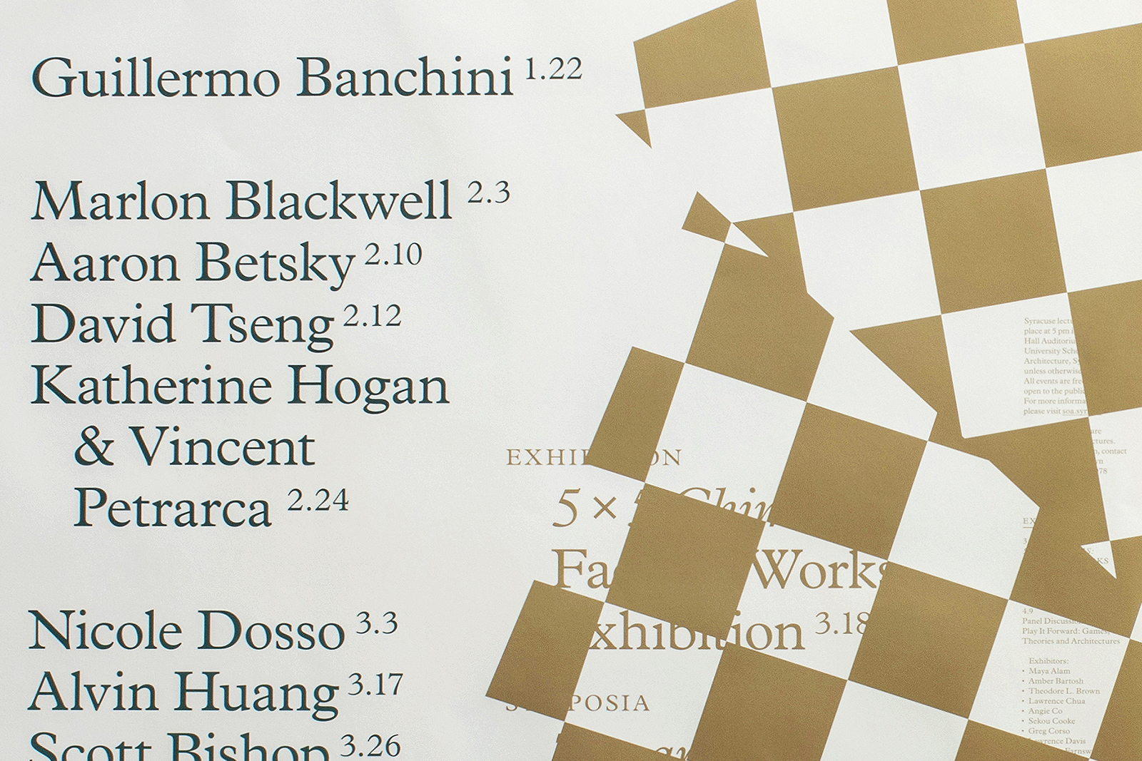
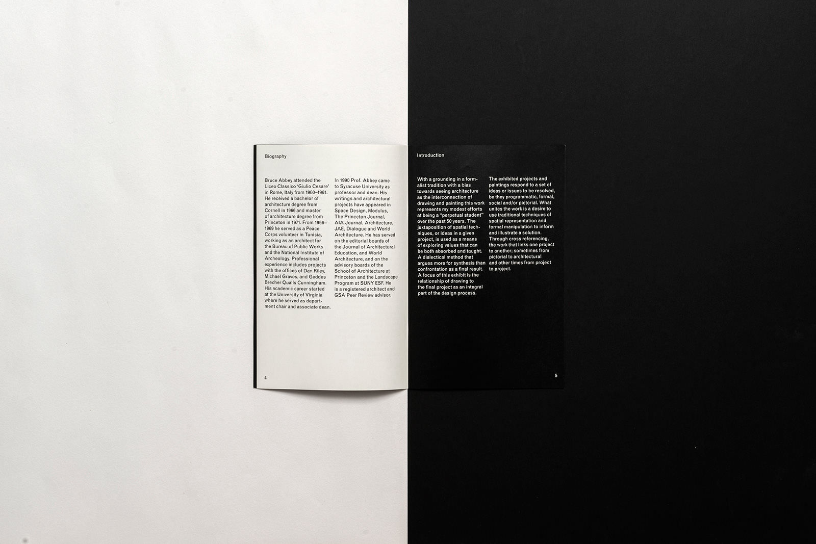
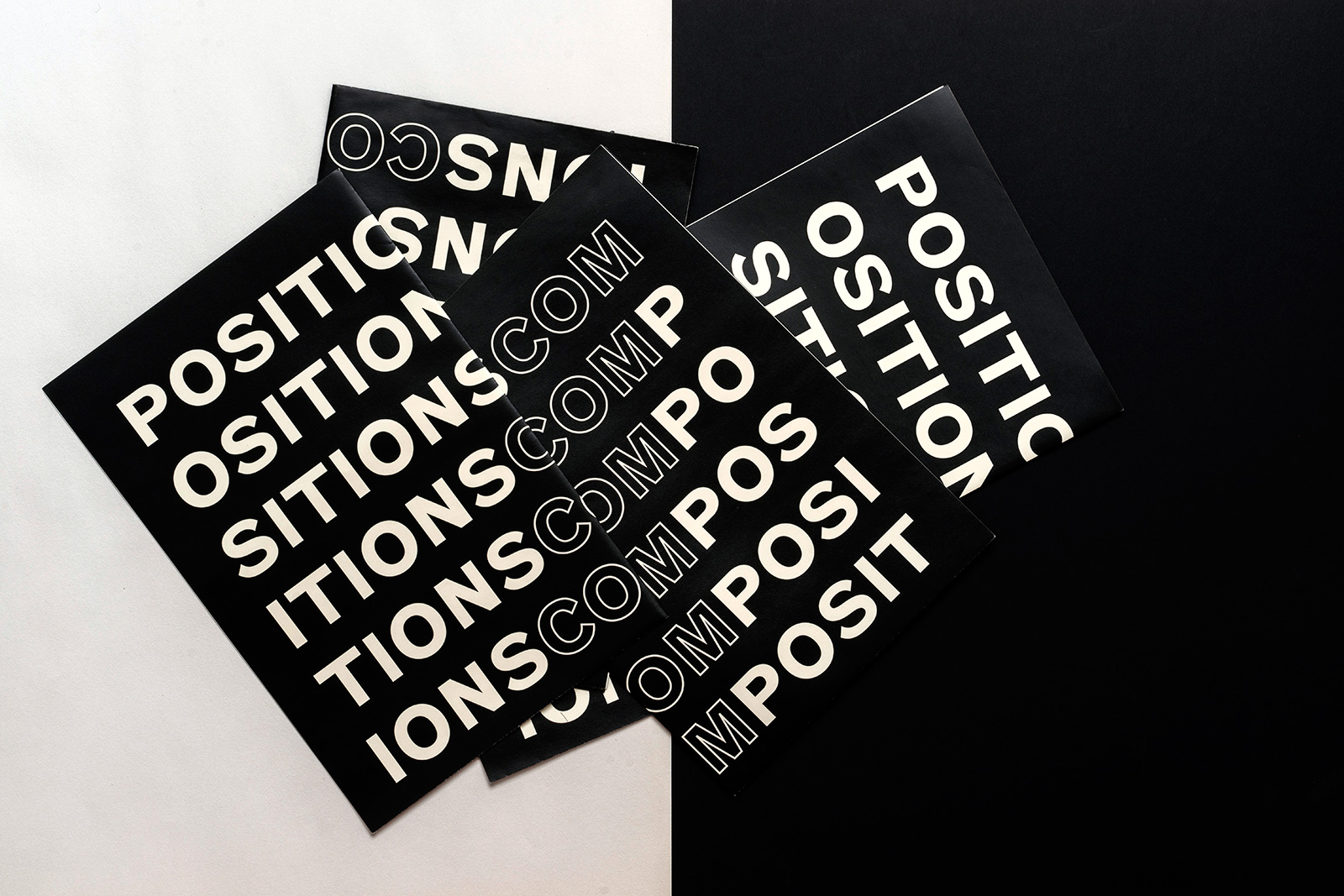
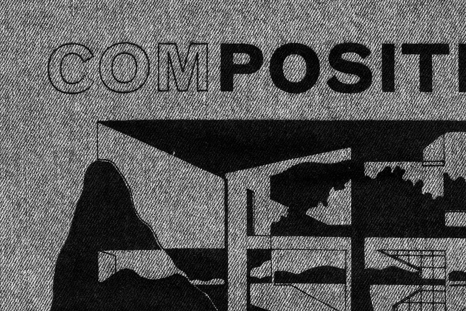
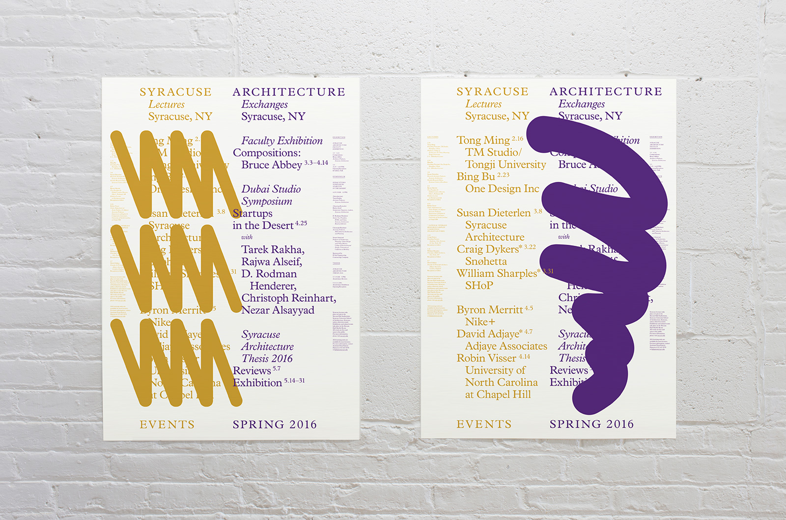
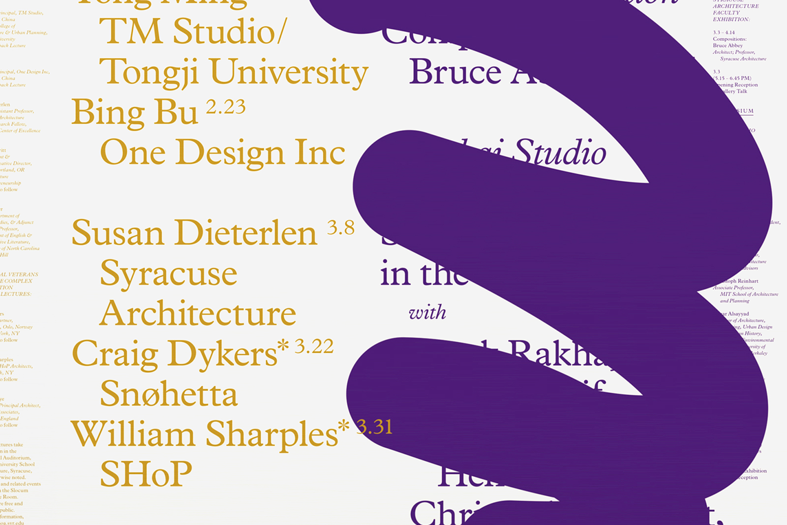
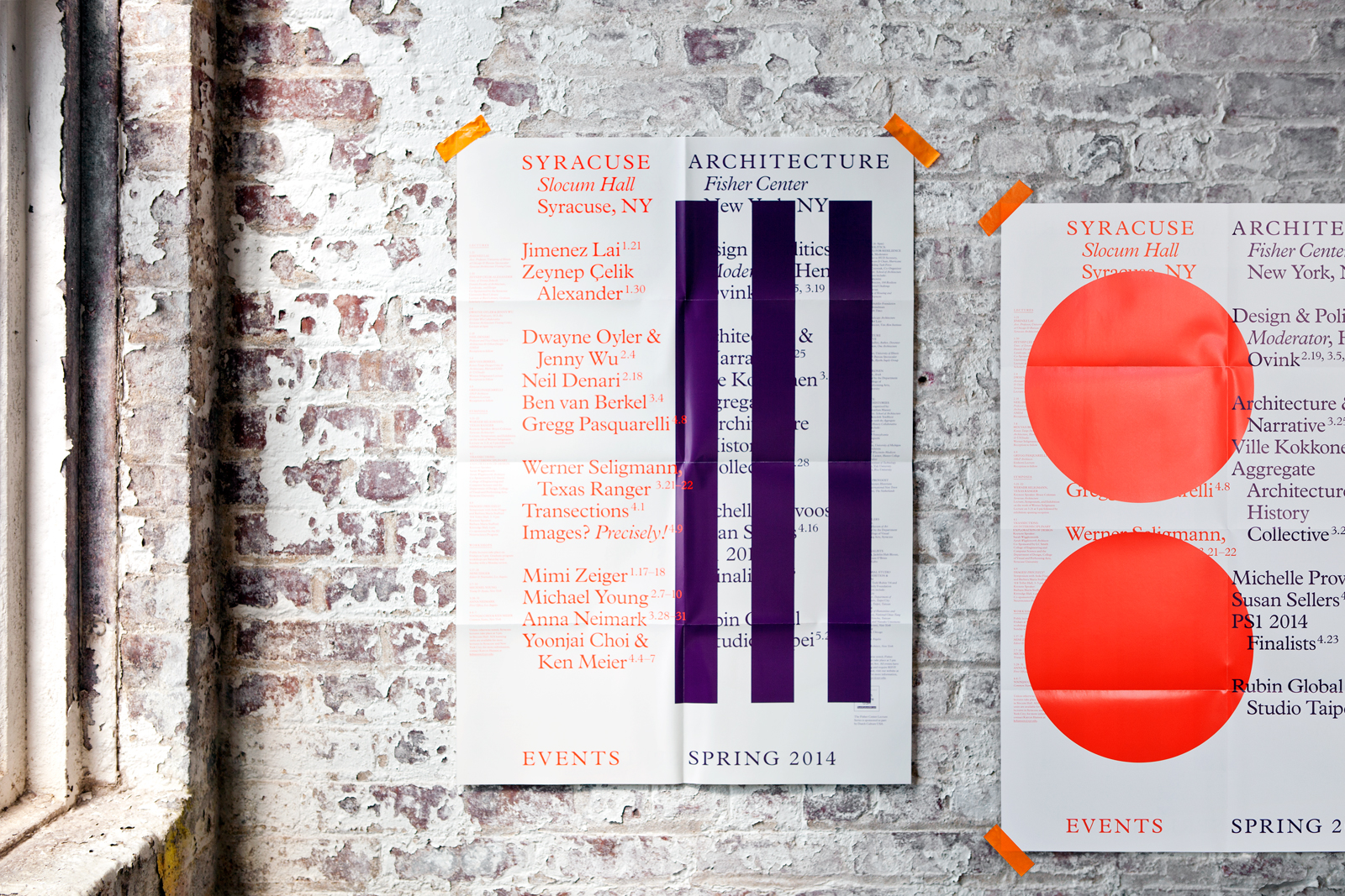
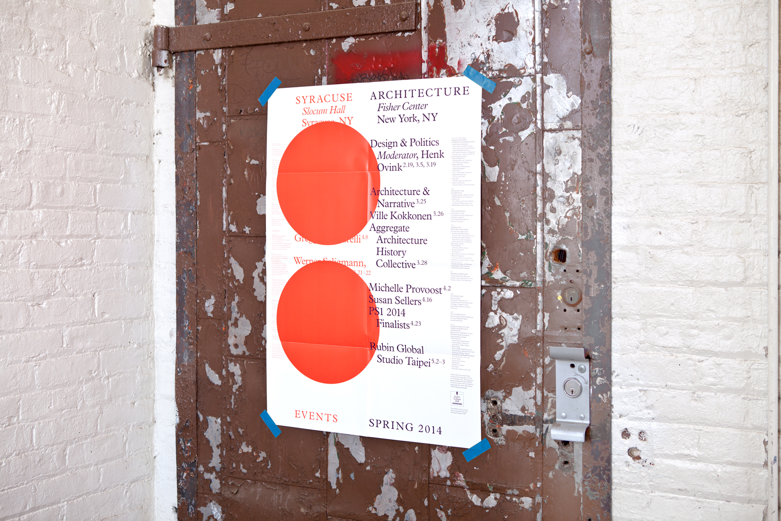
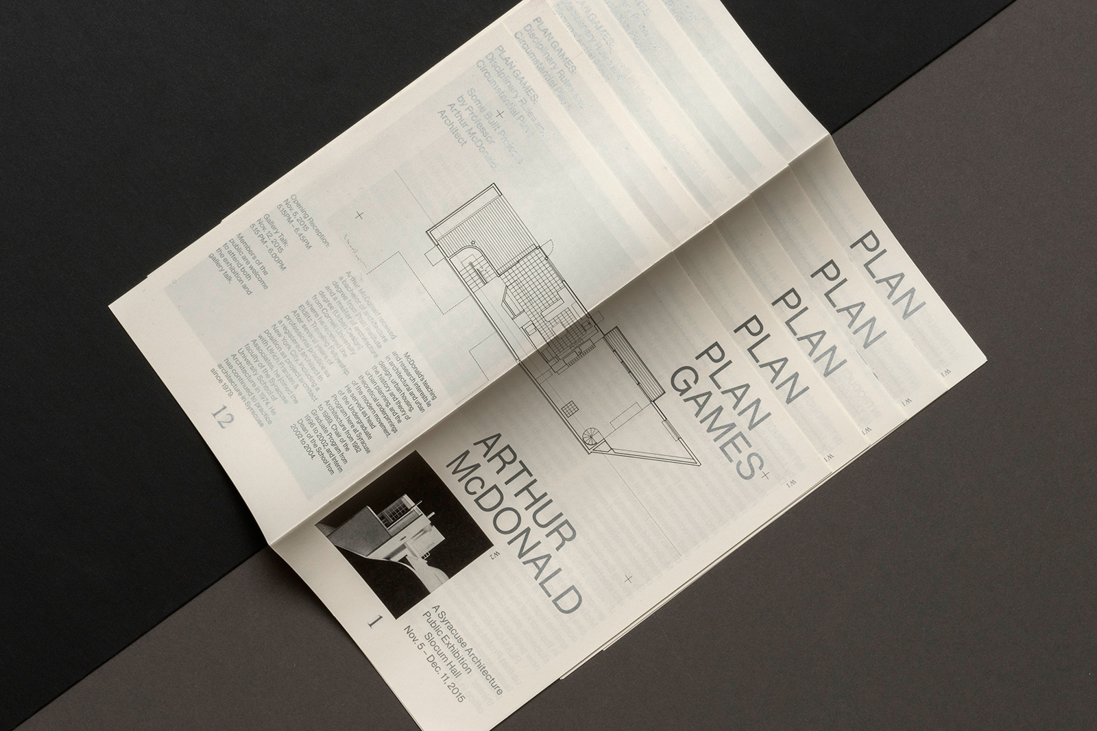
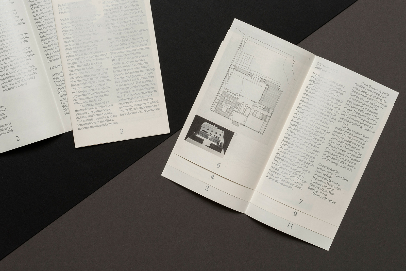
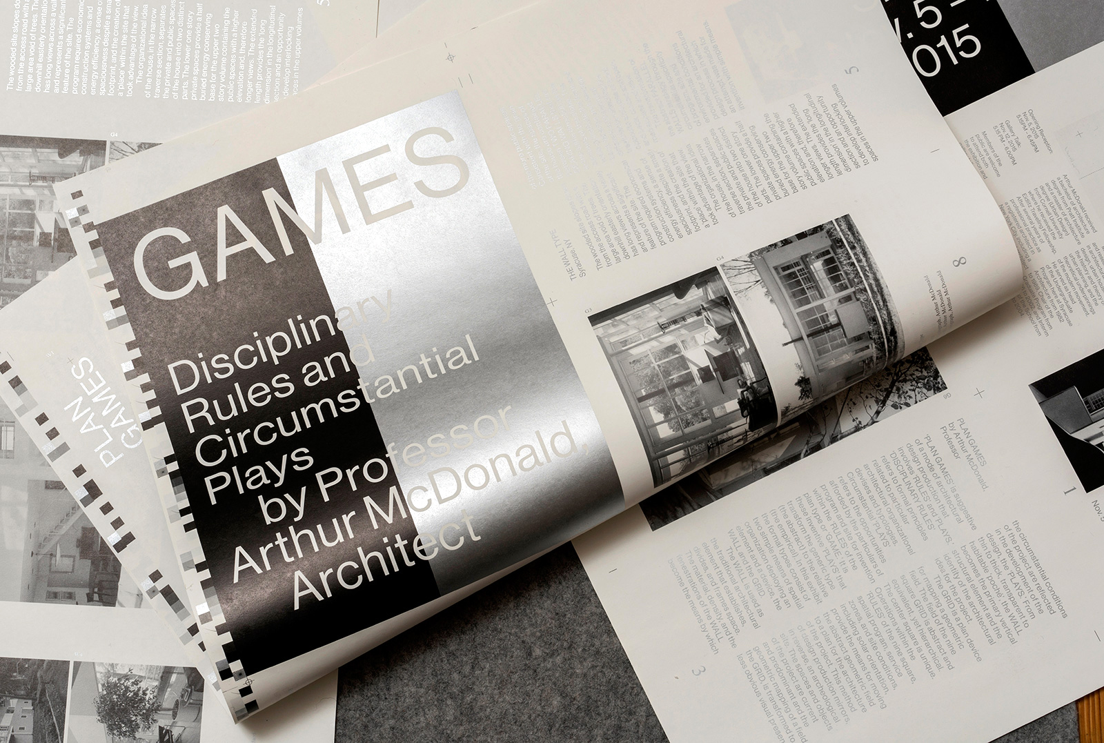
IDENTITY SYSTEM, WEBSITE, and APPLICATIONS for SYRACUSE ARCHITECTURE — Syracuse Architecture is an amalgamation of many perspectives; diverse and dynamic in nature, connected to the past but forward-looking; critical, curious, and intentionally curated. The school’s visual identity expresses these traits through a varied group of formal devices, including the layering, masking, and revealing of content by an ever-expanding vocabulary of graphic forms. Extending across print, digital, and environmental applications, the system is reworked incrementally and expanded upon each academic year.

Michael Speaks, Dean
Fei Wang, Director of China Programs
Vittoria Buccina, Assistant Dean, Enrollment
Traci Washburn, Assistant Dean, Advancement
Julie Sharkey, Communications Manager
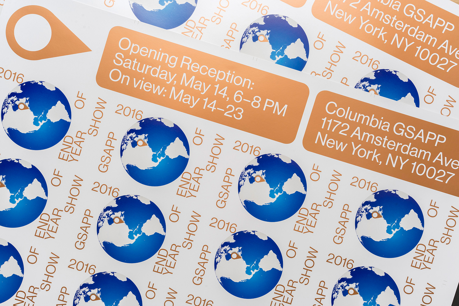
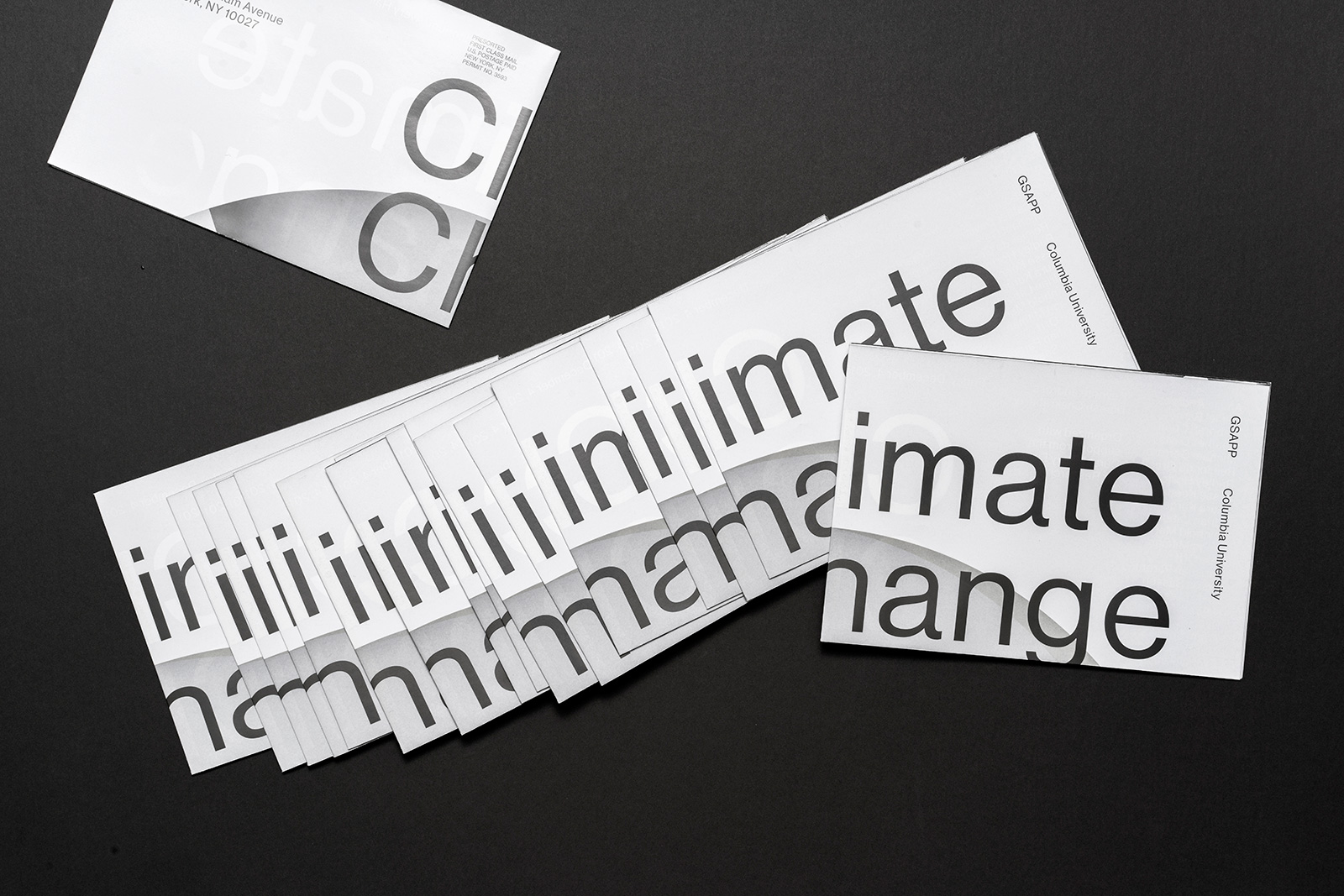
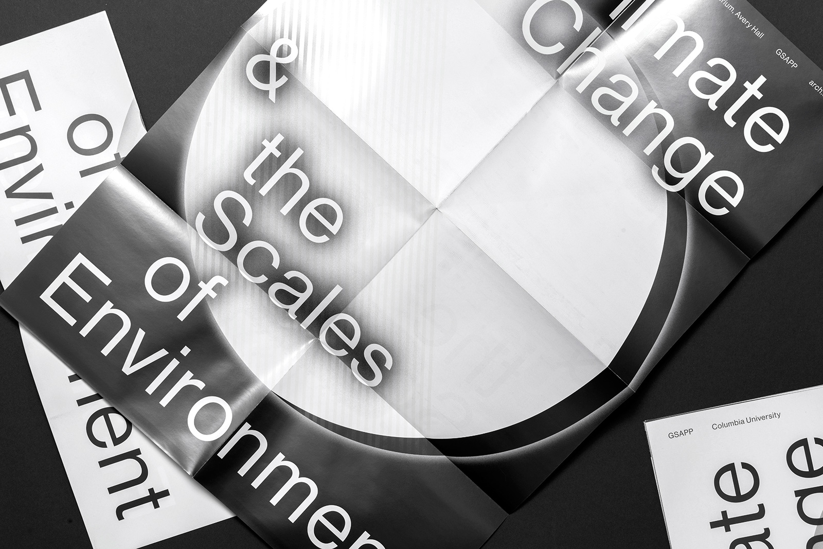
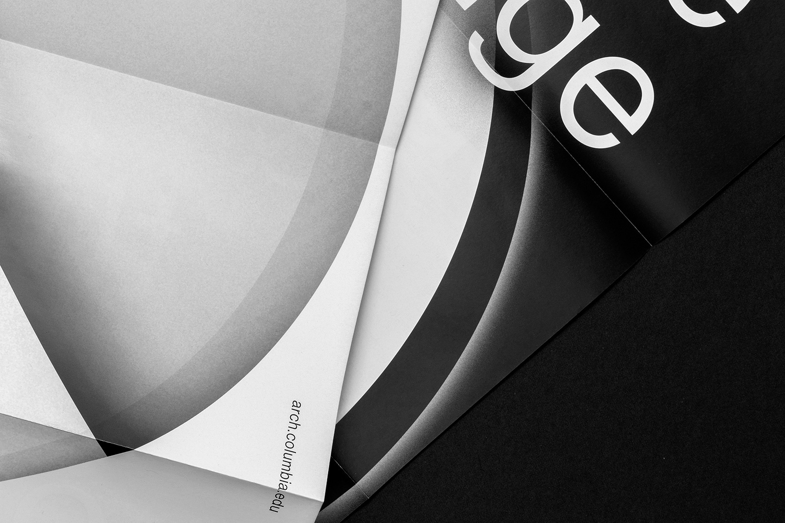
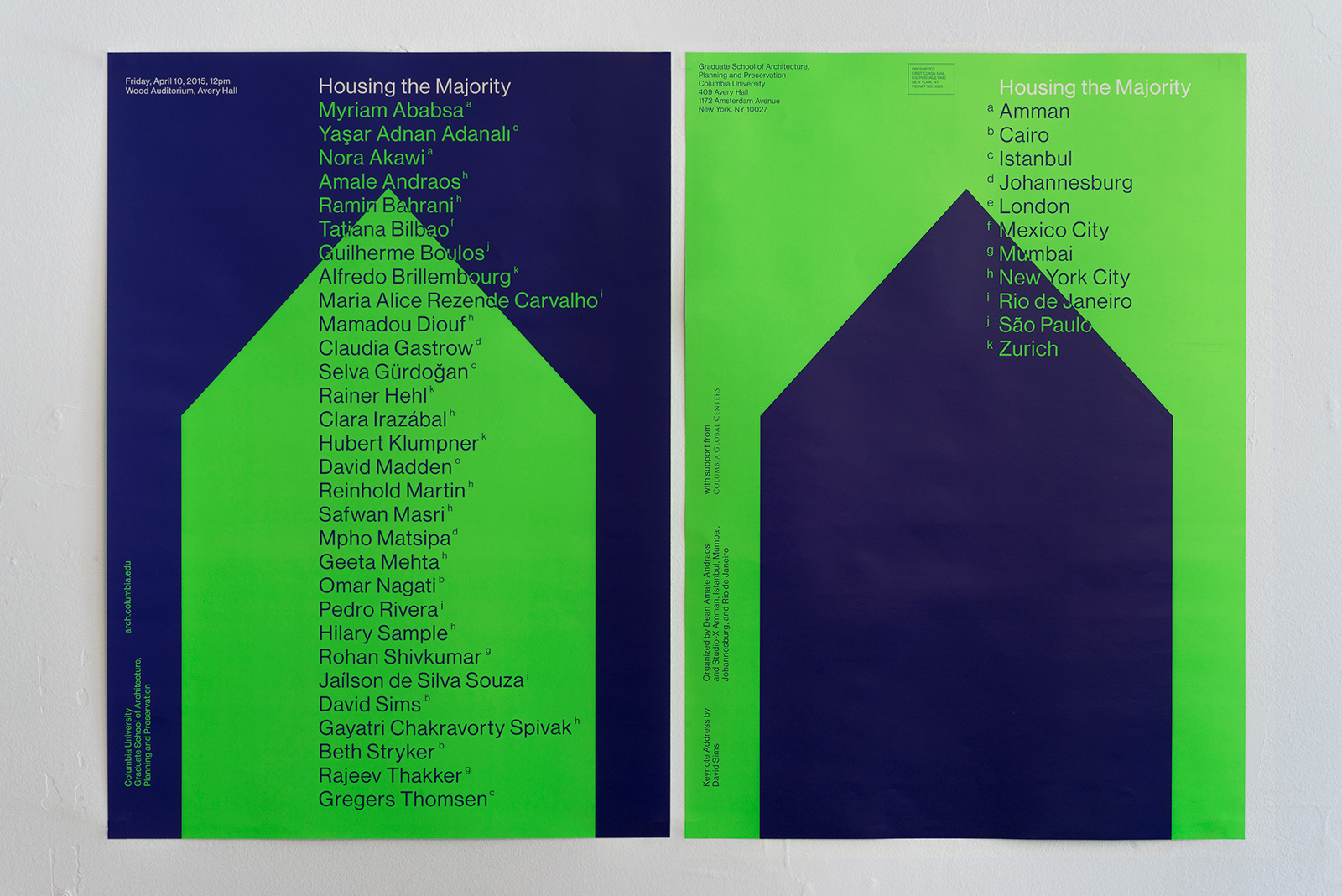
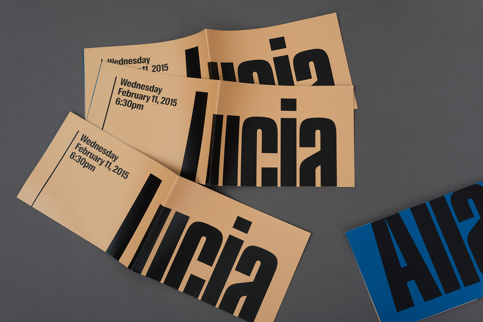
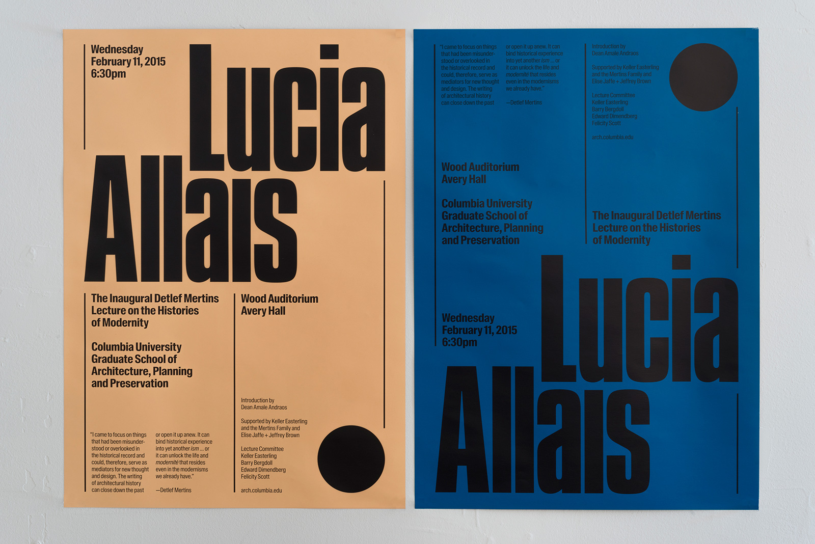
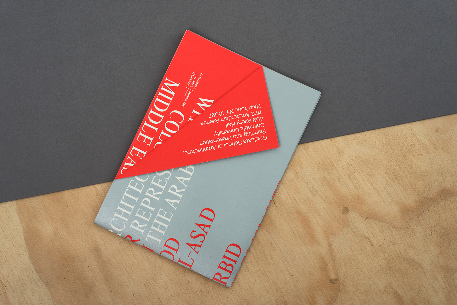
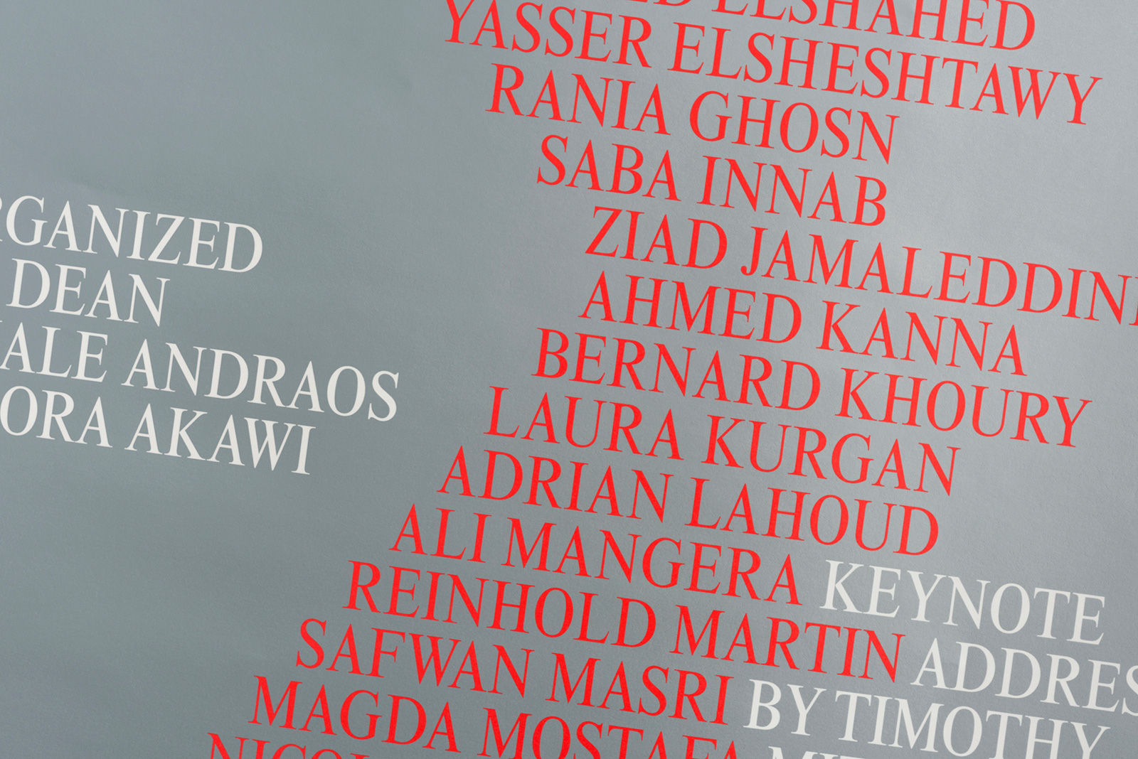
EXHIBITION and EVENT POSTERS for COLUMBIA GSAPP — As part of the school’s annual series of lectures and exhibitions, Columbia GSAPP commissions custom promotional materials, with graphics tailored to the content of each program. Creating a standalone look and feel for these events is key, to help them stand out amongst the din of flyers posted around campus, and delivered to faculty and student inboxes every day. Working within standard formats but eschewing a single, monolithic identity, the typography, color palette, graphic layer, and material strategy vary substantially from event to event.



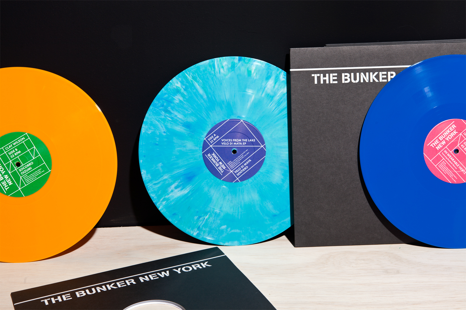
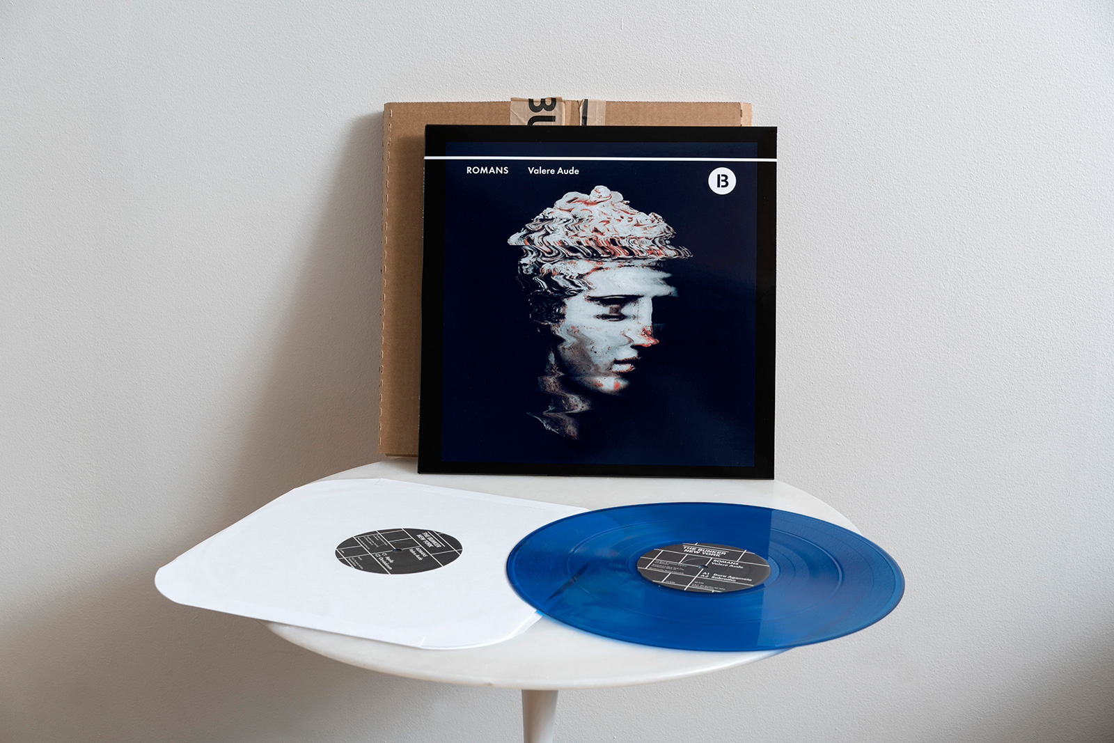
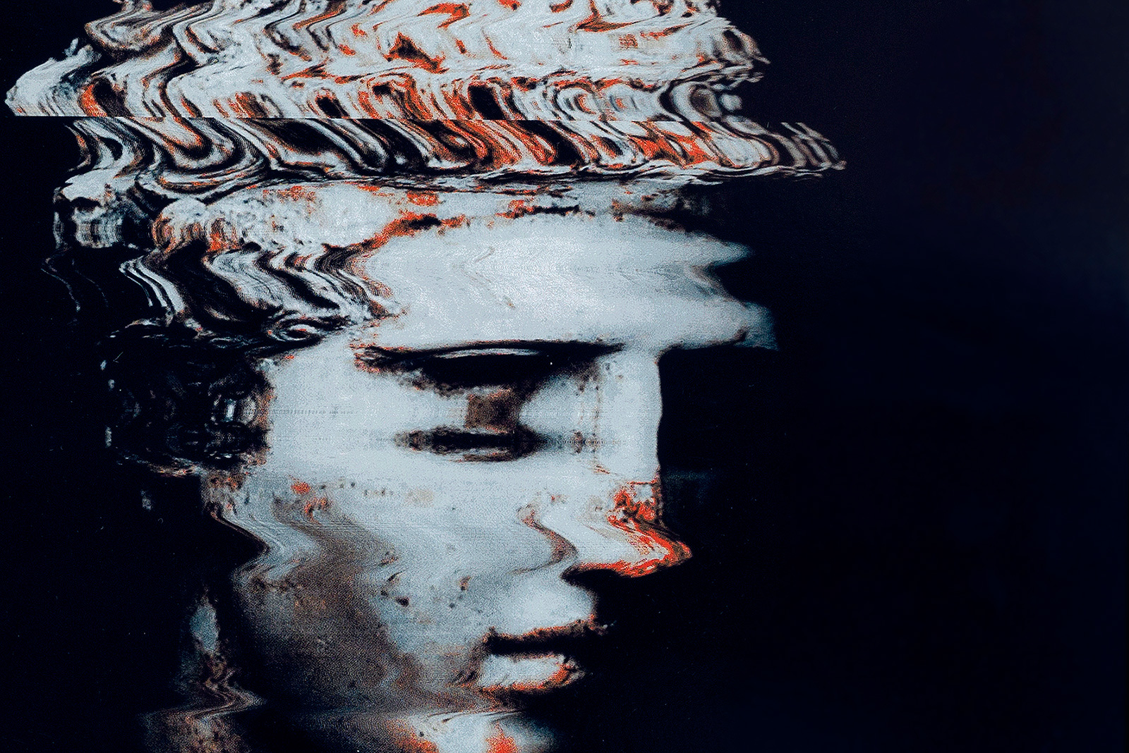
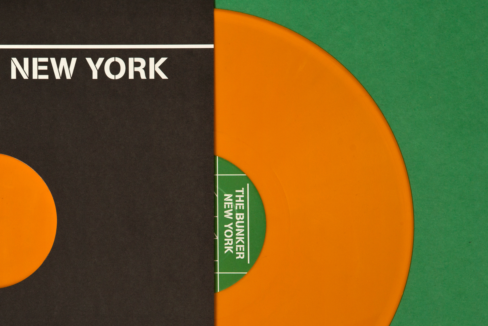
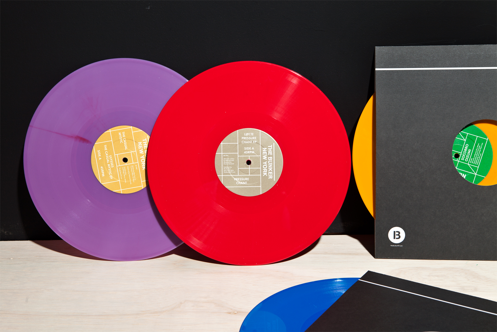
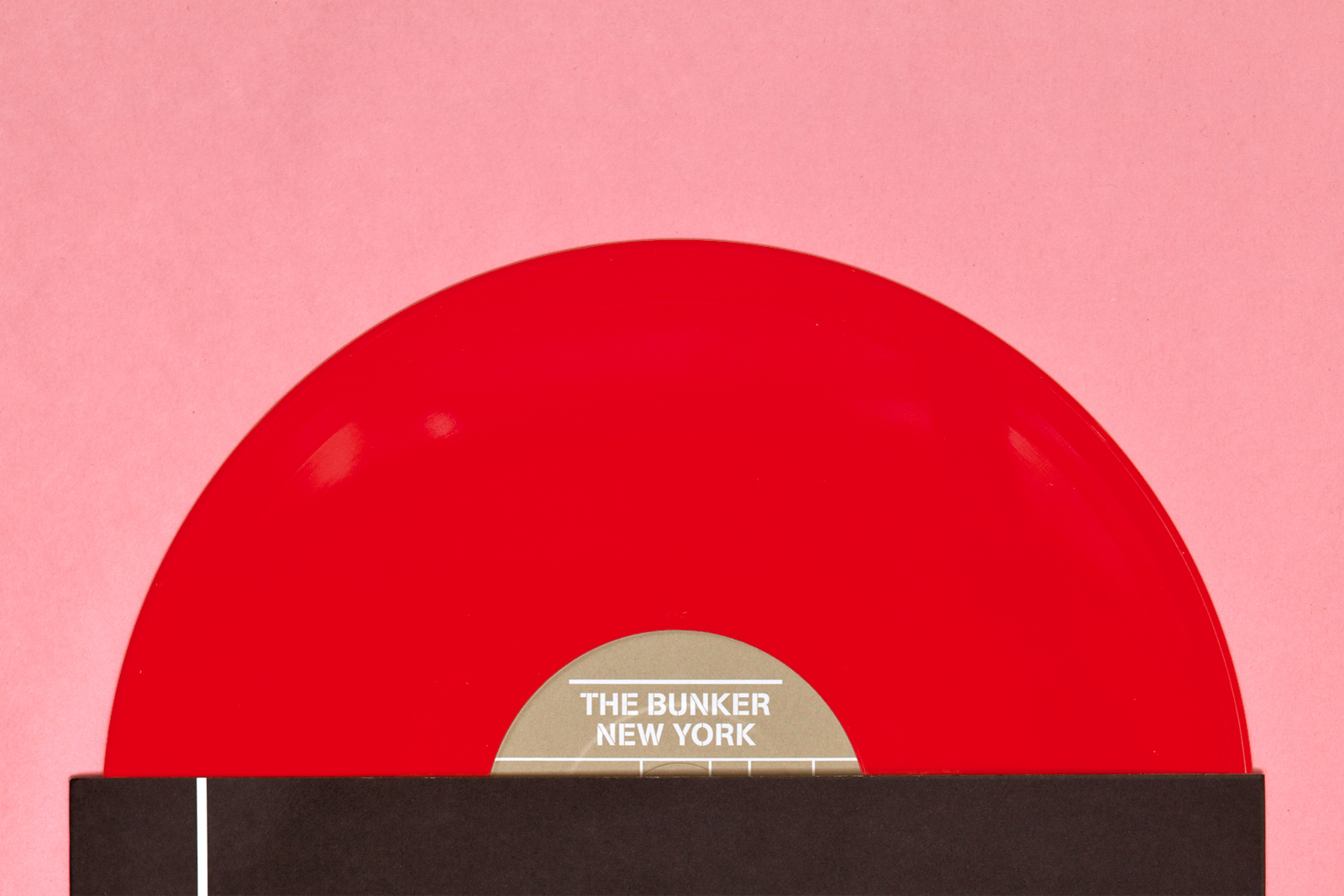
IDENTITY, WEBSITE, and LABEL ART for THE BUNKER NEW YORK — The Bunker is a long-running electronic music series in New York, known for curating experimental, left-of-center sounds in intimate settings with disproportionately high production values. In addition to these events, the team now runs a label releasing original music from an ever-growing stable of local artists, as well as a booking agency, podcast, and radio show. The visual identity makes use of a flexible grid which connects across various physical and digital touchpoints, allowing for assets to be generated quickly, and in a style befitting the type of music being presented.



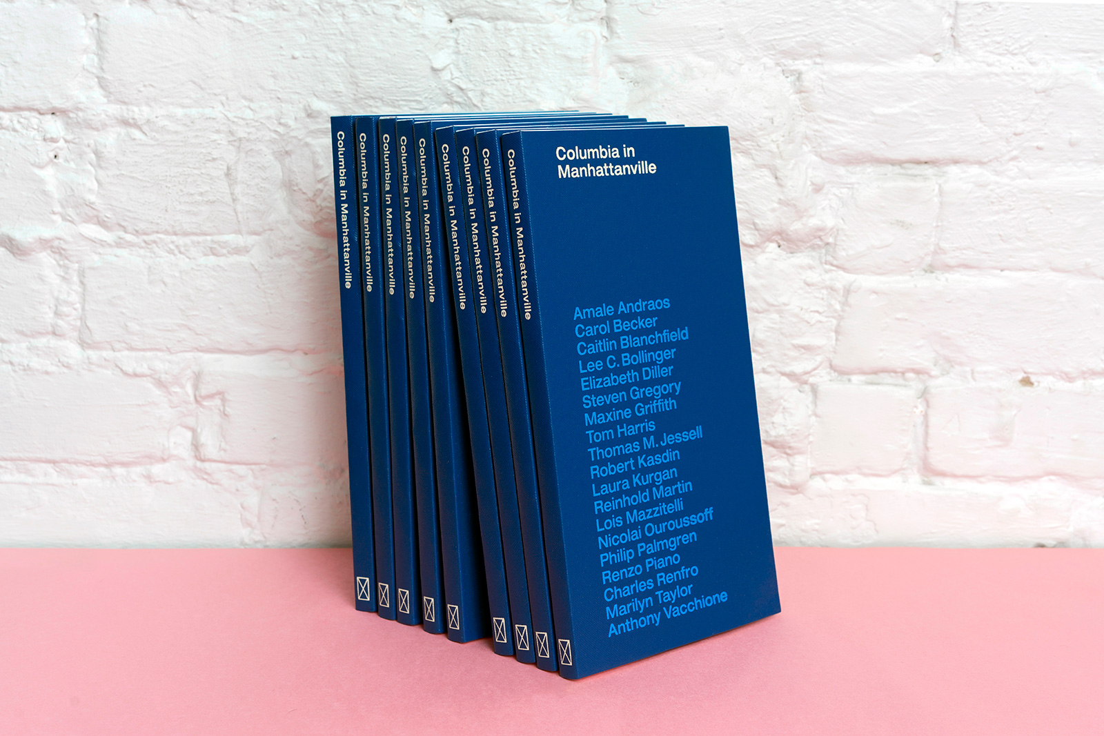
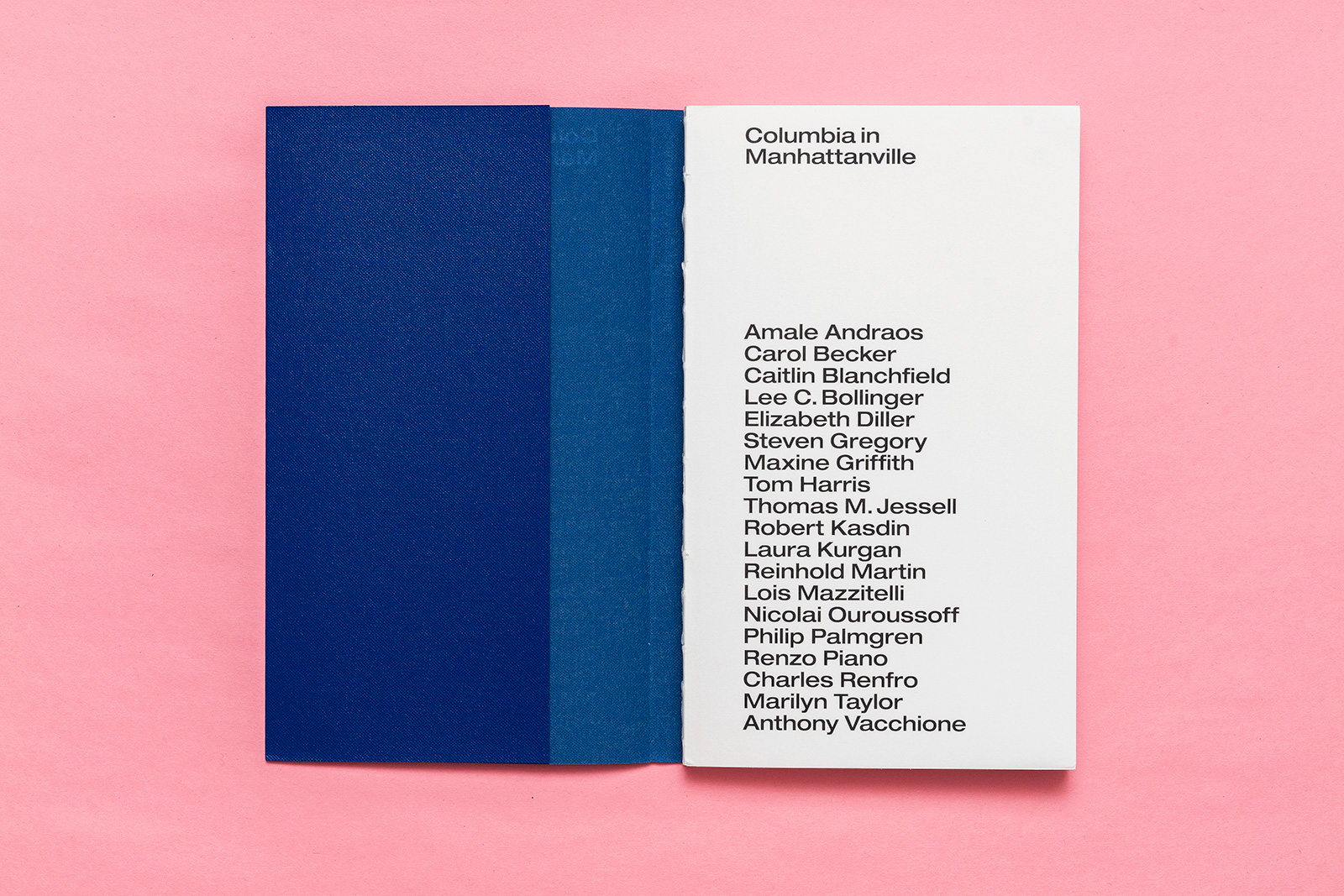
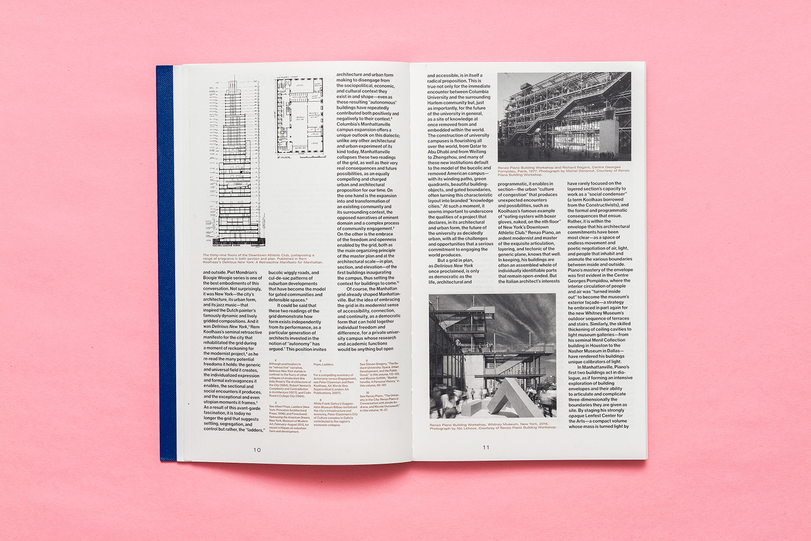
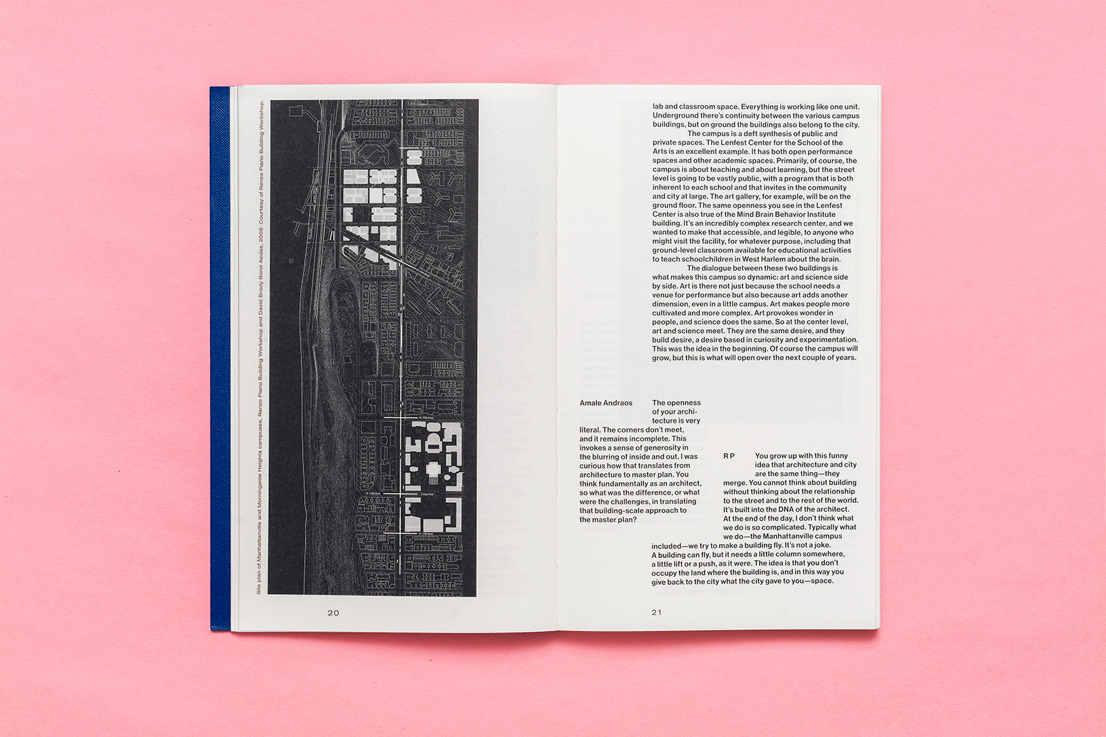
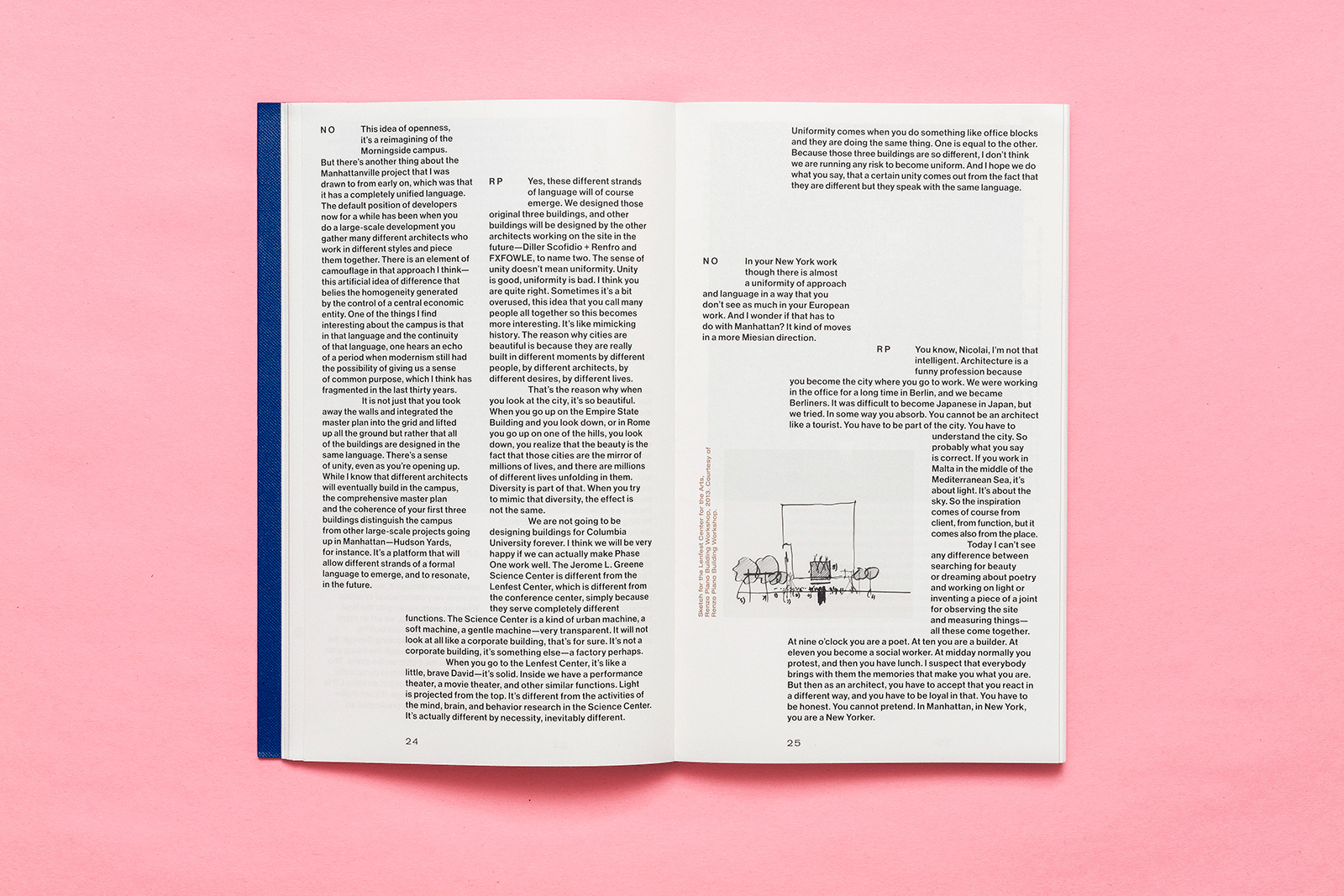
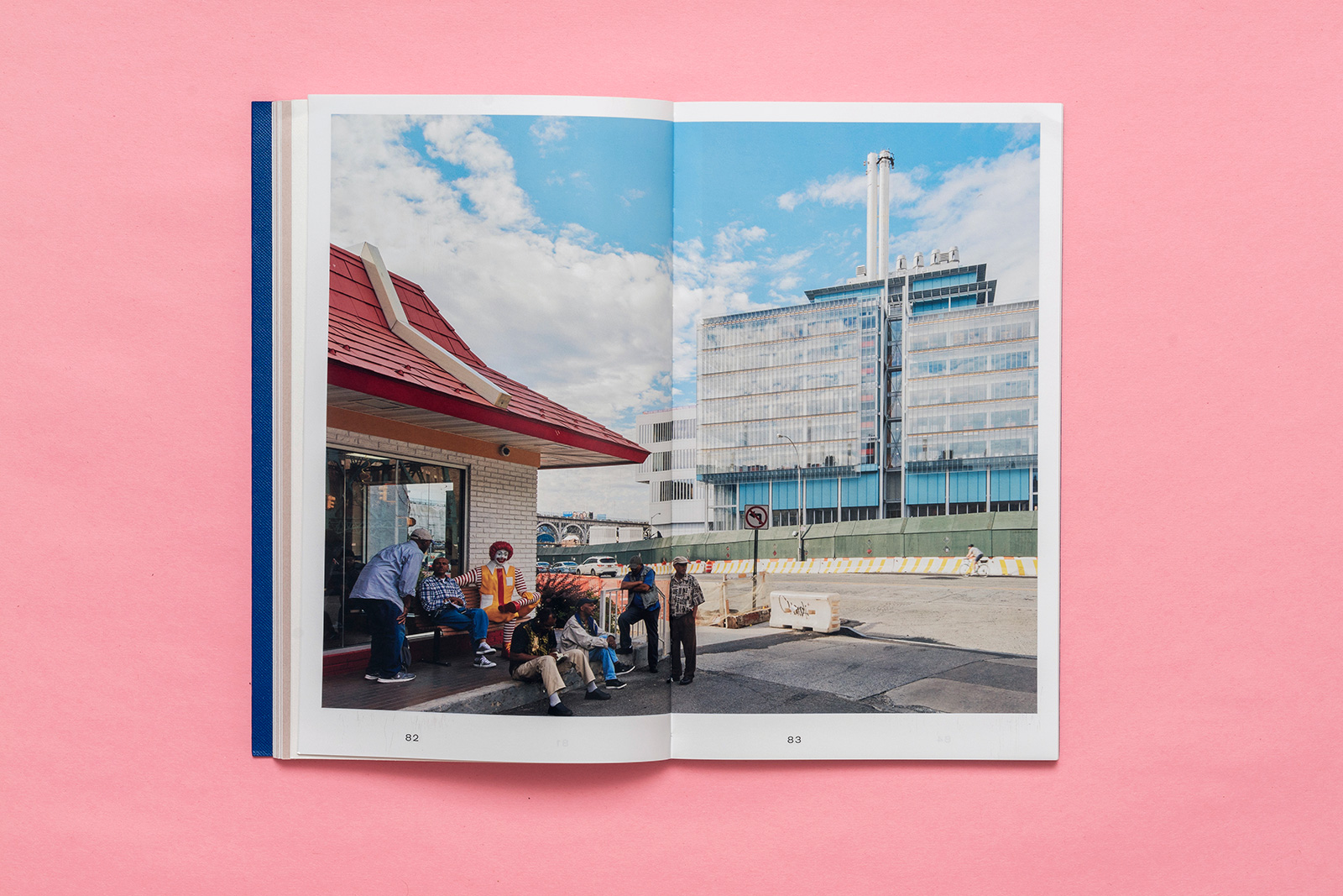
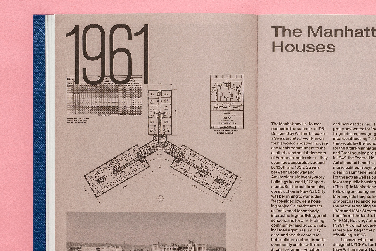
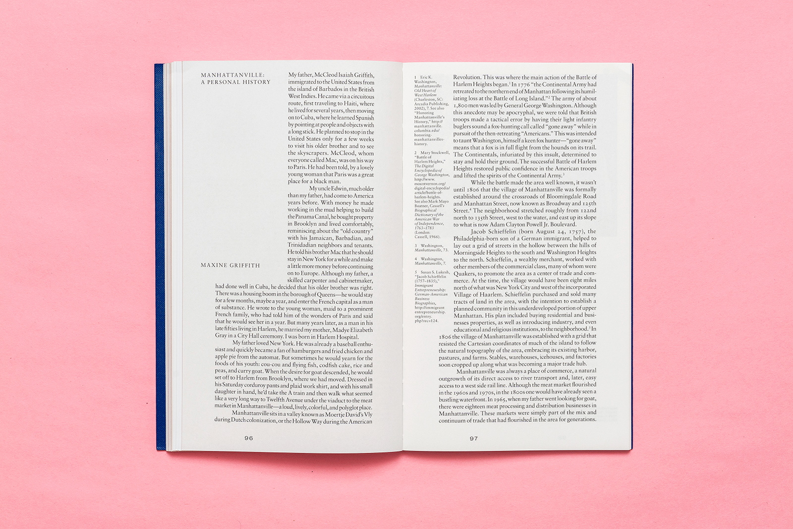
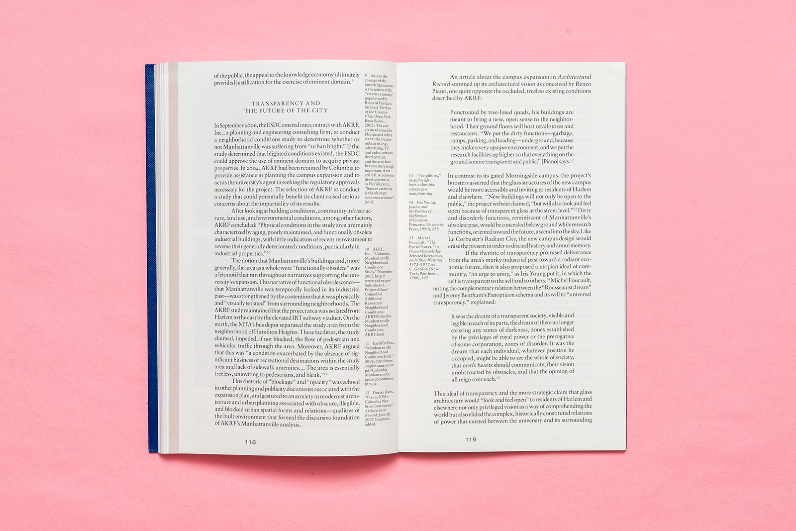
COLUMBIA IN MANHATTANVILLE for COLUMBIA BOOKS ON ARCHITECTURE & THE CITY — As with many urban universities, physical space comes at a premium, but especially in a city as over-developed and hostile to the working class as present day New York. Columbia knew it would need to expand beyond its Morningside campus eventually, and so for over a decade, they planned a move into nearby Manhattanville. This book charts the complex web of needs of both the university and the surrounding community, including essays from and conversations with historians, architects, planners, educators, and administrators involved in the project. The design employs a diverse set of content typologies, each with its own visual logic, in a narrow portrait format with exposed binding and loose, laminated book cloth dust jacket.



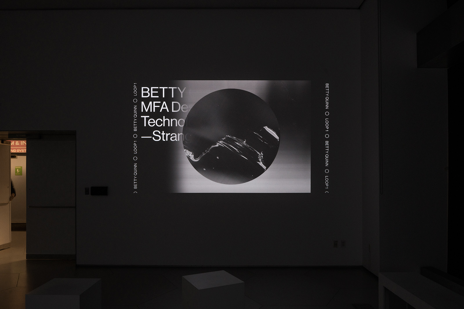
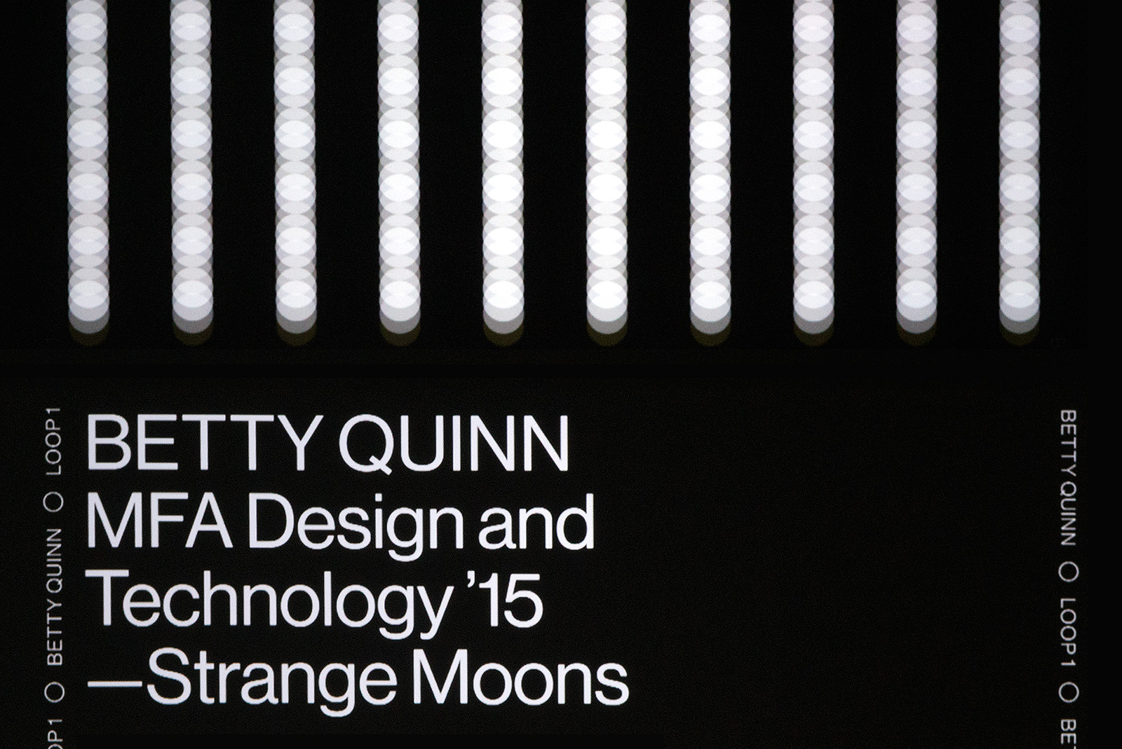
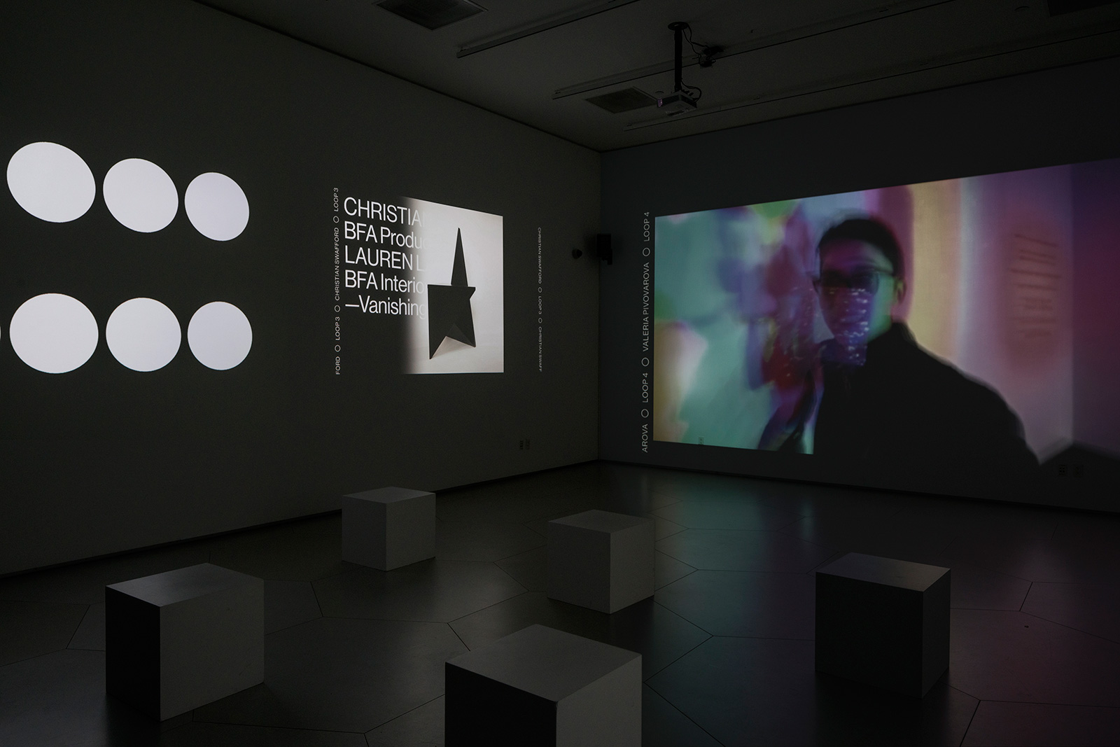
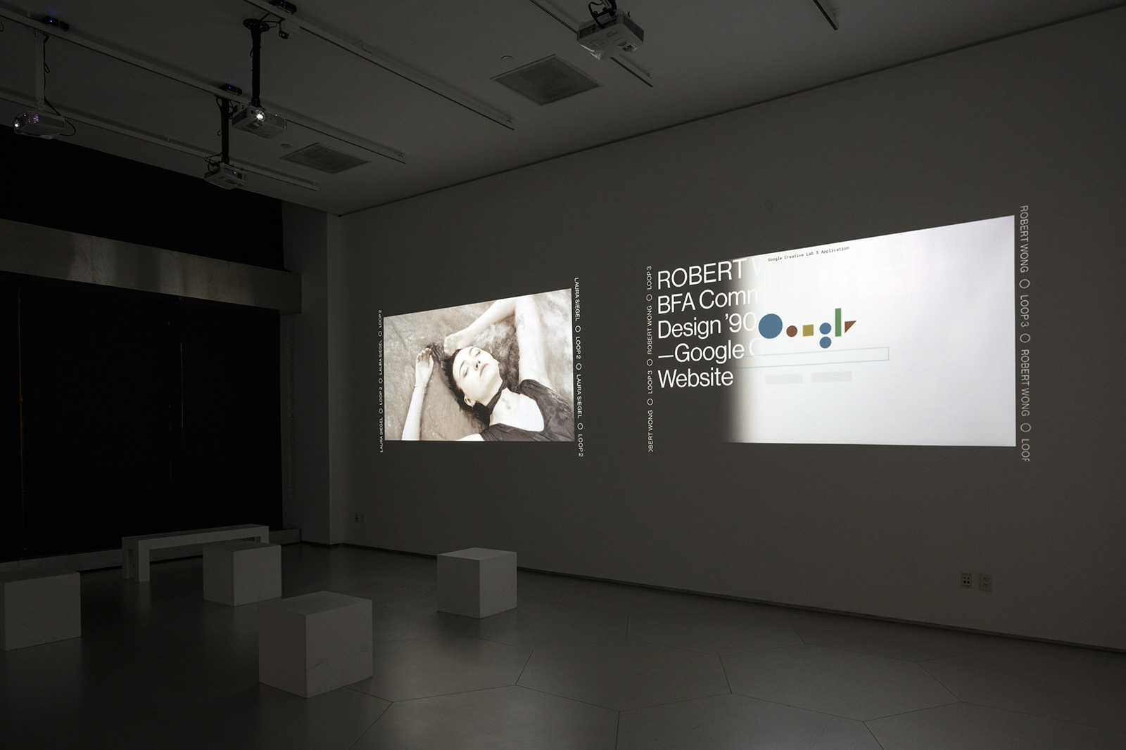
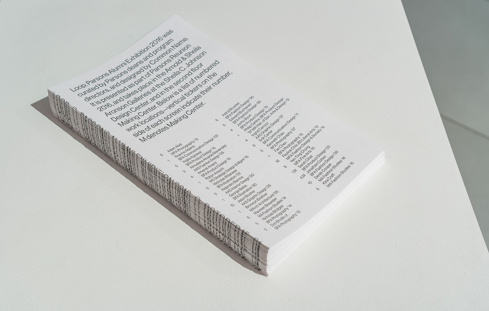
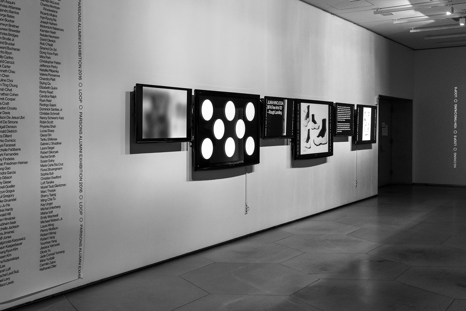
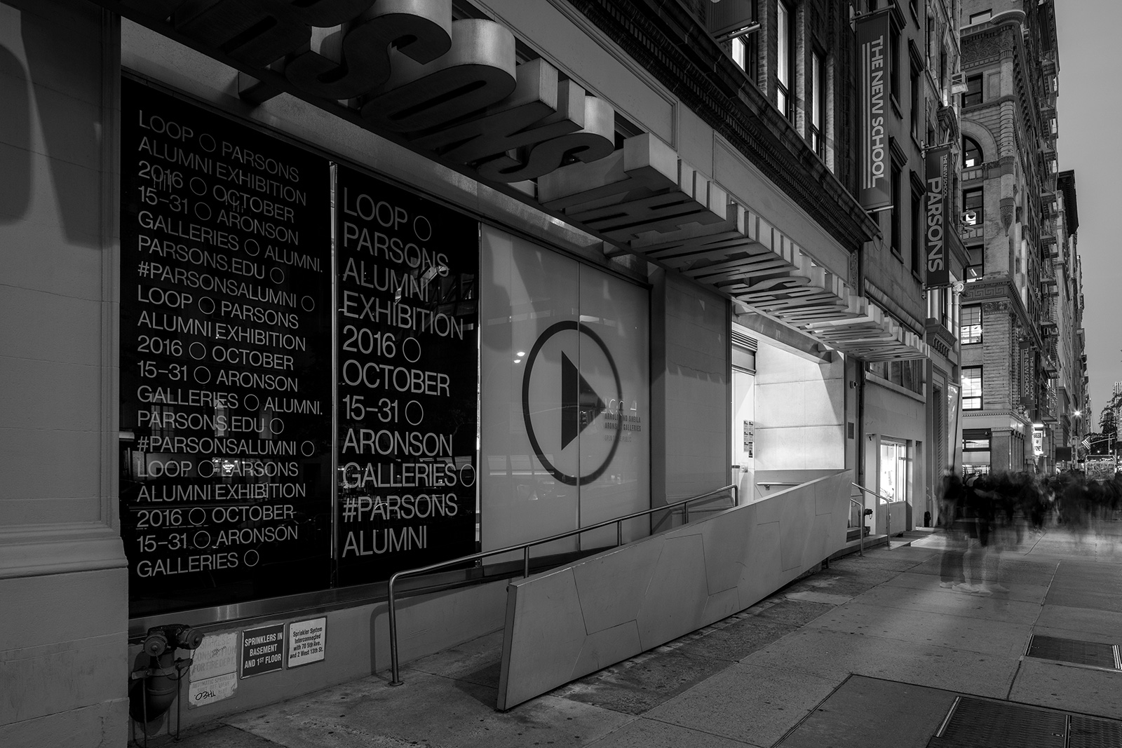
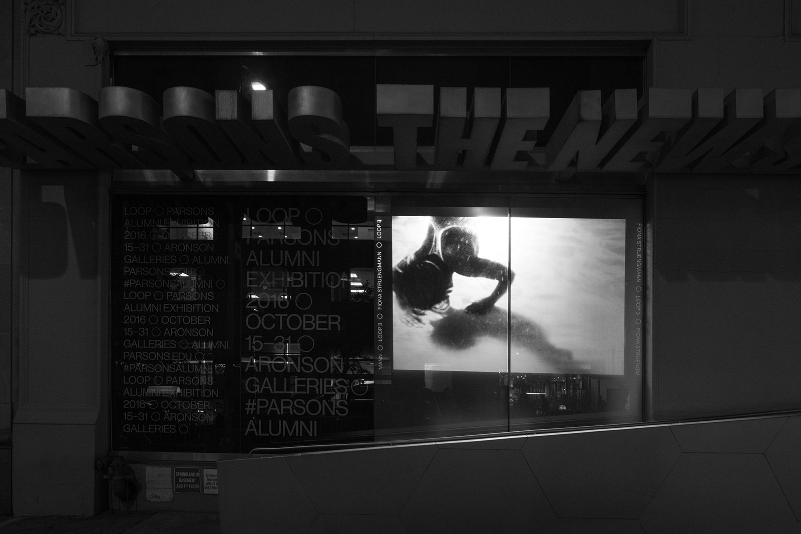
LOOP ALUMNI EXHIBITION for PARSONS THE NEW SCHOOL — Parsons in particular, and The New School more broadly, are incredibly diverse institutions wth students from all over the globe studying a wide range of disciplines, including studio art, fashion, and architecture, as well as graphic, interactive, and experiential design. Loop, the sixth annual alumni exhibition, showcases work by over 120 graduates from every program at the school, looking at the work they’re making today. As a result of the mixed-media nature of the submissions, the approach was to create an all-digital exhibition, where work is projected onto screens at the Aronson Gallery, in the adjacent hallway, upstairs at the Making Center, and onto window glass along both Fifth Avenue and 13th Street.

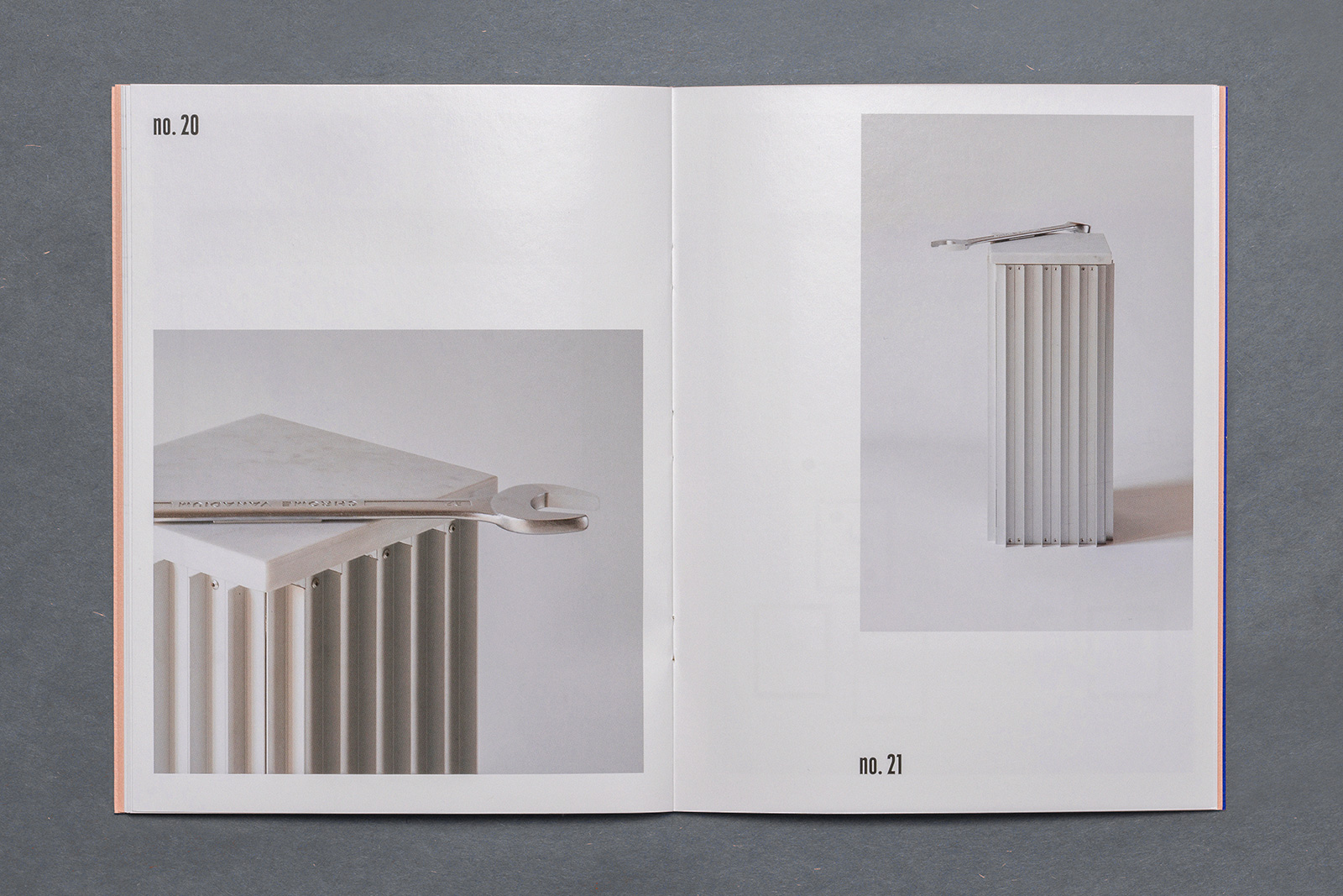
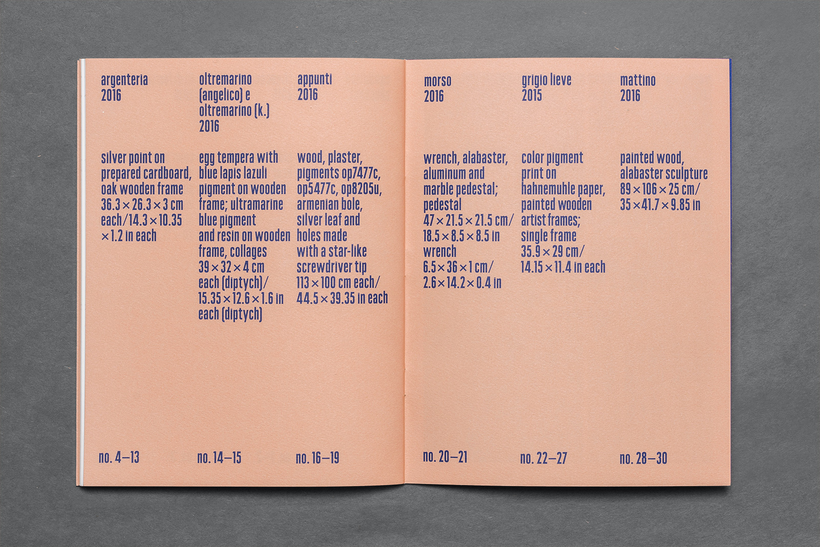
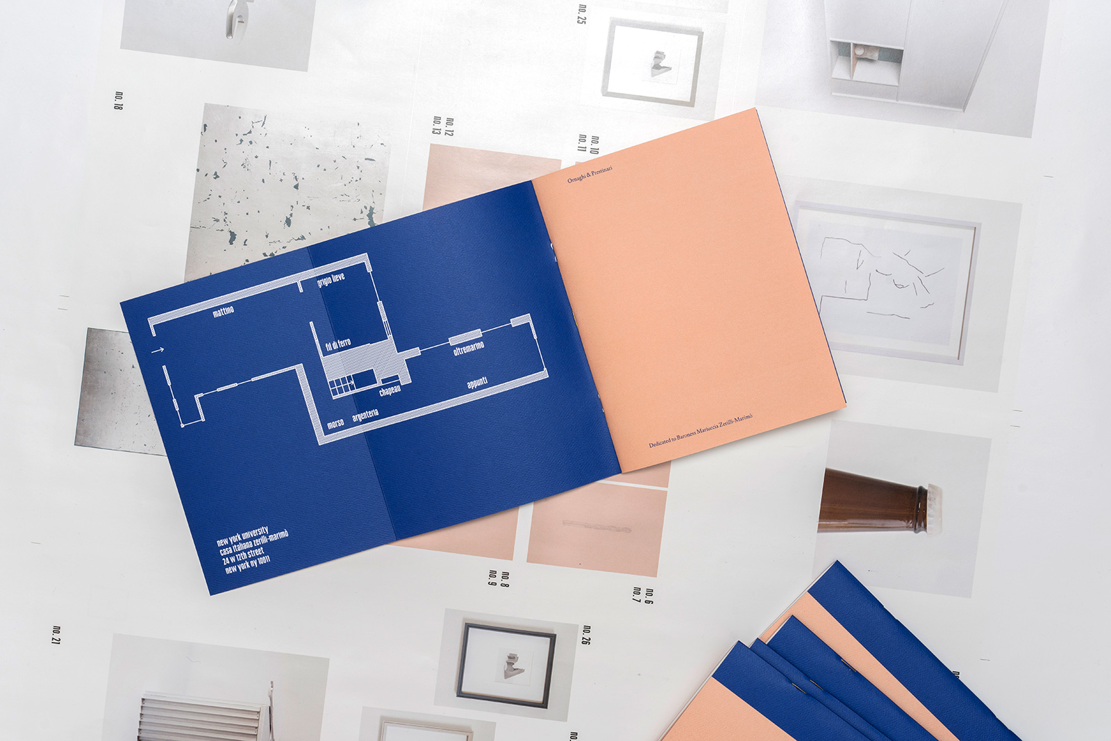
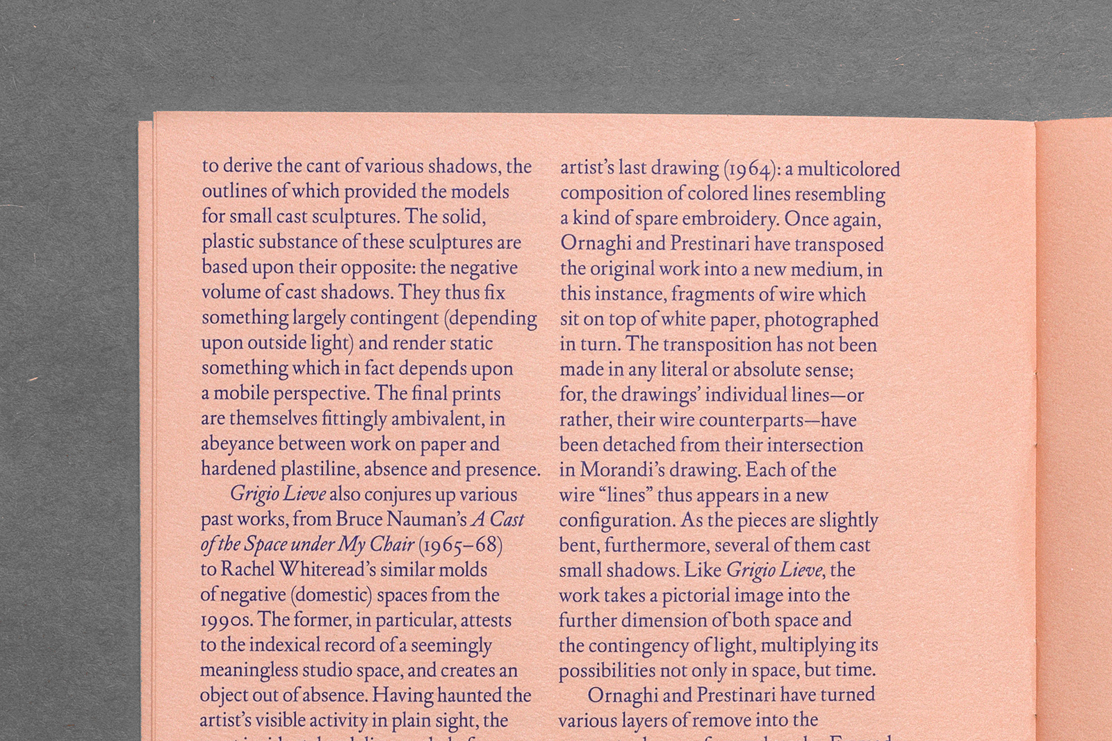
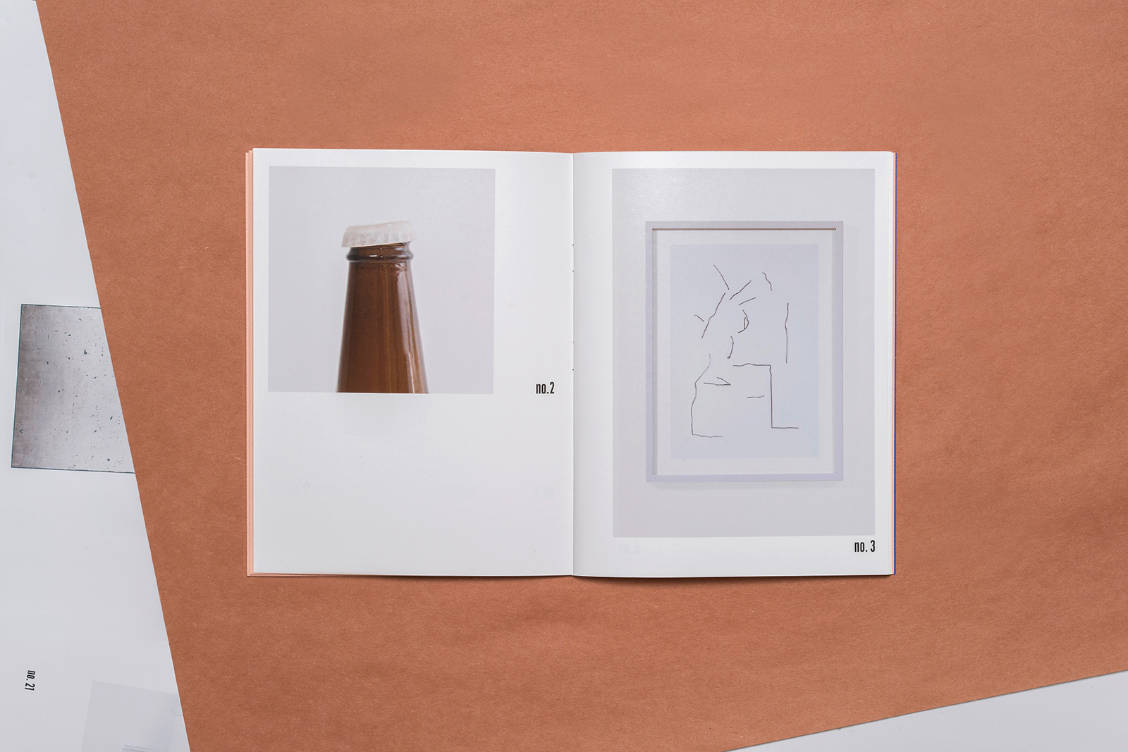
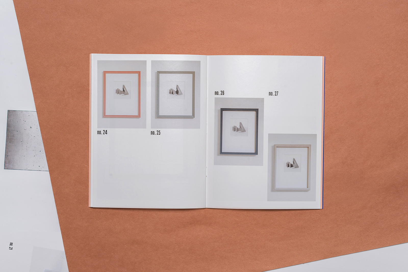
ORNAGHI & PRESTINARI and RELATED APPLICATIONS for MAGAZZINO ITALIAN ART — Located in Cold Spring, New York, Magazzino is an extensive private collection of arte povera and other post-war and contemporary Italian art. Occasionally, the collectors present shows in other locations, such as this intimate exhibition of the artist duo Ornaghi & Prestinari. Here, their unlikely re-creations of domestic objects fit so well into the townhouse-like setting of New York University’s Casa Italiana, they occasionally blur into the existing decor. The catalog plays with this notion of domesticity, employing the familiar visual language of furniture and design catalogs, albeit in a more abstracted manner.

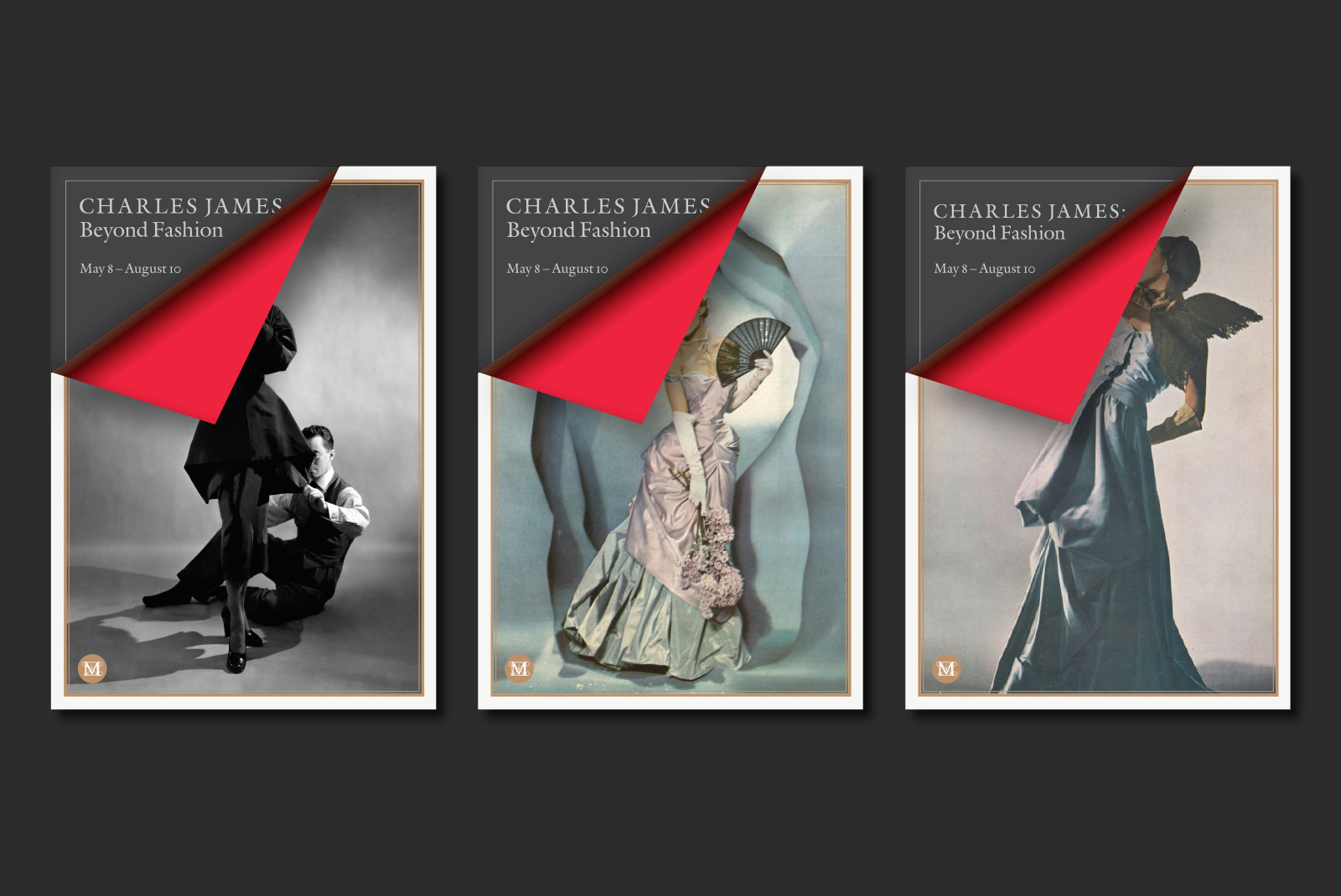
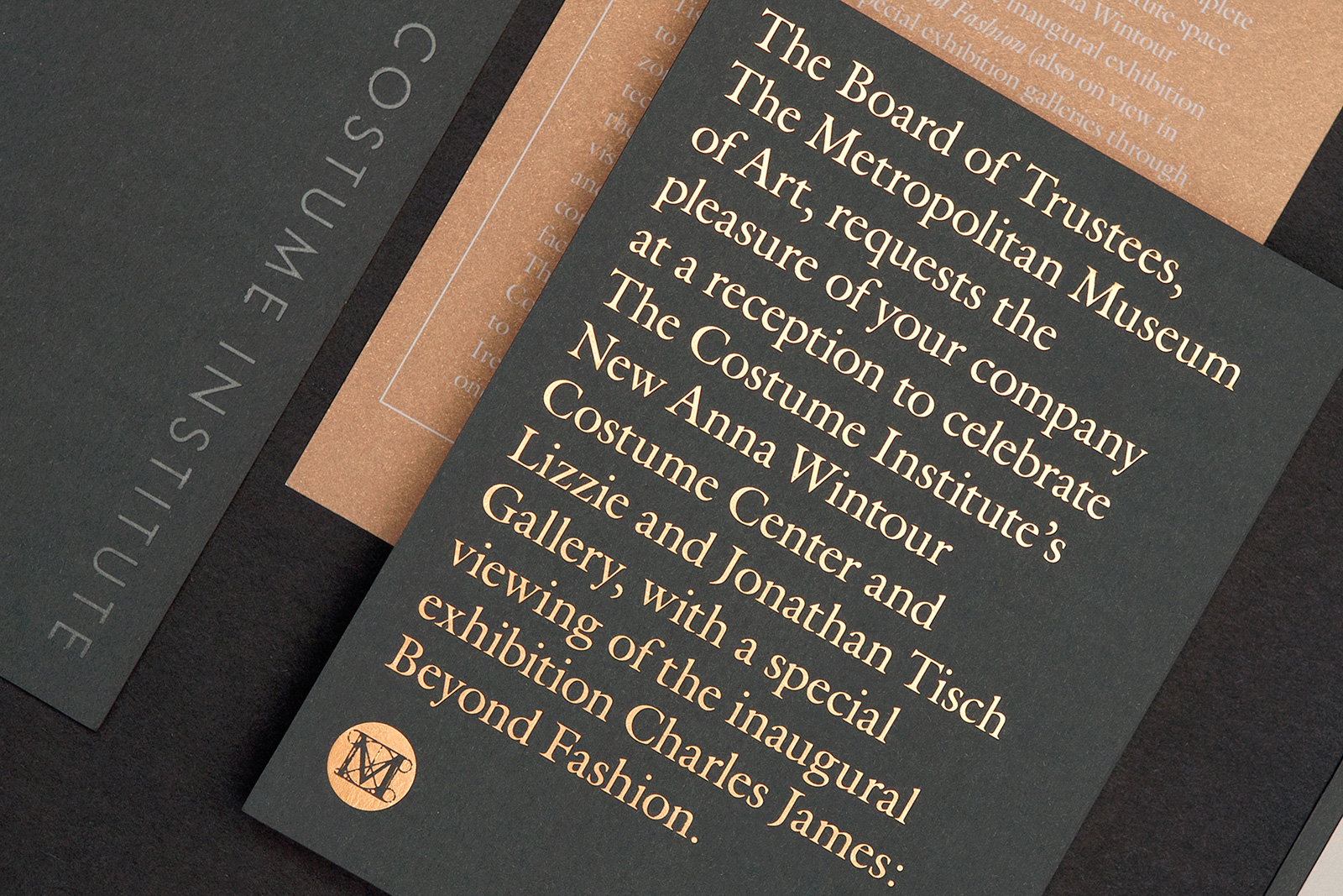
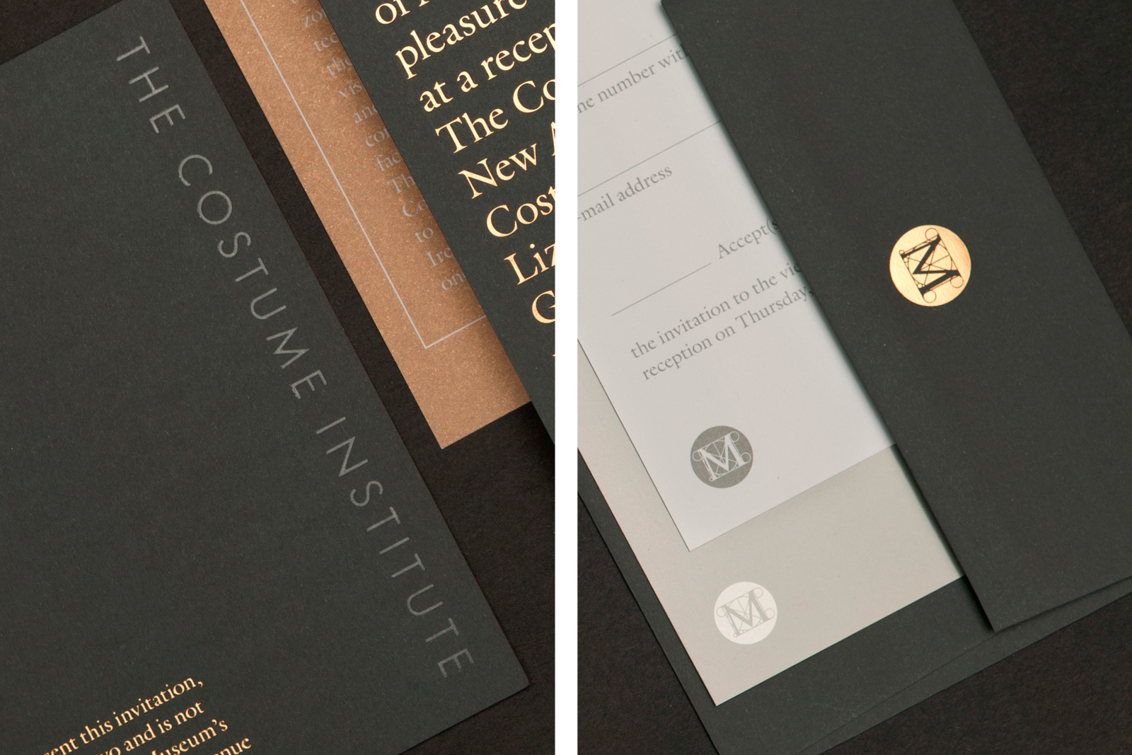
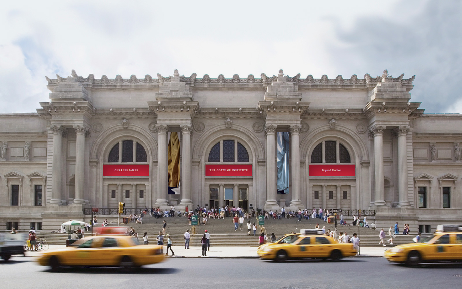
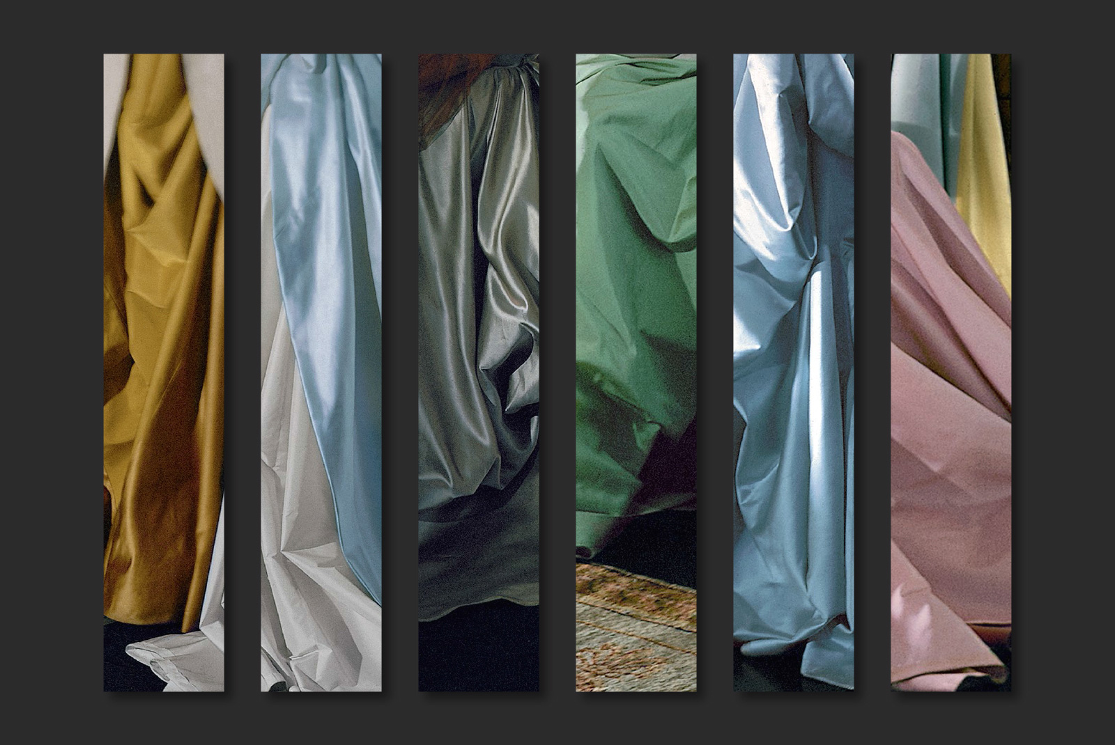
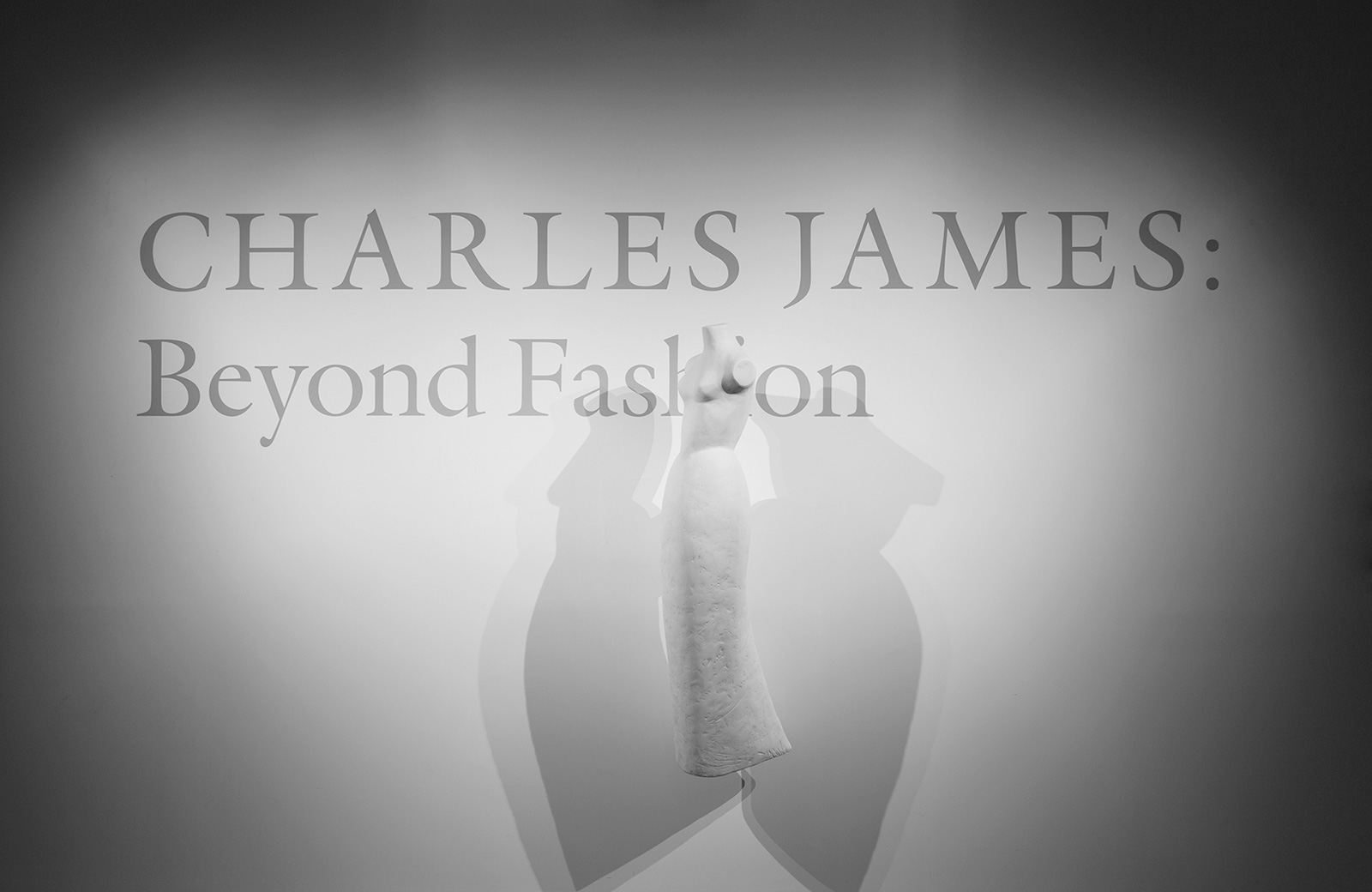
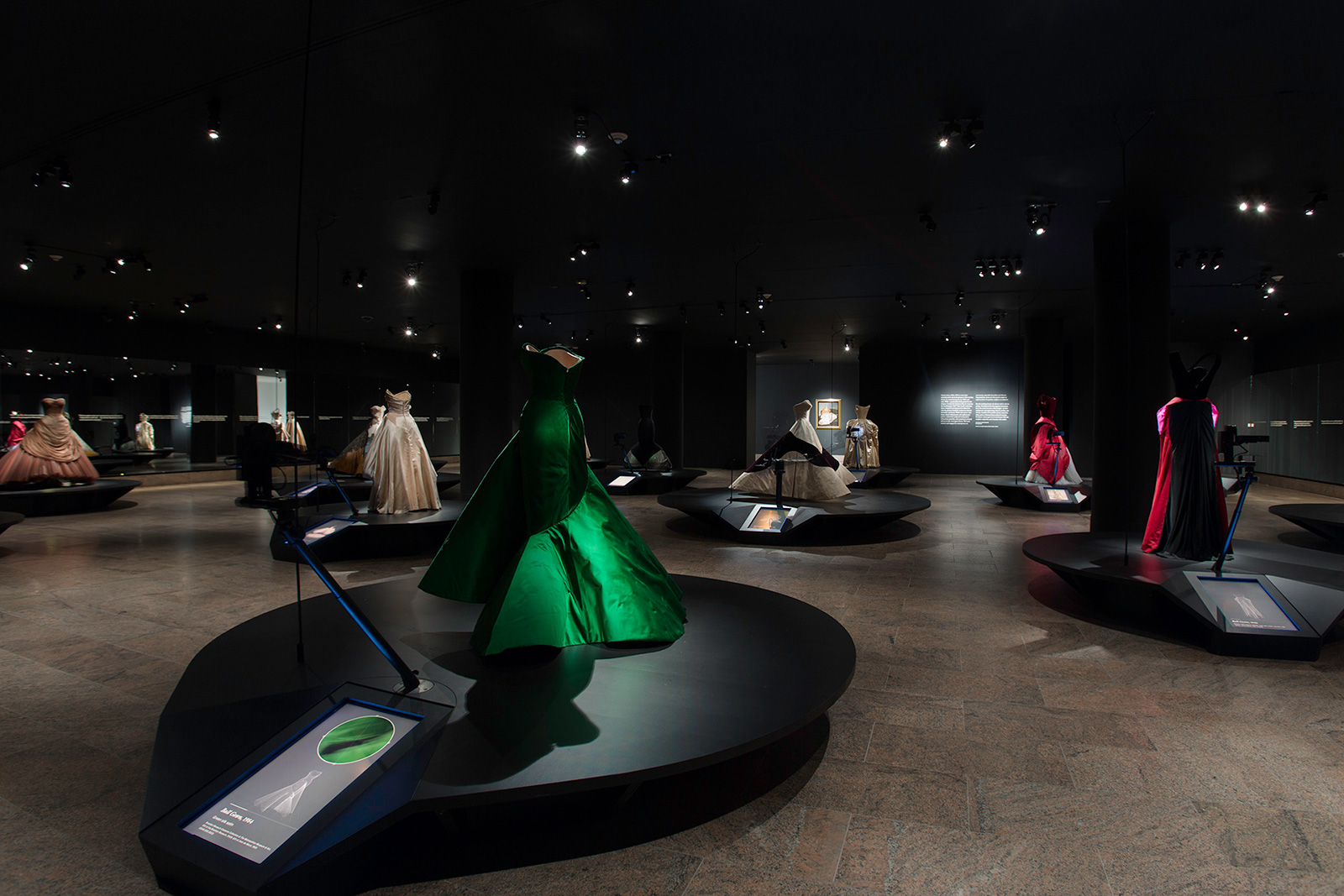
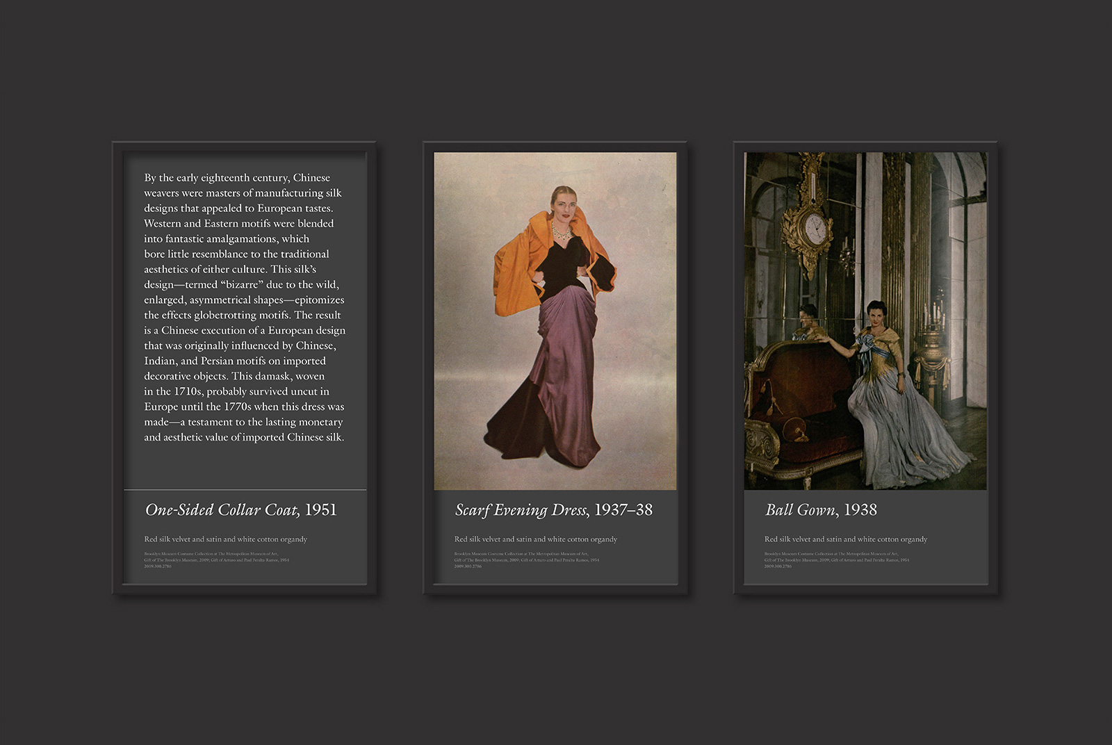
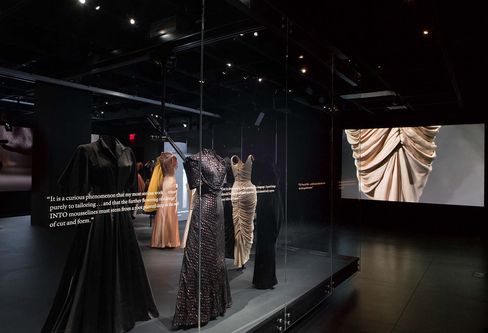
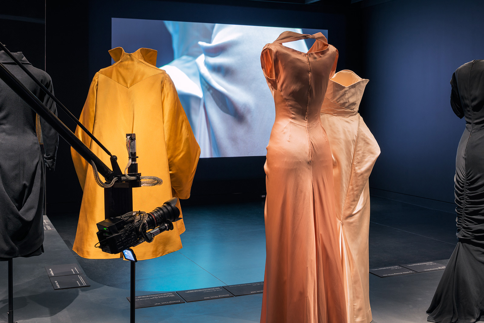
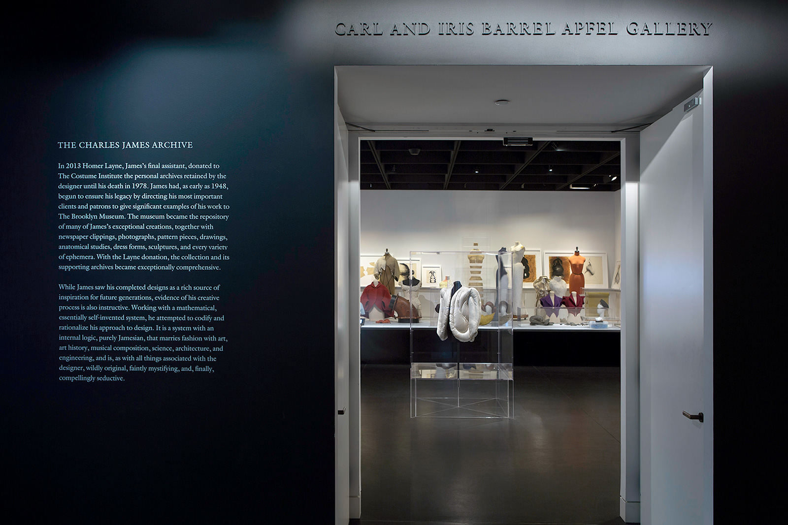
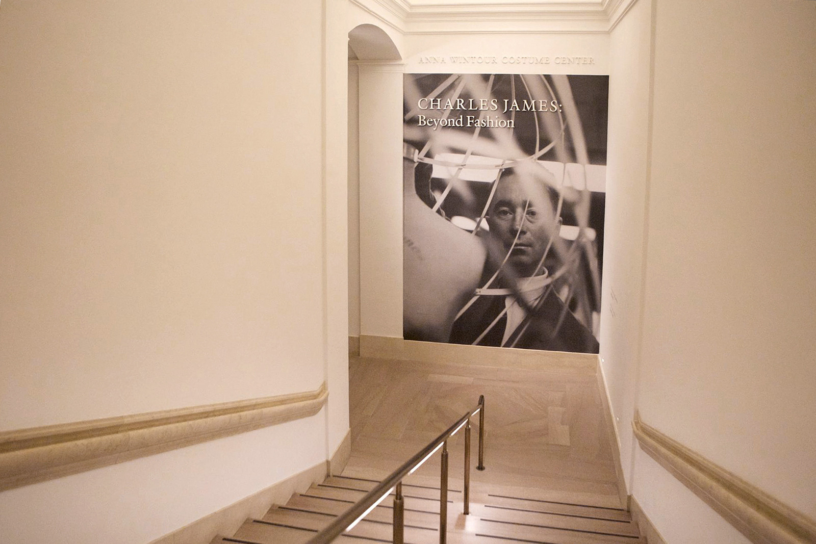
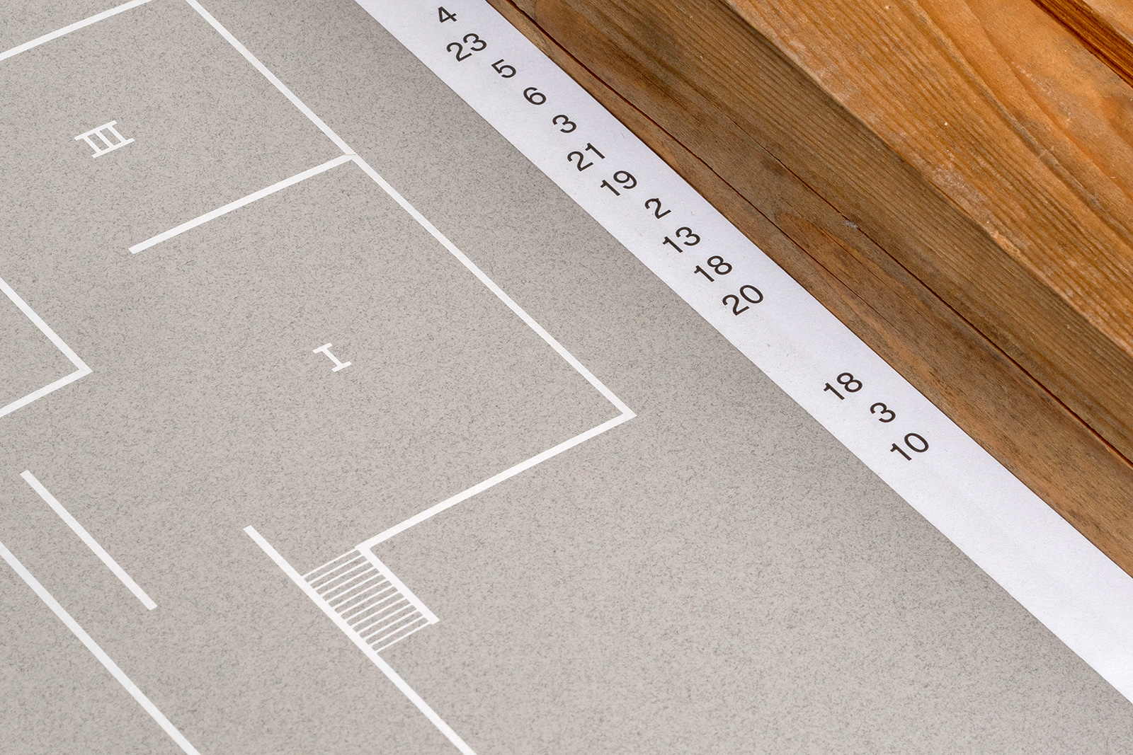
CHARLES JAMES: BEYOND FASHION for THE METROPOLITAN MUSEUM OF ART — The final show from long-time Costume Institute director Harold Koda, and the first in their renovated exhibition space, Beyond Fashion explores the career of iconic dressmaker and couturier Charles James. With a technically-focused exhibition design by Diller Scofidio & Renfro, the show deconstructs James’s design process through a series of animations that accompany many of the gowns, and reverse engineer each dress pattern in three-dimensional space. The identity plays off the idea of moving beyond the familiar, anecdotal history of the artists work, into a more nuanced, almost scientific look at his designs. The typographic strategy for wall and screen text was to remain more neutral and reserved, contrasting the technical look of the exhibition itself.

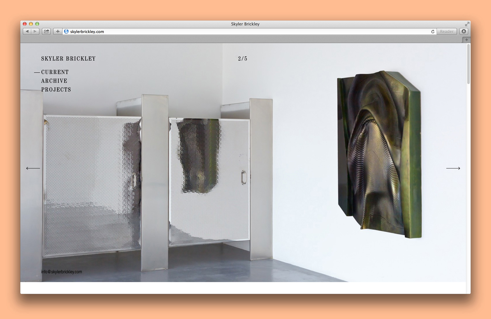
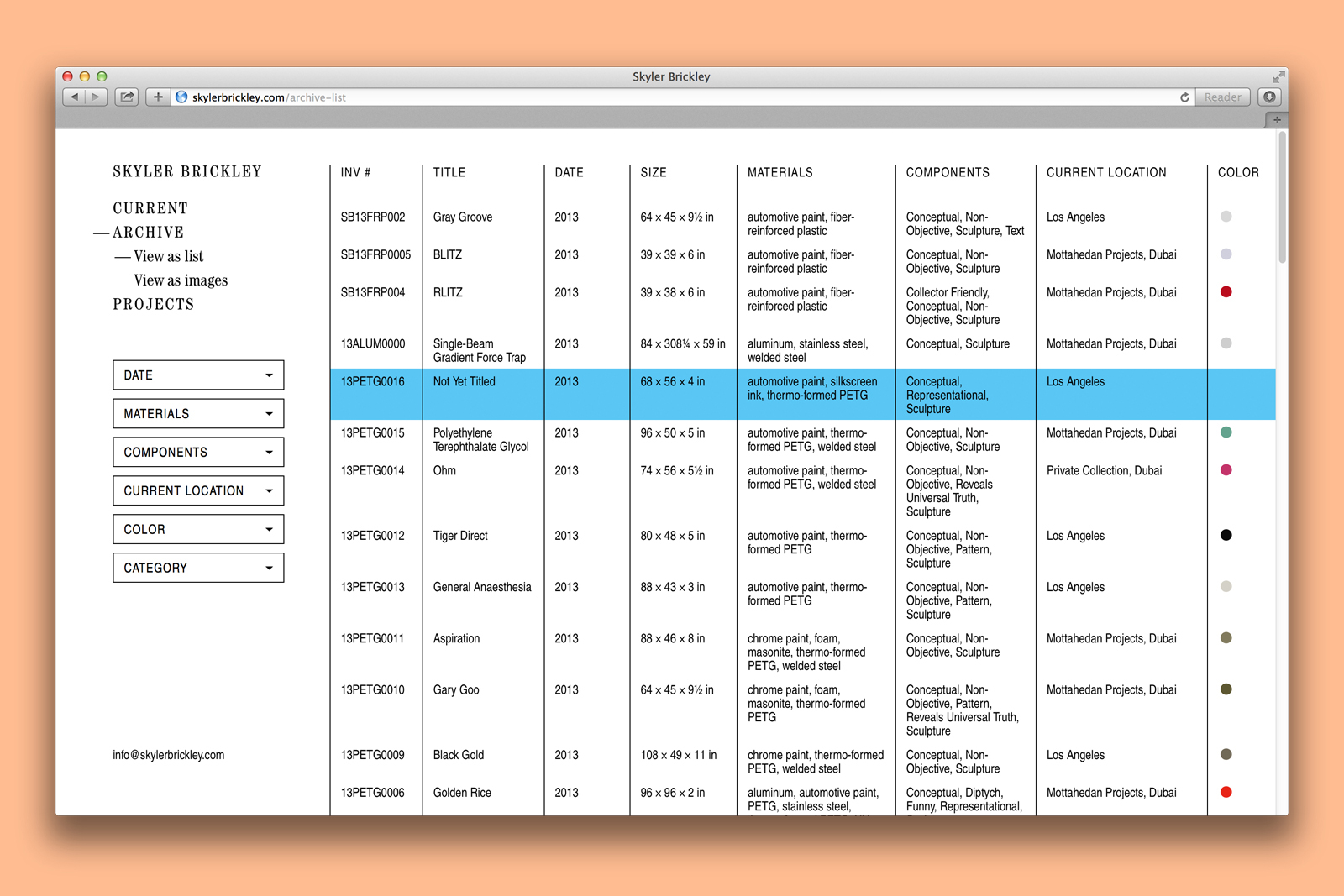
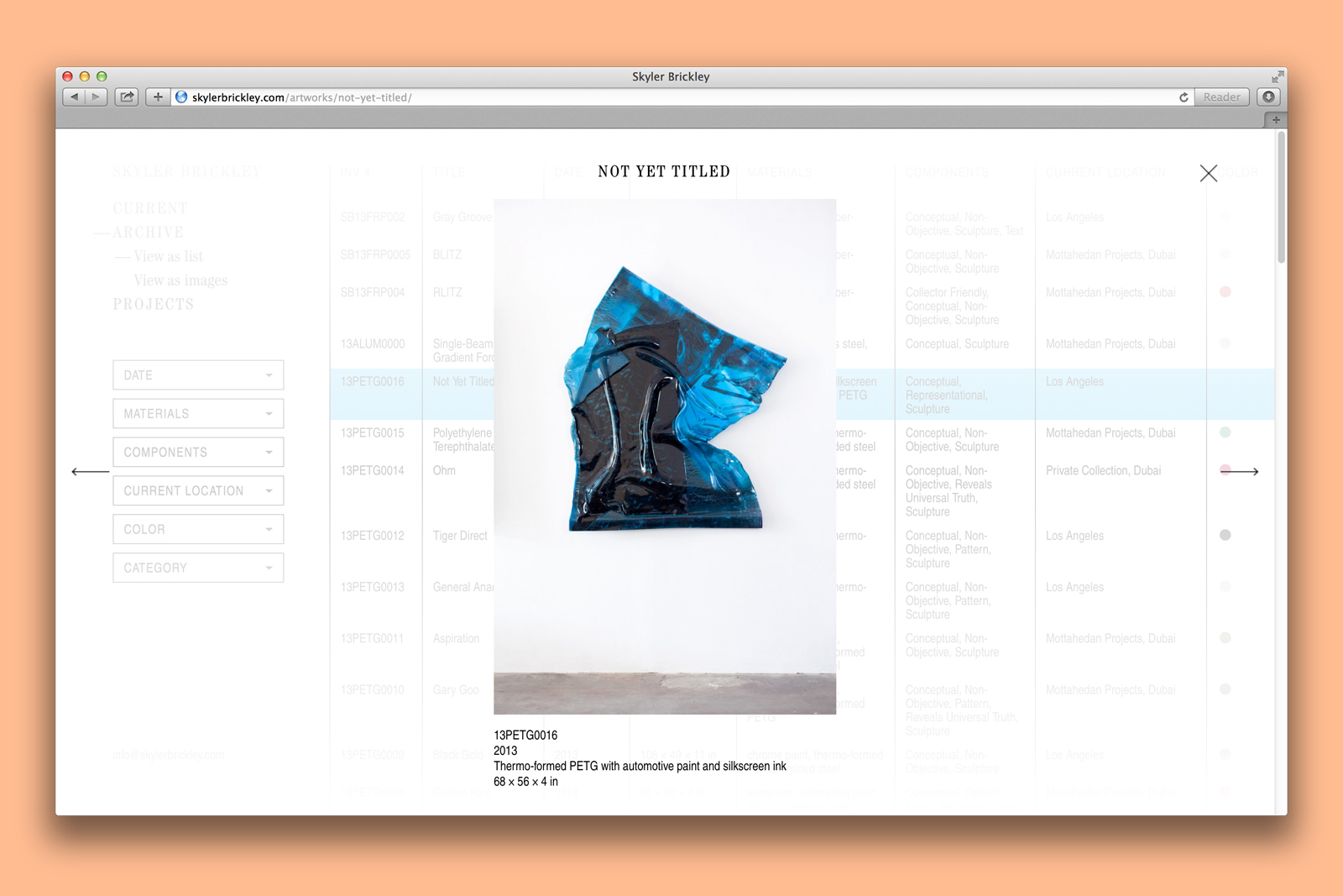
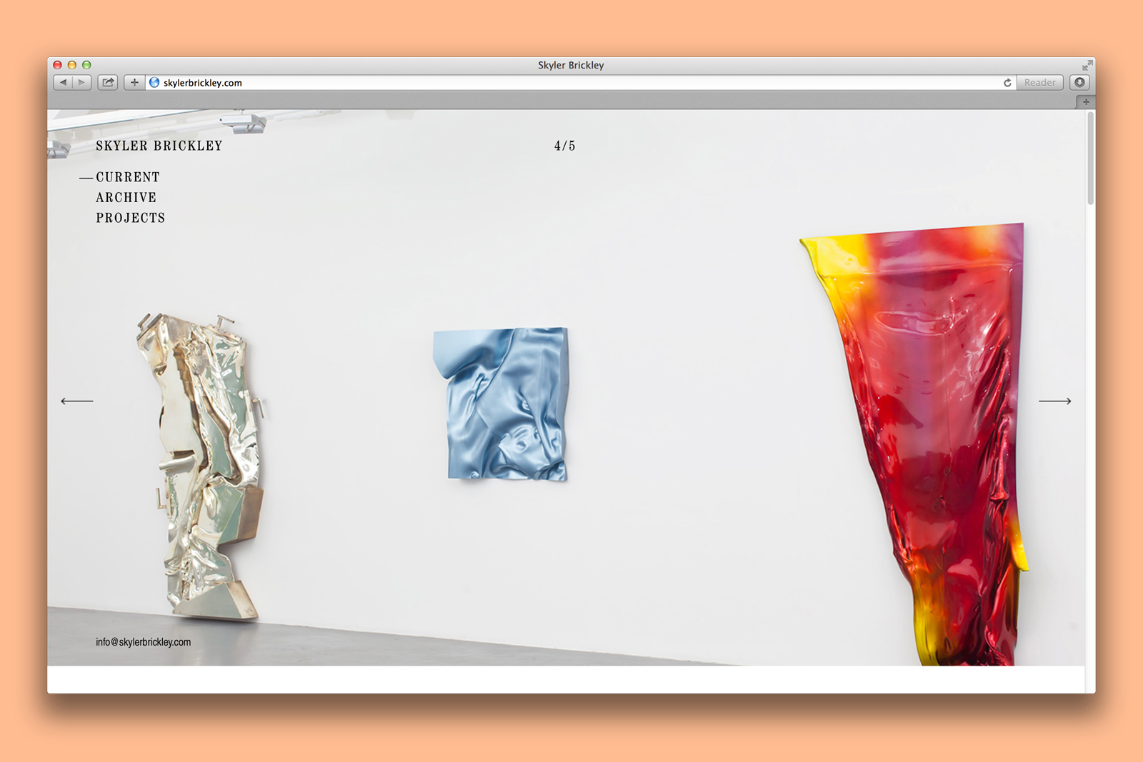
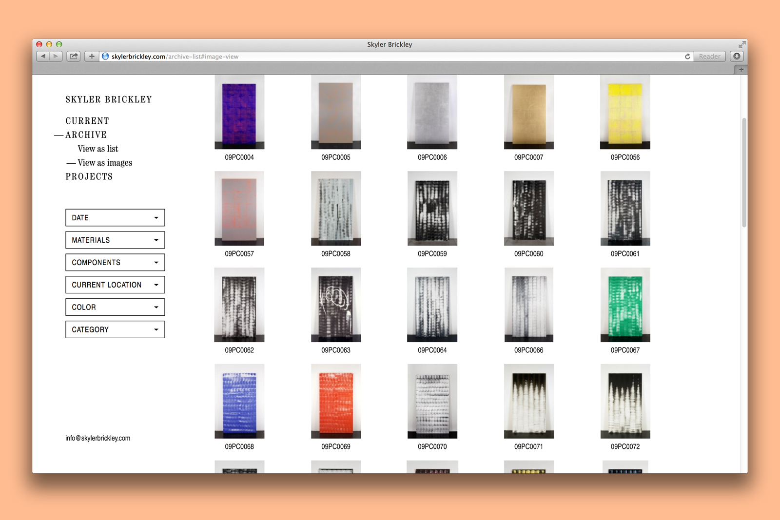
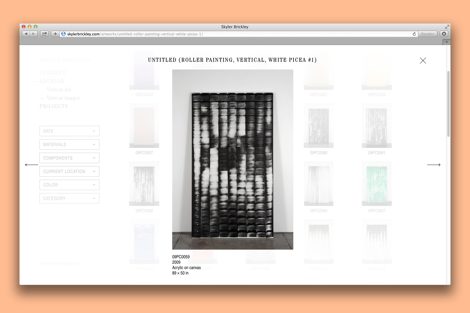
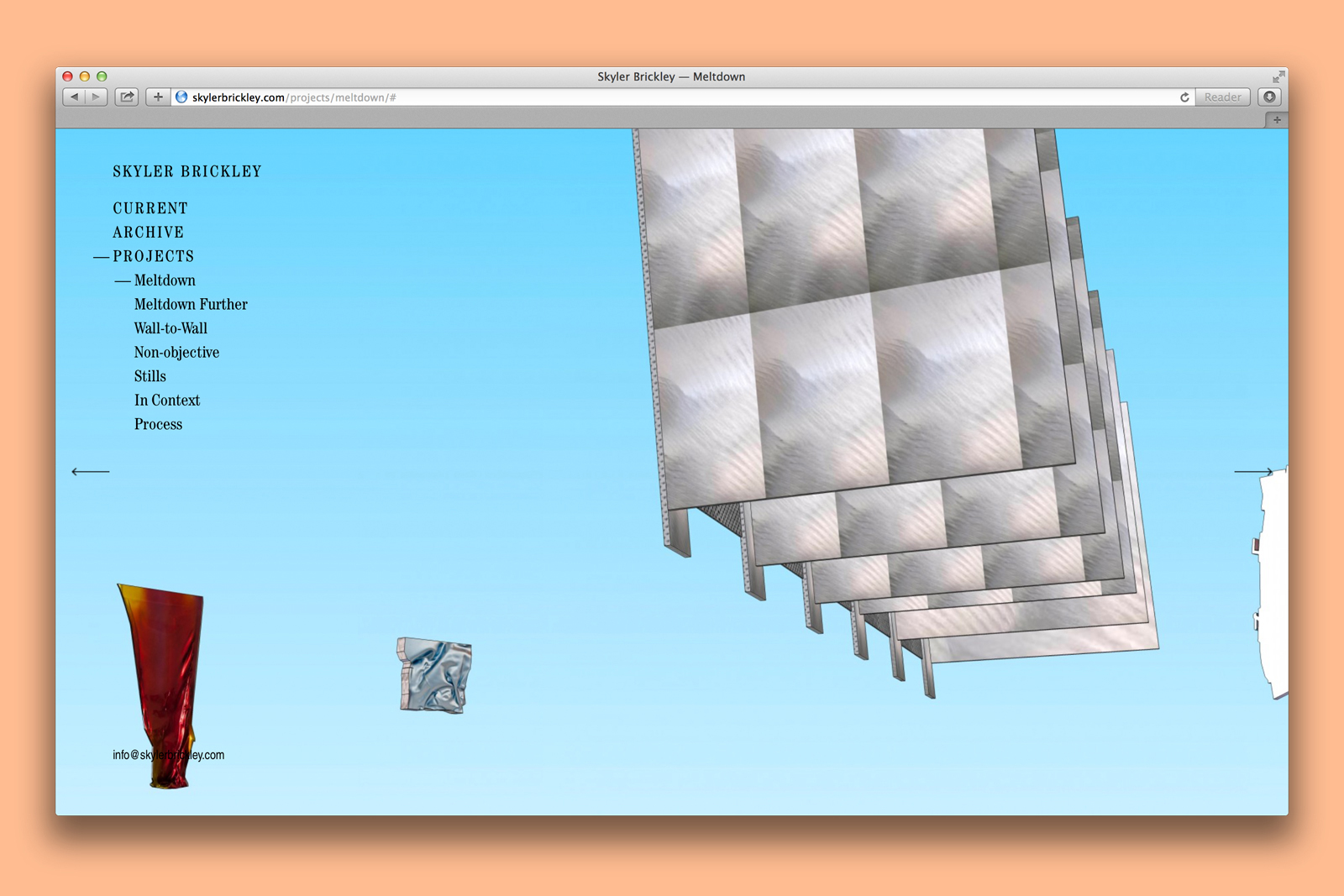
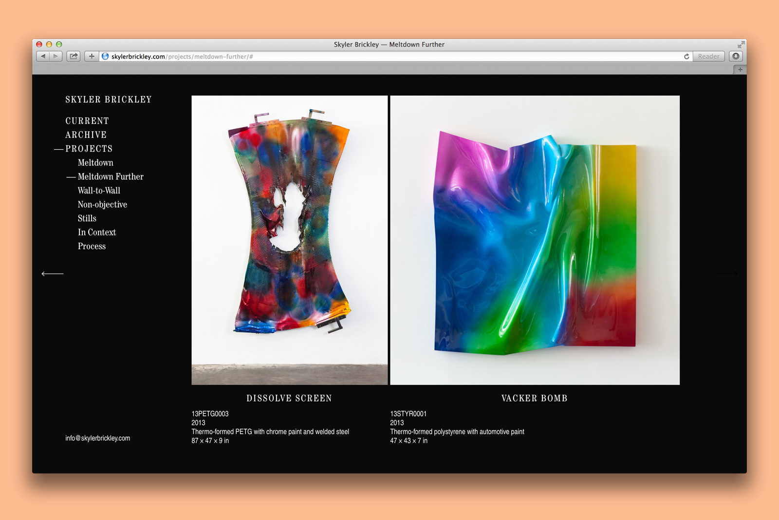
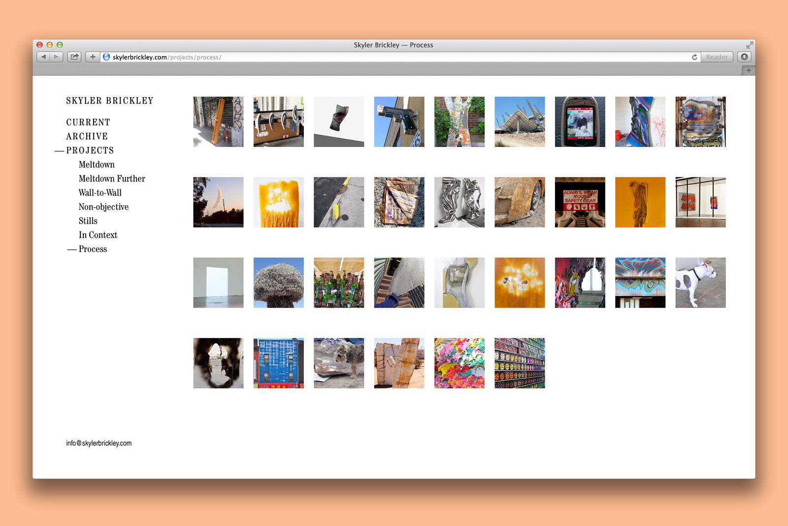
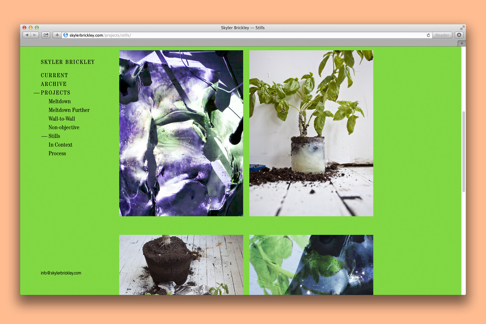
PORTFOLIO WEBSITE for SKYLER BRICKLEY —— In his work, Skyler Brickley often explores notions of reproduction and recontextualization, both in his large, system-driven dot paintings and the more recent wall sculptures. As part of his process, he collects a near-endless stream of reference material and found imagery, along with material samples and experiments, all of which inform his work. He applies a rigorous cataloging system to keep track of everything, including all of the pieces that come out of this process, what they are made from, where and when they were created, their material makeup, and so on. For his portfolio website, we remade this rich archival database into the primary user interface, allowing users to sort and filter based on a variety of criteria set by the artist.
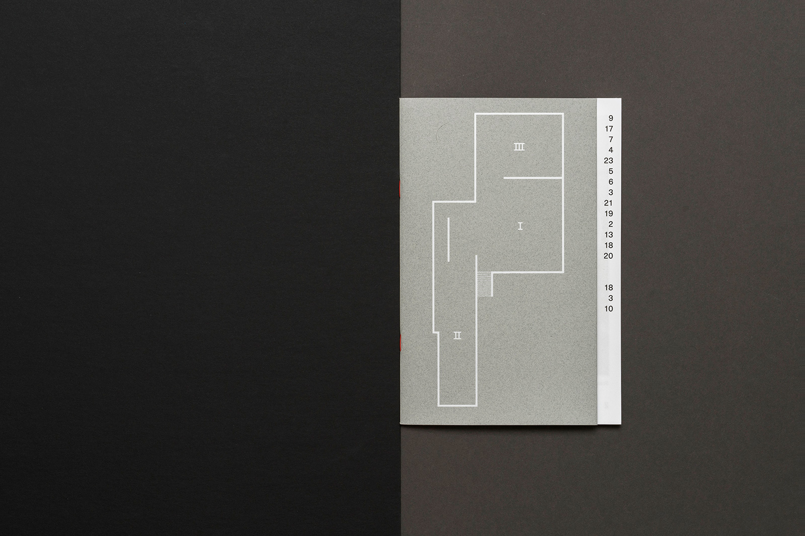
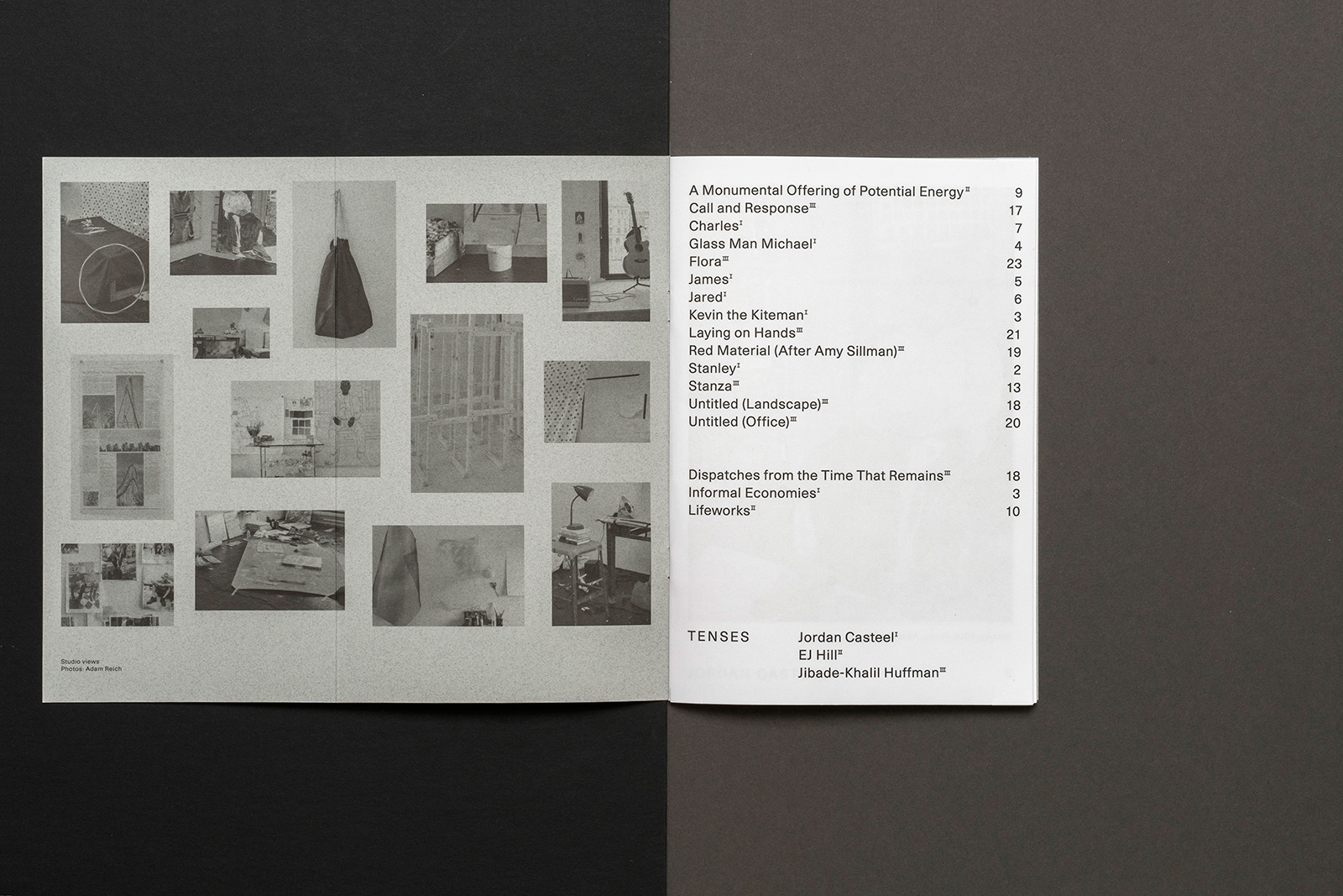
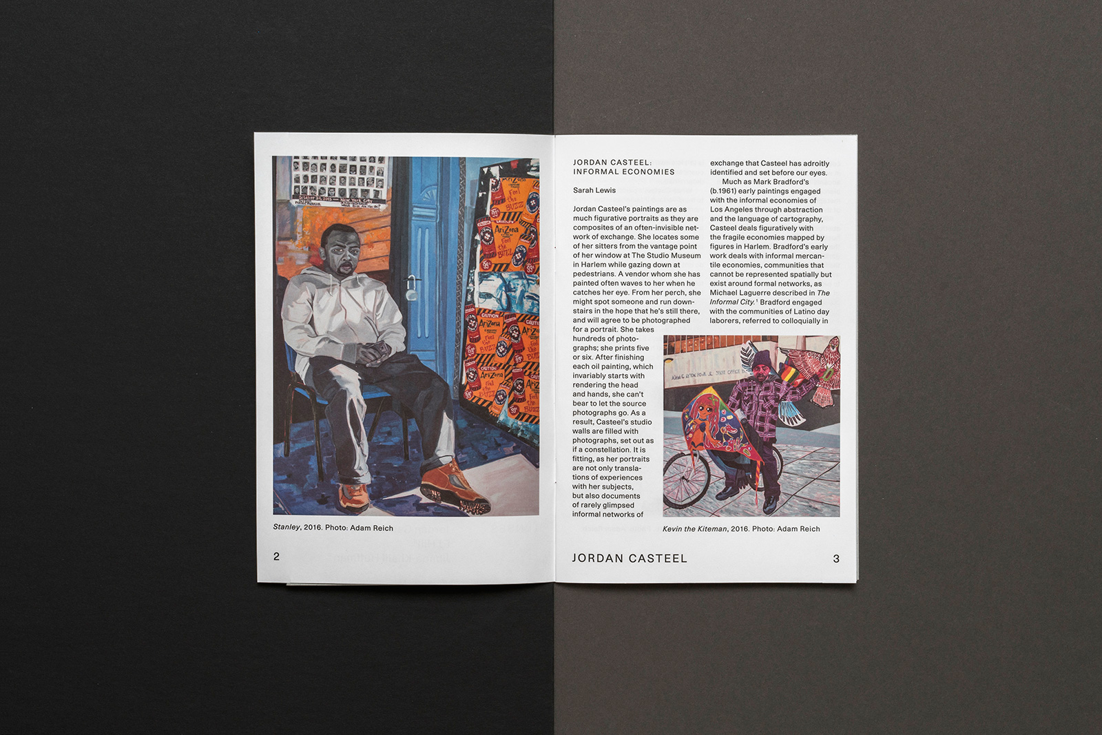
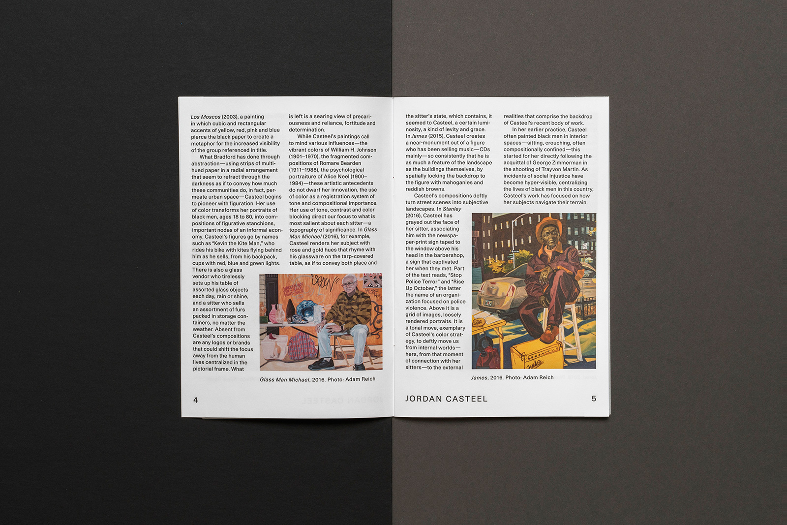
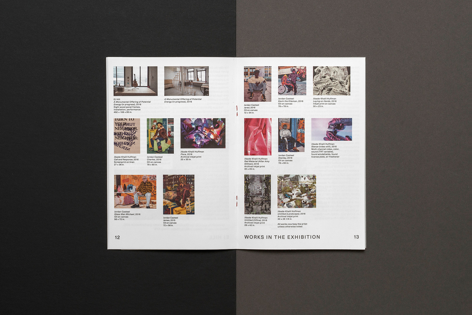
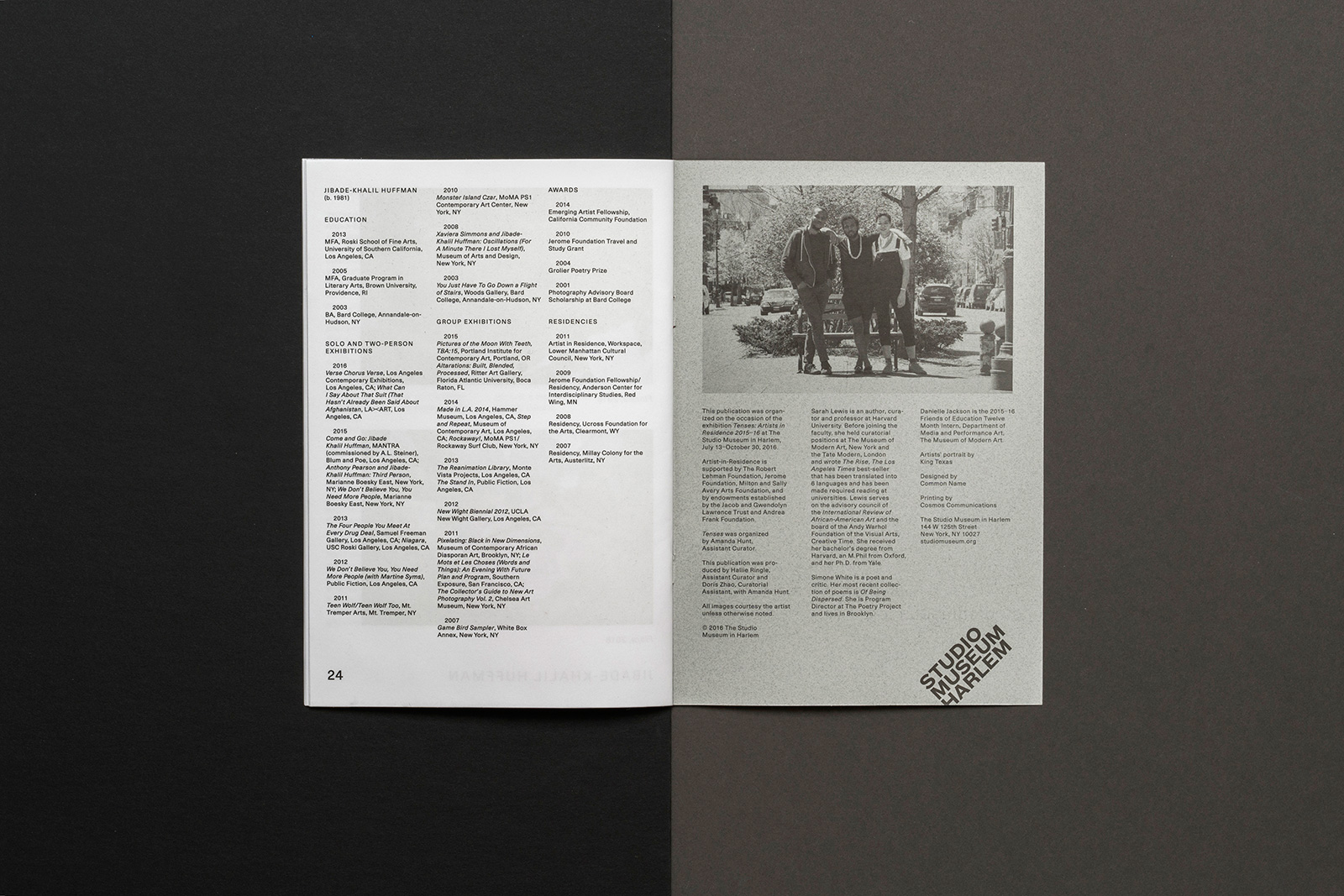
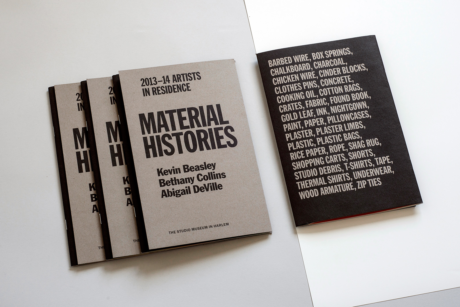
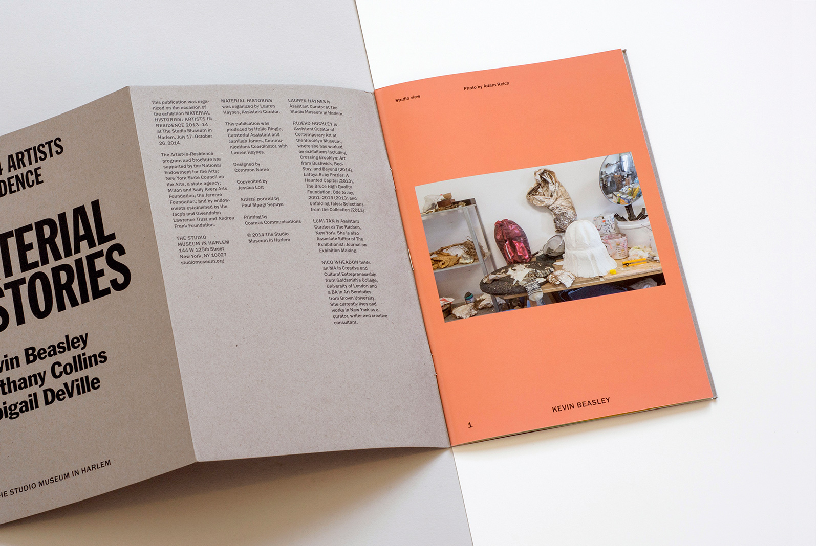
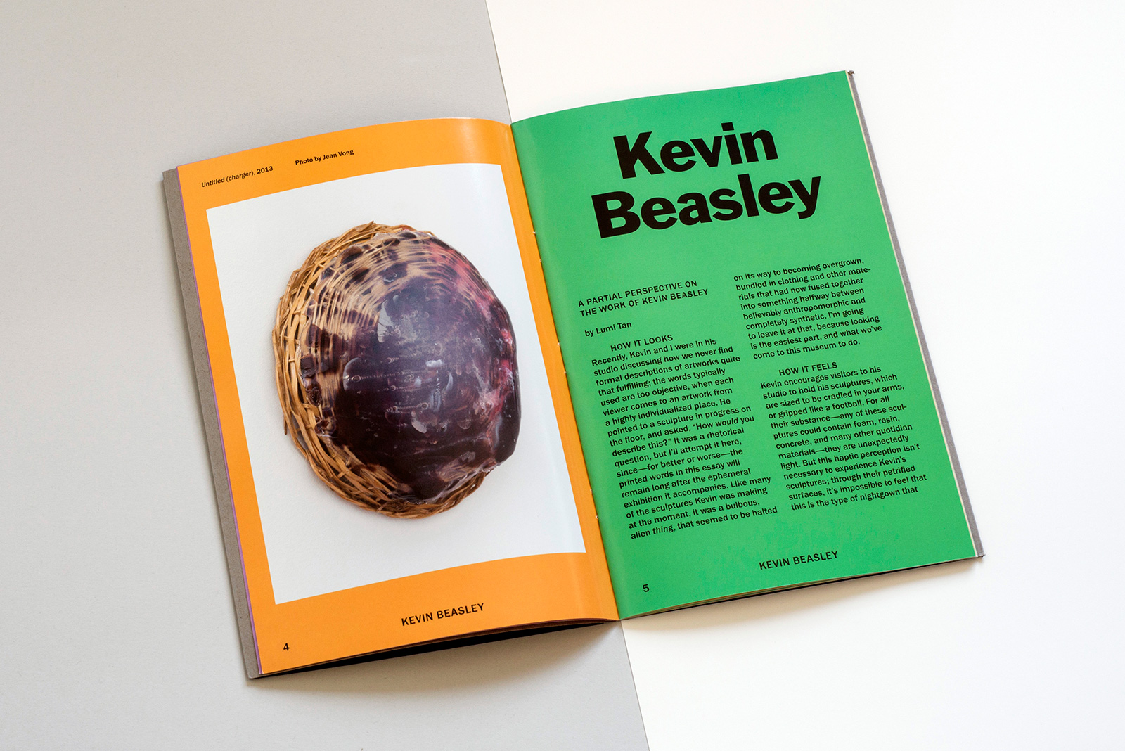
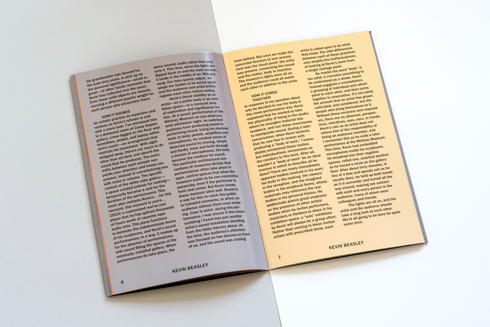
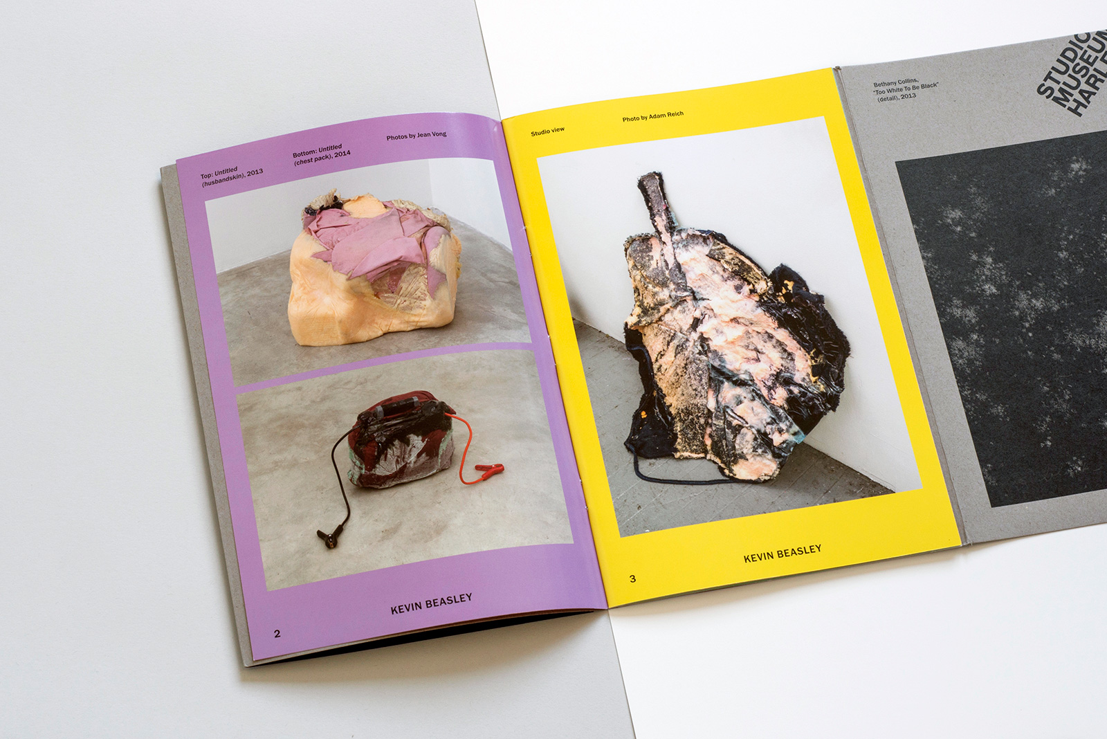
TENSES & MATERIAL HISTORIES for STUDIO MUSEUM HARLEM — For decades, The Studio Museum in Harlem has provided a platform for emerging artists of African and Latino decent through their Artist in Residence program. Many now-established artists who spent time an an AIR cite it as a turning point in their career. Each year, at the conclusion of the residency, the museum exhibits the work made during the artists’ time in Harlem, with many creating site-specific installations or using the community as inspiration in some way. In addition, a small catalog is produced for each show, helping to reveal the thematic links which underpin their work.
